Complete issue 10:1 as one pdf - TUG
Complete issue 10:1 as one pdf - TUG
Complete issue 10:1 as one pdf - TUG
Create successful ePaper yourself
Turn your PDF publications into a flip-book with our unique Google optimized e-Paper software.
<strong>TUG</strong>boat, Volume <strong>10</strong> (1989), No. 1<br />
thereby omitting $'s around a mathematical constant<br />
unless I needed them to get a minus sign instead<br />
of a hyphen. After all, I re<strong>as</strong><strong>one</strong>d, those extra<br />
$IS just make TEX work harder and the result looks<br />
the same; so why should I be logical? But in Concrete<br />
Mathematics I needed to type<br />
$x$ is either $I$ or $-I$,<br />
to keep x from being 'either 1 or -1'. The early<br />
drafts of my manuscript had been prepared in the<br />
old way; therefore I needed to spend several hours<br />
laboriously hunting down and correcting all instances<br />
where the new convention w<strong>as</strong> necessary.<br />
This experience proved to be worthwhile, because<br />
it taught me that there is a useful and meaningful<br />
distinction between text numerals and mathematical<br />
numerals. Text numerals are used in contexts<br />
like '1776' and 'Chapter 5' and '41 ways', where<br />
the numbers are essentially part of the English<br />
language; mathematical numerals, by contr<strong>as</strong>t, are<br />
used in contexts like 'the greatest common divisor of<br />
12 and 18 is 6', where the numbers are part of the<br />
mathematics. (Authors of technical texts in languages<br />
like Japanese, where Arabic numerals are<br />
used in formul<strong>as</strong> but not in ordinary text, have always<br />
been well aware of this distinction; now I had<br />
a chance to learn it too.)<br />
As I w<strong>as</strong> tooling up to begin using AMS Euler,<br />
my publishers were simultaneously showing the<br />
preliminary manuscript of Concrete Mathematics to<br />
a book designer, Roy Howard Brown. I had sent<br />
Roy a copy of the first Euler report [8] so that he<br />
could see examples of the typeface we planned to<br />
use for mathematics. Our original intention, b<strong>as</strong>ed<br />
on Zapf's original plans when he began the design<br />
in 1980, w<strong>as</strong> to use Computer Modern Roman for<br />
the text and AMS Euler for the mathematics. But<br />
Roy noticed that AMS Euler w<strong>as</strong> somewhat darker<br />
in color than a traditional mathematical italic, so<br />
he decided that the text face should be correspondingly<br />
heavier. He sent me several samples of typefaces<br />
with more suitable weights, so that I could<br />
prepare a special font compatible with AMS Euler.<br />
(One of my b<strong>as</strong>ic premises when I had developed the<br />
Computer Modern meta-font w<strong>as</strong> that it should be<br />
readily adaptable to new situations like this.) When<br />
I saw Roy's samples, I decided to pursue something<br />
that I'd wanted an excuse to do for several years,<br />
namely to find settings for the parameters of Computer<br />
Modern that would produce an "Egyptian"<br />
(square-serif) style.<br />
The cover designs for Computers & Typesetting,<br />
Volumes A-El show a gradual transition of<br />
the respective letter pairs Aa, Bb, Cc, Dd, and Ee<br />
from the style of standard Computer Modern Roman<br />
to an Egyptian style. I had made these cover<br />
designs just for fun, at the suggestion of Marshall<br />
Hendricks, but I had never had time to experiment<br />
with a complete text face in that style. Now I had<br />
a good re<strong>as</strong>on to indulge that whim, and after a<br />
ple<strong>as</strong>ant afternoon of experiments I found a combination<br />
of parameters that looked re<strong>as</strong>onably attractive,<br />
at le<strong>as</strong>t when I examined samples produced by<br />
our l<strong>as</strong>er printer. (I magnified the fonts and viewed<br />
them from a distance, to overcome the effects of<br />
300dpi resolution.) Then I made more elaborate<br />
samples of text and printed them on Stanford's APS<br />
phototypesetter, to see if the new fonts would really<br />
p<strong>as</strong>s muster. Some characters needed to be adjusted<br />
(e.g., the 'w' w<strong>as</strong> too dark), but I w<strong>as</strong> happy with<br />
the result and so w<strong>as</strong> Roy.<br />
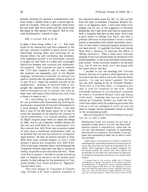
I decided to call the resulting font Concrete<br />
Roman, because of its general solid appearance and<br />
because it w<strong>as</strong> first used in the book Concrete Mathematics.<br />
(In c<strong>as</strong>e you haven't guessed, the text<br />
you are now reading is set in Concrete Roman.)<br />
There also zs Concrete Italzc, a companzon face<br />
that zs used for emph<strong>as</strong>zs zn the book. EVEN<br />
STRONGER EMPHASIS IS OCCASIONALLY ACHIEVED<br />
BY USING A CONCRETE ROMAN CAPS AND SMALL<br />
CAPS FONT. Anybody who h<strong>as</strong> the METAFONT<br />
sources for Computer Modern can make the Concrete<br />
fonts rather e<strong>as</strong>ily by preparing parameter files<br />
such <strong>as</strong> ccrl0 .mf, analogous to cmrl0 .mf; you just<br />
need to change certain parameter values <strong>as</strong> shown<br />
in the accompanying table.<br />
Here are samples of Concrete Roman in the 9 pt,<br />
8pt, 7pt, 6pt, and spt sizes:<br />
Mathematics books and journals do not look <strong>as</strong><br />
beautiful <strong>as</strong> they used to. It is not that their mathematical<br />
content is unsatisfactory, rather that the<br />
old and well-developed traditions of typesetting<br />
have become too expensive. Fortunately, it now appears<br />
that mathematics itself can be used to solve<br />
this problem.<br />
A first step in the solution is to devise a method for<br />
unambiguously specifying mathematical manuscripts in<br />
such a way that they can e<strong>as</strong>ily be manipulated by machines.<br />
Such languages, when properly designed, can<br />
be learned quickly by authors and their typists, yet<br />
manuscripts in this form will lead directly to high quality<br />
plates for the printer with little or no human intervention.<br />
A second step in the solution makes use of cl<strong>as</strong>sical<br />
mathematics to design the shapes of the letters and symbols<br />
themselves. It is possible to give a rigorous definition<br />
of the exact shape of the letter "a", for example, in such a<br />
way that infinitely many styles (bold, extended, sans-serif,<br />
italic, etc.) are obtained from a single definit~on by changing<br />
only a few parameters. When the same is d<strong>one</strong> for the


