Complete issue 10:1 as one pdf - TUG
Complete issue 10:1 as one pdf - TUG
Complete issue 10:1 as one pdf - TUG
You also want an ePaper? Increase the reach of your titles
YUMPU automatically turns print PDFs into web optimized ePapers that Google loves.
38 <strong>TUG</strong>boat, Volume <strong>10</strong> (1989), No. 1<br />
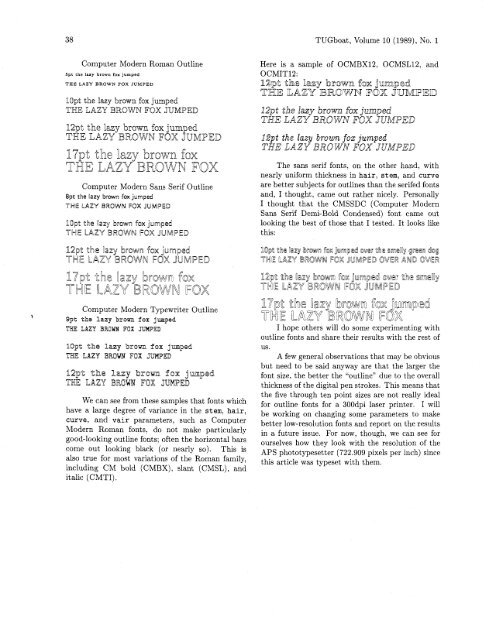
Computer Modern Roman Outline<br />
5pt the lazy brown fox jumped<br />
THE LAZY BROWN FOX JUMPED<br />
Here is a sample of OCMBX12, OCMSL12, and<br />
OCMIT12:<br />
]Opt the lazy brown fox jumped<br />
THE LAZY BIROWN FOX JUMPED<br />
B2pt the lazy brown fox jumped<br />
THE LAZY BROWN FOX JUMPED<br />
Computer Modern Sans Serif Outline<br />
8pt the lamy brown fox jumped<br />
THE LAZY BROWN FOX JUMPED<br />
The sans serif fonts, on the other hand, with<br />
nearly uniform thickness in hair, stem, and curve<br />
are better subjects for outlines than the serifed fonts<br />
and, I thought, came out rather nicely. Personally<br />
I thought that the CMSSDC (Computer Modern<br />
Sans Serif Demi-Bold Condensed) font came out<br />
looking the best of those that I tested. It looks like<br />
this:<br />
12pt the lazy brown fox jumped<br />
THE LAZY BROWN FOX JUMPED<br />
Computer Modern Typewriter Outline<br />
> Opt the lazy brown fox jumped,<br />
ThE LAZY BREW FOX JUMPED<br />
We can see from these samples that fonts which<br />
have a large degree of variance in the stem, hair,<br />
curve, and vair parameters, such <strong>as</strong> Computer<br />
Modern Roman fonts, do not make particularly<br />
good-looking outline fonts; often the horizontal bars<br />
come out looking black (or nearly so). This is<br />
also true for most variations of the Roman family,<br />
including CM bold (CMBX), slant (CMSL), and<br />
italic (CMTI).<br />
I hope others will do some experimenting with<br />
outline fonts and share their results with the rest of<br />
US.<br />
A few general observations that may be obvious<br />
but need to be said anyway are that the larger the<br />
font size, the better the "outline" due to the overall<br />
thickness of the digital pen strokes. This means that<br />
the five through ten point sizes are not really ideal<br />
for outline fonts for a 300dpi l<strong>as</strong>er printer. I will<br />
be working on changing some parameters to make<br />
better low-resolution fonts and report on the results<br />
in a future <strong>issue</strong>. For now, though. we can see for<br />
ourselves how they look with the resolution of the<br />
APS phototypesetter (722.909 pixels per inch) since<br />
this article w<strong>as</strong> typeset with them.


