

Complete issue 10:1 as one pdf - TUG
Complete issue 10:1 as one pdf - TUG
Complete issue 10:1 as one pdf - TUG

You also want an ePaper? Increase the reach of your titles
YUMPU automatically turns print PDFs into web optimized ePapers that Google loves.
<strong>TUG</strong>boat, Volume <strong>10</strong> (1989), No. 1 37<br />
mode-setup macros; they are extra-beginchar and<br />
extr<strong>as</strong>etup.<br />
This macro w<strong>as</strong> intended to be used (by me<br />
anyway) <strong>as</strong> an extension of the plain and cm<br />
(Computer Modern) b<strong>as</strong>e files. This way I did not<br />
need to input it each time I wanted to make an<br />
outline font. Since I place all of my local extensions<br />
to either b<strong>as</strong>e file into a file named local .mf, that<br />
is where my outline macro went.<br />
To load it into the plain b<strong>as</strong>e file using the<br />
initialization version of METAFONT, INIMF, use the<br />
following line:<br />
inimf plain input local dump<br />
Similarly, for the Computer Modern b<strong>as</strong>e file use:<br />
inimf plain input cmb<strong>as</strong>e input local dump<br />
Now that it is a part of your b<strong>as</strong>e files, you simply<br />
need to set the boolean switch outlining to true<br />
to make an outline font. Here is <strong>one</strong> way to make a<br />
17 point sans serif font:<br />
mf %cm \mode=varityper;<br />
outlining:=true; input cmssl7<br />
After making my first few outline fonts I w<strong>as</strong><br />
feeling quite ple<strong>as</strong>ed with them so I happily sent<br />
them off to Professor Knuth thinking I had some<br />
interesting results to share. Here is a small sample<br />
of how the characters had turned out.<br />
Some were ffuaroony looking!<br />
Notice the l<strong>as</strong>t two characters in the line<br />
above have fairly thin strokes, so the resulting<br />
outline characters appear mostly filled in.<br />
Professor Knuth suggested that the values for<br />
rule-thickness be incre<strong>as</strong>ed to match the other<br />
characters, so I experimented a bit and came up<br />
with rule-thickness=lpt for the font sample I<br />
sent, cmssl7 (a 17pt sans serif font). Another parameter<br />
which he suggested I change w<strong>as</strong> notch-cut.<br />
Looking at the W reveals why. The notch-cut parameter<br />
helps "black" fonts look correct at the<br />
meeting place between diagonal strokes by removing<br />
pixels there. While I w<strong>as</strong> at it, I also found that<br />
the capnotch-cut parameter, when set to a very<br />
high value, made the outline fonts look less dark.<br />
Knuth's suggestion of setting the notch-cut value<br />
to 17pt# (relative infinity) helped out considerably.<br />
Here is our reworked W.<br />
Some were better looking! # =<br />
Another <strong>issue</strong> to be addressed is that of font<br />
naming conventions. The method supplied above<br />
h<strong>as</strong> the side-effect of creating METRFONT runs with<br />
the names "cmss17.600" for a GF file, "cmssl7.tfm<br />
for a TFM file, and "cmssl7.log" for the log file<br />
METAFONT creates. Since what we are doing is<br />
modifying Computer Modern fonts, we should also<br />
change the name of our outlined fonts. Besides,<br />
if you installed them in your font directories, you<br />
would overwrite the real cmssl7 CM fonts!<br />
I believe the best way around this name collision<br />
is to create unique fonts by copying the original<br />
name, say cmssl7.mf1 and copying it to another<br />
test file you can then work with. I put forth the<br />
suggestion that outline fonts have the letter "on<br />
prepended such that an outline font created with<br />
cmssl7 would thus become ocmss17. This way the<br />
names and values of fonts which Knuth h<strong>as</strong> perfected<br />
will remain untouched and we can happily<br />
play with the font "ocmssl7.mf" without fear of<br />
reprimand. Below is a sample of some of the type<br />
of information I would change at the beginning of<br />
the file ocmssl7.mf.<br />
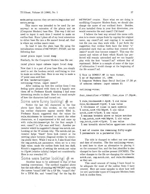
% This is OCMSS17.MF in text format,<br />
% <strong>as</strong> of September <strong>10</strong>, 1988.<br />
% Computer Modern Sans Serif Outline 17.28 pt<br />
if unknown cmb<strong>as</strong>e: input cmb<strong>as</strong>e fi<br />
font-identifier:="0CMSSU; font-size 17.28pt#;<br />
% rule_thickness#:=.6pt#; % old value<br />
rule-thickness#:=lpt#; % new value<br />
% thickness of lines in math symbols<br />
% notch_cut#:=32/36pt#; % old value<br />
notch-cut#:=17pt#; % new value<br />
% maximum breadth above or below notches<br />
% cap-notch_cut#:=46/36pt#; % old value<br />
cap-notch_cut#:=17pt#; % new value<br />
% max breadth above/below upperc<strong>as</strong>e notches<br />
% and of course the remaining fifty-eight<br />
% parameters in a parameter file<br />
The title is changed to reflect our new name<br />
and date of creation. The line outlining: =true;<br />
is used here to show an alternative to placing it<br />
on the command line, and the fontidentifier is also<br />
changed to have the outline present (OCMSS). The<br />
other changes to the file are changing the values for<br />
notch-cut, capnotch-cut, and rule-thickness,<br />
<strong>as</strong> they are.<br />
This small amount of tuning I have found to<br />
be adequate for most of the outline fonts I have<br />
created. Here are some samples to show how well<br />
(or not) particular types of Computer Modern fonts<br />
look in outline form.


