Matlab Chapter6.pdf
Matlab Chapter6.pdf
Matlab Chapter6.pdf

Create successful ePaper yourself
Turn your PDF publications into a flip-book with our unique Google optimized e-Paper software.
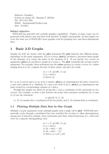
Subjects:: Graphics<br />
lecturer in charge: Dr. Muzafar F. HAMA<br />
Tel: 0771 015 4795<br />
EMail: hamamuzafar@yahoo.com<br />
date: 3-2-2011<br />
Subject objective:<br />
MATLAB has powerful and versatile graphics capabilities. Figures of many types can be<br />
generated with relative ease and their“look and feel” is highly customizable. In this chapter we<br />
cover the basic use of MATLAB’s most popular tools for graphing two- and three-dimensional<br />
data.<br />
1 Basic 2-D Graphs<br />
Graphs (in 2-D) are drawn with the plot statement.The plot function has different forms,<br />
depending on the input arguments. If y is a vector, plot(y) produces a piecewise linear graph<br />
of the elements of y versus the index of the elements of y. If you specify two vectors as<br />
arguments, plot(x, y) produces a graph of y versus x. The plot command also accepts matrix<br />
arguments. For example, these statements use the colon operator to create a vector of x values<br />
ranging from 0 to 2π, compute the sine of these values, and plot the result:<br />
≫ x = 0 : pi/100 : 2 ∗ pi;<br />
≫ y = sin(x);<br />
≫ plot(x, y)<br />
If x is an m-vector and y is an m-by-n matrix, plot(x, y) superimposes the plots created by<br />
x and each column of y. Similarly, if x and y are both m-by-n, plot(x, y) superimposes the<br />
plots created by corresponding columns of x and y.<br />
Straight-line graphs are drawn by giving the x and y coordinates of the end-points in two<br />
vectors. For example, to draw a line between the point with cartesian coordinates (0, 1) and<br />
(4, 3) use the statement<br />
≫ plot([0 4], [1 3])<br />
i.e. [0 4] contains the x coordinates of the two points, and [1 3] contains their y coordinates.<br />
1.1 Plotting Multiple Data Sets in One Graph<br />
Multiple x-y pair arguments create multiple graphs with a single call to plot. MATLAB automatically<br />
cycles through a predefined (but user settable) list of colors to allow discrimination<br />
among sets of data.For example, these statements plot three related functions of x, with each<br />
curve in a separate distinguishing color:<br />
≫ x = 0 : pi/100 : 2 ∗ pi;<br />
≫ y = sin(x);<br />
≫ y2 = sin(x − .25);<br />
≫ y3 = sin(x − .5);<br />
≫ plot(x, y, x, y2, x, y3)<br />
1
1.2 Specifying Line Styles and Colors<br />
It is possible to specify color, line styles, and markers (such as plus signs or circles) when you<br />
plot your data using the plot command:<br />
≫ plot(x, y, ′ color style marker ′ )<br />
color style marker is a string containing from one to four characters (enclosed in single<br />
quotation marks) constructed from a color, a line style, and a marker type:<br />
• Color strings are ′ c ′ , ′ m ′ , ′ y ′ , ′ r ′ , ′ g ′ , ′ b ′ , ′ w ′ , and ′ k ′ . These correspond to cyan, magenta,<br />
yellow, red, green, blue, white, and black.<br />
• Line style strings are ′ − ′ for solid, ′ −− ′ for dashed, ′ : ′ for dotted, and ′ −. ′ for dash-dot.<br />
Omit the line style for no line.<br />
• The marker types are ′ + ′ , ′ ◦ ′ , ′ ∗ ′ , and ′ x ′ , and the filled marker types are ′ s ′ for square,<br />
′ d ′ for diamond, ′ ∧ ′ for up triangle, ′ v ′ for down triangle, ′ > ′ for right triangle, ′ < ′ for<br />
left triangle, ′ p ′ for pentagram, ′ h ′ for hexagram, and none for no marker.<br />
Example 1.1<br />
≫ x = 0 : pi/100 : 2 ∗ pi;<br />
≫ y = sin(x);<br />
≫ plot(x, y, ′ ks ′ )<br />
plots black squares at each data point, but does not connect the markers with a line.<br />
Example 1.2 The statement<br />
≫ x = 0 : pi/100 : 2 ∗ pi;<br />
≫ y = sin(x);<br />
≫ plot(x, y, ′ r : + ′ )<br />
plots a red dotted line and places plus sign markers at each data point.<br />
Example 1.3 This example plots the data twice using a different number of points for the<br />
dotted line and marker plots:<br />
x1 = 0 : pi/100 : 2 ∗ pi;<br />
x2 = 0 : pi/10 : 2 ∗ pi;<br />
plot(x1, sin(x1), ′ r : ′ , x2, sin(x2), ′ r+ ′ )<br />
1.3 Graphing Imaginary and Complex Data<br />
When the arguments to plot are complex, the imaginary part is ignored except when you<br />
pass plot a single complex argument. For this special case, the command is a shortcut for a<br />
graph of the real part versus the imaginary part. Therefore,<br />
plot(Z)<br />
where Z is a complex vector or matrix, is equivalent to plot(real(Z), imag(Z)) For example,<br />
≫ t = 0 : pi/10 : 2 ∗ pi;<br />
≫ plot(exp(i ∗ t), ′ −o ′ )<br />
draws a 20-sided polygon with little circles at the vertices.<br />
2
1.4 Adding Plots to an Existing Graph<br />
The hold command enables you to add plots to an existing graph. When you type<br />
≫ holdon<br />
MATLAB does not replace the existing graph when you issue another plotting command;<br />
it adds the new data to the current graph, rescaling the axes if necessary.<br />
For example, these statements first create a contour plot of the peaks function, then superimpose<br />
a pseudocolor plot of the same function:<br />
≫ x = 0 : pi/100 : 2 ∗ pi;<br />
≫ y = sin(x);<br />
≫ plot(x, y)<br />
≫ holdon<br />
≫ plot(x, cos(x))<br />
≫ holdoff<br />
For More Information See “Creating Specialized Plots” in [1].<br />
1.5 Displaying Multiple Plots in One Figure<br />
The subplot command enables you to display multiple plots in the same window or print them<br />
on the same piece of paper. Typing<br />
≫ subplot(m, n, p)<br />
partitions the figure window into an m-by-n matrix of small subplots and selects the p−th<br />
subplot for the current plot. The plots are numbered along the first row of the figure window,<br />
then the second row, and so on. For example, subplot(425) splits the figure window into a<br />
4-by-2 matrix of regions and specifies that plotting commands apply to the fifth region.For<br />
example, these statements plot data in four different subregions of the figure window:<br />
≫ t = 0 : pi/10 : 2 ∗ pi;<br />
≫ [X, Y, Z] = cylinder(4 ∗ cos(t));<br />
≫ subplot(2, 2, 1); mesh(X)<br />
≫ subplot(2, 2, 2); mesh(Y )<br />
≫ subplot(2, 2, 3); mesh(Z)<br />
≫ subplot(2, 2, 4); mesh(X, Y, Z)<br />
Remark 1.1 It is possible to produce irregular grids of plots by invoking subplot with different<br />
grid patterns. For example,:<br />
x = linspace(0, 15, 100);<br />
subplot(2, 2, 1), plot(x, sin(x))<br />
subplot(2, 2, 2), plot(x, round(x))<br />
subplot(2, 1, 2), plot(x, sin(round(x)))<br />
The third argument to subplot can be a vector specifying several regions, so we could replace<br />
the last line by<br />
subplot(2, 2, 3 : 4), plot(x, sin(round(x)))<br />
1.6 Controlling the Axes<br />
The axis command provides a number of options for setting the scaling, orientation, and aspect<br />
ratio of graphs.<br />
3
1.6.1 Setting Axis Limits<br />
By default, MATLAB finds the maxima and minima of the data and chooses the axis limits to<br />
span this range. The axis command enables you to specify your own limits:<br />
≫ axis([xmin xmax ymin ymax])<br />
or for three-dimensional graphs,<br />
≫ axis([xmin xmax ymin ymax zmin zmax])<br />
Use the command<br />
≫ axis auto<br />
to reenable MATLAB automatic limit selection.<br />
1.6.2 Setting the Axis Aspect Ratio<br />
The axis command also enables you to specify a number of predefined modes. For example,<br />
≫ axis square<br />
makes the x-axis and y-axis the same length.<br />
≫ axis equal<br />
makes the individual tick mark increments on the x-axes and y-axes the same length. This<br />
means<br />
≫ plot(exp(i ∗ [0 : pi/10 : 2 ∗ pi]))<br />
followed by either axis square or axis equal turns the oval into a proper circle:<br />
≫ axis auto normal<br />
returns the axis scaling to its default automatic mode.<br />
1.6.3 Setting Axis Visibility<br />
You can use the axis command to make the axis visible or invisible.<br />
≫ axis on<br />
makes the axes visible. This is the default.<br />
≫ axis off<br />
makes the axes invisible.<br />
1.6.4 Setting Grid Lines<br />
The grid command toggles grid lines on and off. The statement<br />
≫ grid on<br />
turns the grid lines on, and<br />
≫ grid off<br />
turns them back off again. For More Information See the axis and axes reference pages and<br />
“Axes Properties” in [1].<br />
1.7 Adding Axis Labels and Titles<br />
The xlabel( ), ylabel( ), and zlabel( ) commands add x-, y-, and z-axis labels. The title(text)<br />
command adds a text at the top of the figure and the text function inserts text anywhere in<br />
the figure. You can produce mathematical symbols using LaTeX notation in the text string, as<br />
the following example illustrates:<br />
4
Example 1.4 The characters \ pi create the symbol π.<br />
Example 1.5<br />
≫ xlabel( ′ x = 0 : 2\pi ′ )<br />
≫ ylabel( ′ Sine of x ′ )<br />
≫ title( ′ Plot of the Sine Function’,’FontSize ′ , 12)<br />
≫ t = −pi : pi/100 : pi;<br />
≫ y = sin(t);<br />
≫ plot(t, y)<br />
≫ axis([−pi pi − 1 1])<br />
≫ xlabel( ′ −\pi ≤ t ≤ \pi ′ )<br />
≫ ylabel( ′ sin(t) ′ )<br />
≫ title(’Graph of the sine function’)<br />
≫ text(1, −1/3, ′ Notetheoddsymmetry. ′ )<br />
You can also set these options interactively. Note that the location of the text string is defined<br />
in axes units (i.e., the same units as the data).<br />
Remark 1.2 Graphs may be labeled with the following statements:<br />
≫ gtext(text)<br />
writes a string (text) in the graph window. gtext puts a cross-hair in the graph window<br />
and waits for a mouse button or keyboard key to be pressed. The cross-hair can be positioned<br />
with the mouse or the arrow keys. For example,<br />
≫ gtext(Xmarksthespot)<br />
Text may also be placed on a graph interactively with Tools click Edit Plot from the figure<br />
window.<br />
≫ text(x, y, text)<br />
writes text in the graphics window at the point specified by x and y.<br />
If x and y are vectors, the text is written at each point. If the text is an indexed list,<br />
successive points are labeled with corresponding rows of the text.<br />
≫ title(text)<br />
1.8 Figure Windows<br />
Graphing functions automatically open a new figure window if there are no figure windows<br />
already on the screen. If a figure window exists, MATLAB uses that window for graphics<br />
output. If there are multiple figure windows open, MATLAB targets the one that is designated<br />
the “current figure” (the last figure used or clicked in).<br />
To make an existing figure window the current figure, you can click the mouse while the<br />
pointer is in that window or you can type<br />
≫ figure(n)<br />
where n is the number in the figure title bar. The results of subsequent graphics commands<br />
are displayed in this window.<br />
≫ x = 0 : pi/100 : 2 ∗ pi;<br />
≫ y = sin(x);<br />
≫ y2 = sin(x − .25);<br />
≫ y3 = sin(x − .5);<br />
≫ plot(x, y)<br />
≫ plot(x, y2)<br />
≫ plot(x, y3)<br />
5
To open the second figure window and make it the current figure, type<br />
≫ figure(2)<br />
To open a new figure window and make it the current figure, type<br />
≫ figure<br />
Clearing the Figure for a New Plot When a figure already exists, most plotting commands<br />
clear the axes and use this figure to create the new plot. However, these commands do not<br />
reset figure properties, such as the background color or the colormap. If you have set any figure<br />
properties in the previous plot, you might want to use the clf command with the reset option,<br />
≫ clf reset<br />
before creating your new plot to restore the figures properties to their defaults.<br />
clf clears the current figure window. It also resets all properties associated with the axes,<br />
such as the hold state and the axis state.<br />
cla deletes all plots and text from the current axes, i.e. leaves only the x- and y-axes and<br />
their associated information.<br />
For More Information See “Figure Properties” and “Graphics Windows” the Figure in [1].<br />
1.9 Plotting rapidly changing mathematical functions: fplot<br />
In all the graphing examples so far, the x coordinates of the points plotted have been incremented<br />
uniformly, e.g. x = 0 : 0.01 : 4. If the function being plotted changes very rapidly in<br />
some places, this can be inefficient, and can even give a misleading graph.<br />
For example, the statements<br />
≫ x = 0.01 : .001 : .1;<br />
≫ plot(x, sin(1./x))<br />
But if the x increments are reduced to 0.0001, we get another graph instead. For x < 0.04, the<br />
two graphs look quite different.<br />
MATLAB has a function called fplot which uses a more elegant approach. Whereas the<br />
above method evaluates sin(1/x) at equally spaced intervals, fplot evaluates it more frequently<br />
over regions where it changes more rapidly. Here’s how to use it:<br />
≫ fplot( sin(1/x), [0.01 0.1])% no, 1./x not needed!<br />
The general pattern is fplot(fun, lims, tol, N, ′ LineSpec ′ , pl, p2, . . .). The argument list<br />
works as follows.<br />
• fun specifies the function to be plotted.<br />
• The x and/or y limits are given by lims.<br />
• tol is a relative error tolerance, the default value of 2 × 10 −3 corresponding to 0.2%<br />
accuracy.<br />
• At least N + 1 points will be used to produce the plot.<br />
• LineSpec determines the line type.<br />
• p1, p2, . . . are parameters that are passed to fun, which must have input arguments x,<br />
p1, p2, . . . .<br />
The arguments tol, N, and ’LineSpec’ can be specified in any order, and an empty matrix<br />
([ ]) can be passed to obtain the default for any of these arguments.<br />
6
Example 1.6 In this example, fplot produces a graph of the function exp( √ x sin 12x) over the<br />
interval 0 ≤ x ≤ 2π. In the second call, we override the default solid line style and specify a<br />
dashed line with ′ − − ′ . The argument [0.01 1 − 15 20] in the third call forces limits in both the<br />
x and y directions, 0.01 ≤ x ≤ 1 and −15 ≤ y ≤ 20, and ′ − . ′ asks for a dash-dot line style.<br />
The final fplot example illustrates how more than one function can be plotted in the same call.<br />
subplot(221), fplot( ′ exp(sqrt(x) ∗ sin(12 ∗ x)) ′ , [0 2 ∗ pi])<br />
subplot(222), fplot( ′ sin(round(x)) ′ , [0 10], ′ −− ′ )<br />
subplot(223), fplot( ′ cos(30 ∗ x)/x ′ , [0.01 1 − 15 20], ′ −. ′ )<br />
subplot(224), fplot( ′ [sin(x), cos(2 ∗ x), 1/(1 + x)] ′ , [05 ∗ pi − 1.5 1.5])<br />
Remark 1.3 We remark that:<br />
• The two statements plot(x, Y, ′ ms − − ′ ) and plot(x, Y, ′ s − −m ′ ) are equivalent.<br />
• You can exert further control by supplying more arguments to plot. The properties<br />
LineWidth (default 0.5 points) and MarkerSize (default 6 points) can be specified in<br />
points, where a point is 1/72 inch. For example, the commands<br />
≫ plot(x, y, ′ LineWidth ′ , 2)<br />
≫ plot(x, y, ′ p ′ , ′ MarkerSize ′ , 10)<br />
produce a plot with a 2-point line width and 10-point marker size, respectively. For markers<br />
that have a well-defined interior, the MarkerEdgeColor and MarkerFaceColor can<br />
be set to one of the colors in subsection 1.2. So, for example,<br />
≫ plot(x, y, ′ o ′ , ′ Marker Edge Color ′ , ′ m ′ )<br />
gives magenta edges to the circles.<br />
≫ plot(x, y, ′ m − −− ′ , ′ LineWidth ′ , 3, ′ MarkerSize ′ , 5)<br />
and the right-hand plot with<br />
≫ plot(x, y, ′ − − rs ′ , ′ MarkerSize ′ , 20, ′ MarkerFaceColor ′ , ′ g ′ )<br />
Default values for these properties, and for some others to be discussed later in the chapter,<br />
are summarized in Table 6.1.<br />
centerlineTable 6.1. Default values for some properties.<br />
LineWidth 0.5<br />
MarkerSize 6<br />
MarkerEdgeColor auto<br />
MarkerFaceColor none<br />
FontSize 10<br />
FontAngle normal<br />
• Using loglog instead of plot causes the axes to be scaled logarithmically. This feature is<br />
useful for revealing power-law relationships as straight lines. In the example below we plot<br />
|1 + h + h 2 /2 − exp(h)| against h for h = 1, 10 −1 , 10 −2 , 10 −3 , 10 −4 . This quantity behaves<br />
like a multiple of h 3 when h is small, and hence on a log-log scale the values should lie<br />
close to a straight line of slope 3. To confirm this, we also plot a dashed reference line<br />
with the predicted slope, exploiting the fact that more than one set of data can be passed<br />
7
to the plot commands.<br />
h = 10. ∧ [0 : −1 : −4];<br />
≫ taylerr = abs(1 + h + h. ∧ 2/2) − exp(h));<br />
≫ loglog(h, taylerr, ′ − ′ , h, h. ∧ 3, ′ −− ′ )<br />
≫ xlabel( ′ h ′ )<br />
≫ ylabel( ′ Absolute value ′ , ′ of error ′ )<br />
≫ title( ′ Error in quadratic Taylor series approximation to exp(h) ′ )<br />
≫ box off<br />
In this example, we used title, xlabel, and ylabel. These functions reproduce their input<br />
string above the plot and on the x- and y-axes, respectively. We also used the command<br />
box off, which removes the box from the current plot, leaving just the x- and y-axes.<br />
MATLAB will, of course, complain if nonpositive data is sent to loglog (it displays a<br />
warning and plots only the positive data).<br />
Table 6.2. Some commands for controlling the axes.<br />
axis([xmin xmax ymin ymax])<br />
axis auto<br />
axis equal<br />
axis off<br />
axis square<br />
axis tight<br />
xlim([xmin xmax])<br />
ylim([ymin ymax])<br />
Set specified x- and y-axis limits<br />
Return to default axis limits<br />
Equalize data units on x-, y-, and z-axes<br />
Remove axes<br />
Make axis box square (cubic)<br />
Set axis limits to range of data<br />
Set specified x-axis limits<br />
Set specified y-axis limits<br />
The command close closes the current figure window. The command close all causes all<br />
the figure windows to be closed.<br />
Example 1.7 [2] The following program:<br />
• Plots the function 1/(x − 1) 2 + 3/(x − 2) 2 over the interval [0, 3]:<br />
x = linspace(0, 3, 500);<br />
plot(x, 1./(x − 1). ∧ 2 + 3./(x − 2). ∧ 2)<br />
grid on<br />
We specified grid on, which introduces a light horizontal and vertical hashing that extends<br />
from the axis ticks. Because of the singularities at x = 1, 2 the plot is uninformative.<br />
However, by executing the additional command<br />
ylim([0 50])<br />
which focuses on the interesting part of the first plot.<br />
• Plot the epicycloid<br />
0 ≤ t ≤ 10π<br />
{ x(t) = (a + b) cos(t) − b cos((a/b + l)t))<br />
y(t) = (a + b) sin(t) − b sin((a/b + l)t)<br />
8
for a = 12 and b = 5.<br />
a = 12; b = 5;<br />
t = 0 : 0.05 : 10 ∗ pi;<br />
x = (a + b) ∗ cos(t) − b ∗ cos(a/b + l) ∗ t);<br />
y = (a + b) ∗ sin(t) − b ∗ sin(a/b + l) ∗ t);<br />
plot(x, y)<br />
axis equal<br />
axis([−25 25 − 25 25])<br />
grid on<br />
title( ′ Epicycloid: a = 12, b = 5 ′ )<br />
xlabel( ′ x(t) ′ ), ylabel( ′ y(t) ′ )<br />
• Plot the Legendre polynomials of degrees 1 to 4 (for the properties of these polynomials,<br />
see, help of matlab) and use the legend function to add a box that explains the line styles.<br />
x = −1 : .01 : 1;<br />
p1 = x;<br />
p2 = (3/2) ∗ x. ∧ 2 − 1/2;<br />
p3 = (5/2) ∗ x. ∧ 3 − (3/2) ∗ x;<br />
p4 = (35/8) ∗ x. ∧ 4 − (15/4) ∗ x. ∧ 2 + 3/8;<br />
plot(x, pl, ′ r : ′ , x, p2, ′ g − − ′ , x, p3, ′ b − . ′ , x, p4, ′ m− ′ )<br />
box off<br />
legend( ′ \it n = 1 ′ , ′ \it n = 2 ′ , ′ \it n = 3 ′ , ′ \it n = 4 ′ , ′ Location ′ , ′ SouthEast ′ )<br />
xlabel( ′ x ′ , ′ FontSize ′ , 12, ′ FontAngle ′ , ′ italic ′ )<br />
ylabel( ′ P n ′ , ′ FontSize ′ , 12, ′ FontAngle ′ , ′ italic ′ , ′ Rotation ′ , 0)<br />
title( ′ Legendre Polynomials ′ , ′ FontSize ′ , 14)<br />
text(−.6, .7, ′ (n + 1)P n + 1(x) = (2n + 1)xP n(x) − nP n − 1(x) ′ , . . .<br />
′ FontSize ′ , 12, ′ FontAngle ′ , ′ italic ′ )<br />
Remark 1.4 Generally, typing legend(’string ′ 1, ’string 2 ’,. . ., ’string n ’) will create a legend<br />
box that puts ’string i ’ next to the color/marker/line style information for the corresponding<br />
plot. By default, the box appears in the top right-hand (northeast) corner of the axis area. The<br />
location of the box can be specified with the syntax legend(’,. . ., ’Location’, location), where<br />
location is a string with possible values that include:<br />
’North’<br />
’NorthWest’<br />
’NorthOutside’<br />
’Best’<br />
’BestOutside’<br />
inside plot box near top<br />
inside top left<br />
outside plot box near top<br />
automatically chosen to give least conflict with data<br />
automatically chosen to leave least unused space outside plot<br />
These values can be abbreviated as ’N’, ’NW ’, etc. In our example we chose the bottom righthand<br />
corner. Once the plot has been drawn, the legend box can be repositioned by putting the<br />
cursor over it and dragging it using the left mouse button. The legend function has many other<br />
options, which can be seen by typing doc legend.<br />
2 3-D plots<br />
MATLAB has a variety of functions for displaying and visualizing data in 3-D, either as lines<br />
in 3-D, or as various types of surfaces. This section provides a brief overview.<br />
9
2.1 plot3<br />
The function plot3 is the 3-D version of plot. The command<br />
plot3(x, y, z)<br />
draws a 2-D projection of a line in 3-D through the points whose coordinates are the elements<br />
of the vectors x, y and z. The following example illustrates the simplest usage: plot3(x, y, z)<br />
draws a “join-the-dots” curve by taking the points x(i), y(i), z(i) in order.<br />
t = −5 : .005 : 5;<br />
x = (1 + t. − 2). ∗ sin(20 ∗ t);<br />
y = (1 + t. − 2). ∗ cos(20 ∗ t);<br />
z = t;<br />
plot3(x, y, z)<br />
grid on<br />
F S = ′ FontSize ′ ;<br />
xlabel( ′ x(t) ′ , F S, 14), ylabel( ′ y(t) ′ , F S, 14)<br />
zlabel( ′ z(t) ′ , F S, 14, ′ Rotation ′ , 0)<br />
title( ′ plot3example ′ , FS, 14 )<br />
This example also uses the functions xlabel, ylabel, and title, which were discussed in the<br />
previous section, and the analogous zlabel. The color, marker, and line styles for plot3 can<br />
be controlled in the same way as for plot. So, for example, plot3(x, y, z, ′ rx − − ′ ) would use<br />
a red dashed line and place a cross at each point. Note that for 3D plots the default is box<br />
off; specifying box on adds a box that bounds the plot.<br />
For example, the command<br />
plot3(rand(1, 10), rand(1, 10), rand(1, 10))<br />
generates 10 random points in 3-D space, and joins them with lines.<br />
As another example, the statements<br />
≫ t = 0 : pi/50 : 10 ∗ pi;<br />
≫ plot3(exp(−0.02 ∗ t). ∗ sin(t), exp(−0.02 ∗ t). ∗ cos(t), ...<br />
xlabel(x-axis), ylabel(y-axis), zlabel(z-axis))<br />
2.2 Mesh and Surface Plots<br />
MATLAB defines a surface by the z-coordinates of points above a grid in the x-y plane, using<br />
straight lines to connect adjacent points. The mesh and surf plotting functions display surfaces<br />
in three dimensions. mesh produces wireframe surfaces that color only the lines connecting the<br />
defining points. surf displays both the connecting lines and the faces of the surface in color.<br />
Example 2.1 (Mesh surfaces)<br />
[x y] = meshgrid(−8 : 0.5 : 8);<br />
r = sqrt(x. ∧ 2 + y. ∧ 2) + eps;<br />
z = sin(r)./r;<br />
Remark 2.1 The mesh function can also be used to ‘Visualize’ a matrix.<br />
≫ a = zeros(30, 30);<br />
≫ a(:, 15) = 0.2 ∗ ones(30, 1);<br />
≫ a(7, :) = 0.1 ∗ ones(1, 30);<br />
≫ a(15, 15) = 1;<br />
≫ mesh(a)<br />
10
The matrix a is 30 × 30. The element in the middle a(15, 15) is 1, all the elements in row 7<br />
are 0.1, and all the remaining elements in column 15 are 0.2. mesh(a) then interprets the rows<br />
and columns of a as an x-y coordinate grid, with the values a(i, j) forming the mesh surface<br />
above the points (i, j).<br />
2.2.1 Contour plots<br />
If you managed to draw a plot try the command<br />
≫ contour(u)<br />
You should get a contour plot of the heat distribution for example. Here’s the code:<br />
≫ [x, y] = meshgrid(−2.1 : 0.15 : 2.1, −6 : 0.15 : 6);<br />
≫ u = 80 ∗ y. ∧ 2. ∗ exp(−x. ∧ 2 − 0.3 ∗ y. ∧ 2);<br />
≫ contour(u)<br />
Remark 2.2 The function contour can take a second input variable. It can be a scalar specifying<br />
how many contour levels to plot, or it can be a vector specifying the values at which to<br />
plot the contour levels.<br />
Remark 2.3 A simple contour plotting facility is provided by ezcontour. ezcontour in the<br />
following example produces contours for the function sin(3y − x 2 + 1) + cos(2y 2 − 2x) over the<br />
range −2 ≤ x ≤ 2 and −1 ≤ y ≤ 1;<br />
subplot(211)<br />
ezcontour( ′ sin(3 ∗ y − x ∧ 2 + 1) + cos(2 ∗ y ∧ 2 − 2 ∗ x) ′ , [−2 2 − 1 1]);<br />
x = −2 : .01 : 2; y = −1 : .01 : 1;<br />
[X, Y]=meshgrid(x, y);<br />
Z = sin(3 ∗ Y − X. ∧ 2 + 1) + cos(2 ∗ Y. ∧ 2 − 2 ∗ X);<br />
subplot(212)<br />
contour(x, y, Z, 20)<br />
Example 2.2 (meshc) A 3-D contour may be drawn under a surface as follows:<br />
≫ [x y] = meshgrid(−2 : .2 : 2);<br />
≫ z = x. ∗ exp(−x. ∧ 2 − y. ∧ 2);<br />
≫ meshc(z)<br />
Example 2.3 (Cropping a surface with NaNs) If a matrix for a surface plot contains a<br />
data of type NaNs, these elements are not plotted. This enables you to cut away (crop) parts<br />
of a surface.<br />
[x y] = meshgrid(−2 : .2 : 2, −2 : .2 : 2);<br />
z = x. ∗ exp(−x. ∧ 2 − y. ∧ 2);<br />
c = z; % preserve the original surface<br />
c(1 : 11, 1 : 21) = nan ∗ c(1 : 11, 1 : 21);<br />
mesh(c), xlabel(x-axis), ylabel(y-axis)<br />
Example 2.4 Consider the scalar function of two variables V = x 2 + y. The gradient of V is<br />
defined as the vector field<br />
( ∂V<br />
∇V =<br />
∂x , ∂V )<br />
= (2x, 1).<br />
∂y<br />
11
The following statements draw arrows indicating the direction of ∇V at points in the x − y<br />
plane:<br />
≫ [x y] = meshgrid(−2 : .2 : 2, −2 : .2 : 2);<br />
≫ V = x. ∧ 2 + y;<br />
≫ dx = 2 ∗ x;<br />
≫ dy = dx; % dy same size as dx<br />
≫ dy(:, :) = 1; % now dy is same size as dx but all 1’s<br />
≫ contour(x, y, V )<br />
The ‘contour’ lines indicate families of level surfaces; the gradient at any point is perpendicular<br />
to the level surface which passes through that point. The vectors x and y are needed in the call<br />
to contour to specify the axes for the contour plot.<br />
Example 2.5 (Rotation of 3-D graphs) The view function enables you to specify the angle<br />
from which you view a 3-D graph. To see it in operation, run the following program:<br />
2.2.2 Polar plots<br />
≫ a = zeros(30, 30);<br />
≫ a(:, 15) = 0.2 ∗ ones(30, 1);<br />
≫ a(7, :) = 0.1 ∗ ones(1, 30);<br />
≫ a(15, 15) = 1;<br />
≫ mesh(a)<br />
≫ for az = −37.5 : 15 : −37.5 + 360<br />
≫ mesh(a), view(az, el)<br />
≫ pause(0.5)<br />
≫ end<br />
The point (x, y) in cartesian coordinates is represented by the point (θ, r) in polar coordinates,<br />
where<br />
x = r cos(θ),<br />
y = r sin(θ),<br />
and θ varies between 0 and 2θ radians (360 ◦ ).<br />
The command polar(θ, r) generates a polar plot of the points with angles in theta and<br />
magnitudes in r.<br />
As an example, the statements<br />
References<br />
≫ x = 0 : pi/40 : 2 ∗ pi;<br />
≫ polar(x, sin(2 ∗ x)), grid<br />
[1] –, “<strong>Matlab</strong>7 Graphics”, The MathWorks, 2007.<br />
[2] –, “<strong>Matlab</strong>7 Programming”, The MathWorks, 2007.<br />
[3] –, “<strong>Matlab</strong>7 3-D Visualization”, The MathWorks, 2007.<br />
[4] B. Hahn and D. T. Valentine, “Essential <strong>Matlab</strong> For Engineers and Scientists”, Elsevier,<br />
third edition, 2007.<br />
[5] D. J. Higham and N. J. Higham, “<strong>Matlab</strong> Guide”, SIAM puplications, 2000.<br />
12