- Page 2:
Download from Wow! eBook Professio
- Page 6:
Christian, I never thought I would
- Page 10:
About the Author Clint Eccher (Fort
- Page 14:
Contents vii Uncompressed Images ..
- Page 18:
Contents ix Chapter 8 Creating CSS
- Page 22:
Contents xi Adding the Body Content
- Page 26:
Contents xiii Use to Tags .......
- Page 30:
Introduction The methods and proces
- Page 34:
DVD-ROM Downloads xvii 91-100-signa
- Page 38:
chapter 1 Overview of Web Developme
- Page 42:
Defining Web Design 3 Many of the t
- Page 46:
Knowing the Seven Rules of Web Desi
- Page 50:
Understanding Three Web-Design Phil
- Page 54:
Understanding Three Web-Design Phil
- Page 58:
Understanding Three Web-Design Phil
- Page 62:
Understanding Three Web-Design Phil
- Page 66:
Understanding Three Web-Design Phil
- Page 70:
Summary 17 book employ simple, crea
- Page 74:
chapter 2 Designing for the Past, P
- Page 78:
Feeling Browser Pains 21 Figure 2.1
- Page 82:
Incorporating Usage Statistics 23 F
- Page 86:
Understanding Bandwidth 25 Subseque
- Page 90:
Understanding Bandwidth 27 designed
- Page 94:
Building on Previous Design Weaknes
- Page 98:
Building on Previous Design Weaknes
- Page 102:
Building on Previous Design Weaknes
- Page 106:
Building on Previous Design Weaknes
- Page 110:
Building on Previous Design Weaknes
- Page 114:
Building on Previous Design Weaknes
- Page 118:
chapter 3 Things to Consider Before
- Page 122:
Using Requirements 43 additional ch
- Page 126:
Using Requirements 45 12. Proposed
- Page 130:
Knowing Bandwidth Requirements 47 1
- Page 134: Knowing Bandwidth Requirements 49 2
- Page 138: Deciding on Resolution 51 wide. If
- Page 142: Deciding on Resolution 53 which is
- Page 146: Deciding on Resolution 55 Looking a
- Page 150: Deciding on Color Depth 57 The adva
- Page 154: Deciding on Color Depth 59 Figure 3
- Page 158: Designing for Scalability 61 Downlo
- Page 162: Designing for Scalability 63 Figure
- Page 166: Summary 65 designer does not need t
- Page 170: chapter 4 Enhancing Usability Users
- Page 174: Simplifying Architecture 69 One ins
- Page 178: Simplifying Architecture 71 Create
- Page 182: Positioning Content Probably the mo
- Page 188: 76 Chapter 4 ■ Enhancing Usabilit
- Page 192: 78 Chapter 4 ■ Enhancing Usabilit
- Page 196: 80 Chapter 4 ■ Enhancing Usabilit
- Page 200: 82 Chapter 4 ■ Enhancing Usabilit
- Page 204: 84 Chapter 5 ■ Gathering Requirem
- Page 208: 86 Chapter 5 ■ Gathering Requirem
- Page 212: 88 Chapter 5 ■ Gathering Requirem
- Page 216: 90 Chapter 5 ■ Gathering Requirem
- Page 220: 92 Chapter 5 ■ Gathering Requirem
- Page 224: 94 Chapter 5 ■ Gathering Requirem
- Page 228: 96 Chapter 5 ■ Gathering Requirem
- Page 232: 98 Chapter 5 ■ Gathering Requirem
- Page 236:
100 Chapter 5 ■ Gathering Require
- Page 240:
This page intentionally left blank
- Page 244:
104 Chapter 6 ■ What Is Needed to
- Page 248:
106 Chapter 6 ■ What Is Needed to
- Page 252:
108 Chapter 6 ■ What Is Needed to
- Page 256:
110 Chapter 6 ■ What Is Needed to
- Page 260:
112 Chapter 6 ■ What Is Needed to
- Page 264:
114 Chapter 6 ■ What Is Needed to
- Page 268:
116 Chapter 6 ■ What Is Needed to
- Page 272:
118 Chapter 6 ■ What Is Needed to
- Page 276:
120 Chapter 6 ■ What Is Needed to
- Page 280:
122 Chapter 6 ■ What Is Needed to
- Page 284:
124 Chapter 6 ■ What Is Needed to
- Page 288:
126 Chapter 7 ■ Understanding Gra
- Page 292:
128 Chapter 7 ■ Understanding Gra
- Page 296:
130 Chapter 7 ■ Understanding Gra
- Page 300:
132 Chapter 7 ■ Understanding Gra
- Page 304:
134 Chapter 7 ■ Understanding Gra
- Page 308:
136 Chapter 7 ■ Understanding Gra
- Page 312:
138 Chapter 7 ■ Understanding Gra
- Page 316:
140 Chapter 7 ■ Understanding Gra
- Page 320:
142 Chapter 7 ■ Understanding Gra
- Page 324:
144 Chapter 7 ■ Understanding Gra
- Page 328:
146 Chapter 7 ■ Understanding Gra
- Page 332:
148 Chapter 7 ■ Understanding Gra
- Page 336:
150 Chapter 7 ■ Understanding Gra
- Page 340:
152 Chapter 7 ■ Understanding Gra
- Page 344:
This page intentionally left blank
- Page 348:
156 Chapter 8 ■ Creating CSS Desi
- Page 352:
158 Chapter 8 ■ Creating CSS Desi
- Page 356:
160 Chapter 8 ■ Creating CSS Desi
- Page 360:
162 Chapter 8 ■ Creating CSS Desi
- Page 364:
164 Chapter 8 ■ Creating CSS Desi
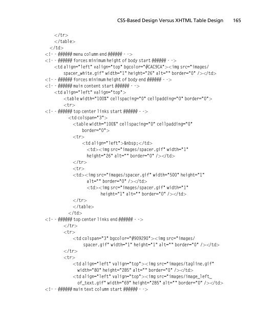
- Page 368:
166 Chapter 8 ■ Creating CSS Desi
- Page 372:
168 Chapter 8 ■ Creating CSS Desi
- Page 376:
170 Chapter 8 ■ Creating CSS Desi
- Page 380:
172 Chapter 8 ■ Creating CSS Desi
- Page 384:
174 Chapter 8 ■ Creating CSS Desi
- Page 388:
176 Chapter 8 ■ Creating CSS Desi
- Page 392:
178 Chapter 8 ■ Creating CSS Desi
- Page 396:
180 Chapter 9 ■ Case Study: Low-C
- Page 400:
182 Chapter 9 ■ Case Study: Low-C
- Page 404:
184 Chapter 9 ■ Case Study: Low-C
- Page 408:
186 Chapter 9 ■ Case Study: Low-C
- Page 412:
188 Chapter 9 ■ Case Study: Low-C
- Page 416:
190 Chapter 9 ■ Case Study: Low-C
- Page 420:
192 Chapter 9 ■ Case Study: Low-C
- Page 424:
194 Chapter 9 ■ Case Study: Low-C
- Page 428:
196 Chapter 9 ■ Case Study: Low-C
- Page 432:
198 Chapter 9 ■ Case Study: Low-C
- Page 436:
200 Chapter 9 ■ Case Study: Low-C
- Page 440:
202 Chapter 9 ■ Case Study: Low-C
- Page 444:
204 Chapter 9 ■ Case Study: Low-C
- Page 448:
206 Chapter 9 ■ Case Study: Low-C
- Page 452:
208 Chapter 9 ■ Case Study: Low-C
- Page 456:
210 Chapter 9 ■ Case Study: Low-C
- Page 460:
212 Chapter 9 ■ Case Study: Low-C
- Page 464:
214 Chapter 9 ■ Case Study: Low-C
- Page 468:
216 Chapter 9 ■ Case Study: Low-C
- Page 472:
218 Chapter 9 ■ Case Study: Low-C
- Page 476:
220 Chapter 9 ■ Case Study: Low-C
- Page 480:
222 Chapter 9 ■ Case Study: Low-C
- Page 484:
224 Chapter 10 ■ Case Study: Medi
- Page 488:
226 Chapter 10 ■ Case Study: Medi
- Page 492:
228 Chapter 10 ■ Case Study: Medi
- Page 496:
230 Chapter 10 ■ Case Study: Medi
- Page 500:
232 Chapter 10 ■ Case Study: Medi
- Page 504:
234 Chapter 10 ■ Case Study: Medi
- Page 508:
236 Chapter 10 ■ Case Study: Medi
- Page 512:
238 Chapter 10 ■ Case Study: Medi
- Page 516:
240 Chapter 10 ■ Case Study: Medi
- Page 520:
242 Chapter 10 ■ Case Study: Medi
- Page 524:
244 Chapter 10 ■ Case Study: Medi
- Page 528:
246 Chapter 10 ■ Case Study: Medi
- Page 532:
248 Chapter 10 ■ Case Study: Medi
- Page 536:
250 Chapter 10 ■ Case Study: Medi
- Page 540:
252 Chapter 10 ■ Case Study: Medi
- Page 544:
254 Chapter 10 ■ Case Study: Medi
- Page 548:
256 Chapter 10 ■ Case Study: Medi
- Page 552:
258 Chapter 10 ■ Case Study: Medi
- Page 556:
260 Chapter 10 ■ Case Study: Medi
- Page 560:
262 Chapter 10 ■ Case Study: Medi
- Page 564:
264 Chapter 10 ■ Case Study: Medi
- Page 568:
This page intentionally left blank
- Page 572:
268 Chapter 11 ■ Case Study: High
- Page 576:
270 Chapter 11 ■ Case Study: High
- Page 580:
272 Chapter 11 ■ Case Study: High
- Page 584:
274 Chapter 11 ■ Case Study: High
- Page 588:
276 Chapter 11 ■ Case Study: High
- Page 592:
278 Chapter 11 ■ Case Study: High
- Page 596:
280 Chapter 11 ■ Case Study: High
- Page 600:
282 Chapter 11 ■ Case Study: High
- Page 604:
284 Chapter 11 ■ Case Study: High
- Page 608:
286 Chapter 11 ■ Case Study: High
- Page 612:
288 Chapter 11 ■ Case Study: High
- Page 616:
290 Chapter 11 ■ Case Study: High
- Page 620:
292 Chapter 11 ■ Case Study: High
- Page 624:
294 Chapter 11 ■ Case Study: High
- Page 628:
296 Chapter 11 ■ Case Study: High
- Page 632:
298 Chapter 11 ■ Case Study: High
- Page 636:
300 Chapter 11 ■ Case Study: High
- Page 640:
302 Chapter 11 ■ Case Study: High
- Page 644:
304 Chapter 11 ■ Case Study: High
- Page 648:
306 Chapter 11 ■ Case Study: High
- Page 652:
308 Chapter 11 ■ Case Study: High
- Page 656:
310 Chapter 11 ■ Case Study: High
- Page 660:
312 Chapter 11 ■ Case Study: High
- Page 664:
314 Chapter 11 ■ Case Study: High
- Page 668:
316 Chapter 11 ■ Case Study: High
- Page 672:
318 Chapter 11 ■ Case Study: High
- Page 676:
320 Chapter 11 ■ Case Study: High
- Page 680:
322 Chapter 12 ■ Case Study: Full
- Page 684:
324 Chapter 12 ■ Case Study: Full
- Page 688:
326 Chapter 12 ■ Case Study: Full
- Page 692:
328 Chapter 12 ■ Case Study: Full
- Page 696:
330 Chapter 12 ■ Case Study: Full
- Page 700:
332 Chapter 12 ■ Case Study: Full
- Page 704:
334 Chapter 12 ■ Case Study: Full
- Page 708:
336 Chapter 12 ■ Case Study: Full
- Page 712:
338 Chapter 12 ■ Case Study: Full
- Page 716:
340 Chapter 12 ■ Case Study: Full
- Page 720:
342 Chapter 12 ■ Case Study: Full
- Page 724:
344 Chapter 12 ■ Case Study: Full
- Page 728:
346 Chapter 13 ■ Case Study: Back
- Page 732:
348 Chapter 13 ■ Case Study: Back
- Page 736:
350 Chapter 13 ■ Case Study: Back
- Page 740:
352 Chapter 13 ■ Case Study: Back
- Page 744:
354 Chapter 13 ■ Case Study: Back
- Page 748:
356 Chapter 13 ■ Case Study: Back
- Page 752:
358 Chapter 13 ■ Case Study: Back
- Page 756:
360 Chapter 13 ■ Case Study: Back
- Page 760:
362 Chapter 13 ■ Case Study: Back
- Page 764:
364 Chapter 13 ■ Case Study: Back
- Page 768:
366 Chapter 13 ■ Case Study: Back
- Page 772:
368 Chapter 13 ■ Case Study: Back
- Page 776:
370 Chapter 13 ■ Case Study: Back
- Page 780:
372 Chapter 14 ■ Case Study: A CS
- Page 784:
374 Chapter 14 ■ Case Study: A CS
- Page 788:
376 Chapter 14 ■ Case Study: A CS
- Page 792:
378 Chapter 14 ■ Case Study: A CS
- Page 796:
380 Chapter 14 ■ Case Study: A CS
- Page 800:
382 Chapter 14 ■ Case Study: A CS
- Page 804:
384 Chapter 14 ■ Case Study: A CS
- Page 808:
386 Chapter 14 ■ Case Study: A CS
- Page 812:
388 Chapter 14 ■ Case Study: A CS
- Page 816:
This page intentionally left blank
- Page 820:
392 Chapter 15 ■ Case Study: Low-
- Page 824:
394 Chapter 15 ■ Case Study: Low-
- Page 828:
396 Chapter 15 ■ Case Study: Low-
- Page 832:
398 Chapter 15 ■ Case Study: Low-
- Page 836:
400 Chapter 15 ■ Case Study: Low-
- Page 840:
402 Chapter 15 ■ Case Study: Low-
- Page 844:
404 Chapter 15 ■ Case Study: Low-
- Page 848:
406 Chapter 15 ■ Case Study: Low-
- Page 852:
408 Chapter 15 ■ Case Study: Low-
- Page 856:
This page intentionally left blank
- Page 860:
412 Chapter 16 ■ Tips and Techniq
- Page 864:
414 Chapter 16 ■ Tips and Techniq
- Page 868:
416 Chapter 16 ■ Tips and Techniq
- Page 872:
418 Chapter 16 ■ Tips and Techniq
- Page 876:
420 Chapter 16 ■ Tips and Techniq
- Page 880:
422 Chapter 16 ■ Tips and Techniq
- Page 884:
424 Chapter 16 ■ Tips and Techniq
- Page 888:
426 Chapter 16 ■ Tips and Techniq
- Page 892:
428 Chapter 16 ■ Tips and Techniq
- Page 896:
430 Chapter 16 ■ Tips and Techniq
- Page 900:
432 Chapter 16 ■ Tips and Techniq
- Page 904:
434 Chapter 16 ■ Tips and Techniq
- Page 908:
436 Chapter 16 ■ Tips and Techniq
- Page 912:
438 Chapter 16 ■ Tips and Techniq
- Page 916:
440 Chapter 16 ■ Tips and Techniq
- Page 920:
442 Chapter 16 ■ Tips and Techniq
- Page 924:
444 Chapter 16 ■ Tips and Techniq
- Page 928:
446 Chapter 16 ■ Tips and Techniq
- Page 932:
448 Chapter 16 ■ Tips and Techniq
- Page 936:
450 Chapter 16 ■ Tips and Techniq
- Page 940:
452 Chapter 16 ■ Tips and Techniq
- Page 944:
454 Chapter 16 ■ Tips and Techniq
- Page 948:
456 Chapter 16 ■ Tips and Techniq
- Page 952:
458 Chapter 16 ■ Tips and Techniq
- Page 956:
460 Chapter 16 ■ Tips and Techniq
- Page 960:
462 Chapter 16 ■ Tips and Techniq
- Page 964:
464 Chapter 16 ■ Tips and Techniq
- Page 968:
466 Chapter 17 ■ Search Engine Op
- Page 972:
468 Chapter 17 ■ Search Engine Op
- Page 976:
470 Chapter 17 ■ Search Engine Op
- Page 980:
472 Chapter 17 ■ Search Engine Op
- Page 984:
474 Chapter 17 ■ Search Engine Op
- Page 988:
476 Chapter 17 ■ Search Engine Op
- Page 992:
478 Chapter 17 ■ Search Engine Op
- Page 996:
480 Chapter 17 ■ Search Engine Op
- Page 1000:
482 Chapter 17 ■ Search Engine Op
- Page 1004:
484 Chapter 17 ■ Search Engine Op
- Page 1008:
486 Chapter 17 ■ Search Engine Op
- Page 1012:
488 Chapter 17 ■ Search Engine Op
- Page 1016:
490 Chapter 17 ■ Search Engine Op
- Page 1020:
492 Chapter 17 ■ Search Engine Op
- Page 1024:
494 Chapter 17 ■ Search Engine Op
- Page 1028:
496 Chapter 17 ■ Search Engine Op
- Page 1032:
498 Chapter 17 ■ Search Engine Op
- Page 1036:
500 Chapter 17 ■ Search Engine Op
- Page 1040:
502 Chapter 17 ■ Search Engine Op
- Page 1044:
504 Chapter 17 ■ Search Engine Op
- Page 1048:
506 Chapter 17 ■ Search Engine Op
- Page 1052:
508 Chapter 18 ■ Conversion Rate
- Page 1056:
510 Chapter 18 ■ Conversion Rate
- Page 1060:
512 Chapter 18 ■ Conversion Rate
- Page 1064:
514 Chapter 18 ■ Conversion Rate
- Page 1068:
516 Chapter 18 ■ Conversion Rate
- Page 1072:
518 Chapter 18 ■ Conversion Rate
- Page 1076:
520 Chapter 18 ■ Conversion Rate
- Page 1080:
522 Chapter 18 ■ Conversion Rate
- Page 1084:
524 Chapter 18 ■ Conversion Rate
- Page 1088:
526 Chapter 18 ■ Conversion Rate
- Page 1092:
528 Chapter 18 ■ Conversion Rate
- Page 1096:
530 Chapter 18 ■ Conversion Rate
- Page 1100:
532 Chapter 18 ■ Conversion Rate
- Page 1104:
534 Chapter 18 ■ Conversion Rate
- Page 1108:
536 Chapter 19 ■ Customizing the
- Page 1112:
538 Chapter 19 ■ Customizing the
- Page 1116:
540 Chapter 19 ■ Customizing the
- Page 1120:
542 Chapter 19 ■ Customizing the
- Page 1124:
544 Chapter 19 ■ Customizing the
- Page 1128:
546 Chapter 19 ■ Customizing the
- Page 1132:
548 Chapter 19 ■ Customizing the
- Page 1136:
550 Chapter 19 ■ Customizing the
- Page 1140:
552 Chapter 19 ■ Customizing the
- Page 1144:
554 Chapter 19 ■ Customizing the
- Page 1148:
556 Chapter 19 ■ Customizing the
- Page 1152:
558 Chapter 19 ■ Customizing the
- Page 1156:
560 Chapter 20 ■ Templates Includ
- Page 1160:
562 Chapter 20 ■ Templates Includ
- Page 1164:
564 Chapter 20 ■ Templates Includ
- Page 1168:
566 Chapter 20 ■ Templates Includ
- Page 1172:
568 Chapter 20 ■ Templates Includ
- Page 1176:
570 Chapter 20 ■ Templates Includ
- Page 1180:
572 Chapter 20 ■ Templates Includ
- Page 1184:
574 Chapter 20 ■ Templates Includ
- Page 1188:
576 Chapter 20 ■ Templates Includ
- Page 1192:
578 Chapter 20 ■ Templates Includ
- Page 1196:
580 Chapter 20 ■ Templates Includ
- Page 1200:
582 Chapter 20 ■ Templates Includ
- Page 1204:
584 Chapter 20 ■ Templates Includ
- Page 1208:
586 Chapter 20 ■ Templates Includ
- Page 1212:
588 Chapter 20 ■ Templates Includ
- Page 1216:
590 Chapter 20 ■ Templates Includ
- Page 1220:
592 Chapter 20 ■ Templates Includ
- Page 1224:
594 Chapter 20 ■ Templates Includ
- Page 1228:
596 Chapter 20 ■ Templates Includ
- Page 1232:
598 Chapter 20 ■ Templates Includ
- Page 1236:
600 Chapter 20 ■ Templates Includ
- Page 1240:
602 Chapter 20 ■ Templates Includ
- Page 1244:
604 Chapter 20 ■ Templates Includ
- Page 1248:
606 Chapter 20 ■ Templates Includ
- Page 1252:
608 Chapter 20 ■ Templates Includ
- Page 1256:
610 Chapter 20 ■ Templates Includ
- Page 1260:
612 Chapter 20 ■ Templates Includ
- Page 1264:
614 Chapter 20 ■ Templates Includ
- Page 1268:
616 Chapter 20 ■ Templates Includ
- Page 1272:
618 Chapter 20 ■ Templates Includ
- Page 1276:
620 Chapter 20 ■ Templates Includ
- Page 1280:
622 Chapter 20 ■ Templates Includ
- Page 1284:
624 Chapter 20 ■ Templates Includ
- Page 1288:
626 Chapter 20 ■ Templates Includ
- Page 1292:
628 Chapter 20 ■ Templates Includ
- Page 1296:
630 Chapter 20 ■ Templates Includ
- Page 1300:
632 Chapter 20 ■ Templates Includ
- Page 1304:
634 Chapter 20 ■ Templates Includ
- Page 1308:
636 Chapter 20 ■ Templates Includ
- Page 1312:
638 Chapter 20 ■ Templates Includ
- Page 1316:
640 Chapter 20 ■ Templates Includ
- Page 1320:
642 Chapter 20 ■ Templates Includ
- Page 1324:
644 Chapter 20 ■ Templates Includ
- Page 1328:
646 Chapter 20 ■ Templates Includ
- Page 1332:
648 Chapter 20 ■ Templates Includ
- Page 1336:
650 Chapter 20 ■ Templates Includ
- Page 1340:
652 Chapter 20 ■ Templates Includ
- Page 1344:
654 Chapter 20 ■ Templates Includ
- Page 1348:
656 Chapter 20 ■ Templates Includ
- Page 1352:
658 Chapter 20 ■ Templates Includ
- Page 1356:
660 Chapter 20 ■ Templates Includ
- Page 1360:
662 Chapter 20 ■ Templates Includ
- Page 1364:
664 Chapter 20 ■ Templates Includ
- Page 1368:
666 Chapter 20 ■ Templates Includ
- Page 1372:
668 Chapter 20 ■ Templates Includ
- Page 1376:
670 Chapter 20 ■ Templates Includ
- Page 1380:
672 Chapter 20 ■ Templates Includ
- Page 1384:
674 Chapter 20 ■ Templates Includ
- Page 1388:
676 Chapter 20 ■ Templates Includ
- Page 1392:
678 Chapter 20 ■ Templates Includ
- Page 1396:
680 Chapter 20 ■ Templates Includ
- Page 1400:
682 Chapter 20 ■ Templates Includ
- Page 1404:
684 Chapter 20 ■ Templates Includ
- Page 1408:
686 Chapter 20 ■ Templates Includ
- Page 1412:
688 Chapter 20 ■ Templates Includ
- Page 1416:
690 Chapter 20 ■ Templates Includ
- Page 1420:
692 Chapter 20 ■ Templates Includ
- Page 1424:
694 Chapter 20 ■ Templates Includ
- Page 1428:
696 Chapter 20 ■ Templates Includ
- Page 1432:
698 Chapter 20 ■ Templates Includ
- Page 1436:
700 Chapter 20 ■ Templates Includ
- Page 1440:
702 Chapter 20 ■ Templates Includ
- Page 1444:
704 Chapter 20 ■ Templates Includ
- Page 1448:
706 Chapter 20 ■ Templates Includ
- Page 1452:
708 Chapter 20 ■ Templates Includ
- Page 1456:
710 Chapter 20 ■ Templates Includ
- Page 1460:
712 Chapter 20 ■ Templates Includ
- Page 1464:
714 Chapter 20 ■ Templates Includ
- Page 1468:
716 Chapter 20 ■ Templates Includ
- Page 1472:
718 Chapter 20 ■ Templates Includ
- Page 1476:
720 Chapter 20 ■ Templates Includ
- Page 1480:
722 Chapter 20 ■ Templates Includ
- Page 1484:
724 Chapter 20 ■ Templates Includ
- Page 1488:
726 Chapter 20 ■ Templates Includ
- Page 1492:
728 Chapter 20 ■ Templates Includ
- Page 1496:
730 Chapter 20 ■ Templates Includ
- Page 1500:
732 Chapter 20 ■ Templates Includ
- Page 1504:
734 Chapter 20 ■ Templates Includ
- Page 1508:
736 Chapter 20 ■ Templates Includ
- Page 1512:
738 Chapter 20 ■ Templates Includ
- Page 1516:
740 Chapter 20 ■ Templates Includ
- Page 1520:
742 Chapter 20 ■ Templates Includ
- Page 1524:
744 Chapter 20 ■ Templates Includ
- Page 1528:
746 Chapter 20 ■ Templates Includ
- Page 1532:
748 Chapter 20 ■ Templates Includ
- Page 1536:
750 Chapter 20 ■ Templates Includ
- Page 1540:
752 Chapter 20 ■ Templates Includ
- Page 1544:
754 Chapter 20 ■ Templates Includ
- Page 1548:
756 Chapter 20 ■ Templates Includ
- Page 1552:
758 Chapter 20 ■ Templates Includ
- Page 1556:
760 Chapter 20 ■ Templates Includ
- Page 1560:
762 Chapter 20 ■ Templates Includ
- Page 1564:
764 Chapter 20 ■ Templates Includ
- Page 1568:
766 Chapter 20 ■ Templates Includ
- Page 1572:
768 Chapter 20 ■ Templates Includ
- Page 1576:
770 Chapter 20 ■ Templates Includ
- Page 1580:
772 Chapter 20 ■ Templates Includ
- Page 1584:
774 Chapter 20 ■ Templates Includ
- Page 1588:
776 Chapter 20 ■ Templates Includ
- Page 1592:
778 Chapter 20 ■ Templates Includ
- Page 1596:
780 Chapter 20 ■ Templates Includ
- Page 1600:
782 Chapter 20 ■ Templates Includ
- Page 1604:
784 Chapter 20 ■ Templates Includ
- Page 1608:
786 Chapter 20 ■ Templates Includ
- Page 1612:
788 Chapter 20 ■ Templates Includ
- Page 1616:
790 Chapter 20 ■ Templates Includ
- Page 1620:
792 Chapter 20 ■ Templates Includ
- Page 1624:
794 Chapter 20 ■ Templates Includ
- Page 1628:
796 Chapter 20 ■ Templates Includ
- Page 1632:
798 Chapter 20 ■ Templates Includ
- Page 1636:
800 Chapter 20 ■ Templates Includ
- Page 1640:
802 Chapter 20 ■ Templates Includ
- Page 1644:
804 Chapter 20 ■ Templates Includ
- Page 1648:
806 Chapter 20 ■ Templates Includ
- Page 1652:
808 Chapter 20 ■ Templates Includ
- Page 1656:
810 Chapter 20 ■ Templates Includ
- Page 1660:
812 Chapter 20 ■ Templates Includ
- Page 1664:
814 Chapter 20 ■ Templates Includ
- Page 1668:
816 Chapter 20 ■ Templates Includ
- Page 1672:
818 Chapter 20 ■ Templates Includ
- Page 1676:
820 Chapter 20 ■ Templates Includ
- Page 1680:
822 Chapter 20 ■ Templates Includ
- Page 1684:
824 Chapter 20 ■ Templates Includ
- Page 1688:
826 Chapter 20 ■ Templates Includ
- Page 1692:
828 Chapter 20 ■ Templates Includ
- Page 1696:
830 Chapter 20 ■ Templates Includ
- Page 1700:
832 Chapter 20 ■ Templates Includ
- Page 1704:
834 Chapter 20 ■ Templates Includ
- Page 1708:
836 Chapter 20 ■ Templates Includ
- Page 1712:
838 Chapter 20 ■ Templates Includ
- Page 1716:
840 Chapter 20 ■ Templates Includ
- Page 1720:
842 Chapter 20 ■ Templates Includ
- Page 1724:
844 Chapter 20 ■ Templates Includ
- Page 1728:
846 Chapter 20 ■ Templates Includ
- Page 1732:
848 Chapter 20 ■ Templates Includ
- Page 1736:
850 Chapter 20 ■ Templates Includ
- Page 1740:
852 Chapter 20 ■ Templates Includ
- Page 1744:
854 Chapter 20 ■ Templates Includ
- Page 1748:
856 Chapter 20 ■ Templates Includ
- Page 1752:
858 Chapter 20 ■ Templates Includ
- Page 1756:
860 Chapter 20 ■ Templates Includ
- Page 1760:
862 Chapter 20 ■ Templates Includ
- Page 1764:
864 Chapter 20 ■ Templates Includ
- Page 1768:
866 Chapter 20 ■ Templates Includ
- Page 1772:
868 Chapter 20 ■ Templates Includ
- Page 1776:
870 Chapter 20 ■ Templates Includ
- Page 1780:
872 Chapter 20 ■ Templates Includ
- Page 1784:
874 Chapter 20 ■ Templates Includ
- Page 1788:
876 Chapter 20 ■ Templates Includ
- Page 1792:
878 Index bits per second (bps), 26
- Page 1796:
880 Index saving uncompressed image
- Page 1800:
882 Index tag, 371, 376 format mis
- Page 1804:
884 Index box modelmethod, 172-174
- Page 1808:
886 Index savingfor weboption, 536-
- Page 1812:
888 Index when to use, 176 tag, 40
- Page 1816:
This page intentionally left blank
- Page 1820:
This page intentionally left blank
- Page 1824:
Design 131 Homepage Design 134 Home
- Page 1828:
Design 142 Homepage Design 143 Home
- Page 1832:
Design 146 Homepage Design 149 Home
- Page 1836:
Design 158 Homepage Design 161 Home
- Page 1840:
Design 165 Homepage Design 166 Home
- Page 1844:
Design 171 Homepage Design 172 Home
- Page 1848:
Design 175 Homepage Design 176 Home
- Page 1852:
Design 179 Homepage Design 180 Home