How to use FSBforecast Excel add-in for regression analysis
How to use FSBforecast Excel add-in for regression analysis
How to use FSBforecast Excel add-in for regression analysis

Create successful ePaper yourself
Turn your PDF publications into a flip-book with our unique Google optimized e-Paper software.
fitt<strong>in</strong>g a <strong>regression</strong> model, only rows of data <strong>in</strong> which all the chosen dependent and <strong>in</strong>dependent variables have<br />
numeric values can be <strong>use</strong>d <strong>to</strong> estimate the model.<br />
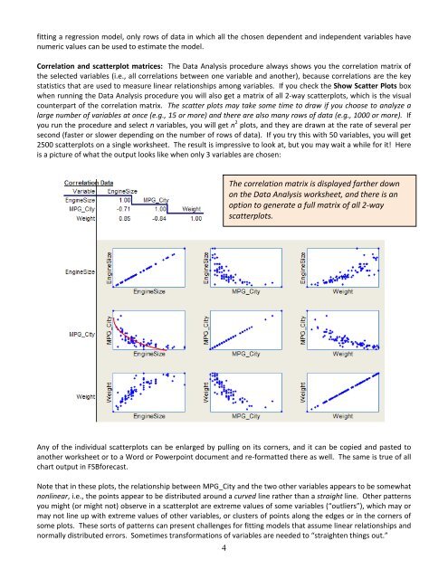
Correlation and scatterplot matrices: The Data Analysis procedure always shows you the correlation matrix of<br />
the selected variables (i.e., all correlations between one variable and another), beca<strong>use</strong> correlations are the key<br />
statistics that are <strong>use</strong>d <strong>to</strong> measure l<strong>in</strong>ear relationships among variables. If you check the Show Scatter Plots box<br />
when runn<strong>in</strong>g the Data Analysis procedure you will also get a matrix of all 2‐way scatterplots, which is the visual<br />
counterpart of the correlation matrix. The scatter plots may take some time <strong>to</strong> draw if you choose <strong>to</strong> analyze a<br />
large number of variables at once (e.g., 15 or more) and there are also many rows of data (e.g., 1000 or more). If<br />
you run the procedure and select n variables, you will get n 2 plots, and they are drawn at the rate of several per<br />
second (faster or slower depend<strong>in</strong>g on the number of rows of data). If you try this with 50 variables, you will get<br />
2500 scatterplots on a s<strong>in</strong>gle worksheet. The result is impressive <strong>to</strong> look at, but you may wait a while <strong>for</strong> it! Here<br />
is a picture of what the output looks like when only 3 variables are chosen:<br />
The correlation matrix is displayed farther down<br />
on the Data Analysis worksheet, and there is an<br />
option <strong>to</strong> generate a full matrix of all 2‐way<br />
scatterplots.<br />
Any of the <strong>in</strong>dividual scatterplots can be enlarged by pull<strong>in</strong>g on its corners, and it can be copied and pasted <strong>to</strong><br />
another worksheet or <strong>to</strong> a Word or Powerpo<strong>in</strong>t document and re‐<strong>for</strong>matted there as well. The same is true of all<br />
chart output <strong>in</strong> <strong>FSB<strong>for</strong>ecast</strong>.<br />
Note that <strong>in</strong> these plots, the relationship between MPG_City and the two other variables appears <strong>to</strong> be somewhat<br />
nonl<strong>in</strong>ear, i.e., the po<strong>in</strong>ts appear <strong>to</strong> be distributed around a curved l<strong>in</strong>e rather than a straight l<strong>in</strong>e. Other patterns<br />
you might (or might not) observe <strong>in</strong> a scatterplot are extreme values of some variables (“outliers”), which may or<br />
may not l<strong>in</strong>e up with extreme values of other variables, or clusters of po<strong>in</strong>ts along the edges or <strong>in</strong> the corners of<br />
some plots. These sorts of patterns can present challenges <strong>for</strong> fitt<strong>in</strong>g models that assume l<strong>in</strong>ear relationships and<br />
normally distributed errors. Sometimes trans<strong>for</strong>mations of variables are needed <strong>to</strong> “straighten th<strong>in</strong>gs out.”<br />
4