How to use FSBforecast Excel add-in for regression analysis
How to use FSBforecast Excel add-in for regression analysis
How to use FSBforecast Excel add-in for regression analysis

Create successful ePaper yourself
Turn your PDF publications into a flip-book with our unique Google optimized e-Paper software.
<strong>How</strong> <strong>to</strong> <strong>use</strong> <strong>FSB<strong>for</strong>ecast</strong><br />
<strong>Excel</strong> <strong>add</strong>‐<strong>in</strong> <strong>for</strong> <strong>regression</strong> <strong>analysis</strong><br />
<strong>FSB<strong>for</strong>ecast</strong> is an <strong>Excel</strong> <strong>add</strong>‐<strong>in</strong> <strong>for</strong> data <strong>analysis</strong> and <strong>regression</strong> that was developed here at the Fuqua School of<br />
Bus<strong>in</strong>ess over the last 3 years by faculty members who teach statistics, <strong>in</strong> collaboration with Professor John Butler<br />
at the University of Texas. See the separate handout on “<strong>How</strong> <strong>to</strong> <strong>in</strong>stall and un<strong>in</strong>stall <strong>FSB<strong>for</strong>ecast</strong>” <strong>for</strong> details on<br />
how <strong>to</strong> <strong>in</strong>stall or update it. After it has been <strong>in</strong>stalled, you should see <strong>FSB<strong>for</strong>ecast</strong> appear on the ma<strong>in</strong> menu bar<br />
<strong>in</strong> <strong>Excel</strong> whenever you <strong>use</strong> it. If you click on the <strong>FSB<strong>for</strong>ecast</strong> tab, a <strong>to</strong>olbar will appear with the follow<strong>in</strong>g options:<br />
FS<strong>for</strong>ecast is very simple <strong>to</strong> <strong>use</strong>—this handout conta<strong>in</strong>s about all you need <strong>to</strong> know. The examples shown here<br />
were created from the accompany<strong>in</strong>g file called <strong>FSB<strong>for</strong>ecast</strong>_car_data.xlsx that conta<strong>in</strong>s data on makes and<br />
models of cars sold <strong>in</strong> the U.S. <strong>in</strong> 1993. To obta<strong>in</strong> this file, go <strong>to</strong> the Decision 411 course software web page, click<br />
on the “<strong>FSB<strong>for</strong>ecast</strong>_car_data_file” l<strong>in</strong>k, then click the Extract but<strong>to</strong>n on the W<strong>in</strong>zip <strong>to</strong>olbar <strong>to</strong> extract the <strong>Excel</strong> file<br />
<strong>to</strong> a direc<strong>to</strong>ry of your choice. Then open it from there us<strong>in</strong>g <strong>Excel</strong> after <strong>FSB<strong>for</strong>ecast</strong> has been <strong>in</strong>stalled. (A second<br />
file conta<strong>in</strong><strong>in</strong>g the completed <strong>analysis</strong>, called <strong>FSB<strong>for</strong>ecast</strong>_car_data_with_<strong>analysis</strong>.xlsx, is also available there.)<br />
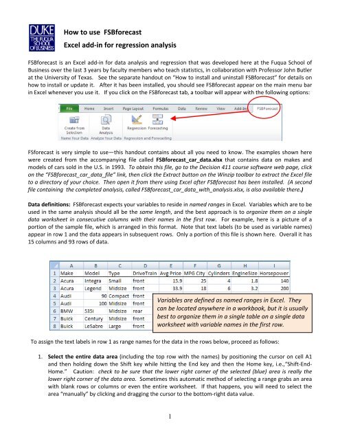
Data def<strong>in</strong>itions: <strong>FSB<strong>for</strong>ecast</strong> expects your variables <strong>to</strong> reside <strong>in</strong> named ranges <strong>in</strong> <strong>Excel</strong>. Variables which are <strong>to</strong> be<br />
<strong>use</strong>d <strong>in</strong> the same <strong>analysis</strong> should all be the same length, and the best approach is <strong>to</strong> organize them on a s<strong>in</strong>gle<br />
data worksheet <strong>in</strong> consecutive columns with their names <strong>in</strong> the first row. For example, here is a picture of a<br />
portion of the sample file, which is arranged <strong>in</strong> this <strong>for</strong>mat. Note that text labels (<strong>to</strong> be <strong>use</strong>d as variable names)<br />
appear <strong>in</strong> row 1 and the data appears <strong>in</strong> subsequent rows. Only a portion of this file is shown here. Overall it has<br />
15 columns and 93 rows of data.<br />
Variables are def<strong>in</strong>ed as named ranges <strong>in</strong> <strong>Excel</strong>. They<br />
can be located anywhere <strong>in</strong> a workbook, but it is usually<br />
best <strong>to</strong> organize them <strong>in</strong> a s<strong>in</strong>gle table on a s<strong>in</strong>gle data<br />
worksheet with variable names <strong>in</strong> the first row.<br />
To assign the text labels <strong>in</strong> row 1 as range names <strong>for</strong> the data <strong>in</strong> the rows below, proceed as follows:<br />
1. Select the entire data area (<strong>in</strong>clud<strong>in</strong>g the <strong>to</strong>p row with the names) by position<strong>in</strong>g the cursor on cell A1<br />
and then hold<strong>in</strong>g down the Shift key while hitt<strong>in</strong>g the End key and then the Home key, i.e.,“Shift‐End‐<br />
Home.” Caution: check <strong>to</strong> be sure that the lower right corner of the selected (blue) area is really the<br />
lower right corner of the data area. Sometimes this au<strong>to</strong>matic method of select<strong>in</strong>g a range grabs an area<br />
with blank rows or columns or even the entire worksheet. If that happens, you will need <strong>to</strong> select the<br />
area “manually” by click<strong>in</strong>g and dragg<strong>in</strong>g the cursor <strong>to</strong> the bot<strong>to</strong>m‐right data value.<br />
1
2. Hit the Create‐From‐Selection but<strong>to</strong>n on the <strong>FSB<strong>for</strong>ecast</strong> menu and check (only) the “Top row” box <strong>in</strong> the<br />
dialog box.<br />
To def<strong>in</strong>e the variables <strong>for</strong> <strong>analysis</strong>,<br />
highlight the table of data (<strong>in</strong>clud<strong>in</strong>g the<br />
first row with the variable names) and hit<br />
the “Create From Selection” but<strong>to</strong>n. Check<br />
only the “Top row” box <strong>for</strong> creat<strong>in</strong>g names.<br />
You can have any number of named ranges <strong>in</strong> your workbook, although you cannot <strong>use</strong> more than 50 variables at<br />
one time <strong>in</strong> the Data Analysis or Regression procedures. You can have up <strong>to</strong> 32,000 rows of data, although the<br />
graphs will take a long time <strong>to</strong> draw if you have a huge number of rows, and the row limit is somewhat less <strong>for</strong><br />
<strong>regression</strong>s with large numbers of variables. A 50‐variable <strong>regression</strong> is limited <strong>to</strong> about 18,000 rows. The<br />
<strong>regression</strong> procedure has a “brief‐output” mode that suppresses some of the chart output <strong>to</strong> speed up the<br />
<strong>analysis</strong> of large data sets and keep file sizes from gett<strong>in</strong>g <strong>to</strong>o large when many models are fitted. In brief‐output<br />
mode, a <strong>regression</strong> with 50 variables and 18,000 rows of data will run <strong>in</strong> about 30 seconds on most PC’s, which is<br />
as fast or faster than most other <strong>regression</strong> software such as SPSS.<br />
Data <strong>analysis</strong>: The Data Analysis procedure provides descriptive statistics, correlations, series plots, and<br />
scatterplots <strong>for</strong> a selected group of variables. Simply click the Data Analysis but<strong>to</strong>n on the <strong>FSB<strong>for</strong>ecast</strong> <strong>to</strong>olbar and<br />
check the boxes <strong>for</strong> the variables you wish <strong>to</strong> <strong>in</strong>clude. The variable list that you see will only <strong>in</strong>clude variables<br />
conta<strong>in</strong><strong>in</strong>g at least some rows of numeric data. In this example, the variables Make and Type do not appear on<br />
the list of variables available <strong>for</strong> <strong>analysis</strong> beca<strong>use</strong> they have only text values. Model does appear beca<strong>use</strong> a few of<br />
its values are numeric (e.g., <strong>for</strong> the Audi 90 and 100 models), but you would not choose it <strong>for</strong> <strong>analysis</strong>.<br />
2<br />
In the Data Analysis procedure, select<br />
the variables you want <strong>to</strong> analyze and<br />
choose the plot options.
If you check the Show Series Plots box, you will also get a plot of each variable versus row number. We<br />
recommend that you always ask <strong>for</strong> series plots <strong>in</strong> at least one of your data <strong>analysis</strong> runs, no matter how large the<br />
data set. These plots give you a visual impression of each variable by itself and are vitally important if the<br />
variables are time series (although <strong>in</strong> this example they are not). If your variables are time series (i.e.,<br />
measurements of the same quantities per<strong>for</strong>med at different periods <strong>in</strong> time and arranged <strong>in</strong> chronological order),<br />
then you should check the Time Series Data box. This will provide an <strong>add</strong>itional table of statistics, namely the<br />
au<strong>to</strong>correlations of the variables, i.e., their correlations with their own prior values, go<strong>in</strong>g back as far as 12 periods<br />
<strong>in</strong><strong>to</strong> the past depend<strong>in</strong>g on the amount of his<strong>to</strong>ry available. Also, the series plots are drawn with connect<strong>in</strong>g<br />
l<strong>in</strong>es when the Time Series box is checked.<br />
Here is a picture of the <strong>to</strong>p portion of the Data Analysis report <strong>for</strong> the variables selected above, show<strong>in</strong>g the<br />
descriptive statistics and series plots. (Only two of the 7 series plots <strong>in</strong> this <strong>analysis</strong> are shown.) Notice that the<br />
Cyl<strong>in</strong>ders variable has only a small number of possible values and they are all <strong>in</strong>tegers (4, 5, 6, 8), and there are<br />
only two cars with 5 cyl<strong>in</strong>ders and only seven cars with 8 cyl<strong>in</strong>ders <strong>in</strong> the sample. This is an example of the<br />
properties of your data that you can clearly see when you look at the series plots.<br />
The results of runn<strong>in</strong>g the procedure are s<strong>to</strong>red<br />
on a new worksheet. Descriptive stats and<br />
optional series plots appear at the <strong>to</strong>p. If the<br />
“Time series data” box is checked, you also get a<br />
table of au<strong>to</strong>correlations and the series plots<br />
have connect<strong>in</strong>g l<strong>in</strong>es.<br />
Sample sizes may vary if any values are miss<strong>in</strong>g: Be aware that on any given run the data <strong>analysis</strong> procedure<br />
ignores rows where any of the selected variables have miss<strong>in</strong>g values or text values, so that the sample size is the<br />
same <strong>for</strong> all the variables. (In some data files, miss<strong>in</strong>g values may be coded as text labels such as “NA”, mean<strong>in</strong>g<br />
“not available.”) This means that the sample sizes and the values of the sample statistics may vary from one data<br />
<strong>analysis</strong> run <strong>to</strong> another if you <strong>add</strong> or drop variables that have miss<strong>in</strong>g or text values <strong>in</strong> different positions. If the<br />
sample size (“Count”) is less than you expected or if it varies from one run <strong>to</strong> another, you should look carefully at<br />
the data matrix <strong>to</strong> see if there are unsuspected miss<strong>in</strong>g or text values scattered around among the variables. In<br />
this data set, if you choose Model as one of the variables <strong>to</strong> be analyzed, you will only get a sample size of 7,<br />
beca<strong>use</strong> there are only 7 cars whose model names consist of numbers (like the Audi 90 and 100).<br />
The reason <strong>for</strong> follow<strong>in</strong>g this convention is that it keeps the data <strong>analysis</strong> sheet <strong>in</strong> synch with a <strong>regression</strong> model<br />
sheet that <strong>use</strong>s the same set of variables—e.g., the correlation matrix on both sheets will be the same. When<br />
3
fitt<strong>in</strong>g a <strong>regression</strong> model, only rows of data <strong>in</strong> which all the chosen dependent and <strong>in</strong>dependent variables have<br />
numeric values can be <strong>use</strong>d <strong>to</strong> estimate the model.<br />
Correlation and scatterplot matrices: The Data Analysis procedure always shows you the correlation matrix of<br />
the selected variables (i.e., all correlations between one variable and another), beca<strong>use</strong> correlations are the key<br />
statistics that are <strong>use</strong>d <strong>to</strong> measure l<strong>in</strong>ear relationships among variables. If you check the Show Scatter Plots box<br />
when runn<strong>in</strong>g the Data Analysis procedure you will also get a matrix of all 2‐way scatterplots, which is the visual<br />
counterpart of the correlation matrix. The scatter plots may take some time <strong>to</strong> draw if you choose <strong>to</strong> analyze a<br />
large number of variables at once (e.g., 15 or more) and there are also many rows of data (e.g., 1000 or more). If<br />
you run the procedure and select n variables, you will get n 2 plots, and they are drawn at the rate of several per<br />
second (faster or slower depend<strong>in</strong>g on the number of rows of data). If you try this with 50 variables, you will get<br />
2500 scatterplots on a s<strong>in</strong>gle worksheet. The result is impressive <strong>to</strong> look at, but you may wait a while <strong>for</strong> it! Here<br />
is a picture of what the output looks like when only 3 variables are chosen:<br />
The correlation matrix is displayed farther down<br />
on the Data Analysis worksheet, and there is an<br />
option <strong>to</strong> generate a full matrix of all 2‐way<br />
scatterplots.<br />
Any of the <strong>in</strong>dividual scatterplots can be enlarged by pull<strong>in</strong>g on its corners, and it can be copied and pasted <strong>to</strong><br />
another worksheet or <strong>to</strong> a Word or Powerpo<strong>in</strong>t document and re‐<strong>for</strong>matted there as well. The same is true of all<br />
chart output <strong>in</strong> <strong>FSB<strong>for</strong>ecast</strong>.<br />
Note that <strong>in</strong> these plots, the relationship between MPG_City and the two other variables appears <strong>to</strong> be somewhat<br />
nonl<strong>in</strong>ear, i.e., the po<strong>in</strong>ts appear <strong>to</strong> be distributed around a curved l<strong>in</strong>e rather than a straight l<strong>in</strong>e. Other patterns<br />
you might (or might not) observe <strong>in</strong> a scatterplot are extreme values of some variables (“outliers”), which may or<br />
may not l<strong>in</strong>e up with extreme values of other variables, or clusters of po<strong>in</strong>ts along the edges or <strong>in</strong> the corners of<br />
some plots. These sorts of patterns can present challenges <strong>for</strong> fitt<strong>in</strong>g models that assume l<strong>in</strong>ear relationships and<br />
normally distributed errors. Sometimes trans<strong>for</strong>mations of variables are needed <strong>to</strong> “straighten th<strong>in</strong>gs out.”<br />
4
Regression: The Regression procedure fits multiple <strong>regression</strong> models and allows them <strong>to</strong> be easily compared<br />
side‐by‐side. Just hit the Regression but<strong>to</strong>n and select the dependent variable you want <strong>to</strong> <strong>use</strong> and check the<br />
boxes <strong>for</strong> the <strong>in</strong>dependent variables from which you wish <strong>to</strong> predict it, then hit the “Run” but<strong>to</strong>n. Consecutive<br />
models are named “Model 1”, “Model 2”, etc., by default, but you can also enter a name of your choice <strong>in</strong> the<br />
Model Name box be<strong>for</strong>e hitt<strong>in</strong>g “Run”, and the cus<strong>to</strong>m name will be <strong>use</strong>d <strong>to</strong> label all of the output.<br />
To run a <strong>regression</strong>, select the dependent variable and<br />
then check the boxes <strong>for</strong> the <strong>in</strong>dependent variables<br />
you wish <strong>to</strong> <strong>in</strong>clude, and hit the “Run” but<strong>to</strong>n.<br />
A model can have up <strong>to</strong> 50 <strong>in</strong>dependent variables and<br />
over 18,000 rows of data.<br />
If you also check the Brief Output box, then some of the usual <strong>regression</strong> output‐‐‐the normal probability plot, the<br />
descriptive statistics and plots of the <strong>in</strong>dividual variables, the residuals‐vs‐<strong>in</strong>dependent‐variable plots, and the<br />
residual table—will not be <strong>in</strong>cluded on the model worksheet. These take a large amount of time and space <strong>to</strong><br />
produce compared <strong>to</strong> the rest of the standard output. If you have relatively large numbers of <strong>in</strong>dependent<br />
variables (say, a dozen or more) and/or relatively large numbers of rows (say, 500 or more), you may wish <strong>to</strong> ask<br />
<strong>for</strong> brief output when first runn<strong>in</strong>g a model. Brief output will give you more compact model sheets, and it will<br />
also cut down on the time needed <strong>to</strong> re‐draw plots with large numbers of po<strong>in</strong>ts when you scroll up and down the<br />
sheet. Once you have identified a promis<strong>in</strong>g‐look<strong>in</strong>g model <strong>for</strong> a large data set, you can re‐run it with full output<br />
<strong>for</strong> a more complete picture. Brief‐output mode will also keep the file size more manageable if you fit a large<br />
number of models <strong>in</strong> one workbook. It is easy <strong>to</strong> end up with file sizes of 10M or 20M or more if you run a lot of<br />
full‐output <strong>regression</strong>s with many variables and many rows of data.<br />
If all your variables consist of time series (i.e., variables whose values are ordered <strong>in</strong> time, such as daily or weekly<br />
or monthly or annual observations of some quantities), then you should also check the Time Series Data box. This<br />
will provide <strong>add</strong>itional model statistics that are relevant only <strong>for</strong> time series, such as au<strong>to</strong>correlations of the<br />
residuals, which reveal whether there are unexpla<strong>in</strong>ed time patterns.<br />
5
There is also a Set Intercept <strong>to</strong> 0 option, which <strong>for</strong>ces the <strong>in</strong>tercept <strong>to</strong> be zero <strong>in</strong> the equation. In the special case<br />
of a simple (1‐variable) <strong>regression</strong> model, this means that the <strong>regression</strong> l<strong>in</strong>e is a straight l<strong>in</strong>e that passes through<br />
the orig<strong>in</strong>, i.e., the po<strong>in</strong>t (0, 0) <strong>in</strong> the X‐Y plane. If you <strong>use</strong> this option, values <strong>for</strong> R‐squared and adjusted R‐<br />
squared are not computed, beca<strong>use</strong> they do not have the same mean<strong>in</strong>g <strong>for</strong> a model that does not <strong>in</strong>clude an<br />
<strong>in</strong>tercept and there is no universally accepted way of def<strong>in</strong><strong>in</strong>g them <strong>in</strong> this situation.<br />
The model sheet: The <strong>regression</strong> results <strong>for</strong> each model are s<strong>to</strong>red on a new worksheet whose name is whatever<br />
model name was entered <strong>in</strong> the name box on the <strong>regression</strong> <strong>in</strong>put panel when the model was run (either a default<br />
name such as “Model n” or a cus<strong>to</strong>m name of your choice). Here is a picture of a portion of the <strong>regression</strong> output<br />
which appears at the <strong>to</strong>p of the model sheet. More tables and charts will appear below it.<br />
The results of runn<strong>in</strong>g each model are<br />
s<strong>to</strong>red on a new worksheet. At the <strong>to</strong>p<br />
of the sheet the variables are listed<br />
and the model equation is pr<strong>in</strong>ted out<br />
as a text str<strong>in</strong>g, suitable <strong>for</strong> copy<strong>in</strong>g<br />
and past<strong>in</strong>g <strong>in</strong><strong>to</strong> a report.<br />
The usual tables of <strong>regression</strong><br />
model statistics, coefficient<br />
estimates, and significance tests<br />
appear below…<br />
…followed by a table of residual distribution statistics that <strong>in</strong>cludes the Anderson‐Darl<strong>in</strong>g<br />
test <strong>for</strong> a non‐normal error distribution and the size and location of the largestmagnitude<br />
residual. If the “Time series data” box was checked, a table of residual<br />
au<strong>to</strong>correlations and tests of their significance are also shown.<br />
It is easy <strong>to</strong> ref<strong>in</strong>e an exist<strong>in</strong>g model by <strong>add</strong><strong>in</strong>g or remov<strong>in</strong>g variables. If you hit the Regression but<strong>to</strong>n while<br />
positioned on an exist<strong>in</strong>g model worksheet, the variable specifications <strong>for</strong> that model are the start<strong>in</strong>g po<strong>in</strong>t <strong>for</strong><br />
specify<strong>in</strong>g the next model. You can <strong>add</strong> or remove a variable relative <strong>to</strong> that model by check<strong>in</strong>g or uncheck<strong>in</strong>g a<br />
s<strong>in</strong>gle box.<br />
6
Charts appear farther down on the model sheet. The output always <strong>in</strong>cludes a chart of actual and predicted<br />
values vs. observation number, residuals vs. observation number, residual his<strong>to</strong>gram plot, residuals vs. predicted<br />
values, and a l<strong>in</strong>e fit plot <strong>in</strong> the case of a simple (1‐variable) <strong>regression</strong> model. Forecasts, if any were produced,<br />
are shown <strong>in</strong> a table and also plotted. “Full” output, which is the default, also <strong>in</strong>cludes a normal probability plot<br />
and plots of residuals vs. each of the <strong>in</strong>dependent variables and dependent variable vs. each of the <strong>in</strong>dependent<br />
variables. On the worksheet the charts are all arranged one above the other, not side‐by‐side as shown here, and<br />
the charts and tables are sized <strong>to</strong> be pr<strong>in</strong>table at 100% scal<strong>in</strong>g on 8.5” wide paper. The default pr<strong>in</strong>t area is preset<br />
<strong>to</strong> <strong>in</strong>clude all pages of output, so the entire output is pr<strong>in</strong>table on standard‐width paper with a few keystrokes,<br />
leav<strong>in</strong>g a complete audit trail on paper. <strong>How</strong>ever, <strong>for</strong> presentation purposes, it is usually best <strong>to</strong> copy and paste<br />
<strong>in</strong>dividual charts and tables <strong>to</strong> other documents, as discussed later.<br />
All table and chart titles <strong>in</strong>clude the model name<br />
and the name of the dependent variable <strong>to</strong> leave an<br />
audit trail if they are copied and pasted <strong>to</strong> reports.<br />
At the very bot<strong>to</strong>m of the model sheet is a table<br />
that shows actual and predicted values, residuals,<br />
and standardized residuals <strong>for</strong> all rows <strong>in</strong> the data<br />
file. The table is sorted <strong>in</strong> descend<strong>in</strong>g order of<br />
absolute values of the residuals, so that “outliers”<br />
appear at the <strong>to</strong>p.<br />
Forecast<strong>in</strong>g: If you wish <strong>to</strong> generate <strong>for</strong>ecasts from your fitted <strong>regression</strong> models, there are two ways <strong>to</strong> do it <strong>in</strong><br />
<strong>FSB<strong>for</strong>ecast</strong>: “manually” and “au<strong>to</strong>matically.” In the manual approach, def<strong>in</strong>e your variables so that they conta<strong>in</strong><br />
only the sample data <strong>to</strong> be <strong>use</strong>d <strong>for</strong> estimat<strong>in</strong>g the model, not the data <strong>to</strong> be <strong>use</strong>d <strong>for</strong> <strong>for</strong>ecast<strong>in</strong>g. Then, after<br />
fitt<strong>in</strong>g a <strong>regression</strong> model, scroll down <strong>to</strong> the l<strong>in</strong>e on the worksheet that says “Forecasts: Dep. Var. = etc.”, and<br />
click the + <strong>in</strong> the left sidebar of the sheet <strong>to</strong> maximize (i.e., open up) the <strong>for</strong>ecast table. Then type (or copy‐and‐<br />
7
paste) values <strong>for</strong> the <strong>in</strong>dependent variables <strong>in</strong><strong>to</strong> the cells at the right end of the <strong>for</strong>ecast row, as <strong>in</strong> the shaded cells<br />
<strong>in</strong> the table below, and then click the Forecast<strong>in</strong>g but<strong>to</strong>n. The <strong>for</strong>ecast and its confidence limits will then be<br />
computed and displayed <strong>in</strong> the cells <strong>to</strong> the left. Two plots of the <strong>for</strong>ecasts are also produced. The first one shows<br />
only the <strong>for</strong>ecast(s), <strong>to</strong>gether with 95% confidence limits <strong>for</strong> both means and <strong>for</strong>ecasts. (A 95% confidence<br />
<strong>in</strong>terval <strong>for</strong> the mean is a confidence <strong>in</strong>terval <strong>for</strong> the true height of the <strong>regression</strong> l<strong>in</strong>e <strong>for</strong> given values of the<br />
<strong>in</strong>dependent variables. A 95% confidence <strong>in</strong>terval <strong>for</strong> the <strong>for</strong>ecast is a confidence <strong>in</strong>terval <strong>for</strong> a prediction that is<br />
based on the <strong>regression</strong> l<strong>in</strong>e. The latter confidence <strong>in</strong>terval also takes <strong>in</strong><strong>to</strong> account the unexpla<strong>in</strong>ed variations of<br />
the data around the <strong>regression</strong> l<strong>in</strong>e, so it is wider.) The second plot shows the actual and predicted values from<br />
the sample <strong>to</strong> which the model was fitted, <strong>to</strong>gether with the <strong>for</strong>ecasts and 95% confidence <strong>in</strong>tervals <strong>for</strong> <strong>for</strong>ecasts.<br />
(The latter plot is always produced, even if there are no <strong>for</strong>ecasts.)<br />
<strong>How</strong> <strong>to</strong> generate <strong>for</strong>ecasts “manually”:<br />
enter values <strong>for</strong> the <strong>in</strong>dependent<br />
variables <strong>in</strong> one or more rows at the<br />
right end of the <strong>for</strong>ecast table, below<br />
the variable names, then hit the<br />
Forecast<strong>in</strong>g but<strong>to</strong>n on the <strong>to</strong>olbar.<br />
The <strong>for</strong>ecasts and confidence limits will<br />
be displayed at the left end of the same<br />
row(s), and they will also be plotted.<br />
In the au<strong>to</strong>matic <strong>for</strong>ecast<strong>in</strong>g approach, which is more systematic and more suitable <strong>for</strong> generat<strong>in</strong>g many <strong>for</strong>ecasts<br />
at once, def<strong>in</strong>e your variables up front so that they <strong>in</strong>clude rows <strong>for</strong> out‐of‐sample data from which <strong>for</strong>ecasts are<br />
<strong>to</strong> be computed later. <strong>FSB<strong>for</strong>ecast</strong> will au<strong>to</strong>matically generate <strong>for</strong>ecasts <strong>for</strong> any rows where all of the <strong>in</strong>dependent<br />
variables have values but the dependent variable is miss<strong>in</strong>g (i.e., has a blank cell). The variables must all be<br />
ranges with the same length, but the dependent variable will have some empty cells at the bot<strong>to</strong>m or elsewhere.<br />
The advantage of this approach is that you only need <strong>to</strong> enter the <strong>for</strong>ecast data once, at the time the data file is<br />
first created, and it will au<strong>to</strong>matically be trans<strong>for</strong>med if you apply any data trans<strong>for</strong>mations <strong>to</strong> the same variables<br />
later. Also, when us<strong>in</strong>g this method it is possible <strong>for</strong> <strong>for</strong>ecasts <strong>to</strong> be generated <strong>in</strong> the middle of the data set if<br />
miss<strong>in</strong>g values of the dependent variable happen <strong>to</strong> occur there. The file <strong>use</strong>d <strong>in</strong> the example above conta<strong>in</strong>s an<br />
extra row of data at the bot<strong>to</strong>m <strong>for</strong> a “hypothetical car” whose mileage is <strong>to</strong> be predicted. It has values <strong>for</strong> all the<br />
numeric variables other than MPG_City, so any model fitted <strong>to</strong> MPG_City will generate a <strong>for</strong>ecast <strong>for</strong> this row<br />
au<strong>to</strong>matically, without the need <strong>for</strong> you <strong>to</strong> type values <strong>for</strong> the <strong>in</strong>dependent variables <strong>in</strong> the <strong>for</strong>ecast table. Only<br />
one <strong>for</strong>ecast is shown <strong>in</strong> this example, but you can generate any number of <strong>for</strong>ecasts <strong>in</strong> this way by <strong>in</strong>clud<strong>in</strong>g<br />
8
<strong>add</strong>itional rows with out‐of‐sample data <strong>for</strong> the <strong>in</strong>dependent variables. You can also <strong>use</strong> this feature <strong>to</strong> do out‐ofsample<br />
test<strong>in</strong>g of a model by remov<strong>in</strong>g the values of the dependent variable from a large block of rows and then<br />
compar<strong>in</strong>g the <strong>for</strong>ecasts <strong>to</strong> the actual values afterward.<br />
A <strong>for</strong>ecast is also generated au<strong>to</strong>matically <strong>for</strong> any<br />
row of data where the dependent variable is<br />
miss<strong>in</strong>g and all <strong>in</strong>dependent variables are present.<br />
View<strong>in</strong>g tables and charts <strong>in</strong> your <strong>regression</strong> output: Each model worksheet provides a number of standard<br />
tables and charts, and they can be maximized or m<strong>in</strong>imized by click<strong>in</strong>g the +’s or –’s on the left sidebar of the<br />
worksheet. At the time you run the model you have the option <strong>for</strong> “full” <strong>regression</strong> output (which is the default)<br />
or “brief” output (which you get by check<strong>in</strong>g the box). If you allow full output <strong>to</strong> be produced, much of it will be<br />
m<strong>in</strong>imized <strong>to</strong> start with, and you will need <strong>to</strong> go down the left sidebar of the sheet check<strong>in</strong>g the +’s <strong>to</strong> see the<br />
complete results. As noted earlier, full output <strong>in</strong>cludes scatterplots of the dependent variable versus each of the<br />
<strong>in</strong>dependent variables and plots of the residuals versus each of the <strong>in</strong>dependent variables. These are all<br />
m<strong>in</strong>imized by default beca<strong>use</strong> they take up a lot of room when there are many variables. Full output also <strong>in</strong>cludes<br />
a normal probability plot (a diagnostic test <strong>for</strong> normally distributed errors) as well as the usual his<strong>to</strong>gram plot of<br />
the residuals. In the special case of a simple <strong>regression</strong> model, you also get a l<strong>in</strong>e fit plot (the <strong>regression</strong> l<strong>in</strong>e and<br />
confidence bands around it) <strong>in</strong> both brief‐output and full‐output mode. See the last page of this handout <strong>for</strong> an<br />
example.<br />
Choos<strong>in</strong>g the output <strong>to</strong> display: click the “‐”<br />
symbol <strong>to</strong> m<strong>in</strong>imize (hide) a table or chart and click<br />
“+“ <strong>to</strong> maximize (unhide) it.<br />
Model summary worksheet: An <strong>in</strong>novative feature of <strong>FSB<strong>for</strong>ecast</strong> is that it ma<strong>in</strong>ta<strong>in</strong>s a separate “Model<br />
Summary” worksheet that shows side‐by‐side summary statistics and model coefficients <strong>for</strong> all <strong>regression</strong> models<br />
that have been fitted <strong>in</strong> the same workbook. This allows easy comparison of models, and it also provides an<br />
“audit trail” <strong>for</strong> all of the models you have fitted so far. Here’s an example of the model summary worksheet that<br />
was obta<strong>in</strong>ed after fitt<strong>in</strong>g two more models <strong>in</strong> which less‐significant variables were successively removed:<br />
9
Model statistics and coefficients<br />
are compared side‐by‐side on the<br />
Model Comparison worksheet.<br />
This sheet also provides an audit<br />
trail of your work. Each model is<br />
time‐and‐date‐stamped.<br />
Variable Trans<strong>for</strong>mations: At any stage <strong>in</strong> your <strong>analysis</strong> you can create new variables <strong>in</strong> <strong>add</strong>itional columns by<br />
enter<strong>in</strong>g and copy<strong>in</strong>g your own <strong>Excel</strong> <strong>for</strong>mulas and assign<strong>in</strong>g range names <strong>to</strong> the results. <strong>How</strong>ever, there is also a<br />
Variable Trans<strong>for</strong>mations option on the Regression panel that allows you <strong>to</strong> easily create new variables by<br />
apply<strong>in</strong>g standard trans<strong>for</strong>mations <strong>to</strong> your exist<strong>in</strong>g variables such as the natural log trans<strong>for</strong>mation or exponential<br />
or power trans<strong>for</strong>mations. The trans<strong>for</strong>med variables are au<strong>to</strong>matically assigned descriptive names, such as X_LN<br />
(natural log of X).<br />
The “Variable Trans<strong>for</strong>mation” <strong>to</strong>ol<br />
can be <strong>use</strong>d <strong>to</strong> create <strong>add</strong>itional<br />
variables from trans<strong>for</strong>mations of<br />
the exist<strong>in</strong>g ones.<br />
10
In the data set shown here, the relationship between miles‐per‐gallon and some of the other variables looks<br />
somewhat nonl<strong>in</strong>ear on the scatterplots, as po<strong>in</strong>ted out earlier. Perhaps it would be better <strong>to</strong> predict gallons‐permile<br />
as the dependent variable? The MPG_City variable can be trans<strong>for</strong>med <strong>in</strong><strong>to</strong> units of gallons per mile by<br />
rais<strong>in</strong>g it <strong>to</strong> the power of negative‐1, as shown <strong>in</strong> the dialog box below.<br />
Basic variable trans<strong>for</strong>mation options:<br />
natural log, exponential, power,<br />
plus/m<strong>in</strong>us/times/divided‐by (“f(x)”), and<br />
creation of dummy variables <strong>for</strong> <strong>in</strong>teger<br />
or categorical data.<br />
The trans<strong>for</strong>med variable will be au<strong>to</strong>matically assigned the name MPG_City_POWneg1, and it will show up next<br />
<strong>to</strong> the orig<strong>in</strong>al variable <strong>in</strong> the alphabetical list of variable names <strong>in</strong> the dialog boxes:<br />
You could also assign a less‐geeky name <strong>to</strong> the variable (e.g., GallonsPerMile) by us<strong>in</strong>g the Name Manager <strong>to</strong><br />
change its name. To change the name of a variable, click the Formulas tab on the <strong>Excel</strong> ma<strong>in</strong> menu, then click the<br />
Name Manager but<strong>to</strong>n, then click on the variable whose name you want <strong>to</strong> change, then click the Edit but<strong>to</strong>n, and<br />
enter a new name <strong>for</strong> it <strong>in</strong> the Name box and hit OK.<br />
The “Make Dummy Variable” trans<strong>for</strong>mation can be <strong>use</strong>d <strong>to</strong> create dummy (0‐1) variables from variables that<br />
consist either of numbers or text labels, <strong>in</strong>clud<strong>in</strong>g variables such as DriveTra<strong>in</strong> (front/rear/all) <strong>in</strong> this file. A<br />
separate dummy variable (with a name such as “DriveTra<strong>in</strong>_EQ_front”) will au<strong>to</strong>matically be created <strong>for</strong> each<br />
dist<strong>in</strong>ct value of the <strong>in</strong>put variable.<br />
11
If the Time Series Data box is checked on the <strong>regression</strong> <strong>in</strong>put panel, then many <strong>add</strong>itional trans<strong>for</strong>mations are<br />
available which are specific <strong>to</strong> time series, such as comput<strong>in</strong>g lagged values, or changes from one period <strong>to</strong><br />
another, or percentage changes from one period <strong>to</strong> another, or adjust<strong>in</strong>g <strong>for</strong> <strong>in</strong>flation us<strong>in</strong>g a fixed rate of<br />
deflation:<br />
Additional trans<strong>for</strong>mations that are<br />
specific <strong>to</strong> time series data: lags,<br />
differences, and deflation. These are only<br />
available when the “Time Series Data” box<br />
is checked on the <strong>regression</strong> <strong>in</strong>put panel.<br />
Scal<strong>in</strong>g of variables: The coefficients <strong>in</strong> the <strong>regression</strong> equation and <strong>regression</strong> summary table are displayed <strong>in</strong><br />
fixed <strong>for</strong>mat with 3 decimal places. Normally this is f<strong>in</strong>e <strong>for</strong> a wide range of units of measurement, but if your<br />
dependent and <strong>in</strong>dependent variables are measured <strong>in</strong> units that are “poorly scaled” relative <strong>to</strong> each other (e.g.<br />
one measured <strong>in</strong> dollars and another measured <strong>in</strong> millions or billions of dollars), the coefficients may end up<br />
display<strong>in</strong>g as zeros <strong>in</strong> 3‐decimal‐place <strong>for</strong>mat beca<strong>use</strong> their estimated values are less than 0.0005, even though<br />
they are statistically significant. Keep <strong>in</strong> m<strong>in</strong>d that the value of a <strong>regression</strong> coefficient is measured <strong>in</strong> “units of Y<br />
per unit of X”, whatever those units may be. If you are puzzled <strong>to</strong> f<strong>in</strong>d zeros or very small numbers <strong>in</strong> the model<br />
equation or table of <strong>regression</strong> coefficients, when the model otherwise seems reasonable, you should consider<br />
rescal<strong>in</strong>g some of the variables. For example, if an <strong>in</strong>dependent variable has a coefficient that is displayed as zero<br />
despite be<strong>in</strong>g statistically significant (as <strong>in</strong>dicated by a large t‐stat and a small P‐value), consider rescal<strong>in</strong>g it <strong>in</strong><br />
thousands of its orig<strong>in</strong>al units, so that its values are smaller by a fac<strong>to</strong>r of 1000, which will <strong>in</strong>crease its estimated<br />
coefficient by the same fac<strong>to</strong>r while leav<strong>in</strong>g the t‐stat and P‐value unaffected. Alternatively, you might rescale the<br />
dependent variable so that its values are larger rather than smaller. In the car data example above, the<br />
coefficients of RevsPerMile and Weight were on the order of 0.002 and ‐0.008 respectively, so they were<br />
displayed with only one significant digit of precision. Some re‐scal<strong>in</strong>g of variables might be helpful there. For<br />
example, you could create a new dependent variable called GallonsPer100Miles by multiply<strong>in</strong>g GallonsPerMile by<br />
100. This would <strong>in</strong>crease the values of all the estimated coefficients by a fac<strong>to</strong>r of 100, other th<strong>in</strong>gs be<strong>in</strong>g equal.<br />
12
Display<strong>in</strong>g gridl<strong>in</strong>es and column head<strong>in</strong>gs on the spreadsheet: By default the data <strong>analysis</strong> sheets and model<br />
sheets do not show gridl<strong>in</strong>es and column head<strong>in</strong>gs, <strong>in</strong> order <strong>to</strong> make the data stand out more clearly. <strong>How</strong>ever, if<br />
you wish <strong>to</strong> turn them back on, you can do so by go<strong>in</strong>g <strong>to</strong> the “View” <strong>to</strong>olbar and click<strong>in</strong>g the boxes <strong>for</strong> “Gridl<strong>in</strong>es”<br />
and/or “Head<strong>in</strong>gs.” This allows you <strong>to</strong> do th<strong>in</strong>gs like chang<strong>in</strong>g column widths if necessary.<br />
Copy<strong>in</strong>g output <strong>to</strong> Word and Powerpo<strong>in</strong>t files: The various tables and charts produced by <strong>FSB<strong>for</strong>ecast</strong> have been<br />
designed <strong>in</strong> such a way that they can be easily copied <strong>to</strong> document files, and the table and chart titles all <strong>in</strong>clude<br />
the name of the dependent variable and the model name so that they can be traced back <strong>to</strong> their source. When<br />
copy<strong>in</strong>g and past<strong>in</strong>g a chart or table, there are several alternatives. On the Home tab, the pull‐down Paste menu<br />
has a row of icons <strong>for</strong> different <strong>for</strong>mats as well as a “paste special” option. The icons give you a number of<br />
complicated options, e.g., tables can be pasted <strong>in</strong> a <strong>for</strong>m that allows their contents <strong>to</strong> edited, and they can be<br />
given the same <strong>for</strong>mat as either their source or dest<strong>in</strong>ation, and their contents can be merged <strong>in</strong><strong>to</strong> other tables.<br />
We suggest that you <strong>use</strong> the “picture” option, which is on the right end of the list of icons, or else choose “paste<br />
special” and then choose one of the picture <strong>for</strong>mats (e.g., png or enhanced metalfile). This will paste the table or<br />
chart as an image whose contents cannot be edited. It can be scaled up and down <strong>in</strong> a way that will keep<br />
everyth<strong>in</strong>g <strong>in</strong> proportion, and it will be secure aga<strong>in</strong>st hav<strong>in</strong>g its numbers changed (accidentally by you or<br />
deliberately by others) later on. Often charts can be made smaller without loss of readability or impact, and you<br />
should always consider do<strong>in</strong>g this when prepar<strong>in</strong>g reports.<br />
For example, here is the l<strong>in</strong>e fit plot <strong>for</strong> a simple <strong>regression</strong> model pasted as a picture and scaled way down:<br />
55<br />
L<strong>in</strong>e Fit Plot<br />
Dep. Var. = MPG_City, Model = Model 3<br />
MPG_City<br />
45<br />
35<br />
25<br />
15<br />
5<br />
1500 2000 2500 3000 3500 4000 4500<br />
Weight<br />
13<br />
Actual<br />
Upper 95%F<br />
Predicted<br />
Lower 95%F