Sotheby's International Realty® Identity Standards ... - the Members
Sotheby's International Realty® Identity Standards ... - the Members
Sotheby's International Realty® Identity Standards ... - the Members
- No tags were found...

You also want an ePaper? Increase the reach of your titles
YUMPU automatically turns print PDFs into web optimized ePapers that Google loves.
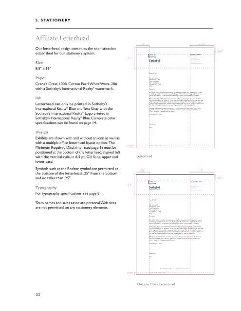
5. STATIONERYAffiliate LetterheadOur letterhead design continues <strong>the</strong> sophisticationestablished for our stationery system.Size8.5" x 11"2.5"1.5" 2.75"Smy<strong>the</strong>& JonesFirst Name Last NameProfessional Title100 Street NameTown Name ST 00000t 555.555.5555f 555.555.5555smy<strong>the</strong>jonesso<strong>the</strong>bysrealty.com.845"June 14, 2004PaperCrane’s Crest, 100% Cotton Pearl White Wove, 28#with a So<strong>the</strong>by’s <strong>International</strong> Realty ® watermark.Mr. John SmithChairman & CFOAny Corporation1234 Any StreetAnytown, XX 12345USASalutation:InkLetterhead can only be printed in So<strong>the</strong>by’s<strong>International</strong> Realty ® Blue and Text Gray with <strong>the</strong>So<strong>the</strong>by’s <strong>International</strong> Realty ® Logo printed inSo<strong>the</strong>by’s <strong>International</strong> Realty ® Blue. Complete colorspecifications can be found on page 14.The public rarely sees a letterhead without a typewritten message on it. When a letter is typedon <strong>the</strong> Corporate Letterhead, in a sense, <strong>the</strong> design of <strong>the</strong> letterhead is completed. The style orformat of <strong>the</strong> letter is an important part of <strong>the</strong> overall design of our company's stationery.This is an example of one typewritten format on company stationery. As you can see, all <strong>the</strong>typewritten elements are “flush left” on <strong>the</strong> page. Everything aligns with <strong>the</strong> logotype at <strong>the</strong> topof <strong>the</strong> page and with <strong>the</strong> address line at <strong>the</strong> bottom of <strong>the</strong> page. This format is double-spacedbetween paragraphs but single-spaced within <strong>the</strong> paragraph. There are no paragraph indentations.The date and complimentary close are also aligned flush left with <strong>the</strong> paragraphs.This particular letter format presents a very clean and businesslike appearance. A consistenttypewritten style as well as an error-free letter will communicate an image of our companyas very organized, competent and professional.Complimentary close,John JonesJJ/vcDesignExhibits are shown with and without an icon as well aswith a multiple office letterhead layout option. TheMinimum Required Disclaimer (see page 6) must bepositioned at <strong>the</strong> bottom of <strong>the</strong> letterhead, aligned leftwith <strong>the</strong> vertical rule, in 6.5 pt. Gill Sans, upper andlower case.0.25"LetterheadEach Office Is Independently Owned And OperatedSymbols such as <strong>the</strong> Realtor symbol, are permitted at<strong>the</strong> bottom of <strong>the</strong> letterhead, .25" from <strong>the</strong> bottomand no taller than .25".TypographyFor typography specifications, see page 8.2.5"1.25" 3"Smy<strong>the</strong>& JonesFirst Name Last NameProfessional Title100 Street NameTown Name ST 00000t 555.555.5555f 555.555.5555smy<strong>the</strong>jonesso<strong>the</strong>bysrealty.com.845"Team names and sales associate personal Web sitesare not permitted on any stationery elements.June 14, 2004Mr. John SmithChairman & CFOAny Corporation1234 Any StreetAnytown, XX 12345USASalutation:The public rarely sees a letterhead without a typewritten message on it. When a letter is typedon <strong>the</strong> Corporate Letterhead, in a sense, <strong>the</strong> design of <strong>the</strong> letterhead is completed. The style orformat of <strong>the</strong> letter is an important part of <strong>the</strong> overall design of our company's stationery.This is an example of one typewritten format on company stationery. As you can see, all <strong>the</strong>typewritten elements are “flush left” on <strong>the</strong> page. Everything aligns with <strong>the</strong> logotype at <strong>the</strong> topof <strong>the</strong> page and with <strong>the</strong> address line at <strong>the</strong> bottom of <strong>the</strong> page. This format is double-spacedbetween paragraphs but single-spaced within <strong>the</strong> paragraph. There are no paragraph indentations.The date and complimentary close are also aligned flush left with <strong>the</strong> paragraphs.This particular letter format presents a very clean and businesslike appearance. A consistenttypewritten style as well as an error-free letter will communicate an image of our companyas very organized, competent and professional.Complimentary close,John JonesJJ/vcRiverside • Allentown • Covington • Newland • Lambert • Scottsville0.25"Each Office Is Independently Owned And OperatedMultiple Office Letterhead33