


You also want an ePaper? Increase the reach of your titles
YUMPU automatically turns print PDFs into web optimized ePapers that Google loves.
Aa Bb Cc Dd Ee Ff Gg Hh liJj Kk LI Mm Nn Oo Pp<br />
UPPER AND LOWER CASE. THE INTERNATIONAL JOURNAL OF TYPE AND GRAPHIC DESIGN<br />
Qy Rr SsTt UuVvWwXxYy Zz12345678908dECE$S(£%!?( ) []<br />
PUBLISHED BY INTERNATIONAL TYPEFACE CORPORATION. VOLUME SEVENTEEN. NUMBER ONE. WINTER 1990. $5.00
FontStudio-<br />
The new standard for font design and modification of existing<br />
fonts, including tetraFore& PostScript ® Type 1 and 3 formats.<br />
Powerful outline drawing tools for the design of letter forms,<br />
logotypes and symbols. Automatic or manual kerning table<br />
generation. Anti-aliasing and color palettes enhance screen dis-<br />
play. Hint creation improves low resolution printing and video<br />
display plus support for all PostScript ehigh-resolution type-<br />
setters. Creates standard PostScript type 3 characters & fonts.<br />
DesignStudio'<br />
The only page composition program which combines precision with<br />
total design flexibility. Professional typography plus unsurpassed<br />
object creation and image manipulation features. Full support for<br />
24-bit color, PANTONE MATCHING SYSTEle* Color range and pre-<br />
press links. Support for all popular word processing and image file<br />
formats. Add-on modules provide extended functionality and features.<br />
BesignStudio<br />
Wit<br />
Conceptualize, design, produce.<br />
Page design software far tke creative professional.<br />
INTRODUCING FIVE 0<br />
FEATURES FOR DESI<br />
Letraset, Designstudio, Colorstudio,<br />
Imagestudio Letrastudio, Fontstudio and<br />
Letrafont are trademarks of Esselte Pendaflex<br />
Corporation in the United States, of Letraset<br />
Canada LTD. in Canada, and of Esselte<br />
Letraset Limited elsewhere and are widely<br />
protected by registration.<br />
*Pantone, Inc's check-standard trademark for<br />
color reproduction and color reproduction<br />
materials. PANTONE Computer Video<br />
simulations used in this product may not<br />
match PANTONE-identified solid color<br />
standards. Use current PANTONE Color<br />
Reference Manuals for accurate color.<br />
Macintosh is a registered trademark of Apple<br />
Computer Inc. PostScript is a registered<br />
trademark of Adobe Systems, Inc.<br />
This advertisement was created and produced<br />
using Letraset Graphic Design Software.<br />
"PANTONE Color Computer Graphics"'<br />
Pantone, Inc., 1986, 1988<br />
oftware solutions for design and publishing have never<br />
been easier to integrate than now. Introducing the Studio Line<br />
from Letraset. Five professional graphic applications, each the<br />
best in its class. Together they form a complete tool set for the<br />
electronic studio. Support for the creative process from concept<br />
development to color separations... every step of the way.
mageStudio®<br />
he first program to bring grayscale image compositing and reouching<br />
to the Macintosh ®. Comprehensive value and contrast<br />
ontrol for black and white photographic images. Customizable<br />
ffects and retouching tools, plus import and export of all pop-<br />
lar image file formats. Add-on modules provide extended capabilities<br />
and features.<br />
ColorStudio®<br />
The premier application for 24-bit true-color image creation,<br />
compositing and retouching. Brings prepress quality color to the<br />
desktop. Full density masking and powerful paint and retouch-<br />
ing tools provide the designer with unlimited creative options.<br />
Achieve predictable and repeatable color results with total control<br />
of image input, display and output. Produce professional<br />
color separations with PostScript ® imagesetters or supported<br />
pre-press systems. Add-on modules extend functionality.<br />
ColorStudio<br />
Create, assemble, retouch.<br />
Software fat true color illustration and image assembly.<br />
)nly from Letraset, the leading supplier of tools for design and<br />
visual communication. See Letraset Studio Line products at your<br />
ocal Authorized Letraset Dealer or <strong>Res</strong>eller. For information in<br />
he U.S., call 1-800-343-TYPE. International users may contact<br />
he Letraset subsidiary in their country.<br />
Letraseto<br />
Circle 208 on Reader Service Card<br />
LetraStudllo®<br />
The advanced display type design tool for logotypes, headlines<br />
and video titling. Real-time, interactive control provides im-<br />
mediate visualization of typographic compositions. Features<br />
include scaling, rotation, proportional distortions and extremely<br />
precise letter spacing. Exports all popular image file formats.<br />
Compatible with letraFont-, PostScript® Type 1 and 3 fonts.<br />
■
WHAT DO YOU GET \X<br />
THE WORLD'S LARGEST<br />
ADOBE POSTSCRII<br />
The AgfaType Collection<br />
A complete line of type products for any application, any resolution, any POSTSCRIPT<br />
or QuickDraw- printer—from AGFA Compugraphic, a Division of Agfa Corporation.<br />
Professionar Series: True Adobe POSTSCRIPT typefaces. Print them at any<br />
resolution from 300 dpi to 2400 dpi. For your Macintosh; IBM® PC, PS/2 -,<br />
or compatible. For the most demanding desktop applications.<br />
Studio- Series: User-defined POSTSCRIPT fonts for the Macintosh. Unique<br />
alternative typefaces. Authentic and precise letterforms. Character outline<br />
accessibility for customized headlines, logos, and special effects.<br />
Desktop- Series: Professional quality type. Complete with the only scalable<br />
font program that provides high-quality bitmap fonts required for Apple<br />
Computer's QuickDraw technology screen and page description language.<br />
More choices. The AgfaType Collection<br />
is a notch above other POSTSCRIPT type<br />
libraries because it gives you the typefaces<br />
you want plus the performance characteristics<br />
suited to your publishing<br />
needs. Select from the AgfaType<br />
Professional Series, over 475 fonts<br />
licensed from Adobe Systems. The<br />
AgfaType Studio Series features<br />
over 275 unique typefaces designed to typographers'<br />
specifications. Mix both the Professional Series and<br />
Studio Series fonts in the same application. And look<br />
for Desktop Series fonts to give professional performance<br />
for your QuickDraw printer.<br />
Professional results.<br />
AgfaType fonts are easy to<br />
use and instantly enhance<br />
the readability and credibility<br />
of your printed<br />
words. You can take full<br />
advantage of AgfaType's<br />
high-resolution capabilities.<br />
Demanding professionals<br />
AGFA and the Agfa Rhombus are registered trademarks of Agfa-Gevaert, AG. Compugraphic<br />
and CG are registered trademarks; and AgfaType, Professional, Studio, and Desktop are trade-<br />
marks of Agfa Corporation. POSTSCRIPT is a registered trademark of Adobe Systems Incorpo-<br />
rated. Macintosh is a registered trademark, and OuickDraw is a trademark of Apple Computer,<br />
Inc. IBM is a registered trademark, and PS/2 is a trademark of International Business Machines<br />
Corporation. Copyright © 1989 by Agfa Corporation. All rights reserved.<br />
use AgfaType for results that reflect their commitment<br />
to uncompromising quality. Output files created with<br />
AgfaType from any type house or<br />
service bureau POSTSCRIPT laser<br />
imagesetter. Be assured of full<br />
compatibility<br />
The AgfaType Collection—<br />
Adobe POSTSCRIPT technology<br />
combined with professional<br />
quality type. AgfaType is part<br />
of the growing family of POST-<br />
SCRIPT output devices and<br />
imaging products from AGFA<br />
Compugraphic. We offer a full<br />
line of high-performance laser<br />
imagesetters, plain-paper printers,<br />
and high-resolution scanners.<br />
AGFA Compugraphic has<br />
been a leading supplier of type, typesetting, and<br />
electronic publishing products for over 29 years.<br />
For more about the AgfaType Collection or for<br />
the nearest authorized AGFA Cornpugraphic dealer,<br />
call 800-622 TYPE.<br />
ALFA<br />
AGFA COMPUGRAPHIC DIVISION
HIEN YOU COMBINE<br />
TYPE RESOURCE WITH<br />
T TECHNOLOGY?<br />
A g fc/Typ e<br />
.1ftlImemium...11111111 ■Moore.,^^....
6<br />
ite CENTER<br />
Exhibition Schedule<br />
February 14—March 29<br />
Typographic Treasures:<br />
Josef Miiller-Brockmann-Posters<br />
1948-1981<br />
MB<br />
Posters by renowned graphic designer Josef Mfiller-Broclunann are<br />
the focus of this exhibition, which has been organized by Pro Helvetia (Arts<br />
Council of Switzerland) and the Embassy of Switzerland, Washington, D.C.<br />
A proponent of functional typography, Mfiller-Brockmann, in his<br />
book, The Graphic Designer and His Design Problems, wrote,"Each problem calls<br />
for a grid suited specially to itself. It must enable the designer to arrange<br />
the captions, photographs and drawings so that they are as visually effective<br />
as their importance warrants and yet form an ordered whole:'<br />
The powerful use of type—alone or in conjunction with photography—<br />
typifies the work of this member of the so-called "Swiss School:' A pioneer in<br />
the use of the grid, Muller-Brockmann consistently demonstrates that<br />
the grid need not inhibit creativity—rather the two can co-exist. Shown in<br />
the collection are the original grids upon which the compositions are based.<br />
April 11—May 24<br />
Schriftkunst: The Lettering Art of Karlgeorg Hoefer<br />
Much as the work of lettering artists such as Rudolf Koch,<br />
F. H. Ernst Schneidler, Edward Johnston and Rudolf Larisch influenced<br />
the calligraphic development of Karlgeorg Hoefer, so has Hoefer's<br />
work influenced generations of calligraphers around the world. A teacher<br />
for more than 30 years at the Hochschule fiir Gestaltung in Offenbach,<br />
West Germany, he has also taught calligraphy throughout the<br />
United States. Energetic calligraphic experiments, painstaking lettering—<br />
and all that falls in between—are included in this retrospective<br />
exhibition of Hoefer's work.<br />
Hours: 12:00 noon-5:00 p.m.<br />
Open Monday—Friday<br />
(Closed February 19 and April 13)<br />
Admission: Free<br />
Morning hours available for schools and professional organizations by reservation only.<br />
For more information and group reservations call (212) 371-0699.<br />
ITC Center<br />
2 Hammarskjold Plaza<br />
(866 Second Avenue, between 46th and 47th Streets)<br />
Third Floor<br />
New York, NY 10017<br />
HEADLINE: ITC NEW BASKERVILLE BOLD, ITC AVANT GARDE GOTHIC MEDIUM<br />
TEXT: ITC NEW BASKERVILLE SEMI BOLD. SEMI BOLD ITALIC, BOLD<br />
SUBHEAD: ITC BENGUIAT MEDIUM, ITC SERIF GOTHIC BLACK<br />
in this issue:<br />
ITC Center Exhibition Schedule<br />
Posters by Josef Miiller -Brockmann 1948 -1981. The Lettering Art of Karlgeorg Hoefer.<br />
The Letter I<br />
The simplest letter of our alphabet has one of the most complex histories.<br />
0<br />
Friend or Foe<br />
Names linked for all time, but not always happily.<br />
42C10<br />
Contest Winners<br />
Winners of the 1989 Herb Lubalin International Student Competition<br />
on the theme "Illiteracy— the Price:'<br />
Typographic Milestones —William Caslon<br />
In art and business, the Caslon touch turned everything to gold.<br />
41)<br />
Homann's Maps<br />
This 18th century engraver used mathematics and the stars to map the whole world.<br />
Polyphonic Pranks, Puns and Parodies<br />
Chameleon illustrator, Benoit Jacques, adapts his style to any occasion.<br />
*I)<br />
Call for Entries-1990 Herb Lubalin Competition<br />
"Drive Smart, Drive Sober" is the theme for this year's student competition.<br />
I&Uc Alphabet<br />
An alphabet submitted by an aspiring designer who is now a prize -winning pro.<br />
Learning to Write Again<br />
Amid the new technologies, a professor is resolute about the art of handwriting.<br />
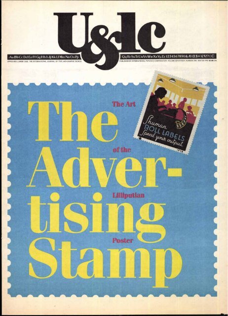
The Advertising Stamp<br />
All about the once-monumental success of the lilliputian poster.<br />
A Woman of Letters<br />
A fiber artist does almost everything with paper and almost nothing without letterforms.<br />
4a)<br />
The Making of a Prodigy<br />
How a little Chinese girl became a national treasure.<br />
The Vigeland Sculpture Park<br />
How one man's obsession turned into a controversial theme park.<br />
CE)<br />
Where Is It?<br />
Just for fun —an exercise in locutions and locations.<br />
Cib<br />
Tech Talk<br />
A look at some new tools and sources.<br />
idle<br />
VOLUME SEVENTEEN, NUMBER ONE, WINTER 1990<br />
MANAGING EDITOR: JULIET MARGOLIN<br />
DESIGN DIRECTOR: LARRY YANG<br />
GRAPHIC DESIGN: WEISZ YANG DUNKELBERGER INC.<br />
EDITORIAL DIRECTOR: ALLAN HALEY<br />
CONSULTING EDITOR: EDWARD GOTTSCHALL<br />
CONTRIBUTING EDITOR: MARION MULLER<br />
EDITORIAL ASSISTANT: ANNA SMITH<br />
ART/PRODUCTION DIRECTOR: ILENE STRIZVER<br />
ART/PRODUCTION COORDINATOR: PAT KRUGMAN<br />
ART/PRODUCTION: BRAD HAMILTON, SID TIMM<br />
ADVERTISING PRODUCTION: SUSAN FORREST-REYNOLDS<br />
SUBSCRIPTIONS: ELOISE COLEMAN<br />
$) INTERNATIONAL TYPEFACE CORPORATION 1990 U&LC (ISSN 0362 6245)<br />
IS PUBLISHED QUARTERLY BY INTERNATIONAL TYPEFACE CORPORATION,<br />
2 HAMMARSKJOLD PLAZA, NEW YORK, NY 10017. ITC IS A SUBSIDIARY OF<br />
ESSELTE LETRASET. U.S. SUBSCRIPTION RATES $20 ONE YEAR: FOREIGN<br />
SUBSCRIPTIONS, $25 ONE YEAR: U.S. FUNDS DRAWN ON U.S. BANK. FOREIGN<br />
AIR MAIL SUBSCRIPTIONS-PLEASE INQUIRE. SECOND-CLASS POSTAGE<br />
PAID AT NEW YORK, NY AND ADDITIONAL MAILING OFFICES. POSTMASTER:<br />
SEND ADDRESS CHANGES TO U&LC, SUBSCRIPTION DEPARTMENT,<br />
2 HAMMARSKJOLD PLAZA, NEW YORK, NY 10017.<br />
ITC FOUNDERS:<br />
AARON BURNS, HERB LUBALIN, EDWARD RONDTHALER<br />
ITC OPERATING EXECUTIVE BOARD 1990<br />
MARK J. BATTY, PRESIDENT AND CEO<br />
AARON BURNS, CHAIRMAN<br />
ALLAN HALEY, EXECUTIVE VICE PRESIDENT<br />
ANN OLSEN, CONTROLLER<br />
CHARLES M. WILHELM, DIRECTOR OF PUBLISHING PRODUCTS<br />
LAURIE BURNS, PUBLIC RELATIONS AND EDUCATIONAL ACTIVITIES<br />
MICROFILM COPIES OF U&LC MAY BE OBTAINED FROM MICRO PHOTO DIVISION,<br />
BELL & HOWELL. OLD MANSFIELD ROAD, WOOSTER, OH 44691<br />
FRONT COVER: ITC FENICE BOLD TABLE OF CONTENTS: ITC NEW BASKERVILLE SEMI BOLD, BOLD MASTHEAD: ITC NEWTEXT REGULAR<br />
THE INDEX TO ITC TYPEFACES APPEARS ON PAGE 62.
The `I' and T not only follow each other in<br />
the alphabet and look a lot alike—they also, to a<br />
very large measure, share the same history.<br />
The Phoenician ancestor to our present 'I'<br />
was a sign called "Yodh," meaning a hand bent at<br />
the wrist. This sign, if you stretched your imagination,<br />
could be construed to look somewhat like a<br />
hand. Some say that this sign can be traced even<br />
further back in history to the ancient Egyptian<br />
hieroglyphs of a leaf, which supposedly later<br />
evolved into a hieratic symbol which also resembled<br />
a hand. This Egyptian part of the 'I' story is,<br />
however, probably a typographic fairy tale. First,<br />
because the Sumerian and Assyrian-Babylonian<br />
symbols which predate the Phoenician, and to<br />
some degree have been influenced by the Egyptian<br />
culture, bear no resemblance to a hand.<br />
The original Phoenician symbol evolved over<br />
time into a zig-zag shape which was eventually<br />
adopted by the Greeks. The Greeks tended to<br />
simplify the symbols that they adopted from the<br />
Phoenicians, and the Yodh was no exception. In<br />
their hands the zig-zag became a simple vertical<br />
line. And they eventually changed the name of<br />
the letter to "Iota:'<br />
Yodh was the smallest letter of the Phoenician<br />
alphabet. As such, iota has come to mean<br />
"the smallest possible thing," as in "There is not one<br />
iota of truth in what you just said:' Also the word<br />
"jot" which comes to us via Latin from the Greek<br />
iota usually refers to a small note or mark.<br />
HEADLINE: ITC FRANKLIN GOTHIC BOOK, ITC GALLIARD ROMAN TEXT: ITC KABEL MEDIUM, ITC CASLON NO 224 BOOK<br />
Like the `G' and `F,' the T is another<br />
letter which took some time to make<br />
up its mind which sound it represented.<br />
The Phoenicians used it as a semi-<br />
consonant, as the 'y' in toy. When it was<br />
adopted by the Greeks around 900 B.C.,<br />
they used the letter to represent the "ee"<br />
vowel-sound. Then in the early Latin<br />
language it represented the vocalic<br />
sound T—and the consonant `j.' Even-<br />
tually somebody probably got tired of<br />
using the same letter to represent two<br />
sounds, and tried to differentiate them<br />
by lengthening the T slightly to repre-<br />
sent the T sound. In the 16th century, a<br />
lettering artist decided that just the<br />
simple lengthening of the letter was too<br />
subtle a change to distinguish the `i'<br />
from the `j, and added a hook to the<br />
bottom of the stroke; finally, the distinc-<br />
tion between the T and T was complete.<br />
There are two theories as to how the<br />
T and T obtained their dots. One sug-<br />
gests that the T got its dot first, around<br />
the 13th century, in an attempt to fur-<br />
ther distinguish it from the The other<br />
theory states that the `i' got the dot first<br />
(at about the same time) but to help<br />
distinguish it from characters like the<br />
`in,"n; and `u' when it fell in close prox-<br />
imity to those letters in text copy.<br />
The T is just 'I: It isn't difficult to<br />
draw, and has no optical considerations<br />
or caveats to contend with. Draw a<br />
straight vertical line the width of a stan-<br />
dard stroke and season with serifs when<br />
necessary. That's pretty much it.<br />
The hook of the ',I' should extend<br />
just slightly below the base line (for opti-<br />
cal reasons) or very far below the line,<br />
which allows it to be spaced more evenly<br />
with other characters—and provides<br />
a little more distinction or drama to<br />
the basic shape. The end of the hook<br />
can be terminated with either a serif or<br />
a ball terminal. The ball terminal is a<br />
privilege of the In a classical Roman<br />
alphabet (to which the ',I' does not<br />
belong) it can be used on no other letter.<br />
Allan Haley
There are characters in his-<br />
tory, literature and mythology<br />
whose names are linked for all<br />
time. You can almost never<br />
mention one without the other.<br />
But being inseparable does<br />
not always mean the relation-<br />
ship was amicable. Some of<br />
the names we've coupled were<br />
true friends; some were lovers;<br />
some, enemies. And in some<br />
instances there were two-<br />
somes that started as friends<br />
and wound up at odds with<br />
each other. For instance...<br />
:71<br />
w yaw. +ogow away war. vs"<br />
Sir William Schwenk Gilbert (1836-1911) was an English<br />
playwright and humorist. Sir Arthur Seymour<br />
Sullivan (1842-1900) was an<br />
English composer and conduc-<br />
Gilbert<br />
SULLIVAN<br />
tor. In 1871 the two men began<br />
a creative collaboration that<br />
was wildly successful. They<br />
composed 14 brilliant comic<br />
operas which are still favorites in the United States<br />
and Britain. Among them are Trial by Jury, H.M.S.<br />
Pinafore, Pirates of Penzance, Patience, Ruddigore,<br />
The Mikado, Iolanthe. However, in the late 1890s the<br />
perfect union of librettist and composer went sour<br />
because of a dispute between them, and neither man<br />
produced anything of note afterwards.<br />
Romeo and Juliet are the quintessential lovers of all<br />
time. But their families, the Montagues and Capulets,<br />
were traditional enemies in<br />
Shakespeare's tragic play. From<br />
Montagues the highest ranking member of<br />
CAPU LETS<br />
each clan to their lowliest ser-<br />
vant, they were continually<br />
embroiled in bickering, quarrels<br />
and bloodshed. The young lovers, in a desperate<br />
attempt to escape their families' hostilities, brought<br />
about their own disastrous end.<br />
HEADLINE: ITC ISADORA REGULAR, ITC MACHINE BOLD SUBHEADS: ITC SOUVENIR DEMI ITALIC, ITC ISADORA BOLD, ITC MACHINE BOLD TEXT: ITC SOUVENIR LIGHT. LIGHT ITALIC, DEMI ITALIC<br />
BYLINE: LIGHT ITALIC
These two noble Greek youths who lived in ancient<br />
Syracuse are legendary paradigms of true friendship.<br />
According to the story, Pythias<br />
Damon<br />
PYTHIAS<br />
was condemned to death by<br />
the tyrannical ruler of Syracuse,<br />
Dionysius. Dionysius was<br />
persuaded to allow Pythias to<br />
leave the city to set his affairs in<br />
order before the sentence was carried out, because<br />
Damon promised to stand in for him if Pythias didn't<br />
return. That's a friend! Pythias was delayed, but he<br />
arrived just in time to save Damon. Dionysius was so<br />
impressed by such an act of devotion, he called off the<br />
execution and asked if he could be one of the boys.<br />
It's a tossup whether this pair should be labeled<br />
"friends" or "foes." These twin boys who were thrown<br />
into the River Tiber at birth,<br />
Romulus<br />
REMUS<br />
then cast ashore and nurtured<br />
by a she-wolf, grew up to be<br />
strong and powerful. They<br />
decided to build a city (Rome)<br />
along the river bank where they<br />
were saved by the wolf. But the two men quarreled<br />
over the exact location and turned to the gods to<br />
decide. When they decided in favor of Romulus'<br />
choice, Remus was so enraged he leaped over the<br />
boundary markings. It so infuriated Romulus, he<br />
killed his brother. He almost immediately regretted his<br />
violent act and, as King of Rome, kept an empty chair<br />
at his side as a symbol of his dead brother's partnership<br />
in the kingdom.<br />
Though their names are coupled for all time, these<br />
men did not know each other at all when Henry Mor-<br />
ton Stanley was sent out by his<br />
Stanley<br />
LIVINCSTONE<br />
employer, the New York Herald,<br />
to find David Livingstone.<br />
Livingstone, the English<br />
explorer had disappeared in<br />
the course of one of his expedi-<br />
tions to Africa. Stanley set out in 1869 from the United<br />
States, and after many hardships finally found Livingstone<br />
in 1871. He stayed on with him in Africa for a<br />
few months. After Livingstone's death, Stanley<br />
returned to Africa to continue the explorer's work,<br />
leaving us to assume a genuinely friendly relationship<br />
had evolved between the men.<br />
Illustrations by David Cutler<br />
He was the macho husband. She was the intimidated<br />
wife in Ibsen's play, A Doll's House, written in 1879.<br />
The playwright, who explored<br />
Nora<br />
TORVALD<br />
Marco Polo was only 20 when he arrived in China in<br />
1275. But the Mongol Emperor, Kublai Khan, who<br />
was three times Marco's age,<br />
Marco Polo<br />
KUBLAI KHAN<br />
took enormous pleasure in the<br />
young man's intellect and<br />
enthusiasm. He included<br />
Marco in the social life of the<br />
court and, despite his youth,<br />
was installed as governor of one of the most civilized<br />
cities in the kingdom.<br />
More proof, if you need it, that lovers are not necessarily<br />
friends. Samson was a popular hero of the Old<br />
Testament who was famous for<br />
Samson<br />
DELILAH<br />
issues of social and moral conflicts<br />
in his dramas, used this<br />
play to present the inequality of<br />
women in society. Abandoning<br />
her docile, submissive role,<br />
Nora finally proclaims her independence and walks<br />
out on her benighted husband. The parting, to say the<br />
least, was less than amicable.<br />
Peter Abelard (1079-1142) was a distinguished<br />
rational philosopher and teacher in Paris, sought out<br />
by scholars throughout the<br />
Heloise<br />
ABELARD<br />
land. He was hired by the<br />
Canon of Notre Dame to<br />
supervise the education of his<br />
beautiful young niece, Heloise.<br />
The teacher and student<br />
became lovers, she bore a child and they married<br />
secretly to legitimize the baby. When Abelard feared<br />
that her uncle was mistreating Heloise, he removed<br />
her to a convent for protection. The enraged uncle .<br />
engaged thugs to rough up Abelard. They castrated<br />
him and broke his spirit as well. Abelard spent the rest<br />
of his life in a monastery. Heloise became a nun. She<br />
lived 22 years longer than he did, but the tragic lovers<br />
were finally reunited in death; they were moved to a<br />
Paris cemetery and buried side by side in 1817.<br />
his superhuman strength and<br />
triumphs leading the Israelite<br />
rebellion against the oppressive<br />
Philistines. He had a weakness,<br />
though, for a Philistine<br />
woman, Delilah. In her bed chamber he confided to<br />
her that his strength was in his hair, whereupon Delilah<br />
lulled him to sleep, cut off his hair and reduced him<br />
to a powerless captive. M.M.<br />
9
10<br />
First Prize<br />
Mr. Lawrence McGarvey<br />
Fashion Institute of Technology,<br />
New York, New York. 36 x 24"<br />
Prepared as a reflective street sign, the<br />
message relayed by this poster is understandable<br />
by those who can read and<br />
those who cannot.<br />
▪<br />
illiteracy—The Price<br />
Illiteracy et ao eeti went ha room spread<br />
ale Imago onto ime Pam. amaY<br />
or petkone Mt me, the oz.,<br />
Met two to eradicate IC Moot obviatialy<br />
dent. to victim many et Pie *mkt<br />
pleasures amich Me, tt makes a<br />
meaningke, ,W09.4.14W onitegy<br />
Mem.* and meg Mad to tinkled Me<br />
oppettuottme td totmeekert geteemion,<br />
deems tta anent% may range tome<br />
13CYI.181 misery to come to mimeo<br />
agetnat tortesent people m hNi es<br />
opkto r tinmenem tiockaa ens.<br />
pennanemee opt. and elknewee<br />
imetl Milency from the gene em tat<br />
Memo Wk. ft long et*, The price<br />
et ignoring C e. tat meet Mee the met<br />
of weeding ft out gement Getteckedi<br />
literaCY<br />
°<br />
The Price<br />
In the United States alone, there are an estimated 21-25 million adults who are functionally<br />
illiterate. Worldwide, it is estimated that there are nearly one billion adults who cannot read.<br />
The inability to read forms a barrier to many precious things that we take for granted: not<br />
just knowledge from reading the written word, but physical independence (stemming from the<br />
ability to read schedules and street signs), quality medical care and housing (because of the
Illiteracy—The Price<br />
Illiteracy is an evil weed. Its roots spread<br />
and fasten onto and poison many aspects of<br />
a person's life and degrade the society that<br />
fails to eradicate it. Most obviously it denies<br />
its victims many of the aesthetic pleasures<br />
that enrich life. It makes a meaningful,<br />
productive education virtually impossible<br />
and leads to limitedjob opportunities, to<br />
frustration, depression, despair. Itsflowers<br />
may rangefrom personal misery to crime—<br />
to crimes against innocent people as well<br />
as against an uncaring society. The time to<br />
permanently uproot and eliminate the<br />
weed of illiteracyfrom the garden of human<br />
affairs is long overdue. The price of<br />
ignoring it isfar greater than the cost of<br />
weeding it out. —Edward Gottschall<br />
If you think<br />
the cost of<br />
education<br />
is high,<br />
think about<br />
ignorance.<br />
—Derek Bok,<br />
President,<br />
Harvard<br />
University.<br />
Second Prize<br />
Ms. Debra Bandelin<br />
Syracuse University,<br />
Syracuse, New York. 8 1/2 x 7 1/2"<br />
The artist describes the compositions<br />
appearing in this school notebook as<br />
' ...written by adults who are in the process<br />
of acquiring basic literary skills. They have<br />
taken the first step towards personal freedom,<br />
economic opportunity and security,<br />
social justice and dignity"<br />
Third Prize<br />
Mr. Rob Musters<br />
Academy St. Joost,<br />
Breda, the Netherlands. 351/2 x 46 1/2"<br />
Even comic strips may not be properly<br />
interpreted without being able to understand<br />
the characters' words.<br />
poverty that often accompanies the illiterate), safety (from the ability to read words ofwarning),<br />
adequate nutrition (from being able to read food product names and ingredients) and the ability<br />
to work at a responsible, rewarding job. To say nothing of the joy of creativity and imagination<br />
that is so often sparked by reading the words of others.<br />
In the last few years we have seen increasing public and private sector attention paid to this<br />
worldwide problem. Literacy programs have been active in recruiting volunteers to tutor those<br />
in their communities who are unable to read, but are eager to be able to do so.<br />
The United Nations has designated 1990 as International Literacy Yeai.<br />
It was fitting, therefore, that we address the problem of illiteracy in this year's Herb Lubalin<br />
International Student Design Competition. ITC was overwhelmed by more than 1300 entries from<br />
students in 30 countries who offered us their visual interpretations of Illiteracy—The Price,<br />
written by Edward M. Gottschall, recently retired editor of U&/c.<br />
Ironically, a surprising number of the entrants failed to properly read (and follow) the instruc-<br />
tions they were given. This not withstanding, the jurors were greatly impressed with the<br />
quality of the work that was submitted. One concern they voiced was the intended audience<br />
Third Prize<br />
Mr. Filip Heyduk<br />
College ofApplied Arts,<br />
Prague, Czechoslovakia. 191/2 x 27 1/2"<br />
This visual illustrates the inability of the<br />
illiterate to connect with the printed word.
12<br />
Serving on the jury were (left to right) Burton<br />
Kramer, Nancy Rice, Woody Pirtle, James Cross<br />
and Herbert Spencer.<br />
Third Prize<br />
Ms. Rosa Cho<br />
Pratt Institute,<br />
Brooklyn, New York. 8 1/2 x 11"<br />
The illiterate person could not respond to<br />
this letter marked urgent. 1 he words in this<br />
letter are mostly formed of random letters,<br />
representing how the printed word appears<br />
to an illiterate person.<br />
rs<br />
lEr8Ailk4 .<br />
AW: O...""/V 4J1<br />
c tit tEk ;(:S ‘41! '7 . 41' V: ' (1!-<br />
4<br />
A ksr<br />
Eauptc.1%*,--<br />
LOIN OEFE<br />
cp (<br />
Arnote,,,( sii:848K-114<br />
0041° 9.1<br />
PEZA1 '44 ALE<br />
i.. "841,1E, 8 F:u15 CA rcm , V.-<br />
-: G 4 E'Sk' LAS t ME#4 P E '1 .<br />
ER150■ vi 111.,1-jEl Et 9 C9X8<br />
NtER4RECIAEPt ICE i OE 144 1.<br />
OiEt4 SO WOK. qt.s VC4 - ECES EP<br />
4ECHGLJELOCA. 118z;<br />
ocvs.fceN ENT*CV E: 1.0)46' tt4<br />
USES IISALNIAOUSIM Crii,A4v1f£14<br />
1:04' GSTEICLER Piert3OPAC<br />
Atr i.981051' 03ER LU F<br />
r ZENIVCR .<br />
'ALS tilt 41.v.v,E97.!<br />
Third Prize<br />
Mr. Oliver Hartmann<br />
Hochschule fur Bildende Kunst,<br />
Braunschweig, West Germany. 8 1/2"<br />
diameter x 2" high<br />
The required text is presented as a bowl<br />
of alphabet soup.<br />
of the creations: were they directed toward literate or illiterate members of our society? They<br />
felt that this might have been better addressed in the original design brief that was presented'<br />
to the students. The piece awarded the first prize circumvented this question in that it could<br />
be interpreted by those who cannot read as well as those who can.<br />
Serving on the jury were James Cross (James Cross & Associates, Los Angeles), Burton Kramer<br />
(Burton Kramer Associates Limited, Toronto), Woody Pirtle (Pentagram Design, New York City)<br />
Nancy Rice (Rice & Rice Advertising, Minneapolis) and Herbert Spencer (London).<br />
The 42 winning pieces were exhibited at the ITC Center in New York City earlier this winter.<br />
The first prize of $5,000 and the 1989 Herb Lubalin Medal was awarded to Mr. Lawrence<br />
McGarvey, a student at the Fashion Institute of Technology in New York City. Ms. Debra Bandelir<br />
a student at Syracuse University in Syracuse, New York, was awarded the $2,500 second prize.<br />
Eight third prizes of $500 each were awarded to Ms. Rosa Cho (Pratt Institute, Brooklyn,<br />
New York), Ms. Theresa Duffy (Art Center College of Art and Design, Pasadena, California),<br />
Mr. Douglas J. Fuller (Syracuse University, Syracuse, New York), Mr. Peter Ham (Academy<br />
St. Joost, Breda, the Netherlands), Mr. Oliver Hartmann (Hochschule far Bildende Ktinste,<br />
Braunschweig, West Germany), Mr. Filip Heyduk (College of Applied Arts, Prague, Czecho-<br />
Third Prize<br />
Ms. Theresa Duffy<br />
Art Center College of Art and Design,<br />
Pasadena, California. 7 1/4 x 10"<br />
This shredded Webster's New World Dictionary<br />
is as useful to those who can read as a<br />
normal dictionary is to those who cannot.
Illiteracy<br />
Third Prize<br />
Mr. Peter Ham<br />
Academy St. Joost,<br />
Breda, the Netherlands. 34 x 451/2"<br />
The left side of this poster is perforated<br />
suggesting that illiteracy can be eradicated.<br />
Third Prize<br />
Mr. Douglas J. Fuller<br />
Syracuse University,<br />
Syracuse, New York. 141/4 x 41/4"<br />
The irony of this bumper sticker needs no<br />
explanation.<br />
slovakia), Mr. Rob Musters (Academy St. Joost, Breda, the Netherlands) and Mr. Alex Wittholz<br />
(Ontario College of Art, Toronto, Canada).<br />
The Herb Lubalin International Student Design Competition was established in 1984 to honor<br />
and perpetuate the memory of Herb Lubalin, internationally famed graphic designer,<br />
teacher, co-founder and principal of ITC, and editor of U&/c.<br />
The call for entries for this year's contest, Drive Smart, Drive Sober, appears on page 46 of this<br />
issue of UC9Dlc. Laurie Burns<br />
This exhibition is available to travel. For further information, please contact Laurie Burns at<br />
ITC, 2 Hammarskjold Plaza, New York, NY 10017; phone, (212) 371- 0699.<br />
Third Prize<br />
Mr. Alex Wittholz<br />
Ontario College of Art,<br />
Toronto, Canada. 18 x 22 1/2"<br />
The text, repeated throughout the piece in<br />
two colors and in small type, forms a typographic<br />
illustration. The resulting image<br />
proposes that the world of books is bolted<br />
shut to those who cannot read.<br />
HEADLINE: ITALIA BOOK PULLQUOTE, BOOK, BOLD TEXT: ITC ZAPF INTERNATIONAL LIGHT, LIGHT ITALIC, DEMI ITALIC, ITC SYMBOL BOOK CAPTIONS: ITC SYMBOL BOOK, BOOK ITALIC, BOLD<br />
Additional artists included in the exhibition:<br />
Mr. Robert S. Achten (Wellington Polytechnic,<br />
Wellington, New Zealand); Mr. Christoph Becker<br />
(Fachhochschule Dusseldorf, Dusseldorf, West<br />
Germany); Suki Berwyn-Jones (Maidstone College<br />
of Art, Maidstone, Kent, England); Mr. George<br />
Cheng (Pratt Institute, Brooklyn, NY); Ms. Trudy<br />
Cole-Zielanski (Pennsylvania State University,<br />
University Park, PA); Mr. Marco Crisari (London<br />
College of Printing, London, England); Ms. Katja<br />
Derr (Fachhochschule DOsseldorf, Dusseldorf,<br />
West Germany); Mr. Gunnar Friel (Fachhochschule<br />
DUsseldorf, Dusseldorf, West Germany);<br />
Ms. Nicola Ginzler (Academy of Art College, San<br />
Francisco, CA) Ms. Bettina Golk (Fachhochschule<br />
Dusseldorf, DOsseldorf, West Germany); Mr. Kevin<br />
D. Hem (Syracuse University, Syracuse, NY);<br />
Ms. Kirsten Hesse (Fachhochschule Darmstadt,<br />
Darmstadt, West Germany); Ms. Janca Huysmans<br />
(Academy St. Joost, Breda, the Netherlands);<br />
Mr. Greg D. James (McNeese State University, Lake<br />
Charles, LA); Mr. Vincent La Cava (Pratt Institute,<br />
Brooklyn, NY); Ms. Sharon G. Lindgren (San Diego<br />
State University, San Diego, CA); Mr. Domenic<br />
Lopergolo (Syracuse University, Syracuse, NY);<br />
Mr. Bernard G. Madden (Pratt Institute, Brooklyn,<br />
NY); Mr. Michael Miklas (Hochschule fur Bildende<br />
Kunste, Braunschweig, West Germany); Mr.<br />
Matthew Montero (School of Visual Arts, New<br />
York, NY); Ms. Christine K. Nguyen (San Jose State<br />
University, San Jose, CA); Mr. Michael Overton<br />
(University of Utah, Salt Lake City, UT); Ms.<br />
Suzanne Parkey (University of Cincinnati, Cincinnati,<br />
OH); Ms. Melissa A. Poole (McNeese State<br />
University, Lake Charles, LA); Mr. Christopher<br />
Schuld (University of Dayton, Dayton, OH); Mr.<br />
Kevin Smead (Johnson County Community<br />
College, Overland Park, KS); Ms. Beth A. Smearsoli<br />
(University of Cincinnati, Cincinnati, OH); Mr.<br />
William G. Sutts (University of Cincinnati, Cincinnati,<br />
OH); Mr. Dennis Ou Chee Wai (Academy of<br />
Art College, San Francisco, CA); Mr. Franz<br />
Wohwinkel (Fachhochschule Darmstadt, Darmstadt,<br />
West Germany); Mr. Robert Wolfe (State<br />
University of New York at Buffalo, Buffalo, NY).<br />
13
14<br />
Typographic<br />
Milestones<br />
Allan<br />
Haley<br />
[jam Casion<br />
Illustration by Mark Summers
0<br />
nee each month,<br />
William Caslon<br />
would host a party<br />
at his house. The<br />
evening was dedicated<br />
to good food,<br />
hearty ale (usually<br />
brewed by Caslon himself), friendly<br />
conversation and beautiful music. Often,<br />
the music was provided by eminent masters<br />
of the day. Caslon enjoyed those<br />
parties, and the music that was their<br />
unifying theme—almost as much as he<br />
enjoyed the financial success which<br />
made them possible.<br />
William Caslon not only designed<br />
very beautiful. typefaces that changed<br />
the course of British typographic history;<br />
the father of the Caslon typeface<br />
was also a very wealthy man. He was a<br />
shrewd businessperson who made<br />
money quickly and easily. Also devoted<br />
to life's gentler arts, Caslon loved literature,<br />
drama, the fine art of conversation,<br />
and above all—music. Once his<br />
financial success allowed him to do so,<br />
Caslon shared these many loves with<br />
friends and acquaintances. Throughout<br />
his life, Caslon was able to combine<br />
business and art, pragmatism and passion<br />
(perhaps, to some degree, this<br />
explains why he married three times).<br />
Many artistic people are also successful<br />
in business, but few have been able to<br />
combine these seemingly diverse<br />
aspects of art and business with the ease<br />
and natural grace of William Caslon.<br />
Beautiful British Types<br />
Caslon's art was typeface design. His<br />
types were immediately recognized as<br />
exceptionally beautiful communication<br />
tools. Typographers and printers<br />
throughout Europe unanimously<br />
praised his work and made the Caslon<br />
designs virtually overnight successes.<br />
What makes Caslon's typefaces even<br />
more extraordinary is that they were<br />
not evolutionary designs based on the<br />
firm foundation of earlier work. Prior to<br />
Caslon, British typefounding and type<br />
design standards were at an all-time low.<br />
Typefounding was virtually a lost art<br />
and "new" faces that were released were<br />
not much more than poor copies of<br />
designs from other European countries.<br />
Caslon's types sprang from barren<br />
(typographic) ground—a much more<br />
remarkable occurrence than beautiful<br />
designs produced in a friendly and<br />
nurturing environment. Caslon type<br />
set the benchmark for all future design<br />
in Britain. It has been said that, just as<br />
Shakespeare gave England a national<br />
theatre, William Caslon gave the country<br />
a national typeface.<br />
Most type critics and historians contend<br />
that, given sufficient talent, it is<br />
relatively easy to create typefaces<br />
which are beautiful, but that it is an<br />
altogether more difficult task to produce<br />
a type of high utilitarian value.<br />
Caslon was able to do both. For over 200<br />
years Caslon was the typeface of choice<br />
among printers and typographers. It<br />
was used to set virtually every form of<br />
printed material: from fine books to<br />
high pressure advertising, to, the most<br />
mundane ephemera. Everyone<br />
specified Caslon. It was a favorite of<br />
Benjamin Franklin; the American Constitution<br />
and Declaration of Independence<br />
were both first typeset in Caslon;<br />
George Bernard Shaw, the famous Irish<br />
playwright, insisted that all his works be<br />
set in Caslon. For generations, the<br />
motto among printers was "When in<br />
doubt, set it in Caslon:' The Caslon style<br />
still holds the record for the type that<br />
has been copied, revived, reissued, and<br />
modified more than any other style.<br />
Caslon the Businessman<br />
Caslon's typefaces made him famous.<br />
It was, however, his typefounding corn-<br />
otialid1111111111116<br />
AS411011111111111111114111111<br />
AWAR11111111111011111 WM WSW<br />
/NP411110111_11111111111111111NNESIM,<br />
a^wa<br />
11111211111110.1106194111111WISPEIMIS III<br />
AILNIIHNI ITIZIOJIVItarlerw ISOM .11'<br />
wwew^ iow<br />
":12114 INN<br />
_owl90,!retft. ow N Ull<br />
Interior of the Caslon 13,pe Foundry, 1750<br />
pany that made him wealthy. He built<br />
England's first major typefounding<br />
business. One that was so successful,<br />
and so influential, that Caslon's types<br />
were sold throughout Europe, and eventually<br />
eclipsed in popularity all other<br />
designs from competitive foundries.<br />
Caslon's acumen enabled him to build a<br />
business which permitted a comfortable<br />
lifestyle and relaxed retirement<br />
filled with the things he loved: art, literature,<br />
his many friends and good music.<br />
Like many famous type founders and<br />
designers, William Caslon did not begin<br />
his professional career in the typographic<br />
arts. He was an accomplished<br />
i I<br />
and prominent engraver before he produced<br />
any type. Caslon specialized in<br />
engraving and personalizing gun barrels.<br />
By all accounts, he could have<br />
been as successful in this endeavor as<br />
he was at creating type. Early in his<br />
career his work was highly prized by<br />
many wealthy patrons.<br />
Engraving gun barrels would normally<br />
not seem to be a prerequisite for<br />
designing one of the world's most successful<br />
typefaces, yet there were many<br />
similarities between this craft and that<br />
of typeface design in the 18th century.<br />
Both demanded patience, artistic ability,<br />
skill with engraving tools, and the<br />
steady hand of a surgeon. Caslon developed<br />
these skills early; and by age 24<br />
had established his own, highly suc-<br />
cessful engraving business. In addition<br />
to this early profession, Caslon occasionally<br />
took on other small assignments,<br />
which also consistently aided in<br />
his training for typefounding. Silver<br />
casting provided him with the skill of<br />
working with small objects cast from<br />
molten metal, while the production of<br />
bookbinders' stamps gave him additional<br />
expertise in carving letters—in<br />
relief, instead of in an engraved form.<br />
Introduction to the<br />
World of Typography<br />
It was through these latter two crafts, in<br />
fact, that William Caslon was eventually<br />
introduced to the typographic arts.<br />
John Watts, a successful bookbinder,<br />
and William Bowyer, a noted British<br />
printer, became aware of Caslon's artistic<br />
ability and engraving skills, and<br />
commissioned his services on several<br />
occasions. Watts provided Caslon with<br />
his first experience in type design by<br />
employing the young craftsman to do<br />
lettering and punch-cutting for a number<br />
of his book covers. He also encouraged<br />
Caslon to further pursue his<br />
letter-cutting ability, promising him<br />
personal support and introductions to<br />
many of the leading printers of the day.<br />
At about the same time, Bowyer saw,<br />
in a local bookshop, one of the books for<br />
which Caslon produced the cover<br />
engraving. He inquired as to who did the<br />
work and was eventually introduced to<br />
Caslon. The two men quickly became<br />
friends, and as a result Bowyer was<br />
delighted to take Caslon to a variety of<br />
printing offices; and on one occasion, a<br />
prominent London typefoundry. Caslon<br />
had never seen this part of the type<br />
business. After their return from the<br />
foundry, Bowyer asked Caslon if he felt<br />
that he could manage both the art and<br />
business of producing type. Caslon took<br />
a night to think the idea over; the next<br />
morning he embarked on a career path<br />
that was to change the course of typographic<br />
history.<br />
William Caslon opened his fledgling<br />
typefounding business in a small garret<br />
with the help of loans from William<br />
Bowyer, John Watts, and James Bettenham,<br />
son-in-law to Bowyer, and a<br />
prominent London printer. At the outset,<br />
Caslon's new business succeeded<br />
primarily on the financial and moral<br />
support of his three patrons; Watts,<br />
Bowyer and Bettenham. But his products<br />
were of remarkable quality, and in<br />
15
16<br />
a few months the foundry was able to<br />
stand on its own and compete with the<br />
best companies in the trade. Within a<br />
very short time Caslon's natural ability<br />
in business and his exceptional talents<br />
in typefounding, turned the tiny garretbased<br />
venture into a thriving business.<br />
The First Big Job<br />
Either Bowyer and Watts provided their<br />
new investment with an excellent public<br />
relations program, or the 18th century<br />
type community had a grapevine<br />
that rivaled the current version,<br />
because no sooner had Caslon opened<br />
his doors for business than he received<br />
his first important commission.<br />
In 1720, the Society for Promoting<br />
Christian Knowledge decided to print<br />
a version of the New Testament in<br />
Arabic for the Eastern Churches. They<br />
required a new font of Arabic type for<br />
the purpose, and Caslon, despite his<br />
lack of a history of producing such<br />
work, was selected for the task. Their<br />
decision could be considered especially<br />
odd since the Society was already in<br />
possession of an Arabic font from a long<br />
established British foundry. (Perhaps<br />
British Arabic types at the time were as<br />
obviously bad as British Roman types.)<br />
The first typographic commission<br />
proved to be more fortunate than even<br />
Caslon would initially realize. After<br />
designing the Arabic type he produced a<br />
specimen sheet to encourage additional<br />
sales. In order to identify the source of<br />
the sheet, he also cut a few letters in a<br />
Roman type (just enough to show the<br />
words "William Caslon" as a byline).<br />
Perhaps to Caslon the cutting of these<br />
letters was a relatively insignificant act,<br />
but to those who saw the printed name<br />
it became one of the most important<br />
events in typographic history.<br />
Upon seeing the byline, one of<br />
England's most respected typographic<br />
critics encouraged Caslon to develop a<br />
complete font based on the few letters<br />
in his name. The critic encouraged<br />
Caslon's work, and provided enthusiastic<br />
evaluations of the young designer's<br />
ability to influence British printers and<br />
typographers—until the foundries with<br />
which he had longstanding business<br />
relationships advised him to be a little<br />
more "careful" about whom he encouraged.<br />
As a result he not only became<br />
less enthusiastic about Caslon's new<br />
type, he even tried to discourage the<br />
novice typefounder from continuing<br />
work on the project. Caslon, confused<br />
and frustrated, turned to his good friend<br />
and patron, William Bowyer, for advice.<br />
Bowyer, of course, saw the same rare<br />
beauty and grace of letterform that<br />
impressed the type critic. He, in turn<br />
provided all the encouragement Caslon<br />
needed to complete the font.<br />
Caslon Copies<br />
The result was Caslon's original roman,<br />
and the basis for all succeeding Caslon<br />
An) )'; Ave Original<br />
CASLON<br />
OLDSTYLE<br />
Roman and Italic<br />
No. 471<br />
THIS type face is cast also on the AMERICAN<br />
POINT LINE. The difference is entirely in<br />
the shortening of several of the descenders.<br />
Its catalogue name is CAS Lc) NT No.540 and<br />
Caslon Italic No. 540. The sizes are from<br />
designs. Over the years, many replicas,<br />
re-cuttings, and attempted improvements<br />
of the original Caslon have been<br />
produced.<br />
Caslon's types have not, however,<br />
maintained their favor continuously,<br />
but have passed through several stages<br />
of decline and revival. Although popular<br />
at the founding of America they fell into<br />
disuse about 1800, and had little or no<br />
further exposure for nearly 60 years.<br />
Then in 1858 Laurence Johnson, a<br />
prominent Philadelphia typefounder,<br />
visited Caslon Type Foundry in London.<br />
There he became interested in the<br />
revival of the original Caslon types and,<br />
although they had not been produced<br />
for some time, convinced the directors<br />
of the foundry to cast a complete set for<br />
him. When he returned to Philadelphia,<br />
he made electrotype matrices from<br />
these casts and reintroduced the face<br />
under the name "Old Style:'<br />
The face had reasonable popularity,<br />
but certainly not of a "Helvetica" magnitude,<br />
until 1892 when it was used in<br />
the, then new, Vogue magazine. About<br />
6 to 120 point in the roman and from<br />
6 to 96 point in the italic<br />
ATF's Caslon No. 471<br />
this same time, American Type Founders<br />
was formed out of 23 smaller businesses,<br />
one being the Philadelphia<br />
foundry which imported the Caslon<br />
types many years previously. ATF<br />
renamed the designs Caslon 471, and<br />
made it part of its highly successful<br />
promotional program.<br />
What Goes Around,<br />
Comes Around<br />
This time the face enjoyed, once again,<br />
almost immediate popularity. Such that<br />
other designs based on the Caslon style<br />
were quickly produced to cash-in on the<br />
Caslon name. Within the next several<br />
years at least 20 different fonts, all bearing<br />
the Caslon name, were released and<br />
promoted to the American printers and<br />
typographers. By the time they published<br />
their famous 1923 specimen<br />
book, American Type Founders, alone,<br />
had over 12 different typeface families<br />
carrying the name Caslon.<br />
In 1916 Lanston Monotype introduced<br />
a copy of Caslon No. 471 and<br />
called their version No. 337. Ludlow<br />
copied the same face and called it<br />
Caslon True-Cut. Other versions of<br />
Caslon are called New Callon, Caslon<br />
137, American Caslon, Caslon Ad,<br />
Caslon No. 3, ITC Caslon No. 223 (a<br />
display face named after the street number<br />
of the design studio where it was<br />
created), and its text companion ITC<br />
Caslon No. 224 (which carries the number<br />
"224" only because it follows "223").<br />
More Designs from<br />
the Master<br />
After the release of his first roman,<br />
Caslon cut a number of non-Latin and<br />
exotic fonts. A font of Coptic was the<br />
first to follow the roman. This face was<br />
also cut under the direction of Bowyer,<br />
whom Caslon repeatedly acknowledged<br />
as the master from whom he learned<br />
his art.<br />
Shortly after the Coptic, Caslon<br />
produced a "black letter" which<br />
received special praise for its faithful<br />
following of the traditional Old English<br />
character first used by Wynkyn de<br />
Worde. He also cut an Armenian, an<br />
Etruscan, a Hebrew, and several other<br />
foreign language fonts. All were completed<br />
before 1734, the year Caslon<br />
produced his foundry's first specimen<br />
showing. This famous broadside is<br />
arranged in four columns and displays<br />
altogether 38 fonts. All, with the exception<br />
of three cut by his son, are Caslon's<br />
own handiwork and represent the untiring<br />
commitment of-14 years. The exceptional<br />
quality and breadth of this work<br />
placed Caslon absolutely without rival<br />
at the head of his profession in England.<br />
Can Bad Type Produce<br />
a Good Font?<br />
The virtually instantaneous and longlived<br />
success of the Caslon type was not<br />
due to coldly flawless perfection like
that found in the work of Bodoni or<br />
Baskerville. In fact, the Caslon design<br />
has been berated by many critics, who<br />
have called it crude and inconsistent.<br />
But his goal was not to design beautiful<br />
letters; it was to create a beautiful font<br />
of type. Here, even his most ardent<br />
critics agree that talent, and mastery of<br />
the science of type design, had produced<br />
letters that in any mass are<br />
vibrant examples of the typographic art;<br />
creating text copy that appears perfect<br />
in spite of the individuality of each<br />
letterform. Caslon's types were able to<br />
produce that rare circumstance in<br />
which the total is something greater<br />
than the sum of its parts.<br />
From time to time Caslon's ability to<br />
make money overpowered his talent to<br />
create beautiful type. On one such<br />
occasion, his desire to increase the size<br />
of his inventory almost caused him to<br />
not only jeopardize his business, but<br />
also to put the future of the Caslon types<br />
at risk. In 1728 one of four main London<br />
typefoundries was put up for sale. The<br />
foundry had been ineffectively managed,<br />
sold poor quality fonts, and was<br />
generally a prime example of the<br />
degraded state of the British typographic<br />
industry. Caslon thought that<br />
he could purchase the business at much<br />
less than the asking price, and made a<br />
ridiculously low bid; much lower than<br />
the seller was willing to accept.<br />
The good news was (although certainly<br />
Caslon did not think so at the<br />
time), the deal fell through. Had he<br />
been burdened by a large and essentially<br />
useless stock of matrices, they<br />
would almost inevitably have been<br />
mingled with his own beautiful work.<br />
The end result being a patchwork of<br />
dissimilar types in which the bad<br />
greatly outnumbered the good.<br />
Caslon had these flashes of acquisition<br />
fever on other occasions: several<br />
times with results that yielded larger<br />
inventory. Fortunately his actual purchases<br />
were considerably smaller and<br />
more discerning than the deal that<br />
could have ruined his business and the<br />
Caslon type heritage.<br />
How It All Began<br />
William Caslon was born in the West<br />
Midland village of Cradley in England.<br />
His birth, in 1692, was recorded in the<br />
parish register as "child of George Casselon<br />
by Mary his wife Tradition has it<br />
that the surname had originally been<br />
Caslona, after'an Andalusian town from<br />
which William Caslon's father migrated<br />
to England.<br />
Villagers in 17th century England<br />
were often brought into the trade of the<br />
area. Children learned their craft under<br />
apprenticeship contracts arranged by<br />
their parents. The process usually<br />
entailed a strictly disciplined sevenyear<br />
learning program. First, as an<br />
indentured servant, then journeyman<br />
service until the young worker was<br />
invited to join the craft's guild.<br />
ABCD<br />
ABODE<br />
ABCDEFG<br />
ABCDEFGHI<br />
ABCDEFGHIJK<br />
ABCDEFGHIJKL<br />
ABCDEFGHIKLMN<br />
French Cannon.<br />
Quoufque tandem<br />
abutere,<br />
Catilina, padtouhfue<br />
tandem<br />
William Caslon began his career<br />
under very similar circumstances.<br />
While his father was a shoemaker by<br />
trade, the area where Caslon was born<br />
was part of a growing arms industry.<br />
Most of the metal parts were produced<br />
in Midland forges and then sent to London<br />
where they were assembled and<br />
joined to their wooden stocks. It was<br />
also in London that the engraving and<br />
trademark initials were crafted prior to<br />
the sale of the guns.<br />
Caslon's artistic talent probably displayed<br />
itself early, because at age 13 he<br />
HEADLINE/INITIAL: ITC CASLON NO. 224 MEDIUM SUBHEADS/BYLINE BLACK TEXT. BOOK CAPTIONS. BOLD ITALIC<br />
was indentured not to a tradesman in<br />
his own town, but to Edward Cookes, a<br />
successful engraver living in London.<br />
The story is told that this unusual<br />
arrangement was made because the<br />
Headmaster at Caslon's school saw raw<br />
talent in the boy and helped set up the<br />
indenture program with his daughter's<br />
husband, Edward Cookes.<br />
Caslon was declared a "free man of<br />
London" in 1717, but continued to work<br />
for Cookes until he established his own<br />
business a year later. Even after leaving<br />
DOUBLE PICA ROMAN.<br />
("..oufque tandem abutere, Cati-<br />
lina, patientia noftra ? quamdiu<br />
nos etiam furor ifte- taus eludet?<br />
quem ad finem fefe effrenata jac-.<br />
ABCDEFGHJIKLMNOP<br />
GREAT PRIMER ROMAN.<br />
It:oufque tandem abutere, Catilina, pa-<br />
tientia noltra ? quamdiu nos etiam fu-<br />
ror ifte tuns eludet? quem ad finem fe-<br />
fe effrenata jaetabit audacia ? nihilne te<br />
nodurnum prafidium palatii, nihil ur-<br />
bis vigilix, nihil timor populi, nihil con-<br />
ABCDEFGHI JKLMNOPQ_RS<br />
ENGLISH ROMAN.<br />
Quoufque tandem abutere, Catilina, patientia<br />
noftra? quamdiu not etiam furor ifte tuus eludet?<br />
quem ad finem fefe effrenata jaCtabit audacia ?<br />
nihilne te nodurnum prafidium palatii, nihil<br />
urbis vigilia , nihil timor populi, nihil confen-<br />
fus bonorum omnium, nihil hic munififfimus<br />
ABCDEFGHIJKLMNOPQRSTVUW<br />
PICA ROMAN.<br />
Mehum, novis rebus ftudentem, manu fua occklit.<br />
Fuit, fuit ifta quondam in hac repub. vireos, ut viri<br />
fortes acrioribus fuppliciis civem perniciofum, quam<br />
acerbiflimum hoftem coercerent. Habcmus enim fenatufconfultum<br />
in te, Catilina, vehement, Sc grave:<br />
non deeft reip. confilium, neque autoritas hujus ordinis<br />
: nos, nos, dico aperte, confules defumus. De-<br />
ABCDEFGHIJKLMNOPQ_RSTVUWX<br />
the employment of his teacher, Cookes<br />
and his family had a profound influence<br />
on Caslon's early career. His first wife,<br />
Sarah Pearman, was Cooke's niece; and<br />
the first employee of Caslon's own firm<br />
was a nephew of Cookes.<br />
Learning the "Secret" Craft<br />
Caslon worked as an engraver for several<br />
years, building a successful business,<br />
before he learned the craft of<br />
typefounding, still a closely guarded<br />
secret in 18th century England. To pro-<br />
Partial showing of the first broadside specimen<br />
issued by William Caslon, 1734<br />
duce type was to be involved in the<br />
spread of printing and book selling—<br />
trades dominated by government censorship<br />
and imposed monopolies. Only<br />
50 or 60 years earlier, the Church and<br />
State had complete control of all British<br />
publishing. It was William Bowyer who<br />
provided Caslon with the opportunity to<br />
enter the profession that made him<br />
artistically renowned and financially<br />
successful.<br />
Caslon carried on business out of his<br />
first small foundry until 1727 when he<br />
moved to larger quarters on Iron Monger<br />
Row. By 1730 his fame was such that<br />
many of the most important British<br />
printing houses were using his type. He<br />
even secured rights for the exclusive use<br />
of his fonts by the King's Printers.<br />
In 1737 Caslon's growing business<br />
forced him to move once again to larger<br />
space. This time to the now famous<br />
Chiswell Street Foundry. It was here<br />
that his son and succeeding generations<br />
of Caslon carried on the family business<br />
for over 120 years.<br />
By 1742, Caslon had printed his second<br />
specimen sheet. This one showed<br />
12 fonts created by his son, William<br />
Caslon II, who had just been made a<br />
partner in the business. Young Caslon<br />
proved to be as able as his father and<br />
soon managed enough of the firm's dayto-day<br />
business to allow the senior<br />
Caslon to participate in more administrative<br />
activities.<br />
At 57, Caslon was appointed to Justice<br />
of the Peace for Middlesex by King<br />
George II. This was a tribute to his stature<br />
and importance to the British government<br />
and prominence within his<br />
community.<br />
William Caslon, having lived to<br />
see the results of his ability as an artist<br />
and businessman, retired, universally<br />
respected, from active management of<br />
his company, free, and financially able<br />
to pursue his more artistic enjoyments.<br />
On January 23,1766, at the age of 74,<br />
William Caslon died at his country<br />
house in Bethnal Green.<br />
Like the music of many of the musicians<br />
who performed in Caslon's house,<br />
his work lives on. To be able to create<br />
beautiful works of art is one thing, to<br />
have these pieces of art be considered<br />
highly utilitarian tools is something<br />
else; and to have these beautiful, utilitarian<br />
tools considered such, and used<br />
consistently for over 200 years is surely<br />
something quite remarkable. William<br />
Caslon made truly remarkable type.
18<br />
Baptist<br />
Homann's<br />
Help<br />
Shape an<br />
Emerging<br />
World<br />
by Lee Sinoff<br />
10,<br />
In the early days of what historians call The Age of Kings,<br />
which followed the Renaissance, the year 1664 was one of<br />
dramatic changes in a stormy and turbulent world.<br />
It was a year filled with events of truly historic propor,<br />
Lions, equally powerful forces of nature and numerous import<br />
tant developments in culture, science and geography—all<br />
converging in time's grinding march forward. Charles II was sitting<br />
on the English throne. The Austrians had defeated the Turks at<br />
St. Gotthard, and the victorious Holy Roman Empire imposed the<br />
Truce of Vasvar on a vanquished Turkey. In the New World, after the<br />
surrender of the obstinate and dictatorial Dutch Director e General<br />
Peter Stuyvesant, the English "annexed" the prospering Dutch<br />
colony of New Amsterdam, from Connecticut to Delaware, and re,<br />
named the territory New York, in honor of James, the Duke of York.<br />
That same year, the Trappist Order was founded at La Trappe, in<br />
Normandy, by Armand De Rance. Christopher Wren, the noted<br />
English architect, began designing the Sheldonian Theatre in<br />
Oxford; Thomas Willis wrote "Cerebri Anatome" on the human<br />
nervous system; large periwigs for men were introduced as a fashion<br />
statement of the day; the French horn became an orchestral instru,<br />
ment; and French furniture was the only thing to have in European<br />
palaces and castles.<br />
Late in the year of 1664, the Great Plague — the last and worst of a<br />
series of bubonic plagues which began in the 130os<br />
— raged in London, killing 75,000 people<br />
over the next 12 months.<br />
And, in the German village of<br />
Kambach, near Mindelheim, on<br />
the zoth day of March, Johann<br />
Baptist Homann was born.<br />
Not much is known about his early<br />
life or adolescence in the German countryside. He<br />
attended the Jesuit school in Mindelheim, and then spent<br />
several years in monasteries there, because he wanted to<br />
enter the Dominican Order. He apparently became a Dominican<br />
monk but eventually left the order, moved to Nuremberg and<br />
became a Lutheran. To support himself, he colorized copper/etched<br />
engravings with oil paints.<br />
Johann married in 1690, at the age of 26. The following year, he<br />
became a notary and public scribe. At the same time, he continued to<br />
work at his painted copper engravings and began to engrave printing<br />
plates of text material, possibly the written legends which accompa-<br />
nied map printing.<br />
The next year, in 1692, Johann Baptist Homann engraved his first<br />
map — from a drawing of the Nuremberg area by Christoph Scheurer.<br />
This early work had no shading or graduation in tones. It was sim ,<br />
in cross,gridded, letter-coded quadrants for general orientation.<br />
According to a report by historians and cartography experts who<br />
examined this map years later, a city registry of Nuremberg build,<br />
ings was planned to accompany the map, but such a volume had<br />
never been found and apparently not preserved. However, in 1694,<br />
on the 3ooth anniversary of Herr Homman's birthday, a pamphlet<br />
published as part of an exhibit celebrating his cartography achieve/<br />
ments, and staged in the City Library & Archive of Nuremberg,<br />
states that the City Library does have copies of this map's building<br />
registry, including various editions, as well as the map itself— which<br />
was printed on fabric in two editions. City records of November 9th,<br />
ilar to modern city maps, with locations on the map arranged
P LAN IG LO BII TERRESTRIS ..<br />
Mappa Vniverfalis<br />
Utricinip He sai itp/icerium Orient or Occidentals relievers...um<br />
mar", General bur, llaaiva,e, ceasy4sta tt actlAlt,<br />
cettrei Ittntif:;e4ariit 44?tata a<br />
AltH.T.W.r17<br />
.1 44. ..V.r./144 4r44. It ./641,414,44,4re<br />
.1444. ,4 !I' 1,44 Ml le, re. 4.4..4.4or<br />
gg.t..ra .44 4.1.4.004<br />
S<br />
Large map above shows the<br />
Eastern and Western Hemi-<br />
spheres and was compiled<br />
from other maps drawn by<br />
Homann, 1746. Smaller<br />
map directly above is a revi-<br />
sion done by Homann<br />
in 1784.<br />
esi#:<br />
arms.,,...<br />
1693, at the time the map was produced, indicate that the<br />
Nuremberg council questioned -who had commissioned<br />
Johann's map even though he did get paid for making<br />
changes to the copper printing plate for the Nuremberg<br />
map, and received eight gulden for his efforts—which was<br />
probably a sizable amount in that day.<br />
Homann's work in Nuremberg as an engraver<br />
of map printing plates was interrupted abruptly. The edict<br />
of the city council questioning his map assignment cast<br />
suspicion on his integrity.<br />
He was arrested once, wavered between his<br />
Lutheran and Catholic faith and secretly left his wife and<br />
child in Nuremberg in 1693 to become a Dominican in<br />
Vienna. For the next several years, Homann led an unstable,<br />
wandering life.<br />
During this period of personal turbulence, Johann<br />
completed his first detailed work in map etching. From<br />
mid...1696 to late 1697, he produced 34 individual maps for<br />
Christoph Cellarius' "Notitia Orbis Antiqui," and fol ,<br />
lowed that with a major part of the maps used in Heinrich<br />
Scherer's "Atlas Novus ...Augsburg, 170347to:'<br />
Homann also prepared copper plates for maps in<br />
Heinrich Ursinus' "Arboretum Biblicum... Nuremberg,<br />
1699'; and provided etchings for a book on calligraphy and<br />
the art of maps by Jakob Sandrart and David Funck in<br />
the same period.<br />
The great Dutch publishing houses dominated<br />
the map market internationally during the 16th and first<br />
1"<br />
MAYPE.— MONDE,<br />
qui reprefente le d.eaix He mifpheres fa voir<br />
ethei Oriesst a .ylsti dr l'Ocrailetrt tiree de/<br />
yeowttrt CAW, gersef-alee Ate./ra ..Pnyikee.e. Ilallue<br />
joar Lorite , et 1.4.4 ■Vei p... f. .4'tritier,<br />
:Ago fel,eti .<br />
-4, 4"- ,z<br />
half of the 17th century. Political conditions in the world<br />
then presented obstacles which slowed progress in economic<br />
and scientific development, but cartography, as most other<br />
sciences at the close of the 17th century, stumbled forward<br />
nevertheless.<br />
Progress in cartography and map technology was<br />
being made, but slowly. An atlas of French national territory<br />
was published in 1619, and the same French publisher<br />
later produced a medium-scale map of France itself.<br />
The latter work's hydrography was quite detailed,<br />
but the map's relief detail was poorly presented. However,<br />
the map went through four editions and remained the stark ,<br />
dard of the day until it was outdated as a result of the work<br />
of an Italian astronomer, Giovannni Domenico Cassini<br />
(1625-1712).<br />
Real progress in cartography began with the work<br />
of Nicola Sanson and his three sons. A man of wide inter ,<br />
ests, including studies of science and antiquities, Sanson<br />
had been influenced by the French mathematician and<br />
philosopher Rene Descartes, who believed in the personals<br />
ity of mathematical exactitude in metaphysical reasoning.<br />
Sanson applied Descartes' approach to mathe ,<br />
matical exactitude in his own work, and is known as the<br />
inventor of the sinusoidal projection — a way of illustrating a<br />
map so that it projects the entire surface of the earth with<br />
all parallels as straight lines evenly spaced, the central meridian<br />
as one half the length of the equator and all other<br />
meridians as curved lines.<br />
19
20<br />
He earned a wide reputation for his maps, and his<br />
style was extensively copied, particularly in England. It was<br />
through Sanson's maps that the discoveries of Champlain<br />
and other French explorers in North America became<br />
generally known.<br />
As in other countries throughout the world in<br />
the 16th and 17th centuries, the map market in Germany<br />
was dominated by the Amsterdam-based map publishing<br />
houses; that is, until their decline. In 1702, when he was<br />
38 years old, Johann Baptist Homann opened his own map<br />
engraving office and publishing house in Nuremberg. After<br />
five years, he published his first atlas, with 40 maps he<br />
had etched himself. Five years after that, in 1712, Homann's<br />
atlas of countries in the world was enlarged to too maps.<br />
In 1716, Johann's greatest work up to that time,<br />
"Grosse Atlas Uber Die Ganze Welt" (The Atlas of the<br />
Whole World) was introduced. Three years later, at the<br />
age of 55, he published the "Atlas Methodicus:' a school<br />
atlas, at the suggestion of the head of the<br />
school system in Hamburg.<br />
New York Public Library, Rare Map Collection<br />
At the time of his death in 1724, more than 200<br />
separate maps had been etched by Johann Baptist Homann<br />
and published by his establishment.<br />
Astronomer J. G. Doppelmayer helped keep<br />
abreast of contemporary progress in scientific discoveries<br />
and its impact on cartographic knowledge of the day.<br />
The result of their collaboration, and the most important<br />
work ever produced by Johann Baptist Hamann, was the<br />
"Basic Geography and Current Astronomy" a world map<br />
in two hemispheres, with the coordinates of all known<br />
countries and reference points at that time in the world,<br />
accurately determined through the application of astronomical<br />
precision.<br />
City of Paris and sur-<br />
rounding area. Undated.<br />
Mathematical renderings<br />
of the globe in quadrants<br />
aligned on the equator 1753.<br />
This map, which was eventually published in<br />
1733 — nine years after Homann's death —was a landmark<br />
in 18th century cartography. It included 140 places in the<br />
world, positioned exactly according to astronomical find ,<br />
ings and precision.<br />
After his death, his heirs continued to publish his<br />
maps and the company flourished. The largest work pub ,<br />
lished by the firm, "Atlas Homannianus," was produced<br />
in 1742 with 300 individual maps, many of them revised<br />
versions of work originally done by Johann himself.<br />
During his later life, Johann Baptist Homann's<br />
work was honored by people inside Germany as well as out.<br />
At the time of his death in Nuremberg on July 1, 1724, he<br />
had been appointed the Imperial Geographer for the Holy<br />
Roman Empire by Kaiser Karl VI, was a member of the<br />
Prussian Academy of Science and named an Imperial<br />
"Moscow Agent" by the Czar Peter Alexejwitsch.<br />
In addition to the extensive body of work pro ,<br />
duced by Herr Homann in cartography, he also engraved<br />
distinctive portraits of many well-known people of the day,<br />
including one of Czar Alexi Michailowitsch and one of<br />
Czar Michael Fjodorowitsch.<br />
Obviously a clever man with his hands, he also<br />
produced small globes, so-called "geographical watches:'<br />
and mechanical artifacts.<br />
His son Johann Christoph Homann directed the<br />
publishing house until he died in 1730, followed by Johann<br />
Michael Franz, a gifted friend of the elder Homann and a<br />
medical doctor who later was named a professor at the<br />
Gottingen university.<br />
Homann's publishing house, known at this<br />
time as Homann's Heirs, remained in the map pub ,<br />
lishing business until 1848, following the death of the<br />
last owner.<br />
Lee Sinoff is an advertising and public relations executive<br />
with Communications Associates, his own firm in<br />
Miami, Florida, and a partner in Lambeth & Nagle<br />
Communications. Sinoff is a self-described "profes-<br />
sional daydreamer and practicing wordsmith:'<br />
Great Britain including<br />
Scotland and Hibernia.<br />
Date illegible.<br />
HEADLINE, ITC NEW BASKERVILLE ROMAN, SEMI BOLD ITALIC BYLINE: ITALIC TEXT: ITC GOLDEN TYPE ORIGINAL, BLACK CAPTIONS: ITC CENTURY BOOK ITALIC
Dr. Gunter Buchstab<br />
Vereinigung zur Erforschung der Neuren Geschichte e.V.<br />
Bonn, Federal Republic of Germany<br />
Gertraude Benohr, Secretary General<br />
Gutenberg‘Gesleeschaft Internationale Vereinigung<br />
fur Geschichte und Gegenwart der Druckkunst e.V.<br />
Mainz, Federal Republic of Germany<br />
Professor Dr. H. Stehkamper<br />
Gesamtverein de Deutschen , und Altertumsvereine der<br />
Vorsitzende<br />
Cologne, Federal Republic of Germany<br />
Dr. Hermann Rumschottel<br />
Verein Deutscher Archivare<br />
Munich, Federal Republic of Germany<br />
Professor Dr. Rudolf Vierhaus<br />
Max,Planck Institut fur Geschichte, Verband der<br />
Historiker Deutschlands<br />
Gottingen, Federal Republic of Germany<br />
The Consulate General of the Federal Republic of<br />
Germany<br />
A special thank you to Mrs. Eva Conrad, who translated<br />
several articles for this story.<br />
Patrick E. Dempsey, Senior Reference Librarian<br />
Geography & Map Division, Washington, D.C.<br />
Africa, the second optical<br />
projection. Undated.<br />
General map of the<br />
Americas. 1746.<br />
/<br />
N<br />
Ai;<br />
,-- , ,<br />
\<br />
T I<br />
21<br />
.--k------1---<br />
‘ It'<br />
,<br />
-1.-
22<br />
6X11,110<br />
til iill.., I 1!, (17 1<br />
.1 11 . 4, It 114 o, 11111 , ,,,<br />
'',.., it 'fp ii o!,,, gqiii ifri<br />
l 'irl ..„; I -!!! /14 R. 1<br />
■ 1141 ;III<br />
-I Pull<br />
..4 ,, , ,. 1 p.,.. i<br />
io.. II<br />
114 441 tZ,',!<br />
%11 ;if I Illia:i<br />
1,1Z, i "Ial<br />
lii imr l ,:,<br />
■i) 111101 1<br />
I<br />
Ill i.ili<br />
..,,, , ;4 11 , L.!<br />
111 0: ' .. 11111111<br />
°III 9111r ZI<br />
I. 9 s ii<br />
If ii If lir i .<br />
tli , . .,:),/ ly al<br />
—; i I Ilidir<br />
"' e.,. . 'Ili<br />
...a<br />
tap h 7,<br />
11101. 11;:q<br />
1,4:- ;.-.;<br />
Ift.. P I<br />
9"...4 i IIIIi<br />
1 a i<br />
1111111<br />
On ty.'11<br />
1.4 :'.. ;1 11<br />
1,1 11 111<br />
.11<br />
2 , DIM t l i i<br />
1;:111 j<br />
1 I<br />
II i<br />
1111' ill II<br />
k! . Phi<br />
1„<br />
11 ,1 11 .:14<br />
II vi ci<br />
ttl. u :: 1l<br />
;'.;9 ..1. 11 1 ' A<br />
`1641 01. ,;$<br />
-mg lora<br />
Introducing<br />
Polyphonic<br />
Benoit Jacques,<br />
Pranks<br />
a chameleon/illustrator<br />
Puns and<br />
who can suit his style<br />
Parodies to any occasion.<br />
■<br />
g atimiA<br />
.E.Ad/g-N-<br />
WI h 401<br />
l'IN,ANIFAVOIllefaIMIN Alri 40111141 , 4r zer<br />
DWI Ar Asr .1 if JI IlAIN eamillIsAr t a<br />
1 I, fir g-k: MIMI V cifilorAr Mari Wit<br />
ay , aorsirersar ist/ MIL aaMILAIWAilli ON al<br />
1.11111.111111111111.1111111111&_ AMP<br />
al<br />
qpn<br />
on<br />
°Id<br />
NO III ,Il<br />
1;114 °;17.11' :11<br />
1,,: i o "IP 41<br />
lilii L. it,<br />
il !PI No7)1<br />
1 i;:41; iP:ii Ili.i:1:: iP,:1:<br />
!,<br />
: :11<br />
4, IA<br />
'...<br />
A<br />
J<br />
0<br />
ILI Iii 1111<br />
1 I :I I 1:;‘?' 1 II; 1:I I sill ! I 1 I ik I I i Ir11ja<br />
I:<br />
I ll 1'<br />
II ;4.111 1<br />
11<br />
1 I I lirl:il!l<br />
1<br />
'Lili Ilad<br />
Pf<br />
:I: : II<br />
r<br />
;r<br />
l;14 'r\ Ill 1<br />
I: j1:1 1:1 l c4 I I I<br />
III VII<br />
..r,<br />
171<br />
/<br />
Recently we received a tanta-<br />
lizing little package in the mail. It was crudely<br />
wrapped in corrugated board with a frenetic<br />
music score scrawled across it. Even the mail-<br />
ing label—a little square of paper torn from a<br />
piece of sheet music—had an urgency to it. It<br />
was impossible to put off opening it.<br />
Inside we found a little 6 x 6"<br />
notebook, containing page after page of musi-<br />
cal scores, which the author wanted us to consider<br />
for possible publication in U6/c. For<br />
someone who still recalls the notes of a scale<br />
by reciting Every Good Boy Does Fine, I was<br />
immediately intimidated by the frenzied complexity<br />
of the pages. But a closer look assured<br />
me I had nothing to fear. The compositions<br />
turned out to be a series of musi-<br />
cal pranks, puns and parodies.<br />
The gifted and witty<br />
"composer," illustrator Benoit<br />
Jacques, confessed that he<br />
cannot read music either,<br />
but it does not deter him<br />
from playing flamenco gui-<br />
tar, nor from running<br />
amuck through the art and<br />
music world for humorous<br />
material. In a composi-<br />
tion entitled "Marche,'<br />
the staff and notes<br />
meander around the<br />
page in marching band<br />
formation. His parody<br />
of Eine Kleine Nachtmusik<br />
(A Little Night<br />
Music) is printed in<br />
white on a midnight<br />
black ground. In<br />
musical homage to Alexander<br />
Calder, the notes hang like mobiles on the<br />
staff. And he epitomizes chamber music with a<br />
drawing of a nude in a bedroom entirely deco-
Nor<br />
MI<br />
atiizAA<br />
, ktiAxr,✓ett4<br />
IN NI IMMINIFUNa<br />
e 0 I I I MEN= f lin rajuNININNImrsts<br />
11.1.. I. 1.1. 11.1,1,IPP'" ,..gm ■<br />
so iNAN NAIIN ':, MEMMWPOHN _ MIAMI<br />
is........m..2........=.4wwarii.<br />
,,,,,,I ...m.............<br />
MINIM;<br />
111■Wii 'yr<br />
1111!MIN Mill11.1ab.<br />
111111.11.2 110.11/ MM. MEW<br />
Milar■IMMINIAGJOUNNIMINIMMi<br />
PalIMIM<br />
umisig■ , 40■■ ■Nromif MIME'<br />
wir ANINNIAIIMISIMIIIIIIIIIIIINNININIM N.<br />
I<br />
mielertmosiolosis ■ ■ ■■11111.111<br />
rille=1PRINIMIL MINI<br />
AIIMMINIIM.<br />
7iliais riak_r: 1 IAA POINMIIIMIIIIIMMINW-1. ea..<br />
IIIIILIMINIMPLA IIII MM.<br />
' 1,...., r.." r",' =r". ......_<br />
-- - ■. ii..7.1■NwAs..., .<br />
..■■ ■14,■111VINGOI11111111WINIMIIMINEIN<br />
1111.111iii Mr..%NprirlIMINNEUMMIIIIMINIMIIIMMeinill.<br />
MIONUMII'MUM IIIIIMIVirriUl■Pvar.er rlaisio■-■imiumimaNN<br />
..rmidmisisimp o_ ame■s...4.Aimurr-■ = wow -am a a vs a ....<br />
iiiilizonorisams.... .4111/1was<br />
UPC ,IMMIHin.n. II<br />
...mu...mom .. ■ =1111111_ rillIWAnsam■ ■mi<br />
..assegh..‘1111111 ■ nera11111111<br />
JINIIMIII&J.WIIIIIIIIIIIIIIIIIMINIMr<br />
. NM Firm 11.7u IMINIMMINIMMIND. i Nom<br />
wijnw.r4=e.;;... : worm Noma l= mwormallaiamowsi 1 -<br />
r.mIng di III Meg vamirril mair il■inicnnes<br />
-111114111111111111111111<br />
sow....uurg wwwwwwiltam/A111111<br />
ii i ilirMatirg== ammo am. z =RIUSINA,...„ 1.1.41<br />
''...."10.......r.„, ..t.,4=11.: r°1111.1111F: =. -..rimil . .<br />
'airl."111.11 iiminailliad illimill ri=—/Ja<br />
I<br />
p 111111EnifiummallilapoillOrOVIin ..........<br />
imma, _ar13111.1111Prellillff , WW111111■11.WINN IIMMIIii<br />
43 -Nr: 1. ■ ■=irar ' J I INIIIIIIIIII MIME 7.<br />
1.11111111111111/0ZOIVMw.. ■■■ wilsomum.■■ ..<br />
WWII I l'alow. 0,141111M sr imiyiNNorirmeglimiamm<br />
Milli Illf illEIMIIINImmi etws VIEUIENIN<br />
WVIEBIN<br />
4 11",hadalLa ouh-las III<br />
IMIMIPM 1 4BILMd<br />
11081r<br />
rated with music notation. His wit and humor<br />
run rampant through the pages, as you can see<br />
from those reproduced here.<br />
But we would be doing him a<br />
disservice if we left you with the notion that this<br />
is the limit of his illustration style. Benoit Jac-<br />
ques is a young man who has lived around...<br />
worked around... and been influenced by a<br />
number of titans in the graphics world.<br />
He was born in Belgium in<br />
1958, studied drawing in the Fine Art Academy<br />
in Brussels for three years and went on to study<br />
visual communication in college. Upon gradua- -<br />
tion in 1979, he was encouraged by his mentors<br />
to travel abroad, which he did. Late in 1979 he<br />
arrived in London and got a job at Pentagram<br />
working for Mervyn Kurlansky and Alan<br />
Fletcher. In 1981, with two years of experience<br />
under his belt, he traveled to the United States<br />
and worked for R. O. Blechman. His stay in the<br />
United States was cut short because of his mandatory<br />
tour of duty with the army in Belgium,<br />
but in 1983 he returned to London and started<br />
his solo career as a designer/illustrator. By 1985<br />
he dropped the "designer" from his title and<br />
turned all his attention to illustration.<br />
It was bound to happen. Draw-<br />
ing and painting are as natural to him as breath-<br />
ing. Jacques can't keep his hands off a pencil.<br />
Wherever he goes...whatever the occasion...<br />
he's constantly recording the scene. During his<br />
stay in New York City in 1981, he delineated every<br />
water tower within his visible radius. At an AGI<br />
conference in Gargonza, Italy, in the 1970s, he<br />
trailed his graphic heros through meetings,<br />
meals, shopping, strolling; and commited it<br />
all to paper.<br />
HEADLINE: ITC VEUOVIC MEDIUM, MEDIUM ITALIC, BOLD ITALIC TEXT. BOLD. BOLD ITALIC BYLINE BOLD ITALIC<br />
What is remark-<br />
able about Jacques' work is that<br />
no set of illustrations bears any<br />
resemblance to another. He has<br />
no allegiance to any style or<br />
medium. To be fluent in a range of<br />
expressions is his philosophy and<br />
his forte. He uses pencils, pen<br />
and ink, watercolor, oils, collages,<br />
and sometimes a mixture of techniques.<br />
He can be humorous,<br />
weighty, economical or complex.<br />
His main concern is to suit the<br />
illustration to the subject. You<br />
would be hard put to recognize his meticulous<br />
oil portraits if you judge him by the undis-<br />
ciplined goings-on in these pages.<br />
Benoit Jacques has published<br />
a number of promotional books demonstrating<br />
his varied styles and techniques. But in a little<br />
green book, measuring a mere 3'/z x 5',' he has<br />
composed the most compact, comprehensive<br />
portfolio we've seen to date. In 12 little pages<br />
with 12 illustrations, he manages to present the<br />
entire range of his philosophy, his illustration<br />
techniques and his styles so far. (He never<br />
closes the book on new experiments.)<br />
His little green book, Benoit<br />
Jacques Illustrates, his music book, Play It By<br />
Ear, his AGI conference book and hi s's sketchbook<br />
of New York Water Towers have all been<br />
printed in limited editions. Anyone interested<br />
in one or more of his publications may address<br />
inquiries to Benoit Jacques at 95 Hanover<br />
Road, London NW 10 3DL.<br />
Who knows—by the time<br />
this story is in print he may spring yet another<br />
surprise on us. M.M.<br />
_<br />
1i:l:a 'Pi<br />
.<br />
mg .21.°<br />
; 7n. it- ea. is si<br />
:#4<br />
imodi g<br />
IV rt.<br />
Ore SEV<br />
4t4,1.f'-- /V"<br />
awe/Lk-14e<br />
,64,,ffleidiefisater4, itivme<br />
:<br />
23
Drive Smart, Drive Sober, the theme<br />
for this year's Herb Lubalin International<br />
Student Design Competition comes from<br />
the words of Lara Dhingra of Wilmington,<br />
Delaware, whose 1989 essay received<br />
first prize (grades 10-12) in the annual<br />
Nationwide Poster/Essay Contest sponsored<br />
by Mothers Against Drunk Driving<br />
and National Car Rental System, Inc.<br />
Mothers Against Drunk Driving<br />
(MADD) is a non-profit corporation that<br />
was founded in the United States in 1980.<br />
It has grown to include nearly 400 chapters<br />
in 48 states and four foreign countries.<br />
In addition to providing support<br />
and services for victims of automobile<br />
crashes involving alcohol and other<br />
drugs, MADD's mission statement reads<br />
"Mothers Against Drunk Driving mobilizes<br />
victims and their allies to establish the<br />
public conviction that impaired driving<br />
is unacceptable and criminal, in order to<br />
promote corresponding public policies,<br />
programs and personal accountability"<br />
Drive Smart, Drive Sober is the sixth<br />
annual Herb Lubalin International Student<br />
Design Competition sponsored by<br />
International Typeface Corporation. The<br />
competition was established in 1984 to<br />
honor and perpetuate the memory of<br />
Herb Lubalin, internationally famed<br />
graphic designer, a founder and principal<br />
of ITC, editor of U8c1c, teacher and<br />
concerned citizen of the world.<br />
Students throughout the world are<br />
invited to submit their visual interpretations<br />
of the Drive Smart, Drive Sober<br />
text. The jury will evaluate each entry<br />
for quality of the concept as well as<br />
for excellence in design and the use<br />
of typography<br />
Who can enter?<br />
Undergraduate, graduate or special students<br />
of bona fide art or graphic design<br />
schools or departments any place in the<br />
world. Employees (and their families) of<br />
Esselte AB and its subsidiaries are not eligible<br />
to participate.<br />
The Jury:<br />
Saul Bass<br />
Rolf Harder<br />
Michael Peters<br />
Michael Vanderbyl<br />
Jessica Weber<br />
A Call for Entries:<br />
Prizes:<br />
First Prize: The Herb Lubalin Medal<br />
and $5,000.<br />
Second Prize: $2,500.<br />
Eight Third Prizes: $500 each.<br />
Certificates will be issued for all<br />
pieces selected for inclusion in the exhi-<br />
bition which will be held in the ITC Center<br />
in New York, in the Fall of 1990. A selection<br />
of the winning pieces will be featured<br />
in a future issue of U8c1c.<br />
School certification:<br />
Each entrant must submit a note from the<br />
school on the school's letterhead certifying<br />
that the entrant is a student.<br />
Entry/hanging fees: None.<br />
Format:<br />
Format is at the artist/designer's choice—<br />
an advertisement, booklet, poster, blotter,<br />
game, sculpture, three-dimensional<br />
piece, or 35mm color slides or reproduction<br />
quality photographic prints of them<br />
—all are acceptable so long as the mandatory<br />
copy is included. Entries larger<br />
than 3' X 4' (.915 by 1.22m) or heavier<br />
than 15 lbs. (6.8 kg) are not acceptable,<br />
but 35mm color slides or photographic<br />
prints of them will be accepted, as will<br />
VHS (NTSC format) video and 16mm<br />
film. Photographic entries should be shot<br />
against a black background. Typeset,<br />
calligraphic, and handlettered reading<br />
matter are all acceptable. All entries<br />
must be able to withstand handling by<br />
exhibit personnel, jurors, and press<br />
photographers.<br />
Name of entrant<br />
Entrant's complete home mailing address<br />
Entrant's home phone number<br />
Medium (ink, silk screen, etc.)<br />
Size<br />
Typeface<br />
School<br />
Instructor<br />
School's complete mailing address<br />
Copy:<br />
The copy that appears between the<br />
rules below including the headline,<br />
signature, and reprint permission statement<br />
must appear in each piece submitted.<br />
The copy may be set in English or a<br />
language of the designer's choice.<br />
Drive Smart, Drive Sober.<br />
...It can all be over in a second. It<br />
takes one foolish decision that was<br />
avoidable: drinking and driving....<br />
When (an intoxicated person) gets<br />
behind the wheel of a car or allows<br />
another impaired person to drive, he is<br />
playing a deadly game with chance. A<br />
game which you win if you're still alive<br />
when , you get home. Intoxicated persons<br />
endanger themselves as well as<br />
...innocent people. Drinking doesn't<br />
free you from your responsibilities. It<br />
augments them. Before drinking and<br />
driving, (people) should consider<br />
their readiness for the responsibility<br />
of harming someone. The world has<br />
unlimited possibilities.... Avoid the<br />
path to destruction, drive smart,<br />
drive sober.<br />
Lara Dhingra, Age 15.<br />
Reprinted with permission from<br />
Mothers Against Drunk Driving.<br />
Entry Form. Please print or type neatly.<br />
Attach at this edge only. Form will be removed prior to the Judging.<br />
Artist/designer releases:<br />
Artwork submitted to this competition<br />
cannot be returned. Students should<br />
make copies of their entries if they want<br />
a record of them. By submitting work,<br />
you are granting permission for ITC to<br />
use the art for publication in U8c1c and for<br />
publicity for the exhibition. The artist/<br />
designer will receive proper credit for<br />
any piece that is reproduced.<br />
Deadline for entries:<br />
All entries must be received by May 18,<br />
1990.<br />
Entry form:<br />
Please attach a copy of the entry form to<br />
the back of each submission. Attach the<br />
bottom edge of the form only, as it will be<br />
removed by ITC prior to judging. Entry<br />
forms otherwise affixed cannot be<br />
processed.<br />
Where to send your entry:<br />
Drive Smart, Drive Sober,<br />
ITC Center<br />
2 Hammarskjold Plaza,<br />
New York, NY 10017, USA<br />
Mailing/shipping:<br />
Costs to be borne by entrant. Please use<br />
protective mailers to ensure that artwork<br />
does not arrive damaged. Airport deliveries<br />
will not be accepted.<br />
Postage/customs requirements:<br />
Please be sure the postage is adequate<br />
and that your package has the proper<br />
customs information and forms so that it<br />
will leave your country and be properly<br />
received in the United States. The phrase<br />
"Material for Contest. No Commercial<br />
Value' on the package normally will<br />
expedite it through customs.<br />
HAVE YOU:<br />
Included the required text in your<br />
submission?<br />
Completed entire entry form?<br />
Affixed entry form at bottom edge<br />
only?<br />
Enclosed proof of student status on<br />
school letterhead?<br />
DRIVE SMART, DRIVE SOBER
Fahren Sie gescheit, fahren Sie<br />
nuchtern, das Thema des diesjahrigen<br />
internationalen Herb-Lubalin-Studenten-Entwurfswettbewerbs,<br />
stammt von<br />
Lara Dhingra aus Wilmington, Delaware,<br />
deren Aufscrtz 1989 den ersten Preis<br />
(Kaassen 10-12) in einem jahrlich in den<br />
USA abgehaltenen Plakat- und Aufsatzwettbewerb<br />
einholte. Dieser Wettbewerb<br />
steht unter der Schirmherrschaft<br />
von Mothers Against Drunk Driving<br />
(Mutter gegen das Fahren unter AlkoholeinfluB)<br />
und National Car Rental Systems,<br />
Inc.<br />
Mothers Against Drunk Driving<br />
(MADD) ist eine 1980 in den Vereinigten<br />
Staaten gegrtindete gemeinnUtzige<br />
Vereinigung. Sie ist seither auf nahezu<br />
400 Ortsgruppen in 48 amerikanischen<br />
Staaten und vier anderen Ldndern<br />
angewachsen. MADD gewahrt Hilfe und<br />
Dienstleistungen ftir Opfer von Automobilunfdllen,<br />
die durch Alkohol- oder<br />
DrogeneinfluB verursacht wurden.<br />
DarUber hinaus besagen die Satzungen<br />
dieser Organisation: "Mothers Against<br />
Drunk Driving mobilisiert Unfallopfer<br />
und andere Betroffene ddzu, die<br />
Offentlichkeit davon zu uberzeugen,<br />
daB Fahren unter AlkoholeinfluB in<br />
unserer Gesellschaft unannehmbar und<br />
gesetzeswidrig ist, urn so entsprechende<br />
RegierungsmaBnahmen und Erziehungsprogramme,<br />
die der Erhbhung<br />
des personlichen Verantwortungsgefuhls<br />
dienen, herbeizufuhren<br />
Fahren Sie gescheit, fahren Sie<br />
nuchtern, ist der sechste jdhrliche Herb-<br />
Lubalin-Studentendesignwettbewerb<br />
unter der Schirmherrschaft der International<br />
Typeface Corporation. Dieser<br />
Wettbewerb wurde 1984 begonnen zum<br />
Geddchtnis an Herb Lubalin, den international<br />
bekannten Grafikdesigner,<br />
Mitbegrunder und Vorstandsmitglied<br />
von ITC, Lehrer und besorgten Weltburger.<br />
Studierende in aller Welt werden<br />
hiermit eingeladen, ihre visuelle Interpretation<br />
des Textes von Fahren Sie<br />
gescheit, fahren Sie,ntichtern einzusenden.<br />
Die Jury wird jede einzelne Einsendung<br />
auf Konzeptqualitdt, sowohl<br />
als auch auf Gtite des Gesamtentwurfs<br />
und der typografischen Gestaltung<br />
bewerten.<br />
Wer kan teilnehmen?<br />
Studenten an Kunstakademien oder<br />
Hochschulen mit Abteilungen kir grafische<br />
Gestaltung in aller Welt. Angestellte<br />
(sowie deren Familien) von Esselte AB<br />
und deren Tochtergesellschaften sind<br />
nicht zur Teilnahme berechtigt.<br />
Die Jury<br />
Saul Bass<br />
Rolf Harder<br />
Michael Peters<br />
Michael Vanderbyl<br />
Jessica Weber<br />
Einladung zum Wettbewerb<br />
Preise<br />
Erster Preis: die Herb-Lubalin-Medallie<br />
und $5000.<br />
Zweiter Preis: $2500.<br />
Acht dritte Preise von je $500.<br />
Fur jede Arbeit, die fur die Ausstellung<br />
im ITC Center in New York im Herbst<br />
1990 auserwahlt worden ist, wird eine<br />
Urkunde ausgestellt. AuBerdem wird<br />
eine Auswahl von angenommenen<br />
Arbeiten in einer zukunftigen Ausgabe<br />
von U&Ic verbffentlicht werden.<br />
Beglaubigung der Schule<br />
Jeder Teilnehmer muB eine Bescheinigung<br />
auf dem Briefkopf seiner Lehranstalt<br />
vorlegen zur Bestatigung, daB der<br />
Teilnehmer Student ist.<br />
Format der Einsendungen<br />
Die Art des Entwurfs steht dem<br />
Teilnehmer Frei. Anzeigen, Broschtiren,<br />
Plakate, Werbezettel, Spiele, Skulpturen,<br />
dreidimensionale Entwtrfe, Farbdias<br />
(35 mm) oder reproduktionsfahige<br />
Fotografien werden samtlich angenommen,<br />
solange sie den vorgeschriebenen<br />
Text enthalten. Arbeiten, die groBer sind<br />
als 915 x 1220 mm (3' x 4') oder schwerer<br />
als 6,8 kg (15 lbs.) kOnnen nicht<br />
akzeptiert werden. Diapositive (35 mm),<br />
druckrelle Fotografien, 16-mm Fil me<br />
oder VHS-Videokassetten im NTSC Format<br />
sind jedoch akzeptabel.<br />
Fotografien mussen einen schwarzen<br />
Hintergrund aufweisen. Gesetzte,<br />
kalligrafische oder handgeschriebene<br />
Texte sind zugelassen. Alle Einsendungen<br />
mussen haufigem Anfassen und<br />
Herumreichen durch Ausstellungspersonal,<br />
Preisrichter und Pressefotografen<br />
standhalten konnen,<br />
Teilnahmeformularillitte mit Maschine oder in klarer Druckschrift schreiben<br />
Name des Teilnehmers<br />
Vollstandige Postanschrift<br />
Telefon Nr.<br />
Medium (Tusche, Siebdruck, Gouache, Bleistift, usw)<br />
GroBe der Einsendung<br />
Schrift<br />
Lehranstalt<br />
Professor<br />
Genaue Anschrift der Lehranstalt<br />
Text<br />
Das Zitat, das in der unten/gegenuber<br />
erscheinenden Umrandung abgedruckt<br />
ist, einschlieBlich Uberschrift und Nachdruckerlaubnis,<br />
muB auf alien eingereichten<br />
Arbeiten erscheinen. Der Text<br />
kann in Englisch oder in jeglicher, vom<br />
Entwerfer gewahlten Sprache gesetzt<br />
oder geschrieben werden.<br />
Fahren Sie gescheit, fahren Sie<br />
nuchtern!<br />
...In Sekundenschnelle kann alles<br />
vorbei sein. Sie brauchen nur eine<br />
torichte Entscheidung zu treffen, die<br />
durchaus vermeidbar ist: zu trinken<br />
und autozufahren... Wenn Sie im<br />
betrunkenen Zustand hinter dem<br />
Steuer sitzen, oder wenn Sie einem<br />
anderen unter AlkoholeinfluB stehenden<br />
Menschen das Fahren erlauben,<br />
treiben Sie ein todliches Spiel. Als<br />
Betrunkener gefahrden Sie nicht nur<br />
Ihre eigene Person, sondem auch<br />
unschuldige andere Menschen.<br />
Trinken nimmt Ihnen nicht die<br />
Verantwortung, sondern es vergroBert<br />
sie. Bevor Sie zuviel trinken und dann<br />
autofahren, sollten Sie sich Ihrer<br />
Verantwortung bewufit sein im Falle,<br />
daB Sie Demand verletzen. Die ganze<br />
Welt steht Ihnen often... vermeiden Sie<br />
den Pfad zur Vemichtung. Fahren Sie<br />
gescheit, fahren Sie nuchtern!<br />
Lara Dhingra, 15 Jahre alt<br />
Abgedruckt mit Erlaubnis der Mothers<br />
Against Drunk Driving<br />
Nur an dieser Seite befestigen. Formular wird vor der Jurierung entfemt.<br />
Freigabe durch den Kiinstier<br />
Fur diesen Wettbewerb vorgelegte<br />
Ictinstlerische Entwtrfe konnen nicht<br />
zurtickgesandt werden. Wer einen<br />
Nachweis daftir braucht, sollte eine<br />
Kopie davon anfertigen. Durch die<br />
Vorlage Ihrer Arbeit geben Sie ITC die<br />
Erlaubnis, diese in U&lc zu verbffentlichen<br />
und zur Werbung fur die Ausstellung<br />
zu benutzen. Fur jedes Stuck, das<br />
reproduziert wird, wird der Designer/<br />
ktinstlerische Gestalter ordnungsgemaB<br />
namentlich erwahnt.<br />
AnnahmeschluB<br />
Alle Einsendungen mussen bis zum 18.<br />
Mai 1990 eingegangen sein.<br />
Wettbewerbsformular<br />
Bitte befestigen Sie eine Kopie des<br />
Teilnahmeformulars an der Ruckseite<br />
jeder Einsendung. Befestigen Sie<br />
lediglich den unterern Rand des Formulars,<br />
da dieses vor der Jurierung von ITC<br />
entfernt werden wird. Teilnahmeformulare,<br />
die anderweitig befestigt sind,<br />
konnen nicht abgefertigt werden.<br />
Anschrift fur Einsendungen<br />
Drive Smart, Drive Sober<br />
ITC Center<br />
2 Hammarskjold Plaza<br />
New York, NY 10017, USA<br />
Versand<br />
Die Kosten des Versands sind vom Wettbewerbsteilnehmer<br />
zu tragen. Bitte<br />
sichere Verpackung benutzen, so daB<br />
die Arbeiten beim Transport nicht<br />
beschadigt werden. Am Flughafen<br />
ausgelieferte Einsendungen werden<br />
nicht angenommen.<br />
Porto/Zollvorschriften<br />
Bitte achten Sie darauf, daB die Einsendungen<br />
mit genugend Porto und den<br />
erforderlichen Zollformularen versehen<br />
sind, damit sowohl beim Versand als<br />
auch beim Eintreffen in den USA keine<br />
Schwierigkeiten entstehen. Die Aufschrift<br />
"Material for Contest. No Commercial<br />
Value" ist normalerweise fur die Erfordernisse<br />
der hiesigen ZollbehOrden<br />
ausreichend.<br />
HABEN SIE:<br />
Den verlangten Text in ihrer<br />
Einsendung inbegriffen?<br />
Das Teilnahmeformular<br />
volistandig ausgeffilit?<br />
Letzteres nur an der rechten Seite<br />
befestigt?<br />
Eine Bescheinigung Ihrer<br />
Lehranstalt beigefiigt, die besagt,<br />
daB Sie Stundent sind?<br />
FAHREN SIE GESCHEIT, FAHREN SIE NUCHTERN!
Boire ou conduire. Tel est le theme,<br />
cette armee, de la Herb Lubalin International<br />
Student Design Competition. II est<br />
emprunte a Lara Dhingra, de<br />
Wilmington, Delaware. C'est elle qui a<br />
gagne, en 1989, le premier prix du concours<br />
de la meilleure Alf iche/Texte<br />
organise chaque armee aux Etats-Unis<br />
par Mothers Against Drunk Driving et<br />
par National Car Rental System, Inc.<br />
(l'Association des Mares contre l'alcool<br />
au volant et celle des Agents de<br />
location de voitures).<br />
Mothers Against Drunk Driving<br />
(MADD) est une association sans but<br />
lucratif fondee aux E.U. en 1980. Elle<br />
compte a present 400 antennes dans 48<br />
bids et quatre pays etrangers. Elle prate<br />
aide et assistance aux victimes des accidents<br />
de la route attribuables a la boisson<br />
ou a la drogue. Son but declare est le<br />
suivant: "Mothers Against Drunk Driving<br />
mobilisent les victimes et leurs partisans<br />
en vue de convaincre les masses que<br />
l'alcool au volant est revoltant et<br />
criminel; en vue aussi de susciter des<br />
legislations appropribes, des campagnes<br />
de dissuasion et un sens des<br />
responsabilites personnelles:'<br />
Boire ou conduire est le sixieme<br />
concours annuel Herb Lubalin International<br />
Student Design Competition spansorise<br />
par l'International Typeface<br />
Corporation. Ce concours tut tree en<br />
1984 pour celebrer et perpetuer la<br />
memoire d'Herb Lubalin, graphiste de<br />
reputation internationale, fondateur et<br />
directeur de ITC, de U8c1c, enseignant et<br />
citoyen du monde.<br />
Tous les etudiants du monde sont<br />
invites a proposer leurs interpretations<br />
visuelles de Boire ou conduire. Le jury<br />
appreciera dans tous les projets la<br />
qualite de la conception, l'excellence<br />
de la presentation et les merites de la<br />
typographie.<br />
Qui peut participer?<br />
Les etudiants, les diplomes ou boursiers<br />
des ecoles ou sections d'art reconnues,<br />
n'importe oil dans le monde. Les membres<br />
du personnel (et leurs families) de<br />
Esselte AB et de ses f iliales sont exclus.<br />
Le jury:<br />
Saul Bass<br />
Rolf Harder<br />
Michael Peters<br />
Michael Vanderbyl<br />
Jessica Weber<br />
Une invitation a participer:<br />
Prix:<br />
Premier prix: la medaille Herb<br />
Lubalin et $5.000<br />
Deuxierne prix: $2.500<br />
Huit troisiemes prix: $500 chacun.<br />
Des certificcrts seront attribues pour<br />
chacun des projets qui aura ate retenu<br />
pour figurer dans l'exposition qui se<br />
tiendra au Centre ITC a New York, en<br />
automne 1990. Une selection parmi les<br />
projets couronnes sera reproduite dans<br />
un numero special d'U8c1c.<br />
Attestation de recole:<br />
Chaque participant est tenu de fournir<br />
une attestation sur papier a entete de<br />
l'ecole ou it fait ses etudes.<br />
Presentation:<br />
La presentation du projet est laissee au<br />
choix des participants: annonce, brochure,<br />
poster, sous-main, jeu, sculpture,<br />
objet a trots dimensions, diapositive en<br />
couleur 35 mm ou photo en couleur de<br />
qualite, pourvu que le texte impose y<br />
figure. Les pieces depassant 0,915 x 1,220<br />
m. et 6,8 kilos ne peuvent nous etre<br />
envoyees autrement que sous forme de<br />
diapositives, de photos couleurs, de<br />
video VHS ou de film 16 mm. Les photos<br />
seront faites sur fond noir. Les compositions<br />
en caracteres imprimes, en calligraphie<br />
ou en lettres transfert sont<br />
egalement acceptees. Tous les envois<br />
doivent pouvoir resister aux manipulations<br />
du personnel d'expedition, du jury<br />
et des photographes de presse.<br />
Texte impose:<br />
Le texte, le titre, la signature, et le droit de<br />
reproduction qui figurent dans l'encadre<br />
(au bas de la page d'en face) doivent<br />
apparaitre dans tout envoi. Il peut<br />
etre compose en anglais ou tout autre<br />
langue au choix du dessinateur.<br />
Boire ou conduire.<br />
...C'est l'affaire d'une seconde, le<br />
temps d'une decision idiote et parfaitement<br />
evitable: celle de boire alors<br />
qu'on dolt conduire. S'installer au<br />
volant quand on a bu ou laisser conduire<br />
quelqu'un qui a bu, c'est provoquer<br />
le destin. Et alors, on n'est plus<br />
stir de rien, tant qu'on n'est pas centre<br />
chez soi, sain et sauf. Lorsqu'on a bu,<br />
on est un danger. Pour soi-meme et<br />
pour les autres. La boisson n'est pas<br />
une excuse. C'est une circonstance<br />
aggravante. Avant de boire et de conduire,<br />
songez a vos responsabilites en<br />
cas d'accident. La vie est si belle...<br />
N'allez pas la dotruire. U taut choisir:<br />
boire ou conduire.<br />
Lara Dhingra, 15 ans.<br />
Reproduit avec la permission de<br />
Mothers Against Drunk Driving.<br />
Bulletin de participation. A taper ou a ecrire en caracteres d'imprimerie.<br />
Nom et prenoms du participant<br />
Adresse privee et complete du participant<br />
Telephone prive du participant<br />
Technique utilisee (encre, silkscreen, gouache, crayon, etc.)<br />
Dimensions ou format de la piece<br />
Caractere employe<br />
Ecole<br />
Prof esseur<br />
Adresse complete de l'ecole<br />
A fixer de ce cote seulement. Ce bulletin sera detache avant le passage du Jury.<br />
Cession de droits:<br />
Les envois ne seront pas retournes. Les<br />
etudiants qui veulent en conserver<br />
la trace doivent en prendre copie. En<br />
nous adressant vos projets, vous donnez<br />
a ITC le droit de les publier dans U&lc et<br />
dans la publicite pour l'exposition. Toute<br />
reproduction sera accompagnee du<br />
nom de son auteur.<br />
Date limite:<br />
Tous les envois devront nous etre parvenus<br />
avant le 18 mai 1990.<br />
Bulletin de participation:<br />
Veuillez joindre une copie du bulletin de<br />
participation au dos de tout envoi. Priere<br />
d'attacher le bulletin par la marge inferieure,<br />
car nous le detachons avant le<br />
passage du jury. Toute autre fixation est<br />
inutilisable.<br />
Adresse:<br />
Drive Smart, Drive Sober<br />
ITC Center<br />
2 Hammarskjold Plaza<br />
New York, NY 10017, USA<br />
Expedition:<br />
Les frais de port sont a charge de l'expediteur.<br />
Veuillez a un bon conditionnement<br />
af in que vos envois nous parviennent<br />
en bon etat. Les "bureaux restants"<br />
ne seront pas retires a l'aeroport.<br />
Douanes:<br />
Veillez a affranchir correctement vos<br />
envois et a remplir toutes les formalites<br />
douanieres af in qu'ils puissent bien<br />
quitter votre pays et entrer aux Etats-<br />
Unis. La formule "Material for contest. No<br />
commercial value'," inscrite sur l'envoi<br />
facilitera les operations douanieres.<br />
RIEN OUBLIE?<br />
Le texte compose est bien<br />
celui que vous avez utilise?<br />
Le bulletin de participation<br />
est bien rempli?<br />
lest bien attaché par la marge<br />
inferietue uniquement?<br />
La lettre a entete de votre stole?<br />
BOIRE OU CONDUIRE
Lri<br />
^l<br />
l^<br />
I. 7. orl<br />
ri FA. MA III<br />
'; (fA PI ril<br />
74° r 77,0" W<br />
<strong>Low</strong>er (SL Upper<br />
Case for Upper &<br />
<strong>Low</strong>er Case<br />
1111r121he note designer Lisa Robins sent along with this alphabet<br />
was almost an apology. She hoped that she was not "violating<br />
any rules, ethical or legal:' as her alphabet was derived from<br />
two existing typefaces—Baby Teeth and Caslon 471 Italic. "I<br />
am a recent graduate of Tyler School of Art, in Philadelphia:' she<br />
wrote, "and I am not familiar with the do's and don'ts of this busi-<br />
ness." 0 That was in March, 1986.. In a few short years, Lisa<br />
appears to have become more than familiar with the business.<br />
She is a designer for a video design studio. She is also co-inventor and a<br />
partner of a Visual Communication System being marketed internationally.<br />
Along the way, she has managed to pick up a Gold Medal from the<br />
Art Directors Club of Philadelphia, became a finalist in a recent Osaka<br />
Design Competition, and has been featured in Print, Creativity, and Art<br />
Direction magazines. From where we sit, she seems to have mastered<br />
the do's of the business in record time. M.M.<br />
HEADLINE/BYLINE. ITC USHERWOOD MEDIUM ITALIC TEXT MEDIUM, MEDIUM ITALIC<br />
27
28<br />
Learning Write Again...<br />
In their first exercises<br />
students work with<br />
unorthodox writing<br />
implements such as<br />
twigs, shells, glass<br />
shards, wires, strings,<br />
etc., and create intui-<br />
tive rhythmic patterns<br />
devoid of content.<br />
At left: Bodo Kaemmle<br />
Above: Karen Behnke
Professor Martin Andersch of the<br />
University of Hamburg is worried. He<br />
sees a whole generation of young<br />
people with disgraceful handwriting<br />
taking their places in the world.<br />
If their writing is at all legible, it is<br />
generally lacking in any esthetic qual-<br />
ity or character. Though he blames<br />
the educational system, not the stu-<br />
dents, for the neglect of handwriting,<br />
he sees the failure as a threat to our<br />
visual environment, our culture and<br />
our civilization.<br />
"Lighten up, Professor," we're<br />
tempted to say."So the kids don't write<br />
Palmer Method. What of it? They have<br />
typewriters, word processors, trans-<br />
fer type..!' As for the esthetics, we<br />
are past the crude digital type of early<br />
computers. These days we have<br />
dozens of tasteful typefaces and hun-<br />
dreds of fonts to choose from.<br />
Though he may sound like an old<br />
diehard, the good professor, who<br />
teaches Design and Lettering, is not at<br />
war with technology, old or new. He<br />
just wants to be sure our advanced<br />
communication techniques don't drag<br />
us down into esthetic mediocrity. In<br />
his recently published book, Symbols<br />
Signs Letters, he reminds us that all<br />
the beautiful typography we have<br />
today grew out of beautiful writing.<br />
When Gutenberg's movable type came<br />
along, "the most gifted writers in<br />
Europe dedicated themselves to the<br />
challenge and developed the outstand-<br />
ing type of their time. Typesetting<br />
was an elaboration of the art of<br />
handwriting:'<br />
But in our computer age, Andersch<br />
points out,"there is a stagnation in<br />
the art of writing!' He sees the same<br />
forms and shapes developed within the<br />
last few hundred years being refined,<br />
adapted and recycled for electronic<br />
reproduction. Where are the new<br />
ideas? The new esthetics? According<br />
to Andersch, the high resolution<br />
printing and greater economy are not<br />
enough. He pleads for expanded<br />
esthetic awareness to keep us from<br />
being bogged down in boredom or,<br />
worse still, enslaved in mediocrity. He<br />
hopes that competent writers and<br />
designers will save the day, but "it is<br />
imperative that we re-evaluate our<br />
attitude toward writing:'<br />
With that as his premise, the pro-<br />
fessor designed a unique program to<br />
sensitize his students to words and<br />
letterforms, and to teach them to<br />
write all over again.<br />
Starting from Scratch<br />
His main objective is "to free my stu-<br />
dents from indifference and ugliness<br />
caused by incompetent previous<br />
instruction:' and to make writing a<br />
joyous process.<br />
For their first exercise the stu-<br />
dents gather an unorthodox assort-<br />
ment of writing implements such as<br />
leaves, reeds, twigs, stones, shells,<br />
wood and metal shavings, wire loops,<br />
paper clips, nails, ribbons, wires and<br />
strings. With the instruction to "forget<br />
everything you've learned before!'<br />
they dip their chosen instruments into<br />
rich black ink and create rhythmic<br />
patterns on smooth wrapping paper.<br />
Though the scratches and pat-<br />
terns convey no rational meaning,<br />
they do communicate something of<br />
the writer's emotional or contempla-<br />
tive state. The students eagerly con-<br />
tinue the exploration, writing while<br />
listening to music, singing, even<br />
breathing and screaming in synchrony<br />
with their body movements.<br />
Some students find it hard to free<br />
themselves of ingrained writing pat-<br />
terns. But with repetition they make<br />
continuous progress toward creating<br />
truly original, beautiful forms.<br />
In the next phase, they concen-<br />
trate on a single character, 2 x 3 inches,<br />
written on standard 8 1 /2 x 11-inch<br />
paper. The shift from lines of aimless<br />
writing to the single character intensi-<br />
fies their interest and efforts. Then,<br />
still focusing on single characters, they<br />
arrange them in a series on a single<br />
page; it begins to look like viable text.<br />
Finally the playful exercises and<br />
experiments culminate in the chal-<br />
lenge to create an expressive mark,<br />
sign or symbol. With a specially cho-<br />
sen writing tool and ink color, the<br />
students let preconceived images fly<br />
out the window, and they proceed to<br />
invent forms that glide, dance, float,<br />
stomp, explode, charge or wriggle<br />
across the page.<br />
On to Italic<br />
For their first experience with formal<br />
calligraphy, Professor Andersch intro-<br />
duces the students to italic. Their<br />
preliminary rhythmic exercises have<br />
prepared their hands for this free-<br />
moving writing style. But now for the<br />
first time the students guide their<br />
pens in disciplined movements to<br />
shape real letters. They use light-<br />
weight pens with steel nibs and write<br />
on graph paper which helps guide<br />
them in the spacing, size and angle of<br />
the letters. Later they go on to work<br />
After the initial experi-<br />
ments in rhythmic<br />
writing, students con-<br />
centrate on creating a<br />
single esthetic form<br />
and composition, still<br />
ignoring content.<br />
Kirsten<br />
Siedenburg-Everd,<br />
1st semester<br />
29
30<br />
with reed and quill pens which they<br />
cut and prepare themselves.<br />
Concentrated practice with a<br />
wide-nibbed pen produces the thick<br />
and thin strokes and the variations in<br />
tonality which sensitize the students<br />
to the enormous range of possibilities.<br />
Individual styles soon become appar-<br />
ent, and each student must decide<br />
for himself or herself what is esthetic<br />
and usable.<br />
After extended practice with sin-<br />
gle letters, words and lines of italic<br />
writing, they go on to reproduce an<br />
entire text—a poem, an essay, an<br />
excerpt of prose—of high literary<br />
quality, with special attention to the<br />
design of the text on the page.<br />
A first attempt at Inter-<br />
pretation and expres-<br />
sion, using the name<br />
"Che" (Che Guevara).<br />
Sometimes hundreds of<br />
versions are produced,<br />
enlarged and studied in<br />
minute detail for form<br />
and tonality before<br />
a satisfying solution<br />
is found.<br />
Leonore von Bensfleld,<br />
1st semester<br />
Prof. Andersch chooses<br />
italic for the students'<br />
first encounter with<br />
conventional letter.<br />
forms, because It fol-<br />
lows naturally from the<br />
free-flowing rhythmic<br />
writing exercises. After<br />
concentrated practice<br />
of single letters, they<br />
move on to words and<br />
sentences.<br />
Sigrid Engelmann<br />
Now...with Expression<br />
What calligraphy can do—and typog-<br />
raphy attempts to do—is express the<br />
meaning or emotional mood of text.<br />
In the next exercise, students choose<br />
words or phrases that convey senti-<br />
ment, passion, lightheartedness, even<br />
ugliness, and try to find ways to inter-<br />
pret them visually."If their intuition<br />
and writing skills are sufficiently<br />
developed:' says Andersch,"emOtions<br />
and feelings can be communicated to<br />
the viewer." The students turn out<br />
dozens of versions before they arrive<br />
at their best solutions. In this project<br />
the students evolve original, expres-<br />
sive marks that can stand alone as<br />
miniature works of art.<br />
Back to the Source: The Roman<br />
Alphabet<br />
Once the students have tasted the<br />
freedom of fantasy and personal ex-<br />
pression, and gained some dexterity<br />
with writing implements, it's safe to<br />
settle down for an orderly study of the<br />
letterforms that are the basis of our<br />
Western alphabets. They start prac-<br />
ticing the three historic roman scripts:<br />
quadrata, uncials and rustic capitals.<br />
They analyze the alphabets character<br />
by character, make comparative<br />
studies of the great Renaissance mas-<br />
ters' versions, even reproduce letter-<br />
forms in three dimensions as they<br />
appear on buildings and monuments.<br />
At the same time they are gaining<br />
facility with their pens, they are devel-<br />
oping an appreciation of the noble,<br />
harmonious lines, arcs and angles, as<br />
well as the history of these ancient,<br />
durable forms.<br />
When they have finished their<br />
exercises with the roman alphabet,<br />
they put down their pens and pick up<br />
pencils, rulers and compasses to learn<br />
how drawn letters are translated into<br />
typeface characters. They study the<br />
writings and works of Bodoni, Didot<br />
and Walbaum, are introduced to typo-<br />
graphical systems, and proceed to<br />
design their first type alphabet.<br />
Themes and Variations<br />
To broaden their horizons, Andersch<br />
next introduces his students to other<br />
historic writing styles: Carolingian,<br />
Gothic, Art Nouveau and Sans Serif<br />
forms. They study the structures and<br />
interrelationships of characters and<br />
then go on to produce pages of text in<br />
their own variations of the old forms.<br />
Andersch believes that once they<br />
grasp the basic structural design and<br />
relationships of characters in an<br />
alphabet, they have taken the most<br />
significant step toward creating their<br />
own viable writing systems.<br />
Visible Thoughts...Visible Feeling<br />
By the end of the course Andersch<br />
hopes he has inspired a reverence for<br />
the alphabet and its role in civilization.<br />
Just a handful of characters have<br />
made it possible for man to write an<br />
infinite number of words—making<br />
ideas visible and preservable forever.<br />
But ideal communication is not<br />
just a matter of making thoughts<br />
visible, no more than listening to robot<br />
voices is ideal aural communication.<br />
Our minds may hunger for knowledge,<br />
but our humanity cries out for beauty<br />
in what we see, hear and read.<br />
Design students have our future in<br />
their hands. They're the ones who will<br />
process information—digest it, shape<br />
it, color it—and present it to us in vis-<br />
ual form. That is why Professor<br />
Andersch is so determined to arouse<br />
their sensibilities to one of the quin-<br />
tessential elements of communication<br />
—writing. He hopes that with under-<br />
standing and training, they will pro-<br />
tect us from boredom and help provide<br />
us with a beautiful environment.<br />
The samples of his students' pen-<br />
manship illustrated in his book* give<br />
us every reason to be optimistic about<br />
our future.<br />
Marion Muller<br />
`Symbols Signs Letters by Martin Andersch.<br />
Published in English and German by<br />
Design Press, Division of Tab Books Inc.,<br />
10 East 21st Street, New York, NY 10010.<br />
Hard cover. 255 pages. Full color. $75.<br />
Spuren Zeichen Buchstaben © 1988 by<br />
Ravensburger Buchverlag Otto Maier<br />
GmbH, English translation © 1989 by<br />
Design Press. Reproduced courtesy of<br />
Design Press.<br />
Students are intro-<br />
duced to monumental<br />
Roman letters with the<br />
help of a coordinate<br />
system. They also study<br />
them in 3 dimensions<br />
In practice slates of<br />
plaster or beeswax.<br />
Karin Peinert,<br />
2nd semester
A single expressive<br />
mark made with a glass<br />
shard dipped in two<br />
colors—red and indigo<br />
watercolor.<br />
Rita Cordes,<br />
1st semester<br />
Students are intro-<br />
duced to typographical<br />
systems by reading<br />
works of Bodoni, Bidet<br />
or Waibaum. They also<br />
make precise drawings<br />
and study the widths,<br />
heights and relation-<br />
ships of ietterforms<br />
before they go on to<br />
design their first<br />
metal type.<br />
Karen Peinert,<br />
2nd semester<br />
czsrrit.11.<br />
HEADLINE: ITC FRANKLIN GOTHIC HEAVY, HEAVY ITALIC, ITC ZAPF CHANCERY MEDIUM ITALIC TEXT: ITC NEWTEXT REGULAR, REGULAR ITALIC SUBHEADS: DEMI CAPTIONS: ITC FRANKLIN GOTHIC HEAVY<br />
An interpretation of<br />
the text,"The Legend of<br />
Samarkand;' made with<br />
a reed pen and wood<br />
shavings, in Payne's<br />
gray and vermilion tem-<br />
pered with gray water-<br />
color, on pale taupe<br />
Fabriano Ingres paper.<br />
Jutta Nachtwey,<br />
6th semester<br />
31
32<br />
TIEFIGARTEN<br />
NORNBERG<br />
♦ THE<br />
ADVERTISING<br />
STAM P<br />
OR THE<br />
R T<br />
0 F T H E<br />
LILLIPUTIAN<br />
POSTER<br />
A poster must seduce immediately.<br />
Like a firefly, its glow lasts only seconds.<br />
One vintage book on poster design says<br />
the lure must begin from five blocks (or<br />
a quarter of a mile) and build to a visual<br />
crescendo at five feet away. This means<br />
that a successful poster must not only be<br />
striking in its original size, but given<br />
the prescribed distance, it should also<br />
be crystal clear at postage stamp size.<br />
Between the turn of the century<br />
and the 1930s when the sachplakat,<br />
or object poster (a form of advertising<br />
that began in England and Germany, in which a simple image with minimal<br />
lettering was used to show a product or object) was at its peak, the<br />
best were those that could be enlarged and reduced without losing<br />
any essential visual information. The master of this form was Lucian<br />
Bernhard, whose stark, colorful images for Preister Matches, Adler<br />
Typewriters, and Osram Lightbulbs—all masterpieces of graphic<br />
simplicity—were equally suited for either giant or lilliputian reproduction.<br />
Hollerbaum and Schmidt, Bernhard's printer and selling<br />
agent, realized the business potential inherent in this versatile<br />
medium, and began printing poster stamps as a sideline service<br />
to their advertising customers. It was a revelation.<br />
But isn't a poster stamp a contradiction in terms? If a poster is<br />
intended for posting, and a postage stamp is in the scrip used to post a<br />
letter, then a postage stamp is, in a literal way, a poster.<br />
SOCKETS<br />
ABSORBINE J11<br />
THE ANTISEPTIC UNIMENT
Semantics aside, what began as an ingenious means to get more<br />
printing revenue, soon became a popular method of increasing advertising<br />
coverage during the epoch when modern advertising was in its<br />
infancy. Ultimately poster stamps became a thriving international industry<br />
with thousands of them produced annually.<br />
A wide range of products, services and events were advertised on<br />
these perforated manifestos. Insurance agencies, hotels, electric companies,<br />
banks, tobacco, food, clothing stores and manufacturers, were<br />
among the most devoted users. The esthetic quality was surprisingly high<br />
because most stamps began as full-size posters or point of purchase displays<br />
which were photographically reduced. Only an exceptional few of<br />
the anonymous artists employed by printers designed especially for this<br />
miniature form. But there was another inherent quality: even the most<br />
cliché-ridden image was curiously transformed into a striking miniature.<br />
People have an irrepressible fondness and illogical tolerance for all<br />
things miniature.<br />
Because of strict postal regulations that legislated what was<br />
proper and improper to affix on mailing envelopes, combined with the<br />
rise in more visibly encompassing advertising outlets, underscored by<br />
a trend favoring more narrative approaches, the production of commercial<br />
advertising stamps was virtually cancelled by the 1940s. Moreover,<br />
the questionable notion that consumers would gladly subsidize a<br />
merchant by littering their mail with unpaid advertising was not a sound<br />
way to run an efficient campaign. The non-commercial stamp (i.e., Christmas<br />
and Easter seals) continue, however, to remain popular. Seals are<br />
badges of distinction showing the letter writer has financially, or at least,<br />
philosophically, supported a worthy cause or political viewpoint.<br />
HEADLINE' ITC KABEL BOOK, DEMI. BOLD BYLINE, BOLD TEAT. MEDIUM<br />
The stamps reproduced here from<br />
Germany, Austria, and the United States,<br />
ranging in time from 1910 to 1930, and<br />
selected from a collection of over 2,000<br />
stamps, are iconographic fragments of<br />
industrial, commercial and art history. In a<br />
sense they now commemorate, as effectively<br />
as any "official stamp',' the burgeoning of free trade and market capitalism.<br />
Take for example the stamps for light bulbs, lamps and appliances, they<br />
reveal the formidable and unrelenting push by industry for electrification<br />
of the private home.<br />
Long ago junk mail replaced the advertising stamp as the favored<br />
means of invading the consumer's privacy and consciousness. Given the<br />
qualitative paucity of these pesty missives, these lilliputian posters<br />
re-emerge from the attic of advertising history as infinitely —<br />
more appealing.<br />
Aii1.111KC /YAW,<br />
it. N Y
34<br />
of<br />
letters
or most of us, our first experience with the alphabet<br />
was pure pleasure. Each time we chanted it correctly,<br />
we won a round of applause from the grownups.<br />
A few years later, the fun was over. We had<br />
to labor with pencil or crayon to form the letters to<br />
some teacher's satisfaction. The alphabet became<br />
just a tool. Like the forks and spoons that had to be<br />
managed in order to eat properly, we had to learn to<br />
manipulate the alphabet so we could read and write.<br />
It's still the same today. Not too many children enjoy<br />
letterforms for their wondrous lines, curves, shapes<br />
and spaces. But then, not too many children grow<br />
up to be Jan Baker.<br />
Jan traces her fascination with abstract forms<br />
and letters back to her early childhood. She recalls<br />
how the abstract symbols in her first doll's quilt<br />
entranced her; especially when, with a blink of her<br />
eyes, she could magically interchange the negative<br />
and positive shapes. Some years later, when she was<br />
allowed to choose a spread for her own bed, she<br />
unhesitatingly selected one with an alphabet design.<br />
With such an early sensitivity to abstract shapes and<br />
letters, it's not surprising that as an art student, she<br />
gravitated toward calligraphy, typography, printing<br />
and book design. In fact, almost every project she<br />
puts her hand to involves letters and words — not<br />
just the hand-bound books, but also bowls, patchwork<br />
quilts, hand-knit sweaters and art works, too.<br />
beyond serifs, swashes and strokes<br />
She makes it clear though that her preoccupation<br />
with letters goes beyond the pleasure she finds in<br />
them esthetically. She is awed by the power of the<br />
alphabet; just a handful of characters that enable us<br />
to compose thousands of words and express every<br />
human idea and emotion.<br />
In a number of projects she has deliberately intermingled<br />
letterforms of diverse languages. An<br />
accordion-fold book, for instance, contains an<br />
alphabet composed of Roman, Greek, Hebrew,<br />
Japanese, Phoenician, Hindi and computer characters,<br />
among others. In other works, foreign words<br />
and English words peacefully co-exist, suggesting<br />
the possibility of a universal language that would<br />
make international communication and understanding<br />
a reality.<br />
0 Universal Alphabet book,<br />
composed of letters from diverse<br />
alphabets, unfolds into a 3-dimensional<br />
screen. 30" x 60:' Photo:<br />
White Light Corp.<br />
0 Paper bowls, with calligraphic<br />
detail, inspired by Japanese<br />
paper fans, lanterns and screens.<br />
Photo: David Colvin.<br />
3-Dimensional Paper<br />
Collage, crafted of handmade<br />
paper, letterpress and hand sewing,<br />
in collaboration with typographer<br />
Luci Gbodman. 20"x<br />
Photo: David Colvin.
0 An early weaving, integrates<br />
letters of the alphabet with paper<br />
and natural fibers. 20" x 95'.'<br />
Photo: White Light Corp.<br />
@ Patchwork of woven and<br />
collaged papers, old books and<br />
natural fibers. 32" x 40' Photo:<br />
David Colvin.<br />
partial to paper<br />
Jan Baker expresses herself in a variety of forms and<br />
media. But without question, her favorite medium<br />
is paper. She weaves, sculpts, collages and sews with<br />
paper. And it is no exaggeration to say she literally<br />
pours herself into her work, because she often shreds<br />
her own worn clothes to make the paper for her<br />
projects. She is also an obsessive collector of small<br />
bits and pieces of printed matter — tea tags, notes<br />
and labels — which find their way into her works.<br />
One pocket book was fabricated out of a thousand<br />
such found pieces.<br />
major influences<br />
Her fascination with paper as a medium was<br />
strongly prompted by Japanese art and artifacts.<br />
She particularly admires the imagination and economy<br />
with which they manipulate paper for practical<br />
purposes: umbrellas, fans, lanterns, screens<br />
and scrolls. Her own paper creations also reflect<br />
the Japanese concern for esthetics in even the most<br />
utilitarian objects.<br />
When Jan reflects on other influences on her work,<br />
the name Sonia Delaunay looms large and bright.<br />
Sonia Delaunay, a French painter of Russian birth,<br />
was one of the first women artists to achieve her due<br />
recognition. In the early 1900s, she stirred up the<br />
art world with her experimental geometric compositions<br />
in brilliant color juxtapositions. When she<br />
applied those designs to fabrics, she opened grand<br />
new vistas to textile and interior designers. More<br />
than half a century later, her patterns, designs<br />
and color inventions kindled sparks in Jan Baker's<br />
imagination, too.<br />
HEADLINE/INITIAL: ITC NEW BASKERVILLE BOLD ITALIC TEXT: SEMI BOLD SUBHEADS: BLACK ITALIC BYLINE: SEMI BOLD ITALIC CAPTIONS: ITALIC, BOLD ITALIC. ITC ZAPF DINGBATS TYPE ILLUSTRATIONS:<br />
ITC FRANKLIN GOTHIC BOOK, HEAVY
0 Typographic Collage,<br />
assembled from 500 swatches of<br />
colorful printed paper. 30"x 40:'<br />
Photo: David Colvin.<br />
0 Universal Alphabet weaving,<br />
combines letters A to Z from<br />
diverse alphabets in natural fibers<br />
and colors. 30" x 60!' Photo:<br />
White Light Corp.<br />
0 Teacher's sweater, a knitted<br />
piece, features a scarlet A on a<br />
blackboard-black ground. Other<br />
letters appear on the back.<br />
Photo: Jan Baker.<br />
A more recent influence on her work has come<br />
from a series of journeys to India, Nepal, Pakistan,<br />
Bhutan and Tibet, where she lectured and traveled.<br />
In the textile center Ahmedabad, in India, she participated<br />
as a visiting designer at the National Institute<br />
of Design. Soon, a travel grant from the Rhode<br />
Island State Council on the Arts will take her back<br />
to Ahmedabad as an artist-in-residence, where she<br />
will concentrate on designing patchwork quilts with<br />
Hindi letterforms and weaving on a jacquard loom.<br />
To be sure, her immersion in the Asian scene has<br />
filled her head with exotic color and design ideas<br />
for current and future projects.<br />
Jan Baker has an enviable list of credentials and<br />
accomplishments as an exhibitor, award-winner,<br />
professor and visiting lecturer. She has made herself<br />
felt, seen and heard, from Yale and the Rhode<br />
Island School of Design on the east coast, to the<br />
University of Southern California at Santa Cruz on<br />
the west coast, and across the Pacific in Japan and<br />
Asian lands. Although she bears the designation<br />
"fiber artist;' her commitment to typography makes<br />
us feel a special kinship with her.<br />
Marion Muller
Yani (Age 3)<br />
How a Little Chinese Girl<br />
Became a National Treasure<br />
A Hundred Monkeys<br />
(1984)<br />
The Lotus Flowers Are So<br />
Pretty ( 1986)<br />
► Don't Fight (1981)<br />
You don't have to be an historian or<br />
aficionado of Eastern art to recognize that<br />
these paintings are the work of a Chinese<br />
hand. The agile brushwork, the sensuous<br />
puddling of color, the rhythmic energy and<br />
rich textures are all characteristic of traditional<br />
Chinese form. The surprise here is<br />
that the paintings are all the work of a child,<br />
Wang Yani.<br />
Yani was born in 1975, in Guangxi province<br />
in southern China. From the time she was<br />
a toddler, she was familiar with the smell of<br />
oil paint and the look of a painter's easel,<br />
and she well understood that working with<br />
a brush and paint, as her artist-father did,<br />
was serious business.<br />
It's not remarkable that Yani made her first<br />
painting—a large black kitten—when she<br />
was three. Most children know how to wield<br />
a drawing tool at that age. What is awesome<br />
about that first effort, and the 4,000 other<br />
paintings she produced before she was<br />
six, is the sophisticated technique and expressive<br />
imagery. Typically, a child's first<br />
drawings are simple stick figures with lop-<br />
4 Arriving at Butterflies'<br />
House (1980-81)<br />
1). The Lion Is Awake! (1983)<br />
sided circles for heads. But Yani's animals—<br />
mostly monkeys at first—were fuzzy, furry<br />
creatures in authentic animated postures,<br />
with accurately shaped heads and a full<br />
complement of fingers and toes. With<br />
uncanny deftness, she also managed to<br />
endow her animals with a full range of<br />
human emotions which echoed her own<br />
childish wishes, joys and concerns.<br />
Yani's imagination knew no bounds. She<br />
envisioned monkeys in pebbles and dragons<br />
in pine bark. But she also observed<br />
real-life animals so intently, she could draw<br />
them from memory. Along with her visual<br />
acuity and fertile fantasizing, she developed<br />
a mature sense of composition. A<br />
35-foot scroll of One Hundred Monkeys, produced<br />
when she was nine, and her poetic<br />
Last Night I Dreamt I Saw the Racing Egrets,<br />
painted when she was II, are triumphs of<br />
spatial organization.
Considering the tender age at which she<br />
started to demonstrate her gifts, Yani<br />
qualifies as a genuine child prodigy, even<br />
though the concept of a prodigy in visual<br />
arts is unprecedented. We know of prodigies<br />
in music; almost every recognized<br />
virtuoso was accomplished at an early age.<br />
Mathematical geniuses also show their<br />
aptitude at a tender age, and dancers must<br />
be on their toes early on or forget the<br />
dream altogether. But in the field of visual<br />
arts, even such giants as Michelangelo,<br />
Picasso, MirO and Klee didn't show their<br />
stuff until their adolescent years.<br />
Especially in China, the celebration of a<br />
child's talents is entirely unexpected. In<br />
old China, age and experience—not youth<br />
—were revered. To become a painter, a<br />
novice trained under the guidance of a<br />
master artist for years, until he gained the<br />
grace and agility to reproduce the traditional<br />
brush strokes and washes that were<br />
esthetically acceptable. And in modern<br />
Communist China, the cult of the individual<br />
and self-expression have been anathema.<br />
Yet Yani is recognized and treated like a<br />
national treasure in China today, because<br />
she had the good fortune to be born at the<br />
right time, in the right place and into the<br />
right family.<br />
She was just one year old when Mao<br />
Zedong, fanatic chairman of the Communist<br />
Party died. With his death, a fresh new<br />
wind blew through the land. The government<br />
eased its stranglehold on the arts.<br />
Master painters, weary of the injunction to<br />
work only in a social realist mode, returned<br />
to their work with renewed interest and<br />
creativity. Educators welcomed experimentation,<br />
and eagerly encouraged precocious<br />
skills and fantastic visions such as Yani's.<br />
The fact that the Wang family lived in one of<br />
the most geographically dramatic terrains<br />
in China, close by Guilin and the Li River<br />
with its legendary mountains and mists,<br />
was no small inspiration to romantic and<br />
impressionable Yani. But most of all, it was<br />
her genetic inheritance, coupled with the<br />
loving support of her family, that provided<br />
her with the nurturing environment a developing<br />
artist needs at any age, anywhere<br />
in the world.<br />
Through the influence of her father, other<br />
noted artists, educators and the Ministry of<br />
Culture of the People's Republic of China,<br />
Yani's talents have been fully celebrated in<br />
China and in parts of the Western world.<br />
She is 14 now, and her work has been exhibited<br />
in major cities of China every year<br />
since she was four. In the past few years,<br />
the Ministry of Culture has also sponsored<br />
exhibitions of her work abroad in West<br />
Germany, England, Japan, Singapore and<br />
the United States. Her most recent exhibit<br />
opened last year at the Arthur M. Sackler<br />
Gallery of the Smithsonian Institution in<br />
Washington, D.C., and will be seen in 1990<br />
The Bananas Have Not<br />
Come Out Yet (1983-84)<br />
HEADLINE: ITC NOVARESE MEDIUM ITALIC, BOLD TEXT/FOOTNOTE:<br />
MEDIUM, MEDIUM ITALIC CAPTIONS: BOLD; BOLD ITALIC<br />
at the Nelson-Atkins Museum in Kansas<br />
City, Missouri and the Asian Art Museum in<br />
San Francisco, California.<br />
Anyone unable to enjoy Yani's paintings "in<br />
the flesh" will find the book, Yani: The Brush<br />
of Innocence* a rewarding substitute. It is<br />
generously illustrated with 77 colorplates<br />
and 52 black and white<br />
reproductions of her work.<br />
Equally engaging is the<br />
scholarly and illuminating<br />
commentary contributed<br />
by artists, educators and<br />
child psychologists.<br />
♦ Last Night! Dreamt I Saw<br />
the Racing Egrets (1986-87)<br />
In all fairness we must observe that Yani, at<br />
age 14, is no longer an innocent. She is a fully<br />
conscious artist, and only time will tell<br />
whether she has reached her prime at this<br />
tender age, or she will continue to stride<br />
courageously into unexplored terrain.<br />
Marion Muller<br />
*Yani: The Brush of Innocence<br />
Published by Hudson Hills<br />
Press, Inc.<br />
230 Fifth Avenue, New York,<br />
NY 10001-7704<br />
144 pages. Hardcover. $35<br />
plus tax where applicable.<br />
llYani (Age 14)
Some tourists go to Paris and pass up the Louvre.<br />
Some go to Rome and resist the Colosseum.<br />
But almost nobody leaves Oslo without a visit to<br />
T H E<br />
VIGELAND<br />
SCULPTURE PARK<br />
A<br />
You may not care a fig about sculpture. You may love or hate what you see there, but<br />
the Vigeland Sculpture Park in Oslo, Norway, is a "must see" attraction.<br />
This is not a park where you spread a blanket and commune with nature, or find<br />
respite from the little crises of everyday life. On the contrary, a walk through the park<br />
is a total immersion in the human condition—every joyous and abysmal moment<br />
from birth to death. And "walk" is probably too benign a word. After a while you stagger,<br />
bedazzled by 192 pieces of sculpture (650 figures in all) that are relentless<br />
reminders of what was, what is and what's to come.<br />
The sculpture park itself is not enormous—just 80 acres set within the larger Frogner<br />
Park. But it has been a source of enormous controversy. Every gate, every plaza and<br />
every piece of sculpture in the park is the work of one man, the native Norwegian<br />
artist, Gustav Vigeland. And from the first installations in the early 1940s, the project
B<br />
has drawn hosannas from passionate admirers... and derision from<br />
equally passionate critics. But to this day, no one who visits the park comes<br />
away indifferent.<br />
A trip through the park<br />
The entire park is laid out on an 850-meter axis—approximately onehalf<br />
mile. You enter the grounds through the main gate of wrought iron<br />
and granite and proceed onto The Bridge which crosses over a small lake.<br />
Mounted on the parapets on both sides of the bridge are 58 bronze figures,<br />
arranged in groups, which speak of joy, anger, fear, strength and stress.<br />
Flanking the bridge at each end are tall granite pillars crowned by granite<br />
sculptures of humans in mortal struggle with reptiles.<br />
Below the bridge on the lake shore, an area designated as The Children's<br />
Corner commemorates the start of life. Eight bronze babies, disporting<br />
themselves in characteristic baby poses, are arranged in a circle around a<br />
life-size fetus.<br />
Beyond the bridge you step into a rose garden and The Labyrinth which<br />
surrounds The Fountain. The Labyrinth, which was also designed by the<br />
sculptor, is a convoluted path of inlaid black and white granite. If you<br />
follow the path religiously from entrance to exit, you add an extra 3,000<br />
meters (about a mile and three-quarters) to your walk.<br />
The Fountain itself is a giant granite bowl held aloft by six male figures.<br />
Water overflows the bowl and cascades down into a large rectangular pool<br />
surrounding the fountain. At each corner of the pool five separate sculptural<br />
configurations of people-and-tree forms depict the human life cycle.<br />
There are 20 such groups in all. The first five portray the innocent joys<br />
of childhood. The next ten remind us of the arousal, reveries, torments<br />
and struggles of adolescence and adulthood. The last five are about old<br />
age. An old man clings to the Tree of Life. Another rages against death.<br />
A withered grandmother holds fast to her grandchild while she dreams<br />
about the past. In the last grouping, Death's skeleton and the tree<br />
branches appear to merge, suggesting that all living things eventually<br />
come to the same end.<br />
A The Fountain area in<br />
Vigeland Sculpture Park,<br />
Oslo, Norway, with some of<br />
the 20 bronze tree groupings<br />
surrounding it.<br />
B Dancingfigures and C<br />
Mother and child, two of the<br />
bronze groupings mounted<br />
on the parapets of The<br />
Bridge. The 58figures in<br />
this section of the park are<br />
arranged in configurations<br />
that portray aspects of the<br />
human life cycle.<br />
D Granitefigures on<br />
the steps of The Monolith<br />
Plateau.<br />
D<br />
As if that were not enough, the life cycle is represented again on the outside<br />
walls of the pool basin. Sixty relief sculptures illustrating all the<br />
phases of life are mounted in chronological sequence so that they read<br />
around the pool like a continuous, never-ending tale. In the beginning a<br />
child rises out of the horn of a prehistoric monster. In subsequent panels<br />
boys and girls play childish games together, couples engage in a dance of<br />
life, a baby is born, a man comes between two women, a woman comes<br />
between two men... Finally the relief speaks of old age; the figures stumble,<br />
crumble and fade into nothingness. The last panel brings you back to the<br />
first, and the story begins again.<br />
From the fountain area, you move up a flight of stairs, through decorative<br />
wrought iron gates, also designed by the sculptor, and also depicting<br />
human experiences. Now a giant circle of steps, with 36 groups of figures<br />
arranged in 12 rows, converge on The Monolith Plateau. This is the highest<br />
point in the park, and the Monolith in the center is regarded by some as<br />
Vigeland's crowning achievement. The towering 17 meter (50 ft.) column<br />
writhes with 121 twisting, twining bodies. The sculptor modeled the<br />
column in three sections himself. It was later transferred to a single block<br />
of granite by three stone carvers who worked on the project for 13 years.<br />
The 36 granite groups on the steps surrounding the Monolith leave nothing<br />
to the imagination. Every, emotion and experience is explicitly defined.<br />
But the Monolith leaves everything open to personal interpretation. Some<br />
see it as a symbol of man's yearning for spiritualism, as a representation of<br />
man's interdependence, as a <strong>Res</strong>urrection. It also resembles a monumental<br />
funeral pyre and, quite obviously, a phallus.<br />
41
42<br />
E<br />
The last two installations on the 850-meter axis of the park are The Sundial<br />
and The Wheel of Life. The Sundial is mounted on a 12-sided pedestal<br />
with the signs of the zodiac carved into it. Up another flight of stairs you<br />
come to the final grouping of figures, The Wheel of Life: seven humans<br />
joined in a wreath-like ring. This is the only sculpture in the park that<br />
encompasses the entire human life cycle in a single form.<br />
The man and his obsession<br />
He started with The Fountain. Then came The Monolith and its 36 satellite<br />
groups. Then The Bridge with 58 more figures. For 40 years he devoted<br />
himself to expanding his little universe. You have to wonder what kind<br />
of man harbored such a prodigious obsession.<br />
Vigeland (1869-1943) was the legendary starving artist. He had a harsh,<br />
alcoholic father who died when Gustav was 17, leaving the family with little<br />
financial security and no desirable male role model. Gustav left home at an<br />
early age and tried to support himself (as his father did) as a woodcarver.<br />
In truth he did poorly, often went without food or lodging, while in his<br />
heart of hearts he dreamed of being a great sculptor.<br />
He drew and dreamed incessantly, and was finally "discovered" by a prominent,<br />
established sculptor who offered him an opportunity to work and<br />
pursue his studies. His skills paid off. He won grants and, with the money,<br />
he did what all aspiring artists did, went off to Paris and Italy to study the<br />
■ ■ ■<br />
:E1111 ■11111111 ■ 11■ ■ ::<br />
■ ■<br />
great masters. Smitten with the Rodins and Michelangelos he saw, he<br />
returned home with visions of monumental sculptures expressing all the<br />
emotions and experiences known to man.<br />
While Vigeland earned a fine livelihood in the 1900s modeling portraits of<br />
intellectuals and other prominent people, he set to work on a project that<br />
was far more profound. It was a fountain, much like the one that appears<br />
in the sculpture park today, with all the surrounding sculptural configurations.<br />
He envisioned it installed in a prominent site in Oslo, but discussions<br />
with the city officials about "where and how" resulted in lengthy<br />
arguments, controversy and curiosity on the part of the public. So much<br />
so, he was forced to open his studio to allow the public to come and see the<br />
work for themselves. The sculptural units overflowed his meager studio<br />
into the yard. But the sight of them caused much excitement in private<br />
circles and among city officials. Money for the project was contributed by<br />
wealthy citizens, but in 1921 Vigeland entered into a contract with the<br />
City of Oslo that was unprecedented. He agreed to contribute all his public<br />
work to the city for all time, if the city built him a studio large enough<br />
to carry out his plan for The Fountain. In addition to the studio, the city<br />
agreed to provide him with all the materials he needed, a plaster workshop,<br />
a smithy, a stonecutting workshop, all the artisans necessary to<br />
execute the projects, and an apartment for his living quarters.<br />
Eventually, The Fountain and all the succeeding sculptural entities that<br />
make up Vigeland Sculpture Park were installed in a section of Frogner<br />
Park just five minutes distant from his studio.
A park full of passion, jealousy and hate<br />
Psychologists can have a field day arguing among themselves over the<br />
etiology of Vigeland's obsession. But his sculpture park also ignited con- -<br />
troversy and passions.across the board.<br />
At the very beginning, Vigeland's contract with the City of Oslo angered<br />
other Norwegian artists. They felt he had received an undue share of dispensations,<br />
while many artists of merit went unsupported. Religious sects<br />
were offended by some of his concepts which were antithetical to, or at<br />
least unmindful of, their Bible teachings. And while hordes of tourists<br />
enjoyed the open, matter-of-fact Scandinavian attitude toward nudity and<br />
sex, many with Victorian sensibilities were appalled by the acres of naked<br />
flesh and the erotic implications. On a purely esthetic level, some critics<br />
derided his "mannered" style and heavy-handed realism, while others<br />
carped about his injudicious handling of rectangular and circular forms<br />
in the design of the park itself.<br />
Nevertheless, thousands upon thousands of people are drawn to the park<br />
each year. Most are delighted, in this day and age, to look at art that is totally<br />
representational and totally understandable. Some are overwhelmed<br />
with emotion. Some are numb with sensory overload. Some are bored with<br />
the repetitive scenario. But all personal responses and judgments aside,<br />
one can only stand in awe of one man's monumental accomplishment.<br />
Marion Muller<br />
HEADLINE: ITC AVANT GARDE GOTHIC BOOK TEXT: ITC BOOKMAN LIGHT. MEDIUM ITALIC. DEMI BYLINE: LIGHT ITALIC CAPTIONS: LIGHT ITALIC, MEDIUM<br />
E Detail of young girl in a<br />
tree grouping surrounding<br />
The Fountain.<br />
F Eight different wrought<br />
iron gates, similar to this<br />
one, open onto The Monolith<br />
Plateau.<br />
G A view of The Monolith<br />
Plateau. The 50 foot column<br />
contains 121 figures carved<br />
in a single block of stone. It is<br />
mounted on a circle of steps<br />
and surrounded by 39 monumental<br />
granitefigure groupings.<br />
H, I Granitefigure groups<br />
on the steps of The Monolith<br />
Plateau depict physical<br />
and emotional states of the<br />
human condition.<br />
43
01)<br />
pir suoOTTat puu sal -mina mau 01113.11S `S3S.101L1<br />
twm pau.nuax pun spurn tuaTsairt of wino tualsua -Luau q Nuop spoof<br />
apoxa puu sTrs p211.1130 sxapuxuo STMA1R.TUD UTSV uralsam of SS0.13U<br />
axidtug asauTto alp uroxj papuapza vufl spew Jo 4.1011APUlUOTDUO<br />
UU SUM mnog ams ay L .ATITuat quAt patuaatroaun pun patonown<br />
07:<br />
`aTexado sxautuaxp 3.1311A1 aamd Ajoi 'aullspd B sT Jamox ktoctiuv<br />
uoissnasrp Joj uado `anssi ame-luqapu sy—puapj B xppn uoTT<br />
-VS.I3AUO3 tetwou UT rO MI3130 p-noa B ITT Ti ow-T u-ru TOTur nu& Ina sTsa<br />
-Vns autuu alp Su puuuo lids B Tou sT rim pooN CB .uopaury unnos<br />
UT Auuraadsa `sJatoidxa qsTuuds Aq Tr.Mrtos kluaid puB pioV jo puR<br />
TeanpAur B sT `tisTuuds ill „num papuk suuatu rprtpt 'orm.toa ig<br />
S311.T13 puu slalom uo Nur-lump puoj URULMINO ti,stiVua AxInuaa "NJ<br />
B 1.1acpall aaloao of palnqpur asurqd<br />
There are places in this<br />
world that are so well char-<br />
acterized we can allude to<br />
them without ever mention-<br />
ing the name. For instance,<br />
say "Emerald Isle," and<br />
almost everyone will know<br />
you mean Ireland. On the<br />
other hand,<br />
there are<br />
phrases<br />
and expressions<br />
that<br />
sound like<br />
geographic<br />
entities,<br />
but you'll<br />
never<br />
3111 UT 'MUTT 4131.14 SUOTSTA JO surid opsquaxunTnq<br />
`sworn pur sxamoT TRIM sauo atp TOU are updg it? sansva 111 Jo ab'exols Puy asn s,Spoq alp sam -riWax<br />
WITT 3UOULT011 aiTT `IITTITSUT alai3as sax-mans-Ts asatp jo spaa aq , -srataurd atp uT parnoT atu lupnia Tnq<br />
[Tutus 6gurnlia6ung-jo slap' azu damp sTnisamd anuapeur ATarnd of paTonap sAnnnsTuTurpu pile %Tatiana -4<br />
`s.ruiorps atatpt moat paxalsTop Tutp sT awappayjo sanato ata Fil s n ur pun aurisatuT aluT `aupsalul<br />
Hums `Tputuols `snButidosa `unnour arp—uopaiaxa Ol uousaNur tuoxj sassud pool qappt Onattp suram<br />
alp nu saptqaul gams. Apoq utrunni agl ul "lama pooj atp s‘ n s uoT ousatAzi /Duna knnuaugiv ata 111 .saTuj<br />
alatp unotuaq Ham np -Ttu Japui atp of .10111.101 atp Luau passud orpn. asotu, uospd alms alp puu aauTud Tuanp<br />
atp uaairuaq Sumaussud Hems B sT 'Awn `aaTuaAuT sq6KJo a6ppri au EN qpou atp uT umpaaaj 0l sams<br />
aAuTs ularprios 1110.13 OdgaS3 .1T3ITT apeur Sam su `slags puu .ttinTioTo `pooj rp& s uT saAuTs<br />
jo tuaTsAs B svivrlI puoxpux B JOU ptmaarapun imprau suAn prowling punoi6Japuri m -slsonbuoD pup<br />
2 Land of milk<br />
and honey<br />
3 Land of the<br />
midnight sun<br />
4 Land of the<br />
rising sun<br />
5 Land of<br />
counterpane<br />
6 Land of Calvin<br />
and oat cakes<br />
No man's land<br />
8 Dixieland<br />
9 The Antipodes<br />
10 The Road to<br />
Mandalay
find them by looking in an<br />
atlas. For example, anyone<br />
who winds up in "dire<br />
straits" is definitely not in<br />
a narrow waterway. Just for<br />
fun we've compiled a list<br />
of "places" for you to locate.<br />
Give it a whirl. But if you<br />
don't feel like<br />
The Under- 11<br />
ground<br />
Railroad<br />
The Alimentary 13<br />
Canal<br />
The Islets of 15<br />
Langerhans<br />
Castles in 16<br />
Spain<br />
El Dorado 17<br />
Moot Point 18<br />
Ivory Tower 19<br />
The Silk Route 20<br />
standing<br />
on your<br />
head to<br />
research<br />
the answers,<br />
just turn<br />
this spread<br />
upside<br />
down.<br />
samluaApu Annul s‘umpfT jo auo SugnJciapa `aurnu acres<br />
amp Tuaod s,$ujidj$ pJeApnN uT TT pug Him noA Tug -eating jo dem<br />
uo g pug T‘uoAt not pun `Jaqurnu a -1nos ou sug fininpunK of pnog .<br />
aiLL DB sapoTTJJal asom o -T uormas uT asJaq Aves punitua su 'Jam°<br />
tiara ausoddo Aparxa saanid &Tap.' AlluouldniSoap lookof-woj<br />
sunauT prom am alp wag painTsuuJI punTuaz AtaN pun urre.14<br />
-sny gsnlJa ato Aq pond& aungu sT sapodpuy apqa<br />
pauapogs .12413i,:puul s,3ria„ se alms am o4.13.13.1 pal.nns aTdoad<br />
Spuanbasqns ulain uo `a ► `ual Joj (AJoThual uT aSenSuuT SulguAaJd<br />
alp uatp sum gauaJj) p.10A1tpumg alp Timm sum Junop uaT palupd<br />
aauo 31-truct uuuTsTren y :sT /Carols aqZ -saTe-Ts pa-gua Tuatpnos aquo iin al<br />
sa3Tm sun u aql Akou Ina -131113Tsincri of ATuo paiJajaJ aauo pu/31a/xxi<br />
-sdurea Atuaua onti uaamTaq pug' jolaril alp `.rem u 111 JO `punTalsnAt AYR aq U133 pun! 6,1113N oN wouialir<br />
s,punnoH flpn uT purepoas Sumpasap Vitus AaupTs ‘JoTTInn ag -T Aq patuoa uoissaJdxa un ST sayva wo pun<br />
111413910 pun El 'ournu auras amp u_Taod s,uosuaAals sTriol paqow uT paInJqaTaa `paqAzoa n sT aundimunoa<br />
Jo pun 13 „uns aqui) aarnos, SUV311.1 gaTuTAA. `uoddIN 'Tan.; uT `sT Aiumoa JTatp. Joj aureu asaundur agZ<br />
seg alp UT SaST.I uns alp pun 4S13a .1V3 aql UT ST under asneaacCunder Joj ulliuouAs pomsaapun ATTesJaAum<br />
sT uns 6u!sp atop pun III ltiViu atp Onostyri iin aumsuns eq. X.11,1M03 U.Tatri-TOU £13A SITU SSOdX21Sp03<br />
smJna aquo Tin atp. `Ainr—Anyi luau AuAtioN sT uns pAuplui atop pun El .3-moN uoseN u-qor Aq uuiAq u<br />
TIT papnpuT sales asaMAaq,I „Isom Aauog pun Num quAt `uaploS agl maTesniar„ :spJoAt ain 240.1MOTIM 'AIMD<br />
ap TUVU.13H `31110111 gauaig apnux 1.S.TSSIM uoisnite au J warsruar of ssaias flauoy pun lieu to pun<br />
wane)/ 6uui alp acing pop jo aurg agl of suns sT pun . aaT.Tuo sg, knu -noa AhT„ :suTSaq qappi Vitus sputrig<br />
Tantuns Aq UOUTJA1 ‘valiatulrulamuu awl ITT sseadde asmgd aqy -uapauTy sT apud ,suip6nd atop pun El<br />
HEADLINE ITC TIFFANY HEAVY, HEAVY ITALIC "PLACES": HEAVY, DEMI TEXT: MEDIUM. DEMI, DEMI ITALIC, HEAVY BYLINE: DEMI ITALIC
\Men you need<br />
a change of face.<br />
You bought ATM' to clean up your text; now add TypeAlign Since TypeAlign is a desk accessory, you install it<br />
to throw your text a curve — or give it a new slant. And do once in your Macintosh® computer, then use it in just about<br />
it so intuitively, you'll wonder why everyone doesn't do any application. And you can print your creation on any<br />
it our way. ATM-supported printer or other device, including Apple®<br />
TypeAlign is incredibly easy to use — no special draw- ImageWriters® I AserWriters® and Hewlett-Packard® Desk-<br />
ing programs or skills needed. Just choose a tool to draw Writers® and PaintJets® Of course, TypeAlign works with any<br />
an arc, straight line or freehand curve. Type on the line Adobe® PostScript® font, too.<br />
you just drew—your words appear instantly on screen. Let's face it. If you have ATM, you need new TypeAlign,<br />
Adjust the spacing between letters and words until it's too. Especially with a suggested retail price of only $99.95.<br />
just the way you like it. Then rotate, manipulate, distort To find out where you can buy it, call Emerald City<br />
to your heart's content. Software at 1-800-223-0417, in CA 415-324-8080.<br />
TypeAlign a new desk accessory exclusively for<br />
Adobe Type Manager' owners.<br />
TypeAlign is a trademark and Emerald City Software is a registered trademark of<br />
Emerald City Software. Adobe and PostScript are registered trademarks and<br />
Adobe Type Manager and ATM are trademarks of Adobe Systems Incorporated.<br />
Apple, ImageWriter, Macintosh and LaserWriter are registered trademarks of<br />
Apple Computer, Inc. HP, DeskWriter and Paintiet are registered trademarks of<br />
Hewlett-Packard, Inc. ®1989 Emerald City Software. All rights reserved.
01U<br />
MISS ANOTHER DEADLINE?<br />
NEXT TIME USE CLIPPER®!<br />
1 1111111111<br />
^^ 11 11 „ ,II 11<br />
Perfect for<br />
desktop design<br />
applications<br />
with all<br />
types of<br />
scanners<br />
FREE extra issue. Subscribe now and you'll receive 13 issues of Clipper and Clip Bits magazine,<br />
3 pictorial indexes each month, plus a yearly Clipper Pictorial Index of 5 previous years of art and<br />
vinyl binders (one-time) to organize and protect your Clipper issues and Clip Bits.<br />
Circle 220 on Reader Service Card<br />
Clipper Creative Art Service® the monthly art and idea service that<br />
makes your traditional and electronic communications more creative<br />
and effective — and tight deadlines painless!<br />
Created by the world's leading artists. Clipper commissions the talents<br />
of today's leading illustrators and designers and presents their work in<br />
camera-ready form for your use for a small fraction of its actual value.<br />
A marvelous mixture of subjects and artistic approaches. Clipper<br />
contains more subjects — all kinds of people, places, things, situations<br />
— in so many different artistic styles and techniques that we can show<br />
only a small sample here.<br />
In each issue you will find illustrations, graphics, borders and handlettered<br />
headings rendered in styles from realistic to symbolic — and in<br />
moods from dramatic to humorous.<br />
Creative ideas and ready-to-use layouts too. Clipper is the only service<br />
in the world that not only gives you the finest ready-to-use art available,<br />
but also shows you hundreds of ideas for its adaptation and use,<br />
including professionally done layouts, complete with copy, which you can<br />
use or adapt in any way you want.<br />
Free how-to magazine, pictorial indexes and binders. Your Clipper<br />
subscription includes Clip Bits, the 8 1/2"x 11" monthly how-to magazine<br />
filled with professional tips and timely articles. With your first issue you<br />
also receive Clipper and You, an introductory booklet that helps you get<br />
the most from your service.<br />
You receive three monthly pictorial indexes, two large ones to file with<br />
your Clipper issues and a smaller one for desk-top reference. You also<br />
receive two FREE binders, one for organizing and protecting your<br />
Clipper issues and one for filing Clip Bits magazines and small indexes.<br />
World's largest commercial art library at your service. If you can't<br />
locate an illustration you need in your current issues of Clipper, simply<br />
use your Clipper Index to locate the art you need from thousands of<br />
graphics from past issues of Clipper. Then call or write our Special<br />
Services Department for help. The art itself is free, all you pay is a small<br />
processing fee.<br />
12 issues a year, 24 big pages in each. Clipper comes to you about<br />
the 20th of each month with 24 large (12 1/2" x 19") pages of original art<br />
and ideas. Each issue contains about 70 individual illustrations, most<br />
in two or more sizes to save you time and camera costs. Each issue<br />
includes 8 pages of idea starters of suggested layouts and copy ideas<br />
for ads, brochures and other projects.<br />
FREE 13th issue with your 1-year subscription<br />
YES, enter my order for a one-year, 12-issue subscription to Clipper at $32.50<br />
a month, plus $2.75 postage and handling ($4.50 a month postage & handling in<br />
Canada, payable in U.S. funds) beginning with the current issue. As my bonus for<br />
subscribing now, I'll receive an additional (13th) Clipper issue FREE. After the 13<br />
issues, continue to ship monthly, subject to my written cancellation notice 30 days<br />
prior to publication (20th of every month).<br />
I agree to complete payment (check one):<br />
❑ I prefer to save 3% of the subscription price by prepaying. Net prepaid rates<br />
are: U.S. $411.30; Canada $432.30. Bill me now. Net 10 days.<br />
❑ Please bill me monthly as the year's issues are shipped. Net 10 days.<br />
Note: coupon must be completely filled out and future payment option checked<br />
before we can begin your subscription. This offer applies in North America only.<br />
Call or write for prices in other areas.<br />
ATTENTION (please print or type)<br />
TITLE P.O. No. (if required)<br />
COMPANY (if applicable)<br />
ADDRESS<br />
CITY<br />
TYPE OF BUSINESS<br />
BUSINESS PHONE<br />
FOR OFFICE USE 21235000<br />
MAIL TO: Dynamic Graphics, Inc., 6000 N. Forest Park Dr.,<br />
Peoria, IL 61656-1901<br />
STATE ZIP<br />
AUTHORIZED SIGNATURE DATE<br />
47
48<br />
"U<br />
771etjakethethe<br />
MOM<br />
PostScript®<br />
111Pe Designs<br />
FOP<br />
MacHitosh®<br />
ft om<br />
Great Finds for Designing Minds!<br />
Fuel your creative genius at ART SUPPLY EXPO, where you'll find the<br />
widest variety of art materials and equipment from leading manufacturers.<br />
See the newest products for visual artists on display and for sale during<br />
three exciting days.<br />
Save time and money by planning your purchases for the entire year. Do<br />
comparative shopping to get the best deals on everything you need!<br />
Exhibits<br />
Educational<br />
Seminars<br />
Prize Drawings<br />
Free Workshops<br />
Four Big Regional Shows in 1990<br />
Atlanta, Georgia<br />
April 20 — 22<br />
Inforum— Atlanta Market Ctr.<br />
Pasadena, California<br />
October 12 — 14<br />
Pasadena Convention Ctr.<br />
SeithrAht<br />
includes:<br />
screen fonts<br />
printer fonts<br />
EPS outlines<br />
EITERERFECT<br />
Spring finds is a fluid calligraphic brush script in inn v ■ eight ,<br />
...but a growing number of useful display typefaces.<br />
Show Hours for all locations:<br />
Friday & Saturday: 10am — 6pm<br />
Sunday: 10am — 5pm<br />
art<br />
supply<br />
expo<br />
Tools of the Trade for<br />
Artists Designers Illustrators<br />
For free brochure or more information<br />
call 1-800-826-8257, 8am — 5pm<br />
Pacific Time.<br />
ideal for headlines. titles and for lending special emphasis to led<br />
Write or call for a free catalog:<br />
LETTER. PERFECT<br />
(206) 851-5158<br />
6606 Soundview Drive<br />
Gig Harbor, WA 98335<br />
Spring & SpringLighr are trademarks of Letter-Perfect; other trademarks acknowledged.<br />
Circle 216 on Reader Service Card<br />
San Francisco, California<br />
September 21 — 23<br />
Concourse at Showplace Sq.<br />
Chicago, Illinois<br />
November 16 — 18<br />
Rosemont-O'Hare Expo Ctr.<br />
Who's New at ITC<br />
New ITC Subscribers Include:<br />
Apple Computer, Inc.<br />
Apple Computer, Inc. (Cupertino,<br />
California) has signed a typeface<br />
licensing agreement that will enable<br />
Apple to provide ITC typefaces to<br />
users of their products.<br />
ITC typefaces, already found on<br />
Apple's PostScript" printers, will now<br />
be available on Apple's non-PostScript<br />
printers, as well as in the new<br />
Macintosh' Operating System 70.<br />
Apple Computer, Inc.<br />
20525 Mariani Avenue<br />
Cupertino, CA 95014<br />
(404) 966-1010<br />
Dol<br />
Apple and Macintosh are registered trademarks of Apple Computer, Inc.<br />
PostScript is a registered trademark of Adobe Systems. Inc.<br />
The Words/Pictures<br />
Corporation Ltd.<br />
A new Canadian company, they<br />
will be selling ITC typefaces<br />
in a variety of formats to the<br />
PostScript and non-PostScript<br />
communities.<br />
The Words/Pictures Corporation Ltd.<br />
1431 6th Street Northwest<br />
Calgary, Alberta T2M 3E7<br />
Canada<br />
(403) 284-2288<br />
All product names are trademarks or registered trademarks of their respective manufacturers.
VGC's Total Camera III.<br />
It deserves a job<br />
in your studio.<br />
No camera at any price<br />
does as much as the<br />
Total Camera III.<br />
■<br />
RESUME<br />
Produces quality line stats, film negatives and positives, screened halftones, enlargements,<br />
CAPABILITIES hototYpesetting<br />
reductions Add simple and accessories special effects. and In the minutes. Total Camera III becomes a full-color camera, a p<br />
■<br />
processor, Use the a output slide to enlarger, enhance and your more. creativity, cut costs and improve service to clients; or sell the<br />
■<br />
rofits.<br />
output to earn extra p<br />
needed. Easy pushbutton<br />
or plumbing Fully<br />
FEATURES & BENEFITS<br />
The convenience of full daylight operation; no darkroom<br />
State-of-the-art electroncs.<br />
■ osures.<br />
■ operation with 100 channels of programmable memory.<br />
Built-in on-line densitometer for precise exp<br />
■<br />
automatic focusing and exposure calculation.<br />
■ 3000/0-331/3 "Silent-action" vacuum curtain for sharp output.<br />
■ our primary camera or as a<br />
enlargement-reduction. m<br />
Built-in lighting<br />
%<br />
and automatic processorldryer. Can function as y<br />
int<br />
back-up unit to eliminate camera-room bottlenecks. Engineered and designed to save tie, _____________ .<br />
increase production and reduce costs. Leasi ng, training, warranty r _______________________<br />
service, preventive maen-<br />
.<br />
0 , r9 group<br />
ance nationwide by VGC.<br />
1 VGC ,<br />
1<br />
5701 NW 94th Ave.,<br />
Tamarac, FL 33321<br />
REFERENCES<br />
The camera of choice for thousands of ad agencies, art<br />
■ studios, in-house art departments and other graphics facilities.<br />
Its reliability and precision are time-tested and proven under<br />
1<br />
'<br />
Please send information on the<br />
Total Camera III.<br />
■<br />
NAME<br />
actual working conditions.<br />
For free color brochure or more information, mail coupon 1 1<br />
I TITLE<br />
1<br />
i<br />
now or call toll-free.<br />
1<br />
1-800-327-1813 , i<br />
1<br />
IN CANADA (416) 234-5000 1<br />
I<br />
Circle 215 on Reader Service Card<br />
FIRM<br />
ADDRESS<br />
CITY/STATE/ZIP<br />
PHONE
50<br />
NEW Aquinas<br />
In the March/April issue of Desktop!<br />
Multimedia: Corporate America puts desktop technology to work.<br />
Vertical Market Focus: The advertising industry.<br />
Product Directory: Graphics and Presentation software.<br />
NEW Athena<br />
AUGUSTEA Open<br />
NEW ITC Avant Garde<br />
8ALLOON Extra<br />
Corinthian Bold<br />
NEW Corinthian co deny<br />
Corinthian Extra Bold<br />
NEW Corvinus Skyline<br />
Crillee..<br />
(1.1.1,4 &iliac Extra Bold Italic<br />
NEW Proteus Book Italic<br />
NEW Proteus Light<br />
NEW Proteus Medium<br />
NEW Proteus med.. Rah.<br />
NEW Proteus Bold<br />
NEW Proteus Extra Bold<br />
Belwe Mono<br />
Belwe Mono Italic<br />
Pedait *<br />
NEW EMBIRS IS<br />
Pump<br />
NEW Radiant °,0 1,;id =d<br />
Bernhard Antique t'Ide„sed ENVI12_0<br />
klup?ii&*<br />
Bodoni Campanile Equinox<br />
NEW 704)0,4,0<br />
Bodoni Extra Bold<br />
ITC Eras Medium<br />
REREC11011<br />
eaux ITC Eras Dem<br />
NEW llola<br />
Bordeaux It ITC Eras Bold<br />
NEW ilda Italic<br />
]ordeauz hrip1 flush Light<br />
NEW Bramley Light<br />
Bramley Medium<br />
NEW Bramley Bad<br />
FOR ADVERTISING,<br />
call 203-6224352<br />
fax: 203-622-3155<br />
OR, call 404-594-1790<br />
fax: 404-594-1849<br />
DIGIT AL<br />
Academy Engraved CIMIllati<br />
ALGERIAN<br />
NEW AMA<br />
NEW Brantley Extra Bold<br />
NEW Brighton Light<br />
NEW B4tOn act<br />
Brighton Medium<br />
Compacta Bold<br />
NEW ITC American TaPnecrereciMedun' Corinthian Ltghf<br />
NEW I T C American laPnecletedBold Corinthian Medium NEW Proteus Book<br />
Rockwell 37r<br />
Frankfurter..., NEW RockwelLotd 391<br />
FRANKFURTER Romic Li ght<br />
ftweihSotie<br />
fteeseees Snot..<br />
NEW Friz Quad rata<br />
NEW Bri hton Bold<br />
ngraved 1131VIDAIIIDWAN glY/1044)iitik'BoM<br />
Oittij44,4AbrldaShaded<br />
dicerlow Solid<br />
ROrrik Light Italic<br />
Romic Medium<br />
-SLIPSTREAM *<br />
NEW Gill Displayco.„,... NEW SPIRE 377<br />
NEW GUI g:Vn`l<br />
NEW Gill Ka Condensed<br />
Spotlight<br />
5q1Aire<br />
Ca don 540 Italic a ist,d9.9y<br />
Caxton Roman Light NEW HARVEY<br />
Caxton Roman Light Italic Helvetica Medium Condensed<br />
Caxton Roman.. Helvetica Bold Condensed<br />
Caxton Roman Bold Akbil409*<br />
Caxton Roman InformarRaman<br />
CHROMIUM ON r NEW IRIS<br />
NEW Claude Sans L.C. D.<br />
NEW Claude Sans Italic Mehanli<br />
NEW T OWED HEADING Mani Italic<br />
romineicialSCoi egb ellgligh<br />
This advertisement was created and produced using Letraset Graphic Design Software.<br />
ESSELTE<br />
MEC distinctive styles, perfectly formed,<br />
NEW rige? lag<br />
Times New Roman<br />
Times Extra Bold<br />
NEW rWir.,4 etot4ot<br />
VOLDA<br />
'Viege.s*<br />
12 MB RAM required. LetraStudio files using letraFont type or other font sources export to page layout and drawing programs.<br />
Letraset, Letrafant, and LetraStudio are trademarks of Esselte Pendaflex Corporation in the United States, of Letraset Canada Limited in Canada, and of Esselte Letraset Limited<br />
elsewhere and are widely protected by registration. © 1990 Esselte Pendaflee Corporation<br />
Circle 208 on Reader Service Card<br />
Desktop<br />
exclusively from Letraset.<br />
Now through LetraStudio® software,<br />
these true display fonts are<br />
available electronically in all colors<br />
at the press of a button.<br />
Type becomes graphic, effects<br />
and manipulation opportunities<br />
become limitless.<br />
To go digital in display typography,<br />
call 1-800-343-TYPE.<br />
Letraset<br />
Graft Design Software Fm<br />
The Smile Design Wpm<br />
LIBRARY<br />
The ITC Center has prepared a variety of slide<br />
presentations based on past ITC Center exhibitions.<br />
These are available for two week rentals<br />
to schools, companies and design organizations<br />
throughout the world. Rental fees range<br />
from $40 to $50. In the U.S. a refundable<br />
deposit is required. There is also a $25 charge<br />
for slide shows shipped outside the U.S.<br />
Presentations currently available include:<br />
International Calligraphy Today<br />
This collection, from the 1980 Calligraphy<br />
competition sponsored by ITC, represents the<br />
work of more than 100 calligraphers from five<br />
continents. (389 slides) $50.00<br />
Japanese Typography<br />
This slide lecture was delivered in New York City<br />
in 1983 by the Japan Typography Association.<br />
(85 slides) $40.00<br />
The Calligraphy of Friedrich Poppl<br />
An exhibition of the calligraphy of the late West<br />
German calligrapher and type designer.<br />
(90 slides) $50.00<br />
Typo &<br />
A 1983 exhibition of the work of nine contemporary<br />
Czechoslovakian designers. (225 slides)<br />
$50.00<br />
Typographica USSR<br />
A collection from the 1985 exhibition organized<br />
by the Artists Union of the USSR in Moscow, on<br />
Soviet typography, calligraphy and type design.<br />
(230 slides) $50.00<br />
Typographic Treasures 1: Herb Lubalin<br />
The graphic and typographic design of Herb<br />
Lubalin. This exhibtion was formerly called<br />
"Lubalin in Paris: (200 slides) $50.00<br />
Typographic Treasures 2:<br />
Professor F.H.Ernst Schneidler<br />
"Der Wasserman'," a portfolio of the graphic<br />
design and typography of the late German<br />
professor F.H.Ernst Schneidler. (122 slides)<br />
$50.00<br />
Typographic Treasures 3: Paul Rand<br />
Fifty years of the typography and graphic design<br />
of Paul Rand. (392 slides) $50.00<br />
Typographic Treasures 4:<br />
Gudrun and Hermann Zapf<br />
Calligraphy, type design, and book design are<br />
featured in this exhibition of these West German<br />
designers. Also included are examples of<br />
bookbinding by Gudrun Zapf. (290 slides)<br />
$50.00<br />
For additional information and copies of the<br />
rental agreements, contact Sharon Fuller, ITC,<br />
2 Hammarskjold Plaza, New York, NY 10017,<br />
USA. Telephone: (212) 371-0699.
Cheryl Taylor<br />
started out as a<br />
flight attendant<br />
kit she really had<br />
Interior Design<br />
in<br />
career path can take surprising turns.<br />
Cheryl Taylor, graduate of The Art Institute of<br />
louston, describes how specialized training cornined<br />
with personal initiative led her to a promis-<br />
Ig future in New York<br />
'After eleven years as a flight attendant for Pan<br />
m, I enrolled at The Art Institute of Houston bent<br />
n a career in interior design. The concentration<br />
f the program and the top-notch professionals we<br />
7orked with taught me to view the fundamentals<br />
f design as an integral part of daily life.<br />
"Employment Assistance found me a part-time<br />
)1) at an interior design showroom in Houston,<br />
tile I attended The Art Institute. Later on, I was<br />
resent at a Career Day lecture at the school given<br />
y an editor at Houston Home and Garden and<br />
portly afterwards went to work there as the leciring<br />
editor's assistant. Promoted to Design Edi-<br />
I left after three years to become the editor of<br />
le Spring Living Guide, at an Atlanta newspaper.<br />
"A year later I got a phone call from the editor<br />
had first worked for in Houston, asking me to<br />
Dme to New York to join the staff of Decorating<br />
emodeling Magazine, a publication of The New<br />
irk Times Company. I am now the publication's<br />
ome Furnishings Editor."<br />
r—<br />
SUCCESS STORY<br />
We teach our students more than design and art. We teach work.<br />
Graphic design, photography, interior design and other creative<br />
programs at The Art Institutes, prepare students with a solid base<br />
for successful careers. As a group, the schools have America's<br />
highest enrollment of design students—from all 50 states and 48<br />
foreign countries. Professional-level instructors, outstanding<br />
facilities and a well-designed curriculum are the key. Graduates<br />
have record levels of success in the job market. If you are an<br />
employer planning to hire—or a student planning a creative career<br />
—we'd like to hear from you. Write or phone toll free.<br />
The Art<br />
nstitutes<br />
Art Institute of Atlanta<br />
Art Institute of Dallas<br />
Art Institute of Fort Lauderdale<br />
Art Institute of Houston<br />
Art Institute of Philadelphia<br />
Art Institute of Pittsburgh<br />
Art Institute of Seattle<br />
Colorado Institute of Art<br />
For a prompt reply, CALL TOLL FREE 1-800-245-6710<br />
I-1 I am an employer of design<br />
talent. Please send me more<br />
information about the graduates<br />
of The Art Institutes.<br />
LOCATION PREFERRED:<br />
NAME<br />
COMPANY<br />
ADDRESS<br />
CITY<br />
Circle 205 on Reader Service Card<br />
PHONE<br />
1 am interested in a career<br />
in design. Please send me<br />
information about The Art<br />
Institutes and their programs.<br />
STATE ZIP<br />
Or send this coupon to: Edward A. Hamilton, Design Director<br />
The Art Institutes<br />
34 South Broadway, White Plains, NY 10601<br />
48
52<br />
a<br />
ITC American<br />
Typewriter ®<br />
Light<br />
Light Italic,<br />
Medium<br />
Medium Italic<br />
Bold<br />
Bold Italic<br />
Light Condensed<br />
Medium Condensed<br />
Bold Condensed<br />
ITC Avant Garde<br />
Gothic®<br />
Extra Light<br />
Extra Light Oblique<br />
Book<br />
Book Oblique<br />
Medium<br />
Medium Oblique<br />
Demibold<br />
Demibold Oblique<br />
Bold<br />
Bold Oblique<br />
Book Condensed<br />
Medium Condensed<br />
Demibold Condensed<br />
Bold Condensed<br />
ITC Barcelona®<br />
Book<br />
Book Italic<br />
Medium<br />
Medium Italic<br />
Bold<br />
Bold Italic<br />
Heavy<br />
Heavy Italic<br />
The ITC Typeface<br />
Collection<br />
THE TYPEFACES SHOWN ON THESE PAGES REPRESENT THE COMPLETE COLLECTION OF ITC TYPEFACES AS OF FEBRUARY 19, 1990.<br />
ITC Bauhaus®<br />
Light<br />
Medium<br />
Demibold<br />
Bold<br />
Heavy<br />
ITC Benguiat®<br />
Book<br />
Book Italic<br />
Medium<br />
Medium Italic<br />
Bold<br />
Bold Italic<br />
Book Condensed<br />
Book Condensed Italic<br />
Medium Condensed<br />
Medium Condensed Italic<br />
Bold Condensed<br />
Bold Condensed Italic<br />
ITC Benguiat GothiC<br />
Book<br />
Book Italic<br />
Medium<br />
Medium Italic<br />
Bold<br />
Bold Italic<br />
Heavy<br />
Heavy Italic<br />
ITC Berkeley Oldstyle®<br />
Book<br />
Book Italic<br />
Medium<br />
Medium Italic<br />
Bold<br />
Bold Italic<br />
Black<br />
Black Italic<br />
ITC Bookman®<br />
Light<br />
Light Italic<br />
Medium<br />
Medium Italic<br />
Demibold<br />
Demibold Italic<br />
Bold<br />
Bold Italic<br />
ITC Caslon 224®<br />
Book<br />
Book Italic<br />
Medium<br />
Medium Italic<br />
Bold<br />
Bold Italic<br />
Black<br />
Black Italic<br />
ITC Century®<br />
Light<br />
Light Italic<br />
Book<br />
Book Italic<br />
Bold<br />
Bold Italic<br />
Ultra<br />
Ultra Italic<br />
Light Condensed<br />
Light Condensed Italic<br />
Book Condensed<br />
Book Condensed Italic<br />
Bold Condensed<br />
Bold Condensed Italic<br />
Ultra Condensed<br />
Ultra Condensed Italic<br />
C<br />
ITC Cheltenham®<br />
Light<br />
Light Italic<br />
Book<br />
Book Italic<br />
Bold<br />
Bold Italic<br />
Ultra<br />
Ultra Italic<br />
Light Condensed<br />
Light Condensed Italic<br />
Book Condensed<br />
Book Condensed Italic<br />
Bold Condensed<br />
Bold Condensed Italic<br />
Ultra Condensed<br />
Ultra Condensed Italic<br />
ITC Clearface®<br />
Regular<br />
Regular Italic<br />
Bold<br />
Bold Italic<br />
Heavy<br />
Heavy Italic<br />
Black<br />
Black Italic<br />
ITC Cushing®<br />
Book<br />
Book Italic<br />
Medium<br />
Medium Italic<br />
Bold<br />
Bold Italic<br />
Heavy<br />
Heavy Italic<br />
ITC Elan®<br />
Book<br />
Book Italic<br />
Medium<br />
Medium Italic<br />
Bold<br />
Bold Italic<br />
Black<br />
Black Italic<br />
ITC Eras ®<br />
Light<br />
Book<br />
Medium<br />
Demi<br />
Bold<br />
Ultra<br />
ITC Esprit<br />
Book<br />
Book Italic<br />
Medium<br />
Medium Italic<br />
Bold<br />
Bold Italic<br />
Black<br />
Black Italic<br />
ITC Fenice®<br />
Light<br />
Light Italic<br />
Regular<br />
Regular Italic<br />
Bold<br />
Bold Italic<br />
Ultra<br />
ultra Italic
f<br />
ITC Flora"<br />
Medium<br />
Bold<br />
ITC Franklin Gothic®<br />
Book<br />
Book Italic<br />
Medium<br />
Medium Italic<br />
Demi<br />
Demi Italic<br />
Heavy<br />
Heavy Italic<br />
Friz Quadrata<br />
Friz Quadrata<br />
Friz Quadrata Bold<br />
ITC Gaillard*<br />
Roman<br />
Italic<br />
Bold<br />
Bold Italic<br />
Black<br />
Black Italic<br />
Ultra<br />
Ultra Italic<br />
ITC Gamma®<br />
Book<br />
Book Italic<br />
Medium<br />
Medium Italic<br />
Bold<br />
Bold Italic<br />
Black<br />
Black Italic<br />
ITC Garamond®<br />
Light<br />
Light Italic<br />
Book<br />
Book Italic<br />
Bold<br />
Bold Italic<br />
Ultra<br />
Ultra Italic<br />
Light Condensed<br />
Light Condensed Italic<br />
Book Condensed<br />
Book Condensed Italic<br />
Bold Condensed<br />
Bold Condensed Italic<br />
Ultra Condensed<br />
Ultra Condensed Italic<br />
ITC Giovanni'"<br />
Book<br />
Book Italic<br />
Bold<br />
Bold Italic<br />
Black<br />
Black Italic<br />
ITC Golden Type'<br />
Original<br />
Bold<br />
Black<br />
g<br />
ITC Goudy Sans®<br />
Book<br />
Book Italic<br />
Medium<br />
Medium Italic<br />
Bold<br />
Bold Italic<br />
Black<br />
Black Italic<br />
'TIC rldadara"<br />
14jular<br />
Raid<br />
ITC Isbell®<br />
Book<br />
Book Italic<br />
Medium<br />
Medium Italic<br />
Bold<br />
Bold Italic<br />
Heavy<br />
Heavy Italic<br />
Italia<br />
Book<br />
Medium<br />
Bold<br />
ITC Jamille"<br />
Book<br />
Book Italic<br />
Bold<br />
Bold Italic<br />
Black<br />
Black Italic<br />
ITC Kabel®<br />
Book<br />
Medium<br />
Demi<br />
Bold<br />
Ultra<br />
ITC Korinna ®<br />
Regular<br />
Kursiu Regular<br />
Bold<br />
Kursiv Bold<br />
Extra Bold<br />
Kursiv Extra Bold<br />
Heavy<br />
Kursiv Heavy<br />
ITC Leawood®<br />
Book<br />
Book Italic<br />
Medium<br />
Medium Italic<br />
Bold<br />
Bold Italic<br />
Black<br />
Black Italic<br />
ITC Lubalin Graph®<br />
Extra Light<br />
Extra Light Oblique<br />
Book<br />
Book Oblique<br />
Medium<br />
Medium Oblique<br />
Demi<br />
Demi Oblique<br />
Bold<br />
Bold Oblique<br />
m<br />
ITC Mixage®<br />
Book<br />
Book Italic<br />
Medium<br />
Medium Italic<br />
Bold<br />
Bold Italic<br />
Black<br />
Black Italic<br />
ITC Modern No. 216®<br />
Light<br />
Light Italic<br />
Medium<br />
Medium Italic<br />
Bold<br />
Bold Italic<br />
Heavy<br />
Heavy Italic<br />
ITC New Baskerville®<br />
Roman<br />
Italic<br />
Semi Bold<br />
Semi Bold Italic<br />
Bold<br />
Bold Italic<br />
Black<br />
Black Italic<br />
ITC Newtext ®<br />
Light<br />
Light Italic<br />
Book<br />
Book Italic<br />
Regular<br />
Regular Italic<br />
Demi<br />
Demi Italic<br />
ITC Novarese ®<br />
Book<br />
Book Italic<br />
Medium<br />
Medium Italic<br />
Bold<br />
Bold Italic<br />
Ultra<br />
ITC Pacella®<br />
Book<br />
Book Italic<br />
Medium<br />
Medium Italic<br />
Bold<br />
Bold Italic<br />
Black<br />
Black Italic<br />
ITC Panache"<br />
Book<br />
Book Italic<br />
Bold<br />
Bold Italic<br />
Black<br />
Black Italic<br />
ITC Quorum®<br />
Light<br />
Book<br />
Medium<br />
Bold<br />
Black<br />
ITC Serif Gothic®<br />
Light<br />
Regular<br />
Bold<br />
Extra Bold<br />
Heavy<br />
Black<br />
ITC Slimbach°<br />
Book<br />
Book Italic<br />
Medium<br />
Medium Italic<br />
Bold<br />
Bold Italic<br />
Black<br />
Black Italic<br />
ITC Souvenir®<br />
Light<br />
Light Italic<br />
Medium<br />
Medium Italic<br />
Demi<br />
Demi Italic<br />
Bold<br />
Bold Italic<br />
ITC Stone Informal"<br />
Medium<br />
Medium Italic<br />
Semi Bold<br />
Semi Bold Italic<br />
Bold<br />
Bold Italic<br />
ITC Stone Sans"<br />
Medium<br />
Medium Italic<br />
Semi Bold<br />
Semi Bold Italic<br />
Bold<br />
Bold Italic<br />
ITC Stone Serif"<br />
Medium<br />
Medium Italic<br />
Semi Bold<br />
Semi Bold Italic<br />
Bold<br />
Bold Italic<br />
ITC Symbol®<br />
Book<br />
Book Italic<br />
Medium<br />
Medium Italic<br />
Bold<br />
Bold Italic<br />
Black<br />
Black Italic<br />
ITC Tiepolo®<br />
Book<br />
Book Italic<br />
Bold<br />
Bold Italic<br />
Black<br />
Black Italic<br />
ITC Tiffany<br />
Light<br />
Light Italic<br />
Medium<br />
Medium Italic<br />
Demi<br />
Demi Italic<br />
Heavy<br />
Heavy Italic<br />
ITC Usherwood®<br />
Book<br />
Book Italic<br />
Medium<br />
Medium Italic<br />
Bold<br />
Bold Italic<br />
Black<br />
Black Italic<br />
ITC Velj °vie®<br />
Book<br />
Book Italic<br />
Medium<br />
Medium Italic<br />
Bold<br />
Bold Italic<br />
Black<br />
Black Italic<br />
ITC Weidemann®<br />
Book<br />
Book Italic<br />
Medium<br />
Medium Italic<br />
Bold<br />
Bold Italic<br />
Black<br />
Black Italic<br />
ITC Zapf Book®<br />
Light<br />
Light Italic<br />
Medium<br />
Medium Italic<br />
Demi<br />
Demi Italic<br />
Heavy<br />
Heavy Italic<br />
ITC Zapf Chancery<br />
Light<br />
Light Italic<br />
Medium<br />
Medium Italic<br />
Demi<br />
Bold<br />
ITC Zapf International<br />
Light<br />
Light Italic<br />
Medium<br />
Medium Italic<br />
Demi<br />
Demi Italic<br />
Heavy<br />
Heavy Italic
54<br />
L, I 6, ' LIGHT<br />
LIGHT ITALIC<br />
MEDIUM<br />
1) 1" 90,1)2,4 MEDIUM ITALIC<br />
03-fai 70,6-4.4,64 Vu, .,the BOLD<br />
SA-4 3S-41}12-64J-4 011-.)424 BOLD ITALIC<br />
nua<br />
LIGHT<br />
LIGHT ITALIC<br />
MEDIUM<br />
MEDIUM ITALIC<br />
BOLD<br />
ITC Boutros Calligraphy -<br />
BOLD ITALIC<br />
ITC Boutros Setting' ITC Boutros Modern Kufic -<br />
ITC Boutros Kufic'<br />
0-u<br />
JA\-<br />
4-11A51 A9-4<br />
3 As-& )11)Ne4<br />
w4-1.4 1 ;745A 0104=4<br />
Sito%A5-A3A Jui.4=14<br />
ITC Display Typefaces<br />
ITC AKI LINES®<br />
AUno Bold Ocutlisag®<br />
ITC Bauhaus Heavy®<br />
U Ci3Gouaoags3Klaq9 &QED@ ®<br />
ITC Bemuse Roman®<br />
ITC Bolt Bold®<br />
ITC/LSC Book Regular Roman®<br />
ITC/LSC Book Regular Italic®<br />
ITC/LSC Book Bold Roman®<br />
ITC/LSC Book Bold Italic®<br />
ITC/ LSC Book X-Bold Roman®<br />
ITC / LSC Book X-Bold Italic®<br />
RUC E3coAm:0,6m CDmSALEG uitfa OUElge<br />
ITC kntan Contour with<br />
ITC 0000<br />
ITC DUSORt111111 FtEDIUI®<br />
ITC BUSOINIFI BOLD®<br />
ITC Caslon Headline®<br />
ITC/LSC Caslon Light No. 223®<br />
ITC/LSC Gaston Light No. 223 Italic®<br />
ITC/ LSC Gaston Regular No. 223 ®<br />
ITC/ LSC Caslon Regular No.223 Italic®<br />
ITC / LSC Caslon Bold No.223®<br />
ITC / LSC Caslon Bold No.223 Italic®<br />
ITC/LSC Caslon X-Bold No.223®<br />
ITC /1,SC Caslon X -Bold No.223 Italic®<br />
ETC Cheltenthaum Otanne®<br />
ITC Mae DI haro OutllAne Bllnaclow.<br />
ITC Cheltenham Contour-<br />
= Cllearface Otlle®<br />
ITC Clearface Contour ®<br />
Cie a r face Cake 3hadov®<br />
LIGHT<br />
LIGHT ITALIC<br />
MEDIUM<br />
MEDIUM ITALIC<br />
BOLD<br />
BOLD ITALIC<br />
LIGHT<br />
LIGHT ITALIC<br />
MEDIUM<br />
MEDIUM ITALIC<br />
BOLD<br />
BOLD ITALIC<br />
1 ='1-1=-1 3146 LIGHT<br />
J±.4<br />
LIGHT ITALIC<br />
.6-11i4o. =4=1 i 995 JA1}64 MEDIUM<br />
Vito 6-111. 1114:t =J4.= ,111)64<br />
seam% 41.0-1. 065 BOLD<br />
MEDIUM ITALIC<br />
Vice *:%& Atilist4 BOLD ITALIC<br />
-14.0",;.<br />
ITC Boutros Rokaa<br />
Ile , ESC foRdened ®<br />
ITCLVe Condensed Italic<br />
ITC Didi®<br />
DOT IAIT&D4 Offrailtag®<br />
ITC Eras Contour®<br />
ITC FM Face®<br />
ITC Firenze®<br />
ff© Fran []on aaa© ©Maw<br />
Fataildia<br />
ITC Franklin Gothic Contour®<br />
ITC Gorilla®<br />
ITC Grizzly®<br />
ITC Grouch®<br />
ITC Honda®<br />
[3e)20 °game<br />
ITC Babel Contour®<br />
n©TtEEME Dad alllqllfiEW<br />
ITC MACHINE®<br />
ITC MACHINE BOLD®<br />
ITC/1M_ itintAttin®<br />
ITC Milanolioman®<br />
ITC NEON®<br />
LLLLLLLii®<br />
ITC Ronda Light®<br />
ITC Ronda®<br />
ITC Ronda Bold®<br />
gt?fi1 Soilt6c Dad OulOnw<br />
I C/L&C Stymie Hairline®<br />
ITC Tom's Roman®<br />
ITC Upright Regular ®<br />
ITC Upright fleon®<br />
MEDIUM
if VEP31011<br />
eate Professiona l<br />
Type and Logos<br />
In Minutes!<br />
Auto-trace<br />
H<br />
'114,<br />
3111f, IGN<br />
6 R 0 I P<br />
Automatic<br />
PostScript Hints<br />
ABCDEFGHIJKLMN<br />
ABCDEFGHIJKLMN<br />
ABCDEFGHIJKLMN<br />
ABCDEFGHIJKLMN<br />
ABCDEFGHIJKLMN<br />
ABCDEFGHIJKLMN<br />
ABCDEFGHIJKLMN<br />
A BCDEFGHIJKLMN<br />
All, PE F1MJKLM ,<br />
Width 385<br />
Kern: -03<br />
Width: 444<br />
Kern:<br />
Every character you see on<br />
this page was created using<br />
Fontographee.<br />
Whether you begin with a scanned image.<br />
an existing font template, or draw from<br />
scratch — its easy to design fonts using<br />
Fontographer. Right from the start!<br />
With toots like auto-trace, automatic hints,<br />
Bezier curves, and an integrated hinnap<br />
editor, Fontographer creates downloadible<br />
lbstScripta) fonts as precise as your drawings.<br />
Your character sets will then print on any<br />
lbstScript printer, from the LaserWriter" to<br />
professional typesetting machines.<br />
NoW, you can design high-quality type and<br />
logos like these Just add imagination!<br />
5.O<br />
Complete<br />
Character Sets<br />
AaBbCcDdEeFfGg<br />
HhIihKkL1MrriNn<br />
OoPpQqRrSsTtUit<br />
VvWwXxYyZz123<br />
Fontographer works with the MacintosV Plus, SE<br />
and Il family of computers. For more information<br />
on Fontographer or any of the other Altsys<br />
products, contact your favorite dealer or Altsys.
56<br />
ABL Computer Technologies<br />
Limited<br />
43/44 Albemarle Street<br />
London W1X 3FE<br />
England<br />
01-499-9461<br />
Daisy Wheels and Thimbles<br />
Adobe Systems Inc.<br />
1585 Charleston Road<br />
P.O. Box 7900<br />
Mountain View, CA 94039-7900<br />
(415) 961-4400<br />
Interactive Software Tools for<br />
Graphic Arts<br />
Ai phatype Corporation<br />
220 Campus Drive<br />
Suite 103<br />
Arlington Heights, IL 60004<br />
(312) 259-6800<br />
Workstation III and<br />
Alphacomposer<br />
Phototypesetting System<br />
CRS Digital Phototypesetter<br />
AGFA Compugraphic Division<br />
Agfa Corporation<br />
90 Industrial Way<br />
Wilmington, MA 01887<br />
(508) 658-5600<br />
EditWriter, CompuWriters, Text<br />
Editing Systems,<br />
MCS - 8200, 8400, 8600,<br />
Accessories and Supplies<br />
Ampex Corporation<br />
401 Broadway<br />
Redwood City, CA 94063-3199<br />
(415)367-3440<br />
AVA-3 (Video Graphic Art<br />
Generator)<br />
Anagraph, Inc.<br />
3580 Cadillac Avenue<br />
Costa Mesa, CA 92626<br />
(714) 540-2400<br />
Graphic Express System for<br />
Signage<br />
Archftext Inc.<br />
121 Interpark Boulevard<br />
Suite 1101<br />
San Antonio, TX 78216<br />
(512) 490-2240<br />
Custom Digitization Services<br />
and Digital Fonts for Xerox, IBM,<br />
Hewlett-Packard and PostScript<br />
Printers<br />
Artype, Inc.<br />
3530 Work Drive<br />
P.O. Box 7151<br />
Fort Myers, FL 33901<br />
(813)332-1174<br />
Toll Free: 800-237-4474<br />
Dry Transfer Letters<br />
Cut Out Letters<br />
ASIBA GmbH<br />
Ostengasse 7<br />
8400 Regensburg<br />
West Germany<br />
(0941) 52240<br />
Letterplot 33 (Software for<br />
Signage)<br />
Aston Electronic Designs Ltd.<br />
125/127 Deepcut Bridge Road<br />
Deepcut, Camberley,<br />
Surrey GU16 6SD<br />
England<br />
0252 836221<br />
Video Character Generators<br />
Autologic, Inc.<br />
1050 Rancho Conejo Boulevard<br />
Newbury Park, CA 91320 .<br />
(805) 498-9611<br />
Manufacturerers of<br />
Phototypesetting and Laser<br />
Imaging System<br />
Autologic SA<br />
1030 Bussigny Pres Lausanne<br />
Switzerland<br />
021/89.29.71<br />
Bobst Graphic Products and<br />
Phototypesetting Systems<br />
IC ONLY<br />
Avo's Type & Lettering, Inc. Chartpak Filmotype Supplies, Inc.<br />
17562 Eddy Drive<br />
Santa Ana, CA 92705<br />
(714)669-1327<br />
2" Film Fonts<br />
H. Berthold AG<br />
Teltowkanalstrasse 1-4<br />
D-1000 Berlin 46<br />
West Germany<br />
(030) 7795-1<br />
Front-Ends, Optomechanical<br />
Photo Units, Digital Photo<br />
Units/Digital Recorders, Headline<br />
Typesetter, Scanners<br />
Berthold Corporation<br />
6035 Bristol Parkway<br />
Culver City, CA 90230<br />
(213) 670-9606<br />
Front-Ends, Optomechanical<br />
Photo Units, Digital Photo<br />
Units/Digital Recorder, Laser<br />
Recorders, Headline Typesetter,<br />
Scanners<br />
Berthold Inc.<br />
60 McPherson Street<br />
Markham, Ontario L3R 3V6<br />
Canada<br />
(416) 475-8570<br />
Front-Ends, Optomechanical<br />
Photo Units, Digital Photo<br />
Units/Digital Recorder, Laser<br />
Recorders, Headline Typesetter,<br />
Scanners<br />
Bitstream Inc.<br />
Athenaeum House<br />
215 First Street<br />
Cambridge, MA 02142<br />
(617) 497-6222<br />
Fontware and Digital Type<br />
British Broadcasting Corporation<br />
Broadcasting House<br />
London WIA IAA<br />
England<br />
01-580-4468<br />
Video Fonts for the BBC<br />
C2 Computer Specialists<br />
RD1<br />
Box 1285<br />
Bangor, PA 18013<br />
(215) 588-0047<br />
Fonts Galore System<br />
Camex, Inc.<br />
75 Kneeland Street<br />
Boston, MA 02111<br />
(617)426-3577<br />
SuperSetter Digital Imaging<br />
Systems for Text<br />
Casady & Greene Inc.<br />
26080 Carmel Rancho Boulevard.<br />
Suite 202<br />
Carmel, CA 92923<br />
(408) 646-4660<br />
Manufacturer of Bitmap and<br />
PostScript Typefaces for<br />
Macintosh<br />
C. Centennial, Inc.<br />
23 Centennial Drive<br />
Centennial Park<br />
Peabody, MA 01960<br />
(508) 532-5908<br />
Manufacturer of Custom and<br />
Standard Font<br />
Products for Laser Printers and<br />
Dot Matrix Printers<br />
Cello-Tak Mfg., Inc.<br />
35 Alabama Avenue<br />
Island Park, NY 11558<br />
(516)431-7733<br />
Dry Transfer Letters<br />
Century Software<br />
2483 Hearst<br />
Berkeley, CA 94709<br />
(415)549-1901<br />
Laser Fonts<br />
One River Road<br />
Leeds, MA 01053<br />
(413)584-5446<br />
Dry Transfer Letters<br />
Compugraphic Corporation<br />
200 Ballardvale Street<br />
Wilmington, MA 01887<br />
(508) 944-6555<br />
EditWriters, CompuWriters, Text<br />
Editing Systems, MCS 8200,<br />
8400, 8600, Accessories and<br />
Supplies<br />
Computer Associates<br />
International, Inc.<br />
Great Valley Corporate Center<br />
40 Valley Stream Parkway<br />
Malvern, PA 19355<br />
(215) 251-9890<br />
Develop, Market, and Distribute<br />
Graphic Software for<br />
Apple Macintosh Computer<br />
Computer Gesellschaft<br />
Konstanz MBH<br />
Max-Stromeyer-Strasse 116<br />
D-7750 Konstanz<br />
West Germany<br />
(07531)87-4433<br />
Laserset-Laser Typesetter<br />
OCR-Equipment<br />
Computer Output Printing, Inc.<br />
4828 Loop Central Drive<br />
Houston, TX 77081<br />
(713)666-0911<br />
High End Electronic Printing<br />
Systems and Digital Fonts<br />
Conographic Corporation<br />
16802 Aston<br />
Suite 1101<br />
Irvine, CA 92714<br />
(714) 474-1188<br />
ConoFont:" ConoFonr Maker,<br />
ConoType:" ConoDesk- 6000<br />
Digital Composition Systems, Inc.<br />
1715 West Northern<br />
Suite 201<br />
Phoenix, AZ 85021<br />
602-870-7666<br />
Database Publishing Software<br />
for Microcomputer Users<br />
Digital Type Systems, Ltd.<br />
38 Profile Circle<br />
Nashua, NH 03063<br />
(603) 880-7541<br />
Box 115, Place D'Armes<br />
CH-1618 Chatel St. Denis<br />
Switzerland<br />
021-569256<br />
27 Park End Street<br />
Oxford<br />
Oxfordshire<br />
England<br />
Digital Typefaces in Outline or<br />
Bitmap Form for any Digital<br />
Output Device<br />
Digital Visions, Inc.<br />
454 West 46 Street<br />
New York, NY 10036<br />
(212)581-7760<br />
Interactive Computer Graphics<br />
Software<br />
Dubner Computer Systems, Inc.<br />
6 Forrest Avenue<br />
Paramus, NJ 07652<br />
(201)845-8900<br />
Broadcast TV Equipment<br />
ETP Systems, Inc.<br />
10150 SW Nimbus Avenue<br />
Suite E-2<br />
Portland, OR 97223<br />
(503)639-4024<br />
Manufacturers of Laser<br />
Publishing Systems Incorporating<br />
Typesetting and Fonts into Unix<br />
Based Computer Systems<br />
THE FOLLOWING<br />
SUBSCRIBER COMPANIES<br />
ARE LICENSED TO<br />
MANUFACTURE AND SELL<br />
ITC TYPEFACES<br />
2952 Peachgate Court<br />
Glenview, IL 60025<br />
(312) 998-0871<br />
Film Fonts<br />
The Font Company<br />
4101 East Larkspur Drive<br />
Phoenix, AZ 85032<br />
(602)996-6606<br />
PostScript Publisher of URW<br />
Library for Macintosh and PC<br />
The Font Factory<br />
2400 Central Parkway<br />
Suite A<br />
Houston, TX 77092<br />
(713) 682-8973<br />
Desktop Publishing Typefaces<br />
for Ventura Publisher and<br />
Window/Pagemaker<br />
Fonts<br />
Hardy/Williams (Design) Ltd.<br />
300A High Street<br />
Sutton, Surrey<br />
SM1 PQ England<br />
01-636-0474<br />
Font Manufacturer<br />
Fundicion Tipografica<br />
Neufville, S.A.<br />
Puigmarti, 22<br />
Barcelona-12<br />
Spain<br />
219 50 00<br />
Poster Types<br />
GDT Softworks Inc.<br />
Suite 188<br />
4664 Lougheed Highway<br />
Burnaby<br />
British Columbia V5C 6B7<br />
Canada<br />
(604)291-9121<br />
Developer of Macintosh Printer<br />
Driver, Employs Outline Font<br />
Technology for HP Deskjet,<br />
HP Laserjet Series, and HP Laser<br />
Compatible Printers<br />
General Parametrics Corp.<br />
1250 Ninth Street<br />
Berkeley, CA 94710<br />
(415) 524-3950<br />
Genigraphics Corporation<br />
4806 West Taft Road<br />
Liverpool, NY 13088<br />
(315) 451-6600<br />
Computer Generated Graphic<br />
Production<br />
Geographics, Inc.<br />
P.O. Box R-1<br />
Blaine, WA 98230<br />
(206)332-6711<br />
Dry Transfer Letters<br />
Gepeto Eietronica Ltda<br />
Praia de Botafogo 440-16 andar<br />
Rio deJaneiro CEP 22250<br />
Brazil<br />
(021) 286-8284<br />
Telex 021-33499<br />
Digital Phototypesetters<br />
Photocomposition Systems<br />
Graphic Products Corporation<br />
1480 South Wolf Road<br />
Wheeling, IL 60090<br />
(312) 537-9300<br />
Format Cut-out Acetate Letters<br />
and Graphic Art Aids<br />
Hampstead Computer Graphics<br />
378 Emerson Avenue<br />
Hampstead, NH 03841<br />
(603)329-5076<br />
Software for Typesetting on<br />
Personal Computers<br />
Harris Corporation<br />
Harris Composition Systems Div.<br />
P.O. Box 2080<br />
Melbourne, FL 32901<br />
(305) 259-2900<br />
Fototronic 4000, TXT, 1200, 600<br />
CRT 7400, 7450<br />
FOR FURTHER INFORMATION WRITE OR CALL INTERNATIONAL TYPEFACE CORPORATION 2 HAMMARSKJOLD PLAZA, NEW<br />
Dr.-Ing Rudolf Hell GmbH<br />
Grenzstrasse 1-5<br />
D2300 Kiel 14<br />
West Germany<br />
(0431)2001-1<br />
Digiset Phototypesetting<br />
Equipment and Systems,<br />
Digiset-Fonts<br />
High Technology Solutions<br />
P.O. Box 3426<br />
Poughkeepsie, NY 12603<br />
(914)473-5700<br />
MPS Front End System and<br />
Fastsetter Typesetter<br />
image Club Graphics Inc.<br />
#5 1902 11th Street Southeast<br />
Calgary, Alberta T2G 3G2<br />
Canada<br />
(403) 262-8008<br />
Manufacturer of PostScript<br />
Typefaces<br />
Imagen Corporation<br />
2650 San Tomas Expressway<br />
Santa Clara, CA 95052-8101<br />
(408) 986-9400<br />
Electronic Printing Systems<br />
Information International, Inc.<br />
5933 Slauson Avenue<br />
Culver City, CA 90230<br />
(213)390-8611<br />
Phototypesetting Systems<br />
International Business<br />
Machines Corporation<br />
Old Orchard Road<br />
Armonk, NY 10504<br />
Electronic Printing Systems<br />
international Digital Fonts<br />
1431 6th Street Northwest<br />
Calgary, Alberta T2M 3E7<br />
Canada<br />
403-284-2288<br />
Digital Fonts for Laser Printers<br />
and Typemasters<br />
Intran Corporation<br />
Gateway North<br />
5601 Smetana Drive<br />
Minnetonka, MN 55343<br />
(612)931-9170<br />
Digital Fonts, Xerox High-End<br />
Printing Systems<br />
itek Graphix Corp.<br />
Composition Systems Division<br />
34 Cellu Drive<br />
Nashua, NH 03060<br />
(603)889-1400<br />
Phototypesetting Systems and<br />
Equipment, Film Strips, Standard<br />
and Segmented Discs, and<br />
Digitized Fonts<br />
lzumiya Co., Inc.<br />
Ebisu Subaru Building 4F<br />
20-08, Ebisu 1-chome<br />
Shibuya-ku, Tokyo 150<br />
Japan<br />
011-81-3-440-1531<br />
Knowledge Engineering<br />
115 Mason Street<br />
Greenwich, CT 06830<br />
(203) 622-8770<br />
Knowledge Engineering's<br />
Ultre*Setter System<br />
LaserGo, Inc.<br />
Suite A<br />
9235 Trade Place<br />
San Diego, CA 92126<br />
(619) 530-2400<br />
PostScript Interpreter Software-<br />
GoScript:' GoScript Plus -<br />
LeBaugh Software Corporation<br />
10824 Old Mill Road<br />
Suite 6<br />
Omaha, NE 68154<br />
(402)334-4820<br />
Manufacturer of LePrint -<br />
Software<br />
Esselte Letraset<br />
Letraset Limited<br />
St. George's House<br />
195/203 Waterloo Road<br />
London SE1 82J<br />
England<br />
(01)930-8161<br />
Dry Transfer Letters<br />
Letraset USA Inc.<br />
40 Eisenhower Drive<br />
Paramus, NJ 07652<br />
(201)845-6100<br />
Dry Transfer Letters<br />
Linographics<br />
770 N. Main Street<br />
Orange, CA 92668<br />
(714)639-0511<br />
Display Typesetters, 2" Film For<br />
Linotype<br />
Linotype Company<br />
425 Oser Avenue<br />
Hauppauge, NY 11788<br />
(516) 434-2074<br />
Linotype Limited<br />
Chelham House<br />
Bath Road<br />
Cheltenham Glos. GL53 7LR<br />
Great Britain<br />
(0242) 222 333<br />
Linotype AG<br />
Mergenthaler Allee 55-75<br />
D-6236 Eschborn bei Frankfurt<br />
West Germany<br />
(06196) 982 760<br />
Typefaces and Fonts of Digital<br />
Typesetters (CRT and Laser), an<br />
other Visual Communication<br />
Equipment (e.g. PostScript<br />
Laserprinters).<br />
Linotronic Laser Imagesetters<br />
CRTronic Imagesetting<br />
Equipment and Systems<br />
Management Graphics, Inc.<br />
1401 79th Street East<br />
Minneapolis, MN 55425<br />
(612) 854-1220<br />
Manufacturer of Slide-Making<br />
System<br />
Mecanorma<br />
78610 LePerray-en-Yvelines<br />
Paris, France<br />
483.90.90<br />
Dry Transfer Letters<br />
MegaCom, Inc.<br />
3925 Coconut Palm Drive<br />
Suite 115<br />
Tampa, FL 33619<br />
(813)626-6167<br />
Non-Impact Page Printing<br />
Systems<br />
Mephistopheles Systems<br />
Design<br />
3629 Lankershim Boulevard<br />
Hollywood, CA 90068-1217<br />
(818) 762-8150<br />
MSD Fonts<br />
Mesac GmbH<br />
Saarstrasse 29<br />
6360 Friedberg/H.<br />
West Germany<br />
06031/3677<br />
UNI .LET (CAD/CAM System)<br />
Microtype<br />
8 Faubourg St. Jean<br />
21200 Beaune<br />
France<br />
Film Fonts Manufacturer,<br />
Alphabet Designers<br />
Mirus Corporation<br />
445 South San Antonio Road<br />
Los Altos, CA 94022<br />
(415) 949-5544<br />
Mirus FilmPrinter<br />
YORK, NEW YORK 10017 (212) 371-0699 TELEX: 669204
The Monotype Corporation<br />
Limited<br />
Salfords, Redhi II, Surrey<br />
England<br />
(737)65959<br />
Visual Communications<br />
Equipment<br />
NBS Southern, Inc.<br />
100 North Belcher Road<br />
Clearwater, FL 33575<br />
(813)539-6283<br />
Electronic Printing Systems<br />
NEC Information Systems, Inc.<br />
1414 Massachusetts Avenue<br />
Boxborough, MA 01719<br />
(617)264-8000<br />
Personal and Small Business<br />
Computer Systems, Printers and<br />
Peripherals<br />
Neo-Visuals, Inc.<br />
1200 Eglington Avenue E<br />
Suite 404<br />
Don Mills, Ontario<br />
Canada M3C 1H9<br />
(416) 443-9811<br />
High End 3D Computer Graphics<br />
and Animation<br />
Nippon Information Science Ltd.<br />
Sumire Building 4F<br />
5-4-4 Koishikawa<br />
Bunkyo-ku, Tokyo 112<br />
Japan<br />
(03)945-5955<br />
Digital Fonts, Latin and non-Latin<br />
Alphabets, including Kanji<br />
Characters<br />
Officine Simoncini s.p.a.<br />
Casella Postale 776<br />
40100 Bologna<br />
Italy<br />
(051)744246<br />
Hot Metal Composing Matrices<br />
and Phototypesetting Systems<br />
Phoenix Technologies Ltd.<br />
320 Norwood Park South<br />
Norwood, MA 02062<br />
(617) 551-4000<br />
Operating System for Laser<br />
Printers<br />
PhotoVision of California, Inc.<br />
P.O. Box 552<br />
Culver City, CA 90230<br />
(213) 870-4828<br />
Toll Free: 800-421-4106<br />
Spectra Setter 100, Visual<br />
Display Setter, and 2" Film Fonts<br />
Polycutters Limited<br />
25 Bridge Street<br />
Rothwell, Kettering<br />
Northants NN14 2JW<br />
England<br />
(0536) 712627<br />
Presentation Technologies, Inc.<br />
743 N. Pastoria Avenue<br />
Sunnyvale, CA 94086<br />
(408)749-1959<br />
Image-Maker Slide-Making<br />
System<br />
Pressure Graphics, Inc.<br />
1725 Armitage Court<br />
Addison, IL 60101<br />
(312)620-6900<br />
Dry Transfer Letters<br />
Prestype, Inc.<br />
194 Veterans Boulevard<br />
Carlstadt, NJ 07072<br />
(201)933-6011<br />
Dry Transfer Letters<br />
Printing Machine Trading<br />
Company<br />
3-21-4 Minami Oi<br />
Shinagawa-ku, Tokyo<br />
Japan<br />
(03) 763-4141<br />
Professional Software<br />
Associates Inc.<br />
1900 East Fourth Street<br />
Suite 215<br />
Santa Ana, CA 92705<br />
714-558-0145<br />
Software Development, Custom<br />
Font Development for Laser<br />
Printers<br />
PROSOFT<br />
Tesler Software Corporation<br />
7248 Bellaire Avenue<br />
No. Hollywood, CA 91605<br />
(818)764-4555<br />
"Fontasy" Software<br />
Purdy and Associates, Inc.<br />
100 Perimeter Road<br />
Nashua, NH 03063<br />
(603) 883-9796<br />
Device Independent Computer<br />
Board for Printers<br />
Pump Electronics<br />
5 Sonderskowej<br />
8520 Lystrup<br />
Denmark<br />
456-28 2211<br />
Laser Forms Printers<br />
Quantel Group Ltd.<br />
Kenley House<br />
Kenley Lane<br />
Kenley, Surrey<br />
CR2 5YR<br />
England<br />
01-668-4151<br />
Designers and Manufacturers of<br />
Digital Television Broadcasting<br />
Equipment; the Paint Box<br />
Qume Corporation<br />
2350 Qume Drive<br />
San Jose, CA 95131<br />
(800) 223-2479<br />
Manufacture and Distribute<br />
Electronic Off ice Printing<br />
Systems<br />
Ryobi Limited<br />
762 Mesaki-Cho<br />
Fuchu-Shi<br />
Hiroshima-Ken 726<br />
Japan<br />
Text/Display Phototypesetters<br />
Scangraphic Dr. Boger GmbH<br />
Rissner Strasse 112-114<br />
2000 Wedel/Hamburg<br />
West Germany<br />
(04103) 6021-25<br />
Manufacturer of the Scantext<br />
Phototypesetting System,<br />
Frontend, Typesetter, Graphic<br />
Page, Logoscanner, Interfaces<br />
and Digital Fonts<br />
Simulation Excel A.S.<br />
Dag Hammarskjolds vei 15<br />
Oslo 5<br />
Norway<br />
Tel: 47-2-15 66 90<br />
PAGEscan Digital Typesetter<br />
PAGEcomp Interactive Ad<br />
and Page Make-up Terminal<br />
SoftCraft, Inc.<br />
227 N. El Camino Real #201<br />
Encinitas, CA 92024<br />
(619)944-0151<br />
SoftCraft Font Library<br />
Special Graphic Lettering<br />
Systems Holland B.V.<br />
P.O. Box 211<br />
2160 AE Lisse<br />
The Netherlands<br />
01718-26114/22871<br />
Dry Transfer Lettering<br />
Straightforward<br />
15000 Halldale Avenue<br />
Gardena, CA 90249<br />
(213)324-8827<br />
Z-Font Software<br />
Sumitomo Bakelite Co., Ltd.<br />
2-2,1-chome, Uchisaiwai-cho<br />
Chiyoda-ku, Tokyo 100, Japan<br />
(03)595-9391<br />
Printwheels, Daisy Wheels and<br />
Thimbles<br />
Sun Microsystems/Folio<br />
100 View Street<br />
Suite 106<br />
Mountain View, CA 94042<br />
(415) 967-9760<br />
Technology for Digital Typography<br />
TalaatiStellato Associates, Inc.<br />
45 N.E. Loop 410<br />
Suite 660<br />
San Antonio, TX 78216<br />
(512) 525-1131<br />
Digital Computer Fonts<br />
Technographics/FIlm Fonts<br />
PO. Box 552<br />
Culver City, CA 90230<br />
(213)870-4828<br />
Toll Free: 800-421-4106<br />
Film Fonts, Studio Film Kits, and<br />
Alphabet Designers<br />
Tegra, Inc.<br />
Middlesex Technology Center<br />
900 Middlesex Turnpike<br />
Billerica, MA 01821<br />
(508) 663-7435<br />
Electronic Printing and Imaging<br />
Systems<br />
Tektronix, Inc.<br />
Wilsonville Industrial Park<br />
26600 S.W. Parkway<br />
Wilsonville, OR 97077<br />
(503) 682-3411<br />
Ink Jet Printers 4692/4695/4696,<br />
Laser Printer 4636,<br />
The Wax Printer 4693<br />
Models, Phaser Printer<br />
Card 4530 and Quick Draw<br />
Printer Driver<br />
TypeMasters, Inc.<br />
15 Union Hill Road<br />
West Conshohocken, PA 19428<br />
(215) 834-7840<br />
2" Film Fonts<br />
URW Unternehmensberatung<br />
Karow Rubow Weber GmbH<br />
Harksheider Strasse 102<br />
2000 Hamburg 65<br />
West Germany<br />
(040)602 1071<br />
IKARUS-Digital Type Production<br />
SIGNUS-Type Setting with Foils<br />
U.S. Lynx<br />
853 Broadway<br />
New York, NY 10003<br />
(212)673-3210<br />
Lynx Laser Plain-Paper Proofing<br />
System<br />
Varitronic Systems, Inc.<br />
300 Shelard Tower<br />
600 South County Road 18<br />
Minneapolis, MN 55426<br />
(612)542-1500<br />
Merlin Electronic Lettering<br />
Systems for the Office<br />
Varityper<br />
A Tegra Company<br />
11 Mt. Pleasant Avenue<br />
East Hanover, NJ 07936<br />
(201) 887-8000<br />
Phototypesetting and<br />
Photolettering Systems<br />
VCG Holdings<br />
Berkshire House<br />
56 Herschel Street<br />
Slouth SL1 1PY<br />
England<br />
Software Developers for<br />
Presentation Graphics for<br />
Macintosh and IBM Systems<br />
VideoSoft, Inc.<br />
2101 South Broadway<br />
Little Rock, AR 72215<br />
(501)376-2083<br />
Supplier and Manufacturer of<br />
Digital Fonts for Electronic<br />
Systems<br />
Visi -Graphics<br />
8119 Central Avenue<br />
Washington, DC 20027<br />
(301)366-1144<br />
Dry Transfer Letters<br />
Visual Graphics Corporation<br />
5701 N.W. 94th Avenue<br />
Tamarac, FL 33321<br />
(305)722-3000<br />
Manufacturer of Photo Typositor<br />
and Original Typositor Film Fonts<br />
Wang Laboratories, Inc.<br />
One Industrial Avenue<br />
<strong>Low</strong>ell, MA 01851<br />
(508) 459-5000<br />
Office Automation Specialist<br />
Xenotron, S.A.<br />
3, Rue Sandoz<br />
B.P.118<br />
93130 Noisy-le-Sec<br />
France<br />
(1) 48 91 78 33<br />
Manufacturer of Laser<br />
Imagesetters<br />
Xerox Corporation<br />
Xerox Font Center<br />
880 Apollo Street<br />
MS P2-83<br />
El Segundo, CA 90245<br />
(213) 333-6612<br />
Fonts for Xerox Printing Systems<br />
Zipatone, Inc.<br />
150 Fencl Lane<br />
Hillside, IL 60162<br />
(312)449-5500<br />
Dry Transfer Letters<br />
Authorized Suppliers of<br />
ITC Typefaces in Digital Form<br />
Adobe Systems, Inc.<br />
Bitstream Inc.<br />
Compugraphic Corporation<br />
Digital Type Systems, Ltd.<br />
Linotype GmbH<br />
Nippon Information Science Ltd.<br />
URW Unternehmensberatung<br />
Authorized Distributors<br />
of ITC Typefaces<br />
AGFA-Gevaert N.V.<br />
Apple Computer Inc.<br />
Bitstream Inc.<br />
Cubicomp<br />
Datalogics Incorporated<br />
Delphax Systems<br />
Dicomed Corporation<br />
Digital Equipment Corporation<br />
Digitized Information Systems<br />
Corporation (Ghent, Belgium)<br />
Eocom<br />
General Optronics Corporation<br />
Kanematsu Electronics Ltd.<br />
Scitex Corporation Ltd.<br />
Name<br />
While the Supply Lasts<br />
Logistics have necessitated that we discontinue<br />
our inventory of booklets listed below. We will<br />
fill your order as long as our supply lasts.<br />
Company<br />
Title<br />
StreetAddress<br />
City Country Zip Code<br />
To obtain these ITC type specimen booklets, complete and mail<br />
this order form. All orders must be accompanied by a remittance.<br />
Please make checks payable, in U.S. funds, to ITC-Dept. SB, at:<br />
2 Hammarskjold Plaza, New York, NY 10017, USA.<br />
Quantity Unit Price Total<br />
ITC BOOKLETS:<br />
_ITC American Typewriter® $1.00<br />
ITC Avant Garde Gothic° with Oblique 1.00<br />
__ITC Avant Garde Gothic ° Condensed 1.00<br />
ITC Barcelona ® 1.00<br />
_ITC Bauhaus® 1.00<br />
_ITC Benguiat® 1.00<br />
_ITC Benguiat® Condensed 1.00<br />
_ITC Benguiat Gothic ® 1.00<br />
_ITC Berkeley 0 Idstyle° 1.00<br />
_ITC Bookman® 1.00<br />
_ITC Caslon No. 224® 1.00<br />
_ITC Century ® with Condensed 1.00<br />
_ITC Cheltenham ® with Condensed 1.00<br />
_ITC Clearface ® 1.00<br />
_ITC Cushing ® 1.00<br />
_ITC Elan® 1.00<br />
_ITC Eras ® 1.00<br />
ITC Esprit® 1.00<br />
_ITC Fenice® 1.00<br />
_ITC Flora" 1.00<br />
_ITC Franklin Gothic ® 1.00<br />
Quadrata 1.00<br />
ITC Gaillard ® 1.00<br />
_ITC Gamma® 1.00<br />
_ITC Garamond ® with Condensed 1.00<br />
_ITC Giovanni' 1.00<br />
_ITC Golden Type"' 1.00<br />
_ITC Goudy Sans® 1.00<br />
_ITC lsadora 1.00<br />
ITC Isbell ® 1.00<br />
_Italia 1.00<br />
_ITCJamille" 1.00<br />
_ITC Kabel® 1.00<br />
_ITC Korinna ® with Kursiv 1.00<br />
_ITC Leawood® 1.00<br />
_ITC Lubalin Graph® with Oblique 1.00<br />
_ITC Mixage ® 1.00<br />
_ITC Modern No. 216 ® 1.00<br />
ITC New Baskerville ° 1.00<br />
_ITC Newtext® 1.00<br />
Novarese® 1.00<br />
_ITC Pacella ® 1.00<br />
ITC Panache" 1.00<br />
ITC Quorum® 1.00<br />
_ ITC Serif Gothic® 1.00<br />
_ITC Slimbach® 1.00<br />
_ITC Souvenir ® 1.00<br />
_ITC Stone' 1.00<br />
_ITC Symbol ® 1.00<br />
ITC Tiepolo® 1.00<br />
ITC Tiffany with Italic 1.00<br />
_ITC Usherwood ® 1.00<br />
ITC Veljovic ® 1.00<br />
_ITC Weidemann ® 1.00<br />
__ITC Zapf Book® 1.00<br />
_ITC Zapf Chancery® 1.00<br />
ITC Zapf Dingbats® 1.00<br />
_ITC Zapf International ® 1.00<br />
Total Order, in U.S. funds $<br />
Add postage, 25t per booklet $<br />
N.Y. <strong>Res</strong>idents add state sales tax $<br />
Remittance in U.S. funds enclosed $
The Business-to-Business Directory of Products and Services in the Graphic Arts & Printing Industries<br />
Category Headings 3a. Typesetting Waldman Graphics<br />
9110 Pennsauken Hwy.<br />
10. Direct Marketing<br />
Metropolitan Graphic Arts Pennsauken, NJ 08110 Macmillan Publishing<br />
1. Advertising Agencies 930 Turret Court 201-522-8778 866 3rd Avenue<br />
2. Airbrush Services Mundelein, IL 50050 New York, NY 10022<br />
3. Art Services<br />
3a. Typesetting<br />
4. Art Supplies<br />
5. Color Proofing<br />
6. Color Separations<br />
7. Computer Graphics<br />
8. Desktop Publishing<br />
9. Direct Mail<br />
10. Direct Marketing<br />
11. Envelope Manufacturing<br />
12. Graphic Design Services<br />
312-566-9502<br />
Waldman Graphics<br />
9110 Pennsauken Hwy.<br />
Pennsauken, NJ 08110<br />
201-522-8778<br />
Mates Graphics<br />
658 Allwood Road<br />
Clifton, NJ 07012<br />
Gotham Graphics Inc.<br />
120 Park Avenue<br />
Lyndhurst, NJ<br />
201-933-8324<br />
7. Computer Graphics<br />
MGI Computer Graphics<br />
2730 North 46th St.<br />
212- 702-4305<br />
11. Envelope Manufacturing<br />
Double Envelope Corp.<br />
7702 Plantation Road<br />
Roanoke, VA 24019<br />
703-362-3311<br />
Fax: 703-366-8401<br />
13. Lithography 201-778-3110 Milwaukee, WI 53210<br />
14. Paper Specializing in magazine 414-444-3500 Bowers Envelope Company<br />
14a. Distributors typesetting and prep, in Professional quality slides 5331 N. Tacoma Avenue<br />
14b. Merchants both desktop and tradi- from Adobe Illustrator, Indianapolis, IN 46220<br />
tional enviroments Aldus Freehand, etc. 1-2 day<br />
service, disk or modem.<br />
312-253-4321<br />
15. Pre-Press Services<br />
16. Printers<br />
16a. Publication<br />
16b. Specialty<br />
16c. Offset-Web-Commercial<br />
4. Art Supplies<br />
Artmania<br />
8961 Complex Drive<br />
12. Graphic Design Services<br />
1. Advertising Agencies<br />
Charrette Corporation<br />
31 Olympia Avenue<br />
Woburn, MA 01888<br />
San Diego, CA 92123<br />
619-277-0071<br />
U Design<br />
201 Ann Street<br />
Hartford, CT 06103<br />
Krause Advertising & Design<br />
617-935-6000<br />
Art, Architectural, Office,<br />
8. Desktop Publishing<br />
203-278-3648<br />
409 Shelmer<br />
Drafting and Design Leader Graphic Design, Inc.<br />
Euless, TX 76039 Supplies, Equipment and Microprint 1111 W. Dundee Road<br />
817-267-5739 Reproduction Services. 214 Third Avenue Wheeling, IL 60090<br />
Waltham, MA 02154 708-459-9289<br />
The Media Organization, Inc. Grumbacher Inc. 617-890-7500<br />
40 Underhill Boulevard 30 Englehardt Drive Master Eagle<br />
Suite 2B Cranbury, NJ 08512 Waldman Graphics 40 West 25th Street<br />
Syosset, NY 11791 609-655-8282 9110 Pennsauken Hwy. 8th Floor<br />
516-496-2577 Pennsauken, NJ 08110 New York, NY 10010<br />
Fax: 516-496-3331<br />
5. Color Proofing<br />
201-522-8778 212-924-8277<br />
2. Airbrush Services<br />
Identicolor International<br />
Compatible Systems Engineering<br />
7630 Little River Turnpike<br />
Wickham & Associates, Inc.<br />
1215 Connecticut Avenue NW<br />
720 White Plains Road Suite 216 Washington, DC 20036<br />
Hydra Color Systems Scarsdale, NY 10583 Annardville, VA 22003 202-296-4860<br />
61 Maple Valley Drive 800-346-8815 703-941-0917 Fax: 202-331-1025<br />
Carrollton, GA 30117 914-472-6640<br />
404-834-1013 Fax 914-472-0954 Modern Design Lee Goodman Design<br />
Call today for your free 101 South Robertson Blvd. 461 West 47th Street<br />
3. Art Services<br />
sample kit! Suite 204<br />
Los Angeles, CA 90048<br />
New York, NY 10036<br />
212-974-0297<br />
Froehlich Advertising<br />
6. Color Separations<br />
213-858-7007 Fax 212-582-7062<br />
Services, Inc.<br />
8 Wanamaker Avenue Stephenson, Inc.<br />
9. Direct Mail<br />
Fred B. Johnson Co., Inc.<br />
300 East Boundary Road<br />
Mahwah, NJ 07430-1918<br />
Product, logo, B&W line<br />
drawings. Send sample of<br />
5731 General Washington Drive<br />
Alexandria, VA 22312<br />
703-354-6384<br />
The Mecklerstone, Inc.<br />
220 A Moore Street<br />
Chapin, SC 29036<br />
803-345-5482<br />
work desired.<br />
201-529-1737<br />
1-800-336-4637 Philadelphia, PA 19148<br />
215-271-9800<br />
13. Lithography<br />
Fax: 201-529-1918 R.O.P. Color, Inc. Fax: 215-271-9803<br />
501 Bergen Street First Impressions Lithographic Co.<br />
Charrette Corporation Harrison, NJ 07029 Epsilon Adams Court<br />
31 Olympia Avenue 201-482-8062 50 Cambridge Street Plainview, NY 11803<br />
Woburn, MA 01888 Fax: 201-482-5134 Burlington, MA 01803 516-333-3343<br />
617-935-6000 617-273-0250
14. Paper<br />
Coated Paper Division<br />
One Portland Square<br />
16th Floor<br />
Portland, ME 40101<br />
207-774-3557<br />
International Paper<br />
Coated Paper Division<br />
1290 Avenue of the Americas<br />
New York, NY 10104<br />
212-459-7300<br />
Penntech Papers, Inc.<br />
3 Barker Avenue<br />
White Plains, NY 10601<br />
914-947-1600<br />
Fax: 914-997-1238<br />
14a. Distributors<br />
Nashua Corporation<br />
44 Franklin Street<br />
Nashua, NH 03060<br />
603-880-2323<br />
14b. Merchants<br />
JB Paper<br />
Corporate Headquarters<br />
1121 Springfield Road<br />
Union, NJ 07083<br />
201-964-4500<br />
15. Pre - Press Services<br />
Waldman Graphics<br />
9100 Pennsauken Highway<br />
Pennsauken, NJ 08110<br />
201-522-8778<br />
Horst Graphics Inc.<br />
5422 Antioch Drive<br />
Merriam, KS 66202<br />
913-831-2626<br />
Information<br />
International, Inc.<br />
5233 Slauson Avenue<br />
Culver City, CA 90233<br />
213-390-8611<br />
Computer based systems<br />
for pree-press production<br />
in newspaper, magazine,<br />
technical, financial and<br />
catalog publishing.<br />
Unitron Graphics<br />
4710 32nd Place<br />
Long Island City, NY 11101<br />
718-784-9292<br />
Fax: 718-706-0466<br />
York Graphic Services Inc.<br />
3600 West Market Street<br />
York, PA 17404<br />
717-792-3551<br />
16. Printers<br />
Judd's Inc.<br />
500 Fifth Avenue<br />
Suite 1901<br />
New York, NY 10110<br />
212-921-9180<br />
16a. Publication<br />
American Web<br />
4040 Dahlia Street<br />
Denver, CO 80216<br />
303-321-2422<br />
Editor's Press Inc.<br />
6200 Editors Park Drive<br />
Hyattsville, MD 20782<br />
301-853-4900<br />
Fax: 301-853-4961<br />
K & R Printers<br />
32 Main Street<br />
Ellington, CT 06029<br />
1-800-221-6052<br />
Danner Press Corp.<br />
1250 Camden Avenue S.W.<br />
Canton, OH 44706<br />
216-454-5692<br />
Bei Graphics<br />
25 West 43rd Street<br />
New York, NY 10036<br />
212-840-3800<br />
The Sheridian Press<br />
Fame Avenue<br />
Hanover, PA 17331<br />
717-632-3535<br />
Fax: 717-633-8900<br />
16b. Specialty<br />
Prismagraphics, Inc.<br />
PO Box 703<br />
Milwaukee, WI 53201<br />
414-342-6464<br />
Waldman Graphics<br />
9100 Pennsauken Highway<br />
Pennsauken, NJ 08110<br />
201-522-8778<br />
MPI Label Systems<br />
450 Courtney Road<br />
Sebring, OH 44672<br />
216-938-2134<br />
Label Art Inc.<br />
1 Riverside Way<br />
Wilton, NH 03086<br />
603-654-6131<br />
16c. Offset-Web-Commercial<br />
Jay Printing Company<br />
Warwick Industrial Drive<br />
Warwick, RI 02886<br />
401-739-7200<br />
The Hickory Printing Group, Inc.<br />
542 Main Avenue Southeast<br />
PO Box 69<br />
Hickory, NC 28603<br />
704-322-3431<br />
Fax: 704-328-5415<br />
S. Rosenthal & Company<br />
9933 Alliance Road<br />
Cincinnati, OH 45242<br />
513-984-0710<br />
Fax: 513-984-5643<br />
Franklin Printing Company<br />
Bunting Lane<br />
PO Box 465<br />
Primas, PA 19018<br />
215-629-1001<br />
Modern Graphic Arts, Inc.<br />
3131 13th Avenue North<br />
St. Petersburg, FL 33713<br />
813-323-3131<br />
Halben Graphics<br />
29th Street and Mitchell Avenue<br />
Allentown, PA 18105<br />
215-797-6860<br />
Madden Graphics<br />
1147 West Jackson<br />
Boulevard<br />
Chicago, IL 60607<br />
312- 738-6000<br />
Industrial Printing Company<br />
1635 Corning Drive<br />
Toledo, OH 43612<br />
419-476-9101<br />
Histaccount Printing Company<br />
965 Walt Whitman Road<br />
Melville, NY 11747<br />
516-351-4900<br />
Alladin Graphics &<br />
Printing<br />
454 Swedeland Road<br />
King of Prussia, PA 19406<br />
215-275-2244<br />
RR Donnelly<br />
100 5th Avenue<br />
Waltham, MA 02254<br />
617-466-9100<br />
Fax: 617-466-9125<br />
Marsden Reproduction, Inc.<br />
30 East 33rd Street<br />
New York, NY 10016<br />
212-725-9220<br />
Herlin Press Inc.<br />
475 South Hefferoran Drive<br />
West Haven, CT 06516<br />
203-934-6346<br />
Grafika Commercial<br />
Printing, Inc.<br />
PO Box 1714<br />
Reading, PA 19603<br />
215-375-8474<br />
Gray Printing Company<br />
401 East North Street<br />
Forsoria, OH 44830<br />
419-435-6638<br />
Science Press<br />
300 West Chestnut Street<br />
Ephrata, PA 17522<br />
717-733-7981<br />
Williamhouse Regency<br />
28 West 23rd Street<br />
New York, NY 10010<br />
212-691-2000 Ext.551<br />
Color Act<br />
10300 Watson Road<br />
St. Louis, MO 63127<br />
314-966-2000<br />
Fax: 314-966-4725<br />
Nahan Printing Co.<br />
6380 Saukview Drive<br />
St. Cloud, MN 56302<br />
612-251-7611<br />
Morrison Printing Co.<br />
1135 West Morris Blvd.<br />
Morristown, TN 37814<br />
1-800-251-0975<br />
Fax: 615-586-0322<br />
The John Roberts Company<br />
9687 East River Road<br />
Minneapolis, MN 55433<br />
612-755-5500 Ext. 405<br />
CPS Industries<br />
1715 Columbia Highway<br />
Franklin, TN 37065<br />
615-794-8000<br />
Fax: 615-791-5131<br />
Mercury Press Inc.<br />
7550 Industrial Drive<br />
Forest Park, IL 60130<br />
312-771-5700<br />
Burel & Fletcher Co., Inc.<br />
321 West 7th Street<br />
Kansas City, MO 64105<br />
816-842-1122<br />
Clarke and Courts, Inc.<br />
2929 Stemmons Freeway<br />
Dallas, TX 75247<br />
214-638-4400<br />
Fax: 214-637-0614<br />
Lakeway Publishers Inc.<br />
1609 West 1st North Street<br />
Morristown, TN 37814<br />
615-581-5603<br />
Classic Company<br />
318 Racquet Drive<br />
Fort Wayne, IN 46825<br />
219-484-9061<br />
Fax: 219-483-3184<br />
Lebanon Valley Offset Inc.<br />
Box L<br />
Annville, PA 17003<br />
717-867-3612<br />
Federated Lithographers<br />
369 Prairie Avenue<br />
Providence, RI 02901<br />
401-781-8100<br />
Media Printing<br />
8050 NW 74th Avenue<br />
Miami, FL 33166<br />
305-888-1300<br />
Consolidated Revere<br />
Graphics<br />
5050 Parkside Avenue<br />
Philadelphia, PA 19131<br />
215-879-1400<br />
Contort & Co., Inc.<br />
47-47 Austell Place<br />
Long Island City, NY 11101<br />
718-729-8900<br />
Fax: 718-786-7785<br />
THE BUYER'S GUIDE WAS CREATED ON A MACINTOSH<br />
COMPUTER USING QUARKXPRESS.<br />
59
The Business-to-Business Directory of Products and Services in the Graphic Arts & Printing Industries<br />
Page and Listing Samples<br />
Category Headings<br />
1. Advertising Agencies<br />
2. Airbrush Services<br />
3. Art Services<br />
3a. Typesetting<br />
4. Art Supplies<br />
5. Color Proofing<br />
6. Color Separations<br />
7. Computer Graphics<br />
8. Desktop Publishing<br />
9. Direct Mail<br />
10. Direct Marketing<br />
11. Envelope Manufacturing<br />
12. Graphic Design Services<br />
13. Lithography<br />
14. Paper<br />
14a. Distributors<br />
14b. Merchants<br />
15. Pre-Press Services<br />
16. Printers<br />
16a. Publication<br />
16b. Specialty<br />
16c. Offset-Web-Commercial<br />
1. Advertising Agencies<br />
Adverama Etc. Creative<br />
829 Darrow Road<br />
Twinsburg, OH 49870<br />
216 - 425 -4446<br />
Fowler Communications Inc.<br />
2725 Devine Street<br />
Columbia, SC 29205<br />
803-799-7550<br />
E B Advertising Display<br />
2037 Wales Road NW<br />
Massillon, OH 44646<br />
216-799-7550<br />
Casey Associates, Inc.<br />
214 Maple Street<br />
Holyoke, MA 01040<br />
413-534-7371<br />
5. Binding<br />
Ahead Equipment Co.<br />
520 7th Street<br />
West Babylon, NY 11704<br />
516-957-3681<br />
T7<br />
E & M BINDERY, INC.<br />
WIRE-0 BINDING<br />
PLASTIC BINDING<br />
SPIRAL BINDING<br />
PERFECT BINDING<br />
AUTOMATIC COLLATING<br />
GARY R. MARKOVITS<br />
7342 SKILLMAN AVE.<br />
LONG ISLAND CITY<br />
(718) 706-7100<br />
NEW YORK 11101 Fax (718) 784-4585<br />
E & M Bindery, Inc<br />
33-02 Skillman Avenue<br />
Long Island City, NY 11101<br />
718-706-7100<br />
Suburban Graphics Supply Corp.<br />
699 Albany Avenue<br />
N. Amityville, NY 11701<br />
516-842-7666<br />
Get added IMPACT with: 0 Bold Face company listing 4 Logo listing<br />
@ Super Bold company listing 0 Standard Classified Display Ad<br />
(including 3 additional lines) (vertical or horizontal)<br />
Rates and Circulation<br />
lx 2x 3x<br />
Bold Company Listing $ 75.00 $ 70.00 $ 65.00<br />
Super Bold Company Listing $125.00 $115.00 $110.00<br />
Additional Line $ 50.00<br />
Additional Listing (under cliff. heading) $ 50.00<br />
Logo Listing (2 1/4" x 1 3/4") $325.00 $300.00 $280.00<br />
Standard Classified Display<br />
(2 1/4" x 4") $725.00 $685.00 $640.00<br />
Call 1-800-825-7638 and see how you<br />
can qualify to be listed!<br />
or write:<br />
The U&lc Buyer's Guide<br />
162 Wall Street<br />
Princeton, NJ 08540<br />
FAX: 609-921-7296<br />
Advertising bookings are due the Friday 6 weeks prior to publication date.<br />
Advertising materials are due the Friday 5 weeks prior to publication date.<br />
Circulation<br />
150,000<br />
Industries served<br />
21% Printing, Publishing and Typesetting<br />
34% Government and Education<br />
45% Advertising, Design and Production<br />
LASER<br />
COLOR<br />
SEPARATIONS<br />
Open 24 Hour, Quick Service,<br />
Excellent Quality, Best Prices:<br />
4x5 - $ 60.00<br />
5x7 - $ 70.00<br />
6x9 - $ 80.00<br />
8x10 - $ 90.00<br />
10x12 - $100.00<br />
11\14 - $130.00<br />
12x18 - $180.00<br />
16x20 - $200.00<br />
Special prices for large quantities.<br />
Matchprint proof included.<br />
Call (212) 627-8212<br />
W 410<br />
W&D Laser Scan, Inc.<br />
627 Greenwich St., NYC 10014<br />
Advertising Closing Dates<br />
1990: Issue Closing<br />
17.1 1/12/90<br />
17.2 4/13/90<br />
17.3 7/13/90<br />
17.4 10/12/90
‘N ‘6099:;910.<br />
0 °‘)el -n<br />
2,,N.<br />
acct 01 09 .0<br />
CIO 3 C ,Vs0 xe \05 to<br />
Ct. lo&s 0-c$6ss710.1080 0.fs,tt .;::2S6<br />
AN<br />
ON<br />
.,0e,`0.,..zte\sj. ‘,0 .,,skow--,,,,/ 9, e<br />
es 0.. _.,1-00-1-", toe<br />
' ' -<br />
eVzS1.1' o'Oe l\es `IL.' A;t0 e ' .0<br />
NO ve cXx e0. 01- 2`'S<br />
et 'c te0. ‘),Cso eke',<br />
,0 kOt<br />
(PI ,,,, s sY 1-0. \N.V. fc..2..\-<br />
,00° , N<br />
e<br />
d0 ' Csk-)v,-,,,xe te. 2;0's .a,s1°,,Ae sk.z.<br />
?A os, . .,c.co ,t1. ok 1°,0,°0e lest. .0:0‘Le:otl,<br />
e.e\\' 04 6 do<br />
Nell- ON2s (0 0 1- cOvv'T‘Ntl° c'S'<br />
0 6,o ,, c.,2, 6w,S<br />
.,.., e_et, w.,,,...., czt-,. ..„0.-2 - , 0 440- ,k . , tc .<br />
-,..r,-,t). c k\t's.1:, -,, '02.- .,‘-ot 4.1<br />
daces' tic e' ic L%- \- ‘6‘' N.00-5`'- a„eS\L (Pt .Ae, ' ‘).1.se-v'.0,,<br />
to. .olc' ,140 z,x. 00. .q ...,jo 1,eslo 0,e2,, coo<br />
tatV‘. 51L a 0.1„, 2,,V9 Oe \NO 014 0,<br />
"Q- !vie , o, ve<br />
et‘J Ve O 0'0' GCN ./.0‘1 0%-11 .t0.<br />
„m. 6,xxPe , cz,\\ 1- . do Sk.2` VIe<br />
C aces' 'iN. 2z1N<br />
' svAor es. ' - do's oc ..tcP- 6c Ni4oc.<br />
vs c0 i .„ ,as.e \ ,N4Ot .00- ...‹.,<br />
des.<br />
/,,,xx0 xtti<br />
ovN ,Np t toc ' /vev4 \ -t . 00 N5 s etIVe s Ova ,io‘5 e6 y... 0 GO 0 60 2,te<br />
a- 2,4 0.O. V ta.c es<br />
xxv.v x.c.‘c- ,e. si,4.0 v.- , t v'e , le so\`N easy y ?A v.'s- ic) c..± 5<br />
N,,0 v4 25. . AN N. 2' ie N,<br />
o<br />
4 6‘). ,, Nisi S'<br />
s.0 INV4. ..4‘0,1 . gave`<br />
li<br />
Nt"-e:Al<br />
1, (boo- t<br />
,6.o abbe z- .0.. e \ .t.10‘). 08e<br />
v--- (A , .X‘e, sp-N -0). Y .I.0 k Se'. - k,S ° ‘0<br />
S<br />
..s.)0.--- . ce 4.,-co k-2` \\ex tO 6,,es<br />
a - cIss -<br />
-o05 N. SW ..42‘ ,c21:9 V clL<br />
08<br />
2‘. y.,p ell- vitt los, .et, A<br />
4.V k 'o0'ee Az" c<br />
,,<br />
ev4 co exec .,- ,10.1 ,<br />
ac V 5v WI, e<br />
ce V('' el- 1? 100 .8oe<br />
vs-,0 \00460,‘.t1:0<br />
‘s Vs- oe les° Nio e6 to<br />
Vel<br />
.U1<br />
wt tee .eo \Nov-.0e v tog. , it v s o . ■0\2‘<br />
GOY 10‘). te,- \L A.<br />
, , ] 0 i 0v)" 6,15Y te N<br />
eg Ir,.X. el<br />
2‘11. 4-.16AC e<br />
t<br />
OA ■Ae'05‘ 8.-cv.A,‘„i a' _.,,c cXv" .A2,1 .1/4‘<br />
VA -654 5V2 e 60<br />
s 2, c ,-, ct'i. c2.-<br />
1 0e.<br />
x‘e o ez, t'.(v.e.<br />
0 00 *Os' ,' le<br />
'c e. ---S \5<br />
cce5 cal aSOSI' NW'S-XL<br />
2` ,z y31,, „.t-t0.e a<br />
>1_<br />
v‘lxv‘ set ice<br />
\Lk, o ON<br />
„ ,c,e-vc,A ogs<br />
otta.k<br />
c--- 10,-tipi.<br />
N. - .<br />
st,e ,<br />
Circle 206 on Reader Service Card<br />
, n 'c(C' jtoOe<br />
_,:ecii, 0 Nvg39--:600A 10°,10-<br />
1 tr4 - yv v..<br />
Iv‘\- \cf` ,O.k5:\,-A0- - 2- r1.- s<br />
70‘5CPC\S „x\C\/00-Ds'<br />
0°V.''<br />
0<br />
Or?'<br />
Ox ‘2" \14‘if36--°\ao<br />
c;ko.,\NNe \e. 0- ' -1 ,392)<br />
.... acr\ . ‘ 0 too<br />
61
62<br />
THE NEW DESIGNER<br />
THE NEW TOOLS'<br />
computer graphics conferences<br />
for design in the 90s<br />
The Conferences and Equipment Exhibits for creative<br />
professionals ... art directors, graphic designers, illustrators,<br />
educators, and executives ... who are planning to buy equipment<br />
for design, advertising, publication, packaging, and design<br />
production ... to compete in the 90s.<br />
For those who need to keep up with the latest technology for<br />
layouts, comps, mechanicals, prepress, fonts, networks, multimedia<br />
and animation . . . explained by designers who are prepared<br />
for the 90s.<br />
The New Designer Conference<br />
Computer Graphics for DesigniVSpring 90<br />
June 4 - 6 Grand Hyatt New York<br />
The New Tools Conference<br />
Computer Graphics for Design /Fall 90<br />
December 2 - 5 Grand Hyatt New York<br />
For free brochure:<br />
The Center for Computer Graphics for Design<br />
45 Stephenson Terrace Dept. U<br />
Briarcliff Manor, NY 10510 914.741.2850<br />
Circle 219 on Reader Service Card<br />
Who set<br />
this issue of<br />
U&Ic?<br />
Characters<br />
Characters Typographic Services Inc.<br />
5 West 36th Street, New York NY 10018 212/947-0900 Fax 212/695 5594<br />
Circle 218 on Reader Service Card<br />
Advertiser's<br />
Index<br />
Advertiser Page # RSC #<br />
Agfa Compugraphics 4-5 200<br />
Altsys 55 201<br />
Art Supply Expo 48 216<br />
Broderbund IBC 217<br />
Characters 62 218<br />
Computer Graphics Confrences 62 219<br />
Design Schools 51 205<br />
Dynamic Graphics 47 220<br />
Emerald City 46 221<br />
Graphic Composition 61 206<br />
Identicolor BC 207<br />
Letraset USA 2-3, 50 208<br />
Letter-Perfect 48 222<br />
Type-X 63 223<br />
Visual Graphics Corporation 56 215<br />
index to<br />
TC TYPEFACES<br />
ITC Avant Garde Gothic®<br />
ITC Bookman®<br />
ITC Caslon No. 224®<br />
ITC Century*<br />
ITC Fenice®<br />
ITC Franklin Gothic'<br />
ITC Golden Type-<br />
ITC Isadora —<br />
Italia<br />
ITC Kabel®<br />
ITC Lubalin Graph®<br />
ITC Machine®<br />
ITC New Baskerville®<br />
ITC Newtext®<br />
ITC Novarese®<br />
ITC Souvenir®<br />
ITC Symbol®<br />
ITC Tiffany<br />
ITC Usherwood®<br />
ITC Veljovic®<br />
ITC Zapf Chancery®<br />
ITC Zapf Dingbats®<br />
ITC Zapf International*<br />
7,<br />
6 40<br />
41, 43<br />
7, 14-17<br />
19-21<br />
Front Cover<br />
28-31, 34-37<br />
18-21<br />
8, 9<br />
10, 11<br />
7 32, 33<br />
24-26<br />
8, 9<br />
6, 18, 34-37<br />
6, 29, 30<br />
38, 39<br />
8, 9<br />
10, 11<br />
44,45<br />
27<br />
22, 23<br />
28<br />
34-37<br />
10, 11
fierfil<br />
v., me<br />
III so.... i .0<br />
lassa<br />
I! is 1 1PG:a<br />
dhilliqk<br />
i r<br />
-nai' Hu<br />
The TypOgraphic inisging & Publishing Show<br />
'744 4"4.714 —4M—+—+—m, ca, a \ a ,<br />
. WTT.<br />
ar# 1. irdi * vt. i sl<br />
'setae t<br />
ark 124 " "<br />
Philadelphia Civic Center<br />
March 29-31,1990<br />
Produced and Managed by<br />
EXPOSITIONS<br />
A Division of Edgell Communications, Inc.<br />
Sponsored by<br />
the TypeWorld Educational Association<br />
I,.<br />
Set Your Sights<br />
on Tomorrow<br />
at Type-X<br />
Come to Type-X, The Typographic Imaging and Publishing Show,<br />
and be informed, enlightened, invigorated! Most importantly, be<br />
prepared to stay competitive in the years ahead.<br />
Put Type-X on your 1990 calendar<br />
You'll find virtually every vendor of typographic equipment,<br />
software and services at Type-X. The major suppliers of page<br />
design and production will be here. And you can put their<br />
newest innovations to the test — right on the show floor!<br />
Find new ways to operate more efficiently and increase your<br />
profitability at the show seminars.<br />
Meet thousands of other typographers and electronic<br />
publishers who face the same challenges you face. These<br />
contacts are a great source of creative business solutions and<br />
new ideas.<br />
Learn more about the new trends<br />
and technologies<br />
Type-X 1990 features the most comprehensive seminar program<br />
in our thirteen year history with more than 50 sessions. Fifteen<br />
sessions will be devoted exclusively to electronic imaging and<br />
publishing systems — from desktop to dedicated approaches.<br />
The seminar program is coordinated by Frank J. Romano, editor<br />
of TypeWorld and director of the TypeWorld Educational<br />
Association.<br />
Experience the complete graphics event<br />
Your Type-X registration also gives you free admission to Art-X,<br />
the Electronic Art and Design Show; and Printing Expo, The<br />
East Coast's National Printing Show. Together, these shows form<br />
Graphic Communications3 — an industry "mega event" which<br />
also hosts more than 30 related user group meetings and<br />
association seminars.<br />
See the interrelated technologies and share information with<br />
your production peers — only when you participate in Type-X!<br />
Call 1-800-331-5706 for more details.<br />
Yes, send me complete Type-X information.<br />
❑ Exhibitor ❑ Attendee<br />
Name<br />
Title<br />
Company Name<br />
Address<br />
City<br />
Phone (<br />
State Zip<br />
MAIL TO: Graphic Communications 3<br />
P. O. Box 6470<br />
Duluth, MN 55806-6470<br />
Circle 223 on Reader Service Card<br />
T65<br />
63
#1048<br />
Graphic Design in America<br />
Edited by Mildred and Phil Friedman<br />
Graphic Design in America is thought-provoking,<br />
informative, contemporary in<br />
outlook and an excellent book for all concerned<br />
with making graphic design work<br />
most effectively today. Billed as "a visual<br />
language history," this comprehensive<br />
work is based on an exhibition held at the<br />
Walker Art Center and was developed in<br />
cooperation with the American Institute of<br />
Graphic Arts. The text is not just a history,<br />
but a critical examination of American<br />
graphic design from 1829 to 1989. It analyzes<br />
the cultural and technological developments<br />
of the discipline and relates them<br />
to changes in American history.<br />
An interesting feature is the creative<br />
time-lin&which uses the terms of American<br />
presidents as a reference. It was developed<br />
by Ellen Lupton, curator of the Herb<br />
Lubalin Study Center of Design and<br />
Typography at The Cooper Union, and<br />
designer/writerJ. Abbott Miller.<br />
Critical essays review Graphic Arts for<br />
the Public Welfare, Changing Technology<br />
Changing Design, Design in the Service of<br />
Commerce, Europeans in America, From<br />
the Poster of Protest to the Poster of Liberation,<br />
A Zero Degree of Graphics, and an<br />
opening essay threading the others<br />
together and written by Mildred Friedman,<br />
design curator of the Walker Art Center.<br />
A valuable feature of this book is the<br />
series of interviews by Steven Heller, with<br />
such major designers as Saul Bass, Aaron<br />
Burns, Matthew Carter, Ivan Chermayeff,<br />
Muriel Cooper, Milton Glaser, Richard and<br />
Robert Greenberg, April Greiman, Tibor<br />
Kalman, Alexander Liberman, Leo<br />
Lionni, Cipe Pineles, Paul Rand, Louis<br />
Silverstein and Bradbury Thompson.<br />
Also of great value are the set of<br />
designer biographies and the selected<br />
bibliography.<br />
264 pages. 10,14 x 10 ,141390 illustrations, 80 in color.<br />
Hardcover.<br />
#1048<br />
$49.50, U.S. and Canada.<br />
Elsewhere, $68.00.<br />
#1049<br />
Symbols, Signs and Letters<br />
by Martin Andersch<br />
For a change, here is a book not so much to<br />
read as to be looked at. Very brief text<br />
reviews the state of handwriting today, and<br />
there are thoughts on italic handwriting,<br />
Roman letters and the use of the alphabet<br />
to visualize linguistic events. The author's<br />
style is to play instructor to you, the student,<br />
as he takes you through the various<br />
levels of techniques, use of inks and materials,<br />
to learn and master this fine craft and<br />
understand the subtleties of the fine art of<br />
handwritten communications.<br />
The author is a professor of design and<br />
an instructor of calligraphy at the Fachhochschule<br />
of Hamburg, Germany. Virtually<br />
the entire book displays exquisite<br />
examples, elegantly reproduced, of calligraphy<br />
produced in his classes. The result is<br />
a visual banquet. Provocative thoughts<br />
add consideration to many pages, such as,<br />
"spoken symbols of spoken ones;' (Aristotle).<br />
An illustrated glossary follows the calligraphy<br />
pages.<br />
If you are an instructor or serious student<br />
of the art of hand lettering, then this<br />
is a "must have" title for your shelf.<br />
256 pages. 8'/4 x Hardcover.<br />
#1049<br />
$75.00, U.S. and Canada.<br />
Elsewhere, $90.00.<br />
To Instructors of Graphic Design. Due to the<br />
nature of this book and the value it has for both<br />
teacher and student, the U&lc BookShop will<br />
make this book available to recognized instructors<br />
at a special educational rate. Please contact<br />
the U&lc Bookshop for ordering.<br />
#1050<br />
Successful Catalogs<br />
by Steve Warsaw<br />
With the two-income family often too busy<br />
to shop, and the cost of door-to-door sales<br />
calls becoming prohibitive, the catalog is<br />
becoming an increasingly important sales<br />
tool. Of course, the designer's role in maximizing<br />
the catalog's sales effectiveness is<br />
crucial. Successful Catalogs is a profusely<br />
illustrated, full-color book. The text and<br />
illustrations state the sales problems and<br />
explain the how and why behind the solutions.<br />
Forty-six catalogs are case-historied.<br />
Each has received awards in national competitions<br />
evaluating them for effectiveness<br />
as marketing tools as well as for outstanding<br />
design and printing.<br />
Five kinds of catalogs are reviewed. The<br />
categories, and one example of each, are:<br />
Retail, Saks Fifth Avenue; Business-to-<br />
Business, AT&T; Incentive, Sperry &<br />
Hutchinson, Inc. (Green Stamps); Dealer,<br />
Laura Ashley; and Niche Marketing,<br />
Museum of Marketing Art.<br />
222 pages. 9,14 x 12 ,147 Hardcover.<br />
#1050<br />
$49.95, U.S. and Canada.<br />
Elsewhere, $64.95.<br />
Special notice to instructors and full time students. We have received many requests to make various books available to students and educational<br />
centers at favorable rates. If you are cifull time student or instructor of graphic arts and want to register for this new program, please contact the U&lc<br />
BookShop for further information.
#1051<br />
Brodovitch<br />
by Andy Grundberg<br />
li1101 )0■<br />
"Astonish me!" was Alexey Brodovitch's<br />
constant admonition to his students, many<br />
of whom also became internationally<br />
acclaimed. In his own work Brodovitch<br />
astonished the American advertising and<br />
publishing design scene from the 1930s<br />
into the 1960s. He brought the best European<br />
photographers to New York and<br />
nurtured the careers of many American<br />
photographers, including Richard Avedon<br />
and Irving Penn. His impact on design<br />
vitality and effectiveness, and on designers<br />
was, and still is, colossal.<br />
This beautiful book gives today's designers,<br />
or users of design, much to admire and<br />
think about. Brodovitch's work was provocative,<br />
stimulating, exciting; these pages are<br />
bound to open your mind and spirit to new<br />
sensations and new solutions. He was a<br />
master of capturing the reader's eye and<br />
impressing the mind and heart.<br />
Brodovitch will be devoured by everyone<br />
concerned with making visual communications<br />
most successful.<br />
166 pages. 9'/4 x 12 Hardcover.<br />
#1051<br />
$39.95, U.S. and Canada.<br />
Elsewhere, $55.00.<br />
U&Ic BookShop<br />
866 Second Ave., 3rd floor<br />
New York, NY 10017<br />
For questions or problems regarding shipments,<br />
please contact U&lc BookShop Manager.<br />
Quantity Book # Title<br />
=<br />
Please<br />
Print<br />
Clearly<br />
still<br />
available<br />
Reader response has prompted<br />
us to reoffer the following books<br />
which were reviewed in previous<br />
BookShops. ►<br />
U&Ic BookShop<br />
866 Second Ave., 3rd Floor<br />
New York, NY 10017<br />
For faster service, call<br />
(800) 634-9325<br />
M-F, 9-5 EST (USA Only).<br />
NYC area call (212) 371-0699.<br />
For faster service, call (800) 634-9325<br />
M-F, 9-5 EST (USA Only).<br />
NYC area call (212) 371-0699.<br />
#1041<br />
An Essay on Typography*<br />
by Eric Gill<br />
This fine reprint is Gill's personal manifesto.<br />
His visions, reactions and social<br />
commentary on his own life and times will<br />
stimulate you into lively mental conversations<br />
with him. A worthwhile addition to<br />
your office shelf as well as your personal<br />
library<br />
133 pages. Black and white illustrations. 4 112 x 6 314'<br />
Hardcover.<br />
#1041<br />
$15.95, U.S. and Canada.<br />
Elsewhere, $24.95.<br />
#1042<br />
Eric Gill, a Lover's Quest for<br />
Art and God*<br />
by Fiona McCarthy<br />
Eric Gill is regarded by many as the greatest<br />
English artist-craftsman of the 20th century.<br />
He was a typographer and letter cutter,<br />
a sculptor and a wood engraver and a dominant<br />
force in three devout Catholic arts and<br />
crafts communities. The author, with access<br />
to Gill's remarkably candid diaries, has<br />
brought him to life. But as an artist, typographer,<br />
and social reformer he left his mark<br />
on the world and his creations and thoughts<br />
are alive today. An intriguing book for any<br />
lover of type and graphic design.<br />
338 pages. Ole x 9'/2' Hardcover.<br />
#1042<br />
$26.95, U.S. and Canada.<br />
Elsewhere, $41.95.<br />
*Order both Eric Gill books, #1041 and #1042,<br />
and take $5.00 off the combined price.<br />
Name Title<br />
Company Address<br />
County (NY State residents only)<br />
Country Phone<br />
❑ I am ❑ I am not a U&lc subscriber.<br />
Cost Cost outside Total<br />
USA/Canada USA/Canada Price<br />
Sub-Total<br />
Shipping Charges<br />
Applicable NY Sales Tax<br />
Order Total<br />
#1043<br />
Graphis Design 90<br />
by B. Martin Pedersen<br />
One of the finest collections of creative<br />
solutions by designers, containing more than<br />
650 examples of the year's best works. It is<br />
worldwide in its coverage of media, advertising,<br />
brochures, editorial design, annual<br />
reports, illustration, corporate identity,<br />
packaging, calendars, record covers and<br />
books. Multilingual descriptive captions<br />
explain the purpose of featured works as<br />
well as giving complete credits.<br />
256 pages, 91/2 x 11'.' Hardcover.<br />
#1043<br />
$65.00, U.S. and Canada.<br />
Elsewhere, $80.00.<br />
#1033<br />
Nine Pioneers in American Graphic<br />
Design<br />
by R. Roger Remington and Barbara j Hodik<br />
Nine Pioneers focuses sharply on key<br />
designers whose work and teachings have<br />
had a major impact on the direction of<br />
graphic design in America. The nine<br />
featured are: Mehemed Fehmy Agha,<br />
Alexey Brodovich, Charles Coiner,<br />
William Golden, Lester Beall, Will Burtin,<br />
Alvin Lustig, Ladislav Sutnar and<br />
Bradbury Thompson.<br />
Their creative thinking, problem solving,<br />
innovations and influence are explored,<br />
discussed and analyzed. Nine Pioneers is<br />
an asset to the graphics industry.<br />
179 pages. 300+ illustrations, 55 in color. 83/4 x 12 04'.'<br />
#1033<br />
$55.00, U.S. and Canada.<br />
Elsewhere, $67.00.<br />
City/State/Zip Home ❑ Business ❑<br />
All orders shipped postpaid. New York State residents add state/local tax.<br />
Allow 4-6 weeks for delivery. Individual books may arrive separately. We<br />
cannot deliver to P.O. Box without a street address.<br />
Payment In full must accompany order.<br />
Bookshop returns valid within 10 days of receipt Please return via<br />
Registered Mall. Exchange for BookShop credit only.<br />
Payment (no cash or COD orders):<br />
❑ My check/money order for U.S. $ is enclosed.<br />
❑ Please charge my ❑ MasterCard 0 Visa<br />
Include all numbers—card companies require it.<br />
Expiration Date<br />
Name (print)<br />
Date<br />
Signature<br />
(as it appears on card)<br />
(required for credit card orders)<br />
65
66<br />
#1045<br />
The Ventura Publisher Solutions Book<br />
by Michael Utvich<br />
This book is written and designed for<br />
the professional who needs instant, stepby-step,<br />
concise information without the<br />
time-consuming searches required by<br />
traditional books. The subject matter is<br />
current with Ventura Publisher 2.0 (and<br />
Professional Extension) page composition<br />
software for IBM PCs, PS/2s and compatibles.<br />
This is the only recipes-style solutions<br />
sourcebook for professionals currently<br />
available. If you use Ventura Publisher this<br />
is a mandatory book to own.<br />
464 pages. Blacklwhite illustrations. 8x<br />
Softcover.<br />
#1045<br />
$24.95, U.S. and Canada.<br />
Elsewhere, $39.95.<br />
#1036<br />
Visual Thinking: Methods for Making<br />
Imagei Memorable<br />
by Henry Wolf<br />
This unique book reveals the variety of<br />
creative methods he employs to produce<br />
his outstanding visual images and examines<br />
the fascinating process of transforming<br />
words into imagery.<br />
Each chapter focuses on a particular<br />
technique, from use of strange perspectives,<br />
to settings in improbable places, to<br />
unexpected combinations and assembled<br />
objects. A must-have title.<br />
184 pages. More than 250 illustrations, almost all in full<br />
color. 9'/4 X 123/47<br />
#1036<br />
$45.00, U.S. and Canada.<br />
Elsewhere, $57.00.<br />
U&Ic's Special Offerinl<br />
$24.95, U.S. and Canada.<br />
$34.00, elsewhere.<br />
(List price: $49.95)<br />
#1037<br />
New American Design<br />
by Hugh Aldersey-Williams<br />
Twenty-one of America's leading young<br />
industrial and graphic design firms are<br />
profiled in terms of cultural and social<br />
significance as well as esthetic phenomena.<br />
Features a two-page introduction<br />
followed by a full-color four to six page<br />
portfolio. Firms include: M & Go., Stuart<br />
Design, Frog Design, April Greiman,<br />
Design Continuum, and ID Two.<br />
192 pages. 10 x 107<br />
#1037<br />
$35.00, U.S. and Canada.<br />
Elsewhere, $47.00.<br />
#1040<br />
Graphis Corporate Identity 1<br />
Edited by Martin B. Pedersen<br />
MI<br />
Graphis Corporate Identity 1 is devoted to the<br />
visible elements of corporate identity programs.<br />
This stimulating volume covers<br />
logos and symbols, product and package<br />
design, vehicle livery, external identification,<br />
uniforms, buildings, interior design,<br />
product catalogs, information brochures<br />
and promotional articles. Mr. Pedersen's<br />
book presents a pragmatic blend of ideaprovoking<br />
illustrations and commentary.<br />
The material focuses on 45 enterprises<br />
from all over the world. Of great value are<br />
the clients' and design firms' comments.<br />
They provide background information for<br />
understanding the problems and reveal<br />
the thinking that helped develop the<br />
solutions.<br />
256 pages. 10'/4 x 11 ' 3116'.'<br />
#1040<br />
$75.00, U.S. and Canada.<br />
Elsewhere, $90.00.<br />
1,1 ort.,,,; ng<br />
$27.00, U.S. and Canada.<br />
$40.00, elsewhere.<br />
(List price: $69.00)<br />
#9019<br />
Illustration Europeene<br />
#1024<br />
Typographic Communications Today<br />
by Edward Gottschall<br />
Here is a critical review of the past hundred<br />
years of typographic design all<br />
over the world. Over 900 large size illustrations,<br />
more than 500 in full color, it<br />
shows, as well as tells, about design trends<br />
and their significance. Full alphabets of<br />
more than 200 of the twentieth century<br />
typefaces are shown, and a major section<br />
is devoted to the effects of today's computer<br />
and laser technologies on what<br />
designers can do and how they can work.<br />
17 page review in Winter 1989 U&lc.<br />
256 pages. 103/4 x 143/47900+ illustrations,<br />
500+ in full color. Hardcover.<br />
#1024<br />
$55.00, U.S. and Canada.<br />
Elsewhere, $67.00.<br />
#1034<br />
Type and Image<br />
by Phillip B. Meggs<br />
U&Ic's Special Offering<br />
$24.95, U.S. and Canada.<br />
$45.00, elsewhere.<br />
(List price: $55.00)<br />
This excellent book highlights the very<br />
essence of graphic design. Elements that<br />
combine to form a design: Signs, symbols,<br />
words, pictures, and supporting forms are<br />
analyzed and explained. How graphics<br />
functions as a language and the innovative<br />
way that designers combine words and<br />
pictures are discussed.<br />
This book will provide insight and inspiration<br />
for everyone who is interested or<br />
involved in graphic communication.<br />
200 pages. 324 illustrations, many in full color.<br />
83/4 x 11 04'.'<br />
#1034<br />
$32.95, U.S. and Canada.<br />
Elsewhere, $44.00.<br />
#9022<br />
American Illustration 7<br />
U&lc's Special Offering<br />
$36.00, U.S. and Canada.<br />
$45.00, elsewhere.<br />
(List price: $55.00)<br />
#1039<br />
Graphic Design for the Electronic Age<br />
by Jan V White<br />
If you are a non-designer working with<br />
desktop publishing or a professional<br />
designer using the best imagesetters, this<br />
book has a lot to offer you. For the desktop<br />
publisher it offers a great deal of valuable,<br />
clear advice concerning all aspects of<br />
typography and page makeup. It's practical<br />
and problem-oriented. It also covers the<br />
elements of a publication, and its appendices<br />
are loaded with paper sizes, envelopes,<br />
binding, the arithmetic of this business, a<br />
glossary, and much more. Mr. White<br />
accompanies the key points ofinformation<br />
with larger, instantly understandable illustrations.<br />
Whether you are producing a<br />
small or large in-house document, a newsletter,<br />
a magazine or a book, this comprehensive<br />
manual will help you design it<br />
more effectively.<br />
212 pages. More than 300 illustrations. 8'02 x<br />
#1039<br />
$24.95, U.S. and Canada.<br />
Elsewhere, $39.95.<br />
#1030<br />
Graphis Packaging 5<br />
Edited by B. Martin Pedersen<br />
The best works from the past four years,<br />
highlighting the best of creative packaging<br />
efforts and how designers are meeting the<br />
challenges of new materials and manufacturing<br />
methods.<br />
264 pages. 902 x 12' 350 color plates. Hardcover.<br />
#1030<br />
$65.00, U.S. and Canada.<br />
Elsewhere, $77.00.<br />
#1023<br />
Posters Made Possible by a<br />
Grant from Mobil-Graphis Press<br />
U&Ic's Special Offering<br />
$39.75, U.S. and Canada.<br />
$51.00, elsewhere.<br />
(List price: $50.00)
T E<br />
talk<br />
By Barry Zuber<br />
Welcome to Tech Talk.<br />
If you're looking for a reliable source of<br />
information on the new electronic design<br />
tools, you've come to the right place.<br />
Because Tech Talk is focused on the needs<br />
of graphic designers and creative people.<br />
In the coming issues I'll be introducing<br />
new products and explaining the benefits<br />
of these products to designers in easy to<br />
understand terms. I'll also be doing "One<br />
Minute Reviews" on the latest hardware<br />
and software programs that can increase<br />
productivity and enhance creativity.<br />
The bottom line on this column is that<br />
I'll be writing for you. Let's remove the<br />
"magic" veil surrounding computers and<br />
show what is really there: a box that needs<br />
the real magic of creativity—ours.<br />
New Products Worth Looking at<br />
Control Without a Mouse<br />
The Macintizer" tablet uses a slim, pen-like<br />
stylus instead of a mouse that simplifies<br />
freehand sketching. It even has an inking tip<br />
that allows you to see what you are sketching<br />
on paper. $495. Macintosh and IBM/<br />
compatibles. GTCO Corporation, 7125<br />
Riverwood Drive, Columbia, MD 21046.<br />
(301) 381-6688.<br />
What Color Is It?<br />
"Color Extension brings professional quality<br />
color to all phases of document creation:'<br />
according to Paul Brainerd, president of<br />
Aldus® Corporation.<br />
If you're using PageMaker" 3.0, Page-<br />
Maker Color Extension allows you to print<br />
layouts, artwork and scanned color photographs<br />
on a color desktop printer using<br />
Pantone" Colors. So now a client can<br />
envision the design without referring to a<br />
tissue overlay or a Pantone Color Book. For<br />
Macintosh. $195. Aldus Corporation,<br />
411 First Avenue South, Seattle, WA. (206)<br />
622-5500.<br />
Electronic Darkroom on Your Desk!<br />
Gray F/X allows a designer to make changes<br />
or try special effects on those photographs<br />
that are just not right. Gray F/X can do<br />
almost every type of enhancement a professional<br />
photolab can do, with you in control.<br />
For IBM/compatibles. $495. Xerox Imaging<br />
Systems, Inc., 535 Oakmead Parkway,<br />
Sunnyvale, CA 94086. (800 ) 821-2898.<br />
Convert Bitmapped Images<br />
to Smooth Outlines<br />
Streamline" converts a scanned image into a<br />
smooth vector image for output on a Post-<br />
Script printer. The vector image now has control<br />
points that can be moved and edited in<br />
programs like Adobe ® Illustrator"' or Micrografx<br />
® Designer. TM For IBM/compatibles and<br />
Macintosh. $395. Adobe Systems Inc., 1585<br />
Charleston Road, Mountain View, CA 94039-<br />
7900. (800) 344-8335, (415) 961-4400.<br />
Multi -Ad Creator'"<br />
Multi-Ad Creator is a full-featured advertising<br />
layout program available for the<br />
Macintosh computer. Features include<br />
rotation of text, automatic copyfitting, text<br />
wrapping to fit inside as well as around<br />
objects, drop shadows, kerning to 1/1000th<br />
of an em space, customized starbursts,<br />
freehand drawings of polygons and horizontal<br />
scaling of text. For Macintosh.<br />
$995. Multi-Ad Services, Inc., 1720 West<br />
Detweiller Drive, Peoria, IL 61615-1695.<br />
(309) 692-1530.<br />
Dawn'' Display-Ad Workstation<br />
AGFA Compugraphic has announced its<br />
Dawn display-ad workstation. Designed for<br />
layout-intensive publishing tasks such as<br />
display ads, circulars, coupon books and<br />
brochures, the Dawn workstation offers<br />
a choice of an 80286- or 80386-based<br />
computer, a high resolution 19" display,<br />
mouse interface and publishing software.<br />
AGFA Compugraphic Division, 200<br />
Put your best font forward.<br />
Created entirely with TypeStyler by<br />
Michelle McBride Bushnell, Graphic Designer<br />
Created with TypeStyler and imported PixelPaint<br />
graphics by Helena Powell, Graphic Designer<br />
With TypeStyler- and your Macintosh® you can<br />
turn type into an exciting tour de force.<br />
It lets you create dramatic designs that once were<br />
possible only with custom illustrations and the most<br />
expensive typesetting facilities.<br />
Bend. Twist. Stretch. Rotate.<br />
Then, call on an amazing range of<br />
styling effects. Fades, gradient and<br />
starburst fills. Shadows and patterns.<br />
Inlines and outlines. Circular text. Plus<br />
a library of background panels that you<br />
can shape and style as well.<br />
It's powerful, yes. But it's not overpowering.<br />
TypeStyler is amazingly easy<br />
to learn and use.<br />
You can even import and export<br />
PICT, Paint and EPS file formats. And<br />
Ballardvale Street, Wilmington, MA 01887.<br />
( 508 ) 658-5600.<br />
Animated Presentations<br />
Create dazzling business presentations, animated<br />
story boards or complete animated<br />
video productions with this $299 program.<br />
Autodesk ® Animator" features 22 paint<br />
tools, five types of animation techniques<br />
(cel and optical animation, polymorphic<br />
tweening, color cycling, and titling ),<br />
input of scanned color photographs and<br />
input from a still-video camera. For<br />
IBM/compatibles. $299. Autodesk, Inc.,<br />
2320 Marinship Way, Sausalito, CA 94965.<br />
(800) 525-2763, (415) 332-2344.<br />
37-Inch Display for Big Presentations<br />
Mitsubishi® has announced a 37- inch color<br />
Created entirely with TypeStyler by Maureen Gilhooly, Graphic Designer<br />
Created entirely with TypeStyler by Ronni Valenti, Graphic Designer<br />
11 COT -I AVA<br />
GOURMET<br />
COFFEE<br />
Created entirely with TypeStyler by Lynn Longford,<br />
and Julie Glavin, Graphic Designers<br />
SEE YOUR LOCAL RETAILER OR CALL 800-521-6263.<br />
monitor that allows your presentations to<br />
be seen, even in the last row. The XC-3715C<br />
color display is a $7,599 monitor that supports<br />
video output from PCs and the Apple<br />
Macintosh. $7,599. Mitsubishi Electronics<br />
America Inc., Information Systems Division,<br />
991 Knox Street, Torrance, CA 90502.<br />
(213) 515-3993.<br />
Letraset® Announces Integrated Set<br />
of Tools for Professional Designers<br />
Letraset's new Studio Line of software is an<br />
integrated portfolio of electronic tools. The<br />
Studio Line offers a complete tool-kit for<br />
layout and design, color and grayscale<br />
image processing, display type and custom<br />
typeface and logo design. For Macintosh.<br />
Letraset USA, 40 Eisenhower Drive, Paramus,<br />
NJ 07653. (201) 845-6100.<br />
, it39 6<br />
Vil 10 "<br />
Created entirely with TypeStyler by<br />
Michelle McBride Bushneff, Graphic Designer<br />
export Adobe Illustrator outlines. Which means Type-<br />
Styler is fully compatible with most popular desktop<br />
publishing applications.<br />
In addition, TypeStyler comes with 10 AGFA Comp-,<br />
graphic® typefaces. And you can also<br />
work with thousands of other commercially<br />
available fonts. All for an introductory<br />
price of $199.95.<br />
Broderbund is making desktop<br />
publishing easier to do. Easier to afford.<br />
And definitely easier on the eye.<br />
Available for Macintosh Plus/SE/II/11X. Two 800K floppy<br />
disk drives or hard disk. System 4.2 or later version.<br />
Broderbund®<br />
Copyright 1989 Broderbund Software. 17 Paul Drive,<br />
San Rafael, CA 94903-2101. All rights reserved.<br />
Macintosh is a registered trademark of Apple Computer, Inc. AGFA Compugraphic is a registered trademark of the AGFA Corporation.<br />
Broderhunct is a registered trademark, and TypeStyler is a trademark of Broderbund Software, Inc. Adobe Illustrator is a trademark of Adobe Systems, Inc.<br />
, -<br />
Created entirely with TypeStyler by<br />
Julie Glavin, Graphic Designer<br />
67
68<br />
:::we're just<br />
as ood<br />
Identicolor!"<br />
You've all heard that before haven't you? Whether it's Chromatec, Matrocolor, Colorease, Quality, P&P,<br />
Letrachrome, S.O.S., Crush, Fabco, I.N.T., Grobena, TransProof, Spectracolor, France Image, Final Proof,<br />
Artype, Colourtech, Rainbow, Adproof, Society de Graphic, InterPrint, Mecanorma or TransCal, they all<br />
seem to compare themselves to us just to get their foot in the door.<br />
And when they're asked if they can do this or that, don't they swear up and down the line about<br />
"...anything Identicolor can do.. .7 etc, etc?<br />
Well, what exactly is it that Identicolor does-or has-that makes it the benchmark name in the industry?<br />
To begin with, there's a whole raft of special proofing materials, developed in-house and held exclusively,<br />
that have never been duplicated.<br />
Secondly, Identicolor inks are made from the finest resins available and can color-match with absolute<br />
perfection into thouands of colors.<br />
Third is the Multi/cal transfer, so unique it's backed by the only multi-color patent in the industry<br />
This Multi/cal transfer is the ultimate decal that not only gives you a soft velvety release, but won't<br />
leave any burnishing marks or adhesive residue. Our adhesive provides a light tack over the entire transfer,<br />
not just on the image. This way, you end up with a perfect rubdown that firmly grips itself to virtually any<br />
surface for non-skid burnishing.<br />
Fourth, is our Multi/foil rubdown process which simulates actual hot-stamping transfers through the use<br />
of cold burnishing. Multi/foils come in a variety of nine different colors. And are capable of being used in<br />
conjunction with thousands of different colors all pre-registered on a<br />
single transfer.<br />
Fifth, is the personalized training in a worldwide franchise<br />
network, giving Identicolor people a leg up on the new technologies<br />
along with the company's patented procedures.<br />
And finally, there is a reputation for reliability earned with 25<br />
years of experience in the color-proofing marketplace.<br />
Not too shabby a list, we feel.<br />
So next time a rival service tells you they're "just as good.. .7<br />
keep in mind the magnitude of their boast.<br />
And opt for the original.<br />
idenhcolor®<br />
All The Proof You Need®<br />
Identicolor International, Inc. 720 White Plains Road, Scarsdale, NewYork 10583 914-472-6640<br />
Call Toll-Free 1-800-346-8815 Telefax 914-472-0954<br />
RETURN ADDRESS<br />
INTERNATIONAL TYPEFACE CORPORATION<br />
2 Hammarskjold Plaza<br />
New York, NY 10017<br />
Circle 207 on Reader Service Card<br />
SECOND CLASS POSTAGE PAID<br />
AMSTERDAM 31-20-97-77-91<br />
ATLANTA 404-320-3000<br />
AUCKLAND 64-9 419-1308<br />
BALTIMORE 301-687-1222<br />
BERLIN 49-30 262-5017<br />
BIELEFELD 49-521 17-89-90<br />
BOSTON 617-742-4866<br />
BREMEN 49-421 34-10-67<br />
BRUSSELS 32-2 53-90-340<br />
CHATTANOOGA 615-265-0303<br />
CHICAGO 312-467-7117<br />
CINCINNATI 513-681-1500<br />
CLEVELAND 216-621-5388<br />
COLUMBUS 614-475-0242<br />
CONNECTICUT 203-869-2700<br />
COPENHAGEN 45-1 116-320<br />
DALLAS<br />
Pacesetters 214-235-2222<br />
Typographics 214-748-0661<br />
DAYTON 513-299-2422<br />
DENVER 303-832-8320<br />
DETROIT 313-352-7330<br />
EDINBURGH 44-31 22-51-030<br />
FRANKFURT<br />
CTS Identicolor 49-69 78-94-004<br />
Artshop 49-69 72-88-41<br />
FREIBURG 49-711 61-08-55<br />
GREENVILLE, SC 803-232-2486<br />
GREENWICH, CT 203-869-2700<br />
HAMBURG<br />
CTS Identicolor 49-40 47-73-47<br />
Identicolor 49-40 23-41-41<br />
HANNOVER 49-511 28-16-76<br />
HELSINKI 35-8 65-11-99<br />
HONG KONG 852-897-2308<br />
HOUSTON 713-861-2290<br />
INDIANAPOLIS 317-634-1234<br />
KANSAS CITY 913-677-1333<br />
KNOXVILLE 615-522-0455<br />
KUALA LUMPUR 65-336-2333<br />
LANCASTER, PA 717-397-8863<br />
LITTLE ROCK 501-375-5395<br />
LONDON 44-1 637-4571<br />
LOS ANGELES 213-933-7371<br />
LOUISVILLE 502-451-0341<br />
MALMO 46-40 112-650<br />
MELBOURNE 61-3 690-6788<br />
MEMPHIS 901-458-4584<br />
MILWAUKEE 414-352-3590<br />
MINNEAPOLIS 612-338-7171<br />
MONTREAL 514-861-7231<br />
MUNICH<br />
Studio fiir Typographie 49-89 55-81-61<br />
TypoBach 49-89 55-49-77<br />
NASHVILLE 615-383-8261<br />
NEW JERSEY 609-786-3322<br />
NEW ORLEANS 504-866-8816<br />
NEW YORK<br />
CT& P Color 212-675-7500<br />
Pinwheel 212-684-5140<br />
Potomac 212-924-4880<br />
R.O.R. Typographics 718-361-8711<br />
Speed Graphics 212-682-5861<br />
NUREMBURG 49-911-36-616<br />
PARIS 33-1 4337-8000<br />
PHILADELPHIA<br />
Armstrong 215-592-7474<br />
Color Comp 215-572-7725<br />
StalloneType 215-568-6310<br />
PHOENIX 602-242-6500<br />
PITTSBURGH 412-391-3778<br />
PORTLAND, OR 503-226-3943<br />
RALEIGH, NC 919-832-7568<br />
RICHMOND, VA 804-780-0006<br />
ROCHESTER, NY 716-377-0483<br />
SALT LAKE CITY 801-328-8683<br />
SAN DIEGO 619-234-6633<br />
SAN FRANCISCO 415-781-0463<br />
SANTA ANA, CA 714-541-3341<br />
SAUDI ARABIA 966-3-864-1844<br />
SCARSDALE, NY 914-472-6640<br />
914-472-0000<br />
SEATTLE 206-285-6333<br />
SINGAPORE 65 336-2333<br />
SPRINGFIELD, MO 417-866-2502<br />
ST. JOSEPH, MI 616-983-7704<br />
ST. LOUIS 314-773-2400<br />
STOCKHOLM 46-8 10-98-16<br />
STUTTGART 49-711 61-08-55<br />
SYDNEY 62-2 964-3777<br />
TAMPA 813-251-0502<br />
TOLEDO 419-241-7195<br />
TORONTO 416-593-7272<br />
VOLKLINGEN 49-68 98-88-81<br />
WASHINGTON, D.C. 202-293-2214<br />
WICHITA 316-267-5001<br />
WIESBADEN 49-6121 52-40-94<br />
ZURICH 41-4 461-6500


