


Create successful ePaper yourself
Turn your PDF publications into a flip-book with our unique Google optimized e-Paper software.
30<br />
with reed and quill pens which they<br />
cut and prepare themselves.<br />
Concentrated practice with a<br />
wide-nibbed pen produces the thick<br />
and thin strokes and the variations in<br />
tonality which sensitize the students<br />
to the enormous range of possibilities.<br />
Individual styles soon become appar-<br />
ent, and each student must decide<br />
for himself or herself what is esthetic<br />
and usable.<br />
After extended practice with sin-<br />
gle letters, words and lines of italic<br />
writing, they go on to reproduce an<br />
entire text—a poem, an essay, an<br />
excerpt of prose—of high literary<br />
quality, with special attention to the<br />
design of the text on the page.<br />
A first attempt at Inter-<br />
pretation and expres-<br />
sion, using the name<br />
"Che" (Che Guevara).<br />
Sometimes hundreds of<br />
versions are produced,<br />
enlarged and studied in<br />
minute detail for form<br />
and tonality before<br />
a satisfying solution<br />
is found.<br />
Leonore von Bensfleld,<br />
1st semester<br />
Prof. Andersch chooses<br />
italic for the students'<br />
first encounter with<br />
conventional letter.<br />
forms, because It fol-<br />
lows naturally from the<br />
free-flowing rhythmic<br />
writing exercises. After<br />
concentrated practice<br />
of single letters, they<br />
move on to words and<br />
sentences.<br />
Sigrid Engelmann<br />
Now...with Expression<br />
What calligraphy can do—and typog-<br />
raphy attempts to do—is express the<br />
meaning or emotional mood of text.<br />
In the next exercise, students choose<br />
words or phrases that convey senti-<br />
ment, passion, lightheartedness, even<br />
ugliness, and try to find ways to inter-<br />
pret them visually."If their intuition<br />
and writing skills are sufficiently<br />
developed:' says Andersch,"emOtions<br />
and feelings can be communicated to<br />
the viewer." The students turn out<br />
dozens of versions before they arrive<br />
at their best solutions. In this project<br />
the students evolve original, expres-<br />
sive marks that can stand alone as<br />
miniature works of art.<br />
Back to the Source: The Roman<br />
Alphabet<br />
Once the students have tasted the<br />
freedom of fantasy and personal ex-<br />
pression, and gained some dexterity<br />
with writing implements, it's safe to<br />
settle down for an orderly study of the<br />
letterforms that are the basis of our<br />
Western alphabets. They start prac-<br />
ticing the three historic roman scripts:<br />
quadrata, uncials and rustic capitals.<br />
They analyze the alphabets character<br />
by character, make comparative<br />
studies of the great Renaissance mas-<br />
ters' versions, even reproduce letter-<br />
forms in three dimensions as they<br />
appear on buildings and monuments.<br />
At the same time they are gaining<br />
facility with their pens, they are devel-<br />
oping an appreciation of the noble,<br />
harmonious lines, arcs and angles, as<br />
well as the history of these ancient,<br />
durable forms.<br />
When they have finished their<br />
exercises with the roman alphabet,<br />
they put down their pens and pick up<br />
pencils, rulers and compasses to learn<br />
how drawn letters are translated into<br />
typeface characters. They study the<br />
writings and works of Bodoni, Didot<br />
and Walbaum, are introduced to typo-<br />
graphical systems, and proceed to<br />
design their first type alphabet.<br />
Themes and Variations<br />
To broaden their horizons, Andersch<br />
next introduces his students to other<br />
historic writing styles: Carolingian,<br />
Gothic, Art Nouveau and Sans Serif<br />
forms. They study the structures and<br />
interrelationships of characters and<br />
then go on to produce pages of text in<br />
their own variations of the old forms.<br />
Andersch believes that once they<br />
grasp the basic structural design and<br />
relationships of characters in an<br />
alphabet, they have taken the most<br />
significant step toward creating their<br />
own viable writing systems.<br />
Visible Thoughts...Visible Feeling<br />
By the end of the course Andersch<br />
hopes he has inspired a reverence for<br />
the alphabet and its role in civilization.<br />
Just a handful of characters have<br />
made it possible for man to write an<br />
infinite number of words—making<br />
ideas visible and preservable forever.<br />
But ideal communication is not<br />
just a matter of making thoughts<br />
visible, no more than listening to robot<br />
voices is ideal aural communication.<br />
Our minds may hunger for knowledge,<br />
but our humanity cries out for beauty<br />
in what we see, hear and read.<br />
Design students have our future in<br />
their hands. They're the ones who will<br />
process information—digest it, shape<br />
it, color it—and present it to us in vis-<br />
ual form. That is why Professor<br />
Andersch is so determined to arouse<br />
their sensibilities to one of the quin-<br />
tessential elements of communication<br />
—writing. He hopes that with under-<br />
standing and training, they will pro-<br />
tect us from boredom and help provide<br />
us with a beautiful environment.<br />
The samples of his students' pen-<br />
manship illustrated in his book* give<br />
us every reason to be optimistic about<br />
our future.<br />
Marion Muller<br />
`Symbols Signs Letters by Martin Andersch.<br />
Published in English and German by<br />
Design Press, Division of Tab Books Inc.,<br />
10 East 21st Street, New York, NY 10010.<br />
Hard cover. 255 pages. Full color. $75.<br />
Spuren Zeichen Buchstaben © 1988 by<br />
Ravensburger Buchverlag Otto Maier<br />
GmbH, English translation © 1989 by<br />
Design Press. Reproduced courtesy of<br />
Design Press.<br />
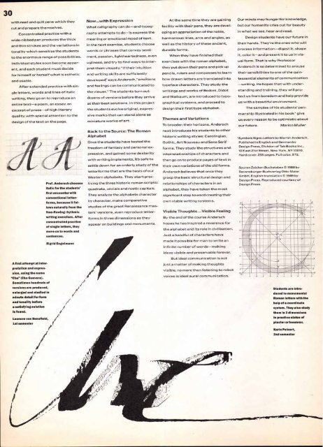
Students are intro-<br />
duced to monumental<br />
Roman letters with the<br />
help of a coordinate<br />
system. They also study<br />
them in 3 dimensions<br />
In practice slates of<br />
plaster or beeswax.<br />
Karin Peinert,<br />
2nd semester


