

Volume 9–3 (Low Res).pdf
Volume 9–3 (Low Res).pdf
Volume 9–3 (Low Res).pdf

Create successful ePaper yourself
Turn your PDF publications into a flip-book with our unique Google optimized e-Paper software.
Ad lib Cc 1)d FA, GgHhiiJpKkLIMmNiOoPp<br />
UPPER AND LOWER CASE. THE INTERNATIONAL JOURNAL OF TYPOGRAPHICS<br />
Qg Rr SsTt (in Vv Ww XxYv Zz 12345678908/<br />
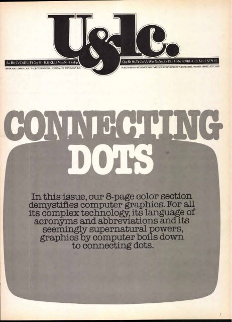
In this issue, our 8-page color section<br />
demystifies computer graphics. For all<br />
its complex technology, its langu.age of<br />
acronyms and abbreviations and its<br />
seemingly supernatural powers,<br />
graphics by computer boils down<br />
to connecting dots.<br />
il%!?0[I<br />
PUBLISHED BY INTERNATIONALTYPEFACE CORPORATION, VOLUME NINE, NUMBER THREE, SEPT. 1982
We.<br />
VOLUME NINE, NUMBER THREE, SEPTEMBER. 1982<br />
EDITOR: EDWARD GOTTSCHALL<br />
ART DIRECTOR: BOB FARBER<br />
EDITORIAL/DESIGN CONSULTANTS: LOUIS DORFSMAN, ALAN PECKOLICK<br />
EDITORIAL DIRECTORS: AARON BURNS. EDWARD RONDTHALER<br />
ASSOCIATE EDITOR: MARION MULLER<br />
CONTRIBUTING EDITOR: ALLAN HALEY<br />
RESEARCH DIRECTOR: RHODA SPARBER LUBALIN<br />
BUSINESS MANAGER: JOHN PRENTKI<br />
ADVERTISING/PRODUCTION MANAGER: HELENA WALLSCHLAG<br />
ASSISTANT TO THE EDITOR: JULIET TRAVISON<br />
ART/PRODUCTION: ILENE MEHL. ANNA DEMCHICK. SID TIMM<br />
SUBSCRIPTIONS: ELOISE COLEMAN<br />
0 INTERNATIONAL TYPEFACE CORPORATION 1982<br />
PUBLISHED FOUR TIMES A YEAR<br />
IN MARCH, JUNE, SEPTEMBER AND DECEMBER<br />
BY INTERNATIONAL TYPEFACE CORPORATION<br />
2 HAMMARSKJOLD PLAZA, NEW YORK. NY 10017<br />
A JOINTLY OWNED SUBSIDIARY OF<br />
LUBALIN. BURNS 6 CO.. INC. AND PHOTO.LETTE RING, INC.<br />
CONTROLLED CIRCULATION POSTAGE PAID AT NEW YORK, NY<br />
AND AT FARMINGDALE, NY USTS PURL 073430<br />
ISSN 0362-6295 PUBLISHED IN USA<br />
ITC FOUNDERS:<br />
AARON BURNS, PRESIDENT<br />
EDWARD RONDTHALER, CHAIRMAN EMERITUS<br />
HERB LUBALIN, EXECUTIVE VICE PRESIDENT 1970-1981<br />
ITC OFFICERS 1982:<br />
GEORGE SOHN, CHAIRMAN<br />
AARON BURNS. PRESIDENT<br />
EDWARD GOTTSCHALL. EXECUTIVE VICE PRESIDENT<br />
BOB FARBER. SENIOR VICE PRESIDENT<br />
JOHN PRENTKI, VICE PRESIDENT, FINANCE AND GENERAL MANAGER<br />
EDWARD BENGUIAT, VICE PRESIDENT<br />
US. SINGLE COPIES $1.50<br />
ELSEWHERE. SINGLE COPIES 52.50<br />
TO QUALIFY FOR FREE SUBSCRIPTION COMPLETE AND RETURN<br />
THE SUBSCRIPTION FORM IN THIS ISSUE TO ITC OR WRITE TO<br />
THE ITC EXECUTIVE OFFICE. 2 HAMMARSKJOLD PLAZA, NEW TORN. NV 10017<br />
MICROFILM COPIES OF U&LC MAY BE OBTAINED FROM MICRO PHOTO DIVISION.<br />
BELL 6 HOWELL. OLD MANSFIELD ROAD, WOOSTER, OH 09691<br />
AS THIS ISSUE OF U&LC WAS IN ITS PLANNING STAGES, ART DIRECTOR BOB FARBER WAS HOSPITALIZED.<br />
HE IS NOW RECOVERING AND WE LOOK FORWARD TO HIS EARLY RETURN. FOR THIS ISSUE, MO LEBOWITZ,<br />
FREQUENT CONTRIBUTOR TO U.LC, DESIGNED PAGES 1.9; 24-25; 2829 AND 36-45; AND ASSISTED IN THE<br />
COMPLETION OF THE DESIGN FOR PAGES 10-15 AND 20-23.<br />
In this issue:<br />
Editorial<br />
A report on the colossal Drupa exhibition in Dusseldorf<br />
with tantalizing descriptions of the newest wrinkles in<br />
electronics, destined to continue the revolution in the<br />
graphics world. Page 2<br />
Collecting Clocks<br />
Some clocks do more than tell time. As fascinating as their<br />
timepieces is the story of why and how Joseph and Cindy<br />
Fanelli started to collect them. Page 4<br />
Alphabet of the Printer's Art<br />
Necessity was the mother of a beautiful invention. A<br />
graphic artist shares his collection of decorative initials,<br />
which includes specimens from famous old hands. Page 10<br />
Sumo<br />
The strange romantic tale of a fashion illustrator who<br />
turned off on couture and turned on to Sumo wrestling as<br />
the subject of her art and object of her affections. Page 12<br />
Man Bites Man<br />
Cartoons, caricatures, graphics—acerbic and satiric—by<br />
artists past and present, American and European, provide<br />
the theme of a new series by Steven Heller. Page 16<br />
The Fantasy and Passion of Aguirre<br />
A sophisticated and eloquent printmaker recognizes his<br />
roots in a compelling native folk art form. Page 20<br />
Simon Nathan's Lettergraphs<br />
A photographer eschews the guaranteed "stoppers"— babies,<br />
nudes and animals—and focuses on letteiforms. Page 24<br />
Alphabets<br />
Two more animated alphabets, supplied by our readers,<br />
wherein people, birds, fish and cats contort themselves into<br />
26 unprecedented postures. Page 26<br />
Coins and Paper<br />
There's a small fortune in currency of every description<br />
and denomination buried here. Get a pencil and dig in.<br />
Page 28<br />
What's New from ITC<br />
ITC New Baskerville;" the 'beautiful workhorse' of<br />
typefaces, is being offered, for the first time in an extended<br />
family of weights, both roman and italic. Page 30<br />
Connecting Dots<br />
What can you do, graphically, on the computer? In festive<br />
color, but simple language, a sampling of graphics<br />
produced at the Computer Graphics Laboratory, a think<br />
tank, ivory tower and bustling workshop at the New York<br />
Institute of Technology. Page 36<br />
Computer Graphics and You<br />
New systems, equipment and options for computer artists,<br />
as seen at the Annual National Computer Graphics<br />
Association; and an interview with some pioneers. Page 45<br />
This issue of U&lc was mailed to 190,000 readers; 156,000 in the<br />
United States and Canada, and 34,000 abroad. It will be read by over<br />
500,000 people.<br />
TABLE OF CONTENTS AND EDITORIAL SET IN ITC NEW BASKERVILLE'<br />
MASTHEAD SET IN ITC NEWT'EXT'A (REDUCED).<br />
Editorial:<br />
The new order changeth...<br />
"The old order chang-eth,<br />
yielding place to new", II<br />
he tempo<br />
of change in our industry is so<br />
rapid that, as a recent visit to<br />
DRUPA shows, even things so new<br />
that we barely understand them<br />
are becoming obsolete.<br />
DRUPA is the world's most<br />
colossal exhibition of new graphic<br />
arts technologies. It is held once<br />
every five years. The name DRUPA<br />
is an acronym, a blending of two<br />
German words: Druck (printing)<br />
and Papier (paper). If you've ever<br />
worn out your legs at Chicago's<br />
McCormick Place you know how<br />
vast such a show can be. Well, the<br />
fairgrounds in Dusseldorf, Germany,<br />
where DRUPA made its two<br />
week stand in June, are equal to<br />
more than a dozen McCormick<br />
Places. Many major innovations<br />
are first shown there.<br />
U8c1c herewith brings to its<br />
readers highlights of some of the<br />
major developments of interest<br />
to graphic designers. For more<br />
detailed reportage, see the Seybold<br />
Report on Publishing Systems,<br />
No. 18, and follow-up Reports.<br />
The big trend. As we move nearer<br />
the mid '8os two trends forecast<br />
in U&lc's "Vision '8os" report are<br />
converging and reaching the market—the<br />
electronic merging of<br />
text and graphics (in black-andwhite<br />
and in full color) and computer<br />
programmed full-page (even<br />
full printing form) makeup.<br />
Perhaps the most advanced<br />
system at this writing is that<br />
offered by Scitex. Just a year ago<br />
Scitex added to its electronic color<br />
correction system an on-line page<br />
and multi-page makeup system<br />
that accommodated off-line<br />
text. Scitex interfaced to color<br />
Alfred, Lord Tennyson. " Idylls of the King"<br />
scanner/separators of other manufacturers.<br />
Now Scitex has added<br />
several major capabilities of interest<br />
to graphic designers.<br />
DO<br />
Scitex Vista is a computerized system<br />
for page layout design and<br />
makeup. It can receive input<br />
from picture scanners and text<br />
composition systems and convert<br />
the data into complete pages<br />
ready for film or plate exposure<br />
or gravure cylinder engraving.<br />
Text is displayed on the screen in<br />
the real typeface, size, leading,<br />
width values, line endings. Pictures,<br />
text, make-up can be interactively<br />
edited. A two-page spread<br />
can be displayed on the CRT or<br />
any detail of it can be magnified<br />
to display minute details In essence,<br />
Vista creates an electronic<br />
mechanical. All final elements are<br />
assembled, color corrected and<br />
airbrushed electronically.<br />
Raystar will receive full-page layout<br />
data from Vista or other frontend<br />
composition systems and<br />
output every two minutes a pressready<br />
plate of film up to 24"x 1.8'.`<br />
Raystar is also a scanner that can<br />
scan furnished graphics. The digital<br />
data it generates can be input<br />
to layout design systems such as<br />
the Vista and pre-press systems<br />
such as the Scitex <strong>Res</strong>ponse-30o.<br />
Lynart is a console with a CRT and<br />
a graphic tablet. It is a black and<br />
white accessory for space plan<br />
ning, page layout, tints and linework<br />
editing.<br />
A new patented laser screening<br />
process that produces all-angle,<br />
all-shape halftone screens of a<br />
quality comparable to that obtained<br />
using contact screens.<br />
Texta is Scitex's typesetter. It provides<br />
input to the Scitex pagination<br />
systems and laser output
devices. Texta stores digital master<br />
fonts. It holds thousands of font<br />
families on line as well as logotypes<br />
and graphic symbols. It can<br />
also accept text and logotypes<br />
from any standard front-end composition<br />
system. It outputs, via a<br />
laser, in fine resolution for high<br />
typographic quality. With Texta a<br />
traditional typesetter and scanner<br />
are bypassed, data remaining in<br />
digital form until output. Texta<br />
outputs to any Scitex output<br />
unit. The first 5o digital fonts<br />
have been delivered to Texta by<br />
Bitstream, Inc.<br />
DO<br />
Other systems merging text and<br />
graphics and offering interactive<br />
electronic full-page makeup<br />
include the Sigmagraph 2000<br />
(Dainippon Screen Mfg. Co. Ltd.)<br />
which is also a sophisticated electronic<br />
color scanner, retouching<br />
composition system. Type is<br />
scanned into the system. Crosfield<br />
scanners also added typesetting to<br />
their separation-color correctionpagination<br />
system by interfacing<br />
to Information International's<br />
Tecs text editing and composition<br />
system.<br />
The magic system. Berthold<br />
Fototype demonstrated its "magic"<br />
system at DRUPA. Magic makes possible<br />
joint processing of text matter<br />
and rules, graphic elements,<br />
and photographic material. Magic<br />
is still being developed and is, at<br />
present, black-and-white oriented.<br />
It features a sophisticated h & j<br />
program, new kerning standards<br />
based on a unitization system<br />
that divides the em into 288 units,<br />
and stored geometrical graphic<br />
elements. The system includes a<br />
graphic monitor (high resolution),<br />
a 158 character programmable<br />
keyboard, and a touch screen.<br />
Linotype now has a "Graphic<br />
System" (not to be confused with<br />
its color scanners). It enables halftone<br />
and linework to be digitized,<br />
stored, recalled and modified<br />
prior to typesetting. It can adjust<br />
tone values to compensate for the<br />
screening process or poor originals.<br />
The system includes a laser<br />
digitizer, an interactive graphic<br />
editing terminal and disc storage,<br />
a Linotron 202W, computer and<br />
a matrix printer. It works with a<br />
variety of front ends.<br />
Typesetters. The trend among<br />
typesetters is to do more than set<br />
type: set graphics, make up pages,<br />
do data or word processing, perform<br />
business functions.<br />
Several major new typesetters<br />
and models were introduced<br />
at DRUPA. These include AM Varityper's<br />
Comp/Edit 6400 CRT.<br />
The 6400 is a direct entry digital<br />
typesetter. It looks like a photographic<br />
Comp/Edit but has a<br />
higher output speed (160-200 1pm).<br />
The Scantext moo is a direct<br />
entry digital typesetting system<br />
and an area composition system<br />
giving multi-column output and<br />
setting horizontal and vertical<br />
rules. The Scantext moo, presently<br />
available in England, is<br />
made by Dr. Boger Photosatz<br />
GmbH and marketed by Visutek<br />
Graphic Products Ltd.<br />
Linotype's cRTronic is now<br />
available in three models-10o,<br />
150, 200. This is a direct entry digital<br />
typesetter. cRTronics can now<br />
use cP/m programs and thus<br />
handle a wide range of business<br />
applications.<br />
A typeface hotline. Users of<br />
Linotype digital typesetters can<br />
now access over 1200 digitized<br />
typefaces via the Linotype Font<br />
Center's hot line. Users with modems<br />
can literally dial the Linotype<br />
Font Center in Frankfurt and<br />
receive the digital font in minutes<br />
in London, South Africa, Australia,<br />
Singapore and many key<br />
centers in Europe.<br />
MAPS is an acronym for the<br />
Itek Quadritek Multiple Application<br />
System. The once little direct<br />
entry typesetter has become a full<br />
system with a display terminal,<br />
floppy disc drives, and a typesetter<br />
available in four models. The system<br />
is modular, and, with appropriate<br />
software, can handle word<br />
and data processing and business<br />
management tasks as well as typesetting.<br />
Each module in the system<br />
has its own microprocessor.<br />
The software options include<br />
Quad Quick, a package of preprogrammed<br />
typesetting formats.<br />
Autologic showed the APS-5G<br />
which can set graphics as well as<br />
text, an improved page assembly<br />
system and a low cost table-top<br />
typesetter.<br />
The Mark II is a new Monotype<br />
Lasercomp. It handles nonroman<br />
alphabets including<br />
Chinese, line art, logotypes, all set<br />
in a single pass and with all makeup<br />
performed at the front end. It<br />
produces output ready for exposure<br />
to the press plate. A Lasercomp,<br />
teamed with an Autokon<br />
camera and a Xenotron electronic<br />
composition terminal can<br />
scan and screen photographs,<br />
merge them with type and line art<br />
and output fully made up pages.<br />
Modular and multifunctional.<br />
Compugraphic's Modular Composition<br />
Systems mcs' now offers<br />
a cP/m 86 operating system that<br />
makes it compatible with a broad<br />
range of business software. Also<br />
now available to mcs users are<br />
Wordstar, Spellstar, and Mailmerge<br />
software to perform a variety<br />
of word processing, spelling<br />
and list merging functions. Cornpugraphic's<br />
8600 digital typesetter<br />
now offers a high speed (215<br />
1pm) high quality (5200 scan lines<br />
per inch) model. The high resolution<br />
option can be switched back<br />
to the standard 1300 lines per<br />
inch when it is not needed.<br />
Sim-X PAGE Comp is a family<br />
of interactive terminals for ad<br />
composition and page makeup<br />
and a mo-pica typesetter, the<br />
PAGEscan, and a graphics input<br />
unit. The Sim-X units comprise a<br />
complete, full-page electronic<br />
system for handling text, line art,<br />
logos and pictures. The PAGEscan<br />
contains the picture module. Its<br />
output resolution for type is moo<br />
lines per inch. It takes about ioo<br />
seconds to set a 16 1/2"x 24"page.<br />
Typefaces in printers. The<br />
trend for devices other than typesetters<br />
to set type continues. For<br />
example, Ism seems close to entering<br />
the market with an electromatrix<br />
printer capable of storing,<br />
and outputting type fonts. The<br />
prototype device shown at DRUPA<br />
outputs on a specially developed<br />
aluminum paper. The type output<br />
at the demonstration was of good<br />
quality. System software showed<br />
a capability to handle complex<br />
tables and rules as well as to<br />
change type size and style.<br />
Another printer with a typographic<br />
capability is the PE4000.<br />
Made by Pump Electronics<br />
(Denmark) it is a laser forms<br />
composing system. It is expected<br />
to be available in the United<br />
States where it has already been<br />
demonstrated.<br />
What does all this mean? Many<br />
among us who did not grow up<br />
with computers are fearful of the<br />
new technologies—afraid they will<br />
replace us or that we won't know<br />
how to use them. We've seen<br />
enough "oldtimers" adapt readily<br />
to the new technologies to know<br />
this need not be so. We are<br />
reminded of Robert Browning's<br />
opening lines to "Rabbi Ben Ezra"—<br />
"Grow old along with me!<br />
The best is yet to be,<br />
The last of life, for which the first<br />
was made:<br />
Our times are in His hand<br />
Who saith a whole I planned,<br />
Youth shows but half; trust God, see<br />
all, nor be afraid."<br />
And for those who think all these technological<br />
wonders will do all their work for them, forget it.<br />
Computers are just tools. They don't replace taste,<br />
judgment, initiative, creativity. They can set words<br />
or graphics but can't think them. As Hamlet said,<br />
"Words without thoughts never to heaven go."<br />
Edward M. Gottschall<br />
3
4<br />
Cone<br />
There are two kinds of people in the<br />
world—"collectors"and"discarders."<br />
Since no one expects to hear any<br />
thrilling answers to the question:<br />
"What have you thrown out lately?"<br />
we're most often exposed to stories<br />
about collections. And just as fascinating<br />
as what people collect is why<br />
and how they got started in the<br />
first place.<br />
Take the case of Joseph and<br />
Cindy Fanelli. It was Joe's voice that<br />
got them started on clock collecting.<br />
Joe Fanelli was a professional entertainer<br />
who sang his way across the<br />
U.S. and Canada, touring the nightclub<br />
circuit. On weekends, when he<br />
was close enough to home base, his<br />
wife Cindy would join him. To fill the<br />
daytime hours between performances,Joe<br />
and Cindy joined that<br />
tireless breed of American tourists<br />
who spend their vacations hunting<br />
down auctions and antiques fairs.<br />
Cindy had been turned-on to auctions<br />
by a friend, and Joe had been<br />
expertly schooled in clock and<br />
watch repairs by an oldtime friend<br />
and master craftsman. It didn't take<br />
too many such weekends for them<br />
to acquire a sizable collection of old<br />
clocks and "things."The first hint<br />
that this could become a business<br />
venture came with the purchase of a<br />
broken down schoolhouse clock,<br />
which they acquired for two dollars.<br />
Joe,it seems, rushed in where experienced<br />
repair men would fear to<br />
tread. Instead of buying a new mainspring<br />
for the clock, he rewound the<br />
old one at considerable danger to<br />
himself (a tightly wound mainspring<br />
can"explode"in your hands and cut<br />
them to shreds). Nevertheless, the<br />
job was done expertly and Joe Fanelli<br />
sold the repaired clock for $25.<br />
While this seemed like a substantial<br />
profit, it was not nearly what the<br />
market could bear. He discovered<br />
that similar clocks were selling for<br />
twice as much.<br />
When Cindy and Joe saw the<br />
potential for combining their incurable<br />
mania for auctions with his<br />
skills at watch repair, it seemed a far<br />
more salubrious lifestyle than one-<br />
night-stands in cafe lounges.In 1969,<br />
they set up shop in earnest. Their<br />
first quarter turned out to be a half<br />
—half of a store they shared with a<br />
shoe repair man. Though they had a<br />
large collection of assorted merchandise<br />
for sale, Joe, for the most<br />
part was repairing clocks—some that<br />
he had picked up for himself, and<br />
many brought to him by antique<br />
dealers. He became more and more<br />
fascinated with the unusual timepieces<br />
that moved through his shop<br />
and his hands. As happens to all<br />
collectors, the Fanelli's appetite and<br />
acquisitions soon exceeded their<br />
space, and they realized they had to<br />
contain their interests. They finally<br />
divested themselves of all the extraneous<br />
paraphernalia and concentrated<br />
on clocks—at first very large ones,<br />
but currently small ones with a<br />
specialty in carriage clocks. They<br />
have long since left their half of the<br />
shoe repair shop and can be found<br />
now in the heart of New York's<br />
antiques district-2nd Avenue at<br />
53rd Street. Years of concentration<br />
have refined their inventory and<br />
Joseph Fanelli is recognized as a<br />
connoisseur in his field, a specialist<br />
in the sale and restoration of antique<br />
timepieces.<br />
At this point we should digress and take<br />
note of the historic significance of the<br />
words clock and watch, which originally<br />
had different meanings. Clock<br />
derives from the Latin clocca which<br />
means bell. Early timepieces that struck<br />
the hours by sounding a bell came to be<br />
known specifically as clocks. The word<br />
watch relates to the ancient custom of<br />
dividing the night into periods of time<br />
when soldiers orguards kept a lookout, or<br />
watch. Watches technically are not<br />
bell-ringers or chimers, but today the<br />
words clock and watch are used interchangeably.<br />
When in doubt, the word<br />
timepiece is suitable for all occasions.<br />
Carriage Clocks<br />
The mainstay and pride of the Fanelli's<br />
are their carriage clocks. They are<br />
highly ornamental, exquisitely fabricated<br />
small clocks which originated<br />
in France in the 18th century. They<br />
A complete timepiece, giving day, date, month,<br />
hour and half hour chimes, packed into a 21/2"<br />
miniature carriage clock.<br />
derived from the small timepieces<br />
Napoleon's officers carried with<br />
them on their extended"tour"of<br />
Europe. These magnificent little<br />
clocks became extremely popular<br />
and were produced in great quantities<br />
in England, and to a lesser extent<br />
in Switzerland, Germany and elsewhere<br />
on the continent.<br />
Translated into contemporary<br />
terms, we might say the carriage<br />
clocks were traveling clocks. Often<br />
they came with a protective leather<br />
case, and in rare instances, with a<br />
little stand. When the owner packed<br />
his bags to go on a trip, he could<br />
lift the little clock by its convenient<br />
handle (leaving the base at home)<br />
and carry his timepiece along on<br />
his travels.<br />
These little carriage clocks are<br />
works of art from their innermost<br />
ratchets to their sumptuous surfaces.<br />
In size, they came from 21/2" to 3"<br />
called miniatures, to 5" to 8" called<br />
standard, and 12" to 18" called giants.<br />
The rarest and most valuable specimens<br />
are the miniatures which weigh<br />
only about one pound. Considering<br />
the small size of all the carriage<br />
clocks, and the fact that they were<br />
built before such things as quartz<br />
crystals, mini-transistors and pinsized<br />
batteries, they are technological<br />
marvels. Some strike hour and<br />
half-hour intervals. Some rare models<br />
strike quarter hours. Extremely<br />
rare models repeat minutes. Some<br />
have a full calendar, giving day, date<br />
and month. And some even sport<br />
perpetual calendars which correct<br />
themselves for leap years.<br />
The simplest editions of carriage<br />
clocks have backs and often<br />
side panels fitted with glass, so the<br />
works are completely visible. But<br />
1. The"Gulliver"clock, a 5-inch,19th century carriage clock engraved with<br />
scenes from Gulliver's Ikavels.
Clocks<br />
an inside story<br />
the appetite for ornamentation in<br />
18th and 19th century England and<br />
France was also sated with more solid<br />
stuff. Among the fabulous carriage<br />
clocks in the Fanelli collection are<br />
some that are encrusted with gems,<br />
others embellished with gilt, and<br />
many with decorated side panels of<br />
Limoges, champleve and cloisonne<br />
(all intricate enamel work over copper<br />
or brass). An unusual clock in the<br />
shop is decorated in pietra dura, a<br />
special technique of Italian craftsmen,<br />
in which colored stones are<br />
cut into patterns and set in marble.<br />
The actual designs, on the panels<br />
were geared to the tastes of the<br />
marketplace. Some had biblical<br />
motifs; others related to literary<br />
works (one of the Fanelli's prize<br />
5" carriage clocks is engraved with<br />
scenes from Gulliver* Travels); some<br />
depict the seasons of the year, and<br />
still others are decidedly oriental in<br />
flavor with bamboo framework, cut<br />
fretwork designs and oriental motifs<br />
in the illustration. These latter<br />
designs were aimed at the growing<br />
market in the Far East and also<br />
catered to the prevailing taste for<br />
Chinoiserie on the continent. The<br />
continued on next page<br />
2.Automaton-skeleton clock with<br />
palace framework. English timepiece<br />
with Swiss music box. One minute<br />
before the hour strikes, music starts up<br />
and soldiers parade about the palace.<br />
3.Automaton clock, 14 inches high<br />
including upper case which contains<br />
a woodland scene with chirping<br />
animated birds.<br />
4.A 9-inch humpback carriage clock<br />
with perpetual calendar which corrects<br />
itself for leap years.<br />
5.French-made, 19th century porcelain<br />
annular dial urn. In place of a<br />
clock face, rotating dials sandwiched<br />
below the neck indicate time.<br />
5
6<br />
market for carriage clocks invited<br />
design variations of many kinds. In<br />
addition to the four-sided rectangle,<br />
there were hexagonal and oval forms<br />
and also humpback styles.<br />
The rarest and most prized of<br />
the Fanelli's carriage clocks are the<br />
miniatures which go for about five<br />
to ten thousand dollars at auction.<br />
A calendar-repeater miniature, which<br />
gives time of day and date, strikes<br />
the hour and half-hour (and repeats<br />
the hour) on demand.<br />
Skeleton Clocks<br />
Another specialty in the Fanelli shop<br />
are the skeleton clocks. In the early<br />
19th century, when Americans invaded<br />
the clock-making market with<br />
inexpensive timepieces, the English<br />
manufacturers tried to counter the<br />
competition with the phenomenon<br />
known as the skeleton clock. It<br />
appealed to the taste for novelty<br />
and the Victorian mood for highly<br />
decorative accoutrements. The<br />
skeleton clock was exactly what the<br />
name implied—a clock with the<br />
works exposed, overlayed with a<br />
decorative see-through framework.<br />
Favorite themes for the framework<br />
were elaborate castles, intricate<br />
gothic-style cathedrals and also<br />
simpler forms such as lyres, hearts,<br />
sheaves of wheat, etc. According to<br />
the Fanellis, the skeleton clocks<br />
were designed originally for a more<br />
limited purpose. It was a required<br />
project, like a thesis, for all students<br />
of watchmaking to produce a clock<br />
that would demonstrate their expertise.Since<br />
the clocks had to be<br />
examined by master-craftsmen, they<br />
could not be enclosed in a framework<br />
but had to be left in skeleton<br />
form. Whatever the origin, skeleton<br />
clocks were extremely popular in<br />
England in the mid-19th century.<br />
Tens of thousands were produced<br />
between 1820 and 1890, but by the<br />
early 1900's they had all but disappeared<br />
from the marketplace.<br />
An extremely rare and valuable<br />
clock is the skeletonized carriage<br />
clock, made in France for the 1851<br />
Exposition. It is completely exposed<br />
with only four decorative columns<br />
framing it. Made of solid silver fittings<br />
and gold plated surfaces, the<br />
columns are decorated to celebrate<br />
the disciplines of mathematics,<br />
science, horology and mechanics.<br />
Automatons<br />
Another prize skeleton clock in their<br />
shop is the palace clock. It combines<br />
an English-made frame and timepiece<br />
with a Swiss music box, plus<br />
still another surprise element. The<br />
music box starts up about one minute<br />
before the hour strikes, and<br />
with it, a parade of automated soldiers<br />
marches around the palace.This<br />
masterpiece of brass and silveredbrass<br />
valued at $15,000 was created<br />
in 1860 and is part of a private collection.<br />
Clocks like the skeletonpalace,which<br />
contain animated<br />
figures or objects that work in conjunction<br />
with the clock mechanism,<br />
are called automatons.<br />
Among the automatons in the<br />
shop is a carved wooden figure of a<br />
peddler, made in Germany in the<br />
early 19th century. ,with a jaw that<br />
drops down and a pair of eyes that<br />
dart back and forth with a startled<br />
expression. There are other clocks<br />
with moving parts, though not<br />
strictly speaking considered to be<br />
automatons: a lyre clock,with an unusual<br />
pinwheel escapement (evenly<br />
spaced pins, instead of teeth, control<br />
the rate of movement) also sports a<br />
compensator pendulum. Here, a<br />
series of rods of different metals expand<br />
and contract with the weather<br />
and indicate when the time is "off"<br />
due to weather conditions. There is<br />
also a made-for-Tiffany lyre clock<br />
designed with a ring of"brilliants"<br />
that move around the clock face in<br />
synch with the mechanism ... a<br />
Japanese temple clock, with a dial<br />
that rotates while the hands stand<br />
still ... a swinger clock that rocks<br />
back and forth ... and a most unusual<br />
French annular dial urn. This delicate<br />
porcelain vase-shaped timepiece<br />
has no clock face, but is fitted with<br />
two revolving bands, sandwiched in<br />
the body of the urn, which indicate<br />
the time in hours and minutes. Some<br />
of the clocks illustrated here are for<br />
sale; some have been sold and are<br />
in the Fanelli shop for restoration,<br />
and others are from permanent collections<br />
but left with the Fanellis<br />
to be maintained.<br />
All their timepieces notwithstanding,<br />
it seems the Fanellis have<br />
simply not found the time to officially<br />
change their name from the<br />
original "Clocks and Things" to<br />
simply "Clocks." But no matter.<br />
Anyone in the market for an unusual<br />
timepiece or expert advice on the authenticity,<br />
the history or restoration<br />
of antique clocks, need only to look<br />
in the Manhattan phone book for<br />
Joseph Fanelli,"Clocks and Things."<br />
MARION MULLER<br />
6. Lyre clock with moving ring of brilliants around clock face; made for Tiffany with matching candelabra.
1 0.<br />
7 Giant `Japanese Temple clock,<br />
early 19th century design, 55 inches<br />
high; face rotates while hands remain<br />
still.<br />
8. Closeup of face of `Japanese Temple clock.<br />
9.Skeleton clock with gothic cathedral framework; strikes quarter hours on 8<br />
bells.<br />
10.Early 19th century lyre clock with compensator pendulum which reports<br />
discrepancies in time due to weather conditions. Pendulum and clock are one.<br />
11.The"Peddkr"automaton,German-made,carved out of wood with movable<br />
jaw and eyes in synch with clock movement.<br />
7
8<br />
12. Miniature 3'/2-inch rococo car- 13. An 8-inch hexagonal carriage 14. French 3-inch miniature carriage 15. Bamboo-framed carriage clock<br />
riage clock with 5 Limoges panels— clock with Limoges panels illustrating clock with Italian pietra dura panels; designed for oriental market; 71/2<br />
4 sides and I on top. the seasons. gives time only. inches high with porcelain side panels.<br />
12.<br />
14.
16. Late 19th century French-made<br />
swinger clock. Clock-and-pendulumin-one,<br />
set in blue metallic-finish<br />
ball which rocks in synch with clock<br />
movement.<br />
17 A rare 9-inch skeletonized carriage<br />
clock, made for the 1851 Paris Exposition.<br />
Corner columns designed to<br />
represent mathematics, science, horology<br />
and mechanics.<br />
18.Swiss 21/2-inch miniature carriage<br />
clock with 3-dial calendar for day,<br />
date and month; strikes hours and<br />
half-hours and repeats.<br />
19.A 6-inch oval carriage clock;<br />
called "The Christmas Clock"because<br />
of its holly decorations.<br />
9
10<br />
11 The artist's name is unknown. This was his<br />
"C monogram. Cofogne/1560-1570
Does the phrase"Pubfication Design"<br />
sound like a contemporary magazine...<br />
or an art school course in graphics ? The<br />
words may sound new, but the idea is as old<br />
as the phenomenon of reading.<br />
In the ancient world, communication<br />
was mostly oral. Myths and folklore were<br />
passed along by word of mouth. News<br />
events were procfai by town criers.<br />
Religious dog ma was pronounced by priests<br />
Grotesque Alphabet. The Netherlands/ 1464<br />
or dramatized on the stage. In short, it's<br />
hard to imagine a citizen of the ancient<br />
world curling up with a roll of papyrus<br />
for"a good read."<br />
But in medieval times, certain select<br />
people became"readers "The Catholic<br />
Church was the main educator, and the<br />
books were Bibles, psalters and missals. It<br />
was then that the look of a book became a<br />
matter of extreme concern. To enliven the<br />
:K.1■1.":46"-r<br />
.
12<br />
ywn<br />
nn<br />
THROUGH<br />
THE EYES<br />
OF AN<br />
ARTIST<br />
,4 1<br />
" '<br />
Iwanami Zeki, during summer tour,<br />
photographing another wrestler.
HERE'S A SAYING (or<br />
there should be)<br />
that fate is stranger<br />
than fiction. Lynn<br />
Matsuoka's involvement<br />
with sumo<br />
bears the unmistakable<br />
stamp of fate, but<br />
it also has something of the<br />
poetic glamor of fiction. Lynn's<br />
training, her interests, the<br />
roads not taken,as well as those<br />
she did take, all seem to have<br />
led inevitably to her present<br />
unique position as an internationally<br />
admired "sumo artist."<br />
However, Lynn's art is by no<br />
means limited to sumo—she<br />
also does illustration, lithographs,<br />
fashion work for Vogue,<br />
and behind-the-scenes drawings<br />
of dance and theater,<br />
as well as three-dimensional<br />
pieces in media such as<br />
trapunto.<br />
She was graduated from the<br />
Tiller School of Art at Temple<br />
University, where (for recreation)<br />
she raced motorcycles<br />
and Porsches, and sang in a<br />
semi-professional choir. Later,<br />
in Hew York, she studied with<br />
Jack Potter, whom she con-<br />
Tochiisami Zeki and three<br />
proteges in dressing room, Kyoto tour.<br />
Grand Champion Wajima and his protege in the dressing room, Osaka.<br />
13
14<br />
Grand champions Wakanohana and<br />
Wajima during a Tokyo grand totirna<br />
Ozeki Kotokaze on the sumo trajp,d ing a rural our.<br />
I Sef 4.4,--1<br />
7<br />
siders her true mentor—her<br />
o-sensei, or Great Teacher, as<br />
the Japanese say. "What I'm<br />
able to do now I owe to Jack<br />
Potter—and hard work;' says<br />
Lynn.<br />
Lynn originally went to Japan<br />
in 1974 to do fashion illustration<br />
for a major department<br />
store, but one day as she was<br />
idly flipping the channels on<br />
a TV set her eye was caught by<br />
a gorgeous fleeting image of<br />
exotic colors, patterns and<br />
shapes; she quickly turned<br />
back to that channel and found<br />
herself watching sumo—totally<br />
transfixed—for the first time<br />
in her life. How, eight years<br />
later, Lynn still sees the beauty<br />
of sumo with unjaded wonder,<br />
for it was not just her eye that<br />
was caught that day but her<br />
heart and mind as well.<br />
Sitting in a coffee shop one<br />
recent rainy evening in Ryogoku<br />
Ozeki Takanohana receiving a massage duringthe Kyoto tour.
(the center of the sumo universe)<br />
Lynn herself spoke eloquently<br />
of her love of drawing<br />
sumo:"Sometimes,sitting by<br />
the dohyo on a freezing winter<br />
morning in the mountains, drawing<br />
sumo practice, I felt that<br />
if I died right then I'd have nothing<br />
left to regret. Other times<br />
when I can't quite get a line<br />
right I feel as though I ought<br />
to be sweeping floors in a luncheonette<br />
somewhere—but<br />
I'm so happy that I've been able<br />
to capture on paper the lines<br />
and the fullness that are to<br />
me, the beauty of sumo—and<br />
that is mine to keep forever.<br />
That's why I hate to sell my<br />
drawings, because each one<br />
represents a memory of a precious,<br />
fleeting moment."<br />
Lynn's private life, too, has<br />
been enriched and transformed<br />
by her fateful involvement with<br />
sumo, and it is here that the<br />
story begins to sound like highly<br />
inventive fiction. "Woman<br />
Artist from Long Island Meets<br />
High-Ranking Japanese Sumo<br />
Wrestler flamed Stone Tiger.<br />
They fall in love, get married,<br />
have a baby to whom they give<br />
the Samurai' Biblical name of<br />
Grand champion Wakanohana and hairdresser<br />
in dressing room before the fight.<br />
Toranosuke Joshua, and live<br />
happily ever after in the West<br />
Village (with periodic trips to<br />
Tokyo)." Certainly not your<br />
average unembroidered romantic<br />
resume; but when real life<br />
offers such wonderful true<br />
stories as this, who needs<br />
fiction?<br />
DEBORAH BOEHM GUSHMAH<br />
Young sumotori on tour,<br />
waiting out a typhoon in a coffee shop.<br />
Lynn's work can be seen at the<br />
Rizzoli Bookstore, NYC<br />
November 15th thru the 28th.<br />
Grand champions Kitanoumi<br />
and Wakanohana making signature<br />
cards for their fan clubs.<br />
THIS ARTICLE WAS SET IN ITC BENGUIAT GOTHIC.<br />
15
16<br />
Beginning with this issue of U&lc, "Man Bites Man" premieres<br />
as a regular feature, devoted exclusively to satiric<br />
art and artists from Europe and the United States. Future<br />
articles will focus on acerbic graphic commentators, both<br />
past and present, whose contributions to the art of cartooning<br />
and caricature have not yet been fully appreciated.<br />
This first feature highlights the powerful three-dimensional<br />
caricatures of Peter Fluck and Roger Law, which have<br />
appeared in numerous magazines, including those of The<br />
London Sunday Times and Stern, on posters and in boCFs.<br />
Currently, under the auspices o two production companies,<br />
"Tooth 'n' Claw" and "Spit'n' Image," they are creating<br />
an animated satiric television series for the BBC, which<br />
it is hoped will be aired on American cable TV.<br />
Not the Nine O'Clock News (TV BBC 2): "The Shap
Models for carnival<br />
heads for anti-National<br />
Front rally: Hitler,<br />
Tyndall, Webster<br />
The irreverent sculptures displayed<br />
here take shape in the<br />
most unlikely surroundings. On<br />
a quaint street in Cambridge,<br />
England, Peter Fluck and Roger<br />
Law are usually found sketching<br />
and sculpting under the high<br />
vaulted ceiling of their deconsecrated<br />
Anglican chapel—a<br />
narrow, seventeenth-century<br />
building which has been their<br />
studio for five years. The pulpit<br />
is gone, the pews have been<br />
removed, and now the only iconography<br />
on the walls is photos<br />
of some unrepentant souls<br />
whom they and other cartoonists<br />
have savaged in print. The Chapel, as they<br />
solemnly refer to it, is an ironic setting for two<br />
such ardent social critics as Fluck and Law to<br />
desanctify, demystify and expose the blemishes<br />
of public beings. 4.. Fluck and Law, each a<br />
respected illustrator in his own right, became<br />
partners in 1975.After a visit to New York,<br />
which provided Roger with more work than he<br />
could possibly handle, he returned home and<br />
asked Peter= his friend of many years—to<br />
join him in business. Their politics and sensibilities<br />
were similar, and both had been doing<br />
pretty much the same type of work for years.<br />
Their first job together was an award-winning<br />
series of covers of all the 1976 preconvention<br />
17
18<br />
presidential candidates for The New York<br />
Times Magazine (Reagan, Wallace, Carter,<br />
Muskie, etc.). Of their immediately successful<br />
union, Law says, "It is a horrible sort of<br />
marriage. If either of us could do better by<br />
ourselves, we would:' needless to say, they<br />
thrive on the collaborative process and<br />
value each other both as friends and as<br />
talents. "We're rarely at odds," says Law. "We<br />
both recognize a good idea when we see<br />
one. Since they don't happen very often, we<br />
certainly would not argue about them when<br />
they do:' And so, during the past seven years<br />
they have produced some of the most biting<br />
caricatures being done in Europe. They<br />
have also achieved two major artistic feats<br />
outside of satire, having completely illustrated,<br />
with 3-D models, Charles Dickens'<br />
A Christmas Carol (published in England<br />
and in the United States) and a still to be<br />
published Treasure Island.<br />
Fluck and Law studied together at<br />
the Cambridge School of Art under the<br />
tutelage of Paul Hogarth. He introduced<br />
them to the conceits of Gilray, the British<br />
caricature tradition, and the German<br />
Expressionists, all of which were seminal<br />
in their development. Both graduated art<br />
school and entered the marketplace at the<br />
same time. Fortuitously they came of age<br />
in the early sixties amidst a long-overdue<br />
rebirth of satire spawned by the comic<br />
innovators Peter Cook and Dudley Moore<br />
(whose Beyond the Fringe had begun as<br />
"university footlight satire" and spread to<br />
the West End). Discovering Lenny Bruce was<br />
also a revelation.As Fluck recalls, "If those<br />
guys could getaway with it,entertain people,<br />
and also make a living by standing up in a<br />
nightclub and slagging away at the Prime<br />
Minister, why couldn't one do it in print?"<br />
Although they were competent drafts-<br />
men, Fluck and Law admit to creating only<br />
average work with pen and ink. Working in<br />
3-D, a process they first encountered in<br />
L'Assiette au Beurre (the early 20th-century<br />
French satiric journal), was clearly a means<br />
to make bolder statements and make them<br />
more accessible to a wider audience of<br />
artistically unsophisticated viewers. Photography<br />
was a further motivating factor. Law<br />
recalls: "As students we were told that magazines<br />
wanted illustrators. It was a lie! What<br />
they really wanted were courtroom sketchers<br />
and hacks who could go into Chinese gam-<br />
bling clubs after the first three photographers
had their cameras busted and get that<br />
edition's pictures by sketching from memory.<br />
Rather than fight it, we came up with a way<br />
of using photography." Muck adds, "It is<br />
also easier to achieve a great deal more<br />
with photography, instantly, than you can<br />
with a drawing or a painting. There are<br />
many theatrical effects such as flames and<br />
masses of color that neither of us could<br />
hope to draw:'<br />
John Lawrence-Jones, their photographer-collaborator<br />
of many years, painstakingly<br />
achieves these all-important cinematic<br />
effects in shooting sessions often lasting<br />
24 hours at a stretch. The time allowed for<br />
building a "little-larger-than-life-size" piece<br />
is usually ten days. This includes sketching<br />
the caricature from photographs, drawing<br />
up a shooting plan, sculpting the plasticene<br />
`models, making the clothes ("They are usually<br />
pinned together, rather than tailored;'<br />
says Muck), constructing the furniture, props<br />
and backgrounds. Altogether, an arduous<br />
but pleasurable task for the boys, who often<br />
end a workday in the local pub cursing their<br />
various art directors.<br />
Although Muck and Law are commissioned<br />
to do illustrations (Roger once constructed<br />
replicas of the entire British court<br />
system for The London Sunday Times), and<br />
have done advertising jobs from time to<br />
time, they prefer to do political and social<br />
caricatures: 'Although satire doesn't relieve<br />
us of whatever anger we may have;' says<br />
Law, "it is a privilege to be able to do it."<br />
Theirs is a fervent belief, since unlike satiric<br />
artists who exclusively do pen or pencil<br />
renderings, Muck and Law require commissions<br />
to pay the large expenses incurred in<br />
producing a 3-D caricature.<br />
Political partisanship is avoided in<br />
their work, but the biases are clearly there.<br />
Muck and Law agree that anyone is fair<br />
"Watergate"<br />
game who "stands up in front of us all and<br />
says he can solve all our problems:' They<br />
admit that their process is oftimes vulgar;<br />
but on the other hand, they do not distort a<br />
figure simply for the sake of doing so.They<br />
respect the target's natural peculiarities,<br />
and this "realistic" approach is respected.<br />
They are often given the freedom to picture<br />
a particular target in any manner they believe<br />
appropriate. A recent poster done, showing<br />
Prime Minister Maggie Thatcher as a leatherclad,<br />
whips-and-chains mistress was not<br />
mere slapstick in their eyes—and obviously<br />
it's been accepted by their patrons, for they<br />
have since been asked several times to<br />
lampoon her in public. However, the market<br />
is not too large and their uncompromising<br />
position certainly limits the number of outlets<br />
available to them."We have a strong reputation;'<br />
says Muck, "and editors who don't<br />
want the work for what it is don't ring us up:'<br />
Once, however, they were contacted<br />
by an international finance magazine: "This<br />
was the only magazine," says Law, "that we<br />
turned down because of their editorial<br />
stance—which for the most part celebrated<br />
the excellence of most South American<br />
dictatorships."<br />
In terms of acceptance of satire, the<br />
"temperature" of England is changing, both<br />
politically and economically,and the vehicles<br />
that Muck and Law once were able to<br />
count on are no longer available to them.<br />
"We used to do most of our work for The<br />
London Sunday Times Magazine," says Law,<br />
"But now (Rupert) Murdoch owns it. With a<br />
Murdoch newspaper, you get a Murdoch<br />
editor. They don't ask for political things<br />
anymore. The last commission we received<br />
from them was for a caricature of a very<br />
popular comedian in this country, who is<br />
totally racist. We dutifully tore him to shreds.<br />
But I'm afraid it won't see the light of day.<br />
I imagine the chances of appearing in Murdoch's<br />
Times again are pretty slim." They<br />
impose a further restriction on themselves:<br />
they refuse to take on (and are constantly<br />
being asked to do so) obscure sportsmen<br />
or second-rate entertainers, since their production<br />
time does not allow them to spend<br />
ten days with a character simply to do<br />
decoration. Furthermore, they are not fond<br />
of "boring exercises:'<br />
Neither Muck nor Law harps on their<br />
excellent artistry. Both emphasize that the<br />
idea is more important than the craft. "If<br />
you start falling in love with your skills;'<br />
says Law, "rather than your statement, you'll<br />
end up as some sort of artist,and that<br />
would not do at all." Almost as an exclamation<br />
point to this fact, all their pieces are<br />
photographed and then brought back to the<br />
studio, where they are destroyed, or dismantled<br />
and recycled.This is not ideological<br />
but practical: "The plasticene," says Muck,<br />
"is just too expensive and has to be shipped<br />
from America. What's more, we couldn't sell<br />
them. Who wants a big blob of plasticene<br />
in their living room?"<br />
The ability to entertain is an essential<br />
part of their work, and animation, no doubt,<br />
will enhance this aspect of it. Muck and Law<br />
see that their job as satirists is to convey an<br />
alternate point of view, and possibly to change<br />
people's minds. However, they see their natural<br />
constituents as those already at odds<br />
with the system. "Caricature and satire will<br />
always appeal in the main to an anti-establishment<br />
base;' says Muck. "If they had a<br />
wide appeal, we'd be out of work. If everybody<br />
agreed with us, we wouldn't be necessary."<br />
however, like the jesters of old, they<br />
display their efforts in popular theatrical<br />
forms and hope to draw more people into<br />
their work. They have produced a satiric<br />
coffee pot of Ronald Reagan and a teapot<br />
of Margaret Thatcher, as well as Prince and<br />
Princess of Wales eggcups, in an attempt to<br />
broaden their audience. Here humorous<br />
distortion is a powerful tool.Given the opportunity,<br />
they jump at the chance to create<br />
theatrical presentations—an interest that<br />
sets them apart from other graphic satirists.<br />
Their most ambitious project, in terms<br />
of size, was the construction of two 5-foothigh<br />
fiberglass carnival masks of Hitler and<br />
Webster (leader of the British neo-Nazis) for<br />
an anti-National Front rally. "These were<br />
enormous and heavy," Law recalls. "Each<br />
one needed an 8-foot-tall socialist to wear<br />
iL It was a fantastic rally. At the end the<br />
organizers wanted to burn the masks ceremoniously.<br />
But we said 'Wait a minute,<br />
everyone in the first eight rows would die<br />
of cancer with all those chemicals going<br />
up in smoke: Instead they used them for<br />
another rally. Strangely, though, at that one<br />
the heads were stolen. I still can't understand<br />
what anyone would want with a 5-foot<br />
head of Hitler or Webster."<br />
Muck and Law have seen their 3-D<br />
models reproduced exclusively in a twodimensional<br />
format long enough. Masks are<br />
fun but they have only momentary impact.<br />
"We've gone as far as we can go with the<br />
stills;' says Muck.Animation is certainly the<br />
next step. "When we first started;' says Law,<br />
"it seemed that the logical thing was to<br />
make these figures move. But at that time the<br />
technology just didn't exist here:' Now it<br />
does, and like their spiritual cousin in the<br />
U.S.,3-D satirist Robert Grossman, they are<br />
preparing to give new action-filled life to<br />
their models. With some monetary support<br />
for the pilot, the skills of computer-savvy<br />
animators, and the scripting talent of Tony<br />
Hendra, Muck and Law will produce a weekly<br />
satiric extravaganza. If they take on the political<br />
blowhards and supercilious socialites<br />
in the same manner as they have done to date,<br />
their endeavor will raise the art of satire to<br />
new heights.<br />
Next issue: Mark Alan Stamaty.<br />
THIS ARTICLE WAS SET IN ITC BENGUIATe CONDENSED AND ITC MACHINE BOLD<br />
19
20<br />
Spirit of the Eagle 1982. Norwegian International Print Biennale. Norway.<br />
If ever there was an art form invented for<br />
a particular artist, it is the woodcut... and<br />
the artist is Carlos Llerena Aguirre.<br />
Here is a young man who grew up<br />
and studied in Peru, where his training in<br />
painting and drawing slavishly followed<br />
the European Impressionist tradition. But<br />
fixed in his mind, like pictures in an old<br />
family album, were the carved ourrelier<br />
designs on gourds—the folk art typical of<br />
the region where he once lived. Also blazing<br />
in his mind were powerful fantasy<br />
images—his own expressive visions of<br />
everything he saw and experienced.These<br />
were the, pictures he started to set down<br />
in a journal when he was fourteen, and<br />
which he continues to do'til this day.<br />
But his headful of images didn't connect<br />
with a particular medium until he saw<br />
a traveling exhibit of European woodcuts.<br />
It was then he first visualized how his<br />
drawings could translate into this energetic<br />
"carved-out-like-the-gourds" form. Still, in<br />
Peru, there was no opportunity to study<br />
printmaking seriously in any form.<br />
But in 197o, he arrived in the United<br />
States and started to explore woodcutting.<br />
It was not a very popular medium then<br />
for commercial use, but possibly by divine<br />
intervention, or the fact that The New<br />
York Times needed an illustration in a<br />
hurry, he sold his first woodcut. It was the<br />
s'.` start of a serious career in printmaking.<br />
On a trip to Europe in 1975, he<br />
visited Rembrandrs home where he saw<br />
the etching materials, the hand press and<br />
the incredibly expressive little etchings<br />
that convinced him of the communicative<br />
power of prints. Aguirre also gives credit<br />
to the drawings of Heinrich Kley, the<br />
engravings of Max Klinger and Edvard<br />
Munch's woodcuts for expanding his vision<br />
and making his work more adventurous.<br />
By this time he was not only intensely<br />
excited about the expressiveness of the<br />
print medium, but the possibility of reaching<br />
a wide audience—millions of people,<br />
instead of the.handful that come to gallery<br />
exhibitions—was exhilarating.<br />
And Aguirre's work has certainly<br />
been seen. He has illustrated a number<br />
of books. He is a regular contributor to<br />
The New York Times, The Boston Globe,<br />
Psychology Today, Harpet's, Esquire,<br />
Print Magazine, Rolling Stone, Politicks<br />
Magazine and other major periodicals.<br />
But whether he is doing commercial<br />
work or free-associating with a block of<br />
wood, his hand is unmistakable.T he<br />
aggressive a_ssuredness of his images, the<br />
magnitude of his compassion, his concern<br />
for mankind (and our vulnerability)<br />
come through loud and clear. His woodcuts,<br />
especially, not only proclaim his<br />
emotions, but all the energy and intensity<br />
behind them.<br />
Aside from participating in fine<br />
art exhibitions and commercial projects,<br />
Mr. Aguirre is also a Visiting Adjunct<br />
Professor at Syracuse University in New<br />
York and an Instructor at the School<br />
of Visual Arts in New York City.<br />
MARION MULLER
TheFantasu<br />
a aPassion<br />
Republicans & Democrats 1977. New York Times.<br />
. ,<br />
:- 1111 \<br />
. ... '''<br />
, Ni%,,, ",<br />
,<br />
__L....J..; .......1 . 4.4.1,--ik --"-\''<br />
.---<br />
....__ :::—.) - )) 11<br />
0,---" --<br />
.4".. .. --. "<br />
. '---<br />
. 2— . . . c . .. _ . . .1<br />
-/--<br />
/". . : - s . -, . .<br />
-' N . .<br />
4.... ,<br />
4! A,<br />
-...q , .;* 44,<br />
.,1),<br />
4<br />
_A1, -7*4 _ - '- :<br />
coy y (-K-.. - \<br />
22<br />
Sacco and Vanzetti 1979. The Washington Post.<br />
Isaac Stern 1982 (color woodcut). Norwegian International Print Biennale. Norway. Grasshopper 1980.<br />
American Eagle I977.The Washington Post.
Blindman I977.200 Years of American I II ustration." New York Historical Society<br />
■■,)<br />
Marathon 1977. New York Times.<br />
= /90 6<br />
';" 4. I -<br />
, i% . 40V ' OP<br />
,,, v<br />
14<br />
/<br />
..87s s,, \ _ :,. .... ..rx ..___ _...4.... ...._,... .._____..... ...:_- ---- ....„.<br />
-_- -.6.... .-=.1....... -.mon(<br />
-<br />
...2-- I:<br />
-<br />
-.J.--<br />
- . -......-7-- --- -<br />
-" :1,....,, ,,,.... ..L<br />
1w ' Allii■,-- '1.— - -7.- - —, :' .--- .,. --7,,,,-7,- , --""eda- - - -----' 1.'"--31 -Lee<br />
^... e ..._...- ■.„._<br />
Ih..\_______.<br />
.-0"<br />
/47<br />
23
24<br />
A souvenir of an overcast day in Vienna,<br />
1967. The light was so low, Nathan had<br />
to use high speed daylight Ektachrome<br />
film to get this shot.<br />
This S had double appeal for Simon.<br />
Not only does he collect letters, but also<br />
stars, arrows and other design symbols.<br />
This star-studded S was photographed<br />
in New York City, 1970.<br />
A truly unique item in Simons collection—<br />
a photo whose origin eludes him, although<br />
it is definitely New York City and of<br />
1967/68 vintage.<br />
The S of the familiar-looking stencilled<br />
"STOP"signs takes on new significance<br />
when photographed by itself. New York<br />
City, 1970<br />
IMON NATHAN'S<br />
LETTERGRAPHS<br />
Well, how did it all start<br />
—Simon Nathan travel-<br />
ing around the world<br />
with a sophisticated<br />
camera, shooting pictures<br />
of B's and F's and M's instead of bridges<br />
and fountains and mountains?<br />
He claims that his fixation on the<br />
alphabet started in his first year of<br />
school,when he learned the 26 letters<br />
that were the key to words, to sentences,<br />
to conversation and to friends.<br />
His fascination with letterforms goes<br />
back that far. He never learned to write<br />
longhand, but remains permanently<br />
addicted to printed characters. (Will<br />
the Keith Country Day School of<br />
Rockford, Illinois, take credit for this<br />
phenomenon, or will they rescind<br />
his diploma?)<br />
Be that as it may, it was back in<br />
1956 that Nathan started to save an<br />
occasional letterform that appealed to<br />
him for its own beauty or for the way<br />
it was designed. In 1964, on a visit to<br />
Zurich, he took his first photographs<br />
of letters he admired on street signs,<br />
billboards and such. But it really<br />
wasn't until 1966 that he started to<br />
roll—literally, roll after roll of film<br />
through his Nikkormat with its 55mm<br />
f.3.5 Micro-Nikkor lens.<br />
Since then he has accumulated a<br />
library of over 11,000 letters. As it<br />
turns out, Simon's lettergraphs are not<br />
just esthetic delights and souvenirs<br />
for himself, in many cases they offer<br />
historic documentation of places, times<br />
and conditions.The Underground<br />
Gallery in New York City has exhibited<br />
a fraction of his collection. The Type<br />
Directors Club of New York was privy<br />
to a presentation of 8 carousels (about<br />
600 slides) of his letters, which, presented<br />
in sequence, spelled out a message<br />
predicting the end of the world.<br />
(His art is not without practical<br />
applications.)<br />
Our limited space inhibits<br />
Mr. Nathan from spelling out various<br />
messages for our benefit. From his<br />
voluminous portfolio, we have merely<br />
selected a series of "S" pictures,<br />
photographed in assorted locations<br />
throughout the world. We thought the<br />
"S" was a splendidly suitable sample<br />
for showing the sensitive and sophisticated<br />
sensibility of someone named<br />
Simon. MARION MULLER<br />
While on location in Salt Lake City, Utah,<br />
working on a movie for United Artists,<br />
Simon shot this S off the side of a farm<br />
panel truck. 1967<br />
A white neon S from the word "casino"<br />
photographed, appropriately, in Las<br />
Vegas, Nevada, c. 1970.
A sample from Simon's collection of<br />
"Americana." This red and white S on blue<br />
background was shot in Cincinnati, 1969.<br />
Memento of the 8 days Simon spent in<br />
Rome waiting for a visa to the US.S.R.<br />
This black-and-white S was photographed<br />
in 1969 with Kodachrome.<br />
An excerpt from a produce crate sitting<br />
on a sidewalk in Amsterdam. Note the<br />
Dutch words beneath the S.1969.<br />
A<br />
A common sight in vigilant neighborhoods<br />
—metal security gates screen off windows<br />
and doors of shops at night, and<br />
routine letterforms take on new configurations.<br />
New York City, 1975<br />
A toy shop window with the last letter of<br />
"Toys"interacting with a display of<br />
model aircraft kits. New York City, 1972.<br />
Shot off the door of a truck parked on<br />
a New York City street, Simon especially<br />
likes the intrusion of the hardware, which<br />
he considers to be of special significance.<br />
Old style signage with incandescent<br />
light bulbs that go on-and-off still in use<br />
in long-established neighborhoods.<br />
Photographed on the <strong>Low</strong>er East Side,<br />
New York City, 1975<br />
The last window in a series of five, advertising<br />
B-o-o-K-s,photographed in Union<br />
Square, an area and environs noted for<br />
its concentration of book stores. New York<br />
City, 1975<br />
THIS ARTICLE WAS SET IN ITC CUSHING'<br />
25
26<br />
Hooker's<br />
Hi-Jinks<br />
Judging from the spirit of this<br />
alphabet and a run-through<br />
of her activities, Ms. D. Hooker<br />
has energy and imagination<br />
to burn. She lives in Santa Cruz,<br />
California, but also maintains<br />
homes in New Mexico and<br />
old Mexico. She "survives:' she<br />
says, by doing some graphics<br />
and producing a line of clothing<br />
called "hookers."It includes<br />
everything from T-shirts to silk<br />
dresses with bold painted<br />
images on them. She has also<br />
recently illustrated a book,<br />
On Becoming Human, by Dr:<br />
Nancy Tanner; published in<br />
1981 by Cambridge University<br />
Press, N.Y.C. But where her<br />
heart is really at is in her<br />
painting. She works with acrylics,<br />
inks, lettering and gold<br />
glazes on glass. Hooker doesn't<br />
seem to be hung up on anything<br />
but hard work. M.M.
Cat owners are notorious<br />
for endowing their pets with<br />
superior powers. But have you<br />
ever known cats to smile and<br />
disport themselves so agreeably<br />
as Jill Timenbaum'sfeline<br />
creations? Her Catphabet<br />
was inspired by, and is something<br />
of a memorial to, her two<br />
loving Siamese cats, PThanny<br />
and Zooey. When Zooey died<br />
of natural causes, Franny<br />
followed soon after of a broken<br />
heart. It is a touching story<br />
and a charming alphabet.<br />
From now on, we'll believe<br />
everything cat owners tell us.<br />
Jill nmenbaum earned an<br />
M.A. in Publication Design;<br />
she attended the University of<br />
Baltimore and the Maryland<br />
Institute of Art after completing<br />
her B.A. degree in studio art<br />
at the Oneonta campus of SU1VY<br />
She is currently employed<br />
as assistant art director in an<br />
advertising studio in Georgetown,<br />
Washington, D.C. M.M.<br />
Catphabet<br />
NIP<br />
'v i ew<br />
THIS ARTICLE WAS SET IN ITC BOOKMAN.<br />
27
28<br />
coins<br />
A WORD SEARCH BY JULIET TRAVISON
How to play: Find and encircle the international currencies<br />
appearing on the right. They appear vertically,<br />
horizontally, diagonally and even backwards. Don't<br />
cross letters out—they may be used again as part of<br />
another name!<br />
Here is a sample to start you off.<br />
While these proper nouns may be spelled differently<br />
in other languages, please follow our English<br />
versions.<br />
Answer on Page 76.<br />
N MKCL I BRATTAAD<br />
EZOLOTN I KKYNN I<br />
WSBBOLSRNPKU I R<br />
P OOENEOA I EORKH<br />
ERAVNNBNTPROAE<br />
N GWE EODQOL E K TM<br />
N GULTRUMTEYN 1 B<br />
YLIRAAENSKELCA<br />
MFTCRT I I FCLHLL<br />
D OHTHRERG I OANB<br />
N MEAONASENT IMO<br />
ARBFENEMEAYA 1 A<br />
RMEDCTEHYPRRNC<br />
R 1 LOHRCKEKESEN<br />
EUYAYSH 1 LL I NGM<br />
G OLAOAANLRTENB<br />
UELRLTLIAIRRAI<br />
ROGAMAFNMAUT LS<br />
K VLNNNDEVPZL I 0<br />
WAEOIGOI EEEPLL<br />
ATCSNLLENMSIYE<br />
CNOEAOL LP I CEMT<br />
H ERPBEA I OLU I I A<br />
ACDEAMRRHBDOLM<br />
LWONTAATECONAB<br />
AEBNRNYMSDSHAA<br />
ZEAY I UGUOARROL<br />
TLNDNVNYL I I UUA<br />
EAOINEYUDLEPOY<br />
UERTULNAWESEPG<br />
QRKJYGINNEFPFT<br />
Le theme est: pieces de monnaie et papier<br />
—monnaie. Un jeu de mots de Juliet Travison.<br />
Entourez d'un cercle les noms dont la<br />
liste figure ci-contre,a droite.lls sont disposes<br />
verticalement,horizontalement,<br />
diagonalement et meme inversement. Ne<br />
barrez aucune lettre—vous pourriez en<br />
avoir besoin pour un autre nom!<br />
Bien entendu,de toutes les orthographes<br />
possib/es, c'est l'anglaise qu'il<br />
faut retenir.<br />
Nous avons simule un exemple pour<br />
vous mettre sur la voie.<br />
La solution est en page 76.<br />
Miinzen und Papiergeld Ein Wortsuchratsel<br />
von Juliet Travison.<br />
So lest man dieses Ratsel: Sie mussen<br />
die rechts angefahrten Namen internationaler<br />
Wahrungen finden und umkreisen.<br />
Diese kOnnen senkrecht,waagerecht,diagonal<br />
und sogar rackwarts vorkommen.<br />
Streichen sie keine Buchstaben aus—sie<br />
konnten als Tell eines anderen Namens<br />
gebraucht werden.<br />
Das Beispiel zeigt,wie man die L6sung<br />
des Ratsels beginnt.<br />
Obwohl die Wahrungsnamen in anderen<br />
Sprachen unterschiedlich geschrieben<br />
werden mOgen,halten Sie sich bitte an<br />
die englische Schreibweise.<br />
Auflosung auf Seite 76.<br />
ATT<br />
BAHT<br />
BALBOA<br />
BAN<br />
BAT<br />
BATZ EN<br />
BOLIVAR<br />
CENT<br />
CENTAVO<br />
CENTIME<br />
CHON<br />
COLON<br />
CORDOBA<br />
DIME<br />
DINAR<br />
DIRHAM<br />
DIRHEM<br />
DRACHMA<br />
ESCUDO<br />
FIL<br />
FILLER<br />
FORINT<br />
FRANC<br />
GOURDE<br />
GROSCHEN<br />
GROSZ<br />
GUINEA<br />
GULDEN<br />
HALALA<br />
HALF DOLLAR<br />
KINA<br />
KOBO<br />
KORUNA<br />
KRONA<br />
KRONE<br />
KRUGERRAND<br />
KWACHA<br />
KYAT<br />
LEK<br />
LEMPIRA<br />
LEV<br />
LIBRA<br />
LILANGENI<br />
LIRA<br />
MARK<br />
MARKKA<br />
MIL<br />
MILLIEME<br />
NEW PENNY<br />
NGULTRUM<br />
NGWEE<br />
NICKEL<br />
OBAN<br />
OBOL<br />
ORE<br />
OUGUIYA<br />
PENNI<br />
PENNY<br />
PESETA<br />
PESEWA<br />
PESO<br />
PFENNIG<br />
PIASTRE<br />
PICE<br />
POUND<br />
PUL<br />
PYA<br />
QUARTER<br />
QUETZAL<br />
RAND<br />
REAL<br />
RIN<br />
RIYAL<br />
RUPEE<br />
RYAL<br />
SALUNG<br />
SATANG<br />
SCHILLING<br />
SEN<br />
SENE<br />
SENTIMO<br />
SHILLING<br />
SOL<br />
SOVEREIGN<br />
STOTI N KA<br />
TALA<br />
TAMBALA<br />
THALER<br />
THEBE<br />
TO EA<br />
WON<br />
YEN<br />
YUAN<br />
ZLOTY<br />
ZOLOTNIK<br />
Photographs of coins from The Art of Coins and Their Photography" by Gerald Hoberman,<br />
published by Harry N. Abrams,Inc.,New York, in association with Spink & Son Ltd,London.<br />
Note: Photographs of famous composers which appeared in Vo/.9,No.2 were from<br />
"Great Composers in Historic Photographs"C 1981 by Dover Publications, Inc., New York.<br />
THIS PAGE WAS SET IN ITC FRANKLIN GOTHIC.AND ITC GORILLA'<br />
29
30<br />
ITC New Baskerville Roman, Semi Bold, Bold, and Black weights with the corresponding<br />
italics are new typefaces from ITC. Small caps are available in the Roman and Semi Bold<br />
weights, and oldstyle figures have been created for all weights in both roman and italic<br />
designs. Only licensed ITC Subscribers are authorized to reproduce, manufacture, and<br />
offer for sale these and other ITC typefaces shown in this issue. This license is your guarantee<br />
of authenticity: Ca UCL_ED lTNes<br />
Basker<br />
Vffie
These new typefaces will be<br />
available to the public on or after<br />
October 15, 1982,<br />
depending on each manufacturer's<br />
release schedule.<br />
WHAT'S NEW FROM ITC<br />
ITC New Baskerville is a revival typeface family<br />
based on Baskerville, the beautiful workhorse.<br />
Two seemingly contradictory terms, and yet<br />
Baskerville is both: accepted as a masterpiece<br />
of typeface design, and one of the world's most<br />
widely used typefaces. If the original typeface<br />
designs created by John Baskerville in 1762 had<br />
any shortcoming, it was that they were not<br />
released as a full typeface family; only a roman<br />
and italic were issued. ++ From time to time,<br />
efforts to redesign and upgrade Baskerville<br />
have been attempted, but no complete family<br />
capturing the beauty and power of the original<br />
materialized. ++ In 1978, Mergenthaler Linotype<br />
Company released a revised and updated<br />
version of Baskerville that was a faithful interpretation<br />
of the first Baskerville design, and<br />
carried three additional weights with corresponding<br />
italics. For the first time, the beauty<br />
and grace of Baskerville was combined with<br />
the practicality of a broad range of typeface<br />
weights. Now, through a licensing agreement,<br />
ITC is making this versatile and well integrated<br />
typeface family available to all ITC Subscribers.<br />
31
ITC New Baskerville Roman<br />
ABCDEFGHIJKL<br />
MNOPQRSTUV<br />
WXYZ&12345678<br />
90abcdefghijklm<br />
nopqrstuvwxyz$$<br />
fa%cLOIEffil'(<br />
loWe'fil23456789<br />
1 -1§@«»123456789<br />
aeilmorst<br />
ITC New Baskerville- Bold<br />
ABCDEFGHIJK<br />
LMNOPQRSTU<br />
VWXYZ&12345<br />
67890abcdefghi<br />
jklmnopqrstuvw<br />
xYz$$fti%cL0<br />
IECE13006efii2<br />
3456789CA:; 12.<br />
12345678901<br />
aeilmorst<br />
ITC New Baskerville' Semi Bold<br />
ABCDEFGHIJK<br />
LMNOPQRSTU<br />
VWXYZ&123456<br />
7890abcdefghijkl<br />
mnopqrstuvwxyz<br />
$Sfa%cLCALECE<br />
130c&-'efefil23456<br />
7896: 1A:;,.!?±- 1-'1=- ')<br />
Wil §@«»1234567890]<br />
aeilmorst<br />
ITC New Baskerville- Black<br />
ABCDEFGHIJK<br />
LMNOPQRST<br />
LTV WXYZ&123<br />
4567890abcdef<br />
ghijklmnopqrs<br />
tuvwxyz$sfa%<br />
cLOIECE1300<br />
eefii234567890<br />
::::0;9!?°- -`-€222)[#/*<br />
fl :§@1234567890]<br />
aeilmorst
ITC New Baskerville - Italic<br />
ABCDEFGHIJKL<br />
MNOPQRSTUV<br />
WXYZ&12345678<br />
90abcdefghijklmno<br />
pqrstuvwxyz$Sfa<br />
%cLOyE(EfiNFee°<br />
fa234567890:::X;.!<br />
?- "")1#/*11-§@<br />
12345678901<br />
aeilmorst<br />
ITC New Baskerville - Bold Italic<br />
ABCDEFGHIJKL,<br />
MNOPQRSTUV<br />
WXYZ&1234567<br />
890abcdefghijkl<br />
mnopqrstuvwxyz<br />
$$f0E%cliclECE<br />
fiet0eeeefir234567<br />
894,70;rT* ---2)<br />
[.# /4111"§@«>> 12345<br />
67890 aeil<br />
morst<br />
ITC New Baskerville - Semi Bold Italic<br />
ABCDEFGHIJKL<br />
MNOPQRSTUV<br />
WXYZ&12345678<br />
90abcdefghijklmn<br />
opqrstuvwxyz$*<br />
f%(1,01E(Efiet0<br />
eefi123456789o `::<br />
§@ 1234567890<br />
aeilmorst<br />
(;,!? -- 2-1)1#11:1-*1<br />
ITC New Baskerville - Black Italic<br />
ABCDEFGH1jK<br />
LMNOPQRSTU<br />
VWXYZ&123456<br />
.7890abcdefghij<br />
klmnopqrstuvw<br />
xyz$sfa%cli0<br />
IECEfieloiebefir2<br />
?*-51=)frfitt:§<br />
@1234567890]<br />
aeilmorst
34<br />
ITC NEW BASKERVILLETM<br />
ROMAN<br />
Excellence in typography is the result of nothing more than an<br />
attitude. Its appeal comes from the understanding used in its pl<br />
arming: the designer must care. In contemporary advertising t<br />
he perfect integration of design elements often demands unort<br />
hodox typography. It may require the use of compact spacing<br />
minus leading, unusual sizes and weights; whatever is needed t<br />
o improve appearance and impact. Stating specific principles o<br />
r guides on the subject of typography is difficult because the pri<br />
6 POINT<br />
Excellence in typography is the result of nothing more<br />
than an attitude. Its appeal comes from the understan<br />
ding used in its planning; the designer must care. In c<br />
ontemporary advertising the perfect integration of d<br />
esign elements often demands unorthodox typograp<br />
hy. It may require the use of compact spacing, minus<br />
leading, unusual sizes and weights; whatever is needed<br />
to improve appearance and impact. Stating specific pr<br />
7 POINT<br />
Excellence in typography is the result of nothin<br />
g more than an attitude. Its appeal comes from<br />
the understanding used in its planning; the de<br />
signer must care. In contemporary advertising t<br />
he perfect integration of design elements often<br />
demands unorthodox typography. It may requi<br />
re the use of compact spacing, minus leading, u<br />
nusual sizes and weights; whatever is needed to<br />
8 POINT<br />
Excellence in typography is the result of n<br />
othing more than an attitude. Its appeal c<br />
omes from the understanding used in its p<br />
lanning; the designer must care. In contem<br />
porary advertising the perfect integration<br />
of design elements often demands unorth<br />
odox typography. It may require the use of<br />
compact spacing, minus leading, unusual s<br />
9 POINT<br />
Excellence in typography is the result<br />
of nothing more than an attitude. Its a<br />
ppeal comes from the understanding<br />
used in its planning; the designer mus<br />
t care. In contemporary advertising th<br />
e perfect integration of design eleme<br />
nts often demands unorthodox typog<br />
raphy. It may require the use of comp<br />
10 POINT<br />
Excellence in typography is the res<br />
ult of nothing more than an attitu<br />
de. Its appeal comes from the und<br />
erstanding used in its planning; th<br />
e designer must care. In contempo<br />
rary advertising the perfect integra<br />
tion of design elements often dem<br />
ands unorthodox typography. It m<br />
... 11 POINT<br />
Excellence in typography is the<br />
result of nothing more than an<br />
attitude. Its appeal comes from<br />
the understanding used in its pl<br />
anning; the designer must care<br />
In contemporary advertising the<br />
perfect integration of design ele<br />
ments often demands unorthod<br />
12 POINT<br />
Excellence in typography is<br />
the result of nothing more t<br />
han an attitude. Its appeal c<br />
omes from the understandi<br />
ng used in its planning; the<br />
designer must care. In cont<br />
emporary advertising the pe<br />
rfect integration of design e<br />
14 POINT<br />
SEMI BOLD<br />
Excellence in typography is the result of nothing more than an<br />
attitude. Its appeal comes from the understanding used in its p<br />
lanning; the designer must care. In contemporary advertising<br />
the perfect integration of design elements often demands uno<br />
rthodox typography. It may require the use of compact spacin<br />
g, minus leading, unusual sizes and weights; whatever is neede<br />
d to improve appearance and impact. Stating specific principl<br />
es or guides on the subject of typography is difficult because th<br />
Excellence in typography is the result of nothing mor<br />
e than an attitude. Its appeal comes from the understa<br />
nding used in its planning; the designer must care. In<br />
contemporary advertising the perfect integration of<br />
design elements often demands unorthodox typogra<br />
phy. It may require the use of compact spacing, minus<br />
leading, unusual sizes and weights; whatever is neede<br />
d to improve appearance and impact. Stating specific<br />
Excellence in typography is the result of nothi<br />
ng more than an attitude. Its appeal comes fro<br />
m the understanding used in its planning; the<br />
designer must care. In contemporary advertisi<br />
ng the perfect integration of design elements o<br />
ften demands unorthodox typography. It may<br />
require the use of compact spacing, minus lead<br />
ing, unusual sizes and weights; whatever is nee<br />
Excellence in typography is the result of<br />
nothing more than an attitude. Its appeal<br />
comes from the understanding used in it<br />
s planning; the designer must care. In con<br />
temporary advertising the perfect integra<br />
Lion of design elements often demands u<br />
northodox typography. It may require th<br />
e use of compact spacing, minus leading<br />
Excellence in typography is the result<br />
of nothing more than an attitude. Its<br />
appeal comes from the understandin<br />
g used in its planning; the designer m<br />
ust care. In contemporary advertisin<br />
g the perfect integration of design ele<br />
ments often demands unorthodox ty<br />
pography. It may require the use of co<br />
Excellence in typography is the re<br />
suit of nothing more than an attit<br />
ude. Its appeal comes from the un<br />
derstanding used in its planning;<br />
the designer must care. In contemp<br />
orary advertising the perfect integ<br />
ration of design elements often de<br />
mands unorthodox typography. I<br />
Excellence in typography is th<br />
e result of nothing more than a<br />
n attitude. Its appeal comes fro<br />
m the understanding used in it<br />
s planning; the designer must c<br />
are. In contemporary advertisi<br />
ng the perfect integration of de<br />
sign elements often demands u<br />
Excellence in typography i<br />
s the result of nothing mor<br />
e than an attitude. Its appe<br />
al comes from the underst<br />
anding used in its plannin<br />
g; the designer must care. I<br />
n contemporary advertising<br />
the perfect integration of de<br />
BOLD<br />
Excellence in typography is the result of nothing more than an<br />
attitude. Its appeal comes from the understanding used in its p<br />
lanning; the designer must care. In contemporary advertising<br />
the perfect integration of design elements often demands uno<br />
rthodox typography. It may require the use of compact spacin<br />
g, minus leading, unusual sizes and weights; whatever is neede<br />
d to improve appearance and impact. Stating specific princi<br />
pies or guides on the subject of typography is difficult because<br />
Excellence in typography is the result of nothing mor<br />
e than an attitude. Its appeal comes from the understa<br />
nding used in its planning; the designer must care. In<br />
contemporary advertising the perfect integration of<br />
design elements often demands unorthodox typogra<br />
phy. It may require the use of compact spacing, minus<br />
leading, unusual sizes and weights; whatever is neede<br />
d to improve appearance and impact. Stating specific<br />
Excellence in typography is the result of nothi<br />
ng more than an attitude. Its appeal comes fro<br />
m the understanding used in its planning; the d<br />
esigner must care. In contemporary advertisin<br />
g the perfect integration of design elements of<br />
ten demands unorthodox typography. It may r<br />
equire the use of compact spacing, minus lead<br />
ing, unusual sizes and weights; whatever is nee<br />
Excellence in typography is the result of<br />
nothing more than an attitude. Its appeal<br />
comes from the understanding used in it<br />
s planning; the designer must care. In con<br />
temporary advertising the perfect integr<br />
ation of design elements often demands<br />
unorthodox typography. It may require t<br />
he use of compact spacing, minus leadin<br />
Excellence in typography is the result<br />
of nothing more than an attitude. Its a<br />
ppeal comes from the understanding<br />
used in its planning; the designer mu<br />
st care. In contemporary advertising<br />
the perfect integration of design ele<br />
ments often demands unorthodox ty<br />
pography. It may require the use of c<br />
Excellence in typography is the re<br />
suit of nothing more than an attitu<br />
de. Its appeal comes from the und<br />
erstanding used in its planning; t<br />
he designer must care. In contemp<br />
orary advertising the perfect inte<br />
gration of design elements often d<br />
emands unorthodox typography. It<br />
Excellence in typography is th<br />
e result of nothing more than a<br />
n attitude. Its appeal comes fro<br />
m the understanding used in it<br />
s planning; the designer must c<br />
are. In contemporary advertisi<br />
ng the perfect integration of de<br />
sign elements often demands u<br />
Excellence in typography i<br />
s the result of nothing mor<br />
e than an attitude. Its appe<br />
al comes from the understa<br />
nding used in its planning;<br />
the designer must care. In<br />
contemporary advertising<br />
the perfect integration of d<br />
BLACK<br />
Excellence in typography is the result of nothing more than<br />
an attitude. Its appeal comes from the understanding used<br />
in its planning; the designer must care. In contemporary a<br />
dvertising the perfect integration of design elements often<br />
demands unorthodox typography. It may require the use o<br />
f compact spacing, minus leading, unusual sizes and weigh<br />
ts; whatever is needed to improve appearance and impact<br />
Stating specific principles or guides on the subject of typ<br />
Excellence in typography is the result of nothing<br />
more than an attitude. Its appeal comes from th<br />
e understanding used in its planning; the design<br />
er must care. In contemporary advertising the pe<br />
rfect integration of design elements often dema<br />
nds unorthodox typography. It may require the<br />
use of compact spacing, minus leading, unusual<br />
sizes and weights; whatever is needed to improve<br />
Excellence in typography is the result of not<br />
hing more than an attitude. Its appeal come<br />
s from the understanding used in its plann<br />
ing; the designer must care. In contempora<br />
ry advertising the perfect integration of des<br />
ign elements often demands unorthodox ty<br />
pography. It may require the use of compa<br />
ct spacing, minus leading, unusual sizes an<br />
Excellence in typography is the result o<br />
f nothing more than an attitude. Its ap<br />
peal comes from the understanding use<br />
din its planning; the designer must car<br />
e. In contemporary advertising the per<br />
fect integration of design elements oft<br />
en demands unorthodox typography. I<br />
t may require the use of compact spaci<br />
Excellence in typography is the res<br />
ult of nothing more than an attitud<br />
e. Its appeal comes from the unders<br />
tanding used in its planning; the de<br />
signer must care. In contemporary<br />
advertising the perfect integration<br />
of design elements often demands<br />
unorthodox typography. It may req<br />
Excellence in typography is the<br />
result of nothing more than an a<br />
ttitude. Its appeal comes from t<br />
he understanding used in its pla<br />
nning; the designer must care. I<br />
n contemporary advertising the<br />
pet g,-.)ct integration of design ele<br />
ments often demands unorthod<br />
Excellence in typography is t<br />
he result of nothing more tha<br />
n an attitude. Its appeal come<br />
s from the understanding use<br />
d in its planning; the designe<br />
r must care. In contemporary<br />
advertising the perfect integr<br />
ation of design elements ofte<br />
Excellence in typography<br />
is the result of nothing m<br />
ore than an attitude. Its a<br />
ppeal comes from the un<br />
derstanding used in its pl<br />
anning; the designer mu<br />
st care. In contemporary<br />
advertising the perfect i
ITALIC SEMI BOLD ITALIC BOLD ITALIC<br />
Excellence in typography is the result of nothing more than an attitude<br />
Its appeal comes from the understanding used in its planning; the desi<br />
gner must care. In contemporary advertising the perfect integration of<br />
design elements often demands unorthodox typography. It may require<br />
the use ofcompact spacing, minus leading, unusual sizes and weights;<br />
whatever is needed to improve appearance and impact. Staling specific<br />
principles or guides on the subject of typography is difficult because the<br />
principle applying to one,* may 'soffit the next. No two jobs are iden<br />
6 POINT<br />
Excellence in typography is the result of nothing more than a<br />
n attitude. Its appeal comes from the understanding used in<br />
its planning; the designer must care. In contemporary advert<br />
ising the perfect integration of design elements often demands<br />
unorthodox typography. It may require the use ofcompact sp<br />
acing, minus leading, unusual sizes and weights; whatever<br />
is needed to improve appearance and impact. Stating specific<br />
principles or guides on the subject of typography is difficult be<br />
7 POINT<br />
Excellence in typography is the result of nothing more<br />
than an attitude. Its appeal comes from the understa<br />
nding used in its planning; the designer must care. I<br />
n contemporary advertising the perfect integration of<br />
design elements often demands unorthodox typography<br />
It may require the use of compact spacing, minus lea<br />
ding, unusual sizes and weights; whatever is needed<br />
to improve appearance and impact. Stating specific pri<br />
8 POINT<br />
Excellence in typography is the result of nothin<br />
g more than an attitude. Its appeal comes from<br />
the understanding used in its planning; the de<br />
signer must care. In contemporary advertising<br />
the perfect integration of design elements often<br />
demands unorthodox typography. It may requi<br />
re the use of compact spacing, minus leading, u<br />
nusual sizes and weights; whatever is needed to<br />
9 POINT<br />
Excellence in typography is the result of no<br />
thing more than an attitude. Its appeal co<br />
mes from the understanding used in its pla<br />
nning the designer must care. In contempo<br />
rary advertising the perfect integration of d<br />
esign elements often demands unorthodox t<br />
ypography. It may require the use of compa<br />
ct spacing, minus leading, unusual sizes a<br />
10 POINT<br />
Excellence in typography is the result o<br />
f nothing more than an attitude. Its ap<br />
peal comes from the understanding us<br />
ed in its planning; the designer must c<br />
are. In contemporary advertising the p<br />
erfect integration of design elements oft<br />
en demands unorthodox typography. I<br />
t may require the use of compact spacin<br />
11 POINT<br />
Excellence in typography is the resu<br />
It of nothing more than an attitude.<br />
Its appeal comes from the understa<br />
nding used in its planning; the desi<br />
gner must care. In contemporary ad<br />
vertising the perfect integration of d<br />
esign elements often demands unort<br />
hodox typography. It may require th<br />
12 POINT<br />
Excellence in typography is th<br />
e result of nothing more than a<br />
n attitude. Its appeal comes fro<br />
m the understanding used in i<br />
is planning; the designer Must<br />
care. In contemporary advertis<br />
ing the perfect integration of de<br />
sign elements often demands u<br />
14 POINT<br />
Excellence in typography is the result of nothingmore than an attitud<br />
e. Its appeal comes from the understanding used in its planning; the d<br />
esigner must care. In contemporary advertising the perfect integratio<br />
is of design elements often demands unorthodox typography. It may re<br />
quire the use ofcompact spacing, minus leading, unusual sizes and w<br />
eights; whatever is needed to improve appearance and impact. St atin<br />
g specific principles or guides on the subject of typography is difficult<br />
because the principle applying to one job may not fit the next. No two<br />
Excellence in typography is the result of nothing more than<br />
an attitude. Its appeal comes from the understanding lewd i<br />
n its planning; the designermust care. In contemporary adv<br />
ertising the perfect integration of design elements often dem<br />
ands unorthodox typography. It may require the use ofeomp<br />
act spacing, minus leading, unusual sizes and weights; wh<br />
ateveris needed to improve appearance and impact. Stating<br />
specific principles or guides on the subject of typography is di<br />
Excellence in typography is the result ofnothingmor<br />
e than an attitude. Its appeal comes from the under<br />
standing used in its planning; the designer must car<br />
e. In contemporary advertising the perfect integrati<br />
on of design elements often demands unorthodox typ<br />
ography. It may require the use of compact spacing m<br />
inns leading unusual sizes and weights; whatever is<br />
needed to improve appearance and impact. Stating<br />
Excellence in typography is the result of nothin<br />
g more than an attitude. Its appeal comes from<br />
the understanding used in its planning; the de<br />
signer must care. In contemporary advertisin<br />
g the perfect integration of design elements ofte<br />
n demands unorthodox typography. It may re<br />
quire the use of compact spacing, minus leadi<br />
ng, unusual sizes and weights; whatever is ne<br />
Excellence in typography is the result of n<br />
othing more than an attitude. Its appeal c<br />
omes from the understanding used in its p<br />
Tanning; the designer must care. In conte<br />
mporary advertising the perfect integrati<br />
on of design elements often demands unor<br />
thodox typography. It may require the use<br />
of compact spacing, minus leading, unus<br />
Excellence in typography is the result of<br />
nothing more than an attitude. Its ap<br />
peal comes from the understanding us<br />
ed in its planning; the designer must c<br />
are. In contemporary advertising the p<br />
erfect integration of design elements oft<br />
en demands unorthodox typography. I<br />
t may require the use of compact sizes a<br />
Excellence in typography is the res<br />
ult of nothing more than an attitu<br />
de. Its appeal comes from the under<br />
standing used in its planning; the<br />
designer must care. In contempora<br />
ry advertising the perfect integrati<br />
on of design elements often deman<br />
ds unorthodox typography. It may<br />
Excellence in typography is the<br />
result ofnothing more than an<br />
attitude. Its appeal comes from<br />
the understanding used in its<br />
planning; the designer must c<br />
are. In contemporary advertis<br />
ing the perfect integration of d<br />
esign elements often demands<br />
Excellence in typography lathe result of more than anattitud<br />
e. Its appeal comes from the understanding used in its planning; the<br />
designer must care. In contemporary advertisingtheperfect integrat<br />
ion ofdesign elements often demands unorthodoxtypography. It may<br />
require the use of compact spacing, minus leading, unusualsixes and<br />
weights; whatever is needed to improve appearance and impact. Sta<br />
ting specific principles or guides on the subject of typography is (lift<br />
ult because the principle applying to one job may not fit the next. No<br />
Excellence in typography is the result of nothing more tha<br />
n an attitude. Its appeal comes from the understandingus<br />
edinitsplanning; the designermustcare. In contemporary<br />
advertising the perfect integration ofdesign elements often<br />
demands unorthodox typography. It may require the use of<br />
compactspacing, minus leading, unusualsizesandweight<br />
s; whatever is needed to improve appearance and impact<br />
Statingspecificprinciples or guides on the subject oftypog<br />
Excellence in typography is the result ofnothing mo<br />
re than an attitude. Its appeal comes from the under<br />
standing used in its planning; the designer must ca<br />
re. In contemporary advertising the perfect integra<br />
tion of design elements often demands unorthodox t<br />
ypography. It may require the use ofcompactspacin<br />
g, minus leading, unusual sizes and weights; what<br />
ever is needed to improve appearance and impact<br />
Excellence in typography is the result ofnothi<br />
ng more than an attitude. Its appeal comes fro<br />
m the understanding used in its planning; the<br />
designer must care. In contemporary advertis<br />
ing the perfect integration of design elements<br />
often demands unorthodox typography. It ma<br />
y require the use of compact spacing; minus le<br />
ading, unusual sizes and weights; whatever<br />
Excellence in typography is the result ofn<br />
othing more than an attitude. Its appeal<br />
comes from the understanding used in it<br />
s planning; the designer must care. In co<br />
ntemporary advertising the perfect integ<br />
ration ofdesign elements often demands u<br />
northodox typography. It may require th<br />
e use ofcompactspacing, minus leading, u<br />
Excellence in typography is the result<br />
of nothing more than an attitude. Its<br />
appeal comes from the understandin<br />
g used in its planning; the designer m<br />
ust care. In contemporary advertisin<br />
g the perfect integration of design ele<br />
ments often demands unorthodox typ<br />
ography. It may require the use of co<br />
Excellence in typography is the res<br />
ult of nothing more than an attitu<br />
de. Its appeal comes from the unde<br />
rstanding used in its planning; the<br />
designer must care. In contempor<br />
ary advertising the perfect integr<br />
ation of design elements often de<br />
mands unorthodox typography. It<br />
Excellence in typography is t<br />
he result of nothing more tha<br />
n an attitude. Its appeal corn<br />
es from the understanding us<br />
ed in its planning; the design<br />
er must care. In contemporar<br />
y advertising the perfect inte<br />
gration of design elements oft<br />
BLACK ITALIC<br />
Excellence in typography is the result of nothing more than<br />
an attitude. Its appeal comes from the understanding used<br />
in its planning; the designer must care. In contemporary a<br />
dvertising the perfect integration ofdesign elements often d<br />
emands unorthodox typography. It may require the use of c<br />
ompact spacing, minus leading, anis:rust sixes and weights;<br />
whatever is needed to improve appearance and impact. Sta<br />
ting specific principles or guides on the subject oftypograph<br />
Excellence in typography is the result ofnothing mo<br />
re than an attitude. Its appeal comes from the unde<br />
rstanding used in its planning; the designer must c<br />
are. In contemporary advertising the perfect integ<br />
ration of design elements often demands unorthod<br />
ox typography. It may require the use of compact sp<br />
acing, minus leading, unusual sizes and weights; w<br />
hatever is needed to improve appearance and impa<br />
Excellence in typography is the result of noth<br />
ing more than an attitude. Its appeal comes f<br />
rom the understanding used in its planning; t<br />
he designer must care. In contemporary adv<br />
ertising the perfect integration of design ele<br />
ments often demands unorthodox typograph<br />
y. It may require the use of compact spacing<br />
minus leading, unusual sizes and weights; w<br />
Excellence in typography is the result ofn<br />
othing more than an attitude. Its appeal<br />
comes from the understanding used in it<br />
s planning; the designer must care. In co<br />
ntemporary advertising the perfect integ<br />
ration of design elements often demands<br />
unorthodox typography. It may require t<br />
he use of compact spacing, minus leadin<br />
Excellence in typography is the result<br />
of nothing more than an attitude. Its<br />
appeal comes from the understandin<br />
g used in its planning; the designer m<br />
ust care. In contemporary advertisin<br />
g the perfect integration of design ele<br />
ments often demands unorthodox typ<br />
ography. It may require the use of co<br />
Excellence in typography is the re<br />
suit ofnothing more than an attitu<br />
de. Its appeal comes from the and<br />
erstanding used in its planning; t<br />
he designer must care. In contem<br />
porary advertising the perfect int<br />
egration of design elements often<br />
demands unorthodox typography<br />
Excellence in typography is the<br />
result of nothing more than an<br />
attitude. Its appeal comes from<br />
the understanding used in its p<br />
lanning; the designer must car<br />
e. In contemporary advertisin<br />
g the perfect integration of desi<br />
gn elements often demands un<br />
Excellence in typography i<br />
s the result ofnothing more<br />
than an attitude. Its appea<br />
comesfrom the understan<br />
ding used in its planning; t<br />
he designer must care. In c<br />
ontemporary advertising<br />
the perfect integration ofd
36<br />
ome years ago, the wonder-<br />
ful, witty American play-<br />
wright, George S. Kaufman,<br />
was invited to the country<br />
estate of a friend. Surveying<br />
the voluptuous flowers in<br />
their tidy beds, the sculptured<br />
shrubs and endless vistas of plush<br />
lawns, he proclaimed the immortal<br />
words ..."It's what God would do if He<br />
had money."<br />
Sitting before a monitor at the<br />
Computer Graphics Lab of NYIT recently,<br />
watching a steady stream of<br />
graphic fireworks exploding on the<br />
screen, those words — with variation —<br />
rang through my head ..."It's what<br />
humans would do if they had time "<br />
Time, it seems, is the major difference<br />
between producing graphics by<br />
"hand" or by computer. For all its mindboggling<br />
stunts, there is nothing magi<br />
rial about the computer. There is nothing<br />
a designer or artist can do via the computer<br />
that he can't do at a drawing board<br />
with conventional tools. But with the<br />
computer, days — even weeks — of experiments,<br />
renderings, revises and retouching<br />
can be reduced to hours — even<br />
minutes and seconds. Not to mention<br />
that you can say goodbye to tons of<br />
supplies — tracing pads, illustration<br />
boards, rubber cement, stats, paints,<br />
pencils and all the paraphernalia of<br />
a studio.<br />
It's true, of course, that even technological<br />
titans get carried away watching<br />
the computer perform, and are ready<br />
to call it "magical." The very scientists<br />
at CGL who devised the software program<br />
refer to the electronic drawing<br />
stylus as a "wand" implying that it's<br />
invested with supernatural powers. But<br />
it misrepresents facts to attribute any<br />
creative powers to the computer. All<br />
the creativity is in the engineers who<br />
program the computer and the artists<br />
who manipulate it. 'lb set the record<br />
straight, one young engineer admonished,<br />
"Remember, the computer just<br />
connects the dots."<br />
Those five little<br />
IT JUST<br />
CONNECTS<br />
THE DOTS<br />
words are the simplest<br />
explanation of<br />
how the computer<br />
works. They also sum<br />
up the relationship<br />
between the artist and his new tool and<br />
should, once and for all, calm the nerves<br />
of graphics people who are afraid the<br />
computer is dehumanizing. On the contrary;<br />
far from stultifying artists and<br />
designers, the options and speed it provides<br />
are mind-expanding Like the<br />
abstract expressionist painters who<br />
thrived on drips and accidents to nourish<br />
their vision, computer artists have<br />
a ball doodling with options and improvising,<br />
like jazz musicians, at the controls.<br />
The instant visuals and variations<br />
take a creative person far beyond the<br />
confines of the conscious imagination.<br />
It is true, the computer is just another<br />
tool — but what a tool!<br />
One of the lovable<br />
THE<br />
NEW TOOL<br />
aspects of the computer,<br />
for all its complexity,<br />
is that you<br />
do not have to know<br />
a nut from a bolt to<br />
become very proficient at using it. It is<br />
also reassuring to know that a whole<br />
army of engineers is available to hold<br />
CONNECTING<br />
DOTS<br />
OR<br />
GRAPHICS BY COMPUTER<br />
your hand when technical advice is<br />
needed in executing a project. But in<br />
actual fact, artists at CGL who had never<br />
sat down at a computer setup before<br />
in their lives, were producing work, very<br />
comfortably, in a matter of days.Another<br />
surprise is that there seems to be no<br />
generation gap in acceptance of this<br />
new tool. Artists with many years of<br />
experience in conventional graphics<br />
have embraced the computer as enthusiastically<br />
as the new crop of graphic<br />
designers fresh out of school. Perhaps<br />
this should not surprise us at all. Who<br />
should know better than those artists<br />
experienced in conventional graphics,<br />
the liberating joys of the computer?<br />
Although there's no need for designers<br />
and artists to understand the<br />
fine points of computer engineering,<br />
you cannot be exposed to the equipment<br />
without absorbing the basic vocabulary<br />
'and some knowledge of how it works.<br />
The equipment, called hardware, and<br />
the system, or set of instructions for<br />
using it, called the software program,<br />
are generally similar throughout the<br />
industry. But the systems we are describing<br />
here are those in use at the Computer<br />
Graphics Lab, where all the artwork<br />
in this color section was produced.<br />
The Graphics Tablet<br />
HOW IT<br />
WORKS: THE<br />
HARDWARE<br />
and Electronic<br />
Stylus are the drawing<br />
tools. The tablet<br />
is a smooth surface<br />
covering an elec-<br />
tronic grid. The stylus, much like a ballpoint<br />
pen, is hooked electronically to<br />
the tablet. Wherever the stylus touches<br />
the tablet, it sets off an electronic impulse,<br />
which shows up on a viewing<br />
screen as a tiny dot of light, called a<br />
cursor. Any mark made on the tablet —<br />
a line, a circle, a figure, a complicated<br />
abstract squiggle — though unseen on<br />
the tablet, is converted to a series of<br />
electronic impulses and then translated<br />
to a series of connected dots on the<br />
viewing screen, called the Video Display<br />
'Ibrminal, or on the Color Monitor.<br />
The Video Display Terminal and<br />
Keyboard.. The viewing screen, much<br />
like a TV screen, displays the list of<br />
options available to the artist. The list,<br />
called a menu, gives a choice of size, of<br />
medium, the width of the brush, color<br />
or tint, whether the image should be<br />
flopped, enlarged, reduced, blurred, compressed,<br />
repeated, erased, etc. The operator<br />
moves the electronic stylus across<br />
the tablet until the cursor, following<br />
those movements on the screen, arrives<br />
at the desired option. The stylus is then<br />
pressed down on the spot to record the<br />
choice. The keyboard, like an ordinary<br />
typewriter, is used for interpolating text,<br />
titles or labeling work for filing purposes.<br />
The Color TV Monitor is a standard<br />
cathode ray tube like the one used in<br />
TV sets. It becomes the artist's equivalent<br />
of a layout pad, illustration board<br />
or canvas. The artist can view work<br />
in progress, call up finished work from<br />
the computer memory, rearrange,<br />
retouch, manipulate artwork and view<br />
the results here.<br />
In our last issue, we described some of the goings-on at<br />
the Computer Graphics Lab of the New York Institute of<br />
Technology, with special attention to new techniques in<br />
animation. In this issue, we're taking advantage of our<br />
color section to show you some of the joys of manipulating<br />
and painting with the computer, using the CGL Images<br />
system specifically. You'll also see that while the computer<br />
is capable of generating psychedelic fantasies, it<br />
can behave quite sedately as well, with stunning fidelity<br />
to traditional techniques.<br />
Scanner and Input Equipment.<br />
This electronic device recognizes the<br />
absence or presence of light and gives<br />
the designer or artist the opportunity<br />
to feed in a variety of images other<br />
than those generated on the computer.<br />
Photographs, film, art reproductions,<br />
typography, and all manner of graphics<br />
can be introduced and manipulated.<br />
'lypically, standard photographs and type<br />
fonts can be scanned, retouched, coloredited,<br />
replicated and what-have-you.<br />
Output Devices. Finished computer<br />
work can be reproduced for distribution<br />
in the form of film, 35mm<br />
slides, Polaroid prints, videotapes and<br />
paper copies in color or monochrome.<br />
Pictures are also available for immediate<br />
television broadcast, directly from<br />
the computer memory.<br />
Processor, Framestore and Disk<br />
Storage.These are all behind-the-scenes<br />
units which record and store anything<br />
generated or fed into the computer —<br />
finished projects or parts of projects to<br />
be assembled at a later time — if so instructed<br />
by the operator. The capacity<br />
for storing work, compared with conventional<br />
filing systems for artwork, is<br />
almost incomprehensible. In some<br />
cases, thousands of images can be stored<br />
on the surface of a single disk.<br />
WHAT IT<br />
DOES: THE<br />
SOFTWARE<br />
PROGRAM<br />
The CGL ink system<br />
for producing graphics<br />
is called Images.<br />
With the Images<br />
system, there seems<br />
to be very little an<br />
artist or designer might desire to do that<br />
could not be accomplished with this program.<br />
For instance, it is possible to:<br />
► Simulate conventional media such as<br />
pencil, pen and ink, pastel, acrylic, oil<br />
and watercolor paints<br />
> Reproduce every geometric figure — a<br />
point, a line, a circle, a square, a cube,<br />
a sphere, a triangle, etc.<br />
> Create a line or brush mark of any<br />
width and any solid color<br />
w) Paint with a multi-colored or gradedcolor<br />
brush<br />
6+ Create an airbrush effect<br />
> Simulate wet acrylic paint<br />
4.> Change a color while retaining<br />
lightness<br />
-> Change lightness while retaining a<br />
given color<br />
> Create and paint with a contrived<br />
brush (make any desired mark repeatedly,<br />
even 3-dimensional strokes<br />
with such shapes as cones, spheres or<br />
cylinders)<br />
.+De-focus or blur edges for soft effects<br />
►>Add text — letters, numbers, symbols<br />
can be introduced, edited and manipulated<br />
to create new fonts, design formats<br />
and logos<br />
.)Enlarge any detail of a drawing, painting<br />
or letterform for correction or<br />
retouching<br />
>Animate 2- and 3-dimensional images,<br />
graphs, maps, charts and text<br />
> Experiment with color schemes<br />
through the Full Color Option which<br />
produces different colors for every picture<br />
element simultaneously. The color<br />
range — with 256 choices of saturation<br />
and value for each hue — runs to the<br />
millions.<br />
Another virtue of the computer, less<br />
spectacular but highly desirable, is the<br />
option it gives the designer to keep a running<br />
history of a project. How often has<br />
a piece of artwork been completed, but<br />
that the question arises: "Was it better at<br />
an earlier stage?" The computer memory<br />
makes it possible to hang on to every<br />
phase of a work-in-progress for evaluation<br />
and review.<br />
The incredible flexibility the computer<br />
provides in creating advertising<br />
layouts, visualizing commercials, producing<br />
graphics for print and TV, for<br />
retouching, manipulating photographs,<br />
making educational and medical films,<br />
animation, architectural graphics and<br />
presentations of every dimension, is<br />
staggering. Studios specializing in computer<br />
graphics are already flourishing,<br />
and much that we see in the way of<br />
news graphics and station I.D.'s on television<br />
is computer-generated.<br />
While, as observers, we are bowled<br />
over by the speed and ability of the computer<br />
to mimic conventional techniques,<br />
experimental artists and engineers<br />
keep plugging away and probing for the<br />
unique potential of the computer. The<br />
Computer Graphics Lab at NYIT, a research<br />
and development center, and also<br />
a production studio for a number of commercial<br />
projects, has provided us with<br />
a variety of work produced there. Some<br />
pieces are entirely abstract, fulfilling<br />
the artists' free-floating fantasies. Some<br />
represent engineering feats. Some are<br />
solidly commercial, produced to meet<br />
a client's needs. But above all, the computer's<br />
role in these works should be<br />
understood realistically. The computer<br />
is not an art form... not a creative robot<br />
...but an instrument. Like a piano, with<br />
all its keys, strings and a sound box, it<br />
doesn't make beautiful music until an<br />
artist sits down and plays.<br />
Marion Muller
Color Editing<br />
This color-drenched Statue of Liberty<br />
illustrates how the computer can be<br />
used to color edit conventional artwork,<br />
photographs and other external<br />
graphics. Here, a black-and-white photograph<br />
was used as a starting point. It<br />
was scanned into the computer, digitized<br />
and translated back to a black-and-white<br />
image on the monitor. For painting<br />
purposes, the artist — through the computer<br />
— reduced the grey levels from 256<br />
to a far more manageable number. The<br />
color was applied in a "tinting" process;<br />
the color tones were washed over the<br />
grey tones of the photo to retain the<br />
contours and 3-dimensional effect. For<br />
textural effects, the artist used a variety<br />
of "brushes" — dry brush, a circular rolling<br />
brush, a wash effect and a pastel<br />
chalk brush — all chosen, along with the<br />
colors, from the menu and color map<br />
displayed on the video terminal. In addition<br />
to the color scheme shown, a touch<br />
of the electronic stylus could call up<br />
the CGL Full Color option, which would<br />
produce a continuous display of color<br />
variations for each element of the pic-<br />
ture simultaneously. Artist: Becky Allen<br />
37
38<br />
Computer-generated art...<br />
This 3-dimensional head was produced<br />
without benefit of a photograph, a drawing,<br />
or any other pre-existing graphic form. It<br />
was generated completely by computer. 'lb<br />
do this, the entire surface of a form must<br />
be conceived as a network of connected<br />
polygons. Each of these small geometric<br />
divisions is then assigned a "light"value,<br />
depending on its relative location on the<br />
form. The differing light values of adjacent<br />
polygons produce the illusion of advancing<br />
and receding planes, and in this way they<br />
describe the contours of a 3-dimensional<br />
image. The location of each polygon and its<br />
assigned light value are digitized into the<br />
computer, and the information is then translated<br />
back as a graphic image which appears<br />
on the monitor.<br />
and<br />
variations<br />
Starting with the head, which was formulated<br />
and generated on the computer by a<br />
programmer, one of the artists at CGL proceeded<br />
to manipulate and experiment with<br />
a number of computer options to achieve<br />
the variations shown here.<br />
The patterns created in this image were<br />
obtained by "blurring" and "smearing"<br />
options in the paint program. 'lb understand<br />
the process, you must think of the picture<br />
as an amalgam of tiny pixels (picture elements)<br />
each having an assigned color. The<br />
blurring effect is achieved by averaging the<br />
color values of adjacent`pixels in either a<br />
vertical or horizontal direction. The effect is<br />
to soften the area involved. The smear option<br />
produces the look of wet paint. Another<br />
unusual technique, called lerping, (linear<br />
interpolation) permits the artist to integrate<br />
a transparent level of the image with<br />
the full color version, for an unusual veiled<br />
and softened effect.<br />
The textures achieved in this version were arrived at through manipulation of the color<br />
system. For every hue, the computer offers<br />
a complete color map — a range of 255 values<br />
and intensities — from which the artist<br />
selects the desired one. The computer also<br />
offers a black-and-white map in a checkerboard<br />
arrangement of alternating blackand-white<br />
squares. When the color and<br />
black-and-white maps were called up simultaneously,<br />
as in this image, the smooth metalliclike<br />
surface of the head was transformed<br />
into a more animated, granular texture.
♦ Any image can be enlarged, reduced, halved, quartered, fractioned to any quantity,<br />
duplicated, multiplied or blocked out by a<br />
command through the keyboard. In these<br />
variations of split and multiplied images,<br />
the artist also used selective vertical and horizontal<br />
blurring and smearing to soften certain<br />
areas, and another option, "filtering," to<br />
sharpen areas and achieve higher resolution.<br />
Computer-generated head by Dr. Fred Parke lbchnical Director of CGL<br />
Variations by artist Michael Assante<br />
39
40<br />
Color<br />
abstractions,<br />
experiments,<br />
manipulations<br />
Like a blank canvas to a traditional artist, a blank<br />
monitor to a computer artist can be either intimidating<br />
or an invitation to plunge into a joyous adventure.<br />
Some artists are adept at simulating traditional<br />
techniques on the computer. Some welcome it as an<br />
aid in simplifying and speeding up conventional<br />
processes. Others, like the artist whose work is represented<br />
here, see the computer as a unique tool with<br />
a character all its own. The work on these pages was<br />
created in the course of experiments with a variety<br />
of computer options. No pre-existing graphics were<br />
used. The work was solely a dialogue between the<br />
artist and the computer.<br />
One small horizontal dash was the start of this<br />
pattern. By cycle painting, the artist created a series<br />
of multicolored dashes arranged in a vertical line,<br />
which he chose as his "brush." Writing with this<br />
brush horizontally across the field, he established a<br />
pattern of vertical, overlapping strokes which provided<br />
depth and grain.<br />
This abstraction started with a cross-hair — two<br />
thin intersecting lines in the middle of the screen.<br />
The artist then selected the cycle paint option which<br />
reproduced the lines in a continuous stream of colors<br />
as long as he held the electronic pen pressed down<br />
on this option. These multi-colored bands then<br />
became his "brush," which he manipulated to create<br />
the design form. Repeating the form elsewhere in<br />
the frame, as he did at the bottom, is called"writing<br />
the brush." The strong grid lines of the pattern were<br />
smoothed off in some areas by horizontal blurring.<br />
This strong free-form pattern started with a<br />
vague, amorphous shape of high color value. Using<br />
judicious horizontal and vertical blurring, and by<br />
manipulating the color map to achieve high contrasts,<br />
the artist achieved the textural effect and<br />
illusion of depth.
Starting with a striped field, the artist applied<br />
circular and elliptical expansions to certain areas.<br />
This kind of distortion is achieved through instructions<br />
via the keyboard. Such distortions can be<br />
applied to any portion of the field by communicating<br />
the location and nature of the distortion desired.<br />
In the beginning, this was a single small square.<br />
It multiplied, via keyboard instructions, into a<br />
checkerboard grid. It was rounded off, distorted into<br />
a spherical shape and quartered, also via keyboard<br />
instructions. The black-and-white image was then<br />
washed over with selected values of red and blue. An<br />
intriguing aspect of the color program is that once<br />
the pixel value of each color in a color scheme has<br />
been established, the artist can experiment with<br />
color choices up or down the scale, and all elements<br />
will move in proportion to the original relationship.<br />
This meandering pattern started from a single<br />
pixel, or dot of color, used as a brush. The artist<br />
moved it in a circular gesture which created a curving<br />
line of continuous dots. He then cycle painted to<br />
create a multi-colored brush of parallel dotted lines,<br />
and with this brush he worked the undulating<br />
curves of this pattern.<br />
In this work, the artist started by drawing a series<br />
of thin vertical lines. Using the blurring and filtering<br />
processes, he broadened lines into stripes, softened<br />
selected stripes and sharpened others. The smear<br />
paint option was also employed to color wash areas.<br />
The transparency of the washes, like in water color,<br />
permits in-between color levels to show through.<br />
Artist: Michael Assante<br />
41
42<br />
Computer<br />
Expressionism<br />
The computer satisfies engineers in one way and artists in another. Engineers use the computer<br />
as a scientific tool. They feed it everything they know and are delighted when it simulates the laws<br />
of the physical world. Artists, on the other hand, are happy to let the computer lead them into<br />
unexplored territory and unpredictable visions.
These two figurative works started as straightforward tableaus of female figures. The figures were<br />
digitized into the computer as polygons of light (described previously). The artist then arbitrarily<br />
mapped patterns onto the surface of the figures, sometimes integrating with the polygons,<br />
sometimes with the natural forms of the bodies. He used transparent effects, distortion, patterns<br />
imposed on imaginary spheres surrounding the figures. Nothing was premeditated but, as in<br />
Abstract Expressionist art, accidents and chance effects were enthi i siastically welcomed. They were<br />
also evaluated and accepted or rejected by the artist who, in the end, had final control over the work.<br />
Artist: Duane Palyka<br />
43
Animated Life Saver commercial.<br />
Looking good enough to eat, and<br />
cavorting for the viewer in tantalizing<br />
true-to-life colors and flavors,<br />
these Life Saver candies were not<br />
the real thing... not photos of the<br />
realthing . nor even physical<br />
models of the real thing. They were<br />
models, completely generated on<br />
the computer, for an animated commercial<br />
shown in Canada. The<br />
models were even colored to look<br />
transparent like the candy — made<br />
possible by a computer paint option.<br />
They revolved, rotated, zoomed and<br />
peeled off in formation, while the<br />
background whirled with concentric<br />
rings of color, producing a psychedelic<br />
tunnel effect.<br />
Artist: Ephraim Cohen<br />
TV Graphics<br />
Commercial applications for computer graphics are limitless. The speed and flexibility with which<br />
layouts, storyboards, films, slides and charts and all manner of communication media can be<br />
developed is staggering. But especially in television, where speed, animation, novel effects and a bigh degree<br />
of sophistication are taken for granted, the computer is becoming a major production tool.<br />
News graphics. For a feature on<br />
crime, this artwork was all created<br />
directly on the computer. Computer<br />
drafting aids were used to create<br />
the lettering. The gun was drawn,<br />
painted — highlights and all — with<br />
the computer paint system, as was<br />
the background color. Artist: Paul )(ander<br />
Station I.D. This Channel 11 I.D.<br />
integrated conventional graphics<br />
with computer options. First a black<br />
and white stat of the Pittsburgh<br />
cityscape was scanned into the<br />
system. Then a picture of the football<br />
trophy and the letterforms for<br />
Pittsburgh City of Champions were<br />
also scanned in. Retouching to<br />
accentuate highlights on the trophy<br />
was done by zooming in, enlarging<br />
it for fine detail work, and then<br />
returning the corrected artwork to<br />
its proper position in the field. The<br />
graduated color in the triangle and<br />
background, as well as the multicolored<br />
striped lettering were all<br />
generated through the computer<br />
paint options. The number "11" was<br />
handlettered with computer draft-<br />
ing aids. Designer/Artist: Marc Cardamone<br />
THIS ARTICLE WAS SET IN ITC AMERICAN TYPEWRITER'.
C AND<br />
YOU NIPUTER<br />
BY<br />
CAMILA<br />
CHAVES<br />
CORTES<br />
Developments of Interest to Artists and Graphic Designers<br />
New courses in computer graphics including<br />
animation, media, video technology, graphic<br />
artists and computer graphics implementation<br />
were among the highlights of presentations<br />
at the Third Annual National Computer Graphics<br />
Association Conference. Similar courses will be<br />
featured at the 1983 conference.<br />
Speakers from the disciplines of computer<br />
graphics ranging from computer aided design,<br />
computer aided manufacturing to geographic<br />
information systems, health related fields, and<br />
the communications field reviewed the present<br />
and future of the technology explosion. Exhibitors<br />
from all facets of the industry displayed<br />
their latest hardware and software configurations.<br />
The Artist and the Tablet<br />
Of particular interest to the artist and<br />
graphic designer is a completely integrated hardware<br />
and software workstation. In the computer<br />
world the term "turnkey system" describes the<br />
type of configuration which includes everything an<br />
artist needs. This system is composed of an electronic<br />
tablet that uses a stylus. The picture the<br />
artist draws on the tablet with the stylus appears<br />
on a 19" TV screen in full color. The artist can display<br />
menus on the screen and from these select<br />
various options and drawing modes. To create<br />
titles, generate fonts and name pictures in the<br />
computer file system the artist uses a keyboard.<br />
Software Options<br />
Some of the software options allow for a<br />
picture to rotate, reflect, scale, create glowing<br />
effects and motion dynamics that appear on the<br />
screen in real time (as fast as they are commanded<br />
by the artist).Another feature offers a picture<br />
resolution higher than the standard TV set of 512<br />
lines.This involves the use of more computer<br />
memory, but provides a sharper, more attractive<br />
picture with improved detail and smoother tone.<br />
Film output is available with an interface to a<br />
digital film recorder. Video output is produced<br />
through an interface with a commercial videotape<br />
recorder. Hardcopy output on paper, monochrome<br />
or color, is available from an ink-jet<br />
or impact color plotter/printer. At the moment<br />
research is ongoing for producing video optical<br />
disks. The development of this system known as<br />
IMAGES (Image Manipulation Graphics<br />
Enhancement Systems) is a product of the<br />
Computer Graphics Lab, Inc.<br />
Artists Can Use Home Computers<br />
Designers and artists can now turn their<br />
home computer into a graphic design workstation,<br />
allowing for creation of effective business<br />
graphics in minutes.This way one can rapidly<br />
create high quality pie, bar and column charts,<br />
line graphs and text slides using up to 64 different<br />
colors. Graphic design data input by the<br />
artist on an Apple II computer can be transmitted<br />
over the telephone to the closest service bureau.<br />
The information goes into a Dicomed film recorder<br />
and is output as a high resolution 35mm<br />
color slide. This is a development of Micromedia.<br />
At the conference we had a chance to talk<br />
with Harry Marks and George Joblove, Creative<br />
Director and Computer Graphics System Designer,<br />
respectively, from the Marks & Marks animation<br />
and design facility in Hollywood, California.<br />
We were interested in how an artist gets into this<br />
THIS ARTICLE WAS SET IN ITC CHELTENHAM. CONDENSED AND ITC ERAS"<br />
type of business, how he services clients, and<br />
what he offers them. Excerpts from our conversations<br />
follow.<br />
CCC What does Marks & Marks do and how<br />
did it get started?<br />
HM Marks & Marks primarily does broadcast<br />
promotion, on-air spots and campaigns for individual<br />
television stations and networks. ABC is<br />
one of our largest clients. When we had so much<br />
going on at one time, program promotion and<br />
graphics, we formed a second company, called<br />
Novocom, that handles only animation.<br />
I was a book designer in San Francisco<br />
for a good number of years, with a pretty strong<br />
interest in film. I had a friend named Randy<br />
Grochoske who was an agency Creative Director.<br />
He left San Fl-ancisco for Hollywood to head up<br />
ABC's On-Air Advertising Department. Randy's a<br />
man of great taste and creativity, and he came to<br />
Los Angeles expecting to be in the haven of all<br />
creativity. The department he took over was<br />
creative in film, but not, by agency standards,<br />
creative in design. I was invited to come down<br />
and work on a typographic image for the network,<br />
in order to achieve some level of on-air<br />
uniformity. Shortly after my arrival Randy went<br />
back to San Francisco and I inherited the department.<br />
I learned about television promotion on<br />
the job. Because I knew very little about film<br />
graphics I did them somewhat differently. For the<br />
most part on-air promotion at all three networks<br />
"We give the logos and the typography textures. Neon, glass, metal, dimension,<br />
anything to get a 'new' look but retain the familiar logo. -<br />
looked and sounded a lot like old movie trailers.<br />
My approach was to try to make small commercials<br />
with better writing, design, music and editing.<br />
Slowly ABC began to get a reputation for graphic<br />
innovation in their promos.<br />
We began to look for different graphic<br />
approaches. Through all of this I had an incredible<br />
advantage: a patient boss. Don Foley, who<br />
was VP, Advertising & Promotion was totally<br />
supportive of all, well almost all, of my crazy<br />
ideas. Without that kind of support, the graphic<br />
changes would never have happened. For instance,<br />
a young man came to my office one day with<br />
some reels of 35mm out-takes.He'd been working<br />
in England for six years on the movie"2001:'<br />
I went nuts when I saw what he'd been doing with<br />
motion graphics and 3-D special effects. His<br />
name is Douglas Trumbull, probably the leading<br />
special effects director in the world today.<br />
I wanted to apply Doug's effects, which he<br />
was using on space ships, to typography. We<br />
worked in a very crude fashion to create what I<br />
believe was a breakthrough in TV graphics. Now<br />
practically every commercial on the air ends up<br />
with a streak, or a glint or a glow, but ABC really<br />
did it first.<br />
After ABC I worked for Lou Dorfsman at CBS;<br />
made a movie with Bob Abel, another special<br />
effects giant, but it was a rock and roll movie and<br />
ended up back at ABC. Finally I had to take the<br />
plunge and open my own shop. Actually Lou<br />
gave me the encouragement I needed to do it.<br />
I still owe him for that.<br />
CCC If a client comes to you, how do you<br />
approach or service him?<br />
JIM It depends largely on what he comes in<br />
with. If, for example, a broadcaster comes in with<br />
a logo job, chances are the logo will need some<br />
design work which becomes a very sensitive<br />
problem. Many stations don't have a design<br />
department, so we are dealing with the station<br />
manager or the sales department who have very<br />
definite ideas about what they should look like.<br />
Ideas that aren't necessarily based on any design<br />
principles, but maybe the need to show their<br />
new building or tower in the logo.We handle<br />
these matters with some delicacy and usually get<br />
through to them when we show very tight<br />
storyboards demonstrating how they can look on<br />
the air, and the ways in which we can treat their<br />
new mark. Or their old mark for that matter.<br />
CCC Treat them in conventional ways?<br />
HM Not exactly. For instance, ABC has a very<br />
distinctive mark designed by Paul Rand. Practically<br />
everyone is familiar with the lower case<br />
"abc" and we adhere carefully to the generic<br />
form of the mark. However, every year the network<br />
wants to have a new look. For 16 years that I<br />
know of, there have been subtle changes in the<br />
on-air version of the logo that the viewing public<br />
is probably unaware of. The same is true of CBS.<br />
When I went to work there, the "eye" was sacred.<br />
The,most one could do was change the typeface<br />
that said CBS within the eye. Sometimes it was<br />
Futura, sometimes Kabel, whatever the style was<br />
for the season, it appeared inside the eye, but<br />
you never messed with the eye! Now it's different.<br />
They play with the formerly sacred eye as<br />
much as we play with Paul Rand's abc.We give<br />
the logos and the typography textures. Neon,<br />
glass, metal, dimension, anything to get a "new"<br />
look but retain the familiar logo.<br />
CCC With the technology you have available<br />
to you, what can you offer a client?<br />
NM Any kind of animation there is. From rastergraphics<br />
straight out of the computer to conventional<br />
cel animation.We did a show opening for<br />
Walt Disney in which we had the conventional<br />
Mickey Mouse and Donald Duck turn into neon<br />
images.<br />
CCC How do you generate typographic characters?<br />
Do you digitize and store them?<br />
BM We certainly have that capability. We can<br />
generate a perfect replica of any typeface, and<br />
manipulate it in three dimensional space to our<br />
hearts content. But there are better tools for<br />
everyday electronic typography.<br />
We recently did all of the on-air promotion<br />
for the new Cable Health Network. Ivan Chermayeff<br />
specified Franklin Gothic for the logo; we decided<br />
to use it for all the superimposed titles for<br />
their promos. We commissioned Autographics in<br />
LA to digitize the face to the Chyron Iv, my<br />
favorite electronic typographic tool. In less than<br />
eight hours the entire font and all of the odd<br />
characters had been recreated electronically. The<br />
transition is truly remarkable, since the Chyron<br />
IV is capable of very sophisticated character<br />
movement, kerning, and virtually every subtlety of<br />
typography. Of course it helps to have someone<br />
as typographically sensitive as Autographics work<br />
on the font. I should also mention that the<br />
machine can display any degree of italic instantly<br />
...not an absolutely perfectly drawn italic true...<br />
but since television typography is very shortlived<br />
on the screen, I'll stick my neck out and say that<br />
it doesn't have to be perfect. In some cases it's<br />
better than photo-distortion. If you haven't looked<br />
at electronic typography in the last year, you're<br />
cheating yourself. It's quite remarkable, very<br />
clean and best of all, it's instantaneous. In the<br />
immediate future were going to see the ability to<br />
set electronic type at angles and some limited<br />
animation. Of course in the hands of an engineer,<br />
this could set television graphics back 25<br />
years! What I hope to see is a new area for design,<br />
the electronic typographer. The designer<br />
injected into the currently sacred area of electronic<br />
graphics. I'm confident that it will happen.<br />
If I'm wrong ... I hate to think what the screen<br />
will look like!<br />
CCC Would you please describe the<br />
technology that you use?<br />
GJ While we have begun to produce computergenerated<br />
animation using a raster-graphics sys-<br />
Continued on page 76.<br />
45
46<br />
"Say hi to my two favorite night crews. The<br />
one at Billy Goat's and the one at Ryder:"<br />
Marcus Kemp worked in Chicago for many years, then<br />
moved to yet another city with bad winters and a lousy football team.<br />
"Every art director has a favorite 'rush job' story. Here's mine.<br />
"At 5:00 p.m., I finished_ the layout for a full-page newspaper<br />
ad that had to be at the publication in NewYork the next morning.<br />
"At 5:01 p.m., I called Ryder<br />
"'there was absolutely no time for re-do's: 1 here wasrit even<br />
time enough for me to see the ad before it had to<br />
be shipped.<br />
"Ryder set the type' 1 hey assembled the art They<br />
keylined the ad: they even engraved it. And shipped it<br />
out by morning.<br />
"It was perfect. I wouldrit have changed a thing.<br />
"I'm very proud to say, my opinion was shared by<br />
CA, the Andy's and Clio's.<br />
"And the whole time the crew at Ryder was working their tails<br />
off, I was sitting on my butt at Billy Goat's drinking beer."<br />
RyderTypes Inc., 500 North Dearborn Street<br />
Chicago, Illinois 60610.Telephone (312) 467-7117<br />
Exclusive Chicago area agents for<br />
Headliners® and Identicolor' processes<br />
Member Advertising Typographers Association
photo © George Ancona 1982<br />
First: Kathleen Pullano, Second: Craig Johnson,<br />
Colorado Institute of Art. Colorado Institute of Art.<br />
Third: Paul Denault,<br />
Art Institute of Pittsburgh.<br />
Aspen Poster Contest Captures Conferees<br />
ASPEN, Colo.—The Design Schools' third<br />
annual poster competition at the International<br />
Design Conference in Aspen proved<br />
one of the event's most popular visual features.<br />
The 53 award-winning posters were<br />
viewed, admired and even photographed by<br />
hundreds of conference delegates. This contest—open<br />
to students at The Design<br />
Schools—attracted over 2,500 entries and<br />
NEWSLETTER<br />
Skills for Hire*<br />
resulted in a wealth of ingenious visual interpretations<br />
of the conference theme, "The<br />
Prepared Professional:' A panel of famous<br />
judges included the regulars (pictured at<br />
right), plus guest judge Cipe Pineles Burtin,<br />
noted publications art director. The winning<br />
posters will travel to all seven of The<br />
Design Schools, as well as to colleges and<br />
schools throughout the country.<br />
Air - -<br />
Prestigious panel of judges for this year's<br />
poster competition sponsored by The De-<br />
sign Schools at the International Design<br />
Hushed audience listens as the keynote speaker, noted author Gene Youngblood, gives a state-of-the-art look at the world of communications.<br />
The<br />
g<br />
Art Institute of Atlanta<br />
Art Institute of Fort Lauderdale<br />
Desi Art Institute of Houston n Art Institute of Philadelphia<br />
SC<br />
5 Art<br />
Art Institute of Pittsburgh<br />
Institute of Seattle<br />
Colorado Institute of Art<br />
* What's a job worth to you? If you're planning a career in art, shouldn't<br />
you consider a school that prepares you for the real world? And if<br />
you're an employer, don't you look for the most qualified candidate?<br />
The Employment Assistance Office at each of The Design Schools works<br />
hard to match skilled graduates with prospective employers. To learn<br />
more about The Design Schools, mail the coupon at right.<br />
Conference in Aspen included Conference<br />
board members (from right) Lou Dorfsman,<br />
Henry Wolf, Saul Bass and Ivan Chermayeff.<br />
Design Schools/RIT<br />
Conference<br />
A Sold-Out Success<br />
ROCHESTER, N.Y.—"Inspiring," "informative,"<br />
"timely" and just plain "great!" were<br />
the terms used by designers, art directors<br />
and executives to describe "The Designer<br />
and the Technology Explosion," a two-andone-half-day<br />
conference cosponsored by<br />
The Design Schools and The Rochester Institute<br />
of Technology. The sold-out event<br />
was a nonstop, hands-on feast of computer<br />
design workshops, lectures and seminars—<br />
featuring prominent names in the fields of<br />
technology and design, and providing information<br />
on the use of computers in TV,<br />
print, film and typography. To prepare students<br />
for the growing need for computer<br />
graphics skills, The Design Schools offer<br />
hands-on experience with the schools' new<br />
computer graphics equipment.<br />
Graduates of The Design Schools have had 24 months of intensive, specialized preparation<br />
in a variety of skills, including advertising design, typography, photography, illustration,<br />
drawing, perspective, lettering, airbrush, package design, multimedia, animation, mechanicals,<br />
pre-separation and many others. They are prepared to work productively for you.<br />
Edward A. Hamilton, Design Director 21<br />
The Design Schools<br />
Pan Am Building, Suite 256, East Mezzanine<br />
200 Park Avenue, New York, N.Y. 10166<br />
❑ I would like to know more about The Design Schools graduates. Please send<br />
me your free booklet "Design Graduates at Work."<br />
❑ I don't have an opening at present, but please keep me advised.<br />
Name Position<br />
Company Phone ( )<br />
Address City State Zip<br />
Skills of special interest to me<br />
47
How to stay<br />
n to<br />
of
Varityper<br />
Great designers are always on top of great<br />
type because they keep up with the latest<br />
developments in typography. That's probably<br />
why you're reading this magazine right now.<br />
And that's why we are just as dedicated to<br />
great type as you are.<br />
To help you stay on top of current design<br />
trends, we're continually adding new styles to<br />
the extensive Varityper library. Like the sample<br />
shown above from our newest type family, ITC<br />
New Baskerville.<br />
And our newest system, the Comp/Edit 6400<br />
digital typesetter, gives you type quality and flexibility<br />
that has to be seen to be believed.<br />
We help make your work easier, too. With<br />
operator aids like our Image Previewer option. It<br />
shows your jobs on-screen in relative size and<br />
ITC New Baskerville Bold<br />
abcdefghijklmnopqrstuvwxyz<br />
ABC DEFGHIJKLMNOPQRSTUVWXYZ<br />
1234567890&$$a%<br />
(:;,.!?.-'=/#*) [n1234567890]<br />
position. So you can see how your layouts look,<br />
even before the type is set.<br />
If you need a type disc in a hurry to meet a<br />
critical deadline, we'll give you extra-fast<br />
service. Just call our Type Express hot line<br />
number, and we'll have your type disc on its way<br />
to you within eight business hours.<br />
Return our coupon, or call toll-free today,<br />
800-526-0709. In Alaska, Hawaii, and New<br />
Jersey, 201-884-2662. In Canada, call<br />
416-298-2700.<br />
When you want to stay on top of type, you'll<br />
find we never let you down.<br />
Comp/Edit and Varityper are registered trademarks, and Image<br />
Previewer, "type" and Type Express are trademarks of<br />
AM International, Inc.<br />
©1982 AM International, Inc.<br />
r Mail this coupon to:<br />
V1 1<br />
Varityper, 11 Mount Pleasant Avenue,<br />
East Hanover, NJ 07936.<br />
❑ Please send me a copy of your Type Wall Chart.<br />
❑ Please send me more information on Varityper<br />
Composition Systems.<br />
❑ Please have a sales representative call on me.<br />
Name<br />
Company<br />
Phone ( )<br />
Address<br />
City/State/Zip<br />
49
This headline is sel in<br />
nape bold condensed for<br />
a double-page ad bil Berthold,<br />
announcing Hick new<br />
sales of brociluits called<br />
»Berthold FANO«.
Apart from the brochures<br />
and layout sheets, you'll also<br />
get a few self-adhesive labels<br />
to stick on your self-made<br />
filing boxes.<br />
There's no charge —<br />
just send us the coupon.<br />
Set on «berthold ads 3000»<br />
in LoTurpe light, 8 key on 3.25 linefeed.<br />
Written and designed by<br />
Erik Spiekermann,<br />
MetaDesign 1981.<br />
The previous three ads on this subject<br />
were a bit on the plain side. We thought that<br />
amongst us designers we didn't have to spell<br />
everything out in detail.<br />
By now, however, all the insiders have sent in<br />
their coupons and we have to appeal to those<br />
of you who need something a bit more tangible<br />
before you're prepared to look at our new<br />
brochures called «Berthold Exclusiv».<br />
There are four of them so far, each one with<br />
16 specially designed pages, often in colour,<br />
displaying our exclusive typefaces<br />
Comenius, LoType, Poppl Pontifex<br />
and Seneca.<br />
As we can't possibly reproduce all 64 pages,<br />
we've instead decided to illustrate a way<br />
of solving the problem of storing these and<br />
other brochures.<br />
r<br />
Address<br />
Clip coupon and send to: H. Berthold AG<br />
Teltowkanalstra8e 1-4 .D-1000 Berlin 46 West Germany<br />
berthold<br />
fototype<br />
51
52<br />
ocoe<br />
sttscfrefek:,<br />
64 \ 4) 4<br />
0* ', e. 6\<br />
4k , ., c<br />
. e::::66<br />
ire<br />
\' z° at<br />
z<br />
6*. e,::::;,,e7. , \e ,<br />
No<br />
c, ,.. :\s: o<br />
. z<br />
"§ sc" e 6 \'<br />
z c\'14 'cA9 sc.z o \<br />
-%f, sc,° 4``*<br />
ire<br />
sc\e'<br />
c §\<br />
efr ,,A.c. ,<br />
,, e , ,,,,cs6 c.(0, ,_,\,T,<br />
A,0 ,,,, , (
T,Q 1
54<br />
.<br />
4° 'A'<br />
(C-N" OS Z ,cf,o e<br />
do 4 6,<br />
sc\e' 4- 4`co<br />
>,\° c.)<br />
c, ,,,c, (52, 6 e C b e<br />
0 \?› c7e j) .(k`-': ■\- see C e,<br />
e o -so<br />
sow<br />
s<br />
.c.c). ( -, Ne. 6' cloN'<br />
S<br />
t'',A<br />
0).<br />
▪<br />
.fiV<br />
41P<br />
i - e,.c.'<br />
tp"` '0 8(k'<br />
044<br />
'Zt‘' Nv4<br />
'S, '°.4.<br />
c o4 ok fc't . 1%6<br />
\, ,o. $ o -<br />
C" .<br />
I 4 $e<br />
.e ,,e ,(4 04 6,^1 e<br />
N o, e" 0 to eP' ie eo y e s - N,%<br />
4 a<br />
. c N, 0, ..< 0, ,c, Ce<br />
4‘4% .0' \ \ ‘;‘, s op N \ ,'N<br />
N % Aoe AO ' .4 c.0 Nv% tNI 1 'NV 0,i c<br />
+ () '<br />
/ \‘' {V T 0 -- '' 4, \N e<br />
.„4 ,..A, $ 4 4 V. c% o e<br />
ea{ tiro{ 0,1<br />
-) AO<br />
e, .0' iv 4' v- &. ee e e e<br />
4 Ns<br />
$'" 'Z(' e' ,,,4 6' so§ d e ‘' 4 44<br />
i›. o e, ve 0<br />
\- 6 ‘, T a Ve i i 6- \,' SA,<br />
NS) \.i‘fi,' ,,, ? 4‘ 20 _60 6,a, v,e, oi<br />
c,0<br />
(1/40<br />
s\c),<br />
sQ^<br />
.4. a v \ . a4%<br />
ex<br />
N),<br />
c<br />
0<br />
\j'\ \\ 1'<br />
et.% c,,,C Ck<br />
\p o`Q'<br />
N> 0. oct\Ne2<br />
\ Cr. 0\ "1<br />
"Q'<br />
6. itjt.<br />
\e<br />
:e 0" \t° 40'<br />
"(%<br />
`)<br />
Ct1 8. 0 (t<br />
0 \S., \F,<br />
q.kgd<br />
0"<br />
Ct' 0:k<br />
\ Ci<br />
Qa'(<br />
e 'XS' q'<br />
0.4' 4 0:i<br />
'V<br />
e-c"<br />
' $ e<br />
$'‘ N. 6 _N {N k0 0 $° k 6,6 ‘,, P" 1.. c .%)„1., ..p i<br />
N.To Q.,<br />
v4 . 42' ° CP<br />
% yob ) s e' 4 .0 ,<br />
-,(%,.i e, Ve*,<br />
N,i' .e o,s 8' .90 v,s 6, O 'c' ‘' e<br />
'<br />
'4(44<br />
. '.,t,o,'`) Ni' 0 Z!.' . e'N V I 0<br />
9+ yo 04 ..)- vi)<br />
.c 4:, e e Zve 6, P 6,,i‘<br />
9.t. . ,,o .iv ot (" ,(N, 4' \<br />
e<br />
do<br />
6 6i% 6i?<br />
.,t_<br />
,., \ 4.1 Q- ,,, ,,<br />
...<br />
4' 66c - %'e' c ce" b. c. \ s0' . * 'z' ' P<br />
‹l' e' cc' .>'' o''' 6 4 ,4" ON." s,'' ',.,,$-.. ,,. I<br />
e o ,,;,0 ,,c, „II ,o ...19s ,... _.,0 0:- , od0<br />
,„,... ,,s, ,, .,.-, 4, A , .A \. o ‘„,-, .„ ,z. 1,,,<br />
." ,,,q' \.(-' No`' c,., ,,,,-..$5., coe' cs- 4 9' ,i,-\ d o''' .c.r.N ;.0 -<br />
S'". 4.,c:C\* 0 5 oc,(' --V' N,‘P '-'' - 0‘). . ce , .c,Z> 4:1* .' ''S' 60. b c<br />
e, 'S. , } , ccc' 6 , . c% - . tie<br />
0<br />
o Z,O<br />
(c, `' ,Z;49- No'C' (roc' c. 0 ce.' e' ..> e' .'s > 4.1'c ,,:.,, ' ,V'<br />
o `c, $.'' '`o te,CN<br />
C' 8k- q,* .+6 \cic Go\ c c' o ‘0* cc; "2+ ,§ ,e Zr z'<br />
..,0 .,, ,,,,, ,
56<br />
/c.%ri) \<br />
4:<br />
\-\-;;C) ek.49<br />
40<br />
„V % CP<br />
A Op 4.<br />
4,s%+ 0 t1(<br />
0<br />
49i ev<br />
to<br />
oce-<br />
For an advertising typographer,<br />
every day is Judgment Day.<br />
That's because Art Directors<br />
have this rather peculiar notion that<br />
their type should come back exactly as<br />
specified. Not pretty close; not just a<br />
smidge off; but exactly.<br />
We agree. We're the Advertising<br />
Typographers Association.The ATA,<br />
for short.<br />
ADVERTISING<br />
HERE<br />
DOES YOUR TYPOGRAPHER LISTEN<br />
WHEN Y011 UNTO H ?<br />
All ATA shops have a long history<br />
of working with advertising and<br />
design agencies. So not only do we talk<br />
a good game, but we've learned how<br />
to listen, too.<br />
Plus, ATA members must pass<br />
rigorous standards, including typesetting<br />
technology and business ethics.<br />
Next time you have an exceptionally<br />
tough job you need set, call<br />
upon an ATA member. They are ready<br />
to receive your commandments.<br />
ADVERTISING<br />
TYPOGRAPIERS<br />
ilOq<br />
461 Eighth Avenue, New York, New York 10001.<br />
Walter A. Dew, Jr., Executive Secretary.<br />
MEMBERS: Atlanta, Georgia Action Graphics, Inc. Bloomfield, Connecticut New England Typographic Service, Inc. Boston, Massachusetts Berkeley Typographers, Inc.; Composing Room of<br />
SPOKEN HE/cr., New England; Typographic House, Inc. Cedar Rapids, Iowa Type 2, Inc. Chicago, Illinois J. M. Bundscho, Inc.; RyderTypes, Inc.; Total Typography, Inc. Cincinnati, Ohio Typo-Set, Inc. Cleveland,<br />
Ohio Bohme & Blinkmann, Inc. Columbus, Ohio Dwight Yaeger Typographer Dallas, Texas Jaggars-Chiles-Stovall, Inc.; Southwestern Typographics, Inc.; Typography Plus, Inc. Dayton, Ohio Craftsman Type Incorporated<br />
Detroit, Michigan The Thos. P Henry Company; Willens +Michigan Corp. Grand Rapids, Michigan Acraforms, Inc. Houston, Texas Typografiks, Inc. Indianapolis, Indiana Typoservice Corporation Kansas City, Missouri Western<br />
Typesetting Company Los Angeles, California Andresen Typographics; Typographic Service Co., Inc. Memphis, Tennessee Graphic Arts, Inc. Miami, Florida Wrightson Typesetting, Inc. Minneapolis, Minnesota Dahl &<br />
Curry, Inc.; Type House+ Duragraph, Inc. Newark, New Jersey Arrow Typographers, Inc. New Orleans, Louisiana Martin/Greater Film Graphics, Inc. New York, New York Advertising Agencies/Headliners; Royal Composing<br />
Room, Inc.; Tri-Arts Press, Inc.; TypoGraphics Communications, Inc. Norwalk, Connecticut Norwalk Typographers, Inc. Philadelphia, Pennsylvania Armstrong, Inc.; Typographic Service, Inc. Phoenix, Arizona Momeau<br />
Typographers, Inc. Pittsburgh, Pennsylvania Davis & Warde, Inc.; Headliners of Pittsburgh, Inc. Portland, Oregon Paul 0. Giesey/Adcrafters, Inc. Rochester, New York Rochester Mono/Headliners San Diego, California<br />
Central Typesetting, Inc. San Francisco, California Headliners/Identicolor, Inc. Seattle, Washington Thomas & Kennedy Typographers, Inc.; The Type Gallery, Inc. St. Joseph, Michigan Type House, Inc. St. Louis, Missouri<br />
Master Typographers, Inc. Syracuse, New York Dix Typesetting Co., Inc. Tampa, Florida Century Typographers Montreal, Canada McLean Brothers, Ltd. Toronto, Canada Cooper & Beatty, Ltd. Winnipeg, Canada B/W Type<br />
Service, Ltd. Brisbane, Australia Savage & Co. Victoria, Australia Davey Litho Graphics Pty Ltd. Brussels, Belgium Graphiservice London, England Filmcomposition Gothenburg, Sweden Fototext/Typografen AB Stockholm,<br />
Sweden Typografen AB Frankfurt, West Germany Layoutsetzerei Typo-Gartner GmbH Stuttgart, West Germany Layout-Setzerei Stulle GmbH<br />
57
58<br />
Universally<br />
tek<br />
The Universal<br />
Quadrifont' sets<br />
eleven languages<br />
French<br />
German<br />
Spanish<br />
Portuguese<br />
Italian<br />
Swedish<br />
Danish<br />
Finnish<br />
Norwegian<br />
Dutch<br />
TM English<br />
Universal<br />
! ce<br />
1 2 3<br />
QWE<br />
q w e<br />
A S D<br />
a s d<br />
Z X C<br />
Z X C<br />
A ae<br />
CE<br />
Shown in MA 55<br />
$ % & a ( )-<br />
4 5 6 7 8 9 0<br />
R TYUIOP«<br />
rtyuiop<br />
FGHJKL:<br />
fghjkl<br />
VBNM, ?<br />
v b n m , /<br />
- —<br />
1 1<br />
The following font schemes are additional language applications available for the Quadritek<br />
Cyril lic Shown in HE C 55<br />
i0 3 ( 10 ) — . , -<br />
1 234567890<br />
CLIP,T(DuAxvinp bl<br />
1-1XBpTi-ly>KHOb<br />
AYI- E>K3K.11M&b<br />
bo6r- rte3 N K„<br />
bIWBLI6OH"?51<br />
w u a cp 3tvin"?!<br />
i % 1/4 1/2 3/4<br />
[ [ =-1 X §<br />
LIA ❑<br />
English Shown in AO 65<br />
! g s % c & *( )-<br />
1 23456789 0<br />
O WERTYUIOP«<br />
q wertyulopn<br />
ASDFGHJKL:'<br />
asdfghjkl;'<br />
ZXCVBNM,.?<br />
zxcvbnm,./<br />
I I - — 1 /2 1/3 1/4<br />
2/3 3/4 1/8 3/13 5/8 7/8<br />
t * ® TM<br />
✓ ) # § * ❑<br />
Maltese Shown in HE 56<br />
s B & °()- ce = %<br />
1234567890<br />
QWERTYUIOPH<br />
q wertyuioph<br />
ASDFGHJKL:`<br />
asdfghjkl;'<br />
ZXCVBNM,.?<br />
zxcvbnm,./<br />
- — +<br />
e ± X « »<br />
§ " 0<br />
Devanagari Shown in Script DV 55<br />
FtlSlc, `O<br />
E5174SZTakrE„<br />
V IT-Tr- ti. t4r<br />
6 ? -<br />
I 7. at<br />
N J P )<br />
Greek Shown in AP G 55<br />
" X $ % & * ) -<br />
1 234567890<br />
' EPTIOIOII«<br />
eptu0 to7c»<br />
A EA Or HEKA:`<br />
oca6cpyri<br />
ZXWOB NM , "<br />
[ 1 —<br />
T1<br />
j I * N.<br />
sr s<br />
Serbian Shown in TR 55<br />
(D 1/2 ! ' ? = 1,1 -<br />
1 2345 67890<br />
H,hxtopitic3rvinTi<br />
KOsJIMPHFUJIT<br />
anrbewnjx;U<br />
uJburABBA -BE: 11<br />
X y B T 6 Jb JI , . X<br />
C 11 I,I lb ti<br />
S / — ( ) [<br />
I « » & § *<br />
$ + — X -:- %<br />
3/4<br />
Y3 2 3 T ' ❑<br />
C<br />
0 0<br />
§ -<br />
East Europe Shown in PL H 45<br />
A«;DALE§EFI<br />
QRSTUVWXYZ<br />
qwertyuiop(<br />
394346.7'12)<br />
asdfghjk1PC<br />
4512 "° OD<br />
z x c v b n m N M B<br />
,0d8e%iNML<br />
G H .2<br />
$<br />
& » !<br />
13 [ - —<br />
Gurmukhi Shown in GM 55<br />
§<br />
? [<br />
RQ98 1.1d9t<br />
1 7 V 2 4 9 5 V'<br />
))1' 7 xr N a 13 V Tr<br />
.14 3 ar trSat V<br />
0<br />
-, 71) 1.1'137We<br />
ITEK language applications for the<br />
Quadritek- phototypesetter<br />
systems are available in over 75<br />
type families and over 356 type<br />
face styles.<br />
Ask for our current type style listing.<br />
Itek<br />
Composition<br />
Systems<br />
A Division of Itek Corporation<br />
34 Cellu Drive<br />
Nashua, New Hampshire 03063
We've just come<br />
out with a new headline<br />
phototypesetter—<br />
the Typositor® 4000—<br />
and want to show<br />
you all the marvelous<br />
things you could do if you had<br />
one on your premises.<br />
So we had an awardwinning<br />
creative team put<br />
together a 20 page, 4-color<br />
book that's packed with exciting<br />
typographic ideas, a few<br />
of which are illustrated on<br />
this page.<br />
There's also a section that<br />
gives you a brief rundown on<br />
all the remarkable features of<br />
the Typositor 4000:' Features<br />
such as simple operation in<br />
normal room light, automated<br />
controls, full visual spacing,<br />
PATENT APPLIED FOR<br />
automatic focusing and<br />
solid state circuitry. Plus<br />
the unique new VGC<br />
Microfontr which<br />
enables you to set<br />
type up to 3 times<br />
faster than with 2" font<br />
machines.<br />
With a Typositor<br />
4000 at your<br />
command you'll<br />
have all the quality display<br />
type you need, in sizes from<br />
24 to 96 point, for just pennies<br />
per word. Use the headlines<br />
straight out of the machine,<br />
or add a few handlettered<br />
touches of your<br />
own by following<br />
the<br />
examples<br />
shown in our<br />
new type design book.<br />
To receive complete<br />
information on<br />
the incredible<br />
Typositor 4000,<br />
as well as a complimentary<br />
copy of our<br />
unusual typog- FREE INK<br />
raphy book<br />
(while supply<br />
lasts), call or<br />
send in the<br />
coupon now.<br />
Call Us<br />
Toll-Free 800-327-1813<br />
IN FLORIDA (305) 722-3000. IN CANADA (416) 533-2305.<br />
— —<br />
VISUAL GRAPHICS CORPORATION1<br />
VGC Park, 5701 N.W. 94th Ave.,<br />
Tamarac, FL 33321<br />
❑ Please send more information on<br />
the Typositor 4000, plus the free type<br />
design book.<br />
[j] Please arrange a demonstration.<br />
Name<br />
Title<br />
Company<br />
Address<br />
City<br />
State Zip<br />
Phone<br />
U8dc 9 82<br />
59
60<br />
A<br />
BCD \<br />
EFGHIJ\<br />
KLMNOPO<br />
RSTUV<br />
WXY<br />
Everybody in this business<br />
plays favorites. And Letraset does it<br />
as well as anyone. So we asked some of our<br />
favorite designers to choose their favorite<br />
Instant Lettering® typeface and have some fun with it.<br />
Kit Hinrichs of Janson Pedersen Hinrichs & Shakery<br />
(San Francisco) couldn't make up his mind so he<br />
picked 3 typefaces and designed them into 1 headline.<br />
Springfield Bold, Windsor and Futura are combined with<br />
rules and tones to produce a head that crackles with energy.<br />
This simply proves that an Instant Lettering sheet in the<br />
hands of a creative designer is a powerful combination. And<br />
if you're thinking about costs, think about how much this<br />
headline would cost to produce any other<br />
way. So ask for a copy of the New Letraset<br />
Reference Manual at your Art Material<br />
Dealer. With almost 500 typefaces to choose<br />
from, you could have a hard time playing<br />
favorites. Below are some of Kit Hinrichs'<br />
other favorites from the Letraset range.<br />
Letraset<br />
0 ESSELTE LETRASET<br />
Times<br />
Rockwell<br />
Belwe<br />
40 Eisenhower Drive, Paramus, NJ 07652 201-845-6100<br />
FRANKFURTER<br />
GLASER STIENCII.<br />
ITC Lubalin Graph<br />
Ow Art Materials ReterenceManual<br />
V95<br />
Goudy<br />
ITC Caslon<br />
Gill<br />
Letraset USA Inc, 1982
THE ALPIIATYPE CRS TYPE MASTERS GUILD —<br />
a group truly concerned about providing you with the finest<br />
typographic quality.<br />
To back their commitment, they use the Alphatype CRS...<br />
the digital phototypesetter with resolution of 5,300 lines<br />
to the inch for razor-sharp characters. Unprecedented<br />
control over letterspacing and kerning in 'A unit<br />
increments. And size for size type design for the<br />
highest quality in terms of letterform and maximum<br />
legibility. All of which gives them virtually unlimited<br />
flexibility to aesthetically solve any typographic challenge.<br />
You can select from their extensive type font<br />
library—with the newest faces being added daily.<br />
The CRS brings a new standard of quality to your<br />
advertisements, annual reports, books, forms<br />
and publications.<br />
The Type Masters Guild—able to handle all of<br />
your requirements with true typeartistry. Call a Type Master<br />
for your next job and see for yourself. You'll never again<br />
settle for less!<br />
THE ALPHATYPE CRS<br />
WE DON'T JUST SET TYPE. WE SET NEW STANDARDS.<br />
In the United States<br />
Arizona<br />
Arizona Typographers, Inc.<br />
Phoenix (602) 263-1166<br />
Morneau Typographers<br />
Phoenix (602) 258-5741<br />
Progress Litho Service<br />
Phoenix (602) 258-6001<br />
Arkansas<br />
Prestige Composition Inc.<br />
Little Rock (501) 375-5395<br />
California<br />
Aldus Type Studio Ltd.<br />
Los Angeles (213) 933-7371<br />
Arrowgraphics Inc.<br />
San Francisco (415) 543-5700<br />
A.T. Composition<br />
Berkeley (415) 548-3192<br />
D &J Typographers, Inc.<br />
Santa Clara (408) 727-0991<br />
Future Studio<br />
Los Angeles (213) 660-0620<br />
fleadliners/Identicolor<br />
San Francisco (415) 781-0463<br />
Koala-T Typesetting<br />
Lafayette (415) 283-5360<br />
Linda Graphics<br />
Santa Barbara (805) 962-2142<br />
Cass Montgomery Typography<br />
San Francisco (415) 398-2395<br />
Omnicomp<br />
San Francisco (415) 398-3377<br />
PM Graphics<br />
Costa Mesa (714) 556-2890<br />
Rapid Typographers<br />
San Frincisco (415) 982-6071<br />
Repro Typographers<br />
San Francisco (415) 362-3971<br />
Taurus Phototypography<br />
Los Angeles (213) 382-8244<br />
TypoGraphic Innovations<br />
Beverly Hills (213) 657-6030<br />
Colorado<br />
Photocomp Phototypographers<br />
Colorado Springs (303) 475-1122<br />
Connecticut<br />
Fairfield County Typographers Inc.<br />
Ntstport (203) 226-9338<br />
Graphics Unlimited<br />
Danbury (203) 792-0351<br />
Production Typographers Inc.<br />
(Pro Type)<br />
Greenwich (203) 531-4600<br />
District of Columbia<br />
Graftec Corporation<br />
D.C. (202) 337-1555<br />
Florida<br />
Typographical Service<br />
Ft. Lauderdale (305) 772-4710<br />
Georgia<br />
Action Graphics, Inc.<br />
Atlanta (404) 351-1753<br />
Phototype<br />
Atlanta (404) 873-1209<br />
Swift Tom & His Electric<br />
Type Shop Ltd.<br />
Atlanta (404) 874-1634<br />
The Typegroup<br />
Atlanta (404) 233-8973<br />
Illinois<br />
A-1 Composition Co., Inc.<br />
Chicago (312) 236-8733<br />
House of Typography<br />
Chicago (312) 263-1532<br />
Master Typographers, Inc.<br />
Chicago (312) 661-1733<br />
Publishers Typesetters, Inc.<br />
Chicago (312) 283-3340<br />
RyderTypes, Inc.<br />
Chicago (312) 467-7117<br />
Shore Typographers, Inc.<br />
Chicago (312) 676-3600<br />
The Typesmiths<br />
Chicago (312) 787-8200<br />
The Typographers<br />
Chicago (312) 644-7768<br />
Louisiana<br />
Forstall Typographers<br />
New Orleans (504) 524-0822<br />
Martin/Greater Film Graphics, Inc.<br />
New Orleans (504) 524-1741<br />
Maryland<br />
Marlowe Typography Inc.<br />
Brentwood (301) 277-8311<br />
Hodges Typographers, Inc.<br />
Silver Springs (301) 585-3601<br />
Michigan<br />
A-Type, Inc.<br />
Dearborn (313) 336-2466<br />
Acra Forms, Inc.<br />
Grand Rapids (616) 458-1161<br />
Alpha 21<br />
Detroit (313) 532-9114<br />
Rudy Carr Co.<br />
Detroit (313) 535-2960<br />
The Thos. P. Henry Co.<br />
Detroit (313) 875-1950<br />
Minnesota<br />
Graph-Tronics<br />
Minneapolis (612) 338-7171<br />
Great Faces, Inc.<br />
Minneapolis (612) 339-2933<br />
P & H Photo Composition .<br />
Minneapolis (612) 374-3213<br />
Type Tronics, Inc.<br />
Minneapolis (612) 339-5563<br />
Missouri<br />
Master Typographers, Inc.<br />
SL Louis (314) 645-2878<br />
National Typographers, Inc.<br />
St Louis (314) 241-8297<br />
Type House, Inc.<br />
SL Louis (314) 644-1404<br />
Nevada<br />
Alpha Typographers<br />
Reno (702) 825-8677<br />
New Hampshire<br />
Phototype N.E.<br />
Pelham (603) 898-7440<br />
New Jersey<br />
Computype Co.<br />
Garfield (201) 546-9267<br />
New York<br />
Able Phototype Systems'<br />
Yonkers (914) 476-3336<br />
M. J. Baumwell Typography Inc.<br />
New York (212) 868-0515<br />
Boro Typographers, Inc.<br />
New York (212) 475-7850<br />
City Typographic Service, Inc.<br />
New York (212) 686-2760<br />
Composition Corporation<br />
Albany (518) 465-7575<br />
Cresset Baxter & Spencer, Inc.<br />
New York (212) 766-9432<br />
Euramerica<br />
New York (212) 921-4390<br />
Farrington &ravia, Inc.<br />
New York (212) 431-9700<br />
Fototype Factory Inc.<br />
New York (212) 889-7995<br />
Lincoln Typographers<br />
New York (212) 679-7933<br />
Line & Tone Associates, Inc. -<br />
New York (212) 921-8333<br />
Marvin Kommel Productions, Inc.<br />
New York (212) 682-3498<br />
Primar Typographers, Inc.<br />
New York (212) 269-7916<br />
Real Type Systems, Inc,<br />
New York (212) 687-0870<br />
Sheridan Associates/<br />
The Slide Center<br />
Ossining (914) 941-4981<br />
Thomer-Sidney Press, Inc.<br />
Buffalo (716) 856-4500<br />
Total Typographers Inc.<br />
Mamaroneck (914) 381-2659<br />
Tribeca Typographers, Inc.<br />
New York (212) 925-8080<br />
Type/Graphics<br />
Syracuse (315) 437-1101<br />
Typographix<br />
Albany (518) 462-2923<br />
Word Management Corp./<br />
Typography Services<br />
Albany (518) 482-8650<br />
Ohio<br />
Advertype Inc.<br />
Cleveland (216) 241-2274<br />
Bohme & Blinkmann, Inc.<br />
Cleveland (216) 621-5388<br />
Typo-Set<br />
Cincinnati (513) 751-5116<br />
Oklahoma<br />
Alphasource, Inc.<br />
Oklahoma City (405) 521-0310<br />
ED-BE Incorporated<br />
Oklahoma City (405) 943-2391<br />
Pennsylvania<br />
Armstrong Inc.<br />
Philadelphia (215) 574-8600<br />
Estelle Bair<br />
Blue Bell (215) 542-7790<br />
Composing Room Inc.<br />
Philadelphia (215) 563-3440<br />
Davis & Warde<br />
Pittsburgh (412) 261-1904<br />
Ontario<br />
Adtype Toronto Ltd.<br />
Toronto (416) 968-6778<br />
Alpha Graphics Ltd.<br />
Toronto (416) 961-5600<br />
Canadian Composition<br />
Toronto (416) 863-0742<br />
Eastern Typographers Inc.<br />
Toronto (416) 465-7541<br />
Headliners of Pittsburgh Linotext<br />
Pittsburgh (412) 391-3778 Toronto (416) 274-6395<br />
Leon Segal Typesetting<br />
Philadelphia (215) 236-5585<br />
Stallone Typography Service Inc.<br />
Philadelphia (215) 568-6310<br />
South Carolina<br />
D G & F Typography<br />
Columbia (803) 799-9140<br />
Tennessee<br />
Graphic Arts Associates, Inc.<br />
Memphis (901) 345-8973<br />
House of Typography Inc.<br />
Memphis (901)726-6961<br />
Lettergraph ics Memphis<br />
Memphis (901) 458-4584<br />
Texas TypoGraphica 2000 Inc.<br />
Candlelight Type Print Corp.<br />
Austin (512) 476-0732<br />
Montreal (514) 933-3315<br />
... Europe<br />
RobertJ. Hilton<br />
Dallas (214) 669-1149<br />
Pix Graphic Arts<br />
Beaumont (713) 842-2122<br />
Virginia<br />
Riddick Advertising Art<br />
Richmond (804) 270-1811<br />
Washington<br />
Art-foto Typography<br />
Seattle (206) 622-0218<br />
Western Typographers Inc.<br />
Seattle (206) 624-3642<br />
Wisconsin<br />
Peter A. Altenhofen Typographers<br />
Milwaukee (414) 352-3590<br />
Graphic Composition, Inc.<br />
Menasha (414) 739-3152<br />
Zahn-Klicka-Hill Typographers Inc.<br />
Milwaukee (414) 276-0136<br />
...Canada<br />
Alberta<br />
Duffoto Process Co. Ltd.<br />
Calgary (403) 263-7160<br />
Manitoba<br />
B/W Type Service Ltd.<br />
Winnipeg (204) 947-0538<br />
M & H Typography Ltd. (Tor.)<br />
Toronto (416) 922-3194<br />
MonoLino Typesetting Co Ltd.<br />
Toronto (416) 537-2401<br />
Protype<br />
Toronto (416) 482-2599<br />
Techni-Process Ltd.<br />
Toronto (416) 363-2493<br />
Vibrd for Word in Colour<br />
Toronto (416) 960-5050<br />
PRT Offset<br />
Quebec London 01-607-7535<br />
Gravel Photograveur Inc.<br />
Quebec (418)683-1501<br />
M & H Typography, Ltd. (Mont.)<br />
Montreal (514) 866-6736<br />
Austria<br />
Grafostil GesmbH<br />
Wien 222-55-4628<br />
Text Typographies Ltd.<br />
Belgium London 01-251-3771<br />
Graph 'prod uction<br />
Brussels 640-25-53<br />
Graphiservice SPRL<br />
Brussels 538-02-21<br />
Denmark<br />
Everts Alfabet<br />
Copenhagen 1-116320<br />
France<br />
Typogabor<br />
Paris 229-19-90<br />
Netherlands<br />
Ploeger Lettering BV<br />
Amsterdam 020-276451<br />
Sweden<br />
Typografen AB '<br />
Malmoe 040-112650<br />
Typografen 2<br />
Stockholm 08-349255<br />
United Kingdom<br />
Apex Photosetting Ltd.<br />
London 01-837-9369<br />
Baird Harris Ltd.<br />
London 01-437-6373<br />
Billington Press Ltd.<br />
London 01-987-8118<br />
De Sa Graphics, Nunhead<br />
London 01-639-2828<br />
Em Photosetting<br />
Beckenham'<br />
Kent 01-658-7336<br />
Film Fount Services Ltd.<br />
Southampton 0703-332686<br />
Focus Photoset Ltd.<br />
London 01-251-4911<br />
Headliners (UK) Ltd.<br />
London 01-580-7045<br />
Heavyweight Graphics<br />
London 01-388-5451<br />
Image Communications Ltd.<br />
London 01-580-7017<br />
Image Services (Edinburgh) Ltd.<br />
Edinburgh 031-229-6345<br />
Wine Graphics Ltd.<br />
London 01-251-4341<br />
Letterform Ltd.<br />
London 01-437-3912<br />
Libra Press<br />
London 01-928-7081<br />
Modern Text Typesetting<br />
Prittlewell<br />
Essex 0702-45195<br />
Nova Graphics Ltd.<br />
Loudon 01-251-3591<br />
J.T. Orange<br />
London 01-253-6415 ,<br />
Premlux Reproductions Ltd.<br />
London 01-236-6991<br />
Pressdata Ltd.<br />
London 01-251-6562<br />
Progress Filmsetting Ltd.<br />
London 01-729-5000<br />
Sabrebrook Ltd.<br />
London 01-658-7336<br />
Sans Serif Ltd., Deritend<br />
Birmingham 021-773-8466<br />
Sellars Phototype<br />
Macclesfield 0625-612075<br />
The Setting Room<br />
Tunbridge Wells<br />
Kent 0892-39625<br />
Studio Press (Birmingham) Ltd.<br />
Birmingham 021-359-3151<br />
1krbatim<br />
London 01-837-2176<br />
Word Machine Ltd.<br />
London 01-609-1140<br />
West Germany<br />
hreuze r<br />
Munich 089-6372771<br />
Schmidt & Klaunig<br />
Kiel 0431-62095<br />
...Orient<br />
Japan<br />
Typro Inc.<br />
Tokyo (03) 716-0131<br />
And more to come!<br />
Alphatype Corporation —a member of the Berthold group — 7711 N. Merrimac Ave. Niles, Illinois (312) 965-8800 CAlphatype Corporation 1982<br />
See us at the Graph Expo East, Booth #241.<br />
See us at the NMI Convention, Booth #509,<br />
61
HOW TO TELL<br />
A PROFESSIONAL<br />
'TYPOGRAPHER<br />
FROM A CHEAP<br />
IMITATION<br />
O<br />
Think about how you design.<br />
If you're designing your layouts<br />
around the limits of the type, you're<br />
working with a typesetter. If you<br />
think the sky's the limit—whatever<br />
you design, they'll set—you're working<br />
with a professional typographer.<br />
Take a close look at the type.<br />
You don't have to read between the<br />
lines to see the difference. If you fmd<br />
characters that don't quite fit, or even<br />
belong, and lines that break in the<br />
most peculiar places, you're working<br />
with a typesetter. If you're getting<br />
type that looks like it was crafted with<br />
as much care and thought as your<br />
layout, you're working with a professional<br />
typographer.<br />
There are all kinds of typesetters<br />
around today. Some are inhouse.<br />
Some are inexpensive. Some are in<br />
somebody's basement. But don't be<br />
fooled. Just because they set type<br />
doesn't mean they're a professional<br />
typographer. Here's how you can tell<br />
the difference:<br />
Watch the clock.<br />
If your type arrives consistently and<br />
nonchalantly late—you guessed it:<br />
it's a typesetter. If you get your type<br />
on time even when you were late<br />
getting your copy in (and you know<br />
they will deliver in a pinch) you're<br />
working with a professional.<br />
The next time you order type, go<br />
with the pros. Call your local TIA<br />
member.<br />
For more information about TIA typographers, phone or write:<br />
Typographers International Association<br />
2262 Hall Place Northwest<br />
Washington, D.C. 20007<br />
Phone (202) 965-3400<br />
Ask a few key questions.<br />
Ask about their equipment. (A professional<br />
typographer has the stateof-the-art.)<br />
Ask about their library.<br />
(A professional typographer has invested<br />
in an extensive type library to<br />
give you more choice.)<br />
Then ask if they're a TIA member.<br />
The Typographers International Association<br />
is devoted to professional,<br />
quality typesetting. Our member<br />
typographers exchange ideas and experience<br />
to insure that you get the<br />
best possible service. At the lowest<br />
possible price.
NORMATYPE DARES<br />
YOU TO WIPE OUT OUR<br />
BOTTOM LINE.<br />
Lay down Normatype Transfer Lettering over pencil guidelines.<br />
Then burnish. Rub out the guidelines with a plastic eraser.<br />
Normatype won't rub off. It stands up to punishment. Other<br />
brands don't.<br />
We're so sure that you'll never do another job without Normatype<br />
Transfer Lettering, we'll send you a sheet and a burnisher.<br />
FREE. (This offer good in the United States only)<br />
Normatype has consistently been a world leader in trend<br />
setting styles, innovation and quality. We won't crack under<br />
pressure.<br />
The rWorldwro<br />
ir GIVE ME THE ANSWER<br />
1 ALL MY PRESSING PROB<br />
I I'll<br />
FREE.<br />
take your dare. Please send my free sheet of type and free<br />
Name<br />
Company Position or Title<br />
I Address<br />
I City State<br />
Send to: Martin/Mecanorma USA /<br />
13450 Farmington Road<br />
Livonia, Michigan 48150<br />
II<br />
AVICCANORNIAI<br />
Allow 4 weeks for delivery. Enclose $1.50 with coupon to<br />
cover postage and handling or merchandise cannot be shipped.<br />
Zip<br />
OFFER EX<br />
DEC. 30, 1<br />
GOOD ONLY<br />
IN U.S.A.<br />
Dept. ULC<br />
The complete Mecanorma System consists of Normatype Transfer Letters & Symbols, Normatype Transfer Cards,<br />
Normatype LPS Strips, Mecanorma Art Markers, Normacolor Film & Paper, Normatone Screens & Patterns, Normapaque<br />
Red Masking Film, and Normafrisket. If your local dealer does not presently carry Mecanorma products,<br />
please contact us. Martin/Mecanorma USA, 13450 Farmington Road, Livonia, Michigan 48150. 313-525-1990.<br />
NMI<br />
63
64<br />
CRESC_\T ILLSTRATIO\<br />
BOARDS & DAD RS<br />
CRESCENT CARDBOARD COMPANY, P.O. BOX XD, 100 W. WILLOW ROAD, WHEELING, ILLINOIS 60090<br />
--044musiatiwslm4owma44AvommlAftWv-- ** ;Inommil<br />
'iltMokMagotg1f4mtt ,--,,weit<br />
- -<br />
1314040MitIAANIV<br />
040la<br />
,,,,toaktfft )1410044.
t.EADERSHIP<br />
FAMILY<br />
GIMMICKS<br />
OCTOBER 198:<br />
k Art<br />
WHAT IS VOLK ART<br />
FOR THE 80's?<br />
It's our answer to tight budgets, impossible<br />
deadlines, and these tough economic times. Volk Art<br />
offers the best of both worlds: QUALITY and PRICE.<br />
You'll find no finer illustrations, cartoons or designs<br />
at any price.<br />
Volk Art for the 80's is a totally new, creative<br />
approach to camera-ready art as we've transformed<br />
our 5 x 8 inch plain vanilla format to a 9 x 12 inch<br />
palatable delight for the creative designer. Like<br />
nothing you've seen before, the specially die-cut art<br />
carrier combines art, layout, and printing techniques<br />
to inspire creativity on all levels. Each month's production<br />
notes and the Volk Art Newsletter will spell<br />
it out for you.<br />
NEW LOOK - BIGGER BOOK - MORE ART !<br />
Volk Art is the choice of professionals for 30 years<br />
and we'll continue in that tradition by rising to<br />
the challenge of the 80's.<br />
CREATIVE ART TITLES<br />
We'll continue to publish those valuable tried and<br />
true titles, plus fresh and current topics in demand.<br />
Each book is introduced with a handsome title page<br />
and an index on the reverse side. All books are titled<br />
and numbered in sequence for fast, easy reference<br />
to save you time and money. We put the art you need<br />
at your fingertips.<br />
GREAT ART-TWO SIZES<br />
Only Volk Art gives you "Graphic Line" illustrations<br />
in pencil, charcoal, and litho crayon without the aid<br />
of half-tones! All of the black and white line art is<br />
flexible enough to withstand plenty of enlargement or<br />
reduction. You'll find crisp, clean art proofs in two<br />
sizes impeccably lithographed on "Kromekote"<br />
repro stock.<br />
Something New! We've gotten some of our topflight<br />
illustrators to labor in full color which you'll<br />
see on covers and color separations provided inside.<br />
Also, special effects will be applied to certain reproductions<br />
(all art provided in two sizes - plus indexes)<br />
to maximize the use of the art. It's our way of giving<br />
you a better art value.<br />
48 BOOK TITLES<br />
12 MONTHLY ISSUES<br />
Your 12 month subscription includes 48 different<br />
book titles (4 titles per issue) delivered to you each<br />
month in a sturdy, attractive art carrier. Packed<br />
with 40 big pages of art, each issue contains an<br />
informative newsletter and four title/index pages on<br />
coordinated color stock.<br />
You'll receive over 1,000 illustrations, all in two<br />
sizes, which easily slips into a specially designed<br />
E-Z Binder by number and title sequence for fast,<br />
easy reference. You'll use the art effectively in<br />
company publications, newspapers, magazines,<br />
booklets, bulletins, ads, signs, direct mail, newsletters,<br />
posters, billboards, brochures, T-shirts, T.V., A.V.<br />
and more.<br />
Impress your clients and inspire your art staff with<br />
Volk Art for the 80's. Top quality camera-ready art,<br />
in a beautiful 9 x 12 art carrier, designed to satisfy<br />
an esthetic need as well as the need to save time<br />
and money.<br />
30 DAY FREE TRIAL<br />
We're so sure you'll like Volk Art, we'll send you<br />
a current issue free to examine and use for 30 days.<br />
This is not a contrived sample issue of "ringers," but<br />
a typical issue of 4 book titles to show you what<br />
Volk Art is all about.<br />
With 30 days you can evaluate Volk Art and<br />
decide whether or not you want to subscribe to the<br />
best in camera-ready art. Should you decide not to<br />
sign up, simply cancel within 30 days, keep the free<br />
issue, and owe us nothing. But, if you do what our<br />
many satisfied subscribers have done, you'll keep<br />
this first free issue and start receiving 12 monthly<br />
issues of Volk Art for the annual rate of $199.95.<br />
Save 5% and send a check for $189.90 with coupon.<br />
Compare PRICE, compare QUALITY, and you'll<br />
agree—the best way to beat budgets and deadlines<br />
in graphic production is Volk Art for the 80's.<br />
U CREATIVE COVERS USEFUL SUBJECTS A ART TWO SIZES 'A E-Z BINDER<br />
PLEASE CLIP & MAIL THIS ORDER FORM<br />
VOLK ART, INC.<br />
BOX 72 L, PLEASANTVILLE, NEW JERSEY 08232<br />
Yes! Send me a free trial issue to examine and use for 30 days. Don't delay, chances are<br />
I'll want to continue receiving Volk Art for 12 months after seeing my first issue of Volk Art<br />
for the 80's. Should I decide not to receive my 12 monthly issues of Volk Art, I'll cancel within<br />
30 days, keep my free issue and owe nothing. My cancellation aside, I agree to receive<br />
Volk Art and complete payment as follows:<br />
❑ I'll save 5% on my subscription by paying in advance. Send me my free issue—and<br />
then my 12 monthly issues. Enclosed is my check for $189.90.<br />
❑ Please bill me annually with my first issue. This does not include my free sample issue.<br />
❑ Please bill me quarterly for my 12 month subscription in the amount of $55 at the start<br />
of each quarter.<br />
Firm Name<br />
Authorized by<br />
Street Address for UPS<br />
Please Print<br />
City, State, Zip Code<br />
Or call toll free 800-257-5377 r64MT-ir7 800B<br />
MMMMM<br />
I<br />
I<br />
I<br />
I<br />
I<br />
I<br />
I<br />
I<br />
I<br />
I<br />
I<br />
I<br />
I<br />
I<br />
I<br />
I<br />
I<br />
65
66<br />
In Japan ifs: /35-60-V02WIZ: 911Alit<br />
In Germany it's: der neue tgeg Sum ntOrfarbigen tatjout<br />
In the U.S. it's: THE BEST COLOR COMP<br />
THIS SIDE OF A FINAL PROOF<br />
A WORLDWIDE SYSTEM<br />
In the U.K., art directors no longer ask for a comprehensive.<br />
They specify "Make a Chromatec."<br />
There must be a lot of good reasons why artists<br />
and designers all over the world are<br />
using Chromatec to comp<br />
their designs. There are.<br />
Listen to this:<br />
MATCH ANY COLOR<br />
Chromatec uses inks with<br />
the same pigments the<br />
pressmen will be using. The<br />
inks are color matched to<br />
standard ink color systems.<br />
The precise color you specify<br />
is the color you will get.<br />
Opaque or transparent. Including<br />
fluorescents and metallics.<br />
ON PRESS STOCK<br />
Chromatec puts your comp on the<br />
very same stock on which you'll<br />
print the finished job. Coated or<br />
uncoated paper. Film. Foil. Almost<br />
any flat surface. Even lightly<br />
textured surfaces.<br />
Your Chromatec comp is an<br />
ink-only image on stock. No colored film<br />
overlays to dull colors or obscure type. No felt<br />
tip "squeaky" renderings. No paste-on galley<br />
proofs. That's why a Chromatec comp looks like<br />
a finished printed piece. We've fooled experts.<br />
You will amaze your clients.<br />
rm 1<br />
For further information<br />
or the name<br />
of your dealer<br />
CALL TOLL FREE:<br />
800-323-9752<br />
IN CANADA: (416) 363-6156<br />
CHROMAT EC<br />
OR PRINTED JOB?<br />
(only your printer will k now for sure).<br />
WAIT—THERE'S MORE<br />
How many times have you wanted transfer<br />
lettering in a special color? Chromatec gives it to<br />
you in any type style, size or color, and you'll<br />
never run out of E's. Tired<br />
. of wasting board time<br />
by rendering the same<br />
client logo over and over?<br />
Chromatec makes logos,<br />
insignia, service marks, any<br />
color, in the sizes you use<br />
most, ready to rub off instead<br />
of draw on. Think of the time<br />
you'll save.<br />
Want more? Chromatec is<br />
also ideal for creating cameraready<br />
art, T.V. cells, or overhead<br />
projection slides. Colors will<br />
photograph true and project<br />
vividly. Further, there is no better<br />
way to make 3-D mockups.<br />
Chromatec comps do not crack or<br />
chip, even when going around a<br />
compound curve or a sharp corner.<br />
COMPS WHICH LOOK LIKE<br />
PRINTING<br />
The best way to present a<br />
graphic idea has always been in finished<br />
form. Now Chromatec allows you to comp your<br />
designs in a form that looks like printing. No<br />
wonder most people refer to it as a proof rather<br />
than a comp. Give your ideas the presentation<br />
quality they deserve. Give them Chromatec.<br />
orK.<br />
CHROMATEC<br />
proofs the design.
Reduced art budget?<br />
Staff cuts? Work overloads?<br />
Creative fatigue? Tight deadlines?<br />
Reach for Clipper<br />
Clipper Creative Art Service...the best friend an<br />
overworked creative communicator ever had!<br />
Especially in today's<br />
economic times, you need<br />
Clipper — world's leading<br />
camera-ready art service.<br />
Every month, Clipper<br />
brings you scores of illus-<br />
trations created by America's<br />
top professionals — all at a<br />
fraction of the cost you would<br />
normally have to pay. Not only<br />
b & w illustrations in a wide<br />
variety of subjects, styles and<br />
techniques, but also special-<br />
effect photos, design elements and<br />
symbols, decorative headings,<br />
borders, mortices and more.<br />
And to save you creative time,<br />
every Clipper issue includes<br />
dozens of idea starters and<br />
visual suggestions for using<br />
the art — comp layouts for<br />
brochures, folders, covers,<br />
UNITED<br />
RADIO<br />
dnpo „ t„<br />
555-0999<br />
ads, sportswear, promotions,<br />
signage, letterheads etc.<br />
Always fresh, contemporary, inspiring<br />
Clipper art never repeats<br />
itself. And it is about as far removed<br />
from "clip art" as you can<br />
possibly imagine. You<br />
always get original<br />
r cL,<br />
1982 ANNUAL<br />
PUMPKIN CARVING FESTIVAL<br />
material that is provided on<br />
70 lb. Kromekote for flawless<br />
reproduction. All are crisp,<br />
beautifully rendered and<br />
selected for usefulness.<br />
Clipper also anticipates the<br />
seasons well in advance<br />
to give you ample time to<br />
prepare and present<br />
future projects.<br />
12 issues a year, 24 big pages<br />
in each. A Clipper annual subscription<br />
includes 12 monthly<br />
Clipper issues, 3 monthly<br />
pictorial indexes, a Cross<br />
Reference Index (of our 8,000plus<br />
subject art library), vinyl<br />
binders for both issues and<br />
indexes, plus 12 monthly issues<br />
of "Clip Bits" — the "how-to"<br />
magazine supplement.<br />
You get all this with Clipper<br />
... for less than $1<br />
a day!<br />
Clipper will arrive on your<br />
drawing board or desk about the<br />
20th of each month. In it are 24<br />
pages (121/2" x 19") containing<br />
scores of individual illustrations,<br />
primarily black and white line art,<br />
but also special-effect photos —<br />
even a ready-to-print color separation<br />
for instant covers, etc.<br />
Dozens of suggested applications<br />
— 8 pages of finished layouts<br />
are included in each issue.<br />
All layouts will have copy, art and<br />
headlines in position. Not that<br />
you'll use them as they are, but<br />
they're great idea starters and are<br />
easily modified to solve tight<br />
deadlines and other creative<br />
problems.<br />
At your service — world's largest<br />
commercial art library. This<br />
Clipper art library contains 10<br />
years and more than 8,000 individual<br />
illustrations. All are<br />
cataloged and cross referenced<br />
for your use, without charge. You<br />
pay only a modest postage and<br />
handling fee to use this exclusive<br />
Clipper subscriber service. And<br />
there's no limit on the number of<br />
times you may use it.<br />
Will you like<br />
Clipper?<br />
We're<br />
convinced<br />
you will.<br />
But try Clipper<br />
yourself and see.<br />
Simply complete<br />
and mail the<br />
coupon. We'll send<br />
you a Special Sample<br />
Issue containing more<br />
than $11,000 of original<br />
Clipper art. Use it. Let it<br />
stimulate and inspire you. Then<br />
decide whether Clipper is for<br />
you. No risk. If you decide<br />
you can't use Clipper,<br />
simply cancel your<br />
order within 15 days and<br />
owe nothing.<br />
In the meantime ...<br />
MAIL COUPON<br />
TODAY FOR<br />
YOUR FREE<br />
SAMPLE CLIPPER<br />
Dynamic Graphics, Inc.<br />
6000 N. Forest Park Dr. P.O. Box 1901<br />
Peoria, IL 61656-1901<br />
I<br />
I<br />
I<br />
I<br />
I<br />
I<br />
I<br />
I<br />
I<br />
MAIL THIS COUPON<br />
TODAY FOR FREE TRIAL ISSUE<br />
Yes! I'd like a FREE TRIAL ISSUE of Clipper®. So enter<br />
my order for a one-year, 12-issue subscription to Clipper<br />
Creative Art Service®at $29.50 per month, plus postage<br />
and handling from Peoria, IL, USA. After the first 12<br />
issues, continue to ship monthly, subject to my written<br />
cancellation notice 30 days prior to publication (20th of<br />
every month).<br />
However, first send me the FREE TRIAL ISSUE, which I<br />
may review and use. If I decide that Clipper is not for<br />
me, I may cancel this order within 15 days, keep the<br />
FREE ISSUE and owe nothing. (Note: this offer applies<br />
in North America only.) Otherwise, I agree to complete<br />
payment as follows:<br />
❑ I prefer to SAVE 3% of the subscription price by<br />
prepaying. Please bill me now.<br />
❑ Please bill me monthly as the year's issues are<br />
shipped. Terms are net 10 days.<br />
ATTENTION (please print or type)<br />
TITLE<br />
COMPANY (if applicable)<br />
STREET (do not use P.O. Box No.)<br />
CITY STATE ZIP<br />
BUSINESS PHONE (area code) TYPE OF BUSINESS<br />
AUTHORIZED BY (signature & title)<br />
FOR OFFICE USE ULC 982<br />
MAIL TO: ® Dynamic Graphics, Inc.<br />
6000 N. Forest Park Dr., P.O. Box 1901<br />
Peoria, IL 61656-1901<br />
Lmmummosmi<br />
67
68<br />
THE FARMERTHAT LAID THE GOLDEN EGG.<br />
A true story.<br />
It was a Thursday afternoon, and Ginny was in trouble.<br />
An ad was due at the client and neither she nor Buck ,the writer,<br />
had any ideas.<br />
"Got anything?"<br />
"No. You?"<br />
The conversation lagged as they flipped from one award<br />
book to another looking for ideas.<br />
"We could try. . ."<br />
"Nah."<br />
At 4:35 sweat began to trace a pencil-thin line through the<br />
downy hairs on the back of Ginny's neck.<br />
At 7:42 Buck threw his pen against the wall.<br />
Together they beseeched the Muse.<br />
Secretly they each began to doubt the other's abilities.<br />
Then, suddenly, shyly, a thought came to one of them.<br />
"Why don't we look in IBID?"<br />
"Ok."<br />
It was a smart move.<br />
Not 20 minutes after they had opened the binders of IBID<br />
photos that are sent to each IBID subscriber, they saw the farmer.<br />
Number 2071.<br />
"That's it," cried Buck, as he dashed off the best headline<br />
of his then-fledgling career.<br />
"It's terrific," warbled Ginny, seeing in her mind a type face,<br />
a look, her name in the One Show.<br />
They called IBID.<br />
And the next day, instead of the doom they had feared,<br />
there appeared at their door a package containing nothing less than<br />
IBID stock photo number 2071.<br />
A farmer, who for them, had laid a veritable golden egg.<br />
IBID<br />
For a free copy of The IBID Sampler, plus all the details on using IBID photos, call or write IBID,<br />
314 W. Superior, Chicago, IL 60610. (312) 644-0515. Or, 515 West End, N.Y.C., NY 10024. (212) 362-5411.
MAGENTA BLACK GATF COLOR TEST STRIP<br />
We do far-out color separations.<br />
At down to earth prices.<br />
2211 SW 57th Terrace, W. Hollywood, FL 33023. Broward: 962-5230<br />
Dade: 625-8242. Fla. WATS: 1-800-432-3552. USA WATS: 327-9786<br />
Another perfect set of color proofs from TruColor.<br />
2211 SW 57th Terrace,VV. Hollywood, FL 33023. Ha. WATS: 1-800-432-3552/Broward: 962-5230/Dade: 625-8242<br />
For color separation samples see the Computer Graphics Lab section in this issue.<br />
69
70<br />
Like our artist's rendition of an Art Director? Send for your free 19"x 21" color poster to: Design Typographers, Inc., 500 N. Dearborn St., Chicago, IL 60610. Please enclose Si for postage. In Chicago, just call 329-9200 and ask.
Talk About<br />
Type Quality<br />
You can talk type at some At Typogram we set only<br />
big lunch with some big Berthold Phototype. You'll<br />
type salesman. Typogram get 1) Much sharper type,<br />
doesn't have big lunches or 2) Authentic font designs<br />
big salesmen. Our Berthold including many Berthold<br />
type talks for itself. exclusives, 3) Up to twenty<br />
weights of horizontal and<br />
vertical rules, 4) A job set,<br />
kerned and checked by<br />
people who care.<br />
berthol<br />
fototype d<br />
Simply remove old<br />
nib and dispose.<br />
Replace, and wait<br />
a few minutes for<br />
ink to rise in<br />
new nib.<br />
0 $‘<br />
6 .1*<br />
li°<br />
eC\ZP<br />
itA*0 Olt\<br />
of \a Cc' ‘\<br />
'S *Os<br />
Ofk<br />
Oehc\ ek'c‘e<br />
s`;sk e \'(\<br />
1)9<br />
\ceN<br />
\NS 6'0 o\Vi<br />
cl (\er<br />
o c‘e c` e eco<br />
\0,\N<br />
ev..x<br />
O<br />
0\<br />
\N'<br />
ocx<br />
\Aas 44,6. ,2,sNq so<br />
age<br />
60<br />
S<br />
Cc` .No. \\. a. yN '‘.<br />
\N Se<br />
c\,s.<br />
‘5( (\‘<br />
-x\se Nos s<br />
44a. e,lo<br />
6 ea s , 0 \),<br />
,6:04 ,00.c 00\kx\<br />
et<br />
0<br />
e,,C\<br />
g<br />
c'<br />
cc`e‘<br />
,(x.0 44 \):( e s<br />
1641%1°1* \\ZS\<br />
Typogram. Typography<br />
for connoisseurs and<br />
for weight watchers.<br />
TvPocJramml<br />
le 212 688 2511<br />
305 East 47th Street<br />
New York NY 10017<br />
Photo: Craig Sugimoto<br />
x\e'( ?se *\se)--<br />
-cx\sel \)9 so coe fai,(\k- epis<br />
PS)<br />
Dept. UIc<br />
407 Gilbert Avenue, Cincinnati, OH 45202<br />
❑ Payment enclosed ❑ Send COD (US only. Postage extra.)<br />
❑ Master Charge ❑ BankAmerlcard or VISA<br />
Account Number (List all digits from your charge card)<br />
Expiration Date<br />
1111111111111111<br />
Master Charge customers: in addition to your account number Signature<br />
please list the four digits above your name.<br />
NAME<br />
COMPANY<br />
STREET<br />
CITY<br />
III I I<br />
STATE<br />
chartpak<br />
A TIMES MIRROR COMPANY<br />
LEEDS, MASSACHUSETTS 01053<br />
DIDCOT, ENGLAND OX11 7NB<br />
MISSISSAUGA, ONTARIO L4W 2V6<br />
Designer's<br />
Dictionary 2<br />
This dictionary of display and design is guaranteed<br />
to stimulate the imagination. Within the 58<br />
subject categories are literally thousands of illustrations<br />
by well-known artists in a variety of<br />
media. Many are line drawings that can be pulled<br />
from the book and used as clip art. If you are a<br />
creative professional in retail display and promotion,<br />
exhibit design, advertising, commercial art<br />
or a related field, you will find Designer's Dictionary<br />
2 a valuable sourcebook of ideas.<br />
Softcover, 407 pages, 8 1/2 x 11, $28.00<br />
Please send copies of DESIGNER'S<br />
DICTIONARY 2 at $28 each. Add tax in Ohio<br />
ZIP<br />
41=<br />
required using charge card<br />
71
72<br />
ompiled by Roy P Basler, Published by Library of Congress, 1972, ISBN 0-8444-0018-1<br />
Translation by Andonis Samarakis in "Lincoln's Gettysburg Address Translatio<br />
'E86.) xat oybovTa ETTa x@Ovia, of ACIttegEg [tag<br />
orptoiTyrioav &akin/ till EVCE xatvoiTto<br />
El9v0g, *6116.11011ev0 otrjv 'EkEy*EQ1a xat al:pootco-<br />
Ovo ottiv toga att of aVOCIONTOL £IVOLL iikot tXao-<br />
l.L£VOt 'toot.<br />
Tthga gxotqte OakaxEi o'gva IlEyako inato<br />
noketio, 3Toi) rya XQI,V£1, ay to E'avog auto, rl<br />
onotoolptoTE ealo ifrvog µe to tSLa Alt[likLa xat Thy<br />
Iota acpooltoori, 1.1,7T0e£1, 1,6 e321..1]0£1,. IlYyXEVT€103-<br />
1511X01.1,E &Eva 11,Erako oTE6Co pax% airrOil T0i) TrOkepov."Hol'aRE<br />
gSw ?La va xabaytotoouvE EVa Tlifilta<br />
tov eSagoovg TOilTOU 06CV Tek£1)Taia XaTOLX1,0<br />
xe(v(ov nob ESCOOCCV e86) yal va<br />
1.17C000£1, TO 65vog auto va OICTEL ltgari vac aim)<br />
ETNOL okOTEka 00)0Til xat nognouoa.<br />
ane) 1116V Eivi)Teell anorprl , Sev ptocoolyz<br />
i[tEig 1,6 xaftaytaaowts—Sev 1.17t0QOUV£ 'V& X0-<br />
1500160011.1,£-8eV 117(0CoOil in yet xaraorrlooulle<br />
tEgO—TO goacpog TOi/TO. Ot yEvvaiot OLVTO£g,<br />
WVTIOCV01, xat vcxgoE, ltoi) erywv(otrixccv t86), TO gx-<br />
ouv xallaytaoEt, Etat, 720i) epzig, [th Ti] cpTcop) vac<br />
, TC720T0 v ligrocoi)RE vex neoolliooli fi vex<br />
1.tEtthoutiRE:0 x6o[tog ?,(yo OXETTEt, xat O'OTE yth<br />
3Toki) fta 19-qtaTat, Tthea 06, akka note<br />
oev rya krio[tovioEt 6oa iXEINOL e86) gltgaay. X'<br />
1.tatg Tab; aV/IXEL PePala TO X9e0g vä<br />
aWLEQCO*Oti)118 656)026 e' yo JT0i)TOoo yEvvalan€106)-<br />
19Tioav X£1,1,01, Tuoi) aycovEcmixav Mci) xat noi) Sev<br />
EX£1 axkun akoxkricicobti, X' gµas aVIIXEL 13ef3ata To<br />
xgeog vex acptEgco*oi4tE o-TO REyako egyo noi) Rag<br />
OlVal.teVEt--OTIeutO roes TLIAllieVOUg abTobglIEXCIOi/g<br />
avTkoign axoµrl 1.1,£),0VITEQTI Svvaµrl ytix v'aytEgco-<br />
OolittE on>v toga -rain', yta Thy 153Tofav<br />
ESWOCCV xat Tip, intecITOT21 eXJT08£1,21 6k0XklleCOTLXfig<br />
acpteQworig--Zial ONO!, Pala [Mg TELOTTI 7Cthg of<br />
VEX901 ainot oev Exouv 72£156tVel [telTa To<br />
ellvOg alto, µE Th 1301plEla T0i) 0£ov, rya yEvvrioa<br />
Ina XOLUVOiTta 'Ek£1_111£Q10—X0.1 Ott, fi XU@LOQXECt<br />
avail Toi) kaoi), ano To kao, yta To XaO, Sev<br />
ill(pOLVLOTEi 6T6<br />
40*-<br />
Lincoln's<br />
Gettysburg<br />
Address<br />
Typeset<br />
in Greek<br />
by<br />
*King<br />
Typographic<br />
Service<br />
We can set type for over<br />
600 languages, not only<br />
for simple headlines<br />
but also the most<br />
difficult text.<br />
4.<br />
For more information<br />
call (212) 754-9595<br />
King Typographic Service<br />
The Foreign Language Division of TGC.<br />
305 E. 46th St.,<br />
New York, N.Y.10017<br />
Cultivating New Characters<br />
There are some great looking faces sprouting up<br />
out there and you can't have them. That is,<br />
unless you know about them.<br />
Graphic Composition, Inc., with one of the largest<br />
type libraries in the country, can get budding<br />
young faces to you fast. And we can also help you<br />
house them. Our new 6-book system lays the<br />
groundwork for our "adopt a font" program.<br />
Cross-referenced. Complete. Expandable.<br />
Easy to use. For every face you can conceive.<br />
You're going to have fun raising all these faces.<br />
Because when we sow the seeds, you<br />
glean the glory.<br />
Graphic Composition, Inc.<br />
PO. Box 585 Dept. U<br />
Menasha, WI 54952<br />
414-739-3152<br />
If it's fonts you want, call or write for more information.<br />
Looking for preferred stock?<br />
Then you should own Alvin's brand new<br />
224 page "K-6" General Catalog .<br />
It's a balanced portfolio<br />
of quality drafting,<br />
engineering and graphic<br />
art supplies to help<br />
you speed your work<br />
and save money too.<br />
Place your order for<br />
,Foe copy today!<br />
You'll agree,<br />
ri is a found<br />
invesiment.<br />
Major<br />
,Stockholder<br />
[70®<br />
For DRAFTING,<br />
ENGINEERING and<br />
GRAPHIC ART SUPPLIES<br />
ALVIN and COMPANY INC.<br />
Importers, Manufacturers and Distributors<br />
CORPORATE HDOTRS:<br />
P.O. Box 188UL, Windsor, CT 06095<br />
ALVIN WEST<br />
Rancho Cordova (Sacramento) CA 95670<br />
ALVIN SOUTHWEST<br />
P.O. Box 47140UL, Dallas TX 75247
The industry has long needed an instrument<br />
which accurately shows round dots, square<br />
dots and rules. You may have a copy on clear<br />
film for $2.00—to cover our cost of manufacturing<br />
and mailing.<br />
HAIRLINE<br />
. 112 POINT<br />
314 POINT<br />
. 1 POINT<br />
. 1 112 POINT<br />
2 POINT<br />
▪ 2 112 POINT ■<br />
3 POINT ■<br />
3 1 12 POINT ■<br />
4 POINT ■<br />
4 112 POINT ■<br />
5 POINT ■<br />
5 112 POINT ■<br />
6 POINT<br />
7 POINT<br />
8 POINT<br />
9 POINT<br />
10 POINT<br />
11 POINT<br />
12 POINT<br />
13 POINT<br />
14 POINT<br />
15 POINT<br />
16 POINT<br />
18 POINT<br />
■<br />
■<br />
■<br />
RULES<br />
Setting industry standards for over 35 years.<br />
mb<br />
M J MUMWELL 1YFOGRAFFIYINc.<br />
4 61 81 1 / E\<br />
Y ORK \Y 1300<br />
(2'2)868-0515<br />
SMALL BED<br />
(5 x 7 x 4") Solid Maple<br />
$30.00 ppd. with clamp<br />
$27.00 ppd. without clamp<br />
❑ $1.00 for catalog<br />
(catalog is free with order)<br />
Make checks payable to TOOLDECKS<br />
Mail orders to:<br />
TOOLDECKS 1911 Wabansia Ave. Chicago, I L 60622 312-384-4539<br />
'V<br />
db minnumomm<br />
Ircill=mmemo<br />
iliNtommome<br />
Iff==1 GIP<br />
Casten TG Professional<br />
4pen set 51164/4.<br />
Contains 4 complete pens.<br />
00.0.1.2.,one cone extractor.<br />
a bottle of ink. a hinged box<br />
& instruction manual.<br />
List Price $36.00<br />
Now, $18.00 per set<br />
0<br />
O<br />
0<br />
0<br />
0<br />
O<br />
0<br />
0<br />
0<br />
0 0 0 0 0 0 0 0 0 0<br />
.1.1.1.51.11.1151<br />
11111 1<br />
IA It.<br />
STAEDTLER<br />
marsmatic 700 S7 pen set<br />
Contains 7 pens one<br />
each of 030 thru 100,<br />
plus one bottle of ink.<br />
List Price $65.00<br />
Now,$32.50 per set<br />
0<br />
0<br />
0<br />
0<br />
0<br />
0<br />
0<br />
0<br />
0<br />
0 0 0 0 0 0 0 0 0 0<br />
A RTFONTS*42-a;„e, 0<br />
AAAABBCCCDDEEEEEF 0<br />
FGGHHHIIIIJKKLLLMMN<br />
NNNOOOOPPORRRRSS 0<br />
SSTTTTUUUVVWWXYY2' 0<br />
aaaaabbcccdddeeeeee 0<br />
nnnnn00000pppqqrrrrrr 0<br />
ssssstttttuuuuvvwwxyyzz<br />
12345678908??1£$0,,,,,,,, 0<br />
AAAABBCCCDDEEEEEF 0<br />
FGGHHHIIIIJKKLLLMMN<br />
NNNOOOOPPORRRRSS 0<br />
SSTTTTUUUVVWWXYYZ O<br />
aaaaabbcccdddeeeeee<br />
IffggghhhiiiiijjkkIllItnnun 0<br />
nnnnn00000pppqqrrrrrr 0<br />
ssssstttttuuuuvvwwxyyzz<br />
12345678906??1£Say,,,,,, 0<br />
1,11,11.01111.11,11.1111<br />
0<br />
ARTHOUSE COMPANY NEW YORK<br />
POST OFFICECO<br />
BOX 671, ED.R STATIO N<br />
NEW YORK CO , NEW YORK 10150 BOSTON<br />
ARTHOUSE COMPANY<br />
R. 0. BOX 329, BRANCH POST<br />
OFFICE, CAMBRIDGE, MASS. 02139<br />
mem.<br />
^ti<br />
Faber-Castell<br />
Castel! TG Professional<br />
7pen set 51167/U.<br />
Contains 7complete pens<br />
000 00.0.1.2.2.5.a a bottle of<br />
ink. a cone extractor, a hinged<br />
box & instruction manual .<br />
List Puce $60.00<br />
Now, $30.uo per set<br />
0 0 0 0 0 0 0 0 0<br />
Castel' FC-17 Stapler<br />
Full-strip capacity desktop stapler .<br />
.<br />
Guaranteed for five years<br />
ABS plastic & steel construction .<br />
Easy for one-hand operation<br />
Uses standard wire staples & tacks.<br />
List Price. $14.25<br />
Now, $ 8.55 each<br />
0 0 0 0 0 0 0 0 0<br />
ARTFONTS'<br />
TRANSFER<br />
LETTERING<br />
SIZE:10"X 15<br />
PRICE:$1.99<br />
PER SHEET,<br />
WRITE FOR<br />
YOUR FREE<br />
CUALOGUE<br />
& SAMPLES<br />
ARfFGNi1 GRAPHICS PRINTED IN U.S.A<br />
O<br />
0<br />
0<br />
0<br />
0<br />
O<br />
0<br />
0<br />
0<br />
111o■<br />
folam ■<br />
as<br />
IMEC■ Faber-Castel)<br />
Castell TG Professional<br />
9pen set S1169.<br />
Contains 9 complete pens'<br />
000.00.0.1.2.2.5.3.4.5, a bottle<br />
of ink.a cone extractor. hinged<br />
box & instruction manual.<br />
List Price. $75.00<br />
Now, $37.50 per set<br />
O o 0 0 0 0 0 0 0 0<br />
0<br />
0<br />
0<br />
0<br />
0<br />
0<br />
0<br />
0<br />
0<br />
Pyramid Electric Nandi-Waxer<br />
Plus the following free items<br />
PYRAMID MM. Wwx. i o. RAMC NANDI.BRAVER<br />
List Price: $3795<br />
Now, $26.57<br />
0°<br />
PIPPO.° MM.,.<br />
30 a _<br />
"er<br />
O 0 0 0 0 0 0 0 0 0<br />
O PLEASE SEND ME:<br />
O () S<br />
0 I have enclosed: 0 Check 0 Money Order<br />
0 Amt. Enclosed $<br />
0 Charge my:<br />
0<br />
Name<br />
0<br />
O Acct. Number<br />
O Exp Date<br />
Signature<br />
0 Shipp to<br />
Name<br />
O Address<br />
0 City<br />
RTHOUSE<br />
P. O. BOX 3001<br />
BROOKLYN,<br />
NEW YORK 11202<br />
(minimum card order $ 35 OW<br />
O State Zip<br />
0 Visa 0 Mastercard<br />
T ORDER,: Please include a postage-handling fee of $2.50 per item and N. Y Tax (if any). Include your<br />
names and addresses for UPS. shipping. For fast delivery use MasterCard, Visa, or money order. NO C. 0. D.<br />
73
74<br />
Do you know this empty matchbook<br />
is printed on Classic Cover?<br />
Neenah Paper<br />
Even old jokes take on a matchless quality<br />
with Classic Cover<br />
Neenah Paper<br />
A Kimberly-Clark Company<br />
Neenah, Wisconsin 54956<br />
©1982 K.C.C.<br />
"$375 for ?<br />
But the space only type costs $750!"<br />
Type bills are driving everyone crazy. Up, up they go—with no ceiling in<br />
sight. But your client doesn't want to know about that. He wants to know why<br />
his catalog cost so much. And why type for a trade ad costs almost as much<br />
as the space. And you're caught in the middle. Your client's steaming and<br />
you're struggling to make a buck.<br />
But Arnold & Debel can help. With advertising quality type at prices that<br />
remind you of the good old days. Prices the big shops can't even remember.<br />
And we operate around the clock. Give us a try, call Ivan Debel today at<br />
889-3711. You have nothing to lose except outrageous type bills!<br />
AD<br />
ARNOLD & DEBEL INC.<br />
TYPOGRAPHERS<br />
270 MADISON AVENUE<br />
NEW YORK, N.Y. 10016<br />
(212) 889-3711<br />
Only the following Subscriber Companies are<br />
licensed to manufacture and sell ITC typefaces:<br />
AM International, Inc.<br />
Varityper Division<br />
11 Mt. Pleasant Avenue<br />
East Hanover, N.J. 07936<br />
(201) 887-8000<br />
Phototypesetters and Photolettering<br />
Systems<br />
Alphatype Corporation<br />
7711 N. Merrimac Avenue<br />
Niles, Illinois 60648<br />
(312) 965-8800<br />
AlphaSette and AlphaComp<br />
Phototypesetting Systems<br />
CRS Digital Phototypesetter<br />
Artype, Inc.<br />
3530 Work Drive<br />
P.O. Box 7151<br />
Fort Myers, Fla. 33901<br />
(813) 332-1174<br />
800-237-4474<br />
Dry Transfer Letters<br />
Cut Out Letters<br />
Autologic, Inc.<br />
1050 Rancho Conejo Blvd.<br />
Newbury Park. Calif. 91320<br />
(213) 889-7400<br />
APS-4/APS-5 CRT Phototypesetter<br />
Composition and<br />
'typesetting Systems<br />
Autologic SA<br />
1030 Bussigny Pres Lausanne<br />
Switzerland<br />
021/89.29.71<br />
Bobst Graphic Products and<br />
Phototypesetting Systems<br />
H. Berthold AG<br />
Teltowkanalstrasse 1-4<br />
D-1000 Berlin 46<br />
West Germany<br />
(030) 7795-1<br />
Diatronic. ADS 3000, Diatext,<br />
Diatype, Staromatic,<br />
Staromat, Starograph<br />
Berthold of North America<br />
610 Winters Avenue<br />
Paramus, N.J. 07652<br />
(201) 262-8700<br />
Diatronic, ADS, Diatype.<br />
Staromat. Diasetter,<br />
Repromatic<br />
Dr. Boger Photosatz GmbH<br />
2 Wedel in Holstein<br />
Rissener Strasse 94<br />
West Germany<br />
(04103) 6021-25<br />
Manufacturers of Copytronic<br />
Phototext Composing Machines,<br />
Film Fonts, and Copytype<br />
Photolettering Systems<br />
and Fonts<br />
Cello-lkk Mfg., Inc.<br />
35 Alabama Avenue<br />
Island Park, L.I., N.Y. 11558<br />
(516) 431-7733<br />
Dry Itansfer Letters<br />
Chartpak<br />
One River Road<br />
Leeds, Mass. 01053<br />
(413) 584-5446<br />
Dry Tyansfer Letters<br />
Compugraphics Corporation<br />
200 Ballardvale Street<br />
Wilmington, Mass. 01887<br />
(617) 944-6555<br />
EditWriters, CompuWriters,<br />
Text Editing Systems,<br />
MCS"' 8200, 8400, 8600,<br />
Accessories and Supplies<br />
Esselte Dymo N.V.<br />
P.O. Box 85<br />
Industrie Park-Noord 30<br />
B-2700 Sint-Niklaas<br />
Belgium<br />
031/76.69.80 (10 1.)<br />
Visual Systems Division<br />
Film Fbnts International, Inc.<br />
330 Phillips Ave.<br />
South Hackensack, N.J. 07606<br />
(201) 440-9366<br />
Manufacturers of fonts for:<br />
2" Display Film Fonts<br />
Filmotype<br />
7711 N. Merrimac Avenue<br />
Niles, Illinois 60648<br />
(312) 965-8800<br />
Film Fonts<br />
Fbnts<br />
Hardy/Williams (Design) Ltd.<br />
73 Newman St.<br />
London WI England<br />
01-636-0474<br />
Font Manufacturer<br />
Fundicion Tipogrifica<br />
Neufville, S.A.<br />
Puigmarti, 22<br />
Barcelona-12<br />
Spain<br />
219 50 00<br />
Poster Types<br />
Geographies, Inc.<br />
P.O. Box R-1<br />
Blaine, WA 98230<br />
(206) 332-6711<br />
Dry ll-ansfer Letters<br />
Graphic Products Corporation<br />
3601 Edison Place<br />
Rolling Meadows, III. 60008<br />
(312) 392-1476<br />
Formatt cut-out acetate letters<br />
and graphic art aids<br />
Harris Corporation<br />
Harris Composition Systems<br />
Division<br />
P.O. Box 2080<br />
Melbourne, Florida 32901<br />
(305) 259-2900<br />
Fototronic 4000. TXT 1200, 600<br />
CRT 7400. 7450<br />
Dr.-Ing Rudolf Hell GmbH<br />
Grenzstrasse 1-5<br />
D2300 Kiel 14<br />
West Germany<br />
(0431) 2001-1<br />
Digiset Phototypesetting<br />
Equipments and Systems,<br />
Digiset-Fonts<br />
Information International<br />
5933 Slauson Avenue<br />
Culver City, Calif. 90230<br />
(213) 390-8611<br />
Phototypesetting Systems<br />
International Graphic<br />
Marketing<br />
21B Quai Perdonnet<br />
P.O. Box 58<br />
CH-1800 Vevey<br />
Switzerland<br />
(021) 51 85 56<br />
Font Manufacturer<br />
International lype Fonts ApS<br />
c/o Cooper & Beatty, Limited<br />
401 Wellington Street West<br />
Ibronto M5V 1E8<br />
(416) 364-7272<br />
'type Discs for Harris 600,<br />
1200. 4000. TXT Typesetters<br />
Itek Composition<br />
Systems Division<br />
34 Cellu Drive<br />
Nashua, N.H. 03060<br />
(603) 889-1400<br />
Phototypesetting Systems and<br />
Equipment. Film Strips,<br />
Standard and Segmented Discs,<br />
and Digitized Fonts<br />
Letraset International Ltd.<br />
St. Georges House<br />
195/203 Waterloo Road<br />
London SE1 84J<br />
England<br />
(01) 930-8161<br />
Dry Transfer Letters<br />
Letraset USA Inc.<br />
40 Eisenhower Drive<br />
Paramus, N.J. 07652<br />
(201) 845-6100<br />
Dry 'transfer Letters<br />
Linographics<br />
770 N. Main Street<br />
Orange, California 92668<br />
(714) 639-0511<br />
Display Typesetters,<br />
2" Film Fonts<br />
Mecanorma<br />
78610 LePerray-en-Yvelines<br />
Paris, France<br />
483.90.90<br />
Dry Tyansfer Letters<br />
Mergenthaler Linotype<br />
Company<br />
201 Old Country Road<br />
Melville, N.Y. 11747<br />
(516) 673-4197<br />
Linoterm, Linotron, Omni-<br />
tech CRTyonic, Phototypesetting<br />
Equipment and Systems<br />
Metagraphics<br />
Division of Intran Corp.<br />
4555 W 77th St.<br />
Edina. Minn. 55435<br />
(612) 835-5422<br />
Digital Fonts for Xerox 9700<br />
For further information, write or call:<br />
The Monotype Corporation Ltd.<br />
Salfords, Redhill, Surrey<br />
England<br />
Redhill 6 5959<br />
Visual Communications<br />
Equipment<br />
Officine Simoncini s.p.a.<br />
Casella Postale 776<br />
40100 Bologna<br />
Italy<br />
(051) 744246<br />
Hot Metal Composing Matrices<br />
and Phototypesetting Systems<br />
Optronics International, Inc.<br />
7 Stuart Road<br />
Chelmsford, Mass. 01824<br />
(617) 256-4511<br />
Phototypesetting Systems<br />
PhotoVision Of California, Inc.<br />
P.O. Box 552<br />
Culver City, Calif. 90230<br />
(213) 870-4828<br />
Toll Free: 800-421-4106<br />
Spectra Setter 1200, Visual<br />
Display Setter, and 2" Film<br />
Fonts<br />
Pressure Graphics, Inc.<br />
1725 Armitage Court<br />
Addison, Illinois 60101<br />
(312) 620-6900<br />
Dry -transfer Letters<br />
Prestype, Inc.<br />
194 Veterans Blvd.<br />
Carlstadt. N.J. 07072<br />
(201) 933-6011<br />
Dry 'Monster Letters<br />
Purup Electronics<br />
28 Jens Juuls Vej<br />
DK 8260 VIBYJ<br />
Denmark<br />
Tel: 456-28 22 11<br />
Laser Forms Printer<br />
Ryobi Limited<br />
762 Mesaki-Cho<br />
Fuchu-Shi<br />
Hiroshima-Ken 726<br />
Japan<br />
Text/Display Phototypesetters<br />
Simulation Excel A.S.<br />
Sinsenveien 51<br />
Oslo 5<br />
Norway<br />
Tel: 47-2-15 66 90<br />
PAGEscan Digital Typesetter<br />
PAGEcomp Interactive Ad<br />
and Page Make-up Terminal<br />
D. Stempel AG<br />
Hedderichstrasse 106-114<br />
Frankfurt am Main-70<br />
West Germany<br />
(0611) 6068-1<br />
Dry Transfer Letters<br />
iltetype, Inc.<br />
12 West 26th Street<br />
New York. N.Y. 10001<br />
(212) 924-1800<br />
Dry Transfer Letters<br />
lbchnographies/Film Pbnts<br />
P.O. Box 552<br />
Culver City, Calif. 90230<br />
(213) 870-4828<br />
Ibll Free: 800-421-4106<br />
Film Fonts, Studio Film Kits,<br />
and Alphabet Designers<br />
Visi-Graphics<br />
8119 Central Avenue<br />
Washington, D.C. 20027<br />
(301) 366-1144<br />
Dryll-ansfer Letters<br />
Visual Graphics Corporation<br />
5701 N.W. 94th Avenue<br />
Tamarac, Florida 33321<br />
(305) 722-3000<br />
Manufacturer of Photo Typositor<br />
and Original Typositor<br />
Film Fonts<br />
Xerox Corporation<br />
Digital Graphics Center<br />
701 South Aviation Blvd.<br />
El Segundo, Calif. 90278<br />
Mail Stop-A3-39<br />
(213) 536-5926<br />
Electronic Printing Systems<br />
Zipatone, Inc.<br />
150 Fend Lane<br />
Hillside, Illinois 60162<br />
(312) 449-5500<br />
Dry Transfer Letters<br />
INTERNATIONAL TYPEFACE CORPORATION<br />
2 HAMMARSKJOLD PLAZA NEW YORK, NEW YORK 10017<br />
(212) 371-0699 TELEX: 125788<br />
LICENSED
I duoprint1400<br />
THE WORLD'S MOST<br />
ADVANCED R. C. PAPER<br />
& FILM PROCESSOR.<br />
Develop—Fix—Wash—Dry any<br />
length up to 14" wide<br />
Variable Speed—Variable Temperature<br />
Self-contained—No Plumbing-110 V.<br />
Compact—Rugged—Easy to Clean<br />
Refinement: Enlightenment & excellent taste resulting<br />
from intellectual development; The ability to distingu<br />
ish, especially to recognize small differences or dra<br />
w fine distinctions. Refinement: Enlightenment & e<br />
xcellent taste resulting from intellectual developme<br />
nt: The ability to distinguish, especially to recogni<br />
ze small differences or draw fine distinctions. Re<br />
finement: Enlightenment & excellent taste result!<br />
ng from intellectual development; The ability to<br />
distinguish, especially to recognize small diffe<br />
rences or draw fine distinctions. Refinement:<br />
Enlightenment & excellent taste resulting fro<br />
m intellectual development; The ability to di<br />
stinguish, especially to recognize small cliff<br />
erences or draw fine distinctions. Refinem<br />
ent: Enlightenment & excellent taste result<br />
ing from intellectual development; The a<br />
bility to distinguish, especially to recogn<br />
ize small differences or draw fine distin<br />
ctions. Refinement: Enlightenment & e<br />
xcellent taste resulting from intellectu<br />
al development; The ability to disting<br />
uish, especially to recognize small d<br />
ifferences or draw fine distinctions.<br />
Refinement: Enlightenment & exce<br />
dent taste resulting from intellectu<br />
al development; The ability to<br />
distinguish, especially to rec<br />
ognize small differences o<br />
r draw fine distinct<br />
ions. R<br />
efine<br />
m en t:<br />
Enlighten<br />
ment &<br />
excell<br />
ent last<br />
e resulting f<br />
rom intellect<br />
ual develop<br />
ment; The<br />
ability to di<br />
stinguish,<br />
especially<br />
rd recogni<br />
ze small<br />
different<br />
es or dr<br />
aw fine<br />
distincti<br />
ons. R<br />
efine<br />
ment:<br />
Enlig<br />
htentn<br />
ent & excelle<br />
nt taste resulting from<br />
intellectual development; The<br />
ability to distinguish, especially to<br />
recognize small differences or draw fine distinctions.<br />
GRANITE GRAPHICS<br />
19 Franklin Place, Rutherford, N.J. 07070<br />
201-438-7398 212-772-0364<br />
Fine Typography<br />
only<br />
$3895®<br />
Complete with<br />
Cabinet and<br />
Recirculation<br />
System.<br />
FOB Rockaway,<br />
New Jersey<br />
duostat<br />
corporation<br />
114 Beach Street<br />
Rockaway<br />
New Jersey 07866<br />
(201)-625-4400<br />
SALES AND SERVICE<br />
NATIONWIDE<br />
Send for free copy of the Graphic Products Catalog<br />
illustrating the FORMOST library of clip art books.<br />
COMPANY<br />
STREET<br />
CITY STATE ZIP<br />
ATTENTION<br />
I Announcing<br />
New & Innovative<br />
F o RMOST<br />
FORMOST Self-Adhesive Clip Art Books are an all new and<br />
exclusive production of original line art and recreation of<br />
invaluable drawings that will add an entire new dimension of<br />
creativity to your graphic art requirements. All FORMOST Clip Art<br />
is printed on a special dull coated paper to assure excellent<br />
reproduction quality. And, the innovative adhesive on FORMOST<br />
Clip Art is repositionable for easy handling. Each FORMOST Self-<br />
Adhesive Clip Art book contains a minimum of 130 original drawings<br />
in at least two sizes and average more than 275 illustrations<br />
per 32 page book. With 12 original titles to choose from, you are<br />
certain to find many valuable aids for your creative needs.<br />
hesv_c,„<br />
Sel Ad Ar k<br />
12 ORIGINAL TITLES TO CHOOSE FROM:<br />
Home & Family At Work School Days Special Times<br />
Leisure Time Travel Sports Seasons Holidays<br />
Borders & Panels Victorian Days Art Aid Potpourri<br />
GRAPHIC PRODUCTS<br />
CORPORATION<br />
CATALOG no .7<br />
New Catalog<br />
Features Clip<br />
Art Books<br />
Mail to: GRAPHIC PRODUCTS CORPORATION<br />
3601 Edison Place, Rolling Meadows, IL 60008<br />
Atiesive<br />
75<br />
The complete selection of<br />
FORMOST self-adhesive clip art<br />
books is featured in the all new<br />
Graphic Products Corporation<br />
Catalog No. 7. Also illustrated are<br />
many new sheets of FORMATT<br />
acetate art aids, new rolls of<br />
FORMALINE graphic art tapes, and<br />
BORDER BOARDS—an exclusive<br />
series of 32 pre-printed borders.
76<br />
CLUSIVE FACES- HEADLINE. CASTRI OTA FLAT TOP BOL D 6453, TEXT FUTURA MAXI BOOK 8228.<br />
THE<br />
FULL8EliVIOE<br />
TYPOOlitirtlEli<br />
Finding a typographer that has everything you need isn't always<br />
easy. One shop may have the headline face you like; another, the text<br />
face. Still another, some specialty service. In the end, you still wind up<br />
doing the work a "Full-Service" typographer could have done.<br />
When you think of Photo-lettering, Inc., you probably think "display<br />
faces" We do have the world's largest collection of display faces. Over<br />
10,000. But we are also a FULL-SERVICE typographer, with more than<br />
40 services under one roof (text composition, special camera effects,<br />
handlettering, decorative and ruled borders, alphabet designing,<br />
and Spectrakrome color preview prints, to name a few). And, we put<br />
them all together to save you time and money.<br />
So, rest easy. Here is a type house that has everything you need.<br />
Think "EVERYTHING" when you think of Photo-Lettering, Inc.<br />
We're the FULL-SERVICE typographer.<br />
Just released!<br />
Dick Blick's '83<br />
Graphic Art Materials<br />
Catalog.<br />
Art<br />
Design<br />
Illustration<br />
Sign<br />
Display<br />
Lettering<br />
Screen Printing<br />
Airbrushing<br />
Free!<br />
Name<br />
Title<br />
Company<br />
Address<br />
City, State, Zip<br />
Graphic Art Materials<br />
Dick Blick, Dept. UL, Box 1267, Galesburg, IL 61401<br />
13,cA<br />
Ifeck.”1<br />
Oa<br />
IMO<br />
dimetp<br />
I thewe locern m■bots,o Dom .<br />
NA 04*r<br />
.exr I'D<br />
1982.83<br />
_ -<br />
Letraset<br />
Chartpak<br />
Zipatone<br />
Koh-l-Noor<br />
Mars<br />
Eberhard Faber<br />
Liquitex<br />
Winsor & Newton<br />
Neolt<br />
Paasche<br />
Etc.<br />
Two Great Ways to Save!<br />
1. Stay on top of rising costs.<br />
2. Lean back relaxed with improved quality.<br />
DUOPRINT papers, films, chemistry<br />
are packaged for your cameras<br />
Join thousands of Satisfied DuoPrint users who enjoy<br />
our low prices and high quality.<br />
t corporation<br />
114 Beach Street, Rockaway, New Jersey 07866 (201) 625-4400<br />
Solution to puzzle ■ ,r) pnge 29<br />
'Trademark of ITEK Corp. 'Trademark of VGC Corp.<br />
N MKCLIBRATTAAD<br />
EZOLOTN I KKYNN I<br />
WSBBOLSRNPKU I R<br />
P OOENEOA I EORKH<br />
ERAVNNBNTPROAE<br />
N GWEEODQOLEKTM<br />
N GULTRUMTEYN I B<br />
YL I RAAENSKELCA<br />
MFTCRT I I FCLHLL<br />
D OHTHRERGIOANB<br />
N MEAONASENT IMO<br />
ARBFENEMEAYA I A<br />
RMEDCTEHYPRRNC<br />
R I LOHRCKEKESEN<br />
E UYAYSH I LL I NGM<br />
G OLAOAANLRTENB<br />
U ELRLTL I AIRRAI<br />
ROGAMAFNMAUTLS<br />
K VLNNNDEVPZL 10<br />
W AEOIGOIEEEPLL<br />
ATCSNLLENMS I YE<br />
CNOEAOLLP I CEMT<br />
H ERPBEAIOLUI IA<br />
ACDEAMRRHBDOLM<br />
LWONTAATECONAB<br />
AEBNRNYMSDSHAA<br />
Z E A Y I UGUOARROL<br />
TLNDNVNYL I I UUA<br />
EAOINEYUDLEPOY<br />
U ERTULNAWESEPG<br />
Q RKJYGINNEFPFT<br />
Cv.isMPUTER<br />
GRAPHICS<br />
Continued from page 45<br />
tern we are developing, most of our work currently<br />
is created with a computerized motion-control<br />
system.A 35mm camera and a lightbox are each<br />
set up on articulated mounts on a track. All the<br />
movements and articulations are effected by<br />
motors controlled by a computer.A high-contrast<br />
negative representing one element of desired artwork<br />
is mounted on the lightbox, and a colored<br />
filter and perhaps a special effects filter are<br />
placed on the camera lens. The computer then<br />
guides the lightbox and camera through motions<br />
previously described by specifying positions at<br />
key frames, exposing one frame of film at a time.<br />
The film is then rewound and the process repeated,<br />
with a different high-contrast negative and<br />
a different filter for each element in the final image.,<br />
For example, let's say we are going to make<br />
a logo fly into the center of the frame with a<br />
streak trailing behind it. The motion is effected<br />
by varying the relative positions and orientations<br />
of the camera and lightbox for each frame<br />
exposed.The streak may be created by having<br />
the computer move the camera and lightbox<br />
during the exposure of each frame to cause what<br />
is essentially a controlled motion blur. If the<br />
face of the logo is to be rendered in one color,<br />
the sides of the logo in a second color, a hairline<br />
outline is to be added in a third color, and the<br />
streak in a fourth color, then at least four passes<br />
of the same piece of film through the camera<br />
will be required.<br />
The computer ensures that the camera and<br />
lightbox go through exactly the same motions for<br />
each pass of the film; the final logo appears as a<br />
single coherent unit, in spite of it actually being<br />
constructed of four separate elements.
Free subscriptions to U&Ic are shipped by<br />
surface mail. If you wish to receive copies<br />
by airmail, please forward the following<br />
appropriate amount to cover airmail costs<br />
for one year in US funds, complete this<br />
form and mail to:<br />
USelc Subscription Dept.<br />
2 Hammarsk old Plaza,<br />
New York, N. . 10017,U.S.A.<br />
Europe $20.00 Far East $24.00<br />
South America . 20.00 Canada 8.00<br />
Africa 24.00 Mexico 10.00<br />
❑ I want to receive U&Ic<br />
Note: U&lc is published quarterly. Please allow<br />
four months before anticipating first copy.<br />
Please Print<br />
SURNAME GIVEN NAME<br />
TITLE<br />
COMPANY<br />
DELIVERY): BUSINESS HOME<br />
ADDRESS<br />
CITY<br />
STATE ZIP CODE<br />
SIGNATURE<br />
DATE<br />
My organization and/or I am involved in the visual communications<br />
field yes no<br />
I am a student yes no<br />
BUSINESS CLASSIFICATION:<br />
(Check One Only)<br />
(a)<br />
Printing (Commercial, Instant, etc.).<br />
(b) Typesetting (Commercial).<br />
(c)<br />
Advertising Agency, Art Studio, Design, Freelance<br />
(d) Newspaper, Magazine, Book Publishing.<br />
(e) In-plant or corporate typesetting and other<br />
reproduction services.<br />
(i)<br />
Education and/or Libraries.<br />
(9)<br />
Government.<br />
(h) Corporation Advertising, Design, Promotion.<br />
(i) Communication and Information processing.<br />
0)<br />
Other.<br />
MY PRIMARY JOB FUNCTION IS:<br />
(Check One Only)<br />
(k) __Artist, Illustrator.<br />
(I) Graphic Artist, Art Director, Creative Director<br />
(m)<br />
Display and Package Design.<br />
(n) Pasteup Artist,Typographer, Keyboarder<br />
(a)<br />
Type Director, Type Buyer<br />
(p) Advertising Manager, Sales Promotion Manager<br />
(q)<br />
Production Manager Office Manager<br />
(r) Printing Buyer, Purchasing Agent.<br />
(s) Editor Writer<br />
(t) Teacher, Instructor.<br />
(u) Audio Visual.<br />
(v) Principal Officer<br />
(w)<br />
Secretary Typist, etc.<br />
(x) Other<br />
NUMBER OF PERSONS EMPLOYED<br />
IN YOUR ORGANIZATION<br />
(1)<br />
1-9<br />
(2) 10-19<br />
(3)<br />
20-49<br />
(4) 50-99<br />
(5)<br />
100-249<br />
(6) 950 and over<br />
uedc 9/82<br />
Abonnements gratuits au U&Ic sont envoyes<br />
par courrier de vole ordinaire. Si<br />
vous desirez recevoir des copies par<br />
avion, je vous prie de bien vouloir envoyer<br />
le montant approprie pour couvrir les<br />
frais d'avion pour une armee, veuillez<br />
remplir ce formulaire et ('addresser dr:<br />
U&Ic Subscription Dept.<br />
2 Hammarskjold Plaza,<br />
New York, N.Y. 10017,U.S.A.<br />
Europe $20.00 Extreme<br />
Amerique du Orient $24.00<br />
Su d 20.00 Canada 8 00<br />
Afrique 24.00 Mexique 10.00<br />
❑ J'aimerais recevoir U&Ic.<br />
N.B.: U&Ic est une publication trimestrielle.<br />
Considerez 4 mois avant de recevoir le premier<br />
numero.<br />
lmprimez S'il vous Platt<br />
NOM PRENOM<br />
FONCTION<br />
FIRME<br />
DELIVREZ A TRAVAIL RESIDENCE PRIVEE<br />
ADDRESSE<br />
VILLE CODE POSTAL<br />
PAYS<br />
SIGNATURE<br />
DATE<br />
Mon organization et/ou je fais partit de communications visuelles<br />
oui non<br />
Je suis etudiant oui non<br />
CLASSIFICATION PAR PROFESSIONS<br />
(Ne cocherqu'une seule fonction)<br />
(a)<br />
Impression (Commerciale, Instantanee, etc.).<br />
(b) Composition (Commerciale).<br />
(c) Agence de publicite, Studio d'art, Conception,<br />
Independant.<br />
(d) .lournal, Revue, Edition de livres.<br />
(e)<br />
Composition faite sur place ou par une societe<br />
et autres services de reproduction.<br />
(f)<br />
Fnseignement et/ou bibliotheques.<br />
(g)<br />
Governement.<br />
(h) Publicite de societe, Conception, Promotion.<br />
(I)<br />
Traitement de communications et d'informations.<br />
(j) Autres.<br />
MON ACTIVITE PRINCIPALE EST:<br />
(Ne cocherqu'une seule fonction)<br />
(k) Artiste, Illustrateur.<br />
(I) Artiste graphique, Directeur artistique, Directeur<br />
de creation,<br />
(m)<br />
Conception de ('exposition et de I'empaquetage.<br />
(n) Metteur en pages,Typographe, Claviste.<br />
(o) Directeur de composition, Acquereur de<br />
caracteres d'imprimerie.<br />
(p) Directeur de publicite, Direeteur de la promotion<br />
des ventes.<br />
(q)<br />
Directeur de production, Directeur de bureau.<br />
(r) __Acquereur de produits d'imprimerie, Agent<br />
propose 6 I'achat.<br />
(s) Reclacteur, Auteur<br />
(t) Professeur, Instructeur.<br />
(u) Audio-visual.<br />
(v) __Agent principal.<br />
(w)<br />
Secretaire, Dactylographe, etc.<br />
(x) Autres.<br />
NOMBRE DE PERSONNES EMPLOYEES<br />
DANS VOTRE FIRME<br />
(1) 1-9<br />
(2) 10-19<br />
(3) 20-49<br />
(4) 50-99<br />
(5)<br />
100-249<br />
(6) 250 et plus<br />
U8dc 9/82<br />
Ihre kostenlose Ausgabe von U&Ic wird<br />
mit normaler Post versandt. Falls Sie<br />
Zustellung per Luftpost wunschen, senden<br />
Sie bitte den ents_prechenden Betrag zur<br />
Deckung der Luthfersandkosten tiff ein<br />
Jahr, Kill -en Sie bitte diesen Coupon aus<br />
und senden ihn an:<br />
U&Ic Subscription Dept.<br />
2 Hammarskjold Plaza,<br />
New York, N.Y. 10017,U.S.A.<br />
Europa $20.00 Ferner Osten . . . $24.00<br />
Sudamerika . . . 20.00 Kanada 8 00<br />
Afrika 24.00 Mexiko 10.00<br />
❑ Ich mOchte U&Ic beziehen,<br />
ANMERKUNG: U&Ic wird vieffel jahrlich vertiffentlicht.<br />
Bitte erlauben Sie 4 Monate, ehe Sie die<br />
erste Nummer erhalten.<br />
Bitte In Druckschrift Schreiben<br />
ZUNAME<br />
BERUF<br />
FIRMA<br />
VORNAME<br />
LIEFERUNG AN FIRMA PRIVAT<br />
STRASSE<br />
POSTLEITZAHL UND ORT<br />
LAND<br />
UNTERSCHRIFT<br />
DATUM<br />
Maine Firma und/oder ich sind auf dem Gebiet der visuellen<br />
Kommunikation tatig ja nein.<br />
Ich bin student ja nein.<br />
FIRMENKLASSIFIZIERUNG<br />
(Bitte eine ankreuzen)<br />
(a)<br />
(b)<br />
(c)<br />
(d)<br />
(e)<br />
(f)<br />
(g)<br />
(h)<br />
(i)<br />
(j)<br />
Druckerei (Akzidenzdruck, Schnelldruck, usw.).<br />
Schriffsetzerei (Werk—oder Layoutsatz).<br />
Werbeagentur, Grafikdesignatelier,<br />
Freischaffender<br />
7eitungs-, Zeitschriften- oder Buchverlag.<br />
Firrneneigene Schriftsetzerei, Reproduktion oder<br />
Druckerei.<br />
Bildungsanstalt oder Bibliothek.<br />
BehOrde.<br />
Werbe-,Veriraufsforderungs- oder Designabteilung<br />
von Industrie- oder Handelsfirrna.<br />
Kommunikation und Datenverarbeitung.<br />
Sonstiges.<br />
MEINE HAUPTBERUFSTATIGKEIT:<br />
(Bitte eine ankreuzen)<br />
(k) KO nstler, Illustrator<br />
(I)<br />
Grafiker, Art-Direktor, Kreativ-Direktor<br />
(m)<br />
Entwurf von Verpackungen oder Auslagen.<br />
(n) Reinzeichner, Schriffsetzer<br />
(o)<br />
Typograf,Type-Direktor, Einkaufer von Schriffsatz<br />
(p) Werbe- oder VerkaufsfOrderungsleiter.<br />
(q) Produktionsleiter, BUrovorsteher.<br />
(r) Drucksacheneinkerufer<br />
(s)<br />
Redakteur, Texter.<br />
(t)<br />
Lehrer Ausbilder<br />
(u) ______Audio-visuell.<br />
(v)<br />
Firmeneigentijmer leitender Angestellter<br />
(w)<br />
Sekretarin, StenOtypistin, usw.<br />
(x) Sonstiges.<br />
ZAHL DER BESCHAFTIGTEN MEINER<br />
FIRMA ODER BEHORDE:<br />
(I) 1-9<br />
(2)<br />
10-19<br />
(3)<br />
20-49<br />
(4) 50-99<br />
(5)<br />
100-249<br />
(6) Ober 250<br />
uedc 9 82<br />
77
78<br />
Name Nom<br />
Company Firme Firma<br />
Title Fonction Beruf<br />
Street Address Rue et n ° Strasse<br />
City Ville Postleitzahl und Oil<br />
Country Pays Land Code Postal Zip Code<br />
Quantity<br />
Quantite<br />
Anzahl<br />
Unit Price Total<br />
Prix unitaire Total<br />
Einzelpreis' Gesamtpreis<br />
ITC BOOKLETS:<br />
__ITC American Typewriter'<br />
$1.00<br />
ITC Avant Garde Gothic"' with Oblique 100<br />
ITC Avant Garde Gothic' Condensed 100<br />
ITC Barcelona' 1.00<br />
ITC Bauhaus' 1.00<br />
ITC Benguiat* 1.00<br />
ITC Benguiat* Condensed 100<br />
ITC Benguiat Gothic" 100<br />
ITC Bookman" 1.00<br />
ITC Century' with Condensed 1.00<br />
ITC Cheltenham*" with Condensed 100<br />
ITC Clearface* 1.00<br />
ITC Cushing' 100<br />
ITC Eras"' 100<br />
ITC Fenice"' 100<br />
ITC Franklin Gothic' 100<br />
Friz Quadrata 1.00<br />
ITC Galliard" 100<br />
ITC Garamone with Condensed 100<br />
ITC Isbell' 100<br />
Italia 1.00<br />
ITC Kabel" 1.00<br />
ITC Korinne with Kursiv 100<br />
_ITC Lubalin Graph*" with Oblique<br />
100<br />
ITC Modern No.216" 100<br />
ITC New Baskerville" 1.00<br />
ITC Newtext" 1.00<br />
ITC Novarese 1.00<br />
ITC Quorum' 100<br />
ITC Serif Gothic* 100<br />
ITC Souvenir' 100<br />
ITC Tiffany with Italic 100<br />
ITC Zapf Book''" 100<br />
ITC Zapf Chancery' 1.00<br />
ITC Zapf Dingbats* 1.00<br />
ITC Zapf International* 1.00<br />
U&Ic BACK COPIES:<br />
U&Ic, Vol. 1, No. 2<br />
_U&Ic, Vol. 2, No. 2<br />
Foreign U.S. Price<br />
$2.50 $1.50<br />
2.50 1.50<br />
N/A*<br />
N/A<br />
U&Ic, Vol. 3, No. 4 2.50 1.50<br />
U&Ic, Vol. 4, No.1 2.50 1.50<br />
_U&Ic, Vol. 4, No.2<br />
2.50 1.50<br />
U&Ic, Vol. 4, No.4<br />
U&Ic, Vol. 5, No. 2<br />
_U&Ic, Vol. 5, No. 3<br />
4.00<br />
2.50<br />
2.50<br />
1.50<br />
1.50<br />
1.50<br />
N/A<br />
N/A<br />
U&Ic, Vol. 5, No. 4 2.50 1.50<br />
U&Ic, Vol. 6, No.1 2.50 1.50<br />
U&Ic, Vol. 6, No.2 2.50 1.50<br />
_U&Ic, Vol. 6, No.3<br />
2.50 1.50<br />
U&Ic, Vol. 6, No.4 2.50 1.50<br />
U&Ic, Vol. 7, No.1 2.50 1.50<br />
_U&Ic, Vol. 7, No.2<br />
5.00 2.50<br />
U&Ic, Vol. 7, No.3 2.50 1.50<br />
U&Ic, Vol. 7, No.4 2.50 1.50<br />
U&Ic, Vol. 8, No.1 2.50 1.50<br />
U&Ic, Vol. 8, No.3 2.50 1.50<br />
U&Ic, Vol. 8, No. 4 2.50 1.50<br />
U&Ic, Vol. 9, No. 1 2.50 1.50<br />
U&Ic, Vol. 9, No.2 2.50 1.50<br />
_U&Ic, Vol. 9, No. 3 2.50 1.50<br />
Total Order, in U.S. funds $<br />
Add postage for booklets $<br />
N.Y. <strong>Res</strong>idents add state sales tax $<br />
Remittance in U. S. funds enclosed $<br />
Montant de la commande $<br />
Affranchissement des brochures, en $ americains $<br />
Pa iement ci-joint (en $ americains), total $<br />
Gesamtprels (in U.S.-Wahrung) $<br />
Zuzuglich Porto $<br />
Belgefugte Zahlanweisung (In U.S.-Wahrung) $<br />
▪ *N/A=Not Available.<br />
.50<br />
.50<br />
.50<br />
Baser<br />
ville<br />
Now You can order these<br />
ITC Type Specimen Booklets<br />
To obtain these handsomely designed, colorful ITC type specimen booklets,<br />
just complete this order form and mail it to us. All orders must be<br />
accompanied by a remittance. Please make checks payable, in U.S. funds,<br />
to ITC at: 2 Hammarskjold Plaza, NewYork,NY.10017,USA<br />
En vente Ces brochures-specimens<br />
ITC sont livrables de stock<br />
Pour obtenir ces jolies brochures-specimens ITC, it suffit de remplir ce bon<br />
de commande et de nous le retourner. Toute commande doit etre accompagnee<br />
d'un avis de paiement acquitte. Priere de payer en $ americains<br />
au nom de ITC: 2 Hammarskjold Plaza,NewYork,NY.10017,USA<br />
Nunmehr kennen Sie diese<br />
ITC-Schriftmusterhefte bestellen<br />
Wenn Sie diese attraktiv entworfenen, farbvollen ITC-Schriftmusterhefte<br />
erhalten mOchten,fullen Sie bitte den Bestellschein aus.Alle Bestellungen<br />
mussen vorbezahlt werden. Senden Sie Ihre Zahlanweisung (in U.S.-<br />
Wahrung und zahlbar an ITC) zusammen mit dem Bestellschein an:<br />
2 Hammarskjold Plaza, New York, N.Y. 10017, USA<br />
Notice to typographers: for purchases of 50 or more ITC specimen booklets,contact Mr. John Prentki for special typographer's price.
THE ITC TYPEFACE<br />
COLLECT CT IS DESIGNED<br />
TO MAKE SPECIFYING<br />
The ITC<br />
Collection<br />
includes all<br />
ITC O'petace<br />
families<br />
issued<br />
through 1980<br />
TYPEFACES EASIER<br />
ITC American Typewriter<br />
ITC Avant Garde Gothic<br />
ITC Bauhaus<br />
ITC Benguiat<br />
ITC Benguiat Gothic<br />
ITC Bookman<br />
towtradappuidorticsh.n .n<br />
intapamiiatuitin<br />
ogrugada ad, id,. ine °daunt.. ‘au<br />
abcdalUdiiiiituOuUtrattuddz<br />
Anratte_f(MIJKISIMOPQRSTINVv7717,<br />
ITC Century<br />
ITC Cheltenham<br />
ITC Cleartirce<br />
ITC Eras<br />
ITC Fenice<br />
ITC Franklin Gothic<br />
Friz Quadrata<br />
ITC Garamond<br />
Italia<br />
ITC Kabel<br />
ITC Korinna<br />
ITC Lubalin Graph<br />
ITC Newtext<br />
ITC Novarese<br />
t1PdVatalard Oir tedill of maid., iiaa<br />
an attitude Its agatical cornea horn the imitedlanato<br />
in its planning the dedunet inamt 41.07" In tonterouniad<br />
vending Ow pude, Akan a, ricnacrus v...<br />
end..h unortluallox typdtraphii It oda, ragare are<br />
abi ,k4g4i.tutunul,a.tuddi77<br />
-11./141,1MWQ1lait INWXY71 -1.34567W. ACCIXT01<br />
,<br />
in dpogtaphy d o n ot nothingmom<br />
thatl An attitude. Its appeal comes Iron, the linck.r.1.111<br />
ding used in its plattning: the iii,igner ‘,isie. I n<br />
ntemparad ackertising the pidek t integration si<br />
go eternenti, oal un deinatud xtilothn dpodiatald 1<br />
ITC Quorum<br />
ITC Serif Gothic<br />
ITC Souvenir<br />
ITC IlfErny<br />
ITC Zapf Book<br />
ITC Zapf Chancery<br />
ITC Zapf International<br />
PLUS...The ITC<br />
Display Typeface<br />
Collection<br />
AIMI:l...The ITC<br />
ZapirDingbat<br />
Series<br />
ahedeinIejkIn n ugrgr .
80<br />
CALENDAR<br />
OF EVENTS<br />
The ITC Center was established to introduce new and exciting typo/graphic arts experiences. It is now a growing resource for students and professionals.<br />
European designers treat<br />
calendars as a special form<br />
of design. One of the masters<br />
of this art, Olaf Leu, has been<br />
invited to exhibit examples<br />
of his unusual calendars at<br />
the ITC Center.These works<br />
are the result of a unique<br />
Do you wish you had placed the illustration<br />
in your layout a bit to the right?<br />
Move it in a split second—with no rubber<br />
cement thinner, no razor blades. Do you<br />
want to have a detailed image repeated<br />
in your artwork, but can't possibly redraw<br />
it? Copy it once, twice, or 1000 times with<br />
the touch of a button.If you don't like a<br />
OCTOBEIt 12-<br />
DECEMBER 3<br />
THE<br />
CALENDARS<br />
OF OLAF LEU<br />
December 13, 1982-January 28, 1983<br />
Computer Graphics from the Computer Graphics Lab,<br />
New York Institute of Technology<br />
color in your painting, change it to any<br />
one of billions of others with the touch<br />
of a pen. A pen? Sure, if you're using a<br />
computer. Artists at the New York Institute<br />
of Technology's Computer Graphics<br />
Lab have put together an exciting exhibit<br />
of computer design, including animation,<br />
fine and commercial art. On display will<br />
blend of photography (dating<br />
back to 1868), illustration<br />
and exquisite typography.<br />
Some of the calendars are<br />
game boards, others are<br />
Greenwich Village scenes.A<br />
variety of printing processes<br />
were used to produce them.<br />
be printed pieces, videotape, films and<br />
slides of artwork generated on a computer.<br />
A videotape explaining how the<br />
art was created will be shown daily. If<br />
the color section in this issue of U&lc<br />
intrigues you, be sure to visit the ITC<br />
Center between December 13th and<br />
January 28th.<br />
Other Future Exhibitions: The Alphabets of Simon Nathan/Nippon Typography Kyokai/Visible Language Workshop<br />
Hours: 12 noon-5:00 PM. Admission: Free. Open Mon.-Fri. (Closed October 11; November 2,24,25,26; December 23,24,30 and 31)<br />
ITC Center: 2 Hammarskjold Plaza (866 Second Avenue between 46th and 47th Streets), 3rd Floor, New York, New York 10017<br />
For more information call (212) 371-0699.<br />
MOVING? CHANGE OF ADDRESS:<br />
SEND THIS LABEL (OR A COPY) WITH<br />
YOUR CORRECTIONS TO:<br />
U&LC SUBSCRIPTION DEPT.,<br />
2 HAMMARSKJOLD PLAZA<br />
NEWYORK, NY 10017<br />
CONTROLLED CIRCULATION POSTAGE PAID AT FARMINGDALE, N.Y. 11735 AND NEWYORK, N.Y. 10017 USTS PUBL 073430


