


Create successful ePaper yourself
Turn your PDF publications into a flip-book with our unique Google optimized e-Paper software.
DESIGN MAKEOVER › ›<br />
DESIGNERS<br />
Charles Bateman / Logan Hall<br />
www.charlesbateman.me / http://loganhalldesign.com<br />
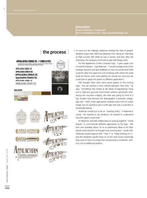
the process<br />
To carry out the redesign, Bateman enlisted the help of graphic<br />
designer Logan Hall. Hall knew Bateman from doing an internship<br />
at High Country 365 while he was in school, and even after the<br />
internship, the company continued to give Hall design work.<br />
For the Appalachia Cookie Company logo, “I gave Logan a lot<br />
of creative freedom,” says Bateman. “I would manage some of the<br />
strategic direction and give feedback on how we would work with<br />
a specific idea, but I gave him a lot of leeway with where we could<br />
build the brand, what color palettes we should use, and how we<br />
could start to apply the system to different applications.”<br />
Hall thought there were some good aspects to the existing<br />
logo, “but we wanted a more refined approach than that,” he<br />
says, “something that hinted at the ideals of Appalachian living<br />
and a high-end gourmet food brand without specifically referencing<br />
the mountain imagery. We were also going for kind of a<br />
hip, modern look because the demographic is primarily collegeage<br />
kids.” Hall’s initial approaches retained some kind of cookie<br />
image, but he wanted to pair it with type that had a script-like or<br />
handmade feeling.<br />
Holloman turned out to be an “exacting client,” in Bateman’s<br />
words. “He wanted to see iterations, he wanted to understand<br />
how the system could work.”<br />
So Bateman and Hall collaborated on putting together “mood<br />
boards” to communicate different approaches to the logo. “We<br />
sent over probably about 10 or so preliminary ideas to let Dave<br />
decide what direction he thought was working best,” recalls Hall.<br />
Holloman would respond with “I like it” or “Keep working on it,”<br />
and the designers would move on to the next round. Eventually<br />
they came to focus on a logo that was primarily a wordmark, without<br />
a lot of additional graphics.<br />
› › photoshop user › february <strong>2016</strong><br />
066