Viva Brighton Issue #56 October 2017

You also want an ePaper? Increase the reach of your titles
YUMPU automatically turns print PDFs into web optimized ePapers that Google loves.
DESIGN<br />
...................................<br />
of beer, we now favour something novel but of<br />
reliable provenance.”<br />
The boom in small drinks producers has<br />
undoubtedly created new business, but the<br />
downside, says Lee, is that “we’re in a transient<br />
stage where brands live and die very quickly.”<br />
The trick to creating one that lasts, he says, is<br />
to recognise the difference between building a<br />
brand and just trying to be different. “You can<br />
shock quite easily. You can create something<br />
new, unusual, but it isn’t necessarily something<br />
that will seep into your consciousness. A brand<br />
that is created properly will do that.”<br />
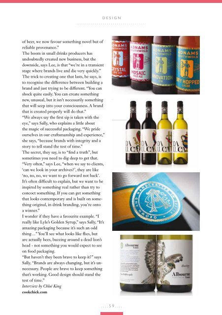
“We always say the first sip is taken with the<br />
eye,” says Sally, who explains a little about<br />
the magic of successful packaging. “We pride<br />
ourselves in our craftsmanship and experience,”<br />
she says, “because brands with integrity and a<br />
story to tell stand the test of time.”<br />
The secret, they say, is to “find a truth”, but<br />
sometimes you need to dig deep to get that.<br />
“Very often,” says Lee, “when we say to clients,<br />
‘can we look in your archives?’, they are like<br />
‘no, no, no, we want to go forward not back’.<br />
It’s often difficult to explain, but we want to be<br />
inspired by something real rather than try to<br />
concoct something. If you can get something<br />
that looks contemporary and is built on something<br />
original, in drink branding, you’re onto<br />
a winner.”<br />
I wonder if they have a favourite example. “I<br />
really like Lyle’s Golden Syrup,” says Sally, “It’s<br />
amazing packaging because it’s such an odd<br />
thing…” You’ll see what looks like flies, but<br />
are actually bees, buzzing around a dead lion’s<br />
head - not something you would expect to see<br />
on food packaging.<br />
“But haven’t they been brave to keep it?” says<br />
Sally. “Brands are always changing, but it’s unnecessary.<br />
People are brave to keep something<br />
that’s working. Good design should stand the<br />
test of time.”<br />
Interview by Chloë King<br />
cookchick.com<br />
....59....