
You also want an ePaper? Increase the reach of your titles
YUMPU automatically turns print PDFs into web optimized ePapers that Google loves.
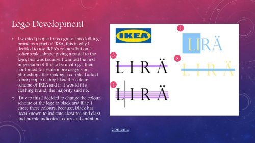
Logo Development<br />
1<br />
o I wanted people to recognise this clothing<br />
brand as a part of IKEA, this is why I<br />
decided to use IKEA’s colours but on a<br />
softer scale, almost giving a pastel to the<br />
logo, this was because I wanted the first<br />
impression of this to be inviting. I then<br />
continued to create more designs on<br />
photoshop after making a couple, I asked<br />
some people if they liked the colour<br />
scheme of IKEA and if it would fit a<br />
clothing brand; the majority said no.<br />
o<br />
Due to this I decided to change the colour<br />
scheme of the logo to black and lilac. I<br />
chose these colours, because, black has<br />
been known to indicate elegance and class<br />
and purple indicates luxury and ambition.<br />
3<br />
4<br />
Contents<br />
2