GIMP Magazine 2
The second GIMP Magazine has a lot of new and interesting topics to read and learn more about GIMP. In this issue you find a master class by Yeshua Nel. The digital artist shows step by step how he creates a masterpiece. On page 29 Madeleine Fisher gives a tutorial on how to create a graphic novel using GIMP. An oil painting tutorial by Susanna Bur can be found on page 42.
The second GIMP Magazine has a lot of new and interesting topics to read and learn more about GIMP. In this issue you find a master class by Yeshua Nel. The digital artist shows step by step how he creates a masterpiece. On page 29 Madeleine Fisher gives a tutorial on how to create a graphic novel using GIMP. An oil painting tutorial by Susanna Bur can be found on page 42.

You also want an ePaper? Increase the reach of your titles
YUMPU automatically turns print PDFs into web optimized ePapers that Google loves.
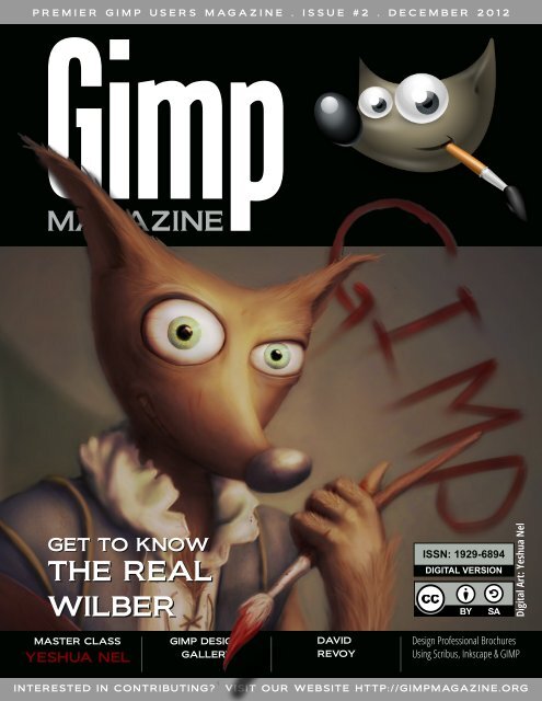
P R E M I E R G I M P U S E R S M A G A Z I N E . I S S U E # 2 . D E C E M B E R 2 0 1 2<br />
GET TO KNOW<br />
THE REAL<br />
WILBER<br />
MASTER CLASS<br />
YESHUA NEL<br />
<strong>GIMP</strong> DESIGN<br />
GALLERY<br />
DAVID<br />
REVOY<br />
ISSN: 1 929-6894<br />
DIGITAL VERSION<br />
INTERESTED IN CONTRIBUTING? VISIT OUR WEBSITE HTTP://<strong>GIMP</strong>MAGAZINE.ORG<br />
Digital Art: Yeshua Nel<br />
Design Professional Brochures<br />
Using Scribus, Inkscape & <strong>GIMP</strong>
g i m p m a g a z i n e . o r g<br />
2<br />
M A G A Z I N E C O N T E N T S<br />
FEATURE<br />
67<br />
5<br />
10<br />
20<br />
22<br />
24<br />
26<br />
LETTER FROM THE EDITOR<br />
MARTÍN ESCHOYEZ<br />
PRZEMYSLAW GEREMEK<br />
MARIA WENDT<br />
JEREMY GOOCH<br />
MASTER CLASS BY YESHUA NEL<br />
Yeshua Nel is a digital artist who has a passion for art—maybe even a<br />
“slight obsession,” according to him. This master class is a highlevel,<br />
step-by-step guide to how Yeshua started with a basic digital drawing<br />
and created a finished product called “Wilber” in six major steps using<br />
<strong>GIMP</strong>.<br />
DAVID REVOY, FOR <strong>GIMP</strong> MAGAZINE<br />
David Revoy is an illustrator / concept artist living and working in the<br />
south of France (Toulouse) as a freelancer since 2002. <strong>GIMP</strong> <strong>Magazine</strong><br />
asked David to contribute and here is his story.<br />
29<br />
GRAPHIC NOVEL<br />
<strong>GIMP</strong> TUTORIAL<br />
Madeleine Fisher is a<br />
Superhero by Day, Graphic<br />
Novelist by Night.<br />
Madeleine shares her story<br />
with us, as well as a full<br />
tutorial on how she creates<br />
graphic novels using <strong>GIMP</strong>.
42<br />
48<br />
80<br />
90<br />
94<br />
OIL PAINTING TUTORIAL<br />
USING <strong>GIMP</strong> BY SUSANNA<br />
BUR<br />
TUTORIAL: DESIGN<br />
PROFESSIONAL BROCHURES<br />
USING <strong>GIMP</strong>, INKSCAPE<br />
AND SCRIBUS<br />
TUTORIAL: USING A GRAPHIC TABLET<br />
WITH <strong>GIMP</strong> BY ROLF STEINORT<br />
<strong>GIMP</strong> DESIGN GALLERY<br />
Some of the most outstanding Digital Art<br />
from around the world—all created<br />
using <strong>GIMP</strong>.<br />
66<br />
THE HUNT FOR WILBER, A SPECIAL FEATURE<br />
BY DAVE LEPEK<br />
PRODUCT REVIEW<br />
The Artist's Guide to <strong>GIMP</strong>, a book review<br />
by Oma Dial<br />
g i m p m a g a z i n e . o r g<br />
3
g i m p m a g a z i n e . o r g<br />
4
L E T T E R F R O M T H E E D I T O R<br />
First, I want to sincerely thank everyone for your overwhelming support of our launch of <strong>GIMP</strong><br />
<strong>Magazine</strong>. Upon the announcement of our launch teaser (in July) we accumulated over 2,500 followers<br />
and roughly 20,000 page views from all parts of the world—and this happened over a weekend.<br />
All of this was based on a mock cover design, a website, social media properties, and an idea to<br />
make the coolest <strong>GIMP</strong> magazine ever. The notion that this is going to be an international magazine<br />
quickly grew as some subscribers from New Zealand asked for clarification of "Fall 2012" (something<br />
I never considered).<br />
<strong>GIMP</strong> <strong>Magazine</strong> - Issue 1 was downloaded over<br />
10,000 times in the first 24 hours, shattering all expectations<br />
and estimates. And our website views<br />
exploded to over 60,000 all while doubling our followers.<br />
Wow! Besides the numbers, most important<br />
were your comments, of which so many were<br />
positive. We greatly appreciate your comments as<br />
they drive us to do more. We want to get better at<br />
this and your constructive criticisms are helping. It<br />
does take significant effort from many people to<br />
produce this magazine, including our team and<br />
submitters.<br />
I am really excited about Issue 2, as it features<br />
digital arts, illustrations, graphic novels, tutorials, a<br />
book review, and so much more. We have had<br />
some pretty spectacular submissions to date, and<br />
the cover art by Yeshua Nel is simply outstanding.<br />
Acting as a curator of this magazine has become a<br />
more difficult task given the amazing submissions<br />
that we are receiving. And the fact that Yeshua and<br />
all the other contributors are willing to share their<br />
art and process under a Creative Commons licence<br />
with the world is pretty incredible.<br />
The format has been revised slightly for Issue 2.<br />
The magazine has been reformatted for professional printing. We are planning to make all issues<br />
from here on in available in a glossy, print-on-demand format. We are now accepting donations and<br />
you can also support us by buying official <strong>GIMP</strong> <strong>Magazine</strong> merchandise available from our gift shop.<br />
These items help us to cover the ongoing costs associated with running a free publication.<br />
I think for me the most spectacular thing is not what we have produced so far in Issues 1 and 2,<br />
but rather the enormous potential that <strong>GIMP</strong> <strong>Magazine</strong> has for the future. There are so many amazing<br />
opportunities that lie before us with this publication, and we can only make it better with your<br />
help. We would love to hear your ideas as to what you would like to see <strong>GIMP</strong> <strong>Magazine</strong> become—after<br />
all, it is your publication. Share your ideas with us on Twitter (www.twitter.com/gimpmagazine),<br />
on Google+ (+<strong>GIMP</strong> <strong>Magazine</strong>), on our website (http://gimpmagazine.org), or simply send<br />
us an email at gimpmagazine@hotmail.ca. With that, we (the <strong>GIMP</strong> <strong>Magazine</strong> Team) proudly leave<br />
you with Issue 2. There are many more <strong>GIMP</strong> users that we want to reach, so do us a favor and continue<br />
to spread the word.<br />
Enjoy!<br />
Cheers<br />
Steve<br />
http://www.twitter.com/steveczajka<br />
http://steveczajka.posterous.com<br />
g i m p m a g a z i n e . o r g<br />
5
A SPECIAL THANKS TO...<br />
HTTP://MEETTHE<strong>GIMP</strong>.ORG<br />
HTTP://SCRIBUS.NET<br />
HTTP://SMASHINGMAGAZINE.COM<br />
HTTP://PHOTOGRAPHYBLOG.COM<br />
HTTP://HOWTOGEEK.COM<br />
HTTP://CHIP.PL<br />
HTTP://MUKTWARE.COM<br />
+<strong>GIMP</strong> ON GOOGLE+<br />
HTTP://<strong>GIMP</strong>USERS.COM<br />
HTTP://<strong>GIMP</strong>USERS.DE<br />
HTTP://OPENNET.RU<br />
HTTP://OSTATIC.COM<br />
HTTP://OSWORLD.PL<br />
HTTP://NL.FOTOVIDEO.NU<br />
HTTP://GOLEM.DE<br />
HTTP://WYKOP.PL<br />
HTTP://PLANET.UBUNTUUSERS.DE<br />
HTTP://PHOTOGEEK.FR<br />
HTTP://<strong>GIMP</strong>FR.ORG<br />
HTTP://<strong>GIMP</strong>FORUMS.COM<br />
HTTP://<strong>GIMP</strong>TALK.COM<br />
HTTP://DYSCULTURED.COM<br />
ISSUE #2 . DECEMBER 2012<br />
EDITORIAL TEAM:<br />
Steve Czajka, Managing Editor<br />
Design & Desktop Publishing<br />
Jorden Grau, All things Editing / Submissions<br />
Dave Lepek, Contributing Writer / Editing Assistance<br />
Oma Dial, All things Product Reviews<br />
Rolf Steinort, All things Web<br />
Sandra Livingston, All things Proof / Editing<br />
LEGAL:<br />
<strong>GIMP</strong> <strong>Magazine</strong> does not take any responsibility, express<br />
or implied, for the material and its nature or accuracy of the<br />
information which is published in this magazine. All the<br />
materials presented in this magazine have been produced<br />
with the express permission of their respective<br />
authors/owners.<br />
<strong>GIMP</strong> <strong>Magazine</strong> and the contributors disclaim all<br />
warranties, express or implied, including but not limited to<br />
implied warranties of merchantability or fitness for a<br />
particular purpose. All images and materials presented in<br />
this document are printed/reprinted with express<br />
permission from the authors and/or writers. The content<br />
responsibility lies completely with the contributing writer or<br />
the author of the article, and may not be representative of<br />
the views of the publisher.<br />
This PDF magazine is free and available from the <strong>GIMP</strong><br />
<strong>Magazine</strong> website. <strong>GIMP</strong> <strong>Magazine</strong> is made available under<br />
Creative Commons "Attribution-Share Alike 2.5" license.<br />
<strong>GIMP</strong> <strong>Magazine</strong> trademark logo is copyright by the owner<br />
Steve Czajka.<br />
ADVERTISING:<br />
Please visit our website to view our advertising rate card<br />
and policies at http://gimpmagazine.org/about .<br />
HOW TO CONTACT <strong>GIMP</strong> MAGAZINE:<br />
Email: <strong>GIMP</strong><strong>Magazine</strong> at hotmail dot ca<br />
Website: http://gimpmagazine.org<br />
Twitter: www.twitter.com/<strong>GIMP</strong><strong>Magazine</strong><br />
Google+: +<strong>GIMP</strong> <strong>Magazine</strong><br />
Publication Origin: Mississauga, Ontario, Canada<br />
PRODUCTION NOTES:<br />
<strong>GIMP</strong> <strong>Magazine</strong> was created using Scribus 1.4.1, <strong>GIMP</strong><br />
2.6/2.8, Inkscape 0.47. Biondi was used for headlines,<br />
Open Sans and Open Sans Condensed for house<br />
typography. And we can't forget "the coolest mascot" ever,<br />
Wilber, adorning the front cover and various locations! ISSN<br />
1929-6894 (online), ISSN 1929-8498 (print).<br />
g i m p m a g a z i n e . o r g<br />
7
g i m p m a g a z i n e . o r g<br />
8<br />
S I N C E R E T H A N K S F R O M G I M P M A G A Z I N E<br />
KARL GEIGER JR4<br />
Awesome!<br />
IAN MUTTOO<br />
Congrats on issue 1! It<br />
looks great - and I'm happy<br />
to be a part of it.<br />
REID BAKER @REID_BAKER<br />
Congratulations to<br />
@<strong>GIMP</strong><strong>Magazine</strong> on the<br />
launch of issue #1...great<br />
work!<br />
DUNCAN @DUNCANHIMSELF<br />
@<strong>GIMP</strong><strong>Magazine</strong> Just<br />
read the first issue. Looks<br />
great.<br />
ΛΕΩΝΊΔΑΣ ΚΑΔΉΣ<br />
That was a great move!! A<br />
Bravo to all of you!!!<br />
KELLIANNE HUTCHINSON<br />
Awesomeness!<br />
LUKE GOODLING<br />
Awesome idea! :D<br />
DEVO BIDEAU<br />
I'm a fan.<br />
THOMAS HEINE<br />
...I am very impressed.<br />
RENÉ SANDOVAL @2ALIN<br />
@<strong>GIMP</strong><strong>Magazine</strong> I'm so<br />
impressed with the first<br />
issue. Looking forward to<br />
the next. Thanks and<br />
congrats!! :D<br />
MISTERMATT2U<br />
@MISTERMATT2U<br />
Just read the first issue of<br />
@<strong>GIMP</strong><strong>Magazine</strong>. Really<br />
enjoyed in. #<strong>GIMP</strong> is a great<br />
tool. Really really happy that<br />
it is now native on OS X too!<br />
TONI TALLEY @2TONTONI<br />
@<strong>GIMP</strong><strong>Magazine</strong> love the<br />
mag, read it cover to cover<br />
in one sitting, I couldn't put<br />
it down! So much great info.<br />
And the tutorial rocks!<br />
FILIPPO VENIERO<br />
@IFILGOOD_NET<br />
@<strong>GIMP</strong><strong>Magazine</strong> great<br />
job :-)<br />
ANDRE DE JESUS @A_DE_JESUS<br />
@<strong>GIMP</strong><strong>Magazine</strong> Great<br />
article with Ian Muttoo. His<br />
tip on using UFRaw was<br />
great being a new Rebel T3i<br />
owner its great to know I<br />
can shoot Raw<br />
ISHA(MARYSIAKUROWSKI<br />
@ISHABLUEBELL<br />
Great free 50 page pdf<br />
mag about the free graphics<br />
program Gimp<br />
http://gimpmagazine.org/<br />
thanks<br />
LUDOVIC CELLE @LUDOVICCELLE<br />
@<strong>GIMP</strong><strong>Magazine</strong> Thanks!<br />
Great job too on the whole<br />
magazine! It is a very<br />
professional mag, real high<br />
class show for Gimp !<br />
Congrats!!<br />
@TRAD76<br />
@<strong>GIMP</strong><strong>Magazine</strong> thank<br />
you :)<br />
CHEREPANOV ANDREY<br />
@ANDREYKAUF<br />
@<strong>GIMP</strong><strong>Magazine</strong> Good<br />
work, guys! Long Live<br />
Wilber!<br />
SCOTT PHILLIPS @EASTBYSOUTH<br />
@<strong>GIMP</strong><strong>Magazine</strong><br />
congratulations on the<br />
publication of Issue 1! On<br />
my #readinglist for today,<br />
can't wait to dive in<br />
#<strong>GIMP</strong>mag<br />
AARONDELANEY1983<br />
@ENGLISHYAM1983<br />
@<strong>GIMP</strong><strong>Magazine</strong> well<br />
done on issue #1, just had a<br />
quick glance, looks fantastic.<br />
MANUFACTURA IND.<br />
@MANUFACTURAIND<br />
@<strong>GIMP</strong><strong>Magazine</strong><br />
Congratulations on the<br />
release! Wonderful to see<br />
the libre design press field<br />
get richer :-)<br />
PIXEL TO VOXEL @PIXELTOVOXEL<br />
@<strong>GIMP</strong><strong>Magazine</strong> Great<br />
work guys!! Nice <strong>Magazine</strong> :)<br />
CHRIS<br />
...Congrats for the<br />
magazine release, must<br />
have been a lot of work.<br />
ARAM GRIGORYAN<br />
Great work from great<br />
people for great<br />
community…<br />
Thank you !!!<br />
DIMITRI ROBERT<br />
I enjoy to read this<br />
magazine that looks<br />
beautiful and interesting.<br />
MARIA<br />
I read and loved it! So<br />
exciting! I’m working on a<br />
project that I want to<br />
submit! I would love to<br />
make the front page!!<br />
SAVANNAH SOFTWARE<br />
This is exciting! Spreading<br />
the word.<br />
JEREMY<br />
Worked great for me on<br />
my tablet. I can`t wait untill<br />
the next issue. Keep up the<br />
good work!<br />
JORGE E.<br />
Great stuff! So glad to<br />
finally see this happening. I<br />
really want to learn Gimp,<br />
sometimes I struggle to find<br />
where to start.<br />
MIKE BING<br />
Wonderful magazine,<br />
well-written and excellent<br />
level of content. Feel very<br />
related to Ian (cover story) –<br />
there’s so much he says<br />
that rings a bell, it’s creepy!<br />
DINA BLASZCZAK<br />
Thanks for the magazine,<br />
looking forward to the next<br />
issue!<br />
LOLITHA RATNAYAKE<br />
Great work guys!<br />
REYNANTE M. MARTINEZ<br />
Great to see <strong>GIMP</strong> finally<br />
has a magazine to be<br />
featured with, and it has all<br />
the right to be.<br />
Looking forward to more<br />
issues.<br />
‘Grats, team. -Reyn<br />
JALOVELESS<br />
Excellent. I have been a<br />
long time user of Gimp but<br />
was self taught and I know I<br />
was missing a great deal by<br />
not really knowing what I<br />
was doing much of the time.<br />
The magazine will be an<br />
inspiration to me to start<br />
anew. Great job, guys and<br />
ladies! Thanks. Jon<br />
CHRIS KILBY<br />
This is belting. I really<br />
hope this flies well – thanks.<br />
CLEMENS ON<br />
Just awesome, guys<br />
Thanks alot^^<br />
VMEDEL<br />
thanks a lot !<br />
FABRICIO ROMERO<br />
Excellent… from<br />
Venezuela thanks a lot<br />
LOIC97450<br />
coooool!!!!!<br />
BWENDO<br />
Great new innovation<br />
JOHN.STILES<br />
Looks great, looking<br />
forward to reading it.<br />
PAUL @PAULSAVAGE<br />
who knew that there was<br />
a magazine for <strong>GIMP</strong>? cool!<br />
JEAN-LOUP R-S @JEAN_LOUP
This could prove really<br />
quite useful as a resource :)<br />
<strong>GIMP</strong> <strong>Magazine</strong> originally<br />
shared this…<br />
THOMAS HEINE<br />
Thanks for your efforts<br />
and impressive work,<br />
+<strong>GIMP</strong> <strong>Magazine</strong> :)<br />
TROY LAUFFER +2<br />
I miss Photoshop a lot. A<br />
whole lot. But Gimp has<br />
surprised me with how<br />
powerful it can be if you<br />
know how it likes to be<br />
tickled. I can't wait to dig in!<br />
JOHN MCCORMACK<br />
Sincere thanks<br />
CHRIS FIEDLER<br />
Congrats to the first issue<br />
of the gimp-magazine!<br />
LOST TRIBE<br />
Awesome work! Thanks<br />
for that!<br />
Wow, Im on 10 page...<br />
EMANUL NOMAN<br />
Great<br />
BRANKO STRIHIC<br />
Congrats!<br />
TIMOTHY BURDINE<br />
the best :)<br />
STEVEN ELLEN STARAR<br />
Very nice!<br />
NICO KEMPE<br />
Awesome!<br />
BORIS PEJIC<br />
Great magazin ;)<br />
POPURI SAI DHRUV<br />
owesome<br />
STUART MCDERMID<br />
Bring out the <strong>GIMP</strong>!<br />
ROBERT FROST<br />
ROBERT FROST<br />
AWESOME<br />
JONAS TIRUNAS<br />
I like this! Glad you guys<br />
are doing this! Best of luck<br />
for new issues.<br />
JOHN MALLOY<br />
Great read, looking<br />
forward to the artist<br />
reviews.<br />
Thanks again for my daily<br />
inspiration!!!<br />
KEVIN HODGES<br />
Great job! I look forward<br />
to the next issue.<br />
ELVIN SURTIDA<br />
Owesome!<br />
LAWRENCE LAGERLOF<br />
Shit, this is awesome!<br />
GEORGE HAYES<br />
very cool about time<br />
someone came out with<br />
this. Great work.<br />
HIMITSU ANIMO<br />
Woo-hoo! :)<br />
MUHAMMAD MAAHIR<br />
So awesome<br />
SHAILESH GYAWALI<br />
wow Finally. thank you<br />
JOSEPH KAYCES<br />
awesome<br />
JIMMY NAIDOO<br />
Was worth the wait...<br />
SUSAN DEVY<br />
awesome ! great job !<br />
OUSSAMA BOUNAIM<br />
Congratulations keep the<br />
good work.<br />
OSCAR MONZÓN<br />
Downloading it right now.<br />
Congratulations, keep up<br />
the good work!.<br />
HORST JENS<br />
already subscribed. will<br />
spread the word. keep<br />
making awesome<br />
magazines !<br />
IMAGISPEAK<br />
wow!! very cool!!<br />
BRIAN A CATNUT<br />
Nice Job, it looks great !!!<br />
NEWMIKEY<br />
Excellent read!<br />
LANCEKINGPHOTO<br />
I enjoyed the first issue<br />
very much. This is some<br />
quality work! It's<br />
encouraging to see there<br />
are serious professionals<br />
using <strong>GIMP</strong> - and creating<br />
fantastic art! rodbotic<br />
thanks<br />
FRANZ CHRISTOPHER<br />
@LEGIONZERO<br />
A high quality free<br />
magazine made entirely of<br />
#FOSS simply awesome! Go<br />
#<strong>GIMP</strong> #INKSCAPE<br />
#SCRIBUS<br />
FRED<br />
yeeeaaah boi. this is<br />
exactly what <strong>GIMP</strong> needs.<br />
Hopefully can this will help<br />
to convert to <strong>GIMP</strong> for good.<br />
JOHN BUK<br />
This is excellent news...this<br />
magazine will be a boon.<br />
Good luck to you all.<br />
COWBOY NICK<br />
So awesome! I’ve always<br />
wanted to dig in deep with<br />
gimp, and this will be a<br />
preferred resource. Thanks<br />
again!<br />
RICHARD<br />
This is going to be great.<br />
DEB SPOONS<br />
Great Idea on the back to<br />
school theme! Always nice to<br />
find information on one<br />
page..can not wait to try it<br />
out.<br />
WYATT<br />
I am so incredibly excited<br />
for this to come out!<br />
ANDREAS HEIMOWSKI<br />
You make a great Job!<br />
THANKS! … for this Mag.<br />
JOHN<br />
Hi. Great news about the<br />
magazine. Really good<br />
timing as I am soon to<br />
launch a serious endeavour<br />
to encourage our school art<br />
department to consider<br />
using <strong>GIMP</strong>. As another from<br />
downunder I agree with<br />
previous poster about<br />
referring to issues by month,<br />
or maybe 1st Quarter, 2nd<br />
Quarter etc. Looking good.<br />
g i m p m a g a z i n e . o r g<br />
9
DAVID REVOY, FOR <strong>GIMP</strong> MAGAZINE<br />
David Revoy is an illustrator / concept artist living and working in the south of France (Toulouse) as a freelancer since<br />
2002. <strong>GIMP</strong> <strong>Magazine</strong> asked David to contribute and here is his story. David's website is http://www.davidrevoy.com<br />
and he can be reached at info@davidrevoy.com. This interview with <strong>GIMP</strong> <strong>Magazine</strong> took place on 2012-08-10.<br />
HOW AND WHEN DID YOU GET STARTED WITH YOUR<br />
ART?<br />
I think I wanted to stick seriously with the idea to become an<br />
artist at around 12 years old. It sounds an early age for a life<br />
choice, but I felt really too seriously concerned by the question of<br />
adults around me: "What do you want to do in the future?" I had<br />
to find a quick and definitive solution to answer this. As I was a<br />
young geek creative boy, I decided to be a comics author. Comics<br />
appeared to me the most full art, and I started to train hard [on]<br />
my drawing skill. But my own comics while I was a teenager were<br />
mostly only made with the part of the "concept-art dossier," not<br />
so much of real story pages. Designing all characters, scenes,<br />
clothes—a universe—was a real passion for me. That's how I discovered<br />
I would love the work of concept artist and illustrator<br />
(and more, art director), which all include a bit of what I love. On<br />
the “how” question, I'm mostly a self-taught artist and started<br />
more than 10 years ago, when [the] Internet and computers<br />
were not in all houses like today.<br />
WHO OR WHAT INFLUENCED YOU THE MOST TO PURSUE<br />
THIS PASSION?<br />
I got a pretty big immersion when I was kid with an RPG game<br />
named "Secret of Mana" on the Nintendo Super Famicom/SNES.<br />
I'll never forget the immersive power of this game, and till today<br />
I'm motivated to one day create something of the same excellence.<br />
WHAT TYPE OF WORK DO YOU DO?<br />
I paint mainly book-cover illustrations for the printing industry<br />
and draw concept art of characters and environments for video<br />
games and movies. I also do training DVDs, and teach in school,<br />
at workshop events, etc.<br />
DESCRIBE YOUR CREATIVE PROCESS.<br />
I have various creative processes. I 'll try to make a little list of<br />
the first that came to my mind.<br />
• Take notes after waking up from an interesting dream (might<br />
g i m p m a g a z i n e . o r g<br />
11
g i m p m a g a z i n e . o r g<br />
have pretty creative contents)<br />
• Watch chaotic shapes (clouds , concrete, fractal imagery) and try<br />
to make sense of it<br />
• Play with Blender 3D and build a scene with random modelled<br />
objects<br />
• Just get an idea and sketch on my sketchbook<br />
TELL US SPECIFICALLY ABOUT THE “CENDREA” IMAGE.<br />
“Cendrea” is a fully video-recorded illustration done to be the<br />
cover of my first training DVD, Chaos & Evolutions. It’s an open<br />
workshop DVD (under Creative Commons Attribution licence),<br />
about digital painting with <strong>GIMP</strong> Painter. I wanted to paint a portrait<br />
for it, inspired by a character design I do in the DVD too.<br />
DESCRIBE YOUR OVERALL DIGITAL PROCESS.<br />
Well, that’s a bit complex and long to write. I create pictures<br />
from scratch on a white digital canvas using a pen tablet. I'll attach<br />
pictures of the work-in-progress of “Cendrea” just to let you<br />
see how things evolve. Most of my process, tutorials, and my two<br />
open DVDs are also available online, under the Tutorial category<br />
of my website http://www.davidrevoy.com/4-tutorials.html<br />
TELL US ABOUT HOW YOU CAME TO USE <strong>GIMP</strong> AND / OR<br />
OTHER OPEN SOURCE GRAPHICS TOOLS?<br />
I started as a poor CG artist, and I always refused to fall into<br />
piracy. That’s how I discovered the free-offer world. My first freelancing<br />
studio ran with <strong>GIMP</strong> 2.2, Photoshop Elements 2, Inkscape,<br />
and Blender. But with time, I had problems with the clients<br />
who wanted CMYK pictures for book covers or board games. I<br />
had to buy Photoshop CS2 for this feature.<br />
Then my studio evolved with more new costly apps, like Painter<br />
9.5 or Manga Studio 3. When Microsoft Vista was a default on<br />
new computers at this time, I had an issue with reinstalling my<br />
paid licences. The only way to solve this issue was to pay for upgrades,<br />
and they were really expensive. So expensive that it was<br />
cheaper to buy back an old computer with XP. I started to see the<br />
total nonsense of proprietary software, and started to get interested<br />
in Linux distributions. I started to play with Ubuntu in 2006.<br />
Being around open source software I also got contacted to do<br />
the art direction on Sintel, the third open movie of the Blender<br />
Foundation, a good challenge to do all the concept art and illustrations<br />
of the preproduction with open sources on Linux.<br />
At this time, <strong>GIMP</strong> Painter 2.6, MyPaint 0.7, and Alchemy were<br />
the best of the digital painting with FLOSS. I'm happy about last<br />
year’s development, the direction MyPaint took, and how Krita<br />
totally got transformed in the last three years to be the reference<br />
as digital painting software. For <strong>GIMP</strong>, I stopped using it full-time<br />
since the 2.8 update at the start of 2012 . I still open it time to<br />
time, mainly for filters.<br />
WHAT COULD THE <strong>GIMP</strong> DEVELOPERS DO TO MAKE <strong>GIMP</strong><br />
3.0 A BETTER PAINT PACKAGE?<br />
I’ve already spent full days working on it with the <strong>GIMP</strong> Mental<br />
Models team, doing long webcam interviews and writing detailed<br />
reports, and I got no feedback. So I doubt my opinion here is<br />
wanted or important. Digital painters like me are not the target<br />
12<br />
TITLE: “LUCID LYNX” (ABOVE, P.10)<br />
DESCRIPTION: AN HOMAGE TO ONE OF MY<br />
FAVORITE LINUX DISTRIBUTIONS. UBUNTU<br />
LUCID LYNX WAS A REALLY MATURE<br />
DISTRIBUTION, AS ALL LTS AND RECENT<br />
PRECISE PANGOLIN. TOO BAD I'M NOT LIKING<br />
GNOME 3’S NEW ERGONOMY AND UBUNTU<br />
UNITY. I’VE SWITCHED TO KUBUNTU 12.04<br />
NOW, WHICH IS ADORABLE.<br />
DONE WITH <strong>GIMP</strong> PAINTER 2.6 AND MYPAINT<br />
1.0
TITLE: “ANCIENT BEAST VOLCANO CREATURE” (ABOVE)<br />
DESCRIPTION: A VOLCANO CREATURE DONE FOR THE ANCIENT BEAST OPEN GAME<br />
CREATION.<br />
DONE WITH KRITA 2.5 AND MYPAINT 1.0
TITLE: “QUETZALCOAT” (LEFT)<br />
DESCRIPTION: A PAINTING FOR THE TRAINING<br />
DVD CHAOS & EVOLUTIONS<br />
DONE WITH <strong>GIMP</strong> PAINTER 2.6 AND MYPAINT 0.8<br />
users of the newer <strong>GIMP</strong> (and never were; that’s why <strong>GIMP</strong> Painter<br />
was a fork).<br />
From <strong>GIMP</strong> Painter 2.6 to actual <strong>GIMP</strong> 2.8 there is a big gap.<br />
I'm happy if the <strong>GIMP</strong> team focuses now on serving other users<br />
with specific needs, such as photographer tweaks or specific image<br />
manipulation.<br />
Digital painters now have Krita and MyPaint, which are both<br />
very powerful. It would be silly to duplicate effort on this side<br />
now, in my opinion.<br />
WHERE DO YOU SEE THE FUTURE OF <strong>GIMP</strong>?<br />
I have no idea. I think as it is now, just more solid, more featured.<br />
Or maybe largely simplified to win the attention of a larger<br />
public, at the cost of the professional users.<br />
WHERE DO YOU SEE YOUR ART GOING? AND WHAT PRO-<br />
JECTS ARE YOU WORKING ON NOW THAT YOU WANT TO<br />
PROMOTE?<br />
I have no idea too at all about my art. I work for the moment to<br />
get more effective, to find a good balance between good quality<br />
and time of creation. Mainly to come back to visual storytelling. I<br />
didn't produce any personal artwork for months; mainly sketchbook<br />
studies.<br />
The project I want to promote is, of course, Tears of Steel (http://mango.blender.org/),<br />
the fourth open movie of the Blender<br />
Foundation, where I did concept art and helped on storyboarding.<br />
AND HOW CAN PEOPLE CONTACT YOU (WEBSITE, TWIT-<br />
TER, ETC.)?<br />
Website http://www.davidrevoy.com<br />
Email info@davidrevoy.com<br />
Twitter https://twitter.com/davidrevoy<br />
Deviant.Art http://deevad.deviantart.com/ ■<br />
g i m p m a g a z i n e . o r g<br />
15
g i m p m a g a z i n e . o r g<br />
16<br />
TITLE: “MEETING UNDER THE TREE” (TOP RIGHT)<br />
DESCRIPTION: A SPEED PAINTING FOR THE TRAINING DVD<br />
CHAOS & EVOLUTIONS<br />
DONE WITH <strong>GIMP</strong> PAINTER 2.6 AND BLENDER<br />
TITLE: “MISSION” (MIDDLE RIGHT)<br />
DESCRIPTION: A PAINTING DONE WITH A 3D BASE, FOR<br />
THE DVD BLEND & PAINT<br />
DONE WITH BLENDER 2.6, <strong>GIMP</strong> PAINTER 2.6, AND<br />
MYPAINT 1.0<br />
TITLE : “LEZARD” (BOTTOM RIGHT)<br />
DESCRIPTION: ONE OF THE FIRST SCREEN RECORDINGS I<br />
DID BEFORE CHAOS & EVOLUTIONS, SHOWING FOR THE<br />
FIRST TIME MY DIGITAL PAINTING WORKFLOW.<br />
DONE WITH <strong>GIMP</strong> PAINTER 2.6 AND MYPAINT 0.7<br />
TIMELAPSE (HTTPS://VIMEO.COM/6143607)<br />
TITLE: “CENDREA” (IMAGE SET BELOW P.18,19)<br />
DESCRIPTION: INCLUDED IN THE INTERVIEW. THERE ARE ALSO THREE WORK-IN-PROGRESS STEPS IN THE<br />
ARCHIVE.
Texture: flickr CC BY Neighya
TITLE: "366 DIBUJOS" (366 DRAWINGS)<br />
ABOUT MARTÍN: I'M A SELF-TAUGHT DESIGNER / ANIMATOR / CG ARTIST &<br />
TEACHER BASED IN ARGENTINA, STRONG PROMOTER OF LIBRE / OPEN SOURCE<br />
SOFTWARE. I AM ALSO A PROFESSOR AT VARIOUS INSTITUTES, AND I'VE GIVEN<br />
TALKS AND WORKSHOPS COVERING OPEN SOURCE TOOLS FOR DESIGN AND<br />
ANIMATION.<br />
DESCRIPTION: THIS IS MY LITTLE PROJECT 366 DRAWINGS, ONE PER DAY.<br />
WEBSITE MY STUDIO & ALTER EGO WWW.EPANIMATION.COM.AR<br />
WEBSITE THE VACUI SPACII OPEN PROJECT WWW.VACUISPACII.ORG<br />
g i m p m a g a z i n e . o r g<br />
21
g i m p m a g a z i n e . o r g<br />
22
Przemyslaw Geremek<br />
TITLE: "PANM+ÔZGDRUK" (LEFT) AND "LUST" (ABOVE)<br />
ABOUT PRZEMYSLAW: PRZEMYSLAW IS FROM POLAND, WORKING AS FREELANCER (IN GAME DEVELOPMENT) IN<br />
THE EVENINGS, AFTER HIS FULL-TIME JOB. PRZEMYSLAW LIKES SCI-FI AND FANTASY, AND THESE IMAGES ARE<br />
MOSTLY MADE IN THIS MOOD. PRZEMYSLAW USES ONLY <strong>GIMP</strong>.<br />
DESCRIPTION: ALL IMAGES WERE MADE WITH PEN TABLET IN <strong>GIMP</strong> 2.6.12 WITH A ROUND BRUSH. PRZEMYSLAW<br />
IS ALSO FEATURED WITHIN OUR DESIGN GALLERY.<br />
EMAIL: PRZEMYSLAWGEREMEK@WP.PL<br />
g i m p m a g a z i n e . o r g<br />
23
g i m p m a g a z i n e . o r g<br />
24<br />
Maria Wendt<br />
TITLE: "VAIN AS A PEACOCK"<br />
ABOUT MARIA: I'VE BEEN USING <strong>GIMP</strong> FOR THE PAST SIX YEARS OR SO AND I LOVE IT!<br />
DESCRIPTION: I TOOK A BASIC PEACOCK SILHOUETTE, COLORED IT BLUE AND PAINTED THE SPLOTCHES<br />
OVER IT. I THEN DOWNLOADED SOME STAINED PAPER TEXTURES AND PUT IT BEHIND THE PEACOCK. I<br />
USED THE FREE FONTS "BEBAS" AND "REGENCYSCRIPTFLF MEDIUM." I DON'T KNOW IF THIS IS MY<br />
BEST WORK, BUT IT'S ONE OF MY FAVORITES.<br />
CONTACT: MWENDT@HYPERDO.COM
g i m p m a g a z i n e . o r g<br />
26
TITLE: "STEAMPUNK" (LEFT) AND "PORTRAIT" (ABOVE)<br />
ABOUT: I'VE BEEN USING <strong>GIMP</strong> SINCE 2008 AND I'VE MADE IT A PERSONAL MISSION TO<br />
SWITCH TO ENTIRELY FREE SOFTWARE TO CREATE MY ARTWORK, SO USING <strong>GIMP</strong> WAS A<br />
NATURAL TRANSITION FOR ME.<br />
I WORK PROFESSIONALLY AS AN INTERFACE DESIGNER, AND I DO FREELANCE ILLUSTRATION AS<br />
WELL. I ENJOY WORKING IN A VARIETY OF MEDIUMS, BUT LATELY I HAVE BEEN WORKING<br />
PRIMARILY IN THE DIGITAL REALM.<br />
DESCRIPTION: ARTWORK CREATED USING <strong>GIMP</strong> 2.6 ON LINUX MINT 11.<br />
CONTACT: HTTP://JEREMYGOOCH.BLOGSPOT.COM/<br />
g i m p m a g a z i n e . o r g<br />
27
g i m p m a g a z i n e . o r g<br />
30<br />
PART 1 - SUPERHERO BY DAY<br />
Tutorial by Madeleine Fisher, Edited by Steve Czajka and Sandra Livingston<br />
My name is Madeleine Fisher. I'm an artist, and I use <strong>GIMP</strong>. By day, I have two very special hours during which I take<br />
simple requests. And, well . . . during the rest of my day and night I create comics. Let me share with you these aspects<br />
of my art in this two-part article.<br />
At 1:30 p.m. every day, I get a knock on my door. I<br />
open it up, lug my backpack along, and join my client<br />
in his mother's car. This is my day job. I work with a<br />
man with profound autism.<br />
Over the years I have developed a talent for<br />
drawing and, for whatever reason, John, my client (as<br />
I call him on my blog) enjoys it. I'm not a social<br />
worker, and this work is not considered art therapy.<br />
John insists on having me there as often as he can.<br />
As soon as I finish up, he's asking if I can come back<br />
again the next day. His mother says that when I'm<br />
there it is the only time when he is really in the<br />
moment.<br />
John’s mother claims, “Every other time, he's<br />
focusing on the next thing. If I take him to the<br />
movies, he's asking to go to his dad's office; if I take<br />
him to his dad's office, he's asking to go to Target;<br />
when he's at Target he asks for the next thing, and so<br />
on. When he's with you [Madeleine], he doesn't ask<br />
for anything.”<br />
So, there we sit, just John and me. John pulls up<br />
Google® images for references, and I draw simple<br />
illustrations for him. This is my job, every day for<br />
about two hours. He requests everything from<br />
Disney characters to video game levels. John<br />
especially likes characters from the early nineties and<br />
late eighties, so I've had to revisit a great deal of my<br />
past to get a handle on all the characters and<br />
settings he likes me to draw. Chip ‘n’ Dale, Mega Man,<br />
the Quack Pack—I draw them all.<br />
Here's how!<br />
Now, I can't use any copyrighted or copyrightbased<br />
materials in this article, but I can show you<br />
what I do, especially if I use a character near and<br />
dear to all our <strong>GIMP</strong>-loving hearts: Wilber!
STEP 1 - CREATE IMAGE<br />
First, I make a large image file—the size of an 8½by-11<br />
sheet of paper.<br />
STEP 2 - CREATE TRANSPARENT LAYER<br />
I then create a transparent, blank layer on top of<br />
the white background. Then I zoom in to 100%. From<br />
there, it's up to John. Here is an example of a request<br />
from John: “Wilber Baseball Cap Baseball Shorts Toes<br />
Tummy.” To make this I use the pencil tool to create<br />
the line art. I could talk about drawing, but I'd need<br />
another article in itself to even scratch the surface,<br />
so let's just stick with what tools I'm using. I set the<br />
pencil to respond to pressure in terms of how big it<br />
is (check “Size”), and leave everything else<br />
unchecked. (In the new release candidate [prior to<br />
2.8], this became much less tedious; instead of<br />
having to adjust every tool, I was able to create a new<br />
pressure setting called “Default Madeleine Pressure,”<br />
and it applies to everything.)<br />
READ MORE:<br />
LEARN ABOUT HOW TO SET UP A GRAPHIC TABLET ON PAGE 90.<br />
EDITOR'S NOTE:<br />
WHILE MADELEINE WROTE THIS TUTORIAL, WE ADDED THE SUPERHERO BIT, BECAUSE WE THINK SHE IS<br />
A TRUE SUPERHERO!<br />
g i m p m a g a z i n e . o r g<br />
31
g i m p m a g a z i n e . o r g<br />
32<br />
STEP 3 - THE PENCIL TOOL<br />
Why the pencil tool? Because (and this is<br />
important) the pencil tool does not produce<br />
feathered edges. This means I also set my eraser tool<br />
to “Hard Edge.” It matches with the hard lines of the<br />
pencil tool so that I can fill easily. (This holds true of<br />
every tool that I want to use directly on the drawing.)<br />
I also make sure to set the mode to “Behind” at this<br />
point. Since this lets me always draw “behind”<br />
whatever I've already drawn, it can really help when I<br />
need to quickly close up a not-quite-closed shape, or<br />
fill in tiny areas like one or two pixels.<br />
STEP 4 - ADD BACKGROUND ELEMENTS<br />
I did a few lines in green, as you can see. This will<br />
be part of the sparse background I like to add. From<br />
there, I pick the colors from the color wheel (the one<br />
with the triangle) and apply as I see fit.
STEP 5 - THE EYEDROPPER TOOL<br />
If I've already drawn a character I can go back and<br />
just use the eyedropper tool to select the colors I<br />
chose the first time. This process goes really fast, and<br />
I can turn out maybe 15 drawings a day with it. That<br />
might not sound like a lot, but 15 drawings in two<br />
hours makes for a finished, fully colored drawing<br />
every eight minutes! Not bad for a free program!<br />
Here's the finished product:<br />
PART 2 - GRAPHIC NOVELIST BY NIGHT<br />
Tutorial by Madeleine Fisher, Edited by Steve Czajka and Sandra Livingston<br />
The other thing I do with my artistic abilities—courtesy of <strong>GIMP</strong>—is create comics. Right now I have two projects in the<br />
works. One is my very own original, “Precious Metal.” I try to update it five days a week. My other comic project now in<br />
the works is tentatively titled “The True Power.”<br />
Since I try to do a full-color page practically every day, I've had to work to find the most efficient methods possible.<br />
Thanks to my job with John, I have a lot of practice daily with efficient drawing and (especially) digital coloring. My<br />
process has changed a lot since the first few pages, even those of the current issue. So far, this is what I've come up<br />
with.<br />
STEP 1 - THUMBNAIL SKETCH<br />
First, I start with a thumbnail. I use plain old white<br />
printer paper and just scribble down the layouts and<br />
rough passes at the dialogue. I've found that the<br />
more I get down on paper at this stage, the easier it<br />
is for me later, so I try hard to include backgrounds,<br />
room for speech bubbles, the characters' positions,<br />
etc. The expressions are probably the most fun part,<br />
and I do get some good ones at this stage. It's a fun<br />
challenge to try to capture those at a bigger size<br />
when I do this!<br />
[see image (right) Here's me at my light box.]<br />
STEP 2 - ROUGH DRAWINGS<br />
I use <strong>GIMP</strong> to cut apart the rough drawings and<br />
reassemble them (when necessary) so I can print out<br />
a full-page-sized version of each page rough. That's<br />
the image you can see below my pencils. I tape a<br />
clean sheet on top, get out my ruler and pencil, and<br />
start doing a rough, large version. Currently I just use<br />
normal 8½-by-11 sheets because that's all my<br />
scanner can handle. The pencilling stage is useful for<br />
g i m p m a g a z i n e . o r g<br />
33
g i m p m a g a z i n e . o r g<br />
34<br />
placing everything, but it's even more useful if I need<br />
to adjust something. Also, the pencil is a great way to<br />
experiment with the little details—poses and<br />
expressions can be adjusted, I can work out the<br />
background and the textures, patterns, and details I<br />
might use. It's a good way for me to see how I can fill<br />
out the panel properly.<br />
STEP 3 - INKING<br />
Once that is finished the rough is no longer<br />
needed, so I peel the two sheets from the light box<br />
and tape down the next clean-sheet and rough. In<br />
the meantime, inking isn't a process tied to the light<br />
box, since I just do it right on top of the pencils, so I<br />
can take my pens and sit somewhere comfortable,<br />
watch a movie, and generally bask in the populace<br />
while I set down my pen lines.<br />
When I ink I try not to just follow the pencil lines. I<br />
focus more on the varying widths and the textures of<br />
the lines than I did in the pencil stage. To get more<br />
rhythm, my lines sometimes extend along past the<br />
overlaps. Thankfully, <strong>GIMP</strong> will help me fix this.<br />
Speaking of which, it's finally time to take it there.<br />
Back into the computer the image goes, through the<br />
magic of digital scanning technology!<br />
STEP 4 - CLEANUP<br />
From here, I go through the longest part of the<br />
process: cleanup then color. Since this is the part<br />
that is the most <strong>GIMP</strong>-intensive step, I use really<br />
basic tools and methods, but again, I'm going for<br />
efficiency. I start by opening up my scanned image<br />
and cropping off the unnecessary edges. I use the<br />
rectangle tool and then choose Image - Crop to<br />
Selection.<br />
The next step is scaling it up. I like to scale it up to<br />
a width of 3300, because that size makes it suitable<br />
enough for printing, yet small enough that it doesn't<br />
crash my computer. When complete I can scale this<br />
down for the Internet.<br />
I learned a nifty image cleanup trick a while ago:<br />
with the image scaled up to at least twice the original<br />
size, when I threshold it, I will end up with nice clean<br />
lines.<br />
(I learned the basics of that technique from a guy<br />
who uses Photoshop®, admittedly, but he knows a<br />
lot more than I do! Anthony Clark, the creator of the<br />
web comic “Nedroid” (http://nedroid.com/), gave<br />
some great free advice on cleanup at
g i m p m a g a z i n e . o r g<br />
36<br />
More free advice along these lines can be found<br />
from another of my favorite artists, Gigi D.G., at<br />
http://gigidigi.tumblr.com/post/16744776382/firstthank-you-so-much-for-all-the-likes-and<br />
After the elusive and sometimes hidden first step,<br />
it's time to actually really truly color.<br />
The first thing I do is select all the black lines and<br />
put them on their own layer. The second thing is to<br />
create a check layer and fill it with an eye-blinding<br />
color. This layer will help me see what I have and<br />
haven't colored, which can be more difficult to do<br />
with just plain white. Once complete I fill in all the<br />
areas that are supposed to be white, including<br />
gutters, speech bubbles, characters' eyes and teeth.<br />
Then I set my pencil tool to behind mode. This allows<br />
me to get the right color in little, hard-to-reach areas.<br />
Rather than having to click a fill bucket precisely on<br />
one pixel, I can just rub the pencil behind the pixel's<br />
general vicinity. This is also useful in situations like<br />
this:
Finally, the most useful thing I get out of behind<br />
mode is that I can start off with two shades, rather<br />
than having to use filters or other layers. My colors<br />
for the chef's skin, for example, are already selected.<br />
For efficiency's sake, I only have two—one for the<br />
light areas and one for the shaded.<br />
I try to keep this as quick as possible by just<br />
coloring all the areas that are the same color. Again,<br />
let's use the chef's skin as an example. The first thing<br />
I do is put in the outlines of the dark areas in the<br />
panel. I fill those, and there are my shadows.<br />
I fill the rest with the lighter color.<br />
Then I move to the next panel, and so forth and so<br />
on until all of the chef's skin on the page is colored.<br />
TIPS AND TRICKS<br />
WANT TO NAVIGATE QUICKLY IN <strong>GIMP</strong>?<br />
USE THE NAVIGATION WINDOW BY CLICKING ON THE TRIANGLE<br />
LOCATED JUST ABOVE WHERE IT SAYS CONFIGURE THIS TAB. CLICK<br />
ON ADD TAB / NAVIGATION. ONCE ADDED, YOU CAN ZOOM IN,<br />
ZOOM OUT, ZOOM FULL IMAGE AND ZOOM 1:1 SCALE. THIS IS A<br />
VERY QUICK WAY TO NAVIGATE YOUR IMAGE!<br />
g i m p m a g a z i n e . o r g<br />
37
g i m p m a g a z i n e . o r g<br />
42<br />
OIL PAINTING TUTORIAL USING <strong>GIMP</strong><br />
By Susanna Bur, Edited by Steve Czajka and Sandra Livingston<br />
Susanna has been an artist since she was 20 years old, and she delved into the world of digital artistry a year and a half<br />
ago. She is a Master of Business Administration graduate, a photographer, painter, and author – publisher.<br />
QUICK <strong>GIMP</strong> USER FACTS<br />
• USES <strong>GIMP</strong> BOTH FOR WORK AND AS A HOBBY<br />
• USES <strong>GIMP</strong> PAINTER 2.6 FOR DIGITAL ART (LOVES<br />
THE MIXBRUSH TOOL) AND <strong>GIMP</strong> 2.8 FOR PHOTOS<br />
• IN TERMS OF NON-<strong>GIMP</strong> SOFTWARE, USES SIGIL,<br />
CALIBRE, CELTX, MS OFFICE, OPENOFFICE,<br />
SKETCHBOOK PRO 2011, HDR DARKROOM,<br />
SCRIBUS, PDFCREATOR, ITUNES, IRFANVIEW, AND<br />
PDF-XCHANGE VIEWER .<br />
• USES AND CREATES THOUSANDS OF TEXTURES,<br />
BRUSHES, AND PALLETTES, WHICH ARE BACKED UP<br />
ON AN EXTERNAL DRIVE<br />
• USES TRUST AND BAMBOO AS GRAPHICS TABLETS<br />
• USES BOTH A NIKON D80 AND SAMSUNG CAMERAS<br />
• USES HER VAST COLLECTION OF PENS, COLORS,<br />
PAPERS, AND CANVASES FOR NON-DIGITAL<br />
MATERIALS
STEP 5 – CREATE DEPTH<br />
Always add to your work on a duplicated layer so<br />
you may go back in case of an error. Choose a round<br />
soft, middle-round-soft, or fuzzy brush to put on the<br />
darker colors.<br />
STEP 6 – PAINT DETAILS<br />
In the next layer, paint the apple’s strems in a<br />
green-gray (R51 G56 B34) color. Use white to paint<br />
the light, with opacity of 30 per cent. Repeat this<br />
procedure several times in order to achieve the<br />
desired result.<br />
STEP 7 – SURFACE TEXTURE<br />
Paint the surface texture of the apples with small<br />
strokes in a darker red. Use the Smudge tool again,<br />
with reduced opacity, to make the surface look soft.<br />
Paint the green color in the left top edge. Work the<br />
piece with the smudge tool over and over again until<br />
you achieve the desired effect.<br />
g i m p m a g a z i n e . o r g<br />
45
g i m p m a g a z i n e . o r g<br />
46<br />
STEP 8 – CREATING STRUCTURE<br />
Paint the structure on the left side above the<br />
apples with darker colors in green and red. Smudge<br />
the colors again to give the painting the look of a soft<br />
oil painting. In the last step draw the water drops.<br />
STEP 9 – ADDING WATER DROPS<br />
(PENDULOUS WATER DROPS AND<br />
HORIZONTAL WATER DROPS)<br />
In this sample, the light rays are flowing from<br />
above left, so the shadows have to be on the lower<br />
right side. Draw the shapes of the drops with a hard,<br />
small, round brush in a dark color using a preset<br />
round brush, 01 – 02 , in black.<br />
The texture under the drops (e.g., leaf veins)<br />
should be drawn as broken, intensified, and<br />
disarranged.<br />
In the next step, the shadows inside the drops are<br />
painted with a soft brush. In this case, the shadowed<br />
area lies on the left side; the white light reflections<br />
have to be placed in the lower right side. Draw the<br />
hard shadow of the water drops.<br />
Lastly, draw the white highlights with a soft brush.<br />
The white spots arise in the areas where the light is<br />
intruding, and in the opposite area in which it is<br />
reflecting. Activate the hard shadows and the image<br />
is complete.<br />
SUSANNA BUR’S COORDINATES:<br />
email: susannabur@googlemail.com<br />
Facebook:www.facebook.com/susanna.bur<br />
Twitter: twitter.com/Susanna_Bur<br />
website: www.punkt-werk.de<br />
website: www.art-and-people.de ■<br />
TIP:<br />
THE BEST WAY TO DRAW NATURE IS TO OBSERVE IT FIRST. TRY TO OBSERVE THE WAY THE LIGHT SHINES<br />
ONTO AN APPLE AND WHERE THE HIGHLIGHTS AND SHADOWS FORM ON A DROPLET OF WATER. THEN TRY<br />
TO REPLICATE THAT INSIDE THE DIGITAL WORLD OF <strong>GIMP</strong>.
g i m p m a g a z i n e . o r g<br />
48<br />
G I M P D E S I G N G A L L E R Y
A Gallery of Works from our <strong>GIMP</strong><br />
User Community<br />
IF YOU’D LIKE TO HAVE YOUR WORK CONSIDERED FOR THE NEXT ISSUE OF <strong>GIMP</strong> MAGAZINE, SEND YOUR<br />
SUBMISSIONS TO HTTP://<strong>GIMP</strong>MAGAZINE.ORG/SUBMISSIONS<br />
g i m p m a g a z i n e . o r g<br />
49
STEVE CZAJKA<br />
TITLE: "CALLIGRAPHY BORDER - ROUND"<br />
DESCRIPTION: THIS IS AUTHENTIC HAND DONE CALLIGRAPHY THAT WAS POST PROCESSED USING BOTH INKSCAPE<br />
0.47 AND <strong>GIMP</strong> 2.6. A COMPLETE FIVE PART TUTORIAL IS AVAILABLE. THIS ARTWORK WAS USED IN A<br />
SIGNIFICANT CERTIFICATES PROJECT.<br />
TEXTURE CREDIT HTTP://WWW.FLICKR.COM/PHOTOS/JODYSPHOTOGRAPHY<br />
WEBSITE HTTP://STEVECZAJKA.POSTEROUS.COM/CALLIGRAPHY-BORDER<br />
CERTIFICATES HTTP://STEVECZAJKA.POSTEROUS.COM/CORPORATE-AWARD-CERTIFICATES<br />
YOUTUBE TUTORIAL<br />
http://www.youtube.com/watch?v=2U8b60mmvLg<br />
g i m p m a g a z i n e . o r g<br />
51
g i m p m a g a z i n e . o r g<br />
52
STAN CZAJKA<br />
Title: "Face"<br />
About Stan: My father, Stan Czajka, is a retired professional sign painter who is now studying fine art.<br />
Description: This fine art was created by hand in his sketch book. Learn how you can take your fine art and prepare it for the web or printed materials.<br />
This image was post processed using <strong>GIMP</strong> 2.6.<br />
Course: http://steveczajka.posterous.com/digital-arts-course-dvd-gimp-inkscape<br />
YESHUA NEL<br />
Title: "Birthday Character"<br />
About Yeshua: I'm a freelance digital artist from South Africa. I've been using <strong>GIMP</strong> for a number of years now. I'm also a big fan of the open source<br />
community.<br />
Description: It is a Character Design for my brother's birthday, Jethro Nel. His birthday is on the 9th of December. The character has a face that looks like<br />
my brother's.<br />
The image was drawn using <strong>GIMP</strong> 2.8 and the default tools.<br />
I mostly used a hard-edge brush with a graphics tablet.<br />
Website: www.unnamed.co.za<br />
Twitter: https://twitter.com/unnamedArt<br />
DeviantArt: http://yeshuanel.deviantart.com/<br />
Facebook: https://www.facebook.com/pages/Unnamed-Art/155739901112016?ref=hl<br />
g i m p m a g a z i n e . o r g<br />
53
g i m p m a g a z i n e . o r g<br />
54<br />
LIBESH B<br />
Title: "ICE"<br />
About Libesh: I'm a newbie graphics and web designer. I use <strong>GIMP</strong> for all my graphics works.<br />
I've always been a <strong>GIMP</strong> user. I did try out other graphics programs, including Photoshop, but<br />
always came back to using <strong>GIMP</strong>. Using a program that is not Photoshop in a .PSD dominated<br />
graphics world hasn't been easy, but <strong>GIMP</strong> seems to be the right program for me. I use<br />
Photoshop for my .XCF to .PSD file conversions.<br />
Description: I worked on this scene in my free time, gathering inspiration from Maxime<br />
Quoilin's beautiful artwork. His artwork has been a huge source of inspiration for this scene. I<br />
humbly thank him for what he has done.<br />
Contact: libeshb@gmail.com
SURE2TALK<br />
Title: "Snowy Bokeh texture"<br />
A variation on the rainbow bubbles bokeh, with this one I added my own texture layer and used 'multiply'<br />
as the layer mode. The tutorial thread that I used for the rainbow bokeh is listed below<br />
Tutorial: http://www.flickr.com/groups/learning_gimp/discuss/72157622253099790<br />
Link: http://www.flickr.com/photos/finlap/4166207562/<br />
SAM HALLADAY<br />
Link http://www.flickr.com/photos/samhalladay/7653593452/<br />
g i m p m a g a z i n e . o r g<br />
55
g i m p m a g a z i n e . o r g<br />
56<br />
CARLOS VENDRAMINI<br />
Title: "gimp_0022_1280x1280"<br />
Title: "gimp_0024_1280x1280"<br />
Description: I don't know how to define this work. I didn't imagined anything<br />
before to start it. As usual, I just start and try to arrive in safe place. I always<br />
try to think about somebody special.<br />
flickr http://www.flickr.com/photos/crvendramini/6545438/<br />
flickr http://www.flickr.com/photos/crvendramini/6576508/
OLLIN BOER BOHAN<br />
Title: "Chrome Cookie"<br />
About Ollin: Iconist and Illustrator from the United States, specializing in desktop icons<br />
on the Mac platform.<br />
Description: An unusual idea I had late one Friday night.<br />
It was a challenge to get this looking tasty enough to eat.<br />
Website: http://madebyollin.com<br />
Twitter: http://twitter.com/madebyollin<br />
g i m p m a g a z i n e . o r g<br />
57
MARIA WENDT<br />
Title: "Sailing On"<br />
About Maria: I've been using <strong>GIMP</strong> for the past six years or so and I'm loving every minute of it. I mainly use it for digital art, but I also use it for editing/manipulating<br />
photos. I really love the <strong>GIMP</strong> community and am so happy to be a part of it!<br />
Description: I don't often use black as the prominent color in my work, but I thought that this fit. I also really liked the coral, to give it contrast. It was fairly simple to<br />
make; some brushes that I modified, some texture that I also modified, a little bit of playing around and trying new things. I'd say it took me about two hours or so to<br />
do.<br />
STEVE CZAJKA<br />
Title: "Angels and Demons"<br />
Description: The skull you are looking at is a scan of a skull<br />
that I had hand drawn using stipple art. Stippling is the<br />
technique of using small dots to simulate varying degrees of<br />
solidity or shading. I used Rapidograph technical pens by<br />
Koh I Noor to create this skull. I sketched the skull out in light<br />
pencil to get the proportions correct, then I inked the work.<br />
The calligraphy shown here was done in late 2011. The<br />
gothic style of calligraphy fits perfectly with the skull idea.<br />
Using Helvetica just wouldn't cut it here, even though I have<br />
a love for Helvetica (who doesn't?). I liked the overlays of<br />
angels in white (top), and demons (bottom) in black against<br />
an off-black background. I think the piece looks pretty cool.<br />
This even looks cool on a T-shirt!<br />
Blog Post:<br />
http://steveczajka.posterous.com/angels-and-demons<br />
TShirt: http://www.cafepress.ca/dd/70501845<br />
TShirt (Hellfire Edition):<br />
http://www.cafepress.ca/dd/70501924<br />
Contact: mwendt@hyperdo.com<br />
g i m p m a g a z i n e . o r g<br />
59
g i m p m a g a z i n e . o r g<br />
60<br />
MARCELINOPORTFOLIO<br />
Title: "Mask Scream, Macara O grito"<br />
I used brushes from Mozard Couto.<br />
brushes: blogdodesenhador.blogspot.com/<br />
flickr: http://www.flickr.com/photos/marcelinonovais/4492912807/<br />
NORBERT ROCHE<br />
Title: "...Hope From A Stranger" (Neuttro)<br />
About the piece: I created this album cover for my band Neuttro (twitter.com/neuttro) with <strong>GIMP</strong><br />
2.8. The logo (Neuttro) also was made with <strong>GIMP</strong> 2.8.<br />
Twitter: www.twitter.com/norbertroche
ANDREW MASON<br />
Title: "Facial Experiment"<br />
Description: This a test experiment in mixing media. First a line drawing was<br />
made, onto which was superimposed a photograph of my own face. Tone was<br />
added, and then alpha layers were used to remove certain areas. I plan on<br />
doing more work in this area.<br />
flickr: http://www.flickr.com/photos/a_mason/7829604/<br />
g i m p m a g a z i n e . o r g<br />
61
g i m p m a g a z i n e . o r g<br />
62
EDDI VAN W.<br />
Title: "The Cave"<br />
Title: "Mysterious"<br />
Title: "Spring"<br />
Title: "Around the Clock"<br />
flickr: http://www.flickr.com/photos/spiritual_marketplace/3556501522/<br />
flickr: http://www.flickr.com/photos/spiritual_marketplace/3173902764/<br />
flickr: http://www.flickr.com/photos/spiritual_marketplace/3257359061/<br />
flickr: http://www.flickr.com/photos/spiritual_marketplace/3417955378/<br />
See more at: http://www.flickr.com/photos/spiritual_marketplace/sets/72157604604898332/<br />
g i m p m a g a z i n e . o r g<br />
63
RAMON MIRANDA<br />
TITLE: "VULCANO LAND"<br />
DESCRIPTION: I WANTED TO CREATE AN ENVIRONMENT FULL OF FIRE, DUST, AND SMOKE. THIS IS THE FINAL<br />
RESULT. I DON’T THINK ANYBODY WANTS TO LIVE THERE. I USED <strong>GIMP</strong> PAINT STUDIO II. SO ANYBODY OUT THERE<br />
CAN USE THE SAME TOOLS TO CREATE THE EFFECTS OF TEXTURING OR LIGHTING.<br />
THIS PIECE IS A CONTRIBUTION FOR THE OPEN PROJECT CALLED "ANCIENT BEAST." ANCIENT BEAST IS A 2D TURN<br />
BASED STRATEGY GAME PLAYED ONLINE AGAINST OTHER PEOPLE, FEATURING A WIDE VARIETY OF ITEMS AND<br />
CREATURES TO ACQUIRE AND PUT TO GOOD USE IN ORDER TO DEFEAT YOUR OPPONENTS. ANCIENT BEAST IS FREE,<br />
OPEN SOURCE AND DEVELOPED BY FREEZING MOON (AND COMMUNITY). THIS WAS CREATED WITH <strong>GIMP</strong>, A GOOD<br />
<strong>GIMP</strong> PAINT STUDIO (GPS) 2 TEST.<br />
SOFTWARE : <strong>GIMP</strong> 2.8 +GPS2<br />
TABLET: INTUOS 4 S<br />
TIME: APPROXIMATELY 16H<br />
TOTAL LAYERS: 20<br />
64 WEBSITE: WWW.RAMONMIRANDA.COM<br />
g i m p m a g a z i n e . o r g
PRZEMYSLAW GEREMEK<br />
TITLE: "TROLL"<br />
ABOUT PRZEMYSLAW: I'M FROM POLAND, WORKING AS FREELANCER (IN GAME<br />
DEVELOPMENT) IN EVENINGS, AFTER MY FULL-TIME JOB. I LIKE SCI FI AND FANTASY,<br />
AND MY PICTURES ARE MOSTLY MADE IN THIS MOOD. I ONLY USE <strong>GIMP</strong> FOR MAKING<br />
MY PICTURES.<br />
DESCRIPTION: THIS IS PICTURE OF TROLL THAT I IMAGINED MYSELF WAS MADE JUST<br />
FOR FUN, AND FOR MY PORTFOLIO.<br />
THIS WAS MADE WITH A PEN TABLET IN <strong>GIMP</strong> 2.6.12 WITH ROUND BRUSH, AND A<br />
PICTURE OF A WALL FROM MY BASEMENT, THAT I USED AS A TEXTURE AT THE END.<br />
CONTACT: PRZEMYSLAWGEREMEK@WP.PL<br />
NOTE: PRZEMYSLAW'S WORKS ARE ALSO FEATURED EARLIER IN THIS ISSUE OF <strong>GIMP</strong><br />
MAGAZINE.<br />
g i m p m a g a z i n e . o r g<br />
65
Dave’s Journal<br />
Day One: “ . . . formerly known as Rhodesia”<br />
How does one really pack for a trip that has a large<br />
question mark under the duration category? If lessons<br />
were ever to be learned, they were learned back in<br />
previous hunting trips in '02, '97, '92, and '89. The most<br />
important lesson? That you can never have enough socks<br />
and underwear. I'll buy the rest locally when needed.<br />
With two-thirds of my titanium Samsonite packed<br />
tightly with the aforementioned essential linens, I'm<br />
finally ready to part with my gold bullion. Ten bars<br />
should do it! Ever since the fall of the US dollar, the<br />
only world currency is gold. Nobody trusts the euro, the<br />
pound is tough to "clean," and the yuan—well, don't get<br />
me started on the yuan.<br />
With huntin', trappin', and shootin' always on the mind,<br />
the question is never who. It hasn't been who since 2005.<br />
The only question now is where. After seven long years<br />
of research, thousands upon thousands of hours of<br />
tracking, reading reports while becoming more and more<br />
anxious and bloodthirsty, I am going on the Hunt for<br />
Wilber.<br />
What is known of Wilber is myth, and this myth has been<br />
well documented. It spans five continents and has<br />
consumed the lives of four lesser hunters. It is known to<br />
have killed three innocent Icelanders, two polar bears,<br />
and one large Indian elephant. Legend has it that Wilber<br />
has the strength of a large grizzly bear, the speed of a<br />
cheetah, and the intelligence of a 5-year-old human. It
������ ��� ��� ������ �� ���� �� �� ��� ��<br />
��� ����� � ������ ��������� �� ��� ������<br />
������ ������ �� � ���� ����� ������ ���<br />
������ ���� ��� ���� �������<br />
����� ������ ���<br />
Yeshua Nel is a digital artist who has a<br />
passion for art—maybe even a “slight<br />
obsession,” according to him. Yeshua has been<br />
using <strong>GIMP</strong> for over six years now and he<br />
works in the game industry. His dream is to<br />
create concept art and illustrations for some of<br />
his favorite game developers.<br />
This master class is a highlevel, stepbystep<br />
guide to how Yeshua started with a basic<br />
digital drawing and created a finished product<br />
called “Wilber” in six major steps using <strong>GIMP</strong>.<br />
While creating this article, Yeshua did mention<br />
that “the process for each artist will differ as<br />
will an artist's style,” so feel free to experiment<br />
and use this master class as a guide for your<br />
work.<br />
�������������<br />
Software:<br />
<strong>GIMP</strong> 2.8<br />
Software plugins / scripts:<br />
Highpass filter (comes with <strong>GIMP</strong> 2.8), or<br />
use the highpass filter by Rob Antonishen,<br />
found at http://ffaat.pointclark.net<br />
Hardware:<br />
Memory 2.0 GB +, processor 3.00 GHz x2<br />
+, and any entrylevel card that can display 24<br />
bit or more<br />
Graphics pen tablet:<br />
Any tablet will suffice<br />
Extras:<br />
Yeshua used the standard brushes from<br />
<strong>GIMP</strong> 2.8, the soft circle brush and circle<br />
brush, and two of his own textures for added<br />
effect on the wood and cloth. The textures<br />
were taken with his own digital camera.
Understanding of <strong>GIMP</strong> techniques:<br />
Layers, layer modes, opacity, masks,<br />
brushes, use of graphics tablet, filters, and<br />
extensions<br />
Drawing experience:<br />
Figure drawing, color understanding,<br />
lighting concepts<br />
Level of difficulty:<br />
Hard (8/10)<br />
���� � �������� � ���<br />
�����<br />
Start with a new image that has a white<br />
background. The picture I made for this<br />
tutorial had an image size of 3508 x 4960 at<br />
300 dpi.<br />
Save the image and name it (01 Line<br />
Art.xcf ).<br />
Note: Each time a main layer is added, you<br />
will save and rename the file (e.g., 02 Base, 03<br />
Depth). Saving in this manner will allow you to<br />
access any of the steps if needed at a later stage.<br />
Next, make a new layer with a Transparent<br />
fill type. Name this layer “Line Art” and move<br />
it on top of the white background layer.<br />
Now create your line art on it with a black<br />
circle brush.<br />
Note: the line art is the foundation of the<br />
image, so make sure the<br />
proportions/perspectives are pleasing to the eye<br />
before continuing to the next step.<br />
���� � ��������� ��� ����<br />
In this step you will add body to the white<br />
background layer. First, save the image and<br />
name it (02 Base.xcf ).<br />
Next, use a soft circle brush and paint in<br />
the base tone using different shades of<br />
monotone on the background layer.
For this step you will use the line art as a<br />
guide. It will also help if you paint in from<br />
background to foreground, using darker shades<br />
for the foreground (areas with more contrast)<br />
and lighter shades where there is less contrast.<br />
Note: In general you want to view any art<br />
piece in layers: foreground, midground, and<br />
background. Give them three different levels of<br />
shade working from back to front and from<br />
light to dark, with the foreground being the<br />
darkest.<br />
In the case of this Wilber tutorial I only<br />
used two layers: a foreground layer and a<br />
background layer. As a result, I used the<br />
different shades to separate dark and light<br />
shapes.<br />
���� � ������ �����<br />
In this step you will give the illusion of a<br />
threedimensional character. I find that people<br />
generally perceive depth better in monotones<br />
than in color, so at this stage I work in<br />
monotones then add color in a later stage.<br />
Save the image and name it (03 Depth.xcf ).<br />
To add depth while using monotones, draw<br />
on the background layer with a soft circle<br />
brush. Use dark shades for shading and lighter<br />
shades for highlights.<br />
TIP: Take this step slowly, and don't be too<br />
eager to add very dark shades or overbright<br />
highlights too early in the process. Add depth<br />
slowly.<br />
It is a good idea to use references of what<br />
you will be drawing throughout the process of<br />
creating the art piece. Reference materials are<br />
hardcopy, digital concept sketches, finished<br />
works, or photographs. Reference materials<br />
include details such as eyes, fur, texture, and so<br />
forth. Reference materials help to define a<br />
style guide for artistic creations and to get the<br />
desired effect.<br />
As you progress, set your “Line Art” layer’s
TIP: Frequently flip your image<br />
horizontally throughout the step of adding<br />
detail. This gives you a fresh perspective and<br />
reveals areas that may look out of place.<br />
Next, make a backup of the flattened layer<br />
by duplicating it. This way you can easily refer<br />
back to its state before you started adding<br />
�������� �����<br />
I rarely recommend merging down layers to our readers as this is generally a oneway<br />
operation. Once you merge down and proceed with editing, you lose the ability to separate your<br />
foreground object from the background. In this Wilber example, Yeshua was not able to provide<br />
me with a layered master for the front cover of <strong>GIMP</strong> <strong>Magazine</strong>. When I contacted Yeshua his<br />
response was, “I found that merging the back [background layer] and front [foreground layer]<br />
before adding detail speeds the process by easily a few hours and most of the time I like the final<br />
product more. I use a process with Layers/Alpha channels but not with this style. This style is<br />
aimed slightly more toward the rugged look, as to the clean crisp look.”<br />
detail.<br />
Note: Repeat the step above but to the<br />
detail layer every time you feel like you have<br />
added enough detail while still feeling safe<br />
about the additions. This way, you can always<br />
return to a save point if necessary.<br />
Repeat the above step until you have<br />
reached your desired effect.<br />
Adding detail can be anything from<br />
•Adding fur<br />
•Touching up messy areas<br />
•Tweaking shades / highlights<br />
•Adding extra lights<br />
•Refining lines<br />
•Adding texture<br />
•Adding clouds<br />
•Creating smoke<br />
•Marking dirt<br />
•Decaying the image<br />
Adding texture can be achieved by drawing<br />
it on manually using references, or by using<br />
downloaded or homemade textures with<br />
overlay modes and masks.<br />
In this image of Wilber I added the<br />
following detail:<br />
•Fur<br />
•Paint splatters<br />
•Dirt<br />
•Defined key edges
•Enhanced focal area lights<br />
•Texture to clothes and wood<br />
•The word “<strong>GIMP</strong>” on the wall<br />
•Cast shadow from his hand on to his chest<br />
•A drop shadow on the back wall<br />
•And, last but not least, a highpass filter<br />
The highpass filter can be great for<br />
enhancing focal points. In this image I've set<br />
the highpass filter radius to about 20, the<br />
filter mode to Color, and, in the filter options,<br />
"Keep original layer" is set to On. I've also set<br />
the mode of the highpass layer to Overlay, and<br />
gave it a mask that is black (in other words, has<br />
full transparency). I then painted my key focal<br />
points in white with a soft brush on the mask.<br />
���� � ����������<br />
Save the image and name it (06<br />
Colorize.xcf ).<br />
Flatten the image and then open the Color<br />
Balance tool, which can be found under Colors<br />
– Color Balance. In the color balance tool,<br />
adjust the color balance properties by adding or<br />
removing different colors. This step can give<br />
the image more color unity and allows you to<br />
add more warmth or coolness to the image.<br />
This step can also help set the mood of the<br />
image.<br />
Yeshua has been busy contributing to a<br />
short story called “A Couple Hundred Years<br />
B.C.” He is planning to create all of the<br />
graphics in <strong>GIMP</strong>. He’s also working on a few<br />
more tutorials that provide insight on how to<br />
make 3D environments and flames using<br />
<strong>GIMP</strong>.<br />
Yeshua Nel can be found at<br />
email art@unnamed.co.za<br />
website http://www.unnamed.co.za/<br />
Twitter www.twitter.com/unnamedArt ■
�������� �� ����������� �� ������
is rarely seen and has never been caught.<br />
This Wilber character was last seen wandering the<br />
Atlantic Seaboard, which lies just west of Cape Town in<br />
South Africa . The latest rumors have him allegedly<br />
stepping into a local bar called The Lions Head for a<br />
single shot of locally brewed bourbon. Being almost six<br />
months old this rumor is not much, but it's a start.<br />
Whether it comes to clothes or weapons, I always buy<br />
local. I quickly take out my wallet. There, I still have<br />
it! I dust off a now-dirty business card that simply<br />
reads<br />
Leonard: Gewere en ammunisie<br />
Rhodesië - Afrika<br />
I remember that I first received this card three years<br />
ago. It came tucked neatly into a package of military-<br />
grade sand goggles from eBay. On the back of the card<br />
was a handwritten message that read "for elephant guns,<br />
two weeks’ notice." This is my arms guy! Lead on,<br />
Leonard!<br />
I tuck it back into my wallet. My journey will first<br />
take me straight into Harare International Airport,<br />
right in the centre of Harare, Zimbabwe. I will meet up<br />
with some old contacts who can perhaps point me in the<br />
direction of Leonard.<br />
I just heard two quick beeps—the taxi must be<br />
waiting for me. I don't know where or when I will find<br />
this elusive beast, but I can assure you of three simple<br />
facts. My name is Dave, I will hunt down Wilber to his<br />
eventual death—and I'll be wearing a fresh pair of<br />
underwear!<br />
Wilber Sighting
"THE WILBER" BY YESHUA NEL
g i m p m a g a z i n e . o r g<br />
82
g i m p m a g a z i n e . o r g<br />
83
g i m p m a g a z i n e . o r g<br />
84<br />
Design Professional Brochures Using<br />
<strong>GIMP</strong>, Inkscape, and Scribus<br />
Written by Steve Czajka, Edited by Sandra Livingston<br />
his article will show you how to create professional brochures using<br />
completely free and open source software. This article uses a highlevel<br />
approach to show you the overall steps to create a brochure, and<br />
some items to consider. Read this article and decide if open source can<br />
do the job for you. Keep in mind that <strong>GIMP</strong>, Inkscape, and Scribus are similar to<br />
Adobe® Photoshop®, Illustrator®, and InDesign® respectively.<br />
Equipment Used<br />
Software: <strong>GIMP</strong> 2.6, Inkscape 0.47, Scribus 1.4.1<br />
Hardware: HP HDX Premium Series Intel Centrino 2<br />
Scanner: Standard HP scanner capable of scanning 300<br />
dpi TIFF images<br />
Skill Level: This article assumes you have a moderate<br />
level of skill with both <strong>GIMP</strong> and Inkscape, yet may be<br />
completely new to Scribus. Scribus is an advanced<br />
desktop publishing tool, and there are multiple online<br />
tutorials and a detailed wiki resource to help you get<br />
started.<br />
About the Project<br />
his brochure was developed during the summer of<br />
2012 for the Calligraphic Arts Guild of Toronto<br />
(http://cagt.posterous.com), a nonprofit<br />
organization run by volunteers of which I am a<br />
member. The Guild was founded in 1974 by Alf Ebsen and a<br />
small group of enthusiasts with a mandate to promote the<br />
teaching and appreciation of hand lettering. The knowledge<br />
of calligraphy has grown to encompass many related arts,<br />
reflecting a contemporary approach to writing.<br />
This is an annual brochure targeted to attract new<br />
members and to provide basic information for existing<br />
members. The brochure is being produced for an outreach<br />
event called Culture Days, where members of the public visit<br />
many different arts groups from all over Canada during this<br />
focused event weekend. This is the first time this brochure<br />
was produced using digital methods. This was also the first<br />
time the brochure was produced in full color. The<br />
expectation was high in that we had to produce a brochure<br />
that best reflected the skills of the Guild members—graphic<br />
appeal and artistic design quality were of the utmost<br />
importance.<br />
The overall piece took a few weeks of effort (working a<br />
few hours per night) to produce. The various project stages<br />
included<br />
• conversion from hard copy to digital design process<br />
• preparing the hard copy artwork pieces for digital<br />
design<br />
• setting up and preparing the layout<br />
• perfecting graphic elements<br />
• preparing various design options<br />
(seven options, A – G)<br />
• working on seven different versions of option G<br />
toward the final version for printing<br />
• proof editing<br />
• gathering print estimates<br />
• preparing and approving the print proof<br />
• preparing the final print run<br />
Note: Each individual art piece took considerable effort to<br />
design and prepare completely outside of this project. All of<br />
the art was created prior to this project.<br />
Step 1 Prepare Overall Design<br />
his brochure is based on a traditional legalsized<br />
paper brochure design that the Guild has used for<br />
several years. Once the basic content was processed
g i m p m a g a z i n e . o r g<br />
86
and placed in Scribus, I was able to produce a few variations.<br />
The original intent was to simply replicate the previous<br />
brochure with updated information (but using a digital<br />
process). Because I am now working in a full digital<br />
environment, the sky is the limit; hence the shift from black<br />
and white to full color.<br />
I produced seven different versions ranging from black and<br />
white to full color. Partway through the design I started to<br />
develop an Old World theme, choosing design elements like<br />
fonts, old maps, an aged background, etc. In keeping with the<br />
goal of the brochure, I realized that in order to attract new<br />
members to our Guild we would have to produce a spectacularlooking<br />
brochure that showcased our calligraphy and design<br />
while providing basic information at the same time. Detailed<br />
information can be found on our new website. The great part<br />
about working on this project for my Guild is that I am<br />
surrounded by experts in these fields who were able to assist<br />
and guide me with the creation of this brochure.<br />
Step 2 Understanding the Graphic Elements<br />
ront and Back Covers: I chose a historic map to go<br />
with our Old World theme, and I also went with our<br />
formal logo, not the contemporary version of our<br />
logo. I also went with an aged, textured background.<br />
The back cover included art from calligrapher Mark<br />
Lurz and a sticker that I developed using original calligraphy.<br />
Inside Map and Art Panel: I used my own calligraphy piece<br />
titled "Letters Interacting." I also used a modernday map<br />
and made it look Old World using <strong>GIMP</strong>.<br />
Inside Brochure (four panels): I used a font called IM Fell,<br />
and various versions of that to give the map and overall<br />
brochure a pirate kind of look and feel. This font is closer to<br />
the gothic style calligraphy that was available for the project.<br />
It wasn’t a historically perfect fit, but given the time frame<br />
looked much better than our other options.<br />
Step 3 Prepare Artwork Assets (<strong>GIMP</strong>)<br />
IMP was critical to the success of this piece. <strong>GIMP</strong><br />
was used to process all of the artwork. The pieces<br />
done by other artists were scanned using my scanner<br />
(300 dpi TIFF format), then cleaned up in <strong>GIMP</strong>,<br />
rotated, aligned, cropped, and readied for Inkscape.<br />
The map was prepared in <strong>GIMP</strong> by taking a screen capture<br />
from a modernday mapping product. This screen capture was<br />
pulled into <strong>GIMP</strong>, and then I used a simple digital effect<br />
called Filters / Oil Paint. This effect did exactly that while<br />
blurring some of the lines. This was touched up using a<br />
paintbrush in <strong>GIMP</strong>, then separated from the background to<br />
add a drop shadow against the roads. The road names were<br />
later added and rotated in Inkscape.<br />
<strong>GIMP</strong> was also used to prepare the background texture.<br />
g i m p m a g a z i n e . o r g<br />
87
g i m p m a g a z i n e . o r g<br />
88<br />
This texture was a combination of a stock texture from<br />
Stock.XCHNG (www.sxc.hu) and my own creation. Years<br />
ago I created a stock texture by hand by overspraying onto a<br />
blank white sheet of paper. The two were merged together<br />
using <strong>GIMP</strong>. I used the command Color / Color to Alpha,<br />
then saved as a PNG file. This is a very highfidelity<br />
texture.<br />
Step 4 Process Vector Artwork (Inkscape)<br />
he artistic quality of this brochure was key. Part of<br />
that is preparing crisp and sharp graphics—and this<br />
means vector graphics. Once the artwork was<br />
prepared in <strong>GIMP</strong> and saved to PNGformat files,<br />
they were pulled into Inkscape and vectorized. I used Path /<br />
Trace Bitmap to vectorize and color each image. This<br />
process prepares a true vector image that can be pulled<br />
directly into Scribus. The quality is outstanding, and super<br />
high fidelity.<br />
The Since 1974 sticker was prepared using Inkscape<br />
entirely. This was done by using curved text around a circle<br />
object. The outer seal was created from vector art that is<br />
freely available.<br />
Note: While Scribus can view .SVG files perfectly, Scribus<br />
cannot view advanced .SVG files that may contain filters<br />
like, for example, drop shadows. I think this would be a key<br />
feature for Scribus developers to add.<br />
Step 5 Layout (Scribus)<br />
y local printer mentioned the only specification<br />
for this project. When printing in full bleed, they<br />
require a print margin of about 0.25". This<br />
means that no text or art can appear in this area,<br />
although the background image must bleed right to the edge<br />
of the page. The digital (not offset) print process is simple.<br />
Simply hand over a printquality PDF file, and they print<br />
the 8.5 x 14 legalsize brochure onto a large 11 x 17 page<br />
doublesided. Few printers are perfect, meaning that when<br />
you hold the page up to the light the full bleed edges will<br />
rarely match up perfectly—this is normal. They then<br />
manually crop the sheet to compensate for this.<br />
Once I knew these requirements from my printer, I was<br />
able to start the layout. Setting up the layout in Scribus is<br />
trivial.<br />
HINT: Use this Scribus guide when preparing folded brochure<br />
layouts<br />
http://wiki.scribus.net/canvas/Creating_a_threefold_brochure<br />
This brochure's specs are<br />
• twosided<br />
• full bleed printing<br />
• 0.25" print margin<br />
• fourcolumn<br />
• digitally printed<br />
This brochure had to be circulated to various members of<br />
my Guild during the design and approvals process. My<br />
Guild provided design guidance as well as proofreading and<br />
approvals. Scribus is an excellent tool to facilitate<br />
circulating design drafts. Simply produce two separate<br />
outputs (one for proofing, one for printing). Here are the<br />
settings I used:<br />
• Proof output<br />
72 dpi<br />
embed fonts (be sure to do this, otherwise it will not<br />
look the same on the receiving side)<br />
screenbased output<br />
• Print Output<br />
300 dpi<br />
embed fonts<br />
print / no spot colors<br />
no print marks as my printing company prefers that<br />
• Image Output for Website<br />
150 dpi, for lowres print and screen reading<br />
My Thoughts<br />
s I have shown, professional brochures can be<br />
produced using completely free and open source<br />
software.<br />
Steve Czajka’s design and calligraphy can be<br />
viewed at<br />
Calligraphic Arts Guild of Toronto<br />
http://cagt.posterous.com<br />
TheKDU www.thekdu.net/steveczajka<br />
Twitter www.twitter.com/steveczajka<br />
Website http://steveczajka.posterous.com<br />
Editor’s Note: <strong>GIMP</strong> <strong>Magazine</strong> is also produced using<br />
<strong>GIMP</strong> 2.6/2.8, Inkscape 0.47, and Scribus 1.4.1.■<br />
WATCH A 26 MIN VIDEO TUTORIAL AT<br />
http://www.youtube.com/watch?v=Jd1-tqoxiVk
g i m p m a g a z i n e . o r g<br />
89
g i m p m a g a z i n e . o r g<br />
90<br />
USING A GRAPHICS TABLET WITH <strong>GIMP</strong> 2.8:<br />
Article and Video Tutorial by Rolf Steinort Edited by Steve Czajka and Sandra Livingston<br />
In this article I’ll show you how to set up and use a graphics tablet with <strong>GIMP</strong>. With the release of version 2.8 there have<br />
been some dynamic new features included that make working with a tablet much easier.<br />
INTRODUCTION<br />
Using a graphics tablet with <strong>GIMP</strong> and other<br />
graphics programs boosts your productivity. Drawing<br />
with a pen is much more intuitive than pushing<br />
around a mouse while pressing a button. And you<br />
can vary the pressure of the pen on the tablet or tilt<br />
it, both impossible with a mouse. Absolute positioning<br />
(which means that the tablet is mapped to the<br />
screen, so a certain pen position on the tablet always<br />
results in the same position on the screen) allows<br />
you to build muscle memory for reaching buttons<br />
and menus.<br />
With all these advantages, tablets have long been<br />
an expensive tool for the professional. In recent<br />
years, though, they have entered a price range that is<br />
accessible for an amateur, and now some usable<br />
models are well under CAD 130 (EUR 100).<br />
I have been using a Wacom Intuos3 tablet for<br />
many years. With an active size of 4 x 6 inches, that’s<br />
about 11 x 17 cm or a little bit larger than a sheet of<br />
A6 paper. It was quite expensive—today I would<br />
probably buy one of the Wacom Bamboo models.<br />
There are other suppliers of tablets but Wacom has<br />
been in the market for ages, produces most of the<br />
high-end, pro-grade tablets, and works out of the<br />
box under Linux; you just plug it into the USB port.<br />
For Windows and Mac there is a DVD with drivers<br />
and setup program in the box, but I have never installed<br />
a tablet on those operating systems (OS).<br />
Linux (and other OS too, I assume) handles the<br />
pen as a mouse-like input device. The tip acts as the<br />
left mouse button and the rocker switch on the side<br />
of the pen as the right and middle buttons. <strong>GIMP</strong><br />
does the rest, but you have to set it up to get the full<br />
potential.<br />
WHICH TABLET TO BUY?<br />
TABLETS DIFFER IN SIZE, RESOLUTION, ABILITY TO RECORD THE TILT OF THE PEN, AND OPTIONS TO ADD<br />
OTHER TOOLS. FOR BASIC PHOTOGRAPHY WORK, A SIMPLE TABLET WITH A SIZE LIKE MINE (A6) OR A BIT<br />
SMALLER IS GOOD ENOUGH. TILT CONTROL IS NOT NECESSARY. WITH THESE TABLETS YOU CAN CONTROL<br />
YOUR CLONE TOOL OR PEN WHILE WORKING ON A MASK AND THE RESULT WILL BE “GOOD ENOUGH.”<br />
IF “GOOD ENOUGH” IS NOT GOOD ENOUGH OR YOU ARE PLANNING TO PAINT IMAGES OR DO GRAPHICS<br />
WORK WITH <strong>GIMP</strong>, GET A BETTER TABLET WITH TILT CONTROL AND HIGHER RESOLUTION. THE SIZE DE-
STEP 1 - SETUP<br />
Open the setup dialog under “Edit/Input Devices”<br />
and select your pen from the list. Set the Mode to<br />
“Screen” and then do the same for the eraser. This is<br />
the basic setup; for more details have a look at my<br />
video.<br />
STEP 2 - TEST<br />
Test your pen by opening a new blank image. Select<br />
the Paint Brush tool with a soft brush and set the<br />
Dynamics to “Basic Dynamics.”<br />
Now draw some lines. Start soft and increase the<br />
pressure during your stroke. Try some different<br />
speeds. You should get something like this:<br />
PENDS ON YOUR DESK CLUTTER FACTOR, YOUR ARM, AND YOUR CREDIT CARD LIMIT. AS THE TABLET SIZE<br />
INCREASES SO DOES THE CONTROL, BUT THIS ADDS TO THE DISTANCE YOUR ARM MUST TRAVEL AS WELL<br />
AS THE IMPACT ON YOUR FINANCES. PRICES START BELOW CAD 250 (EUR 200) AND GO UP TO CAD 1,000<br />
(EUR 800) FOR A LARGE A3 VERSION. AND IF YOU DON’T MIND PAYING FOUR FIGURES IN EUROS OR CA-<br />
NADIAN DOLLARS, GET ONE WITH A 21-INCH LCD SCREEN IN IT. THEN YOU HAVE THE PERFECT PEN AND<br />
PAPER ILLUSION.<br />
g i m p m a g a z i n e . o r g<br />
91
g i m p m a g a z i n e . o r g<br />
92<br />
STEP 3 – DYNAMICS WINDOW<br />
Now open the Paint Dynamics Dialog (Windows/Dockable<br />
Dialogs/Paint Dynamics). I have<br />
pulled this into the dock on the right side of the<br />
screen and now have it accessible on a tab.<br />
STEP 4 – CREATE NEW PRESET<br />
You see a list of all available Paint Dynamics presets,<br />
but let’s make a new one! Click on the “New”<br />
icon on the bottom of the dialog. Now the Paint Dynamics<br />
Editor pops up.<br />
First you see a matrix of brush properties (such as<br />
opacity and size) vs. input from the tablet (such as<br />
pressure and velocity). In the matrix you can link<br />
them together. Here I have linked pressure to opacity.<br />
The more I press, the darker the stroke gets. Velocity<br />
is linked to size, color to stroke direction, and<br />
random to spacing. Random is not an input from the<br />
tablet but a random value from <strong>GIMP</strong>. To test this,<br />
choose red as the foreground color and green as the<br />
background color, and draw some more lines.<br />
As you draw, see if you can figure out the connection<br />
between your results and the settings in your<br />
new Paint Dynamics preset.
STEP 5 – OPACITY DYNAMICS<br />
Let’s change this a bit more. Switch from “Mapping<br />
Matrix” to “Opacity” in the drop-down list below the<br />
name of the dynamics preset. You get a curve where<br />
you can modify the relationship between pressure<br />
and opacity. Just try it—it’s easier to learn by doing<br />
than by reading. The curve in the screenshot makes<br />
a much softer stroke that needs more pressure to<br />
get dark colors.<br />
Below the curve is a list of all the other properties<br />
that you can link to modify the opacity. They all get<br />
their own curve to play with.<br />
This should be enough to get you started exploring<br />
the world of Brush Dynamics. Play around and you’ll<br />
learn the rest. Check out the “Dynamic Options” in<br />
the Brush tool dialog and experiment with these settings.<br />
VIDEO TUTORIAL<br />
Rolf Steinort is a science teacher in Berlin, Germany,<br />
and produces the video podcast Meet the<br />
<strong>GIMP</strong>! about <strong>GIMP</strong> and other open source graphics<br />
and photography programs. In his free time he<br />
sometimes tries to be a photographer.<br />
Website www.meetthegimp.org<br />
Tablet video tutorial http://blog.meetthegimp.org/episode-183-dynamics/<br />
■<br />
g i m p m a g a z i n e . o r g<br />
93
THE ARTIST'S GUIDE TO <strong>GIMP</strong><br />
Book Review By Oma Dial<br />
Your first impression of The Artist’s Guide to <strong>GIMP</strong> might be that<br />
it is a slick, high-quality production and you wouldn’t be wrong. It<br />
has a nice layout with good visuals and is honest about who its<br />
target audience is.<br />
Michael J. Hammel can at no point be accused of misleading<br />
his audience, because the title itself gives a good idea of what<br />
you are going to find in this resource and it really is directed toward<br />
and most useful for (graphic) artists and photographers. In<br />
other words, true beginners be wary.<br />
This book covers everything from an overview of the canvas<br />
and button functions, to techniques showcasing manipulations of<br />
images and photographs, some very sharp-looking font work,<br />
94 and how to create neo noir, Frank Miller type images. The general<br />
g i m p m a g a z i n e . o r g<br />
layout is quite appealing, with each chapter, such as “Web<br />
Design” and “Advertising and Special Effects,” working as competent<br />
standalone tutorials. The graphic examples are sharply done<br />
and are interesting enough that they spark your own creative<br />
flow. Check out the chapter called “Creative Inspiration: Mobsterville.”<br />
For instance, the introduction provides a concise synopsis of<br />
the topics covered, and Hammel emphasizes that he focuses<br />
more on process than on learning by rote. Initially, a friendly<br />
hand is offered to beginners through the book’s introductory<br />
chapter but the process-centric teaching style in the later<br />
chapters does not allow for hand-holding or spoon-feeding.<br />
So if you are accustomed to the step-by-step method of most
how-to manuals, you may not find this approach to be one to<br />
pursue. Should you find you need further foundation and information<br />
not provided in the introductory chapters, you are referred<br />
to <strong>GIMP</strong>’s own help feature—and that’s a daunting maze for the<br />
uninitiated to navigate. In that respect, The Artist’s Guide to <strong>GIMP</strong><br />
falls short.<br />
But don’t feel that you’ll be totally lost at sea, because as a dabbler<br />
in <strong>GIMP</strong> you’ll find that this book does have appeal. Chapter<br />
One, for instance,<br />
provides<br />
the user with a<br />
solid overview<br />
of the canvas<br />
and button<br />
functions. Some<br />
techniques are<br />
included here<br />
but are easy to<br />
miss simply because<br />
they’re<br />
encased in what<br />
you’d assume to<br />
be introductory<br />
text. So if you<br />
are a skimmer,<br />
you might be<br />
out of luck unless<br />
you read<br />
carefully.<br />
Also, defined terms are not always flagged, so the skimmer<br />
would be short-changed. Even so, one of the chapters that most<br />
appealed to me was “Type Effects.” It ably covers almost any technique<br />
you could want, with vivid illustrations, and once you have<br />
that background secure you can really get creative.<br />
On a nitpicking note, most how-to manuals use a mixture of<br />
spacing and other formatting effects to break up large swaths of<br />
text into digestible sections. But in this book there is a real risk of<br />
missing some clever tips in what would appear to be preliminary<br />
text, simply because the techniques aren’t bulleted or otherwise<br />
highlighted to show that they are, in fact, instruction and process.<br />
The tone of The Artist’s Guide to <strong>GIMP</strong> is more formal than you<br />
might expect a how-to manual to be, given that most resources<br />
of this type use a friendly, approachable style. That is not to say<br />
that this book is intimidating; just that there is an assumption<br />
that the reader has more than a nodding acquaintance with this<br />
software.<br />
Given that all<br />
other software<br />
out there<br />
seems to have<br />
a deluge of<br />
manuals devoted<br />
to it and<br />
<strong>GIMP</strong> is still in<br />
the process of<br />
building its<br />
bookshelf,<br />
someone eager<br />
to get their<br />
hands on the<br />
latest and<br />
greatest may<br />
initially be discouraged<br />
by<br />
the intermediate<br />
tone of this<br />
Artist’s Guide. But they can be assured that in their <strong>GIMP</strong> journey,<br />
this resource is a solid stepping stone. ■<br />
PAGES: 295<br />
PRICE: $39.95 ($42.95 CAD)<br />
PUBLISHER: NO STARCH PRESS<br />
WEBSITE: HTTP://NOSTARCH.COM/<strong>GIMP</strong>2
Jordan<br />
Dave<br />
Oma<br />
Rolf<br />
Sandra<br />
and Steve