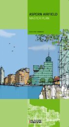
City + The Brand - aspern + Die Seestadt Wiens
City + The Brand - aspern + Die Seestadt Wiens
City + The Brand - aspern + Die Seestadt Wiens

You also want an ePaper? Increase the reach of your titles
YUMPU automatically turns print PDFs into web optimized ePapers that Google loves.
21<br />
Green White Plus<br />
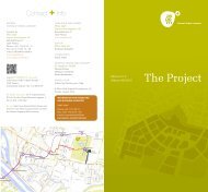
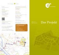
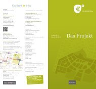
A ring road encircles the core of <strong>aspern</strong>. This lifeline not<br />
only provides the inspiration for the logo but symbolises the<br />
nature of <strong>aspern</strong> as well – it is no smooth, circular shape but<br />
an organic, proudly authentic form that radiates movement<br />
and interactivity.<br />
<strong>aspern</strong> Vienna’s Urban Lakeside stands for individually<br />
combinable advantages and qualities and for the elimination<br />
of ambivalences. In brief, it is “more”. And this “more” is<br />
reflected in the logo: assuming an equally organic form, the<br />
plus sign “+” is placed beside the larger round shape. As an<br />
additional graphic element, it exemplifies added value and<br />
gain. +<br />
What does <strong>aspern</strong><br />
look like?