Download AREA 113 - Architettialtotevere.It
Download AREA 113 - Architettialtotevere.It
Download AREA 113 - Architettialtotevere.It

You also want an ePaper? Increase the reach of your titles
YUMPU automatically turns print PDFs into web optimized ePapers that Google loves.
design focus interview
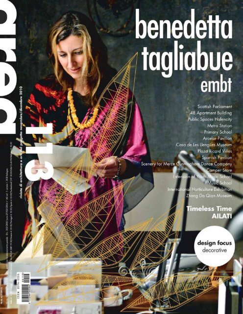
Scottish Parliament, Edinburgh-UK, Benedetta Tagliabue<br />
design<br />
focus<br />
decorative<br />
essay<br />
Paolo Giardiello<br />
Viviana Saitto<br />
interview<br />
Karim Rashid<br />
Patricia Urquiola<br />
object<br />
Alcantara ® Interiors, design Giulio Cappellini + Paola Navone/Alcantara ®<br />
Naturalia recreating nature, design Arpa lab/Arpa Industriale<br />
Marblelace, design Patricia Urquiola/Budri<br />
Terraviva, design Massimiliano Adami/DesignTaleStudio by Ceramiche Refin<br />
Mosaico+, design Giugiaro Design/Mosaico+<br />
Phenomenon Mosaics, design Tokujin Yoshioka/Mutina<br />
Madras ® , design Vitrealspecchi/Vitrealspecchi<br />
review<br />
factory<br />
Zumtobel
design focus essay<br />
dallo stile allo status architettonico<br />
from architectural style to status<br />
Più di dieci anni fa area si interessò e pubblicò alcune riflessioni<br />
teoriche sulla decorazione 1 frutto di ricerche condotte, in ambito<br />
scientifico tra Napoli e Milano, a partire dalla metà degli anni<br />
novanta; in un periodo cioè in cui gli esiti poco felici e le critiche<br />
al post-modern avevano praticamente escluso dalla prassi progettuale<br />
qualsiasi riferimento stilistico creando un diffuso consenso verso<br />
un atteggiamento minimalista ritenuto scevro da linguaggi 2 .<br />
Erano tempi in cui parlare di stile, di apparati decorativi,<br />
di ornamento, di matrici ordinatrici, di linguaggio architettonico,<br />
significava essere indicati come fautori di un ritorno al passato.<br />
Anni in cui, inoltre, le uniche vere sperimentazioni linguistiche<br />
erano prodotte dalla ricerca tecnologica – high tech – ovvero<br />
dall’esperienza di nuove forme espressive autonome.<br />
Insomma, ora come allora, persiste l’incertezza su cosa si debba<br />
realmente intendere per decorazione in architettura o nel design,<br />
confondendo la ricerca di un carattere espressivo e di una<br />
grammatica comunicativa atta a relazionarsi col mondo circostante,<br />
con una presunta mancanza di “purezza” della forma essenziale.<br />
Forma pura che in realtà non esiste in quanto la decorazione,<br />
in architettura, “è per principio superflua, ma la sua superfluità, lungi<br />
dal renderla eliminabile, mostra l’esistenza di un necessario che<br />
travalica lo stesso principio di funzione, […] chiunque cerchi<br />
di eliminarla si troverà inesorabilmente, e a volte angosciosamente,<br />
davanti al suo fantasma” 3 .<br />
In tale contesto storico e critico si manifestano nuove ricerche che<br />
invece fanno esplicito riferimento alla decorazione e al rapporto tra<br />
involucro e spazio e, in particolare, tra pelle dell’involucro e struttura<br />
dei margini. Architetture, come quelle di Herzog e de Meuron –<br />
solo per fare un esempio – che, già dalla fine degli anni novanta,<br />
propongono un attento lavoro di analisi e di approfondimento sul<br />
rapporto tra superficie e spazio, tra “abito” e struttura costruttiva, tra<br />
text by Paolo Giardiello
narrazione e comunicazione. Tale tipo di ricerca, non relativa solo<br />
all’architettura, ma applicata anche nel campo del disegno degli<br />
interni, dei complementi di arredo e del design, permette<br />
di focalizzare l’attenzione direttamente sui valori e sulle potenzialità<br />
del portato espressivo della scrittura delle superfici, della<br />
decorazione. A partire dalla presa di coscienza della sua possibile<br />
autonomia rispetto al corpo che la supporta, del doppio livello<br />
di comunicazione dato cioè dalle necessità tecniche costruttive rispetto<br />
a quelle descrittive e comunicative, si assiste a sperimentazioni che<br />
sempre più entrano nel merito delle regole e delle ragioni stesse dei<br />
fenomeni stilistici e decorativi.<br />
Lo studio di pattern storici, basandosi sulla consuetudine e<br />
riconoscibilità di forme derivanti dalla tradizione, introduce il concetto<br />
di fuori scala di dettagli grafici delle decorazioni, l’estrapolazione<br />
di singoli segni, l’inversione di pieni e vuoti, di positivo e negativo, la<br />
materializzazione di tracce solo bidimensionali in superfici e oggetti<br />
che guadagnano lo spazio e conquistano una fisicità del tutto inedita.<br />
In questi ultimi anni si assiste ad una inversione di tendenza anche del<br />
mercato edilizio ed dell’arredo che, facendo proprie tali indicazioni,<br />
propone prodotti e componenti costruttive (reti stirate, lamiere<br />
microforate, vetri serigrafati), finiture per gli interni (rivestimenti<br />
personalizzabili con texture e disegni a scelta), oggetti di design<br />
(oggetti fuori scala, trasformazione di pezzi esistenti, ridisegno<br />
della tradizione), installazioni multimediali ed artistiche (scenografie<br />
urbane mutevoli, comunicazione interattiva) che sempre più entrano<br />
in contatto con i luoghi di vita quotidiana, agendo sulla decorazione<br />
come strumento per sottolineare i contenuti ed i sensi dell’abitare.<br />
Tale atteggiamento non persegue l’obiettivo di proporre uno stile della<br />
contemporaneità, non cerca di suggerire linguaggi e parole capaci<br />
di essere compresi da tutti, quanto piuttosto consente di identificare<br />
insiemi di “utenti” che scelgono criticamente e indossano l’“abito”<br />
che ritengono più opportuno per mettere in scena il loro tempo.<br />
Si tratta quindi più della definizione di uno status architettonico, del<br />
rapporto cioè tra il singolo e i suoi simili, declinato attraverso la forma<br />
dello spazio e degli oggetti; relazione instabile ed effimera, soggetta<br />
alle variazioni del gusto e delle mode, capace tuttavia di recuperare<br />
importanti modalità del fare, talvolta trascurate o marginalizzate.<br />
More than ten years ago area took an interest in, and published,<br />
a number of theoretical reflections on decoration 1 , the result of<br />
research carried out within a scientific context in Naples and Milan.<br />
This was in the mid-Nineties, in other words a period in which<br />
the rather mediocre results and criticisms of postmodernism had<br />
practically excluded any stylistic reference from design, creating<br />
a diffused consent in favour of a minimalistic attitude considered<br />
immune from languages 2 .<br />
Those were years in which speaking of style, of decorative<br />
apparatuses, of ornaments, ordering matrixes and architectural<br />
languages meant being frowned upon as an advocate of a return<br />
to the past. And in those years the only true linguistic experiments took<br />
place in the field of high tech research, or through the experience<br />
of new autonomous expressive forms.<br />
In a nutshell, then as today, an uncertainty as to what one should<br />
really understand with decoration in architecture or design persists;<br />
research of an expressive character and a communicative grammar<br />
capable of relating to the surrounding world is confused with<br />
a presumed lack of “purity” of the essential form.<br />
Actually, such a pure form does not exist, as decoration,<br />
in architecture “is by principle superfluous, but its superfluity, far from<br />
making it eliminable, reveals the existence of a need which goes<br />
beyond the very principle of function, […] anyone who seeks<br />
to eliminate it will inexorably, and sometimes distressingly, find himself<br />
face to face with its ghost” 3 .<br />
In this historical and critical context new research which on the<br />
contrary explicitly refers to decoration and to the relationship between<br />
shell and space and, in particular, between the skin of the shell<br />
and the structure of the margins, is emerging. Architectures as those<br />
by Herzog and de Meuron – just to make an example – which,<br />
already since the late Nineties, feature an attentive analysis and<br />
in-depth research on the relationship between surface and space,<br />
between the “clothes” and the structure of the building, between<br />
narration and communication.<br />
This kind of research, which not only concerns architecture but<br />
also the field of interior decoration and the design of furniture and<br />
objects, makes it possible to focus the attention directly on the values<br />
and potentials of the expressive significance of the writing on the<br />
surfaces, of decoration. Since one has become aware of its possible<br />
autonomy with respect to the body supporting it, or in other words<br />
of the dual level of communication provided by the requirements of<br />
construction techniques as compared to those related to descriptive<br />
and communicative aspects, we are witnessing an experimentation<br />
which explores, more and more extensively, the merits of the rules and<br />
the very reasons of stylistic and decorative phenomena.<br />
The study of historical patterns, based on the familiarity and<br />
recognisability of forms rooted in tradition, has given rise to the<br />
concept of oversized graphic decorative details, the extrapolation<br />
of single signs, the inversion of massive and empty areas, of positive<br />
and negative, the materialization of only two-dimensional traces on<br />
the surface and objects that invade space, conquering a completely<br />
new physical dimension.<br />
We are, in recent years, also witnessing an inversion of the trend<br />
in the building and decoration market which, adapting to these<br />
suggestions, present products and building elements (stretched grids,<br />
micro-perforated sheet metal, silk-screened glass panes), interior<br />
decoration elements (facing materials which may be customized with<br />
textures and patterns as preferred), design objects (oversized objects,<br />
transformation of existing items, redesigns of traditional pieces),<br />
multimedia and art installations (changing urban scenic effects,<br />
interactive communication) which play an increasingly active role<br />
in the places of everyday life, and which use decoration as a means<br />
of stressing the contents and meaning of living.<br />
This approach is not aimed at proposing a contemporary style,<br />
it does not attempt to suggest languages and words that everyone<br />
can understand; rather, it makes it possible to identify aggregates<br />
of “users” who choose critically, and who wear the “clothes” they<br />
consider best suited to reflect their period. <strong>It</strong> is therefore, more often<br />
than not, a matter of the definition of an architectural status,<br />
or in other words the relationship between the individual and his<br />
fellows, declined through the form of the space and the objects,<br />
an unstable and ephemeral relation subject to changes in taste<br />
and fashion, yet capable of recovering important, and sometimes<br />
neglected or marginalized, ways to do things.<br />
1. Cfr.: P. Giardiello, La decorazione negli interni, in “area”, 47, 1999.<br />
2. Va infatti sottolineato che un linguaggio, per così dire, più essenziale, dalle linee<br />
rigorose, non è un linguaggio “non decorativo”, non realizza cioè spazi o oggetti<br />
non decorati, è semplicemente un tipo di decorazione geometrica riferita a materiali<br />
e colori, trame e texture che nel complesso realizzano un aspetto più severo.<br />
3. R. Masiero, Elogio della decorazione contro la superficialità, in “Rassegna”,<br />
41/1, 1990, I sensi del decoro.<br />
1. See.: P. Giardiello, La decorazione negli interni, “area”, 47, 1999.<br />
2. <strong>It</strong> should be noted that a more essential language, characterized by rigorous<br />
lines, it isn’t a “non-decorative” language, it doesn’t realize not decorated spaces<br />
or objects, but it is simply a type of geometric decoration related to materials and<br />
colors, patterns and textures that produce a more severe aspect.<br />
3. R. Masiero, Praise of decoration against superficiality, in “Rassegna” 41/1,<br />
1990, I sensi del decoro.
design focus essay<br />
decor-azione, interpretazione<br />
e sperimentazione di nuovi pattern<br />
decorative action, interpretation<br />
and experimentation of new patterns<br />
“E sempre penso a queste infinite possibilità dell’arte: date ad uno<br />
un quadrato venti per venti e, benché nei secoli tutti si sian sbizzarriti<br />
con infiniti disegni, v’è sempre posto ancora per un disegno nuovo,<br />
per un vostro disegno. Un acutissimo amico mi chiedeva cosa avverrà<br />
dopo che l’ultimo disegnatore avrà fatto l’ultimo disegno, quando tutti<br />
i disegni saranno fatti. Non avverrà nulla, perché non ci sarà mai<br />
l’ultimo disegno, e non ci sarà mai l’ultimo disegnatore”. (Gio Ponti,<br />
Giochi con i rivestimenti di Salerno in “Domus”, n. 414, 1964).<br />
text by Viviana Saitto<br />
“And I always think of these infinite possibilities of art: give someone a<br />
square, twenty by twenty and, even if everyone have given their fantasy<br />
free reins with infinite drawings, there is always room for a new design,<br />
a design by you. A very acute friend of mine asked me what I would do<br />
when the last designer has made the last design, when all designs have<br />
been made. Nothing will happen, because the last design will never<br />
come, and there will never be a last designer”. (Gio Ponti, Plays with<br />
tiles in Salerno in “Domus”, no. 414, 1964).<br />
Configurare pattern, nella forma più generale, può caratterizzarsi<br />
come un’operazione che ordina gli elementi in base all’identità e alla<br />
differenza, significa dare proporzione allo spazio, esplicitarne gli usi<br />
in riferimento alla funzione che il manufatto dovrà assolvere.<br />
La decorazione è secondo Gottfried Semper un’arte in grado<br />
di “misurare”, rappresentare e rendere riconoscibile lo spazio abitato<br />
riproponendo, o semplicemente evocando, la conoscenza del mondo<br />
circostante. Considerata parte integrante della progettazione<br />
di interni, forma di comunicazione in grado di individuare valori<br />
e posizioni nel sociale, è stata vista per un lungo periodo come una<br />
sorta di “demone da addomesticare” 1 , portando i progettisti alla<br />
realizzazione di texture date dalla semplice successione di elementi,<br />
svilendo spesso il significato e il valore del singolo decoro.<br />
Per Ernst H. Gombrich il ruolo del disegnatore è invece molto<br />
complesso. Deve accettare e superare, nel creare la sua infinita<br />
gerarchia di forme, una serie di restrizioni che non potremmo mai<br />
apprezzare se non davanti al prodotto finito.<br />
“Il disegno si radica nel movimento” 2 , ed è caratterizzato da un<br />
procedimento ordinato, una “complicazione per gradi” 3 , che<br />
inquadra e riempie, delimita campi e organizza lo spazio.<br />
Parliamo di psicologia della percezione, della ricerca di una «quiete»<br />
decorativa attraverso un processo sistematico e impulsivo:<br />
un “arricchimento graduale”, per citare Owen Jones 4 , in grado di dar<br />
vita ad un’ “armonia della forma”.<br />
Ogni ornamento, quindi, per quanto lontano, può essere ricondotto<br />
alla sua radice e il segreto della sua buona riuscita è legato alla<br />
produzione di un vasto effetto generale, ottenibile attraverso la<br />
ripetizione di una matrice di partenza e pochi semplici elementi.
Pattern ottenuti dall’associazione e la<br />
permutazione di una matrice tipo;<br />
deformazione, permutazione e<br />
alleggerimento graduale del decoro;<br />
applicazione del metodo ad uno dei<br />
decori realizzati da Gio Ponti per<br />
il Parco dei Principi di Sorrento.<br />
Pattern obtained by association and<br />
permutation of a standard matrix;<br />
deformation, permutation and<br />
gradual lightening of the decoration;<br />
application of the method to one<br />
of the decorations realized by Gio<br />
Ponti for the Princes’ Park of Sorrento.
design focus essay<br />
È dall’attualità di queste teorie che si è scelto di partire per<br />
l’individuazione di un procedimento base per la configurazione<br />
di nuovi pattern: una sorta di “progettazione guidata” per la decoraazione<br />
contemporanea, in grado di interpretare e riproporre decori<br />
tradizionali attraverso un’azione di deformazione degli stessi 5 .<br />
Il quadrato è il modulo base scelto. “Enigmatico nella sua semplicità<br />
[…] genera una serie di interessanti ed infinite figure: tutto un gruppo<br />
di rettangoli armonici” 6 . Le parole di Bruno Munari chiariscono<br />
al meglio i “giochi di pannelli” 7 corbusieriani, pubblicati<br />
a dimostrazione dell’efficacia armonica del Modulor, in questo caso<br />
utilizzato come base di riferimento per la trasformazione di disegni<br />
tradizionali. I decori selezionati possono quindi essere sovrapposti<br />
alle nuove matrici, modificati attraverso un’azione di deformazione<br />
delle geometrie che li compongono 8 e successivamente trasformati<br />
per essere assemblati.<br />
Il “metodo di permutazione” di P. Dominique Douat 9 rappresenta uno<br />
dei contributi più concreti e di facile applicazione. Attraverso una<br />
successione di tavole l’autore esplicita l’importanza della matematica<br />
e delle permutazioni nella composizione di pattern, dimostrando<br />
l’inesauribile quantità di soluzioni ottenibili associando e ruotando<br />
un modulo unitario. Raddoppiando e permutando in maniera<br />
sistematica il decoro, alleggerendolo gradualmente con un processo<br />
inverso a quello di Jones, è possibile dare vita ad un numero di decori<br />
codificabili all’infinito e adattabili a qualsiasi tipologia di spazio.<br />
Un esperimento concreto è stato condotto sulle piastrelle realizzate<br />
da Gio Ponti, nel 1960, per il Parco dei Principi di Sorrento.<br />
L’architetto è riuscito con trenta moduli prodotti dalle Ceramiche<br />
D’Agostino a comporre, attraverso un procedimento molto vicino<br />
a quello descritto, più di cento pavimentazioni differenti. I disegni<br />
di Ponti evocano nel colore e nel decoro le antiche “riggiole”<br />
partenopee dimostrando che la tradizione può essere interpretata<br />
e può rispondere alla contemporaneità in maniera sempre nuova<br />
grazie a piccoli accorgimenti. Giocando ironicamente con<br />
le piastrelle del Parco dei Principi è stato possibile ottenere nuovi<br />
decori, lontani dalla presunzione di sostituire quelli di Ponti, esempio<br />
dimostrativo dell’efficacia del procedimento.<br />
Per quanto apparentemente meccaniche, infatti, queste semplici<br />
regole non solo permettono di comprendere le caratteristiche<br />
intrinseche dei singoli elementi, di controllare l’effetto finale del<br />
disegno, ma rappresentano un metodo per la composizione di pattern<br />
contemporanei in grado di riproporre, in continuità con il passato,<br />
il problema della decorazione nella sua globalità.<br />
To configure patterns may, more generally speaking, take the form<br />
of an operation where the elements are put in order according<br />
to their identity and difference; it means to give a space proportion,<br />
to clarify the uses associated with the purpose the product has<br />
to serve. Decoration is, according to Gottfried Semper, an art capable<br />
of measuring, representing and making recognizable the inhabited<br />
space, presenting a new version of, or simply evoking, knowledge<br />
of the surrounding world. Considered an essential part of interior<br />
design, form of communication capable of identifying values and<br />
Prototipi realizzati per il corso<br />
di Decorazione tenutosi nell’a.a.<br />
2006/2007 presso la Facoltà<br />
di Architettura dell’Università degli<br />
Studi di Napoli Federico II<br />
(foto di Giovanni Fabbrocino).<br />
Prototypes realized for the Decoration<br />
course held in the academic<br />
year 2006/2007 at the Faculty<br />
of Architecture of the Federico II<br />
University of Naples (photo by<br />
Giovanni Fabbrocino).<br />
positions in society, it has for a long time been seen as a kind<br />
of “demon to tame” 1 , making designers create textures produced<br />
by a simple sequence of elements, often debasing the meaning and<br />
value of the single decoration. To Ernst H. Gombrich, the role of<br />
the designer is on the contrary very complex. He must accept and<br />
surpass, when creating his infinite hierarchy of forms, a series of<br />
restrictions which we will never be able to appreciate except when<br />
placed before the finished product.<br />
“Drawing is rooted in movement” 2 , it is characterized by an orderly<br />
procedure, a “complication by degrees” 3 , which frames and fills,<br />
outlines fields and uses space.<br />
We are speaking of the psychology of perception, of the pursuit<br />
of a decorative “tranquillity” through a systematic and impulsive<br />
process: a “gradual enrichment”, to quote Owen Jones 4 , capable<br />
of creating a “harmony of the form”.<br />
Every ornament, therefore, no matter how distant, may be retraced<br />
to its roots, and the key to its accomplishment is linked to the<br />
production of a vast general effect, which may be obtained<br />
by repeating a basic matrix and a few simple elements.<br />
We have chosen these very topical theories as starting point for<br />
the identification of a basic procedure for the configuration of new<br />
patterns: a kind of “guided design” for the contemporary decorative<br />
action, capable of interpreting and presenting new versions<br />
of traditional decorations through their deformation 5 .<br />
The square is the basic module chosen. “Enigmatic in its simplicity […]<br />
it generates a series of interesting and infinite figures: a whole group<br />
of harmonious rectangles” 6 . Bruno Munari’s words are ideal<br />
as explanation for Le Corbusier’s “plays with panels” 7 , published<br />
to demonstrate the harmonious efficiency of the Modulor, and in this<br />
case used as basis for the transformation of traditional designs.<br />
The chosen decorations can therefore be superimposed on new<br />
matrixes, modified through an action of deformation of the geometries<br />
they are formed of 8 and then transformed in order to be assembled.<br />
P. Dominique Douat’s “method of permutation” 9 is one of the most<br />
concrete and easily applied contributions. The author uses a sequence<br />
of plates to clarify the importance of mathematics and permutation<br />
in the composition of patterns, demonstrating the endless number<br />
of solutions that can be obtained by associating and rotating a unitary<br />
module. By doubling and permuting the decoration in a systematic<br />
manner, gradually lightening it with a process that is the opposite<br />
of the one adopted by Jones, it is possible to create a number<br />
of decorations that may be codified infinitely and adapted to any type<br />
of space.<br />
A concrete experiment has been conducted on the tiles created<br />
by Gio Ponti in 1960 for the Princes’ Park in Sorrento in 1960.<br />
The architect managed to compose, by using thirty modules produced<br />
by D’Agostino Ceramiche, adopting a process very similar to the<br />
one described above, more than a hundred different pavement<br />
decorations. The colours and decorations of Ponti’s designs remind<br />
of the ancient “riggiole” used in the area of Naples, as<br />
demonstration of the fact that tradition may be interpreted and
can meet contemporary requirements in always new ways, with<br />
small adjustments. By playing ironically with the tiles used in the<br />
Princes’ Park, it has been possible to create new decorations; far<br />
from presuming to replace those designed by Ponti, the experiment<br />
demonstrates the validity of the procedure. In fact, even if they may<br />
appear mechanical, these simple rules not only make it possible<br />
to appreciate the intrinsic characteristics of the single elements,<br />
and to control the final effect of the design; they also represent<br />
a method for composing contemporary patters capable of once again<br />
posing the problem of decoration in its global sense, without any<br />
breaks with the past.<br />
1. Demoni da addomesticare è il titolo assegnato da Ernst H. Gombrich ad uno dei<br />
paragrafi del decimo capitolo del libro Il senso dell’ordine. In queste pagine l’autore<br />
approfondisce il tema della progettazione del caos nella decorazione. Cfr. E. H.<br />
Gombrich, The Sens of Order. A Study in the Psychology of Decorative Art, Phaidon<br />
Press Limited, London 1979, trad. it., Il Senso dell’Ordine. Studio sulla Psicologia<br />
dell’arte decorativa, Elemond Editori Associati, Milano 2000, pp. 271-301.<br />
2. E. H. Gombrich, op. cit., p. 172.<br />
3. E. H. Gombrich, op. cit., p. 93.<br />
4. La teoria dell’“arricchimento graduale” è stata pubblicata nel 1856 da Owen Jones<br />
nel suo testo più importante la Grammatica dell’Ornamentazione. Cfr. O. Jones,<br />
The Grammar of Ornament, London 1883.<br />
5. La presente indagine è stata svolta nel 2006 dal gruppo di ricerca coordinato<br />
da Agostino Bossi e Paolo Giardiello, a partire da precedenti studi sulla decorazione<br />
tradizionale delle maioliche partenopee. Il metodo strutturato ha portato alla<br />
produzione di un cospicuo numero di prototipi realizzati artigianalmente dalla<br />
Ceramica Stingo di Napoli.<br />
6. B. Munari, Il Quadrato, Corraini, Mantova 2008, p. 9.<br />
7. Le combinazioni “gioco di pannelli” proposte da Le Corbusier, basate sulle infinite<br />
possibilità che un quadrato ha di essere suddiviso secondo i valori espressi dal sistema<br />
numerico proposto, ci permette di individuare un cospicuo numero matrici armoniche<br />
da utilizzare come base per la trasformazione dei decori. Cfr. Le Corbusier, Il Modulor,<br />
2 vol., Marzotta, Milano 1984.<br />
8. L’associazione della nuova matrice al decoro non è casuale ma strettamente legata<br />
ad un’analisi delle similitudini che caratterizzano le geometrie delle due unità.<br />
9. L’opera di Douat si presenta come il primo, e forse più raro, trattato della teoria<br />
del disegno e reca il titolo Méthode pour fraise una infinité de desseins differént avec<br />
des carreaux mi-partis de deux coleurs par une ligne diagonal. Le tavole realizzate da<br />
Douat sono consultabili su: E. H. Gombrich, op. cit., p. 92.<br />
1. Demons to tame is the title given by Ernst H. Gombrich to one of the paragraphs of<br />
the tenth chapter of the book The Sense of Order. On these pages the author studies<br />
in depth the theme of design of chaos in decoration. Cfr. E. H. Gombrich, The Sens of<br />
Order. A Study in the Psychology of Decorative Art, Phaidon Press Limited, London 1979.<br />
2. E. H. Gombrich, op. cit., p. 172.<br />
3. E. H. Gombrich, op. cit., p. 93.<br />
4. The theory of the “gradual enrichment” was published in 1856 by Owen Jones<br />
in his most important text The Grammar of Ornament, London 1883.<br />
5. This research has been conducted in 2006 by the research team coordinated<br />
by Agostino Bossi and Paolo Giardiello, on the basis of previous studies on the<br />
traditional decoration of majolica in the Naples area. The structured method has led to<br />
the production of a large number of prototypes, realized by the craftsmen of the Stingo<br />
Ceramic manufacturer of Naples.<br />
6. B. Munari, Il Quadrato, Corraini, Mantua 2008, p. 9.<br />
7. The “play with panels” combination proposed by Le Corbusier, based on the infinite<br />
ways in which a square can be subdivided according to the values expressed by the<br />
numeric system proposed, enables us to identify a large number of harmonious matrixes<br />
to use as basis for the transformation of the decorations. See Le Corbusier,<br />
Il Modulor, 2 vol., Marzotta, Milan 1984.<br />
8. The association of the new matrix to the decoration is not casual, but closely linked<br />
to an analysis of the similarities which characterize the geometries of the two units.<br />
9. The work of Douat is presented as the first, and perhaps rarest, treatise on the theory<br />
of design and carries the title Méthode pour fraise una infinité de desseins differént<br />
avec des carreaux mi-partis de deux coleurs par une ligne diagonal. The plates<br />
realized by Douat may be consulted in: E. H. Gombrich, op. cit., p. 92.
design focus interview<br />
Karim Rashid: il lato spirituale del colore<br />
Karim Rashid: the spiritual side of color<br />
interview by area
area: Nell’ambito delle arti figurative esiste una lunga tradizione<br />
ed una consuetudine secolare a rappresentare realtà e finzione attraverso<br />
due sole dimensioni; che si tratti di fogli, tavole o tele il pittore e il grafico<br />
lavorano con facilità all’interno di questo schema. Per un architetto<br />
o un designer lavorare senza la profondità dell’oggetto è più difficile<br />
mentre tu sembri perfettamente a tuo agio e lavori con sorprendente<br />
disinvoltura (una disinvoltura da artista) sulle superfici decorandole<br />
e disegnandole con sapienza e facilità. Questa tua versatilità è realmente<br />
semplice come appare?<br />
Karim Rashid: Nell’era digitale esiste un nuovo linguaggio, un<br />
vernacolo che io chiamo “infostetica”, ovvero l’estetica dell’informazione.<br />
Tutto parte dall’idea di utilizzare strumenti moderni per creare progetti<br />
grafici complessi in 2D che siano tuttavia percepiti come 3D.<br />
La caratteristica del movimento della grafica, l’applicazione e l’uso<br />
di tecniche di composizione sono stati resi possibili dall’impiego delle<br />
nuove tecnologie e di moderni software. Il nuovo movimento tipico della<br />
tecno grafica crea un paesaggio ipertestuale, ipergrafico, ipertrofico<br />
e pieno di energia.<br />
area: Quanto conta la materia e i materiali nei tuoi progetti e quanto<br />
i colori, il disegno, l’immagine?<br />
K.R.: Il mondo sta diventando sempre più in grado di comprendere,<br />
sia le informazioni che riceve che gli input visivi, i consumatori vogliono<br />
essere stimolati dall’ambiente che li circonda. Se oggi qualcuno decide<br />
di fare shopping in un negozio piuttosto che online, l’esperienza deve<br />
essere allettante, seducente, ispirante. Il negozio vende abbigliamento<br />
e oggettistica pensati per un target che va dai 16 ai 25 anni, ho pertanto<br />
deciso di utilizzare colori decisi come il lime, l’arancione, il rosa, l’azzurro<br />
per creare un ambiente pieno di energia. Il colore è uno dei fenomeni più<br />
belli a cui assistiamo nel corso della nostra esistenza.<br />
Per me il colore è vita, è un modo per gestire e toccare con mano<br />
le proprie emozioni, la nostra psiche, il nostro lato spirituale. Alcuni colori<br />
sono forti, altri sono più tenui, ciò che è veramente importante è trovare<br />
la giusta sfumatura, la giusta tinta, la giusta saturazione di ogni colore<br />
e saperli poi abbinare. I colori possono essere utilizzati in modo corretto<br />
o scorretto, l’importante è non averne paura. Ci danno un senso di euforia<br />
spirituale e fenomenologica.<br />
area: Nell’ultimo Cersaie l’azienda Ceramica Cielo ti ha chiesto<br />
di lavorare sulla decorazione di un piatto doccia di produzione, si trattava<br />
perciò di un lavoro di grafica, di un progetto bidimensionale, come hai<br />
affrontato questo tema così particolare?<br />
K.R.: Voglio che ogni cosa che ci circonda sia progettata con intelligenza,<br />
sia bella, poetica, utile, sexy, illuminante, ispirante, contemporanea,<br />
colorata, piena di energia, splendente, potente, ad alte prestazioni<br />
ed accessibile per chiunque. Credo che qualsiasi cosa al mondo dovrebbe<br />
essere intelligente, bella e progettata in modo olistico, ovvero in modo<br />
sperimentale ed ecologico. In ogni cosa che io faccio poi, mi piace<br />
inserire un po’ dello spirito umano, un po’ di umorismo per alleggerire<br />
quella cosa altrimenti troppo palesemente “seria” che è la vita.<br />
area: Il tuo corpo presenta molteplici tatuaggi gli stessi disegni e motivi<br />
che ritroviamo sulle superfici dei tuoi oggetti. Utilizzi il tuo corpo come<br />
tela, come superficie mezzo di comunicazione di un linguaggio artistico?<br />
K.R.: Questi possono essere considerati i miei geroglifici, ho sviluppato<br />
55 simboli negli ultimi 13 anni. Ognuno di questi ha un significato.<br />
Io li definisco “Karimagologos”, il significato è spiegato nel mio libro<br />
Evolution. Non uso mai questi simboli intenzionalmente, diciamo che<br />
vengono riproposti nelle mie opere in modo subcosciente, con una<br />
tempistica accidentale. Ho 12 tatuaggi, ognuno dei quali fatto in una città<br />
diversa, da Tokyo a San Francisco, da New York a Londra, Chicago ecc.<br />
(sono come timbri sul mio passaporto o come gli adesivi sul mio bagaglio).<br />
area: Within the context of the figurative arts there is a long tradition<br />
and century-old custom of representing reality and fiction in only two<br />
dimensions; whether it is a matter of sheets of paper, plates or canvases,<br />
the painter and the draughtsman are comfortable when working within<br />
this scheme. <strong>It</strong> is harder for an architect or designer to work without the<br />
with surprising nonchalance (the nonchalance of an artist) on the surfaces,<br />
decorating them and drawing them with skill and ease. Is this versatility<br />
of yours really as simple as it seems?<br />
Karim Rashid: The digital age has a new language, a vernacular I refer<br />
to as the ‘Infostethic’, the aesthetics of information). The premise is using<br />
new tools to create complex 2D graphic work that has a perception of 3D.<br />
A characteristic of the movement of graphic design and application<br />
and the use of composition techniques only made possible through the use<br />
of new technologies and software. The new movement of techno graphics<br />
is creating a landscape that is hypertextual, hypergraphic, hypertrophic,<br />
and energetic.<br />
area: How much does the material, and materials, matter in your projects,<br />
and how much do the colours, the design, the image?<br />
K.R.: The world is becoming very savvy – both visually and about<br />
information – and consumers are interested in being stimulated by their<br />
physical environments. Nowadays, if one decides to shop in stores (rather<br />
than online), the experience must be seductive, engaging, and inspiring.<br />
The store sells fashion and lifestyle products for a market between 16-25<br />
years old, so I selected bold colors such as lime, orange, pink, baby blue<br />
to create this energetic environment. Color is one of the most beautiful<br />
phenomena of our existence. For me color is life and a way of dealing<br />
with and touching our emotions, our psyche, and our spiritual being.<br />
Some colors are strong, some are soft, but what is important is the specific<br />
hue or tint or saturation of each color and how they work together.<br />
Color can be used well or poorly but no one should be afraid of color.<br />
<strong>It</strong> is a spiritual phenomelogical euphoria.<br />
area: During the past Cersaie Ceramica Cielo has asked you to work<br />
on the decoration of a shower tray that is in production; it was therefore<br />
a matter of a graphic work, of a two-dimensional project. How have you<br />
tackled this very particular theme?<br />
K.R.: I want things that surround us to be smart, beautiful, poetic, useful,<br />
sexy, enlightening, inspiring, contemporary, colorful, energetic, fulgent,<br />
powerful, of performance, and accessible to everyone. I think everything<br />
we make in this world should be smart and beautiful and holistically<br />
designed, meaning it is experimental and ecological. But in everything<br />
I inject some human spirit and humor because it lightens up this overtlyserous<br />
thing we call life.<br />
area: You have numerous tattoos on your body, with the same designs<br />
and motifs as we find on the on the surfaces of your objects. Do you use<br />
your body as canvas, as a surface by means of which to communicate<br />
an artistic language?<br />
K.R.: They are my hieroglyphics. I developed 55 symbols over the last<br />
13 years. Each has meaning. I call them Karimagologos. My book<br />
Evolution explains the meanings. I never try to intentionally use them but<br />
they come into the work subconsciously at the most incidental times.<br />
I have 12 tattoos on me – one from each different city in the world from<br />
Tokyo to San Francisco to New York to London, to Chicago, etc.<br />
(like a stamped passport or stickers on luggage!).<br />
depth of the object; however, you seem to be perfectly at ease and to work Rimmel, Tatoo collection, Ceramica Cielo.
design focus interview<br />
Moroso e Urquiola, dieci anni di sodalizio<br />
Moroso and Urquiola, ten years of association<br />
Il 2010 è stato il decimo anno di sodalizio fra la Moroso e la nota<br />
designer spagnola Patricia Urquiola, celebrato attraverso una mostra<br />
organizzata con l’Ordine degli Architetti di Roma presso l’Acquario<br />
Romano. La proficua collaborazione tra la designer e Patrizia Moroso,<br />
costellata dalla creazione di una ricca serie di oggetti di design di<br />
qualità e valore, apprezzati dalla critica internazionale, prosegue con<br />
la nascita di progetti ispirati a culture diverse e tecniche tradizionali<br />
appartenenti ad epoche lontane come quello per la linea Fergana.<br />
area: La Moroso è stata la tua prima collaborazione con un’azienda?!<br />
Patricia Urquiola: Mi sono trasferita dalla Spagna in <strong>It</strong>alia durante<br />
il periodo della formazione universitaria e, dopo aver concluso gli<br />
studi al Politecnico di Milano, ho svolto immediatamente una prima<br />
esperienza lavorativa importante presso l’ufficio tecnico di una nota<br />
azienda di elementi di arredo. Questo lavoro è durato sei anni ed<br />
è stata un’opportunità molto preziosa perché in quel periodo sono<br />
entrata in contatto con personaggi straordinari, grandi protagonisti<br />
del design contemporaneo, che mi hanno insegnato molto. È stata una<br />
vera e propria scuola per me, ed un grande onore stare vicino a Vico<br />
Magistretti. Successivamente ho lavorato con Piero Lissoni, all’interno del<br />
suo studio, seguendo i suoi progetti di design e grazie a lui sono entrata<br />
in contatto con molte aziende. Questa opportunità mi ha consentito<br />
di ampliare le mie conoscenze e di sperimentare tecniche e realtà<br />
produttive diverse, cosa di cui avevo molto bisogno. Parallelamente<br />
al lavoro svolto con Lissoni, ho potuto iniziare a sviluppare la mia attività<br />
personale e negli ultimi due anni sono entrata in contatto con la Moroso<br />
e per loro ho disegnato il mio primo divano di successo, il Lowland,<br />
nel 2000. Insieme abbiamo ritenuto che potessi essere la persona giusta<br />
per seguire l’azienda e con serenità ho deciso di avviare la mia attività<br />
autonomamente. La Moroso mi è stata molto di aiuto in quella fase della<br />
mio percorso professionale, dandomi credibilità e consentendomi<br />
di mantenere il mio proprio studio. Questo avvenne 10 anni fa.<br />
area: Come si svolge la tua consulenza, o meglio il tuo rapporto<br />
di collaborazione con l’azienda Moroso?<br />
P.U.: Il lavoro con Moroso inizia sempre con un lungo viaggio<br />
in macchina o in treno, necessario per raggiungere la sede a Udine!<br />
All’inizio della collaborazione le mie giornate trascorse in azienda<br />
erano molto frequenti, molto assidue e con il passare degli anni<br />
e il moltiplicarsi degli impegni abbiamo necessariamente dovuto trovare<br />
dei ritmi e una modalità diversa di lavorare insieme. Sono state<br />
e sono tuttora giornate di lavoro molto intense, impegnative per me ma<br />
soprattutto per i collaboratori in azienda che a volte temono quasi il mio<br />
arrivo; con loro oramai si è instaurato un rapporto di stima reciproca,<br />
simpatia e di grande confidenza. In sede ci si confronta,<br />
si discute, si “cucina” tanto. Per me le idee sono molto chiare ma<br />
a queste deve seguire il lavoro di un intero ufficio tecnico che deve<br />
riuscire ad interpretarle, elaborarle e quindi a preparare il materiale per<br />
la mia prossima visita. Non è semplice per loro; noi designer arriviamo<br />
in azienda con disinvoltura, carichi di proposte e suggestioni con cui<br />
l’ufficio tecnico deve poi avere a che fare e talvolta questi progetti<br />
si scontrano con la mentalità stessa dell’azienda e con i limiti tecnici<br />
della produzione. Una caratteristica molto bella delle aziende italiane<br />
è infatti quella di tendere a non rispondere mai alle nostre sollecitazioni<br />
interview by area<br />
con un “non si può fare” ma piuttosto quella di dire, in ogni caso,<br />
“pensiamoci”, “proviamoci”. Quel “ci pensiamo” è molto bello perché<br />
significa non dire un “no” anche se in quel momento agli occhi<br />
dell’azienda, il progetto rappresenta un sfida difficilissima da realizzare.<br />
area: Tra tutti i materiali con cui tu lavori, come la plastica, il legno,<br />
il metallo, tra i vari settori produttivi che hai affrontato, qual è quello che<br />
in questo momento, dopo tanti anni di esperienza, ti danno maggiore<br />
soddisfazione e che tu ricerchi?<br />
P.U.: Non ho una preferenza ben definita, sono molto aperta<br />
e posso avere “simpatia” e affetto per esprienze, oggetti, materie molto<br />
differenti. Ad esempio, nel caso del progetto che ho curato con le donne<br />
sarde per la creazione di una serie di tappeti e che abbiamo venduto<br />
con la Moroso, si è creato un rapporto umano e di collaborazione<br />
straordinario. Posso lavorare ed essere felice lavorando ad un progetto<br />
come questo ed essere allo stesso tempo una patita degli stampi. Sono<br />
una vera patita degli stampi, che siano per la creazione di oggetti<br />
in plastica, ceramica, porcellana, gomma, o metallo… lo stampo<br />
in fondo è alla base del prodotto industriale ma mi piacciono anche<br />
moltissimo il legno così come i tessuti in generale. Sono molto versatile<br />
e tutto dipende dal progetto a cui mi affeziono.<br />
area: Parliamo della tua modalità di lavoro; tu preferisci lavorare<br />
a commessa, ovvero che ti venga dato un tema da sviluppare, oppure<br />
preferisci essere tu a proporre l’idea su cui lavorare.<br />
P.U.: Entrambi, direi. Come diceva Castiglioni, il brief dell’azienda per<br />
me “è come il pane per la marmellata”, è una struttura utile, necessaria<br />
sulla quale sviluppare il progetto ma al tempo stesso posso anche<br />
dimenticarmene per reinterpretare a modo mio la commessa. Molte volte<br />
invece mi vengono richieste le mie idee, le mie proposte ed io ne ho<br />
molte. In studio abbiamo continuamente dei progetti che sono work in<br />
progress, delle ricerche che sviluppiamo insieme con i miei collaboratori<br />
e che noi forniamo quando mi vengono chieste. In questo caso aiutano<br />
molto quei rapporti di vera amicizia che esistono con alcune aziende<br />
e che consentono di sviluppare dei processi più lenti, di dedicare<br />
il tempo giusto a questi progetti di design e a realizzarli in modo<br />
estremamente accurato. Questo avviene con Patrizia Moroso insieme<br />
alla quale riusciamo a realizzare fino a cinque, sei pezzi l’anno e al<br />
tempo stesso, ad esempio, abbiamo fatto uscire recentemente una sedia<br />
di plastica che era pronta come prototipo da più di un anno. Abbiamo<br />
dedicato tempo non soltanto allo studio e alla scelta del materiale<br />
corretto, più adatto da utilizzare, per conferire un significato corretto<br />
alla creazione di un oggetto nuovo ma soprattutto per far in modo che le<br />
cose che si presentano con Moroso siano oggetti credibili e reali. Sono<br />
progetti che seguiamo da tempo e che inseguiamo da tempo, sono il<br />
frutto di un lungo e attento lavoro di ricerca, di studio e di maturazione.<br />
area: Come definirebbe il rapporto tra designer e produzione<br />
industriale oggi, in particolare in <strong>It</strong>alia?<br />
P.U.: Il designer è il vero operatore nei confronti dell’industria e siamo<br />
delle figure al tempo stesso esterne e considerate, rispettate dall’azienda<br />
che ha voglia di instaurare in un rapporto di interazione positivo<br />
e costruttivo. Più il rapporto con una azienda è longevo e più si riesce<br />
a capire quali siano i limiti che si possono spostare, forzare, discutere,<br />
e a capire come appassionare l’azienda, come incuriosirla.
Fergana:<br />
un progetto<br />
complesso e raffinato,<br />
simbolo dell’approccio<br />
cross-over che contraddistingue la<br />
ricerca nel design di Moroso, un’attenta<br />
ricerca sui tessuti, che combinano antiche<br />
tecniche di tessitura Uzbeke,<br />
con realizzazioni industriali europee.<br />
Fergana: a complex, refined design<br />
symbolic of Moroso’s characteristic<br />
cross-over approach and a carefully<br />
considered choice of fabrics combining<br />
ancient Uzbek weaving techniques<br />
with European industrial<br />
processes.
design focus interview<br />
Le aziende in cui si crea il prodotto industriale di design, made in <strong>It</strong>aly,<br />
che siano grosse o a conduzione familiare, sono molto più abituate<br />
a cercare la linea di confronto con il designer, sono molto più flessibili<br />
e disposte a lavorare interagendo con il designer e questo per noi<br />
è estremamente prezioso. Sicuramente nelle grosse industrie è molto più<br />
difficile ritrovare questo tipo di rapporto ma credo anche anche che tutta<br />
la produzione di oggetti teconologici abbia bisogno di “usarci” di più,<br />
anche nella nostra veste di personaggio esterno, non soltanto in quanto<br />
progettisti interni. Il designer esterno all’azienda ha una maggiore<br />
capacità critica nei confronti del prodotto e soprattutto un maggiore<br />
potere di provocazione, di sollecitazione.<br />
In 2010 the collaboration between Moroso and the renowned Spanish<br />
designer Patricia Urquiola has lasted for ten years; celebrated with<br />
an exhibition organized by Ordine degli Architetti di Roma in the<br />
Acquario Romano. it has given rise to an ample range of design objects,<br />
whose quality and value are confirmed by international critics.<br />
The prolific union between the designer and Patrizia Moroso continues<br />
this year, with the launching of projects inspired by different cultures<br />
and traditional techniques dating from distant epochs, as those created<br />
for the Fergana line.<br />
area: Was Moroso your first collaboration with a company?!<br />
Patricia Urquiola: I moved from Spain to <strong>It</strong>aly while studying<br />
at university; when I graduated from the Milan Polytechnic I immediately<br />
begun my first and very important professional experience with the<br />
design department of a well-known manufacturer of furniture accessories.<br />
I worked for this company for six years; it has been a great opportunity<br />
because I came into contact with extraordinary personalities, leading<br />
figures in contemporary design, who have taught me a lot. <strong>It</strong> has been<br />
a true school for me, and a great honour to be close Vico Magistretti.<br />
After that I worked with Piero Lissoni, in his studio, developing his<br />
design projects, and thanks to him I have established contact with many<br />
companies. This opportunity has enabled me to amplify my knowledge<br />
and familiarize with different techniques and production realities,<br />
something I was in great need of. While working for Lissoni I have been<br />
able to develop my personal activities, and in the last two years I began<br />
to cooperate with Moroso, designing my first successful sofa, Lowland,<br />
in 2000. Together we have decided that I would be the right person<br />
to collaborate with the company, and I have serenely decided<br />
to start my own independent activity. Moroso has been very helpful<br />
to me during this phase of my career, giving me credibility and allowing<br />
me to operate with my own firm. This happened 10 years ago.<br />
area: How does your consulting for, or rather your cooperation with,<br />
Moroso take place?<br />
P.U.: My work with Moroso always begins with a long journey by car<br />
or train, necessary to reach their headquarters in Udine! In the early<br />
stages of my collaboration my visits to the company were very frequent,<br />
very assiduous; with the passing of the years and the multiplication<br />
of my commitments we have had to find another rhythm and way<br />
to work together. These days have been, and are still, very intense<br />
and demanding for me, but above all for the company employees who<br />
sometimes fear my arrival; by now a relationship of mutual esteem,<br />
liking and great trust has been established. At the headquarters we<br />
meet, discuss and “cook” a lot. My ideas are very clear to me, but they<br />
must be adapted to the work of a whole design department which must<br />
manage to interpret them, elaborate them and prepare the material<br />
for my next visit. <strong>It</strong> is anything but easy for them; we designers arrive<br />
at a company nonchalantly, full of proposals and suggestions which the<br />
design department must then work on, and sometimes these projects<br />
enter into conflict with the mentality of the company and the technical<br />
limits of the production. In fact, a very positive characteristic of the <strong>It</strong>alian<br />
company consists of the fact that our suggestions almost never meet with<br />
the reply that “it cannot be done”, but rather, in any case, “we’ll think
Nella pagina a fianco, la linea<br />
di imbottiti Fergana disegnata da<br />
Patricia Urquiola per Moroso, è il<br />
frutto di un‘attenta ricerca sui tessuti<br />
che combinano antiche tecniche di<br />
tessitura Uzbeke, con realizzazioni<br />
industriali europee.<br />
In questa pagina, la mostra<br />
organizzata da Moroso, con l‘Ordine<br />
degli Architetti di Roma, allestita<br />
da Emiliano Calderini presso<br />
l‘Acquario Romano in occasione<br />
dei dieci anno di collaborazione<br />
con Patricia Urquiola.<br />
In the following page the line<br />
of Fergana sofa designed by Patricia<br />
Urquiola for Moroso, it is the result of<br />
a carefully considered choice<br />
of fabrics combining ancient Uzbek<br />
weaving techniques with European<br />
industrial processes.<br />
In this page the exhibition organized<br />
by Moroso with Ordine degli<br />
Architetti di Roma at the Acquario<br />
Romano. The exhibition is set up<br />
by Emiliano Calderini on the occasion<br />
of ten year of collaboration between<br />
Moroso and Patricia Urquiola.<br />
about it”, “let’s try”. That “we’ll think about it” is very nice, because<br />
it means avoiding to say “no”, even if that moment the project appears,<br />
in the eyes of the company, a very difficult challenge.<br />
area: Of all the materials you work with, as plastic, wood, metal, and<br />
of the various manufacturing sectors you have dealt with, which is the<br />
one that you today, after many years of experience, find to be the most<br />
satisfactory, and which you prefer?<br />
P.U.: I do not have any clearly defined preference, I am very open<br />
and appreciate and like very different experiences, objects and<br />
materials. For instance, in the case of the project I have directed with<br />
Sardinian women, aimed at the creation of a range of carpets we have<br />
sold through Moroso, an extraordinary relationship, both on a human<br />
and professional level, has been formed. While I can work happily<br />
on this kind of project, I am at the same time an addict of moulds.<br />
I am a true aficionado of moulds, whether they are for the creation<br />
of objects in plastic, ceramics, porcelain, rubber, or metal... In the final<br />
analysis, the mould is at the basis of the industrial project, but I am also<br />
very fond of wood, as well as fabrics in general. I am very versatile<br />
and everything depend on the project I get attached to.<br />
area: Let us speak about how you work; do you prefer to work on the<br />
basis of requests, or to be given a theme to develop, or would you rather<br />
be the one to suggest the idea on which to work?<br />
P.U.: Both, I would say. As Castiglioni said, the company brief is “like<br />
the bread for the jam” to me; it is a useful, indispensable structure<br />
on which to develop the project, but at the same time I can also forget<br />
about it to reinterpret the assignment in my own way. I am often, on the<br />
contrary, asked to suggest my own ideas and proposals, and I have<br />
many. In my studio we work on projects all the time, which are works<br />
in progress, researches which we develop together with my collaborators<br />
and which we present when I am asked to. In this case it is very helpful<br />
to be able to count on true friendships with some companies, which<br />
make it possible to develop slower processes, to dedicate the necessary<br />
time to these design projects, and to realize them in an extremely<br />
accurate manner. This is the case of Patrizia Moroso, with whom we<br />
manage to realize as much as five or six pieces o year, and at the same<br />
time, for instance, we recently produced a plastic chair which had been<br />
ready as a prototype for more than a year. We have dedicated time not<br />
just to the study and choice of the correct material that was best suited<br />
to the purpose, to give the right meaning to the creation of a new object,<br />
but above all to assure that the items presented with Moroso are credible<br />
and real objects. They are projects which we work on, that we pursue<br />
for a long time, they are the products of a long and careful research,<br />
study and maturation.<br />
area: How would you define the relationship between designer<br />
and industrial production today, in particular in <strong>It</strong>aly?<br />
P.U.: The designer is the true operator in relation to industry, and<br />
we are at the same time external and esteemed figures, respected<br />
by the company which wants to create a relationship of positive and<br />
constructive interaction. The more lasting a relationship with a company<br />
is, the more one manages to understand the nature of the limits which<br />
may be moved, forced, discussed, and how to enthuse the company,<br />
how to elicit its curiosity. The companies with which <strong>It</strong>alian industrial<br />
design products are created, whether large or family-run, are much more<br />
accustomed to mediating with the designer, they are much more flexible<br />
and willing to interact with the designer, and this is extremely precious<br />
to us. <strong>It</strong> is certainly much harder to find this kind of relationship<br />
in the large industries, but I also believe that the entire production<br />
of technological products needs to “use us” more, also in our capacity<br />
of external figures, not just as internal designers.<br />
The designer who is independent with respect to the company is more<br />
able to see the product with critical detachment, and above all a greater<br />
ability to provoke, to inspire.
design focus object<br />
alcantara ®<br />
interiors<br />
cappellini<br />
+ navone<br />
azienda Alcantara ®<br />
anno realizzazione prodotto 2010/2011<br />
materiale Alcantara ®<br />
decori Roma, Firenze, Elba, Maddalena, Milano, Siena, Verona,<br />
Venezia, Capri, Portofino, Torino, Taormina<br />
firm Alcantara ®<br />
year of realization 2010/2011<br />
material Alcantara ®<br />
patterns Roma, Firenze, Elba, Maddalena, Milano, Siena,<br />
Verona, Venezia, Capri, Portofino, Torino, Taormina<br />
Alcantara ® INTERIORS porta la tridimensionalità nel rivestimento<br />
per rendere sempre più contemporaneo e attuale un materiale unico<br />
nel suo genere. Proprio l’amore per il materiale e per il suo inimitabile<br />
fascino tattile ha spinto due grandi designer, Giulio Cappellini<br />
e Paola Navone, a collaborare ad un progetto che ne interpreta<br />
le infinite declinazioni dando vita ad una collezione che schiude<br />
molteplici possibilità decorative.<br />
Non più solo cromie, estetica e sensorialità “flat” abbinata<br />
a funzionalità. Grazie alle innumerevoli tecnologie di lavorazione<br />
possibili, Alcantara ® si proietta nel futuro con inediti esercizi stilistici<br />
e nuove proposte. Stampa, goffratura, ricamo, plissé e resine danno<br />
vita a dodici decori (dai nomi di altrettante località italiane) per<br />
una collezione che accosta differenti texture e linguaggi espressivi<br />
sempre lussuosi e sorprendenti: stampe Principe di Galles e Pied de<br />
Poule fuori scala, preziosi ricami, goffrature millerighe, plissettature,<br />
Camouflage e altro ancora.<br />
Alleato imprescindibile il colore, con mood che alternano bianchi<br />
e neri a tonalità blu, bordeaux, verde acido e marrone.<br />
Alcantara ® INTERIORS è una collezione versatile e infinita nelle<br />
applicazioni. Un invito ad accostare, mescolare, far vivere insieme<br />
differenti emozioni attraverso incroci e dialoghi tra linee dritte<br />
e curve. La relazione è tra verticale e orizzontale.<br />
Tra pareti che delineano spazi e imbottiti squadrati o tondi. Il volume<br />
in sé richiede un rivestimento in grado di nobilitare le forme senza<br />
snaturarle, rendendole preziose (anche con la massima discrezione).<br />
Una proposta dal DNA contemporaneo, adatta a ritmi di vita attuali<br />
e cosmopoliti, a persone sempre in viaggio tra una meta e l’altra, che<br />
cambiano spesso lavoro e città, amici e passioni: persone che amano<br />
richiamare nei propri spazi i concetti di movimento<br />
e costante contaminazione di umori e tendenze, per renderli il punto<br />
di riferimento di uno stile davvero personale.<br />
Alcantara ® INTERIORS brings the third dimension into surface<br />
coverings, making this unique material even more contemporary and<br />
relevant. Love of Alcantara ® and its inimitable tactile charm has driven<br />
two great designers, Giulio Cappellini and Paola Navone, to work<br />
together on a project interpreting its infinite forms and create<br />
a collection offering a multitude of decorative possibilities.<br />
But this time, there is more to it than just colours, aesthetics and “flat”<br />
sensoriality combined with functionality. Countless possible processing<br />
technologies take Alcantara ® into the future, with new exercises<br />
in style and new proposals. Printing, embossing, embroidery, pleats<br />
and resins create twelve different patterns (named after twelve <strong>It</strong>alian<br />
towns) in a collection that combines different textures and expressive<br />
languages, all luxurious and surprising: oversized Prince of Wales<br />
check and Houndstooth prints, precious embroidery, embossed<br />
pinstripes, pleats, camouflage and much more.<br />
Colour is an essential ally, in a mood alternating black and white with<br />
shades of blue, burgundy, acid green and brown.<br />
Alcantara ® INTERIORS is a versatile collection with an infinite variety<br />
of applications. An invitation to mix and match, to bring together<br />
different emotions through crossing and dialogue between straight<br />
and curved lines.<br />
The relationship is between vertical and horizontal. Between walls<br />
bounding spaces and square or round upholstery. The volume itself<br />
demands a covering that will ennoble its forms without betraying their<br />
nature, making them precious (though most discretely). A proposal<br />
with a contemporary feel, suited to today’s cosmopolitan lifestyles,<br />
for people who are always on the go between one place and another,<br />
who change their jobs and homes, their friends and passions all the<br />
time: people who want to see the concepts of movement and constant<br />
contamination of moods and trends reflected in the spaces they<br />
inhabit, to allow them to reflect a truly personal style.
cromie<br />
ricche, texture<br />
originali, nuovi<br />
linguaggi espressivi<br />
rich colours,<br />
original textures,<br />
new expressive<br />
idioms
design focus object<br />
naturalia<br />
recreating<br />
nature<br />
arpa lab<br />
azienda Arpa Industriale<br />
anno realizzazione prodotto 2010<br />
dimensioni 3050x1300mm, spessore 6,4/9,7/12,8mm<br />
colori Grano, Duna, Lichene, Marna, Castagna, Ossidiana<br />
finiture Erre, Ghibli, Larix, Naked, Mika<br />
firm Arpa industriale<br />
year of realization 2010<br />
dimensions 3050x1300mm, thicknesses 6.4/9.7/12.8mm<br />
colors Wheat, Dune, Lichen, Marne, Chestnut, Obsidian<br />
finishes Erre, Ghibli, Larix, Naked, Mika<br />
Emozione estetica e alte performance: la vastissima gamma<br />
di prodotti Arpa (oltre 500 decorativi, 30 finiture e numerosi formati)<br />
si arricchisce di una nuova collezione, una reale novità per il mondo<br />
dei materiali: Naturalia è una proposta dedicata a chi desidera<br />
un materiale naturale come il legno ed esige nel contempo<br />
performance altamente funzionali. Frutto dell’innovazione e della<br />
costante ricerca dell’azienda nel mondo dei materiali, nonché della<br />
sua expertise nella lavorazione dei laminati, Naturalia è un materiale<br />
dall’anima eco, proveniente da risorse naturali rinnovabili.<br />
Naturalia è una superficie lignea eco-sostenibile, realizzata con<br />
elementi provenienti da foreste europee certificate PEFC (Programme<br />
for the Endorsement of Forest Certification), che si compone di strati<br />
di fibre di legno impastate con resine termoindurenti pressate<br />
ad alte temperature. Ne deriva un pannello omogeneo, dotato<br />
di un decoro ottico e tattile tutto naturale, dato dalla consistenza<br />
e dalla disposizione casuale delle fibre e connotato da morbide<br />
cromie derivanti dai pigmenti organici presenti nelle resine.<br />
Alle qualità estetiche si associano caratteristiche tecniche di livello<br />
assoluto: omogeneo, compatto, idrorepellente, con elevata densità<br />
e resistenza al carico, Naturalia offre assoluta libertà<br />
di progettazione, rivelandosi ideale sia per utilizzi orizzontali come<br />
banconi, mobili, superfici di appoggio e particolarmente per<br />
i piani da lavoro in cucina (igienico e antigraffio), che per svariate<br />
applicazioni verticali come rivestimenti parietali, elementi divisori<br />
o pannellature. Infinita la libertà progettuale: Naturalia può essere<br />
lavorato e tagliato in moltissime forme o angolature e sottoposto<br />
a processi di fresatura e di pantografatura. Le sei tonalità cromatiche<br />
e le cinque finiture proposte consentono di generare emozioni nuove<br />
e coinvolgenti in ogni ambiente, di ricreare in raffinati interni calde<br />
atmosfere naturali, scegliendo un materiale unico sintesi di ricerca,<br />
tecnologia, progettualità e di una grande attenzione per l’ambiente.<br />
Aesthetic thrills and high performance: the vast Arpa product range<br />
(including more than 500 decorative items, 30 finishes and numerous<br />
different sizes) is now enriched with a new collection, a real novelty<br />
in the world of materials. Naturalia is specifically intended for people<br />
who want a natural material like wood but at the same time demand<br />
highly functional performance. The product of the company’s ongoing<br />
research and innovation with materials and its expertise working with<br />
laminates, Naturalia is a material with an ecological soul made from<br />
renewable natural resources.<br />
Naturalia is an environmentally sustainable wood surface made<br />
with materials from PEFC (Programme for the Endorsement of Forest<br />
Certification) certified European forests, consisting of layers of wood<br />
fibre mixed with thermosetting resins pressed under high temperatures.<br />
The result is a homogeneous panel with a perfectly natural optical<br />
and tactile decoration created by the consistency and random<br />
arrangement of the fibres and characterised by soft colours produced<br />
by the organic pigments present in the resins.<br />
<strong>It</strong>s aesthetic qualities are combined with top technical properties:<br />
homogeneous, compact, water-repellent, with high density and<br />
resistance to loads, Naturalia offers perfect freedom of design, turning<br />
out to be ideal for horizontal uses such as counters, furniture, surfaces<br />
such as kitchen work surfaces (it is hygienic and scratchproof),<br />
as well as for a variety of vertical applications such as wall coverings,<br />
dividers and panels.<br />
Finally, it permits great freedom of design: Naturalia may be worked<br />
and cut in a great variety of shapes and angles, and may be milled<br />
or pantographed.<br />
The six colours and five finishes available create thrilling new<br />
emotions in any room and recreation of warm natural atmospheres<br />
indoors, choosing a unique material that is a synthesis of research,<br />
technology, design and focus on the environment.
Elemento decorativo e piano tavolo salotto<br />
in Naturalia Grano finitura Larix, cucina<br />
“ecocompatta” in Naturalia Castagna<br />
finitura Naked; dettagli: Naturalia multicolor<br />
pantografato, Naturalia Grano pantografato,<br />
Naturalia Castagna finitura Larix, Naturalia<br />
Grano finitura Larix.<br />
Decorative element and living room tabletop<br />
made of Naturalia Wheat with Larix finish,<br />
“Ecocompatta” kitchen made of Naturalia<br />
Chestnut with Naked finish; details: multicoloured<br />
pantographed Naturalia, pantographed Naturalia<br />
Wheat, Naturalia Chestnut with the Larix finish,<br />
Naturalia Wheat with the Larix finish.
design focus object<br />
marblelace<br />
patricia<br />
urquiola<br />
azienda Budri<br />
anno realizzazione prodotto 2010<br />
materiale marmo<br />
dimensioni parete Lace 8,50xH2,40m, parete Marblelace<br />
9xH2,70m, parete modulare Paravent 1,40x1m, tavolo Biscuit<br />
2,70x0,90x0,74m, panche Fachiro 2,20x0,50/1,80x0,40m<br />
firm Budri<br />
year of realization 2010<br />
material marble<br />
dimensions Lace wall 8.50xH2.40m, Marblelace wall<br />
9xH2.70m, Paravent modular wall 1.40x1m, Biscuit table<br />
2.70x0.90x0.74m, Fachiro benches 2.20x0.50/1.80x0.40m<br />
Irregolare, eccezionale ed ecosostenibile! Dopo il successo<br />
di Macrosterias, Patricia Urquiola ci conduce in un mondo nel quale<br />
la pesantezza del marmo e delle pietre scompare per lasciare spazio<br />
a tessuti leggeri come pizzi: irregolarità e trasparenze rappresentano<br />
infatti il focus attrattivo di Marblelace. Forme geometriche<br />
plasticamente modellate traducono le nuove strategie di reimpiego<br />
creativo dei residui delle lavorazioni, diventando protagoniste di una<br />
rinnovata litogenesi artigianale ricca di fantasiosi e ipercromatici<br />
intarsi. Il progetto è composto da Lace, un’ampia parete a traforo<br />
in Bianco Carrara di elevata complessità tecnica, realizzata con<br />
elementi concavi e convessi “intrecciati” l’uno con l’altro che danno<br />
vita ad una texture con effetto “jalousie”. All’estremità opposta<br />
Marblelace, un’ampia parete a intarsio, a tre livelli, realizzata<br />
in Bianco Lasa e marmi policromi. Decine sono i piccoli e grandi<br />
ricami e pizzi che compongono questo “tessuto”; la sovrapposizione<br />
e disposizione degli intarsi è apparentemente casuale, in realtà<br />
nasconde un’attenta e accurata scelta delle forme e dei colori che<br />
conferiscono alla parete una evidente tridimensionalità. Nel centro,<br />
l’ampio tavolo Biscuit in Bianco Lasa levigato e intarsiato in marmi<br />
policromi. Gli intarsi si sovrappongono formando trame di pizzi,<br />
un colorato drappo che scende fluidamente lungo la costa del piano.<br />
I pizzi a traforo nel marmo bianco confluiscono negli intarasi colorati.<br />
Il tavolo è rettangolare con bordi finemente arrotondati, come un<br />
biscotto appunto, e divertenti i piedi in massello, che si abbinano al<br />
piano. Le Paravent, pareti modulari e mobili realizzate con i negativi<br />
di Marblelace in Bianco Carrara si sovrappongono visivamente<br />
e creano un intreccio traforato sorprendente, che evidenzia il<br />
piacevole contrasto tra la leggerezza del pizzo e la pesantezza<br />
materica del marmo. Le due panche Fachiro sono realizzate in Bianco<br />
Carrara levigato con piede a massello, a biscotto. L’ironica texture<br />
a effetto “pixel” conferisce alle sedute un aspetto decisamente insolito.<br />
Irregular, exceptional and environmentally sustainable! In the wake<br />
of the success of Macrosterias, Patricia Urquiola leads us into<br />
a world where marble and stone lose their heaviness and become like<br />
fabrics, as light as lace. Irregularities and transparencies are the key<br />
to Marblelace’s attraction. Geometric shapes modelled like sculptures<br />
express the new strategies for creative re-use of process residues<br />
and become the key to a new form of stone craftsmanship rich in<br />
imaginative, highly colourful inlays. The project is composed of Lace,<br />
a large, technically complex openwork wall of Bianco Carrara made<br />
out of concave and convex elements interwoven to create a “jalousie”<br />
texture. At the opposite end of the scale is Marblelace, a large inlaid<br />
wall, on three levels, made of Bianco Lasa and polychrome marble.<br />
<strong>It</strong>s “fabric” is made up of dozens of embroideries and laces, large<br />
and small; the overlapping and arrangement of the inlays appears<br />
to be random, but in actual fact is the result of careful choice of<br />
shapes and colours to give the wall a three-dimensional look.<br />
In the centre is the big Biscuit table made of polished Bianco Lasa<br />
inlaid with polychrome marble. The inlays overlap to form a weave<br />
of lace in colourful drapery that falls softly over the edge of the<br />
surface. The openwork lace in the white marble blends in with the<br />
coloured inlays. The table is rectangular, with finely rounded edges<br />
like those of a biscuit, and fun heartwood feet that match the top.<br />
Paravents are modular mobile walls made with the negatives<br />
of Marblelace in Bianco Carrara which are visually overlapped<br />
to create a surprising weave of openwork emphasising the pleasant<br />
contrast between the lightness of the lace and the material heaviness<br />
of the marble. The two Fachiro benches are made of polished Bianco<br />
Carrara with heartwood biscuit-shaped feet. The ironic “pixel” texture<br />
gives the seats an unusual appearance.
la<br />
solidità del<br />
marmo per leggeri<br />
ricami tridimensionali<br />
the solidity<br />
of marble for light,<br />
three-dimensional<br />
embroidery
design focus object<br />
terraviva<br />
massimiliano<br />
adami<br />
azienda DesignTaleStudio by Ceramiche Refin<br />
anno realizzazione prodotto 2010<br />
materiale grès porcellanato<br />
colori carbon, silver, sand, diamond<br />
colori decoro oro, blue, rosso, beige, grigio, bianco, nero<br />
firm DesignTaleStudio by Ceramiche Refin<br />
year of realization 2010<br />
material porcelain stoneware<br />
colors carbon, silver, sand, diamond<br />
decoration colors gold, blue, red, beige, grey, white, black<br />
Un intervento umano, un gesto primordiale che nasce da due<br />
osservazioni sul tema dell’oggetto e del materiale legate alla<br />
contemporaneità ma anche alla memoria: la geometria intrinseca nella<br />
forma della piastrella, un’ortogonalità che diventa regola, e la natura<br />
organica del materiale, il grès porcellanato, materiale molto resistente<br />
nel tempo, quasi eterno. Massimiliamo Adami firma il progetto<br />
Terraviva per DesignTaleStudio, il laboratorio creativo di Ceramiche<br />
Refin: un nuovo e significativo passaggio, all’interno del continuo<br />
percorso di sperimentazione e ricerca condotto dall’azienda. Terraviva<br />
è un ritorno all’elemento base della piastrella, la terra, a cui l’uomo<br />
è legato da un indissolubile rapporto naturale, che il designer tenta<br />
in questo modo di ristabilire: il “pavimento domestico” viene avvicinato<br />
al “pavimento terrestre” e la crepa, spesso considerata difetto, diviene<br />
segno della Natura e carattere distintivo della collezione. Adami vuole<br />
realizzare un segno/decoro il più naturale possibile che interferisca<br />
con la geometria dei formati e che riveli una caratteristica fisica/<br />
estetica del materiale stesso, senza limitarsi ad una imitazione di altri<br />
materiali naturali. La crepa è un segno determinato dalla natura, che<br />
si manifesta in tracce particolari definite dalle qualità tecniche del<br />
materiale stesso; ogni materiale si spezza in maniera diversa con crepe<br />
sempre diverse. In questa collezione viene addirittura rivalutata per<br />
diventare espressione simbolica: la crepa come segno del tempo<br />
al quale nessun materiale può sottrarsi.<br />
La collezione Terraviva è realizzata attraverso un intervento artigianale<br />
sul grès porcellanato collezione Visual di Ceramiche Refin.<br />
Ogni lastra viene incisa con tecniche di taglio a idrogetto per creare<br />
il tracciato della crepa, e l’incisione viene poi colmata con resina<br />
epossidica caricata con ossidi coloranti, applicata a mano pezzo<br />
per pezzo. La lavorazione manuale del prodotto rende queste pregiate<br />
ceramiche più delicate rispetto al grès porcellanato, pertanto se ne<br />
consiglia l’utilizzo a pavimento solo in ambito residenziale<br />
e commerciale leggero, non in ambienti a traffico intenso, soggetti<br />
a rilevanti carichi e sollecitazioni meccaniche.<br />
A human act, a primordial gesture inspired by two observations about<br />
contemporary objects and materials and about memory: the intrinsic<br />
geometry of the tile’s shape, right angles that become a rule, and<br />
the organic nature of the material, porcelain stoneware: a very longlasting,<br />
practically eternal material. Massimiliamo Adami designed<br />
Terraviva for DesignTaleStudio, Ceramiche Refin’s creative laboratory:<br />
an important milestone in the company’s ongoing experimentation<br />
and research. Terraviva is a return to the basic element of the tile, the<br />
earth, to which man is linked by an indissoluble natural relationship,<br />
which the designer thus attempts to re-establish: the “domestic floor” is<br />
approached in a way similar to the “floor of the earth”, and the crack,<br />
normally seen as a defect, becomes a mark of Nature and a distinctive<br />
feature of the collection. Adami wanted to create a sign or ornament<br />
that would be as natural as possible to interfere with the geometry of<br />
different sizes and reveal a physical/aesthetic property of the material<br />
itself, without stopping at imitation of other natural materials. The crack<br />
is a mark made by nature which appears in particular traces defined<br />
by the material’s technical qualities; each material breaks in a different<br />
way, with different types of cracks. In this collection it is re-assessed<br />
to become a symbolic expression: the crack as a sign of the passage<br />
of time, from which no material is immune. The Terraviva collection is<br />
created through work performed by hand on Ceramiche Refin’s Visual<br />
porcelain stoneware collection. Each tile is cut with a jet of water under<br />
high pressure to create the form of the crevice, and then the cut is filled<br />
in with epoxy resin to which coloured oxides have been added, applied<br />
by hand to each tile individually. Manual work makes these prestigious<br />
ceramic tiles more delicate than porcelain stoneware, and so they are<br />
recommended for use in the home or in light traffic commercial areas,<br />
not in high traffic areas subject to large loads and mechanical stress.
tracciati<br />
liberamente<br />
accostabili in<br />
infinite combinazioni<br />
patterns freely<br />
combined in infinite<br />
compositions
design focus object<br />
mosaico+<br />
giugiaro<br />
design<br />
azienda Mosaico+<br />
anno realizzazione prodotto 2011<br />
materiale resina poliuretanica e vetro sinterizzato<br />
dimensioni tessera Nova 23x23mm, tessera Pulsar 15x30mm<br />
firm Mosaico+<br />
year of realization 2011<br />
material polyurethane resin and sintered glass<br />
dimensions tile Nova 23x23mm, tile Pulsar 15x30mm<br />
Il fascino indiscreto della terza dimensione, la visione evoluta<br />
dell’essenzialità delle forme geometriche: la ricerca di Mosaico+<br />
si è sempre intrecciata indissolubilmente con il progetto e con le sue<br />
infinite sfumature. L’inedito incontro di Giugiaro Design con il mondo<br />
del mosaico ha prodotto idee, ispirazioni, prospettive per prodotti<br />
originali nati dall’unione tra tridimensionalità, tecnologia e disegno<br />
industriale. In questa collezione Mosaico+, Giugiaro presenta un punto<br />
di vista completamente puro e libero dall’approccio classico<br />
al mondo del rivestimento, una prima volta che non poteva che<br />
produrre risultati davvero sorprendenti: texture agili e al contempo<br />
sobrie e raffinate esprimono l’energia dell’abitare contemporaneo,<br />
superfici diverse muovono la luce naturale con l’elemento base<br />
della tessera del mosaico. Nova e Pulsar sono i nomi dei progetti<br />
firmati Giugiaro per Mosaico+ e presentati in anteprima allo scorso<br />
Cersaie: le tessere sono realizzate come oggetti di design, modulari<br />
e componibili in diversi layout, un progetto aperto che manifesta un<br />
altissimo potenziale di innovazione e di originalità. Pulsar, con la sua<br />
linea aerodinamica, trae ispirazione dal tessuto in fibra di carbonio<br />
utilizzato nelle produzioni industriali ad alta innovazione.<br />
Le tessere sono realizzate in resina poliuretanica e in vetro sinterizzato<br />
ottenuto con la macinazione e la compressione di polvere<br />
di vetro proveniente da scarti e dal riciclo di prodotti vetrosi.<br />
Questo processo di rigenerazione crea una materia ad altissima<br />
resistenza pur mantenendo la ricercatezza e la poesia del mosaico<br />
in vetro e sottolinea l’impegno di Mosaico+ nella ricerca di processi<br />
produttivi a basso consumo energetico. I colori sono brillanti, lucidi<br />
e satinati ed è allo studio una finitura metallica. Il mosaico si presenta<br />
in fogli su rete in fibra di vetro e non necessita di stuccatura per<br />
permettere la massima resa del pattern e ottimizzare gli effetti della<br />
riflessione della luce sulle superfici. Un prodotto non stuccato è il frutto<br />
della perfezione dimensionale e della regolarità della produzione<br />
di ogni singola tessera e di un assemblaggio realizzato a regola d’arte.<br />
Tutto il processo di produzione si svolge rigorosamente in <strong>It</strong>alia.<br />
The indiscrete charm of the third dimension, an advanced vision of the<br />
simplicity of geometric shapes: Mosaico+ conducts research indissolubly<br />
linked with the infinite subtleties of design. Giugiaro Design’s new<br />
meeting with the world of the mosaic has produced ideas, inspirations<br />
and prospects for original products created out of a combination<br />
of three-dimensionality, technology and industrial design. In Mosaico+<br />
collection Giugiaro presents a perfectly pure viewpoint, freed from the<br />
classic approach to tiles, and this new approach has produced truly<br />
surprising results: agile yet sober, refined textures expressing all<br />
the energy of contemporary living, different surfaces shifting natural light<br />
with the basic element of the mosaic tile. Nova and Pulsar are the names<br />
of Giugiaro’s designs for Mosaico+ presented in a preview at the last<br />
Cersaie: the tiles are made as design objects, modular so that they can<br />
be put together in different layouts, in an open design revealing a very<br />
high potential for innovation and originality. The aerodynamic lines of<br />
Pulsar are inspired by the carbon fibre fabric used in innovative industrial<br />
processes.The tiles are made of polyurethane resin and sintered glass<br />
created by grinding and compressing powdered glass from industrial<br />
wastes and recycling of glass products. This regeneration process creates<br />
a very strong material which nonetheless maintains all the elegance<br />
and poetry of the glass mosaic and underlines Mosaico+’s commitment<br />
to research in the area of energy-saving productive processes. Colours<br />
are shiny, glossy and matt, and a new metallic finish is currently being<br />
developed. The mosaic is available in sheets mounted on fibreglass mesh<br />
and does not require stuccoing to permit maximum pattern yield<br />
and optimise the effect of reflections of light on surfaces. A product<br />
requiring no stucco is clearly the result of perfect dimensions, regular<br />
production of every single tile and assembly according to the rules of<br />
skilled craftsmanship. The entire productive process takes place in <strong>It</strong>aly.
Giugiaro<br />
esplora la terza<br />
dimensione nel<br />
mondo del mosaico<br />
Giugiaro explores<br />
the third dimension<br />
in mosaics’<br />
world
design focus object<br />
phenomenon<br />
mosaics<br />
tokujin<br />
yoshioka<br />
azienda Mutina<br />
anno realizzazione prodotto 2010<br />
materiale grès porcellanato<br />
texture/dimensioni Rain A-B-C 0,5x25cm – su rete 25x30cm,<br />
Rock 0,5x1,8cm – su rete 30x30cm, Honeycomb A-B 1,1x1,1cm<br />
– su rete 30x30cm<br />
colori bianco, grigio, moka<br />
firm Mutina<br />
year of realization 2010<br />
material porcelain stoneware<br />
textures/dimensions Rain A-B-C 0.5x25cm –<br />
25x30cm, Rock 0.5x1.8cm – 30x30cm, Honeycomb A-B<br />
1.1x1.1cm – 30x30cm<br />
colors white, grey, moka<br />
Una collezione frutto della ricerca di Tokujin Yoshioka, sull’interazione<br />
dei fenomeni e delle leggi naturali con la creatività propria del<br />
designer giapponese: in collaborazione con Mutina, Yoshioka ha<br />
ideato Phenomenon, un progetto ceramico capace di esprimere con<br />
originalità le texture derivate dalla natura e da immagini che a essa<br />
si riferiscono, non per imitarne semplicemente l’aspetto, ma per<br />
evocarne l’emozione. “Non è mia intenzione manipolare l’aspetto<br />
della natura, ma creare un design che commuova il cuore e rimanga<br />
impresso nella memoria” così Yoshioka descrive la sua collezione.<br />
Phenomenon integra nella materia ceramica sostanze quasi<br />
microscopiche e produce un effetto visivo di profondità e ampiezza<br />
sulla superficie. Ricorda diverse espressioni di pattern naturali come<br />
il favo delle api, i cristalli di neve, i candelotti di ghiaccio, le cellule<br />
delle piante ed evoca memorie di scenari naturali e di esperienze<br />
individuali del mondo della natura. Phenomenon esplora la duplice<br />
anima di Mutina, quella industriale, che si avvale delle ultime<br />
tecnologie disponibili, con Phenomenon Floors e quella artigianale<br />
“su misura” con Phenomenon Mosaics, e si completa con nuovi<br />
elementi d’arredo con Phenomenon Interior design.<br />
Phenomen Mosaics è disponibile nelle texture Rain A-B-C, Honeycomb<br />
A-B e Rock e costituisce la massima espressione dell’abilità dei maestri<br />
artigiani nella lavorazione del grès porcellanato. In questa collezione,<br />
ideale sia per il rivestimento di interni che di esterni, ogni elemento<br />
viene pressato singolarmente per ottenere l’inedito formato molto<br />
piccolo e l’assoluta leggerezza di ogni singola tessera.<br />
Prerogativa della nuova collezione il rispetto per l’ambiente.<br />
Phenomenon viene infatti realizzata reintroducendo nel ciclo produttivo<br />
gli impasti in esubero, in assenza di smalti, senza l’emissione<br />
di elementi nocivi nell’ambiente e, infine, in assenza di V.O.C. (Volatile<br />
Organic Compounds) ossia tutte quelle sostanze chimiche volatili<br />
in grado di evaporare facilmente a temperatura ambiente.<br />
A collection created by Tokujin Yoshioka’s research into the interaction<br />
of natural laws and phenomena with the Japanese designer’s<br />
creativity: in collaboration with Mutina, Yoshioka has created<br />
Phenomenon, a ceramic design which is an original expression<br />
of textures found in nature and images of nature, not simply<br />
reproducing their appearance but calling up the same sensations.<br />
“My intention is not to manipulate the appearance of nature, but to<br />
create a design which stirs ones heart and imagination and remains<br />
deep inside ones memory” is how Yoshioka describes his collection.<br />
Phenomenon integrates almost microscopic substances into ceramic<br />
materials and produces a visual effect of great depth and breadth<br />
on the surface. <strong>It</strong> recalls different expressions of natural patterns<br />
such as the beehive, snowflakes, icicles and plant cells and evokes<br />
memories of natural scenes and individual experiences of nature.<br />
Phenomenon explores Mutina’s dual soul: industrial, based on the<br />
most advanced technologies, in Phenomenon Floors and “customdesigned”<br />
craftsmanship with Phenomenon Mosaics, completing<br />
its range with new items in the Phenomenon Interior Design line.<br />
Phenomenon Mosaics are available in the Rain A-B-C, Honeycomb<br />
A-B and Rock textures and are the utmost expression of master<br />
craftsmen’s ability to work with porcelain stoneware. In the collection,<br />
ideal for both interiors and exteriors, each element is pressed<br />
individually to obtain the unusual small size and light weight of each<br />
individual tile.<br />
The new collection’s particular prerogative is respect for the<br />
environment. Phenomenon is made by returning excess material to the<br />
production cycle, without any enamel, without harmful emissions and<br />
without V.O.C.’s (Volatile Organic Compounds), which are volatile<br />
chemical substances that evaporate easily at room temperature.
1.<br />
4.<br />
1. Rain A / 2. Rain B / 3. Rain C /<br />
4. Rock / 5. Honeycomb A /<br />
6. Honeycomb B.<br />
2.<br />
5.<br />
3.<br />
6.
design focus object<br />
madras ®<br />
vitrealspecchi<br />
azienda Vitrealspecchi<br />
materiale vetro float monolitico<br />
dimensioni lastre 2250x3210mm, spessori fino a 10mm<br />
colori chiaro, extrachiaro<br />
firm Vitrealspecchi<br />
material monolithic float glass<br />
dimensions plate 2250x3210mm, thickness up to 10mm<br />
colors light, extra-light<br />
Oltre cinquanta proposte in grado di esaltare attraverso una<br />
molteplice varietà di effetti le migliori qualità del vetro: la finezza<br />
della lavorazione (appena incisa o preziosa come un intaglio e ricca<br />
di riflessi, oppure ancora liscia ma sensibile e precisa nel contrasto<br />
tra satinature e trasparenze) arricchisce di valore le texture che<br />
si apprezzano al tatto e vengono valorizzate dalla luce.<br />
Madras ® è il vetro tecnologico/creativo per architettura e design<br />
prodotto da Vitrealspecchi, frutto di oltre cinquant’anni di esperienza<br />
dell’azienda nell’incisione chimica del vetro piano.<br />
Texture e decori Madras ® sono realizzati sempre e soltanto con<br />
le tecniche della satinatura e dell’incisione chimica, che, molto meglio<br />
della tradizionale sabbiatura, esaltano le qualità del vetro,<br />
gli conferiscono una particolare setosità al tatto, e quindi refrattarietà<br />
alle impronte e facilità di pulizia. Temperabili e stratificabili, tutti i vetri<br />
Madras ® permettono di realizzare porte a tutto-vetro nel pieno rispetto<br />
delle normative internazionali in materia di sicurezza.<br />
Le ultime proposte Madras ® indagano il tema della trasparenza,<br />
attraverso il contrasto tra opacità e lucentezza, il gioco di<br />
sovrapposizioni suggestivo e intrigante delle lavorazioni double face.<br />
Pattern minimali come Kyoto e Uadi si accompagnano a motivi di<br />
forte impatto e personalità come, Fili Maté e Wenge Maté entrambi<br />
double face, Petali Velo, per offrire a ogni spazio, il vetro più adatto,<br />
la soluzione migliore nel tempo.<br />
Al di là delle tendenze legate al design e allo stile più attuale,<br />
sono indubbi i pregi del vetro in queste applicazioni. Luminosità,<br />
leggerezza visiva, brillantezza, possibilità di generare differenti<br />
visuali dello spazio grazie ai continui giochi di riflessi e rimandi<br />
consentono alle porte in vetro di inserirsi in ogni contesto dal più<br />
classico al contemporaneo.<br />
Per la semplicità d’installazione e l’immediatezza con cui arredano<br />
i diversi ambienti pubblici e privati sono sempre più apprezzate.<br />
More than fifty different proposals for enhancing the best qualities<br />
of glass through a multitude of different effects: fine workmanship<br />
(lightly etched, preciously notched with a wealth of reflections,<br />
or smooth but sensitive and precise, contrasting matt and transparent<br />
surfaces) to add value to textures which are appreciated to the touch<br />
and enhanced by light.<br />
Madras ® is the technological/creative glass for architecture and<br />
design produced by Vitrealspecchi, the product of over fifty years’<br />
experience in chemical etching of flat glass.<br />
Madras ® textures and decorations are always made solely using<br />
the matt finish and chemical etching techniques, which enhance the<br />
quality of the glass much better than the traditional sanding process,<br />
giving it a particular silky feel and ensuring that it does not show<br />
fingerprints and is easy to clean. All Madras ® glass varieties can be<br />
tempered and stratified, and can be used to make full glass doors that<br />
meet international safety standards.<br />
The latest new proposals from Madras ® investigate the theme<br />
of transparency through the contrast of matt and glossy, the<br />
suggestive, intriguing play of overlapping on reversible surfaces.<br />
Minimal patterns like Kyoto and Uadi are accompanied by high<br />
impact motifs with a strong personality, like Fili Maté and Wenge<br />
Maté double face, Petali Velo, to offer the best long-lasting solution.<br />
Going beyond design trends and the latest styles, the benefits<br />
of glass in these applications are clear: luminosity, visual lightness,<br />
brilliance, the possibility of generating different views of space thanks<br />
to the continuous alternation of reflections and references allow doors<br />
to fit into any context, from the most classic to the contemporary.<br />
For their easy installation and immediate impact on spaces both public<br />
and private, the doors are increasingly popular.
satinatura<br />
e incisione<br />
chimica del vetro<br />
per texture e decori<br />
matt finish and chemical<br />
etching of the glass<br />
for textures and<br />
decorations
design focus review<br />
Natura Collection Antolini<br />
Antolini presenta Natura Collection,<br />
una linea raffinata ed elegante<br />
di pietre naturali, finemente intarsiate<br />
con disegni floreali e in perfetto stile<br />
animalier. Questi nuovi materiali<br />
simboleggiano il forte legame con<br />
le creazioni artistiche della natura.<br />
Morbidi arabeschi, chiaroscuri<br />
geometrici, rilievi floreali e disegni<br />
minimal sono delicatamente incisi<br />
su superfici lapidee ammorbidite<br />
da esclusive finiture.<br />
Antolini Luigi & C. spa<br />
via Marconi, 101 – 37010 Sega di Cavaion (VR)<br />
tel 045 6836611 – fax 045 6836666<br />
www.antolini.it – al.spa@antolini.it<br />
Tuli Art Ceramica Bardelli<br />
design Ronald Van der Hilst<br />
A coppie o a piccoli gruppi, grandi<br />
esemplari dai petali ben disegnati<br />
si allungano verso il soffitto, quasi<br />
a cercare un angolo di cielo sopra di<br />
loro o piegano il capo in un elegante<br />
inchino verso un immaginario<br />
prato d’aprile. Tuli Art è il pannello<br />
ceramico decorativo di grandi<br />
dimesioni, interamente eseguito<br />
a mano in tre varianti di colore su<br />
fondo bianco lucido e pennellato<br />
effetto seta, nel formato 20x20cm.<br />
Ceramica Bardelli – Altaeco spa<br />
via Giovanni Pascoli, 4/6 – 20010 Vittuone (MI)<br />
tel 02 9025181 – fax 02 90260766<br />
www.bardelli.it – info@bardelli.it<br />
Antolini presents the Natura<br />
Collection, a refined, elegant line<br />
of natural stones finely inlaid with<br />
floral designs and perfect animalier<br />
patterns. These new materials are<br />
symbolic of the company's strong link<br />
with nature’s own artistic creations.<br />
Delicate arabesques, geometric<br />
chiaroscuro, floral patterns in relief<br />
and minimal designs are delicately<br />
engraved on stone surfaces softened<br />
by exclusive finishes.<br />
In pairs or in little groups, big<br />
specimens with well-designed petals<br />
reach for the ceiling as if trying to<br />
reach a corner of the sky above them,<br />
or bend their heads in an elegant<br />
bow towards an imaginary spring<br />
meadow. Tuli Art is a big decorative<br />
ceramic tile made entirely by hand<br />
in three colours against a glossy white<br />
background with silk-like brushstrokes,<br />
measuring 20x20cm.<br />
Natura Bertolotto Porte<br />
Ispirazioni floreali per un decoro Floral inspiration for timeless<br />
senza tempo: porte laccate, incise decoration: lacquered, engraved and<br />
o pantografate, che prendono spunto pantographed doors drawing their<br />
da fiori, alberi, foglie, elementi inspiration from flowers, trees, leaves<br />
naturali, compongono la nuova and other natural elements make<br />
collezione Natura. Una linea continua up the new Natura collection.<br />
e lieve descrive il leggero decoro Soffi A continuous gentle line creates<br />
(riprodotti, incisi o pantografati, the light Soffi motif (reproduced<br />
su uno spesso strato di MDF), on a thick layer of MDF by engraving<br />
che si ispira ai fiori di campo, dallo or pantograph drawing), inspired<br />
stelo esile che ondeggia a ogni soffio by wildflowers, by slender stems<br />
di vento.<br />
blowing in the wind.<br />
Bertolotto Porte spa<br />
circonvallazione G. Giolitti, 43/45 – 12030 Torre San Giorgio (CN)<br />
tel 0172 912811 – fax 0172 912800<br />
www.bertolotto.com<br />
Animalier Citco<br />
Black Imperial e Desert Honey,<br />
essenze diverse che si armonizzano<br />
tra loro vestendo di contemporaneità<br />
la più classica bellezza del marmo.<br />
Eclettica e audace, una soluzione<br />
dai toni accesi e dai contrasti forti<br />
che disegna textures e geometrie<br />
dal sapore selvaggio, animalesco<br />
appunto, pensata per coloro<br />
che amano osare e dare un tocco<br />
di insolita originalità ai propri spazi<br />
d’arredo.<br />
Black Imperial and Desert Honey:<br />
different essences that blend together<br />
to dress up the classic beauty<br />
of marble in a contemporary style.<br />
Bold and eclectic, a solution<br />
abounding in bright colours and bold<br />
contrasts that designs textures and<br />
geometries with a wild, animal-like<br />
flavour for a bold, original interior.<br />
Citco srl<br />
via del Lavoro 3, loc. Camporengo – 37010 Cavaion V.se (VR)<br />
tel 045 6269118<br />
www.citco.it – info@citco.it
Strop’ Brem<br />
design Steven Cavagna<br />
Brem’Art arricchisce la collezione<br />
con i nuovi modelli pensati per<br />
arredare e riscaldare le superfici<br />
attraverso l’arte. Nel radiatore<br />
Strop’ la luce gioca e rimbalza sulla<br />
superficie irregolare creando effetti<br />
inattesi e sempre variabili.<br />
L’idea di Steven Cavagna porta<br />
ad un risultato artistico decisamente<br />
sorprendente nel quale la lamiera<br />
è trattata come una stoffa e il colore<br />
diventa parte integrante dell’opera.<br />
Brem srl<br />
via dell’Artigianato, 8 – 24046 Osio Sotto (BG)<br />
tel 035 4823636 – fax 035 4824173<br />
www.brem.it – brem@brem.it<br />
Brem’Art adds new styles to its<br />
collection to decorate and warm<br />
up surfaces with art. On the Strop’<br />
radiator, light plays with and bounces<br />
off the irregular surface to create<br />
unexpected ever-changing effects.<br />
Steven Cavagna’s idea leads<br />
to surprising artistic results in which<br />
the sheet of metal is treated like fabric<br />
and colour becomes an integral part<br />
of the design.<br />
Leggeri decori dal gusto<br />
Delicate decorations with<br />
mediterraneo: il progetto Capri a Mediterranean flavour:<br />
di ImolaCeramica è il racconto ImolaCeramica’s Capri project tells<br />
di una terra attraverso i colori e una the story of a land through colours<br />
texture lievemente rigata. La gamma and a slightly rigid texture. The colour<br />
cromatica si arricchisce di decori, che range is enriched with decorations<br />
donano incanto ad ogni parete, ideali which add enchantment to any wall,<br />
per un ambiente bagno dal gusto perfect for a Mediterranean style<br />
mediterraneo. Capri è disponibile bathroom. Capri comes in ten colours:<br />
in dieci colori arancio, sabbia, beige, orange, sand, beige, brown, light<br />
marrone, azzurro, blu scuro, lavanda, blue, dark blue, lavender, purple,<br />
viola, verde acqua, verde scuro. sea green, dark green.<br />
Shine Caleido<br />
design James di Marco<br />
Shine è contraddistinto dalla piastra Shine stands out for its steel plate<br />
in acciaio (modello ICE), nella variante (ICE model), in white or black,<br />
bianco o nero, arricchita da una enriched by a special clear<br />
particolare copertura in policarbonato polycarbonate cover incorporating<br />
trasparente all’interno della quale sono luminous white light electrical LEDs.<br />
stati inseriti dei LED luminosi a luce In the bathroom, the cover also<br />
bianca azionati dall’elettricità. Negli becomes a practical surface on which<br />
ambienti bagno la copertura diventa to rest towels or dressing gowns,<br />
anche funzionale poiché offre basi di a policy dictated by the need to create<br />
appoggio per salviette o accappatoi, versatile products.<br />
scelta dettata dalla necessità di creare<br />
prodotti versatili.<br />
Caleido – CO.GE.FIN srl<br />
via Maddalena, 83 – 25075 Nave (BS)<br />
tel 030 2530054 – fax 030 2530533<br />
www.caleido.bs.it – cogefin@cogefinsrl.it<br />
Capri Cooperativa Ceramica d’Imola Sensunels Di.Bi. Porte Blindate<br />
Cooperativa Ceramica d’Imola<br />
via V. Veneto 13 – 40026 Imola (BO)<br />
tel 0542 601601 – fax 0542 31749<br />
www.beeitalian.it – info@imolaceramica.it<br />
design Karim Rashid<br />
Sensunels è la nuova collezione<br />
di porte da interni complanari<br />
e rivestimenti per porte blindate<br />
ideate da Karim Rashid: una nuova<br />
collezione dall’immagine fresca,<br />
attuale e di raffinato design.<br />
La porta interna e ancor di più<br />
la porta blindata diventano elemento<br />
di arredo. Il nome deriva da due<br />
concetti guida del progetto: Sensual<br />
e Sentinel, la seduzione applicata<br />
ad un prodotto tecnico di sicurezza.<br />
Di.Bi. Porte Blindate srl<br />
via Toniolo, 13/A zona ind.le – 61032 Fano (PU)<br />
tel 0721 8191 – fax 0721 855460<br />
www.dibigroup.com – info@dibigroup.com<br />
Sensunels is a new collection of interior<br />
doors for installation flush with the<br />
wall and reinforced door coverings<br />
designed by Karim Rashid: a new<br />
collection with a fresh, contemporary,<br />
refined look. The interior door and<br />
the reinforced apartment door are<br />
increasingly becoming key elements<br />
of the décor. The name comes from<br />
the two concepts inspiring the project:<br />
Sensual and Sentinel, that is, seduction<br />
applied to a high-tech security product.
zumtobel<br />
Offrire all’uomo luce della miglior qualità per ogni specifica esigenza<br />
visiva: è l’obiettivo che Zumtobel persegue da oltre cinquant’anni attraverso<br />
la ricerca e lo sviluppo di tecnologie innovative che si traducono in sistemi<br />
di illuminazione performanti, efficienti, emozionanti. In questo percorso,<br />
Zumtobel ha sviluppato tecnologie come la struttura waveguide,<br />
le micropiramidi o i LED, trasformandole rapidamente in prodotti concreti<br />
per un mercato d’alta qualità. Grande attenzione è stata da sempre<br />
dedicata al tema dell’efficienza energetica attraverso sistemi di regolazione<br />
che tengono conto dell’andamento della luce diurna e apparecchi luminosi<br />
dotati di rendimenti elevati in grado di assicurare una maggiore quantità<br />
di luce e una luminosità molto migliore rispetto a sistemi convenzionali.<br />
Offering top quality light for all specific visual requirements is the goal<br />
Zumtobel has been pursuing throughout more than fifty years of research<br />
and development of innovative technologies translating into high<br />
performance, efficient, inspiring lighting. Along the way Zumtobel has come<br />
up with technologies such as waveguide structure, micropyramids or LEDs<br />
and rapidly transformed them into concrete products for the top end of the<br />
market. The company has always focused on the issue of energy efficiency,<br />
with control systems that take into account the amount of daylight available<br />
and high performance light fixtures guaranteeing more light and brightness<br />
than conventional systems.
design focus factory<br />
zumtobel<br />
emozioni di luce<br />
light emotions<br />
Non solo prodotti o apparecchi di illuminazione, ma emozionanti<br />
progetti luminosi, atmosfere coinvolgenti, ambienti magici.<br />
Abbiamo avuto la fortuna di visitare un “mondo di luce”, il Light Forum<br />
di Zumtobel Lighting a Dornbirn, una struttura unica, una scatola<br />
magica nel quale farsi sorprendere da continui giochi luminosi,<br />
da intensità cromatiche avvolgenti, da sensazioni sempre nuove.<br />
Le soluzioni illuminotecniche Zumtobel sono studiate per creare<br />
ambienti capaci di rendere evidenti i legami fra la luce e l’architettura,<br />
fra lo spazio e la sua effettiva percezione. Ciò che ne determina<br />
la capacità espressiva e il valore assoluto è la perfetta combinazione<br />
di luce della miglior qualità, tecnologia innovativa e design, un giusto<br />
mix che si può riscontrare frequentemente percorrendo la sequenza<br />
di stanze del Light Forum, ospitato nella sede principale dell’azienda,<br />
che va a completare le strutture del complesso del quale fanno parte<br />
gli stabilimenti produttivi, il laboratorio di ricerca e test delle sorgenti<br />
(merita da solo una visita, davvero fantastico!) e gli uffici amministrativi<br />
e direzionali. Accedere al Light Forum vuol dire entrare nel cuore<br />
di Zumtobel, dove tutti i progetti prendono forma e vengono mostrati<br />
al pubblico, dove le soluzioni proposte, le nuove tecnologie adottate,<br />
gli studi sui materiali e sulle sorgenti diventano apparecchi e<br />
installazioni luminose dedicate a ogni tipologia di spazio e di funzione,<br />
dal settore residenziale al commerciale, dagli uffici agli ospedali,<br />
dalle luci per gli impianti produttivi a quelle di sicurezza per i luoghi<br />
pubblici. Un tunnel luminoso che cambia continuamente colore e codice<br />
interpretativo e che proprio la luce ci fa apparire più esteso di quanto<br />
in realtà sia, ci introduce in questo mondo. Superfici neutre rese vive<br />
unicamente dalla luce si trasformano e si muovono in continuazione<br />
generando alternativamente equilibri delicati o contrasti volutamente<br />
stridenti, situazioni che spiazzano, generano sensazioni diverse,<br />
fanno pensare. È una sorpresa continua, una tappa indispensabile per<br />
toccare con mano ciò che in realtà non si può fare: la luce.<br />
Dietro a questo modo poetico ed emozionale di esprimere i risultati<br />
del proprio lavoro sta l’essenza di Zumtobel, con la professionalità<br />
di tecnici e progettisti, la capacità di gestione dei processi produttivi,<br />
l’attenzione ai nuovi input della società multimediale, lo sguardo attento<br />
e responsabile verso il futuro…<br />
È una sequenza di stanze quella che accoglie il visitatore al livello<br />
più basso del centro, una successione di ambienti dalla caratteristiche<br />
tecniche definite, una sequenza di molteplici situazioni e potenziali<br />
campi d’impiego. Per ognuna di esse sono installati gli apparecchi<br />
più opportuni configurati per una migliore resa luminosa e cromatica.<br />
Scorrono davanti a noi le infinite possibilità di applicazione,<br />
le tipologie di apparecchio (faretti, piantane, sospensione tavolo…).<br />
Agli apparecchi si affiancano i sistemi di controllo, i sistemi per la<br />
comunicazione di messaggi multimediali sulle facciate degli edifici.<br />
Per garantire un’illuminazione della miglior qualità possibile, Zumtobel<br />
si dedica intensamente allo studio degli effetti salutari della luce<br />
cercando di sfruttarli in modo sempre più mirato, senza mai trascurare<br />
l’aspetto del consumo energetico. Trovare il giusto equilibrio fra una<br />
luce a misura d‘uomo e l’efficienza energetica significa mettere<br />
in sintonia entrambi gli aspetti dell’illuminazione: Human Light + Energy<br />
text by Davide Cattaneo<br />
photo by Ferdinando Sacco<br />
Efficiency = Humanergy Balance, vero obiettivo dell’azienda.<br />
La ricerca sulle sorgenti luminose più innovative pone Zumtobel di fronte<br />
a nuove sfide. Allo scorso Light+Building, ha presentato interessanti<br />
studi concettuali sugli apparecchi d’illuminazione con LED organici<br />
(OLED), finalizzati come sempre alla messa a punto di soluzioni<br />
concretamente realizzabili.<br />
Da più di dieci anni Zumtobel Group si occupa intensamente alla<br />
tecnologia LED, e da qualche anno ha avviato attività di ricerca anche<br />
sugli OLED, destinati a diventare senza dubbio la sorgente<br />
del futuro. La tecnologia dei diodi luminosi organici (OLED) rappresenta<br />
la prima autentica sorgente estensiva della storia. Un diodo organico<br />
è infatti composto da sottilissime stratificazioni organiche (ca. 100-200<br />
nanometri) inserite fra due elettrodi (anodo e catodo).<br />
Fissata sopra un substrato di vetro, questa sorgente estensiva<br />
ha uno spessore totale inferiore a due millimetri. Inserendo la corrente,<br />
all’interno della stratificazione si viene a formare luce che fuoriesce<br />
da uno degli elettrodi. A differenza delle sorgenti convenzionali,<br />
i moduli luminosi OLED diffondono una luce estesa con un’alta qualità<br />
di colore estremamente gradevole all’occhio umano, escludendo<br />
qualsiasi fenomeno di abbagliamento.<br />
Oggi il flusso luminoso degli OLED (ca. 20lm/W a 1500cd/m²)<br />
è ancora insufficiente per illuminare da solo un posto di lavoro.<br />
Zumtobel è stata la prima azienda illuminotecnica a sviluppare un<br />
programma di apparecchi ibridi LED/OLED, cercando di coniugare<br />
i vantaggi e le migliori caratteristiche di due tecnologie diverse. I LED<br />
servono a dare un illuminamento efficiente sul piano utile, mentre gli<br />
OLED emettono piacevoli luminanze nel campo visivo.<br />
Grande attenzione è dedicata oggi da Zumtobel Group al tema del<br />
fotovoltaico sviluppato, grazie alla società Sunways AG per il progetto<br />
del Future Cube nel quale riveste un ruolo fondamentale grazie<br />
alla totale integrazione con gli altri sistemi di controllo della luce.<br />
Collaborando con Zumtobel, lo studio milanese di design Continuum<br />
ha ideato un programma completo di apparecchi su base OLED e LED,<br />
ma vi sono importanti sviluppi anche sulle visioni futuristiche di Behnisch<br />
e dello Studio SANAA.<br />
I moduli fotovoltaici con celle solari sviluppati da Sunways vengono<br />
inseriti all’interno del vetro strutturale. In aggiunta ad essi, per sfruttare<br />
al meglio la luce diurna in base alla posizione del sole<br />
è stato realizzato un sistema di alette con celle solari che schermano<br />
e direzionano la luce.<br />
Quest’innovativa tecnologia non pone limiti alla realizzazione ottica<br />
della facciata fotovoltaica. Sunways offre infatti celle solari trasparenti<br />
tecnicamente rivoluzionarie ma anche attraenti versioni colorate<br />
concepite appositamente per l’integrazione negli edifici.<br />
Un design sofisticato che permette di dare al progetto una nota<br />
personale ed esclusiva. La concezione della facciata fotovoltaica<br />
contribuisce in modo sostanziale a ridurre il consumo energetico<br />
dell’intero edificio. L’energia solare viene infatti sfruttata non solo per<br />
gli apparecchi d’illuminazione negli interni ma anche per aumentare<br />
il comfort generale dell’ambiente. Le strategie che legano le differenti<br />
linee di sviluppo dell’azienda trovano la massima espressione in Future
Con la luce Zumtobel vuole<br />
creare sensazioni, semplificare<br />
il lavoro, favorire la<br />
comunicazione e la sicurezza,<br />
consapevole della responsabilità<br />
nei confronti dell’ambiente in<br />
cui viviamo. Zumtobel, società<br />
appartenente a Zumtobel<br />
Group, segue con coerenza<br />
questa filosofia sviluppando<br />
soluzioni illuminotecniche<br />
innovative e personalizzate,<br />
studiate con criteri ergonomici,<br />
ecologici ed economici<br />
e con un contenuto di valore<br />
estetico. Zumtobel è presente<br />
a livello internazionale con<br />
organizzazioni distributive<br />
e filiali che assistono i clienti<br />
sul posto in ben 70 Paesi del<br />
mondo. L’azienda austriaca,<br />
radicata nella regione del<br />
Vorarlberg, ripone la massima<br />
importanza nei contatti<br />
internazionali con specialisti<br />
e progettisti del settore<br />
illuminotecnico.<br />
Zumtobel uses light to create<br />
sensations, simplify work<br />
and promote communication<br />
and safety, without forgetting<br />
its responsibility to the<br />
environment. Zumtobel,<br />
a member of the Zumtobel<br />
Group, consistently applies<br />
this philosophy in innovative<br />
customised lighting technologies<br />
designed to be ergonomic,<br />
ecological and economical while<br />
offering high quality aesthetic<br />
performance. Zumtobel operates<br />
on an international scale, with<br />
distributors and branches<br />
serving customers in 70 different<br />
countries. Based in Austria’s<br />
Vorarlberg region, Zumbotel<br />
has established international<br />
partnerships with top lighting<br />
designers and lighting<br />
specialists.<br />
Zumtobel Illuminazione srl<br />
via Isarco, 1<br />
39040 Varna (BZ)<br />
tel 0472 273300<br />
fax 0472 837551<br />
www.zumtobel.it – infovarna@zumtobel.it
design focus factory<br />
Cube un progetto di Behnisch Architekten realizzato in collaborazione<br />
con Zumtobel Lighting, Transsolar Energietechnik, Sunways<br />
e Bartenbach Lichtlabor, con il quale si prospettano nuovi scenari<br />
di sviluppo per la realizzazione di edifici sostenibili nei quali<br />
illuminazione, energia elettrica e climatizzazione lavorino in sinergia.<br />
Alla base di questo nuovo concept progettuale, che deriva da<br />
una lunga esperienza di lavoro nel campo della sostenibilità e da<br />
considerazioni approfondite sull’evoluzione degli spazi e delle loro<br />
destinazioni d’uso, c’è lo sfruttamento della facciata quale elemento<br />
capace di racchiudere in sé molteplici funzioni, andando a semplificare<br />
la dotazione impiantistica delle altre parti dell’edificio.<br />
La facciata è destinata a diventare un sistema ideale che integra non<br />
solo schermature e pannelli solari, elementi direzionanti per ottimizzare<br />
la diffusione della luce naturale ed elementi di aerazione, ma anche<br />
elementi per l’illuminazione artificiale, invertitori termici, elementi<br />
meccanici per la ventilazione. Nel sistema-edificio ipotizzato, la parte<br />
più alta della facciata vetrata è dotata di lamelle che direzionano<br />
la luce naturale allo zenit convogliandola sul soffitto, che a sua volta<br />
la riflette all’interno. Apparecchi LED alimentati direttamente dai moduli<br />
fotovoltaici di facciata e posti nelle parti più interne dei locali integrano<br />
questo tipo di diffusione e, nel caso ideale, si adattano all’intensità<br />
di luce esterna, al fine di mantenere costante il rapporto fra luce esterna<br />
e interna. Anche la luce artificiale notturna dovrebbe continuare<br />
a provenire dalla facciata, per avere sia di giorno sia di notte<br />
analoghe condizioni di luce, miscelando lentamente la luce artificiale<br />
di pari passo con l’avanzare del crepuscolo. A tale scopo si possono<br />
inserire minuscoli LED in corrispondenza delle lamelle che direzionano<br />
la luce diurna, e si può arrivare a pensare di ridurre gli apparecchi<br />
d’illuminazione al punto tale da inserirli direttamente nei vetri delle<br />
finestre. Accorpare il maggior numero possibile di funzioni in<br />
facciata, libera altre parti dell’edificio dalla presenza di impianti,<br />
elimina la necessità di realizzare controsoffitti o doppi pavimenti per<br />
le canalizzazioni, aumentando lo spazio negli ambienti, e rende<br />
possibile un’estrema flessibilità nell’allestimento interno. Servendosi del<br />
fotovoltaico gli elementi di climatizzazione possono essere azionati con<br />
la corrente da esso erogata, e si può immettere nella rete la corrente<br />
eventualmente in eccesso. La facciata si avvia a divenire un sistema<br />
a circuito chiuso, consentendo di risparmiare in termini di volume<br />
di costruzione e riducendo notevolmente i costi energetici.<br />
La collaborazione continua dell’azienda con designer di fama<br />
internazionale si traduce in prodotti che mettono al primo posto<br />
la qualità della luce attraverso un continuo controllo dei processi,<br />
un costante miglioramento delle prestazioni luminose e perché no,<br />
una ricerca costante sul design e sull’aspetto estetico degli apparecchi.<br />
Ne è un prestigioso esempio ML5 LED Stable White, l’apparecchio<br />
da incasso disegnato da James Irvine, che sviluppa con coerenza<br />
la concezione del noto programma Luce Morbida attraverso notevoli<br />
passi avanti in termini di efficienza. Con un risultato di oltre 60lm/W,<br />
vanta infatti un’efficienza superiore del 40% rispetto al vecchio modello<br />
tradizionale. Considerando il lungo ciclo di vita delle sorgenti luminose,<br />
50.000 ore, questo sistema diventa ideale per l’illuminazione degli<br />
uffici. Luce Morbida V in versione LED si presenta oggi con un look<br />
ancora più raffinato e con un’illuminotecnica all’avanguardia grazie<br />
ad un sistema ottico di nuova concezione che assicura brillanze<br />
equilibrate e illuminamenti visibili sia sulle pareti che sul soffitto.<br />
Per ottenere una perfetta omogeneità sul piano di lavoro, i punti luce<br />
LED sono mascherati da un’ottica primaria.<br />
La tonalità bianca di 3000K o 4000K rimane sempre stabile con una<br />
resa cromatica Ra > 80. L’alta qualità è garantita inoltre dal compatto<br />
e affidabile sistema di dissipazione passiva che, oltre a prolungare<br />
la durata delle lampade, riduce al minimo la necessità<br />
di manutenzione. I downlight LED Panos Infinity Tunable White,
Luce e colore al Light Forum<br />
di Zumtobel Lighting di Dornbirn.<br />
Light and colour at the Zumtobel<br />
Lighting Light Forum in Dornbirn.<br />
disegnati da Christopher Redfern di Sottsass Associati sono in grado<br />
di riprodurre l’andamento della luce naturale grazie ad un esclusivo<br />
dinamismo della temperatura di colore. In base alle differenti esigenze<br />
e alla tipologia di spazio che si andrà a illuminare, l’utente può<br />
modificare a piacere la tonalità senza bisogno di sostituire lampade<br />
o apparecchi. La perfetta regolazione, da 2700 a 6500 Kelvin, non<br />
solo migliora la qualità percettiva ma permette di generare accenti<br />
particolari ed esaltare i colori, favorendo il bioritmo umano.<br />
Panos Infinity Tunable White vanta un’alta qualità di resa cromatica<br />
(Ra 90) che non altera i colori. Per impostare le diverse tonalità<br />
di bianco si utilizza l’elemento di comando Circle Tune oppure il<br />
pannello Emotion touch. Con una temperatura di colore di 2700 Kelvin,<br />
questo efficiente downlight LED emette un flusso superiore a 1600<br />
lumen consumando solamente 27Watt. Il linguaggio formale ridotto<br />
e l’efficienza fino a 68 Lumen/Watt dimostrano che la tecnologia<br />
LED d’alto livello ha ormai superato le classiche lampade fluorescenti<br />
compatte sia per efficienza che per qualità della luce.<br />
More than just light fixtures and lighting products: exciting light projects,<br />
enthralling atmospheres, magical settings. We were lucky enough<br />
to visit a “world of light”, the Zumtobel Light Forum in Dornbirn:<br />
a unique place like a magic treasure chest where we were continually<br />
amazed by the effects created by light, by enthralling colours<br />
and ever-new sensations. Zumtobel’s lighting solutions are designed<br />
to create settings clearly revealing the links between light and<br />
architecture, between space and how it is actually perceived.<br />
Expressive capacity and absolute value are determined by the perfect<br />
combination of top quality light, innovative technology and design,<br />
and we can see several examples of just the right mix in the series<br />
of rooms in the Light Forum located in the complex that is the company’s<br />
headquarters, including production plants, a laboratory for research<br />
and testing of light sources (well worth a visit, very impressive!) and the<br />
company’s administrative and management offices.<br />
Accessing the Light Forum means getting into the heart of Zumtobel,<br />
where all its projects take form and are shown to the public, and where<br />
proposed solutions, new technologies, studies of materials and light<br />
sources become lighting apparatuses and installations for all kinds<br />
of spaces and functions, from homes to commercial spaces, from offices<br />
to hospitals, from factory lights to lighting for ensuring security in public<br />
places. A tunnel of light that continually changes its colour and code<br />
of interpretation, made to look bigger than life by light itself, introduces<br />
us to this world. Neutral surfaces brought to life by light alone are<br />
transformed and move continually, alternatively generating delicate<br />
balances or intentionally strident contrasts, situations that disorient us,<br />
create a variety of sensations and force us to rethink things.<br />
<strong>It</strong> is a continuous surprise, an essential step toward experiencing for<br />
ourselves what cannot in actual fact be made: light.<br />
The essence of Zumtobel appears in this poetic and emotional<br />
expression of the results of its work, with all the professionalism<br />
of its technicians and designers, the management skills evident<br />
in its productive processes, its awareness of the latest new input from<br />
multimedia society, and its attitude of consciousness and responsibility<br />
towards the future.<br />
A series of rooms welcomes visitors to the lowest level of the centre:<br />
a succession of environments with definite technical features,<br />
a sequence of different situations and potential applications.<br />
The most appropriate light fixtures are installed in each of them,<br />
configured to ensure optimal light and colour performance. Infinite<br />
possible applications and a great variety of light fixtures scroll past us<br />
(spotlights, floor lights, tabletop suspension lights…). Alongside<br />
the light fixtures are lighting control systems and communication systems<br />
for displaying multimedia messages on the façades of buildings.<br />
To guarantee the best possible lighting for all situations, Zumtobel
design focus factory<br />
focuses intensely on the study of the health-giving effects of light,<br />
seeking to make more informed use of them without neglecting the need<br />
to save energy. Finding the right balance between lighting on a human<br />
scale and energy efficiency means harmonising both aspects of lighting:<br />
Human Light + Energy Efficiency = Humanergy Balance, the company’s<br />
true goal.<br />
Research into the most innovative light sources poses new challenges<br />
for Zumtobel. At the last Light+Building fair the company presented<br />
interesting conceptual studies of organic LED (OLED) light fixtures, as<br />
always with the aim of coming up with concrete, feasible solutions.<br />
For more than ten years now the Zumtobel Group has been working<br />
intensely on LED technology, and a few years ago the company began<br />
researching OLED: definitely the light source of the future.<br />
Organic luminous diode (OLED) technology is the first truly extensive<br />
light source in history. An organic diode is made up of very thin organic<br />
layers (about 100-200 nanometres thick) sandwiched between two<br />
electrodes (an anode and a cathode). Anchored onto a glass substrate,<br />
this light source has a total thickness of less than two millimetres.<br />
When the power is turned in, light is formed within the layer and comes<br />
out through one of the electrodes. Unlike conventional light sources,<br />
OLED units give off high quality diffuse light in a colour which is<br />
extremely pleasant for the human eye, eliminating all forms of glare.<br />
The light flow that can be obtained from OLEDs today (about 20lm/W<br />
at 1500cd/m 2 ) is not yet sufficient to illuminate a workstation on its<br />
own. Zumtobel is the first lighting company to develop a series<br />
of hybrid LED/OLED light fixtures combining the benefits and the best<br />
features of two different technologies. The LEDs ensure efficient lighting<br />
for practical use, while the OLEDs give off pleasant light within<br />
the visible range.<br />
The Zumtobel Group is focusing a lot of attention on photovoltaic<br />
technology at the moment, developed with Sunways AG for the Future<br />
Cube project, in which the technology plays an essential role fully<br />
integrated with other light control systems. The design studio Continuum<br />
of Milan came up with a complete series of OLED and LED light fixtures<br />
in collaboration with Zumtobel, and there have also been important<br />
developments incorporating the futuristic visions of Behnisch and Studio<br />
SANAA. Sunways’ photovoltaic modules with solar cells are inserted<br />
in structural glass. In addition to these, to take advantage of daylight<br />
according to the position of the sun, a system of wings constructed with<br />
solar cells screens and directs the light.<br />
This innovative technology sets no limits on the optical construction<br />
of photovoltaic walls. Sunways offers technically revolutionary<br />
transparent solar cells as well as attractive coloured versions designed<br />
to fit into the buildings they are assembled on. Their sophisticated<br />
design gives the project an exclusive, personal look. The concept of the<br />
photovoltaic wall makes an essential contribution to reducing energy<br />
consumption in the building as a whole. Solar energy is used not only<br />
for indoor light fixtures but to improve overall comfort in the interior.<br />
The utmost expression of the common strategies behind the company’s<br />
different lines of development is the Future Cube: a Behnisch Architekten<br />
project implemented in partnership with Zumtobel Lighting, Transsolar<br />
Energietechnik, Sunways and Bartenbach Lichtlabor proposing new<br />
development scenarios for the construction of sustainable buildings<br />
in which lighting, electricity and climate control work together.<br />
The concept underlying this new design, the result of years<br />
of experience in the field of sustainability and in-depth consideration<br />
of the evolution of spaces and their uses, is use of the façade as an<br />
element capable of performing numerous functions, simplifying the<br />
installations required in other parts of the building.<br />
The façade becomes an ideal system incorporating not only solar<br />
panels and sunscreens, directional elements for optimising the diffusion<br />
of natural light and ventilation elements but also artificial lighting
elements, thermal invertors and mechanical ventilation elements.<br />
In the proposed building-system, the top part of the glass façade has<br />
blades which direct natural light to the zenith and convey it onto the<br />
ceiling, which in turn reflects it inside. LED apparatuses supplied directly<br />
by photovoltaic modules on the façade and installed in the innermost<br />
parts of the building ensure this type of diffusion and, under ideal<br />
circumstances, adapt to the intensity of outdoor light in order<br />
to maintain a constant relationship between inside and outside.<br />
Artificial light at night should also continue to come from the façade,<br />
so that light conditions will be similar by day and by night, slowly<br />
blending in artificial light as the daylight fades. For this purpose tiny<br />
LEDs may be installed on the blades which are used to direct sunlight<br />
by day, and we may even reduce the number of light fixtures inside by<br />
incorporating them right in the glass of the windows. Having the façade<br />
perform as many functions as possible frees up the rest of the building<br />
from installations and does away with the need to construct false<br />
ceilings or double floors to conceal utility ducts, increasing the amount<br />
of space available in the room and permitting great flexibility in internal<br />
organisation. Climate control units use photovoltaic energy and can be<br />
driven by the current it produces, contributing any extra current to the<br />
electrical grid. The façade thus becomes a closed circuit system, saving<br />
on construction volumes as well as energy costs.<br />
The company’s ongoing partnership with world-renowned designers<br />
translates into products that put the quality of light first, with continuous<br />
control of processes, constant improvement of lighting performance and<br />
ongoing research into the design and aesthetics of light fixtures.<br />
One prestigious example is the ML5 LED Stable White, a built-in light<br />
fixture designed by James Irvine, a consistent evolution of the concept<br />
behind the well-known Soft Light programme which makes significant<br />
steps forward in terms of efficiency. At more than 60lm/W, it is more<br />
than 40% more efficient than the old traditional model.<br />
Considering the long life cycle of light sources, 50,000 hours, this<br />
could be the ideal system for lighting up buildings. The LED version<br />
of Soft Light V now has an even more refined look and employs more<br />
advanced lighting technology thanks to a new optical system concept<br />
guaranteeing balanced brightness and illumination which is visible<br />
on both walls and ceiling. To ensure perfectly even light on the work<br />
surface, LED light spots are concealed by primary optics. 3000K<br />
or 4000K white remains stable at all times with a colour yield<br />
of Ra > 80. High quality is also guaranteed by a compact, reliable<br />
passive dissipation system which not only prolongs the light fixtures’<br />
lifespan but reduces maintenance to a minimum.<br />
Panos Infinity Tunable White LED downlights, designed by Christopher<br />
Redfern of Sottsass Associati, can reproduce natural light trends thanks<br />
to an exclusive colour temperature dynamic. Users can change the hue<br />
of light on the basis of different requirements and different types<br />
of space to be lit up, with no need to replace light bulbs or light<br />
fixtures. Perfect control from 2700 to 6500 Kelvin not only improves<br />
the quality of perception but makes it possible to create special accents<br />
and enhance colours to favour human biorhythms. Panos Infinity<br />
Tunable White offers high quality colour yield (Ra 90) which will not<br />
alter colours. Different shades of white may be set with the Circle Tune<br />
control unit or the Emotion Touch panel. With a colour temperature<br />
of 2700 Kelvin, this efficient LED downlight gives off a light flow<br />
of more than 1600 lumen while consuming only 27 Watts. <strong>It</strong>s minimal<br />
formal idiom and efficiency of up to 68 Lumen/Watt demonstrate that<br />
top quality LED technology now goes far beyond the classic compact<br />
fluorescent lights in terms of both efficiency and light quality.
<strong>113</strong><br />
area n°<strong>113</strong> anno XXI<br />
2010 novembre/dicembre<br />
rivista bimestrale<br />
bimonthly magazine<br />
registrazione<br />
Tribunale di Milano<br />
n. 306 del 1981 08 08<br />
R.O.C. n° 6553<br />
del 10 dicembre 2001<br />
spedizione<br />
in abbonamento postale<br />
D.L. 353/2003<br />
(conv. 27/02/2004 n°46)<br />
art.1 comma 1, DCB Bologna<br />
abbonamenti <strong>It</strong>alia:<br />
abbonamento annuo € 75,00<br />
una copia € 12,00<br />
Foreign subscription by priority mail:<br />
€114,00<br />
customer service<br />
tel +39 02 30225480<br />
fax +39 02 30225402/30225406<br />
www.shopping24.it<br />
amministrazione vendite<br />
fax +39 02-06 30225402-5406<br />
associato a<br />
in copertina<br />
fotografia di Vicens Giménez<br />
direttore responsabile<br />
editor<br />
Marco Casamonti<br />
vicedirettore<br />
deputy editor<br />
Laura Andreini<br />
Philipp Meuser<br />
comitato di direzione<br />
editorial commitee<br />
Alessandro Anselmi<br />
Augusto Romano Burelli<br />
Aurelio Cortesi<br />
Claudio D’Amato<br />
Giangiacomo D’Ardia<br />
Nicola Pagliara<br />
Franz Prati<br />
Franco Stella<br />
comitato di redazione<br />
editorial committee<br />
Maria Argenti<br />
Laura P. Bertolaccini<br />
Davide Cattaneo<br />
Isotta Cortesi<br />
Nicola Flora<br />
Paolo Giardiello<br />
Maura Manzelle<br />
Alessandro Massarente<br />
Efisio Pitzalis<br />
Giovanni Polazzi<br />
Gennaro Postiglione<br />
consulenti<br />
consultants<br />
Luca Basso Peressut<br />
Antonio D’Auria<br />
Aldo De Poli<br />
Sergio Polano<br />
corrispondenti<br />
corrispondents<br />
Cristiano Bianchi, Londra<br />
Annegret Burg, Berlino<br />
Jorge Carvalho, Porto<br />
Galina Kim, Taschkent<br />
Cristiana Mazzoni, Parigi<br />
Thomas Mc Kay, New York<br />
Philippe Meier, Ginevra<br />
Antonio Pizza, Barcellona<br />
Yoshio Sakurai, Tokio<br />
Jamal Shafiq A. Ilayan,<br />
Amman Zhi Wenjun, Shanghai<br />
Marco Zuttioni, Pechino<br />
hanno collaborato<br />
contributions<br />
Maria Amarante<br />
Federica Arman<br />
Cecilia Bianchi<br />
Roberta Borghi<br />
Monica Bruzzone<br />
Alessandro Gattara<br />
Alessandro Massera<br />
Carmine Piscopo<br />
traduzioni<br />
translations<br />
Ilaria Ciccioni<br />
Jorunn Monrad<br />
Selig<br />
Silvia Rodeschini<br />
fotolito<br />
photolito<br />
Art and Pixel, Firenze<br />
stampa<br />
printing<br />
Faenza Industrie Grafiche,<br />
Faenza<br />
distribuzione esclusiva <strong>It</strong>alia<br />
distribution in <strong>It</strong>aly<br />
m-dis distribuzione media spa,<br />
Milano<br />
distribuzione estero<br />
distribution abroad<br />
m-dis distribuzione media spa,<br />
Milano<br />
distribuzione librerie<br />
bookshop distribution<br />
Joo Distribuzione, Milano<br />
realizzazione editoriale<br />
editorial production<br />
Archea Associati<br />
via della Fornace 30/r<br />
50125 Firenze<br />
redazione<br />
editorial staff<br />
Archea Associati<br />
coordinamento redazionale<br />
editorial coordination<br />
Beatrice Papucci<br />
Ilaria Brogi<br />
Sara Castelluccio<br />
telefono +39 055 683199<br />
fax +39 055 685193<br />
redazione@area-arch.it<br />
progetto grafico<br />
graphic design<br />
A G Fronzoni<br />
direttore editoriale Business<br />
Media: Mattia Losi<br />
proprietario ed editore:<br />
Il Sole 24 ORE spa<br />
sede legale: Via Monte Rosa, 91<br />
20149 Milano<br />
presidente:<br />
Giancarlo Cerutti<br />
amministratore delegato:<br />
Donatella Treu<br />
sede operativa: Via C. Pisacane, 1<br />
20016 Pero (MI)<br />
tel. +39 02 30223002<br />
ufficio pubblicità: Lorena Villa<br />
tel. +39 02 30226836<br />
lorena.villa@ilsole24ore.com<br />
ufficio traffico: Sandra Forlani<br />
tel. +39 051 6575842<br />
sandra.forlani@ilsole24ore.com<br />
segreteria di redazione: Caterina Zanni<br />
Informativa ex D. Lgs 196/3<br />
(tutale della privacy)<br />
Il Sole 24 ORE S.p.A., Titolare del<br />
trattamento, tratta, con modalità connesse<br />
ai fini, i Suoi dati personali, liberamente<br />
conferiti al momento della sottoscrizione<br />
dell’abbonamento od aquisiti da elenchi<br />
contenenti dati personali relativi allo<br />
svolgimento di attività economiche ed<br />
equiparate per i quali si applica l’art. 24,<br />
comma 1, lett. d del D.Lgs n. 196/03, per<br />
inviarLe la rivista in abbonamento od in<br />
omaggio.<br />
Potrà esercitare i diritti dell’art. 7 del<br />
D.Lgs n. 196/03 (accesso, cancellazione,<br />
correzione, ecc.) rivolgendosi al<br />
Responsabile del trattamento, che è il<br />
Direttore Generale dell’Area Professionale,<br />
presso Il Sole 24 ORE S.p.A., per le<br />
testate gestite dalle sedi di Milano: l’Ufficio<br />
Diffusione c/o la sede di via Patecchio 2 –<br />
20141 Milano.<br />
Gli articoli e le fotografie, anche se non<br />
pubblicati, non si restituiscono. Tutti i diritti<br />
sono riservati; nessuna parte di questa<br />
pubblicazione può essere riprodotta,<br />
memorizzata o trasmessa in nessun modo<br />
o forma, sia essa elettronica, elettrostatica,<br />
fotocopia ciclostile, senza il permesso scritto<br />
dell’editore.<br />
L’elenco completo ed aggiornato di tutti i<br />
Responsabili del trattamento è disponibile<br />
presso l’Ufficio Privacy, Via Monte Rosa<br />
91, 20149 Milano. I Suoi dati potranno<br />
essere trattati da incaricati preposti agli<br />
ordini, al marketing, al servizio clienti e<br />
all’amministrazione e potranno essere<br />
comunicati alla società di Gruppo 24<br />
ORE per il perseguimento delle medesime<br />
finalità della raccolta, a società esterne per<br />
la spedizione della Rivista e per l’invio di<br />
nostro materiale promozionale.<br />
Annuncio ai sensi dell’art. 2 comma 2<br />
del “Codice di deontologia relativo al<br />
trattamento dei dati personali nell’esercizio<br />
della attività giornalistica”<br />
“La società Il Sole 24 ORE S.p.A., editore<br />
della rivista Area rende noto al pubblico che<br />
esistono banche dati ad uso redazionale<br />
nelle quali sono raccolti dati personali. Il<br />
luogo dove è possibile esercitare i diritti<br />
previsti dal D.Lgs. 196/3 è l’ufficio del<br />
responsabile del trattamento dei dati<br />
personali, presso il coordinamento delle<br />
segreterie redazionali (fax 02 39844802)”.<br />
2<br />
4<br />
16<br />
32<br />
40<br />
56<br />
64<br />
70<br />
76<br />
84<br />
90<br />
110<br />
116<br />
122<br />
130<br />
134<br />
140<br />
146<br />
150<br />
156<br />
168<br />
180<br />
186<br />
192<br />
198<br />
benedetta tagliabue<br />
embt<br />
presentazione/introduction<br />
la danza impetuosa di Benedetta<br />
testo Marco Casamonti<br />
editoriale/editorial<br />
Miralles - Tagliabue<br />
il valore della continuità<br />
testo Luca Molinari<br />
scenari di architettura/architectural scenario<br />
Scottish Parliament<br />
Edinburgh, UK<br />
48 Apartment Building<br />
Figueres, Spain<br />
Hafencity Public Spaces<br />
Hamburg, Germany<br />
Metro Station<br />
Napoli, <strong>It</strong>aly<br />
Primary School<br />
Kathmandu, Nepal<br />
Arcelor Pavilion<br />
Eash-Sur-Azlette, Luxemburg<br />
Casa de Les Llengües Museum<br />
Barcelona, Spain<br />
Plaza Ricard Viñes<br />
Lleida, Spain<br />
Spanish Pavilion<br />
Expo Shanghai<br />
Scenery for Merce Cunningham<br />
Dance Company<br />
New York, USA<br />
Camper Store<br />
Sevilla, Spain<br />
Extension of Youth Music School<br />
Hamburg, Germany<br />
Music School<br />
Gandia, Spain<br />
International Horticulture Exhibition<br />
Xian, China<br />
Zhang Da Qian Museum<br />
Neijiang, Sichuan, China<br />
scenari tecnologici/technologic scenario<br />
I dettagli complessi nelle opere di EMBT<br />
testo Matteo Ruta<br />
EMBT Works and Bibliography<br />
scenari di attualità/actuality scenario<br />
Timeless time<br />
Form and Spirit in <strong>It</strong>alian Design<br />
attualità italiana/italian actuality<br />
AILATI - Riflessi dal futuro<br />
testo Franco Purini<br />
itinerario contemporaneo: ailati<br />
esiti concorsi/competitions<br />
recensioni mostre e libri/<br />
exhibition and book reviews<br />
new media
Miralles - Tagliabue<br />
il valore della continuità<br />
Luca Molinari<br />
Scoprire e vivere il “nuovo” mercato di Santa<br />
Caterina nel cuore della Ciutat Vella di Barcellona<br />
è come ascoltare uno di quei pensieri vivi e curiosi<br />
che a volte si fanno ad alta voce per spostare il<br />
centro stanco di una discussione, per provocare<br />
visioni differenti chiedendo contemporaneamente<br />
l’aiuto di chi ti sta intorno.<br />
Il mercato disegnato e costruito da EMBT, ovvero<br />
Enric Miralles + Benedetta Tagliabue, tra il 1999<br />
e il 2005, è molto più di una semplice, bella<br />
architettura, quanto piuttosto è un punto di domanda<br />
sorridente, un pensiero generoso per la città e i suoi<br />
abitanti, una di quelle opere che hanno cercato<br />
silenziosamente di traghettare la nostra architettura<br />
da un tempo ad un altro.<br />
Il mercato e i suoi spazi urbani contigui ti<br />
raccontano di una Barcellona tradizionale, di storie,<br />
materie e colori conosciuti, ma, insieme, di un modo<br />
assolutamente contemporaneo e inedito di pensare<br />
e costruire luoghi collettivi. La storia, le storie,<br />
qualsiasi esse siano, dalle più alte<br />
e riconosciute a quei frammenti di memoria oscura<br />
che ti si incastrano dentro, sono impastate e digerite<br />
nel corpo denso di quel sistema di archi, coperture,<br />
volte metalliche, legni e ceramiche, cemento che<br />
avvolge il mercato e la vita che incessantemente<br />
lo attraversa.<br />
Questo progetto, come tutte le storie, nasconde nei<br />
suoi meandri altri racconti, eroici e drammatici,<br />
che ci possono dire qualcosa in più della vita<br />
e dell’attività recente di Benedetta Tagliabue, socia<br />
e moglie di Enric, che dall’aprile del 2000, rimase<br />
sola a sorreggere e gestire tutta la grande mole<br />
di lavori e progetti prodotti da EMBT, a causa<br />
dell’improvvisa scomparsa del suo compagno<br />
di vita e lavoro.<br />
Il nuovo mercato è innanzitutto una conquista<br />
sociale e civile a cui i due progettisti hanno dato<br />
un contributo polemico e progettuale decisivo;<br />
la vecchia costruzione era destinata alla<br />
demolizione senza che si fosse portata avanti una<br />
riflessione pubblica adeguata sul suo futuro,<br />
e nella risposta ferma e indignata della città la voce<br />
di Miralles fu una delle più ascoltate e importanti<br />
perché si scegliesse una strada diversa.<br />
To discover and live the “new”<br />
market of Santa Caterina in<br />
the heart of the old town or<br />
Ciutat Vella of Barcelona is<br />
like listening to one of those<br />
vivacious and curious thoughts<br />
that one sometimes speaks<br />
out loud in order to animate<br />
a stalling debate, to elicit<br />
other visions, at the same<br />
time asking the help of those<br />
around one.<br />
The market designed and built<br />
by EMBT, i.e. Enric Miralles<br />
+ Benedetta Tagliabue,<br />
between 1999 and 2005,<br />
is much more than a simple,<br />
pretty architecture; rather,<br />
it is a smiling question mark,<br />
a generous thought for the<br />
city and its inhabitants, one<br />
of those works that have<br />
sought, silently, to ferry our<br />
architecture from one period<br />
to another.<br />
The market and its adjacent<br />
urban spaces tell you the story<br />
of a traditional Barcelona,<br />
about familiar stories,<br />
materials and colours, but<br />
at the same time about an<br />
absolutely contemporary and<br />
new way to conceive and<br />
build collective places.<br />
The story, the stories,<br />
regardless of what they are,<br />
from the highest and most<br />
recognized to those fragments<br />
of obscure memory that get<br />
stuck inside you, are mixed<br />
and digested in the dense<br />
body of that system of arches,<br />
roofs, metal vaults, wood,<br />
ceramic and concrete that<br />
embrace the market and the<br />
life which incessantly passes<br />
through it.<br />
This project, like all stories,<br />
conceals within it other<br />
heroic and dramatic stories<br />
which can tell us something<br />
more about the recent life<br />
and activity of Benedetta<br />
Tagliabue, partner and wife<br />
of Enric, who remained alone<br />
in April 2000, to sustain and<br />
manage the great quantity of<br />
work and projects produced<br />
by EMBT, due to the sudden<br />
death of her companion in life<br />
and work.<br />
5 editoriale editorial
6<br />
Dopo la demolizione vennero alla luce le tracce<br />
del vecchio insediamento monastico che occupava<br />
questo grande isolato, mentre, nel frattempo EMBT,<br />
vincitore del concorso di architettura, sviluppava<br />
il progetto urbano di ricomposizione paziente e<br />
sensibile di questo delicato frammento di città antica.<br />
In questi stessi anni Enric e Benedetta costruiscono<br />
la loro casa, a poche centinaia di metri da Santa<br />
Caterina, nel cuore della città gotica e popolare,<br />
e sembra molto difficile separare questi due versanti,<br />
progetto pubblico e privato, tanto la dimensione<br />
sperimentale e curiosa prende il sopravvento in ogni<br />
carattere, dettaglio e spazio che viene sviluppato<br />
e realizzato.<br />
Le opere sono racconti aperti, in attesa di dialogo<br />
e di essere vissute continuamente. Si fa ogni volta<br />
molta fatica a individuare un punto e a capo nelle<br />
opere di EMBT, ma non si tratta di incertezza<br />
o di incapacità di portare a compimento un’opera,<br />
quanto piuttosto della strenua volontà di considerare<br />
il lavoro di architettura come uno spartito che deve<br />
essere interpretato e vissuto attivamente, senza che<br />
l’architetto debba avere necessariamente l’ultima<br />
parola.<br />
The new market is above all<br />
a social and civil conquest, to<br />
which the two architects have<br />
given a crucial contribution in<br />
terms of debate and design;<br />
the old building was marked<br />
for demolition without an<br />
adequate public reflection<br />
on its future having been<br />
developed, and in the firm and<br />
indignant reaction of the city,<br />
Miralles’ voice was one of the<br />
most respected and important<br />
ones to recommend a different<br />
solution.<br />
After the demolition the traces<br />
of the old monastic structure<br />
which had occupied this large<br />
block came to light; in the<br />
meanwhile EMBT, winner of<br />
the architecture competition,<br />
developed the town plan<br />
for the patient and sensible<br />
reconstruction of this delicate<br />
fragment of the old town.<br />
Santa Caterina Market<br />
in Barcelona, 1997-<br />
2005. Photo by Duccio<br />
Malagamba (in these<br />
pages) and Domi Mora<br />
(in the previous page).
Miralles Tagliabue House<br />
in Barcelona, 1995,<br />
photo by Dexter Hodges.<br />
In questo atteggiamento ritroviamo la lezione<br />
irrequieta degli Smithson, di Giancarlo De Carlo<br />
e del Team X, che il giovane Miralles respirò nei suoi<br />
seminari estivi e, soprattutto, nel dialogo continuo<br />
nel tempo, con la coppia (un’altra!) dei Maestri<br />
inglesi.<br />
Ma insieme credo si debba riconoscere alla poetica<br />
dell’opera aperta l’intuizione irrisolta e spavalda<br />
di un autore che non sembra più accontentarsi<br />
delle continuità con le tradizioni locali (da Gaudì<br />
passando per il modernismo catalano fino alla<br />
soglia contemporanea dei suoi Maestri locali Pinon<br />
e Viaplana), o delle lezioni inquiete dei Maestri del<br />
Moderno (le lezioni universitarie di Miralles su<br />
Le Corbusier erano impareggiabili e acute), ma che<br />
stava cercando una possibile via d’uscita dal secolo<br />
che stava andandosene aprendo nuovi fronti<br />
di ricerca e confronto.<br />
Il cantiere della casa, il progetto di Santa Caterina<br />
si muovono pari passo in questo periodo, così come<br />
i primi sviluppi per il nuovo Parlamento Scozzese<br />
a Edimburgo, il campus universitario di Vigo,<br />
la nuova sede per Gas Natural a Barcellona,<br />
l’ampliamento dello IUAV a Venezia (una delle tante<br />
magre figure e occasioni perse accumulate negli<br />
anni dal nostro Paese), oltre che la chiusura dei<br />
cantieri per una scuola di Musica ad Amburgo<br />
e per il municipio di Utrecht.<br />
Questo biennio a cavallo della fine del secolo<br />
è decisivo e drammaticamente strategico per EMBT,<br />
perché lo studio stava lentamente assimilando il<br />
passaggio da un piccolo, prezioso laboratorio<br />
semi-artigianale alla dimensione di un importante<br />
studio riconosciuto internazionalmente con incarichi<br />
sempre più impegnativi e significativi.<br />
E nel cuore di questa transizione delicata viene<br />
meno la sua anima fondativa, l’autore riconosciuto,<br />
forse uno dei talenti più cristallini e audaci che la<br />
nuova cultura architettonica europea poteva vantare<br />
in quel momento.<br />
In the same years Enric and<br />
Benedetta built their home,<br />
a few hundred meters from<br />
Santa Caterina, in the heart of<br />
the Gothic and working-class<br />
city, and it appears difficult to<br />
separate these two aspects,<br />
public and private project, so<br />
much does the experimental<br />
and curious dimension prevail<br />
in every character, detail and<br />
space which is developed<br />
and realized. The works are<br />
open tales that are waiting<br />
for continuous dialogue and<br />
use. <strong>It</strong> is very hard, in every<br />
work by EMBT, to identify a<br />
conclusive point, but this is<br />
not a symptom of uncertainty<br />
or inability to complete a<br />
work, but rather a strenuous<br />
desire to consider the work<br />
of architecture as a score that<br />
must be interpreted and lived<br />
actively, without the architect<br />
having necessarily to have the<br />
last word.<br />
In this attitude we recognize<br />
the inquisitive lesson of the<br />
Smithsons, Giancarlo De Carlo<br />
and the Team X, which the<br />
young Miralles assimilated<br />
during his summer seminaries<br />
and, above all, in the<br />
continuous dialogue over time<br />
with the couple (another!) of<br />
English masters.<br />
But at the same time I believe<br />
we must recognize, in the<br />
poetic of the open work, the<br />
perceptiveness, unresolved<br />
and defiant, of an author<br />
who no longer seems satisfied<br />
with a continuity with local<br />
traditions (from Gaudì via<br />
Catalan modernism to the<br />
contemporary threshold of<br />
his local Masters Pinon and<br />
Viaplana), or the inquisitive<br />
lesson of the Masters of<br />
Modernism (Miralles’ university<br />
lectures on Le Corbusier were<br />
incomparable and acute),<br />
but who is seeking a feasible<br />
path out from the century<br />
which was coming to an end,<br />
opening new fronts of research<br />
and comparison.<br />
The building site of their home,<br />
and the project of Santa<br />
Caterina proceeded apace<br />
in this period, as well as the<br />
first developments for the<br />
new Parliament of Scotland<br />
in Edinburgh, the university<br />
campus of Vigo, the new<br />
headquarters for Gas Natural<br />
in Barcelona, the expansion<br />
of the IUAV in Venice (one of<br />
the many poor figures cut and<br />
lost opportunities accumulated<br />
over the years by our country)<br />
in addition to the completion<br />
of the building site for a Music<br />
School in Hamburg and the<br />
Municipality of Utrecht.<br />
9 editoriale editorial
10<br />
E Benedetta fa immediatamente una scelta chiara,<br />
non scontata, coerente con la sua storia e con la<br />
filosofia di vita che aveva animato il lavoro con<br />
Enric: portare avanti i progetti, naturalmente, ma<br />
non cadere nel pericoloso rischio di chi cristallizza<br />
un momento, uno stile per prolungare ancora la<br />
fragile sensazione di eternità assicurata dall’opera<br />
costruita. I lavori sui tavoli in quei giorni, e quelli<br />
che sono continuati ad arrivare negli anni a seguire,<br />
sono stati sviluppati rafforzando l’intuizione che<br />
il lavoro di architettura è frutto di regia sapiente,<br />
forte e silenziosa, insieme a un dialogo attivato<br />
continuamente con i progettisti dello studio oltre che<br />
insieme ai tanti, e diversi, compagni di viaggio che<br />
si individuano a seconda dei caratteri diversi<br />
e dei temi che devi affrontare.<br />
La scelta portata avanti da Benedetta Tagliabue<br />
è stata quella di una consapevole regia di una<br />
metamorfosi senza un obiettivo predicato, di un<br />
percorso in cui i caratteri consolidati della ricerca<br />
progettuale insieme a Miralles venissero arricchiti<br />
e messi progressivamente in discussione dalle<br />
occasioni che si sarebbero incontrate e dalle<br />
sensibilità che sarebbero inevitabilmente emerse.<br />
E quello che ritroviamo dopo dieci anni è il felice<br />
e problematico risultato di questa metamorfosi<br />
che ancora sta progredendo, indicando, insieme,<br />
strade nuove e ricerche che hanno trovato risposte<br />
interessanti.<br />
Oltre a tutto questo, Benedetta Tagliabue è anche<br />
una figura che anticipa con la sua storia personale,<br />
un fenomeno che la cultura architettonica italiana<br />
sta sperimentando in questo periodo per ben altre<br />
motivazioni.<br />
Lombarda di nascita, veneziana di formazione<br />
universitaria, dopo il fulminante incontro con Miralles<br />
si sposta definitivamente a Barcellona venendo ad<br />
essere ormai considerata un’autrice catalana per<br />
adozione a tutti gli effetti, anche se, personalmente,<br />
a me piace guardare a Benedetta come a una<br />
progettista europea di nuova generazione, in cui<br />
le “servitù” linguistiche e identitarie si mescolano<br />
sfumandosi, dando vita a caratteri ancora in attesa<br />
di definizione.<br />
È oggi il destino di molti giovani progettisti di talento<br />
che hanno “dovuto” lasciare il nostro Paese, povero<br />
di occasioni e di soddisfazioni, per stabilire il<br />
proprio studio in realtà urbane più evolute e attente<br />
alla qualità dell’architettura contemporanea.<br />
E quando capita di confrontarsi con loro senti<br />
che il l’orizzonte culturale e simbolico con cui si<br />
confrontano è l’Europa e quello che rappresenta<br />
in termini di occasioni e di caratteri.<br />
This two-year period at the<br />
turn of the century has been<br />
decisive and dramatically<br />
strategic for EMBT, because<br />
the firm was slowly making<br />
the transition from a small,<br />
precious semi-crafts workshop<br />
to the dimension of an<br />
important internationally<br />
recognized firm with more<br />
and more demanding and<br />
important assignments. And<br />
in the heart of this delicate<br />
transition it has been deprived<br />
of its founding spirit, the<br />
acclaimed author, perhaps<br />
one of the most limpid and<br />
audacious talents the new<br />
European architectural culture<br />
could boast at that moment.<br />
And Benedetta immediately<br />
made a clear and anything but<br />
foregone decision, coherent<br />
with her background and<br />
the philosophy of life that<br />
had animated her work with<br />
Enric: to continue the projects,<br />
naturally, but to avoid the<br />
dangerous risk of those who<br />
freeze a moment, a style in<br />
order to keep alive the fragile<br />
sensation of eternity assured<br />
by the built work. The works<br />
on the tables in those days,<br />
and those which have kept<br />
arriving in the following years,<br />
have been developed by<br />
reinforcing the intuition that<br />
a work of architecture is the<br />
result of a sagacious, strong<br />
and silent direction, along with<br />
a continuous dialogue with the<br />
architects of the firm as well as<br />
with the many, and different,<br />
fellow travellers who are<br />
identified depending on the<br />
type of themes that have<br />
to be tackled.<br />
The choices made by<br />
Benedetta Tagliabue have<br />
consisted of a conscious<br />
direction of a metamorphosis<br />
without a predicate objective,<br />
an itinerary where the<br />
consolidated characters of<br />
the architectural research<br />
conducted with Miralles<br />
have been enriched and<br />
gradually challenged by the<br />
opportunities encountered and<br />
the sensibilities which would<br />
inevitably have surfaced.<br />
And what we find ten years<br />
later is the felicitous and<br />
problematic result of this<br />
metamorphosis which is still<br />
ongoing, indicating both new<br />
paths and researches which<br />
have produced interesting<br />
results.<br />
Youth Music School in<br />
Hamburg, Germany,<br />
1997-2010, photo by<br />
Duccio Malagamba.
11 editoriale editorial
New Headquarter of Gas<br />
Natural, Barcelona,<br />
1999-2007, photo by<br />
Duccio Malagamba.<br />
Non credo che andremo incontro a uno “stile”<br />
esperanto europeo, quanto piuttosto alla<br />
rielaborazione di quei caratteri urbani, insediativi,<br />
collettivi che hanno fatto del sistema urbano<br />
continentale un modello insediativo in cui ancora<br />
individuare modelli e strumenti di riflessione<br />
progettuale per il futuro.<br />
E su questa linea continua generosamente a lavorare<br />
EMBT sotto la regia sorridente e aperta di Benedetta<br />
Tagliabue.<br />
I lavori di questi anni dimostrano una capacità<br />
di ascolto poetico e materico dei luoghi, potente,<br />
capace di interpretare, soprattutto attraverso il<br />
lavoro ossessivo sugli spazi pubblici, la dimensione<br />
mutevole ed irrequieta della società contemporanea<br />
e dei suoi desideri emergenti.<br />
I piani terra delle opere di EMBT si fanno<br />
incessantemente playground e luoghi informali,<br />
domestici, d’incontro tra cittadini che cercano<br />
di ricostruire legami, tessiture libere all’uso che<br />
ripensano discretamente i caratteri della metropoli<br />
d’oggi.<br />
In addition to all this,<br />
Benedetta Tagliabue is also<br />
a figure who has anticipated,<br />
with her personal history,<br />
a phenomenon that the<br />
<strong>It</strong>alian architectural culture is<br />
experiencing in this period, for<br />
very different reasons.<br />
Lombard by birth, Venetian<br />
by university education, when<br />
she met and fell in love with<br />
Miralles she moved definitively<br />
to Barcelona, where she is by<br />
now considered a Catalan<br />
author by adoption for all<br />
effects and purposes, even if<br />
I personally like to consider<br />
Benedetta as a European<br />
architect of a new generation,<br />
where linguistic influences<br />
and identities are mixed and<br />
blurred, resulting in characters<br />
that are still awaiting<br />
definition.<br />
In is today the fate of many<br />
young architects of talent<br />
who have “had to” leave<br />
our country, lacking in<br />
opportunities and satisfactions,<br />
to open a firm in more<br />
advanced urban realities<br />
that are more attentive to<br />
the quality of contemporary<br />
architecture.<br />
And when one happens to<br />
encounter them one feels that<br />
the cultural and symbolic<br />
horizon with which they<br />
measure swords is Europe,<br />
and what it represents in<br />
terms of opportunities and<br />
characters.<br />
I do not believe the future will<br />
bring a European Esperanto<br />
“style”, but rather<br />
a re-elaboration of those<br />
urban, semi-urban and<br />
collective characters which<br />
have made the continental<br />
urban system a settlement<br />
model in one may still identify<br />
models and design reflections<br />
for the future.<br />
And EMBT continues to<br />
work generously along these<br />
lines under the smiling and<br />
cooperative leadership<br />
of Benedetta Tagliabue.<br />
The works of these years<br />
demonstrate an ability to listen,<br />
in poetic and material terms,<br />
to the places that is powerful,<br />
able to interpret, especially<br />
through an obsessive work on<br />
public spaces, the changing<br />
and restless dimension of the<br />
contemporary society and its<br />
emerging desires.<br />
13 editoriale editorial
In these pages:<br />
Diagonal Mar Park,<br />
Barcelona, 1997<br />
- 2002, photo by<br />
Veronicae©fotografía.<br />
Il lungo porto di Amburgo, come la sequenza<br />
magistrale di spazi pubblici e privati per il<br />
parlamento scozzese, ma, insieme, la fragile<br />
e poetica macchina scenografica per Merce<br />
Cunningham, ci raccontano tutti insieme della stessa<br />
volontà e visione, capace di prendere forme<br />
e materie diverse a seconda dei luoghi che incontra<br />
ed interpreta.<br />
Le tessiture murarie, quella capacità arcaica<br />
e, insieme, modernista di fondere struttura<br />
a paramento trasformando la parete in un<br />
laboratorio a cielo aperto non sembra conoscere<br />
differenza, ma solo un diversificarsi d’intensità<br />
tra le pareti cimiteriali di Igualada e le verticali in<br />
mattoni di Amburgo, quelle in legno e cemento di<br />
Edimburgo, o le tessiture transitorie e fragilissime<br />
del padiglione spagnolo di Shanghai.<br />
È una strada complessa, che non ha paura<br />
dell’autorialità come dichiarazione di ricerca poetica<br />
non fine a se stessa, e della carica espressiva degli<br />
spazi come possibile risposta al progetto di uno<br />
spazio per nuove comunità.<br />
La sensazione struggente che si prova nel vedere<br />
i lavori degli ultimi anni, soprattutto man mano<br />
che ci si allontana dal “maledetto” 2000, è la<br />
caparbietà con cui Benedetta Tagliabue ha cercato<br />
di progettare senza fermarsi, senza congelare il<br />
dolore nelle forme e nei linguaggi di riferimento.<br />
Questo, credo, è stato il modo più alto e amoroso<br />
di rispettare la storia intellettuale e creativa di Enric<br />
Miralles e, insieme, di trasformarla in un motore<br />
libero, potente per continuare le ricerche e le strade<br />
che, anche lui, aveva contribuito ad aprire in questi<br />
anni di profonda e irrequieta metamorfosi.<br />
The ground floor of the<br />
buildings designed by EMBT<br />
continue to offer themselves<br />
as playgrounds and informal,<br />
domestic meeting places<br />
between citizens who seek to<br />
rebuild free connections and<br />
tissues which discreetly rethink<br />
the characters of the presentday<br />
metropolis.<br />
The long port of Hamburg,<br />
like the masterly sequence of<br />
public and private spaces for<br />
the Parliament of Scotland,<br />
but also the fragile and poetic<br />
stage machine created for<br />
Merce Cunningham, all tell<br />
us the story about the same<br />
desire and vision, capable<br />
of taking different forms and<br />
using different materials<br />
to adapt to the places it<br />
encounters and interprets.<br />
The masonry tissue, that<br />
archaic and at the same<br />
time modern ability to merge<br />
structure and non-structural<br />
elements, transforming<br />
the wall into an open-air<br />
workshop, does not seem<br />
to know difference, but only<br />
a diversification of intensity<br />
between the cemetery wall<br />
of Igualada and the brick<br />
uprights in Hamburg, those<br />
in wood and concrete in<br />
Edinburgh, or the transitory<br />
and fragile weavings of the<br />
Spanish pavilion in Shanghai.<br />
<strong>It</strong> is a complex path which<br />
fears no authoritativeness as<br />
declaration of poetic research,<br />
not as an end in itself, and<br />
the expressive charge of the<br />
spaces as possible solution for<br />
the design of a space for new<br />
communities.<br />
The tormenting sensation one<br />
experiences when seeing the<br />
works of the last years, and<br />
especially as the “cursed”<br />
year of 2000 fades in the<br />
distance, is the obstinacy with<br />
which Benedetta Tagliabue<br />
has sought to design without<br />
stopping, without freezing<br />
the pain in the forms and in<br />
the languages of reference.<br />
This, I believe, has been the<br />
highest and most loving way<br />
to respect the intellectual<br />
and creative history of Enric<br />
Miralles and, at the same<br />
time, to transform it into a<br />
free, powerful engine to<br />
continue the researches and<br />
the paths which also he had<br />
contributed to open, in these<br />
years of profound and restless<br />
metamorphosis.<br />
15 editoriale editorial
Plaza Ricard Viñes<br />
Lleida, Spain<br />
2007 - 2010<br />
architects: Benedetta Tagliabue<br />
Miralles Tagliabue EMBT<br />
chief architect: Elena Rocchi<br />
competition: November 2007<br />
collaborators: Alessia Bettazzi,<br />
Alice Failla<br />
3D: Giuseppe Maria Fanara<br />
preliminary project: 2007<br />
chief architect: Josep Ustrell<br />
collaborators: Alessia Bettazzi,<br />
Ivan Grippaldi, Jose Manuel López<br />
Ujaque<br />
urban furniture: Mireia Soriano<br />
Alfara<br />
3D: Armando Arteaga, Aylin Alfaro<br />
Montoya<br />
model: Gabriele Rotelli, Vanessa<br />
Tanguy, Barbara Asnaghi Gordillo<br />
executive project: 2008-2010<br />
chief architect: Daniel Rossello<br />
collaborators: Ivan Grippaldi,<br />
Jose Manuel López Ujaque,<br />
Susana Osés Lana, Silvia Cama,<br />
Georgina Monica Lalli, Nataly Raab<br />
model: Gabriele Rotelli,<br />
Giulio Pellizon,<br />
Ginette Gotti Carvajal<br />
works: 2009-2010<br />
chief architect: Daniel Rossello,<br />
Josep Ustrell<br />
collaborators: Susana Oses Lana,<br />
Francesca Origa,<br />
Francesc Mercadal, Ana Isabel<br />
Ferreira, Jack O’Kelly, Belén Callejas<br />
firm: UTE Dragados-Arno<br />
client: Ayuntamiento de Lleida<br />
85 scenari di architettura architectural scenario
Alex Gaultier
Extension of Youth Music School<br />
Hamburg, Germany<br />
2009 - 2010<br />
architect: Benedetta Tagliabue<br />
Miralles Tagliabue EMBT<br />
project team: Karl Unglaub<br />
collaborators: Stefan Geenen,<br />
Verena Vogler, Max Gunst,<br />
Carmen Fisher, Davide Argenteri,<br />
model: Gabriele Rotelli,<br />
Shavleg Chichishvili<br />
photo by Alex Gaultier,<br />
Duccio Malagamba<br />
123 scenari di architettura architectural scenario
Duccio Malagamba<br />
124<br />
Il nuovo auditorium, con il suo foyer all’entrata,<br />
completa il progetto per la scuola di musica,<br />
terminata nel 1999.<br />
Questo ampliamento dell’edificio, già esistente nel<br />
progetto originale di 10 anni fa, si colloca nello<br />
spazio ristretto venutosi a creare tra la vecchia sede<br />
della scuola e il nuovo istituto e va a costituire un<br />
passaggio tra i due edifici.<br />
L’atrio d’entrata è coperto da un tetto piegato che si<br />
collega alla rampa che, a sua volta, conduce alla<br />
scuola di musica già esistente, al piano superiore.<br />
L’auditorium si colloca al primo piano, al piano terra<br />
va quindi ad aprirsi un open space con il foyer<br />
e un grande spazio multilifunzionale.<br />
L’auditorium appare come uno spazio dalla forma<br />
irregolare e rotondeggiante con annessa galleria.<br />
La facciata è coperta in mattoncini, simili per forma<br />
e materiale a quelli utilizzati negli edifici pre-esistenti,<br />
costruiti dieci anni fa. La decorazione che si nota sui<br />
mattoni riprende l’idea delle onde sonore, portando<br />
quindi all’esterno un riferimento al contenuto interno<br />
dell’edificio.<br />
The new auditorium with the<br />
main entrance foyer completes<br />
the program of the youth music<br />
school, finished in 1999.<br />
The extension, which was<br />
designed 10 years after the<br />
original project, is located in<br />
the narrow space between the<br />
old school and the new youth<br />
music school and creates a<br />
new passage between them.<br />
A folded entrance roof covers<br />
the foyer and connects with<br />
the ramp of the existing music<br />
school in the upper floor<br />
The auditorium is elevated<br />
to the first floor, giving the<br />
opportunity of an open space<br />
in the ground floor which<br />
contains the main foyer<br />
and a big multipurpose space.<br />
The auditorium is visible as<br />
an unregular round shape with<br />
a gallery level.<br />
The façade is covered by<br />
bricks, referring in material<br />
and shape to the existing<br />
buildings build 10 years ago.<br />
A visible ornamentation in the<br />
bricks refers to sound waves<br />
and indicates the content of<br />
the building in the exterior.
Duccio Malagamba<br />
In the previews pages:<br />
fi rst phase, the Youth<br />
Music School building<br />
completed in 1999. In this<br />
page: second phase,<br />
the new auditorium<br />
2009-2010.
contemporary itinerary: AILATI<br />
A<br />
01<br />
B<br />
02<br />
03<br />
06 07<br />
05<br />
04<br />
12<br />
08<br />
10<br />
11<br />
09<br />
13<br />
14<br />
01. ELASTICOSPA – Stefano Pujatti<br />
Architetti, Atelier Fleuriste and Private<br />
House 02. DAP studio, Elsa Morante<br />
Public Library 03. scandurrastudio, Zurich<br />
Insurance Company <strong>It</strong>alian Headquarters<br />
04. Studio Valle Architetti Associati, Cino<br />
Zucchi Architetti with Zucchi & Partners,<br />
Canali Associati, Charles Jencks with<br />
Andreas Kipar – LAND, Arup <strong>It</strong>alia,<br />
Topotek1, offi ce building in the Alfa<br />
Romeo canteen, Portello Quartier 05.<br />
Cino Zucchi Architetti, Portello Quartier<br />
06. MAB Arquitectura, Abitare a Milano<br />
07. <strong>It</strong>alo Rota with Fabio Fornasari,<br />
Arengario Museo del Novecento<br />
08. Studio elementare, Kconsult,<br />
Sauerbruch+Hutton, scandurrastudio,<br />
Studio <strong>It</strong>alo Rota & partners, Maciachini<br />
Quarter 09. Studio elementare,<br />
Food Park 10. Piuarch Partners, D&G<br />
Headquarters 11. Guidarini & Salvadeo,<br />
Sociomedical Centre 12. ifdesign,<br />
piazza Nera, piazza Bianca 13.<br />
Archea Associati, Nembro Public Library<br />
14. Greppi&Bianchetti Studio, Social<br />
Housing 15. Renato Rizzi with Barbara<br />
Borgini, Casa d’Arte Futurista Fortunato<br />
Depero 16. Studio Terragni Architetti,<br />
Gruppe Gut, Jeffrey T. Schnapp, Stanford<br />
Humanities Lab, FilmWork, Le Gallerie<br />
17. Christoph Mayr Fingerle, CasaNova<br />
18. Cino Zucchi Architetti, Park Associati,<br />
Salewa Headquarters 19. MODUS<br />
architects, Skate Park 20. Markus<br />
Scherer with Walter Dietl, Restauration<br />
of Fortezza’s Fort 21. C+S Associati,<br />
primary School<br />
22. Cino Zucchi Architetti with Gueltrini<br />
and Stignani Associati, Public Park<br />
23. aMDL Michele De Lucchi,<br />
Giorgio Cini Foundation<br />
C<br />
29<br />
17<br />
16<br />
15<br />
19<br />
27<br />
18<br />
26<br />
E<br />
20<br />
28<br />
21<br />
D<br />
23<br />
22<br />
24 25<br />
24. Renzo Piano with Alessandro<br />
Traldi and Maurizio Milan, Emilio and<br />
Annabianca Vedova Foundation<br />
25. La Fabbrica del Sole, Modourbano<br />
Architettura, Exergy with Vento<br />
di Venezia, Tobia Scarpa, Thetis,<br />
La rivoluzione off-grid in Isola della<br />
Certosa park 26. diverserighestudio,<br />
Casalogica 27. Labics, Museum and<br />
Multifunctional Centre 28. Cristofani &<br />
Lelli architetti, “Fornace del Bersaglio”<br />
Residential Complex 29. Pietro Carlo<br />
Pellegrini, Lucchese Technological Hub<br />
30. Cherubino Gambardella, I.A.C.P.<br />
Building 31. Davide Vargas, New<br />
City Hall 32. Cherubino Gambardella<br />
and Simona Ottieri, Torre dello Ziro<br />
Restauration 33. ma0/emmeazero<br />
studio d’architettura, Lombardi School<br />
Enlargement 34. ma0/emmeazero studio<br />
d’architettura, Risorgimento Square<br />
35. Marco Navarra, Program<br />
of Self-generation for Tired Urban<br />
Landscapes 36. Emanuele Fidone,<br />
San Pietro Basilica Restauration<br />
37. Vincenzo Latina, Artemide Pavilion<br />
38. Santo Giunta, Orazio La Monaca,<br />
Leonardo Tilotta, Simone Titone, Council<br />
Offices New Seat 39. Riccardo Vannucci,<br />
FAREstudio, G. Kambou Centre<br />
40. Studio tamassociati with Pietro<br />
Parrino and Gino Strada,<br />
Salam Hearth Surgery Centre<br />
38<br />
39 40<br />
30<br />
H<br />
photo by Gabriele Basilico, Alessandra Bello, Giuseppe Bertolucci,<br />
Gaia Cambiaggi, Alessandra Chemollo, Giovanni Chiaramonte,<br />
Giuseppe dell’Arche, Roberto Dell’Orco, Pierluigi Faggion,<br />
Beppe Giardino, Marco Introini, Peppe Maisto, Attilio Maranzano,<br />
Sheila McKinnon, Davide Menis, Alberto Novelli, Fulvio Orsenigo,<br />
Raul Pantaleo, Alberto Piovano, Sebastiano Raimondi, Rene Riller,<br />
Paolo Riolzi, Filippo Romano, Lamberto Rubino, Pietro Savorelli,<br />
Giovanna Silva, Luigi Spina, Studio Mayr Fingerle,<br />
Franco Tagliabue Volontà, Cino Zucchi<br />
31<br />
32<br />
G<br />
36<br />
37<br />
35<br />
F<br />
33<br />
34
01<br />
A<br />
project Atelier Fleuriste<br />
and Private House<br />
typology dwelling<br />
architect ELASTICOSPA<br />
Stefano Pujatti Architetti<br />
realization 2002-2008<br />
address Chieri, Torino<br />
05<br />
B<br />
project Office Building in Alfa<br />
Romeo canteen,<br />
Portello Quarter<br />
typology residential, offices<br />
architect Cino Zucchi Architetti<br />
realization 2001address<br />
Milano<br />
02<br />
B B<br />
project “Elsa Morante”<br />
Public Library<br />
typology library<br />
architect DAP studio<br />
Elena Sacco –<br />
Paolo Danelli<br />
realization 2007-2008<br />
address Lonate Ceppin, Varese<br />
06<br />
03<br />
project Zurich Insurance<br />
Company <strong>It</strong>alian<br />
Headquarters<br />
typology office<br />
architect Alessandro Scandurra,<br />
scandurrastudio<br />
realization 2006-2009<br />
address Milano<br />
B B<br />
B<br />
project Abitare a Milano -<br />
Via Gallarate<br />
typology residential<br />
architect MAB Arquitectura -<br />
Massimo Basile,<br />
Floriana Marotta<br />
realization 2006-2009<br />
address Milano<br />
07<br />
project Arengario Museo<br />
del Novecento<br />
typology museum<br />
architect <strong>It</strong>alo Rota with<br />
Fabio Fornasari<br />
realization 2002-2010<br />
address Milano<br />
04<br />
B<br />
project Portello Quarter<br />
typology mixed use<br />
architect Studio Valle, Cino Zucchi<br />
Architetti with Zucchi &<br />
Partners, Canali Associati srl,<br />
Charles Jencks with Andreas<br />
Kipar - LAND srl, Arup <strong>It</strong>alia,<br />
Topotek1<br />
realization 2001address<br />
Milano<br />
08<br />
project Maciachini Quarter<br />
typology mixed use<br />
architect Studio elementare,<br />
Kconsult,<br />
Sauerbruch+Hutton,<br />
scandurrastudio,<br />
Studio <strong>It</strong>alo Rota<br />
& partners<br />
realization 2003-2011<br />
address Milano
09<br />
B<br />
project Food Park<br />
typology public<br />
architect Studio elementare<br />
Paolo Pasquini<br />
architetti<br />
realization 2006-2011<br />
address Milano<br />
13<br />
B<br />
project Public Library<br />
typology library<br />
architect Archea Associati<br />
realization 2002-2007<br />
address Nembro, Bergamo<br />
6<br />
1 2<br />
7<br />
3<br />
7 7<br />
9<br />
4<br />
5<br />
8<br />
10 11<br />
CB B<br />
project D&G Headquarters<br />
typology offices<br />
architect Piuarch Partners<br />
realization 2005-2006<br />
address Milano<br />
14<br />
project Socio-medical centre<br />
typology hospital<br />
architect Guidarini & Salvadeo<br />
realization 1998-2004<br />
address Lesmo, Monza<br />
e Brianza<br />
B C C<br />
project Social Housing<br />
typology residential<br />
architect Greppi&Bianchetti<br />
Studio<br />
realization 2006-2008<br />
address Chiari, Brescia<br />
15<br />
project Casa d’Arte Futurista<br />
Fortunato Depero<br />
typology museum<br />
architect Renato Rizzi<br />
(Rizzi-Proteco)<br />
with Barbara Borgini<br />
realization 2009<br />
address Rovereto, Trento<br />
12<br />
B<br />
project Piazza Nera,<br />
Piazza Bianca<br />
typology public space<br />
architect ifdesign<br />
realization 2003-2005<br />
address Giussano,Monza<br />
e Brianza<br />
16<br />
project Le Gallerie<br />
typology museum<br />
architect Studio Terragni<br />
Architetti,<br />
Gruppe Gut snc,<br />
Jeffrey T. Schnapp<br />
Stanford Humanities<br />
Lab, FilmWork srl<br />
realization 2008-2010<br />
address Piedicastello, Trento
17<br />
C C<br />
C C<br />
project CasaNova<br />
typology residential<br />
architect Christoph Mayr Fingerle<br />
realization 2004-2008<br />
address Bolzano<br />
21<br />
22<br />
D D<br />
D<br />
D<br />
project Primary School<br />
typology education<br />
architect C+S Associati<br />
realization 2009<br />
address Ponzano Veneto,<br />
Treviso<br />
18<br />
project Salewa Headquarters<br />
typology offices<br />
architect Cino Zucchi Architetti<br />
Park Associati<br />
realization 2007-2011<br />
address Bolzano<br />
project Public Park<br />
typology public<br />
architect Cino Zucchi Architetti<br />
with Gueltrini and<br />
Stignani Associati<br />
realization 2004-2009<br />
address San Donà Piave,<br />
Venezia<br />
19<br />
project Skate Park<br />
typology public<br />
architect MODUS architects<br />
realization 2006-2007<br />
address Bressanone, Bolzano<br />
23<br />
project Giorgio Cini Foundation<br />
typology museum<br />
architect aMDL Michele De Lucchi<br />
realization 2005-2009<br />
address Venezia<br />
20<br />
project Restauration of<br />
Fortezza’s Fort<br />
typology public<br />
architect Markus Scherer<br />
with Walter Dietl<br />
realization 2007-2009<br />
address Fortezza, Bolzano<br />
24<br />
project Emilio and Annabianca<br />
Vedova Foundation<br />
typology musuem<br />
architect Renzo Piano,<br />
Alessandro Traldi,<br />
Maurizio Milan<br />
realization 2009<br />
address Venezia
25<br />
D E E<br />
E<br />
project La rivoluzione off-grid<br />
in Isola della Certosa<br />
park<br />
typology prototype<br />
architect La Fabbrica del Sole,<br />
Modourbano<br />
Architettura, Exergy with<br />
Vento di Venezia,<br />
Tobia Scarpa, Thetis<br />
address Venezia<br />
29<br />
E E F F<br />
project Lucchese<br />
Technological Hub<br />
typology research centre<br />
architect Pietro Carlo Pellegrini<br />
realization 2007-2010<br />
address Lucca<br />
26<br />
project Casalogica<br />
typology residential<br />
architect diverserighestudio<br />
realization 2008-2009<br />
address Altedo di Malalbergo<br />
(BO)<br />
30<br />
project I.A.C.P. Building<br />
typology residential<br />
architect Cherubino<br />
Gambardella<br />
realization 1990-1992<br />
address Ancona<br />
27<br />
project Museum and<br />
Multifunctional Centre<br />
G.D<br />
typology museum<br />
architect Labics<br />
realization 2006-2011<br />
address Bologna<br />
28<br />
31 32<br />
project New City Hall<br />
typology public<br />
architect Davide Vargas<br />
realization 1999-2009<br />
address San Prisco, Caserta<br />
project “Fornace del Bersaglio”<br />
Residential Complex<br />
typology residential<br />
architect Cristofani & Lelli<br />
architetti/Lelli &<br />
Associati architettura<br />
realization 2005-2010<br />
address Faenza (RA)<br />
project Torre dello Ziro<br />
Restauration<br />
typology public<br />
architect Cherubino Gambardella<br />
and Simona Ottieri<br />
realization 2006-2008<br />
address Pontone d’Amalfi ,<br />
Salerno
33<br />
project Lombardi School<br />
Enlargement<br />
typology public<br />
architect ma0 / emmeazero<br />
studio d’architettura<br />
realization 2003-2010<br />
address Bari<br />
34<br />
F F G<br />
G<br />
37<br />
project Artemide Pavilion<br />
typology public<br />
architect Vincenzo Latina<br />
realization 2007address<br />
Ortigia, Siracusa<br />
project Risorgimento Square<br />
typology public<br />
architect ma0 / emmeazero<br />
studio d’architettura<br />
realization 2002-2009<br />
address Bari<br />
38<br />
project Council Offices<br />
New Seat<br />
typology offices<br />
architect Santo Giunta,<br />
Orazio La Monaca,<br />
Leonardo Tilotta,<br />
Simone Titone<br />
realization 2005-2007<br />
address Castelvetrano, Trapani<br />
project Program of<br />
self-generation for tired<br />
urban landscapes<br />
typology public<br />
architect Marco Navarra<br />
realization 2009-2010<br />
address Giampilieri, Messina<br />
36<br />
39 40<br />
G G H H<br />
35<br />
project G. Kambou Centre<br />
typology hospital<br />
architect Riccardo Vannucci_<br />
FAREstudio<br />
realization 2006-2007<br />
address Ouagadougou,<br />
Burkina Faso<br />
project San Pietro Basilica<br />
Restoration<br />
typology public<br />
architect Emanuele Fidone<br />
realization 1999<br />
address Ortigia, Siracusa<br />
project Salam Heart<br />
Surgery Centre<br />
typology hospital<br />
architect Studio tamassociati<br />
with Pietro Parrino<br />
and Gino Strada<br />
realization 2004-2009<br />
address Soba (Khartoum),<br />
Sudan<br />
185 itinerario contemporaneo: ailati contemporary itinerary: ailati