Quaderni di Cultura e Progetto del Colore - Istituto Del Colore
Quaderni di Cultura e Progetto del Colore - Istituto Del Colore
Quaderni di Cultura e Progetto del Colore - Istituto Del Colore

Create successful ePaper yourself
Turn your PDF publications into a flip-book with our unique Google optimized e-Paper software.
INTERVISTA / INTERVIEW [ (1 + 2) 3 4 5 6 ]<br />
Perchè un Ciclorama?<br />
Why a Cyclorama?<br />
Intervista all'artista Sanford Wurmfeld<br />
Interview to the artist Sanford Wurmfeld<br />
D i / By Verena M. Schindler<br />
Perchè un ciclorama? Sicuramente deve sembrare una scelta <strong>di</strong> forma<br />
bizzarra per un pittore astratto alla fine <strong>del</strong> ventesimo secolo. I ciclorama,<br />
o panorama come venivano chiamati in origine, furono inventati<br />
alla fine <strong>del</strong> <strong>di</strong>ciottesimo secolo, <strong>di</strong>vennero assai popolari nel <strong>di</strong>ciannovesimo<br />
secolo, ed erano basati su un approccio alla rappresentazione<br />
<strong>del</strong>la scena che <strong>di</strong>pendeva da una rappresentazione illusoria. La mia<br />
opera ha apparentemente scarsa attinenza con tutto ciò, per cui sarebbe<br />
ovvio porre in questione le mie intenzioni, e ciò nonostante, se<br />
guardo in<strong>di</strong>etro alla mia scelta sembra il risultato <strong>di</strong> un’evoluzione assolutamente<br />
naturale <strong>del</strong> lavoro e <strong>del</strong>le esperienze dai miei inizi come<br />
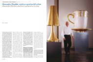
artista sino a Cyclorama 2000. (fig.1)<br />
L’evento cruciale che ha <strong>di</strong>rettamente ispirato il mio Cyclorama 2000<br />
avvenne durante un viaggio sabbatico che feci con la mia famiglia<br />
nell’autunno <strong>del</strong> 1981 quando vi<strong>di</strong> per la prima volta il Panorama <strong>di</strong><br />
Mesdag all’Aia. Non avevo mai visto un <strong>di</strong>pinto a 360 gra<strong>di</strong> prima d’allora<br />
e trovai l’esperienza nel suo complesso travolgente, quasi magica.<br />
Nel giro <strong>di</strong> pochi giorni da questa esperienza, ci trovavamo a Parigi e<br />
vi<strong>di</strong> nuovamente le Ninfee <strong>di</strong> Monet esposte nell’Orangerie. L’opera <strong>di</strong><br />
Monet, al contrario <strong>del</strong> panorama, è una serie <strong>di</strong> otto <strong>di</strong>stinti <strong>di</strong>pinti<br />
all’interno <strong>di</strong> due stanze ovali, quattro <strong>di</strong>pinti separati affissi alla parete<br />
<strong>di</strong> ciascuna stanza che seguivano la curvatura <strong>del</strong>le pareti. Monet,<br />
seppur ispirato dai tra<strong>di</strong>zionali panorama <strong>del</strong> <strong>di</strong>ciannovesimo secolo,<br />
non concepì una rappresentazione come un trompe-l’œil. Questa sua<br />
opera <strong>del</strong>la maturità, come viene considerata ora, possiede una qualità<br />
da campo <strong>di</strong> colore propriamente astratto poiché Monet gioca con le<br />
scene raffigurate fondendo la visione <strong>di</strong>retta degli stagni <strong>di</strong> ninfee con<br />
la visione riflessa <strong>del</strong>le nuvole e <strong>del</strong> cielo, mascherando ogni percezione<br />
<strong>del</strong>la linea d’orizzonte. L’aver visto l’opera <strong>di</strong> Monet imme<strong>di</strong>atamente<br />
dopo quella <strong>di</strong> Mesdag mi convinse in quello stesso momento che la<br />
forma <strong>del</strong> <strong>di</strong>pinto che circonda lo spettatore a 360 gra<strong>di</strong> era la soluzione<br />
ai problemi <strong>di</strong> pittura su cui avevo posto la mia attenzione sin dalle mie<br />
prime opere da artista.<br />
Il mio primo luogo <strong>di</strong> lavoro fu a Roma nel 1963. Sebbene stessi sviluppando<br />
opere astratte sin dagli esor<strong>di</strong>, trascorsi molto tempo in Italia ad<br />
Why a cyclorama? This surely must seem an odd choice of form for<br />
an abstract painter at the end of the twentieth century. Cycloramas,<br />
or panoramas as they were originally called, were invented in the late<br />
eighteenth century, became very popular in the nineteenth century,<br />
and were based on an approach to representing a scene that depended<br />
on an illusory representation. My work has seemingly little relationship<br />
to this so it would seem obvious to question my intent, and yet as I look<br />
back on the choice it seems the result of a very natural evolution of<br />
work and experiences from my beginning as an artist up to Cyclorama<br />
2000. (fig.1)<br />
The crucial event which <strong>di</strong>rectly inspired my Cyclorama 2000 came<br />
during a sabbatical trip I took with my family in the fall of 1981 when I<br />
saw for the first time the Panorama Mesdag in The Hague. I had never<br />
seen a 360-degree painting before and I found the totality of the experience<br />
overwhelming, almost magical. Within days of this experience,<br />
we were in Paris and I saw once again Monet’s Nympheas installed in<br />
the Orangerie. Monet’s work, unlike the panorama, is a series of eight<br />
separate paintings in two oval rooms, four separate paintings set into<br />
the wall of each room following the curve of the walls. Monet, though<br />
inspired by tra<strong>di</strong>tional nineteenth century panoramas, <strong>di</strong>d not intend a<br />
representation in the tromp l’œil sense. His late work, as is now seen,<br />
has a very abstract color field quality to it because Monet plays with<br />
the depicted scene by conflating the <strong>di</strong>rect view of the water lily ponds<br />
with the reflected view of clouds and sky, <strong>di</strong>sguising any awareness<br />
of the horizon line. Seeing Monet’s work so soon after Mesdag’s convinced<br />
me at that very moment that the form of the 360-degree painting<br />
surroun<strong>di</strong>ng the viewer was the solution to the painterly problems<br />
on which I had been focused since my early work as an artist.<br />
My first working venue was in Rome in 1963. Though I was developing<br />
abstract paintings from the beginning, I spent much of my time in Italy<br />
exploring Baroque art; both architecture and paintings in situ. I traveled<br />
extensively in Europe to see other examples of the integration of painting<br />
in architectural space. Because I had been first drawn to study art<br />
by an interest in architecture, I have had a career long interest in the<br />
esplorare l’arte barocca sia nell’architettura che nella pittura in situ. Ho<br />
viaggiato estesamente in Europa per vedere altri esempi <strong>del</strong>l’integrazione<br />
<strong>del</strong>la pittura nello spazio architettonico. Poiché iniziai a <strong>di</strong>segnare<br />
prima <strong>di</strong> stu<strong>di</strong>are arte mosso da un interesse per l’architettura, ho avuto<br />
un interesse lungo tutto il corso <strong>del</strong>la mia carriera per lo stu<strong>di</strong>o <strong>del</strong>lo<br />
spazio <strong>del</strong>la visione come un contesto necessario alla presentazione <strong>di</strong><br />
un <strong>di</strong>pinto. Tra i molti altri esempi, quelli da cui fui particolarmente influenzato<br />
vedendoli in Italia furono la Cappella degli Scrovegni <strong>di</strong> Giotto,<br />
l’Ultima Cena <strong>di</strong> Leonardo, gli affreschi <strong>di</strong> Caracci a Palazzo Farnese, le<br />
stanze <strong>di</strong> Giulio Romano nel Palazzo <strong>del</strong> Tè, la prospettiva <strong>del</strong> Borromini<br />
a Palazzo Spada, la volta <strong>del</strong> Pozzo a San Ignazio, e tutti gli affreschi<br />
<strong>del</strong> Tiepolo in Veneto. Sebbene lavorassi su <strong>di</strong>pinti a due <strong>di</strong>mensioni,<br />
tuttavia, ero interessato nell’attività <strong>del</strong>lo spettatore nell’osservare un<br />
<strong>di</strong>pinto e questo tema era necessariamente esplorato nelle opere che<br />
integravano pittura ed architettura. Ciò mi condusse ad un interesse<br />
più specifico nello stu<strong>di</strong>o <strong>di</strong> come il colore influenzi l’esperienza <strong>del</strong>lo<br />
spettatore <strong>di</strong> un <strong>di</strong>pinto: variando le durate dei momenti <strong>di</strong> fissazione<br />
<strong>del</strong>lo spettatore, i suoi percorsi <strong>di</strong> scrutamento, o le posizioni spaziali.<br />
Quando feci ritorno per lavorare e vivere a New York all’inizio <strong>del</strong> 1966<br />
cominciai a rispondere a questi interessi facendo una serie <strong>di</strong> colonne<br />
tri<strong>di</strong>mensionali in legno che concepii come “passeggiata” o “<strong>di</strong>pinto<br />
continuo”. Questi furono esposti in una galleria a New York nel 1968 e<br />
in seguito al Museum of Modern Art per una mostra antologica <strong>di</strong> arte<br />
americana <strong>del</strong> dopoguerra, The Art of the Real, 1948-68. Una <strong>del</strong>le idee<br />
sul colore che ho esplorato in quei pezzi era l’effetto <strong>di</strong> “trasparenza<br />
apparente” ottenuta tramite l’uso dei colori e <strong>del</strong>le forme in relazione<br />
sequenziale. Ciò condusse logicamente ad un’ulteriore esplorazione<br />
<strong>del</strong> colore mettendo a punto colori primari sottrattivi su fogli acrilici<br />
stampati per creare miscele <strong>di</strong> colore che risultavano dalla visione <strong>del</strong>lo<br />
spettatore attraverso piani trasparenti sovrapposti. Di nuovo l’idea<br />
era <strong>di</strong> incentivare lo spettatore a camminare intorno al pezzo in modo<br />
da scoprire la varietà <strong>del</strong>le <strong>di</strong>verse strutture ed esperienze possibili attraverso<br />
interazioni spaziali e temporali con l’oggetto statico. Sebbene<br />
continuassi ancora a lavorare su <strong>di</strong>pinti per tutto questo periodo – per<br />
Perchè un Ciclorama? / Why a Cyclorama?<br />
study of the viewing space as a necessary context for the presentation<br />
of a painting. Among many other examples, those I was particularly<br />
affected by seeing in Italy were Giotto’s Arena Chapel, Leonardo’s<br />
Last Supper, the Caracci Frescoes in Palazzo Farnese, Giulio Romano’s<br />
rooms in the Palazzo <strong>del</strong> Tè, Borromini’s Perspectiva in Palazzo Spada,<br />
Pozzo’s ceiling in San Ignazio, and all of Tiepolo’s frescoes in the Veneto.<br />
Though I was working on flat paintings I was, nonetheless, interested in<br />
the activity of the viewer when looking at a painting and this issue had<br />
been by necessity explored in works which integrated painting with<br />
architecture. This led to a more specific interest in studying how color<br />
affected the viewer’s experience of a painting: by varying the viewer’s<br />
fixation durations, scanning paths, or spatial locations.<br />
When I returned to live and work in New York in early 1966 I began to<br />
respond to these interests by making a series of three-<strong>di</strong>mensional<br />
wood columns that I thought of as “walk around” or “continuous paintings”.<br />
These were exhibited in a gallery in New York in 1968 and then<br />
in the Museum of Modern Art survey exhibition of post-war American<br />
art, The Art of the Real, 1948-68. One of the color ideas I explored in<br />
these pieces was the effect of “apparent transparency” made by using<br />
colors and forms in sequential relationships. This led logically to my<br />
exploring color further by developing subtractive primary colors in cast<br />
acrylic sheets to create color mixtures resulting from the viewer seeing<br />
through the overlapping transparent planes. Again the idea was to<br />
activate the viewer to walk around the piece in order to <strong>di</strong>scover the variety<br />
of <strong>di</strong>fferent structures and experiences possible through spatial<br />
and temporal interactions with the static object. Although I continued<br />
to work on paintings as well throughout this period – mostly shaped<br />
works which attempted to integrate their image with the wall on which<br />
they were hung – I eventually decided to concentrate my efforts entirely<br />
on flat rectilinear works. I chose to do this because I wanted to present<br />
the seemingly most passive object possible which would demand<br />
the most active searching by the viewer for all possible information.<br />
My investigation of color theory was encouraged when on my return to<br />
New York I had access to Josef Albers’s Interaction of Color published in<br />
18 COLORE<br />
COLORE 19<br />
fig.1