Quaderni di Cultura e Progetto del Colore - Istituto Del Colore
Quaderni di Cultura e Progetto del Colore - Istituto Del Colore
Quaderni di Cultura e Progetto del Colore - Istituto Del Colore

You also want an ePaper? Increase the reach of your titles
YUMPU automatically turns print PDFs into web optimized ePapers that Google loves.
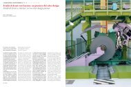
CULTURA / CULTURE [ (1 + 2) 3 4 ] Rosa per caso / Pink by chance<br />
Rosa per caso / La Gazzetta <strong>del</strong>lo Sport<br />
Pink by chance / La Gazzetta <strong>del</strong>lo Sport<br />
<strong>di</strong>/by : Elio Trifari<br />
Siamo avvezzi oggi, frequentando i <strong>di</strong>versi mon<strong>di</strong> legati alla comunicazione<br />
visiva, a imbatterci in sottili <strong>di</strong>squisizioni su una tonalità, una<br />
sfumatura, un'ombra <strong>di</strong> colore che scatena spesso <strong>di</strong>scussioni accese<br />
in funzione <strong>del</strong> messaggio da trasmettere, sia esso pubblicitario, specificamente<br />
rivolto alla comunicazione o semplicemente legato a formule<br />
<strong>di</strong> packaging o <strong>di</strong> presentazione all'utente.<br />
Tutto ciò è logico in un'era in cui i colori sono certificati, nessuno si<br />
muove se non ha il suo bel numero (o co<strong>di</strong>ce) Pantone; i colori certificati<br />
erano 1.144 fino al 2007, poi le esigenze più moderne hanno indotto<br />
la società, leader mon<strong>di</strong>ale nella certificazione <strong>del</strong> colore, ad aggiungere<br />
altre 2.000 e più combinazioni. In comunicazione/pubblicità/marketing,<br />
se non hai un Pantone (cioè la tua sequenza numeri-co<strong>di</strong>ce), non<br />
sei nessuno.<br />
La Gazzetta <strong>del</strong>lo Sport vede la luce alla fine <strong>del</strong>l'Ottocento, in un'epoca<br />
in cui ciascun pittore miscela (se può, segretamente) la sua tavolozza<br />
per ottenere sfumature nuove e affascinanti <strong>di</strong> colore. Oggi il giornale ha<br />
fissato una sfumatura Pantone per il suo rosa base, e aggiunto una sorta<br />
<strong>di</strong> colore-marchio proprietario, un arancione, che è un altro Pantone.<br />
Ma allora, alla fine <strong>del</strong>l'Ottocento, il criterio <strong>di</strong>stintivo nella colorazione<br />
<strong>del</strong>la carta <strong>di</strong> un giornale era assai semplice: carta bianca o sbiancata,<br />
oppure carta colorata. Questa seconda opzione, anche se richiedeva un<br />
processo ulteriore sulle risme <strong>di</strong> carta, era in realtà assai conveniente,<br />
poiché il proce<strong>di</strong>mento <strong>di</strong> sbianca tura <strong>del</strong>la carta era in realtà molto<br />
costoso e produceva risultati accettabili soltanto se applicato a regola<br />
d'arte. Era quin<strong>di</strong> assai più conveniente, piuttosto che utilizzare carta<br />
<strong>di</strong>venuta bianca grazie ai proce<strong>di</strong>menti <strong>di</strong> allora a base <strong>di</strong> biossido <strong>di</strong><br />
cloro, che andavano ripetuti più volte, effettuare un grossolano sbiancamento,<br />
e applicare un colore uniforme che coprisse le imperfezioni.<br />
Fu così che l'e<strong>di</strong>tore Sonzogno, che stampava La Gazzetta nella sua tipografia<br />
collocata in via Pasquirolo, dove oggi a Milano sorge Corsia de'<br />
Servi, scelse una carta <strong>di</strong> basso costo e colore ver<strong>di</strong>no, in accordo con il<br />
colore <strong>di</strong> uno dei due giornali dai quali nasce la Gazzetta, cioè La Tripletta<br />
fondata l'anno prima a Torino da uno dei due creatori <strong>del</strong>la nuova pubblicazione<br />
milanese, Eugenio Camillo Costamagna. Il giornale apparve<br />
dunque in carta ver<strong>di</strong>na, quattro pagine in uscita il lunedì e il venerdì,<br />
con una prima pagina ripartita su 5 colonne, al prezzo <strong>di</strong> 5 centesimi.<br />
Quin<strong>di</strong>, a <strong>di</strong>fferenza <strong>di</strong> quanto comunemente si creda, la Gazzetta non<br />
nacque in carta rosa. Il ver<strong>di</strong>no era il colore <strong>di</strong> uno dei giornali da cui<br />
derivava, ed era più economico. Ma se scorrete le <strong>di</strong>verse storie <strong>del</strong>la<br />
gazzetta, vi leggerete che il giornale <strong>di</strong>venne da ver<strong>di</strong>no giallo, poi bianco,<br />
infine rosa, nell'arco <strong>di</strong> tempo dal 1896 al 1899. Nemmeno questo,<br />
però, è vero: a parte il fatto che, fino alla scelta <strong>del</strong> rosa, sulle colonne<br />
<strong>del</strong>la gazzetta non si fa cenno né alla colorazione d'epoca, né alle variazioni<br />
riscontrate, fino all'annuncio <strong>del</strong>la scelta <strong>del</strong> rosa che viene <strong>di</strong>ffuso<br />
alla fine <strong>del</strong> 1898, e messo in pratica all'inizio <strong>del</strong> 1899, le ricerche<br />
condotte sulle copie meglio conservate hanno permesso <strong>di</strong> chiarire<br />
che, in realtà, il colore verde non venne abbandonato per oltre due anni,<br />
dall'aprile 1896 al <strong>di</strong>cembre 1898. Semplicemente, le tecniche <strong>di</strong> colorazione<br />
erano molto approssimative, né Edoardo Sonzogno intendeva<br />
Today we are used, atten<strong>di</strong>ng the <strong>di</strong>fferent worlds related to visual<br />
communication, to fall in subtle <strong>di</strong>squisitions on a hue, a shade, a gradation<br />
of colour, that often erupt into vivid <strong>di</strong>scussions depen<strong>di</strong>ng on<br />
the message to convey, being it for advertising, specifically aimed to<br />
communication or simply referred to packaging or introduction to user<br />
formulas.<br />
All that is logical in such an age where colours are patented, nobody<br />
moves a finger without a neat Pantone code; certified colours were<br />
1.144 until 2007, then the most modern needs have induced the company,<br />
world leader in colour certification, to add 2.000 and more other<br />
combinations. In communication/advertising/marketing, without a<br />
Pantone code (i.e. the number-code sequence), you are no one.<br />
La Gazzetta <strong>del</strong>lo Sport was founded at the end of the Nineteenth Century,<br />
during a period when every painter produces (possibly in secret)<br />
his own palette in order to obtain new and fascinating shades of colour.<br />
Today the newspaper has set a Pantone hue for its basic pink, and has<br />
added a sort of proprietary colour-label, orange, that is another Pantone.<br />
But then, at the end of the Nineteenth Century, the <strong>di</strong>stinctive principle<br />
for a newspaper paper colouration was very simple: white or whitened<br />
paper, or greaseproof paper. This second option, even though nee<strong>di</strong>ng<br />
a further process for paper reams, in truth was very inexpensive, because<br />
the paper whitening process was actually quite expensive and<br />
produced acceptable results only if properly applied. It was therefore<br />
much more convenient, instead of using white paper obtained by the<br />
period processes based on chlorine <strong>di</strong>oxide, that needed to be repeated<br />
several times, to carry out a coarse whitening, and then to lay an uniform<br />
colour covering every imperfection. So the publisher Sonzogno,<br />
that printed in his typography sited in via Pasquirolo in Milan, where<br />
today there is Corsia de’ Servi, chose a low cost and light green paper,<br />
accor<strong>di</strong>ng the colour to one of the two newspapers which La Gazzetta<br />
derives from, i.e. La Tripletta founded the year before in Turin by one of<br />
the two creators of the new Milanese publication, Eugenio Camillo Costamagna.<br />
The newspaper appeared then with a light green paper, four<br />
pages on sale on Mondays and Fridays, with a first page <strong>di</strong>vided over 5<br />
columns, at the price of 5 cents lira.<br />
So, despite what is commonly believed, La Gazzetta was not born on<br />
pink paper. Light green was the colour of one of the papers it originated<br />
from, and it was more economical. But looking trough the <strong>di</strong>fferent<br />
histories regar<strong>di</strong>ng La Gazzetta, it is possible to notice that the newspaper<br />
from light green became at first yellow, then white, at the end<br />
pink, during the 1896 to 1899 period. However, that is not completely<br />
true: even not considering the fact that, until pink became the colour of<br />
choice, on the newspaper’s columns there was no hint concerning neither<br />
the colour of the time nor its variations, until the public announce<br />
of pink as the chosen colour was made at the end of 1898, and put in<br />
practice at the beginning of 1899, researches conducted on the best<br />
preserved copies have permitted to make clear that, actually, the green<br />
colour was not abandoned for more than two years, from April 1896 to<br />
December 1898. Simply put, the colouring techniques were not very<br />
30 COLORE<br />
COLORE 31