- Page 1 and 2: THE LIQUOR-BOOK By CHARLES AUSTIN B
- Page 3: This hook ,111(1 its aocompanj'ingc
- Page 6 and 7: Copyright J 899 The Charles Austin
- Page 8 and 9: 4 THE LIQUOR BOOK. liquor and would
- Page 10 and 11: 6 THE LIQUOR BOOK. Do not fall into
- Page 14 and 15: 10 THE LIOUOR BOOK. LET US SERVE YO
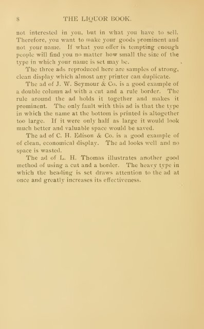
- Page 16 and 17: 12 THE LIQUOR BOOK. Aside from news
- Page 18 and 19: 14 THE LIQUOR BOOK. Now, this is ex
- Page 20 and 21: 16 THE LIQUOR BOOK. Do this in the
- Page 23: Good Claret No. 1025. makes a feast
- Page 27: No. 1035. The Things You See after
- Page 31: No. 1054. Invigorating And Pure. Wh
- Page 35: No. 1127. Pay Enough. Low priced th
- Page 39: No. 1149. Do You Like Egg Nogg ? Yo
- Page 43: The Bible Says No. 1151. " Drink no
- Page 47: No. 1229. This Is The Season when e
- Page 51: No. 1299. The Best Of All. " All wh
- Page 55: No. 1301. Even a Wooden Indian woul
- Page 59: No. 1303. World=Renowned Whiskey is
- Page 63:
No. 13'?^. When You Go Home from a
- Page 67:
No. 1418. The Picture Of Health is
- Page 71:
No. 1509. The New Woman knows a thi
- Page 75:
No. 163:3. Anything You Want. Whate
- Page 79:
No. 3000. " Your Health And Your Fa
- Page 83:
No. 3002. ^,,U!b':
- Page 87:
No. ;50()4. There's Strength In It.
- Page 91:
No. 3006. The Sick Man's Shelter
- Page 95:
A Shandy Gaff No. 3()0S. is a great
- Page 99:
No. 3010. A Household Guard. .porte
- Page 103:
No. 3012. It Will Carry You straigh
- Page 107:
No. :3014. You Are In Danger of the
- Page 111:
No. :'.()l(i. Nothing But The Best
- Page 115:
No. :!018. A Liberal Supply of Wine
- Page 119:
No. 3020. The Approaching Holidays
- Page 123:
No. 3023. Make a Bowl of Egg Nogg f
- Page 127:
No. 3024. We Are Prepared to Fill o
- Page 131:
if You Want No. 3020. good, wholeso
- Page 135:
No. ;5028. Don't Be In a Hurry when
- Page 139:
No 30:30. Don't Forget Us when you
- Page 143:
No. 3032. There's As Much Differenc
- Page 147:
No. ,?084. In Considering the Brew
- Page 151:
No. 3036. We Make a Specialty of bo
- Page 155:
No. 3038. A Reliable Dealer needs n
- Page 159:
Masquerading No. 3040. inferior liq
- Page 163:
Your Selection No. 3042. of a bottl
- Page 167:
No. 3044. Quality Rather Than Quant
- Page 171:
No. 3046. "Knowledge is Power" and
- Page 175:
No. 3048. Full of Life and Vigor. T
- Page 179:
No. aooo. We Have No Leaks to provi
- Page 183:
Good Beer No. 3052. is a refreshing
- Page 187:
Good Health No. 3054. is to be foun
- Page 191:
No. 305(5. AND LIQUORS Be On Your G
- Page 195:
No. 3058. Beer That's Really Good i
- Page 199:
No. 3061. A Pleasure To The Thirsty
- Page 203:
No. 3003. flakes All Hearts Glad. T
- Page 207:
No. 30(55. The Value of Wine to con
- Page 211:
Good Wine No. 3067. has toned up th
- Page 215:
No. 3069. " Tips." The word "tip" m
- Page 219:
No. :5071. A Good Servant and one t
- Page 223:
No. 307;: Statistics Show that for
- Page 227:
No. 3075. Drink Chianti. Chianti is
- Page 231:
No. 3077. ttUtttttttth All Kinds of
- Page 235:
No. 3080. ^^=^^^^ Drink Hints. —
- Page 239:
No. 3083. The Question of Purity is
- Page 243:
No. 3084. Lovers of Pure Wine are u
- Page 247:
No. 308(5. Take Your Choice. We do
- Page 251:
No. 3088. A Significant Sign. Our c
- Page 255:
No. 3090. If You Like Beer come in
- Page 259:
No. 3092.
- Page 263:
No. 3094.
- Page 267:
No. 3090. V/a
- Page 271:
No. 3098. Dinner Without Wine is no
- Page 275:
No. 5421. When You Are Going Away t
- Page 279:
No. 7012. Come Right In. Vou can sa
- Page 283:
No. 7054. The Highest Possible. The
- Page 287:
The Chief Point No. 7062. you shoul
- Page 291:
No. 7101. Nothing Is More Delicious
- Page 295:
i No. 7103.
- Page 299:
Extremes Meet No. 7105. in this sto
- Page 303:
No. 7107. Duplicate Orders. " Send
- Page 307:
No. 7109. The Best On Earth. There
- Page 311:
No. 7111. Very Old People need a li
- Page 315:
No. 711:^. WINES LIQUORS When You T
- Page 319:
No. 7115. When You Are In A Hurry j
- Page 323:
No 71 r If You Like Fine Whiskey tr
- Page 327:
No. 7119. Night Caps. A great many
- Page 331:
No. 7121. Your Favorite Drink with
- Page 335:
No. 712:S. We Want To Introduce you
- Page 339:
The Next Time No. 7125. you give a
- Page 343:
No. 7127. The Matter of Time is mos
- Page 347:
No. 9507. Don't be Taken in liquors
- Page 351:
No. 9547. We Have Reason To Feel Bi
- Page 355:
No. 9562. The Size of the Bottle is
- Page 359:
There is no Use No. 9578. in Preach
- Page 363:
No. 9588. In Puritan Times there wa
- Page 367:
No. 9590. You Won't Have Night=Mare
- Page 371:
CATCH-LINES AND HEADINGS, CLIPPED F
- Page 375:
THE LIQUOR BOOK. If you like to mix
- Page 379:
THE LIQUOR BOOK. A thoroughly good
- Page 383:
THE LIQUOR BOOK. If we traveled the
- Page 387:
THE LIQUOR BOOK. Anybody can claim
- Page 391:
THE LIQUOR BOOK. We don't buy goods
- Page 395:
Daily Sales and Advertising Record
- Page 399:
With Time^ Space, Pi'ice, THE LIQUO
- Page 403:
With Time, Space, Price, THE LIQUOR
- Page 407:
THE LIQUOR BOOK. Record of Advertis
- Page 411:
With Time, Space, Price, THE LIOUOR
- Page 415:
3 4 5 6 7 8 9 lO 11 13 13 14 15 IG
- Page 423:
Total, SALES INCREASE (Advertising)
- Page 427:
3 -1 5 G 7 8 9 lO 11 12 13 14 15 16
- Page 433:
3 4 A C 7 8 9 lO 11 12 13 14 15 IC
- Page 440:
TH&. LIQUO^peOOK By CHARLES AUSTIN