Battle of the Nudes
Battle of the Nudes
Battle of the Nudes
You also want an ePaper? Increase the reach of your titles
YUMPU automatically turns print PDFs into web optimized ePapers that Google loves.
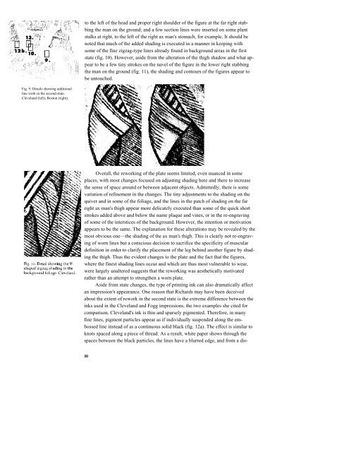
Fig. 9. Details showing additional<br />
line work in <strong>the</strong> second state.<br />
Cleveland (left), Boston (right).<br />
to <strong>the</strong> left <strong>of</strong> <strong>the</strong> head and proper right shoulder <strong>of</strong> <strong>the</strong> figure at <strong>the</strong> far right stab-<br />
bing <strong>the</strong> man on <strong>the</strong> ground; and a few section lines were inserted on some plant<br />
stalks at right, to <strong>the</strong> left <strong>of</strong> <strong>the</strong> right ax man's stomach, for example. It should be<br />
noted that much <strong>of</strong> <strong>the</strong> added shading is executed in a manner in keeping with<br />
some <strong>of</strong> <strong>the</strong> fine zigzag-type lines already found in background areas in <strong>the</strong> first<br />
state (fig. 10). However, aside from <strong>the</strong> alteration <strong>of</strong> <strong>the</strong> thigh shadow and what ap-<br />
pear to be a few tiny strokes on <strong>the</strong> navel <strong>of</strong> <strong>the</strong> figure in <strong>the</strong> lower right stabbing<br />
<strong>the</strong> man on <strong>the</strong> ground (fig. 11), <strong>the</strong> shading and contours <strong>of</strong> <strong>the</strong> figures appear to<br />
be untouched.<br />
Overall, <strong>the</strong> reworking <strong>of</strong> <strong>the</strong> plate seems limited, even nuanced in some<br />
places, with most changes focused on adjusting shading here and <strong>the</strong>re to increase<br />
<strong>the</strong> sense <strong>of</strong> space around or between adjacent objects. Admittedly, <strong>the</strong>re is some<br />
variation <strong>of</strong> refinement in <strong>the</strong> changes. The tiny adjustments to <strong>the</strong> shading on <strong>the</strong><br />
quiver and in some <strong>of</strong> <strong>the</strong> foliage, and <strong>the</strong> lines in <strong>the</strong> patch <strong>of</strong> shading on <strong>the</strong> far<br />
right ax man's thigh appear more delicately executed than some <strong>of</strong> <strong>the</strong> quick short<br />
strokes added above and below <strong>the</strong> name plaque and vines, or in <strong>the</strong> re-engraving<br />
<strong>of</strong> some <strong>of</strong> <strong>the</strong> interstices <strong>of</strong> <strong>the</strong> background. However, <strong>the</strong> intention or motivation<br />
appears to be <strong>the</strong> same. The explanation for <strong>the</strong>se alterations may be revealed by <strong>the</strong><br />
most obvious one—<strong>the</strong> shading <strong>of</strong> <strong>the</strong> ax man's thigh. This is clearly not re-engrav-<br />
ing <strong>of</strong> worn lines but a conscious decision to sacrifice <strong>the</strong> specificity <strong>of</strong> muscular<br />
definition in order to clarify <strong>the</strong> placement <strong>of</strong> <strong>the</strong> leg behind ano<strong>the</strong>r figure by shad-<br />
ing <strong>the</strong> thigh. Thus <strong>the</strong> evident changes to <strong>the</strong> plate and <strong>the</strong> fact that <strong>the</strong> figures,<br />
where <strong>the</strong> finest shading lines occur and which are thus most vulnerable to wear,<br />
were largely unaltered suggests that <strong>the</strong> reworking was aes<strong>the</strong>tically motivated<br />
ra<strong>the</strong>r than an attempt to streng<strong>the</strong>n a worn plate.<br />
Aside from state changes, <strong>the</strong> type <strong>of</strong> printing ink can also dramatically affect<br />
an impression's appearance. One reason that Richards may have been deceived<br />
about <strong>the</strong> extent <strong>of</strong> rework in <strong>the</strong> second state is <strong>the</strong> extreme difference between <strong>the</strong><br />
inks used in <strong>the</strong> Cleveland and Fogg impressions, <strong>the</strong> two examples she cited for<br />
comparison. Cleveland's ink is thin and sparsely pigmented. Therefore, in many<br />
fine lines, pigment particles appear as if individually suspended along <strong>the</strong> em-<br />
bossed line instead <strong>of</strong> as a continuous solid black (fig. 12a). The effect is similar to<br />
knots spaced along a piece <strong>of</strong> thread. As a result, white paper shows through <strong>the</strong><br />
spaces between <strong>the</strong> black particles, <strong>the</strong> lines have a blurred edge, and from a dis-<br />
30


