OpenType User Guide for Adobe Fonts - Linotype
OpenType User Guide for Adobe Fonts - Linotype
OpenType User Guide for Adobe Fonts - Linotype

You also want an ePaper? Increase the reach of your titles
YUMPU automatically turns print PDFs into web optimized ePapers that Google loves.
10<br />
<strong>OpenType</strong> <strong>User</strong> <strong>Guide</strong><br />
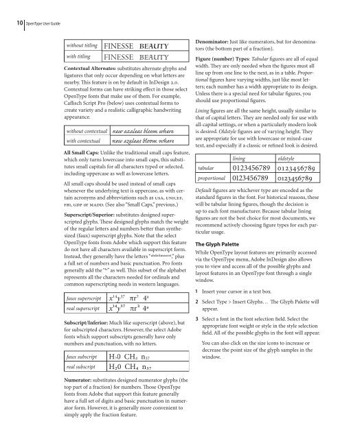
without titling<br />
with titling<br />
FINESSE BEAUTY<br />
<br />
Contextual Alternates: substitutes alternate glyphs and<br />
ligatures that only occur depending on what letters are<br />
nearby. is feature is on by default in InDesign 2.0.<br />
Contextual <strong>for</strong>ms can have striking effect in those select<br />
<strong>OpenType</strong> fonts that make use of them. For example,<br />
Caflisch Script Pro (below) uses contextual <strong>for</strong>ms to<br />
create variety and a realistic calligraphic handwriting<br />
appearance.<br />
without contextual<br />
with contextual<br />
new azaleas bloom where<br />
les l r<br />
All Small Caps: Unlike the traditional small caps feature,<br />
which only turns lowercase into small caps, this substitutes<br />
small capitals <strong>for</strong> all characters typed or selected,<br />
including uppercase as well as lowercase letters.<br />
All small caps should be used instead of small caps<br />
whenever the underlying text is uppercase, as with certain<br />
acronyms and abbreviations such as USA, UNICEF,<br />
FBI, GDP or MADD. (See also “Small Caps,” previous.)<br />
Superscript/Superior: substitutes designed superscripted<br />
glyphs. ese designed glyphs match the weight<br />
of the regular letters and numbers better than synthesized<br />
(faux) superscript glyphs. Note that the select<br />
<strong>OpenType</strong> fonts from <strong>Adobe</strong> which support this feature<br />
do not have all characters available in superscript <strong>for</strong>m.<br />
Instead, they generally have the letters “abdeilmⁿorst,” plus<br />
a full set of numbers and basic punctuation. Pro fonts<br />
generally add the “h” as well. is subset of the alphabet<br />
represents all the characters needed <strong>for</strong> ordinals and<br />
common superscripting needs in western languages.<br />
faux superscript<br />
real superscript<br />
x 14 37 y πr 2 4 a<br />
x¹⁴y<br />
³⁷ πr<br />
² 4a<br />
Subscript/Inferior: Much like superscript (above), but<br />
<strong>for</strong> subscripted characters. However, the select <strong>Adobe</strong><br />
fonts which support subscripts generally have only<br />
numbers and punctuation, with no letters.<br />
faux subscript H 2 0 CH 4 n 37<br />
real subscript H₂0 CH₄ n₃₇<br />
Denominator: Just like numerators, but <strong>for</strong> denominators<br />
(the bottom part of a fraction).<br />
Figure (number) Types: Tabular figures are all of equal<br />
width. ey are only needed when the figures must all<br />
line up from one line to the next, as in a table. Proportional<br />
figures have varying widths, just like most letters;<br />
each number has a width appropriate to its design.<br />
Unless there is a special need <strong>for</strong> tabular figures, you<br />
should use proportional figures.<br />
Lining figures are all the same height, usually similar to<br />
that of capital letters. ey are needed only <strong>for</strong> use with<br />
all-capital settings, or when a particularly modern look<br />
is desired. Oldstyle figures are of varying height. ey<br />
are appropriate <strong>for</strong> use with lowercase or mixed-case<br />
text, and especially if a classic or refined look is desired.<br />
lining<br />
oldstyle<br />
tabular 0123456789 0123456789<br />
proportional 0123456789 0123456789<br />
Default figures are whichever type are encoded as the<br />
standard figures in the font. For historical reasons, these<br />
will be tabular lining figures, though the decision is<br />
up to each font manufacturer. Because tabular lining<br />
figures are not the best choice <strong>for</strong> most documents, we<br />
recommend actively choosing figure types <strong>for</strong> each particular<br />
usage.<br />
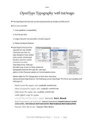
The Glyph Palette<br />
While <strong>OpenType</strong> layout features are primarily accessed<br />
via the <strong>OpenType</strong> menu, <strong>Adobe</strong> InDesign also allows<br />
you to view and access all of the possible glyphs and<br />
layout features in an <strong>OpenType</strong> font through a single<br />
window.<br />
1 Insert your cursor in a text box.<br />
2 Select Type > Insert Glyphs… e Glyph Palette will<br />
appear.<br />
3 Select a font in the font selection field. Select the<br />
appropriate font weight or style in the style selection<br />
field. All of the possible glyphs in the font will appear.<br />
You can also click on the size icons to increase or<br />
decrease the point size of the glyph samples in the<br />
window.<br />
Numerator: substitutes designed numerator glyphs (the<br />
top part of a fraction) <strong>for</strong> numbers. ose <strong>OpenType</strong><br />
fonts from <strong>Adobe</strong> that support this feature generally<br />
have a full set of digits and basic punctuation in numerator<br />
<strong>for</strong>m. However, it is generally more convenient to<br />
simply apply the fraction feature.