THE COLOR CONNECTION BOOK SERIES - Xerox
THE COLOR CONNECTION BOOK SERIES - Xerox
THE COLOR CONNECTION BOOK SERIES - Xerox

You also want an ePaper? Increase the reach of your titles
YUMPU automatically turns print PDFs into web optimized ePapers that Google loves.
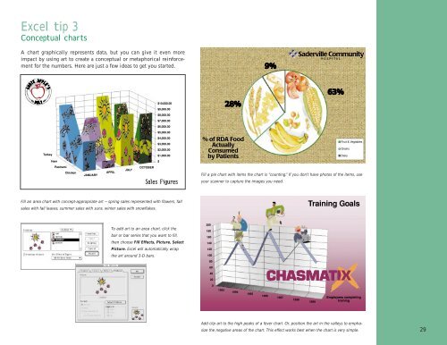
Excel tip 3<br />
Conceptual charts<br />
A chart graphically represents data, but you can give it even more<br />
impact by using art to create a conceptual or metaphorical reinforcement<br />
for the numbers. Here are just a few ideas to get you started.<br />
Fill a pie chart with items the chart is “counting.” If you don’t have photos of the items, use<br />
your scanner to capture the images you need.<br />
Fill an area chart with concept-appropriate art — spring sales represented with flowers, fall<br />
sales with fall leaves, summer sales with suns, winter sales with snowflakes.<br />
To add art to an area chart, click the<br />
bar or bar series that you want to fill,<br />
then choose Fill Effects, Picture, Select<br />
Picture. Excel will automatically wrap<br />
the art around 3-D bars.<br />
Add clip art to the high peaks of a fever chart. Or, position the art in the valleys to emphasize<br />
the negative areas of the chart. This effect works best when the chart is very simple.<br />
29