Getting Started Opportunities If you’re used to being limited to just black and white, you might not immediately recognize all the colorful opportunities you now have. But that won’t last long. Consider these ways to use color: Sales – Product literature, data sheets, direct mail, new business pitches, logos. Quotes, proposals, and presentations customized for each product. Colorful handouts and collateral. Marketing Communications – Brochures, collateral, ad design and layout, and publications design. Market research reports and graphics, customized studies and presentations. Training and Human Resources – Presentations for new hires, procedures manuals, documentation, policies handbooks, informational brochures and forms. Guidelines Production – Originals or multiple copies of reports, report or binder covers, proposals, labels, presentations, conference materials including signs, name tags, and agendas. Accounting – Spreadsheets, financial projections, business graphics. Complex statistics and charts. Invoices and statements, accented with color for a stronger call-to-action. Executive Offices – Full-color transparencies for presentations; color graphs and charts in critical reports. Personalized and customizable letterhead that’s always in stock. 4 To get started using color in your business documents, consider these basic guidelines. Then get ready to increase the power and presence of all your work. Attract attention to the most important ideas with bright colors, such as red or royal blue. Keep in mind, though, that a little goes a long way. Large areas of bright color can take attention away from the rest of your document. Use subtler colors as well. Too-tiny areas of light color can be overlooked. They’re best for backgrounds or large areas. For example, use soft yellow or light blue as a backdrop or text and charts on overheads. Follow the rainbow. If you’re color-coding a sequence of elements, the natural progression is the same as the rainbow — red, orange, yellow, green, blue, indigo, violet. Use color associations. People tend to associate colors with various conventions. For example, red and green denote “Christmas,” black and orange are “Halloween.” Blue is “cool.” Red and orange are “warm.” Be careful — red can also mean “in the red” on a spreadsheet. Use contrast. Make sure that adjacent colors, such as those used in a pie chart, are distinct. Colors that are too similar in tone or value can blur together and confuse the information. Be consistent. Don’t get carried away with your new paintbox of colors. If you have a set of related graphics or headings, keep their colors the same all the way through a document.
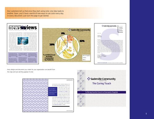
Our customers tell us that once they start using color, one idea leads to another. Soon, you’ll have a world of new ways to use color every day, in every document. Just turn the page to get started. Every design and document you create for your organization can benefit from the snap and eye-catching appeal of color. 5