
You also want an ePaper? Increase the reach of your titles
YUMPU automatically turns print PDFs into web optimized ePapers that Google loves.
Tema broja | Issue Theme<br />
To je <strong>Lone</strong> | To je <strong>Lone</strong><br />
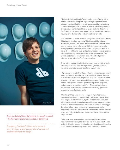
Davor Bruketa<br />
Agencija Bruketa&Žinić OM dobitnik je mnogih hrvatskih<br />
i međunarodnih priznanja i nagrada za oblikovanje<br />
The Agency Bruketa&Žinid OM is the winner of<br />
many Croatian, as well as international awards and<br />
acknowledgements for design<br />
“Najdojmljiviji dio projekta je “srce” zgrade, fantastičan hol koji se<br />
proteže cijelom visinom zgrade, u jednom dijelu apsorbira okolnu<br />
prirodu u interijer, ishodište je za pristup svim sadržajima i u njemu<br />
se nalaze velike prostorne intervencije Ivane Franke i Silvija Vujićića.<br />
Svi koji dođu u taj hotel pamtit će ga upravo po tome. Zato smo to<br />
“srce” odabrali kao simbol ovog hotela. <strong>Lone</strong> je postao izlog kreativnih<br />
industrija ovog dijela svijeta” - objašnjava Davor Bruketa.<br />
Pred kreatorima se potom postavilo pitanje kako “visoku klasu” hotela<br />
iščitati već iz vizualnog identiteta? Bilo bi puno lakše, kaže nam<br />
Bruketa, da je <strong>Hotel</strong> <strong>Lone</strong> “samo” hotel visoke klase. Međutim, hotel<br />
<strong>Lone</strong> je okrenut prema nekoliko različitih ciljnih skupina, između<br />
ostalog i prema ljudima koje zanima dizajn i dizajn hoteli. Radi se o<br />
maloj, ali vrlo zahtjevnoj grupi gostiju koji vrlo dobro znaju prepoznati<br />
vrhunski dizajn i koji nisu sramežljivi u svojim komentarima. Zato<br />
Bruketa ističe kako je originalnost ideje, relevantnost poruke i<br />
vrhunska izrada jedino što “igra” u ovom slučaju.<br />
Grupa koja je kreirala vizualni identitet hotela <strong>Lone</strong> koristila je bijelu<br />
crnu i boju hrasta kao temeljne boje ali se u njihovim vizualnim<br />
rješenjima pojavljuju i akcenti “zemljano-crvene” boje.<br />
“U projektiranju pojedinih aplikacija fokusirali smo se na pozicioniranje<br />
hotela, praktičnost upotrebe i racionalno trošenje resursa. Danas po<br />
hotelskim sobama pronalazimo potpuno iracionalne buntove različitih<br />
tiskanica s vrlo niskim stupnjem praktične upotrebe. Pokušat ćemo<br />
pronaći bolja rješenja, iako smo djelomično ograničeni propisima.<br />
Nadam se da će u nekoj fazi izaći iPad i iPhone aplikacije koje će<br />
biti neki oblik praktičnog vodiča po hotelu i destinaciji, gledano iz<br />
perspektive korisnika dizajn hotela.<br />
Arhitektura <strong>Hotel</strong>a <strong>Lone</strong> inspirira se uspješnim prethodnicima iz<br />
sedamdesetih godina u Hrvatskoj. Mada i suvremeni hrvatski dizajn<br />
vuče korijene iz raznih tradicija, a jedna od najsnažnijih upravo se<br />
odnosi na to razdoblje Kreatori vizualnog identiteta nisu se pretjerano<br />
vezivali uz tradicionalna rješenja. Poštivali su suvremene tehnologije,<br />
digitalizaciju koja otvora potpuno novi spektar mogućnosti u<br />
projektiranju identiteta. Bruketa ističe kako baš zato vizualni identitet<br />
hotela <strong>Lone</strong> više nije do te mjere fiksiran, kao što su bili identiteti iz<br />
ranijih vremena.<br />
“Osim toga, sama narav subjekta nam je dopustila da otvorimo<br />
vrata raznim interpretacijama identiteta što će se jasno vidjeti i kroz<br />
aplikacije. Ukratko, vizualni identitet <strong>Lone</strong>a će imati bezbroj lica, ali će<br />
se sva prepoznavati kao dizajn hotel <strong>Lone</strong>” - zaključuje Bruketa.<br />
“The most impressive part of the project is the “heart” of the building,<br />
a fantastic hall, stretching through the building in all its height,<br />
absorbing the surrounding nature into its interior, the starting point<br />
for reaching all the hotel contents. It is adorned with large spatial<br />
interventions of Ivana Franke and Silvijo Vujićić. All the visitors will<br />
remember the hotel by this, and this is why this “heart” was chosen<br />
to symbolize this hotel. The <strong>Lone</strong> became the showcase for creative<br />
industries in this part of the world,” explained Davor Bruketa.<br />
The designers were asked how one can read a hotel’s “high class” from<br />
its visual identity. It would be much easier if the <strong>Lone</strong> <strong>Hotel</strong> was “just”<br />
a high class hotel, commented Bruketa. However, it speaks to several<br />
different target groups; among others, to people who are interested in<br />
design and designer hotels. This is a small, but very demanding group<br />
of guests who can recognize top-notch design and who do not hesitate<br />
when making comments. An original idea, a relevant message and<br />
supreme workmanship are the only things that play any part here.<br />
The group that designed the visual identity of the <strong>Lone</strong> used white,<br />
black and oak as the basic colours, but their solutions also include<br />
earth-red colours as means of accentuation.<br />
“In designing certain applications, we focused on the positioning of the<br />
hotel, the practicality of its use and rational resource spending. Today’s<br />
hotel rooms often offer completely irrational volumes of various printed<br />
material and the possibilities for their practical use are extremely<br />
limited. We will try to find better solutions, although regulations are<br />
partially limiting. I hope that, in a certain phase, we will publish iPad<br />
and iPhone applications to serve as a kind of a practical guide around<br />
the hotel and the destination, as seen from the perspective of the<br />
clients of the designer hotel.<br />
<strong>Lone</strong> <strong>Hotel</strong>’s architecture was inspired by its successful predecessors<br />
from Croatia’s seventies. Even though modern Croatian design draws<br />
from various traditions, and one of the strongest traditions comes<br />
from that very period, the designers did not cling to traditional<br />
solutions. They took into consideration contemporary technologies and<br />
digitalisation, which opens a completely new spectre of possibilities in<br />
designing identity. Bruketa points out that this is the very reason why<br />
the visual identity of the <strong>Lone</strong> hotel is no longer fixed like identities<br />
from earlier times were.<br />
“Besides, the very nature of the subject lets us open the way for<br />
various interpretations of identity, which will be clearly seen in<br />
applications, too. In a word, the visual identity of the <strong>Lone</strong> will have a<br />
million faces, but all of them will be easily recognizable as part of the<br />
<strong>Lone</strong> <strong>Hotel</strong> design,” concludes Bruketa.<br />
14<br />
15