Age-friendly Primary Health Care Centres Toolkit - World Health ...
Age-friendly Primary Health Care Centres Toolkit - World Health ...
Age-friendly Primary Health Care Centres Toolkit - World Health ...
- No tags were found...
Create successful ePaper yourself
Turn your PDF publications into a flip-book with our unique Google optimized e-Paper software.
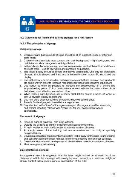
AGE-FRIENDLY PRIMARY HEALTH CARE CENTRES TOOLKITIV.2 Guidelines for inside and outside signage for a PHC centreIV.2.1 The principles of signageDesigning signage:1. Characters and backgrounds of signs should be of an eggshell, matte or other nonglarefinish.2. Characters and symbols must contrast with their background – light background withdark letters or dark background with light letters.3. Letters should be large enough and not overcrowded so that those from a distancecan read them – use as few words and numerals as possible.4. The visual display should be simple and easy to understand. Use only key words andphrases, simple shapes and lines, and a few well-chosen words. Do not crowd thedisplay.5. Use pictures whenever possible, preferably pictures that are common and familiar tothe community in order to increase recognition for those with cognitive impairment.6. Use colour as often as possible to increase the effectiveness of a picture andemphasize key points. Colour combinations or contrasts are important – the coloursthat attract most attention are red and blue.7. When making signs by hand, use a heavy black felt-tip pen on a white, off-white, orlight yellow non-glossy background.8. Use non-glare glass for building directories mounted behind glass.9. Provide Braille signage in line with local regulations.10. Pay attention to the “tone” of the sign messages. Messages should be welcomingand cordial, inserting “please” and “thank you for your cooperation” whereappropriate.Placement of signage:1. Place all signs at eye level, with large lettering.2. Outside the building to identify buildings with accessible facilities.3. At main lobbies or main traffic routes to indicate location of centre.4. At specific areas of the building that are accessible and not only at speciallydesigned toilets.5. Develop a consistent room numbering system that is easy for the user to understand,and consider adding the floor number to reinforce locations in multi-floor buildings.6. Directional signs should be displayed at places where there is a change of direction7. Mark emergency exits clearly.Size of letters in signage:As a general rule it is suggested that the letter height should be at least 1% of thedistance at which the message will usually be read, subject to a minimum height of22mm. Table 1 below gives a general appreciation of this rule:106


