Cherry Creek North Design Guidelines - City and County of Denver
Cherry Creek North Design Guidelines - City and County of Denver
Cherry Creek North Design Guidelines - City and County of Denver

You also want an ePaper? Increase the reach of your titles
YUMPU automatically turns print PDFs into web optimized ePapers that Google loves.
URBAN DESIGN STANDARDS AND GUIDELINES<br />
GUIDELINES<br />
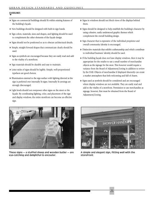
◗ These signs — a stuffed sheep <strong>and</strong> wooden butler — are A simple <strong>and</strong> elegant sign, fitting well with the<br />
◗ Signs on commercial buildings should fit within existing features <strong>of</strong><br />
the building’s façade.<br />
◗ New buildings should be designed with built-in sign b<strong>and</strong>s.<br />
◗ Sign colors, materials, sizes <strong>and</strong> shapes, <strong>and</strong> lighting should be used<br />
to complement the other elements <strong>of</strong> the façade design.<br />
◗ Signs should not be positioned so as to obscure architectural details.<br />
◗ Simple, straight forward shapes that communicate clearly should be<br />
used.<br />
◗ Signs as symbols are encouraged because they are easily read <strong>and</strong> add<br />
to the vitality <strong>of</strong> a storefront.<br />
◗ Sign materials should be durable <strong>and</strong> easy to maintain.<br />
◗ Letter styles <strong>of</strong> signs should be legible. Simple, well-proportioned<br />
typefaces are good choices.<br />
◗ Illumination external to the sign surface with lighting directed at the<br />
sign is preferred over internally lit signs. Internally lit awnings are<br />
strongly discouraged.<br />
◗ Light levels should not overpower other signs on the street or the<br />
façade. By coordinating lighting, color, <strong>and</strong> placement <strong>of</strong> the sign<br />
<strong>and</strong> display windows, the entire storefront can become an effective<br />
sign.<br />
eye-catching <strong>and</strong> delightful to encouter. storefront.<br />
◗ Signs in windows should not block views <strong>of</strong> the displays behind<br />
them.<br />
◗ Signs should be designed to help establish the building’s character by<br />
using cohesive, easily understood graphic themes which<br />
complement the overall building design.<br />
◗ Sign character that is expressive <strong>of</strong> the individual proprietor <strong>and</strong><br />
overall community identity is encouraged.<br />
◗ Distinctive materials that exhibit craftsmanship <strong>and</strong> which contribute<br />
to individual business’ identity should be used.<br />
◗ If the building façade does not have display windows, then it may be<br />
appropriate for the retailer to use a small number <strong>of</strong> merch<strong>and</strong>ise<br />
objects as the signage for the store. This however would require a<br />
variance from the Board <strong>of</strong> Adjustment/Zoning in addition to review<br />
by the DAB. Objects <strong>of</strong> merch<strong>and</strong>ise if displayed discreetly can create<br />
a market atmosphere that feels welcoming <strong>and</strong> full <strong>of</strong> charm.<br />
◗ Signs used as symbols should be considered <strong>and</strong> are encouraged<br />
where display windows are not available. They are easily read <strong>and</strong><br />
add to the vitality <strong>of</strong> a storefront. Permission to use merch<strong>and</strong>ise as<br />
signage, however, first must be obtained from the Board <strong>of</strong><br />
Adjustment/Zoning.<br />
25