Derby Downtown Lighting & Signage Plan

Create successful ePaper yourself
Turn your PDF publications into a flip-book with our unique Google optimized e-Paper software.
Community Workshop #1 - <strong>Lighting</strong> Core Values and<br />
Goals Feedback<br />
ÎÎ<br />
ÎÎ<br />
Bus stops need to be well-lit<br />
No ‘young-trendy’ designs - try to save the history of the district<br />
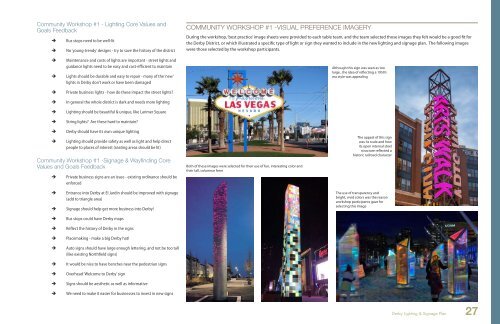
COMMUNITY WORKSHOP #1 -VISUAL PREFERENCE IMAGERY<br />
During the workshop, ‘best practice’ image sheets were provided to each table team, and the team selected those images they felt would be a good fit for<br />
the <strong>Derby</strong> District, or which illustrated a specific type of light or sign they wanted to include in the new lighting and signage plan. The following images<br />
were those selected by the workshop participants.<br />
ÎÎ<br />
ÎÎ<br />
ÎÎ<br />
ÎÎ<br />
ÎÎ<br />
ÎÎ<br />
Maintenance and costs of lights are important - street lights and<br />
guidance lights need to be easy and cost-efficient to maintain<br />
Lights should be durable and easy to repair - many of the ‘new’<br />
lights in <strong>Derby</strong> don’t work or have been damaged<br />
Private business lights - how do these impact the street lights?<br />
In general the whole district is dark and needs more lighting<br />
<strong>Lighting</strong> should be beautiful & unique, like Larimer Square<br />
String lights? Are these hard to maintain?<br />
Although this sign was seen as too<br />
large , the idea of reflecting a 1950’s<br />
era style was appealing<br />
ÎÎ<br />
ÎÎ<br />
<strong>Derby</strong> should have its own unique lighting<br />
<strong>Lighting</strong> should provide safety as well as light and help direct<br />
people to places of interest (seating areas should be lit)<br />
Community Workshop #1 -<strong>Signage</strong> & Wayfinding Core<br />
Values and Goals Feedback<br />
ÎÎ<br />
Private business signs are an issue - existing ordinance should be<br />
enforced<br />
Both of these images were selected for their use of fun, interesting color and<br />
their tall, columnar form<br />
The appeal of this sign<br />
was its scale and how<br />
its open internal steel<br />
structure reflected a<br />
historic railroad character<br />
ÎÎ<br />
ÎÎ<br />
ÎÎ<br />
ÎÎ<br />
ÎÎ<br />
ÎÎ<br />
ÎÎ<br />
ÎÎ<br />
ÎÎ<br />
ÎÎ<br />
Entrance into <strong>Derby</strong> at El Jardin should be improved with signage<br />
(add to triangle area)<br />
<strong>Signage</strong> should help get more business into <strong>Derby</strong>!<br />
Bus stops could have <strong>Derby</strong> maps<br />
Reflect the history of <strong>Derby</strong> in the signs<br />
Placemaking - make a big <strong>Derby</strong> hat!<br />
Auto signs should have large enough lettering, and not be too tall<br />
(like existing Northfield signs)<br />
It would be nice to have benches near the pedestrian signs<br />
Overhead ‘Welcome to <strong>Derby</strong>’ sign<br />
Signs should be aesthetic as well as informative<br />
We need to make it easier for businesses to invest in new signs<br />
The use of transparency and<br />
bright, vivid colors was the reason<br />
workshop participants gave for<br />
selecting this image<br />
<strong>Derby</strong> <strong>Lighting</strong> & <strong>Signage</strong> <strong>Plan</strong><br />
27