
You also want an ePaper? Increase the reach of your titles
YUMPU automatically turns print PDFs into web optimized ePapers that Google loves.
50 k n o w l e d g e & c o m p e t e n c e<br />
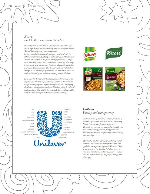
Knorr<br />
Back to the roots – back to nature<br />
It all began in the nineteenth century with vegetable soup<br />
and a logo that fitted with healthy and natural food: white<br />
"Knorr" lettering on a green background.<br />
In the years that followed, the company ventured onto the<br />
international market setting up subsidiaries and factories in<br />
around 100 countries. Its product range grew too, as soups<br />
were joined by sauces, stocks, bouillons, seasonings, dressings,<br />
frozen goods and convenience food, but also exotic specialities<br />
and classic Italian cuisine. This development was reflected in<br />
changes to the Knorr logo: yellow and red elements were added<br />
to the white and green and later it even gained a 3D look.<br />
Last year, the brand went back to basics and returned to its<br />
origins with the new logo featuring "Knorr" in the familiar<br />
swept lettering against a green background, thus conveying<br />
the distinct message of naturalness. This clear pledge is reflected<br />
in the products. After all, 95 per cent of the herbs and vegetables<br />
used at Knorr do originate from sustainable farming.<br />
sun<br />
dna<br />
bee<br />
palm tree<br />
hand & flower<br />
hair<br />
bowl<br />
flower<br />
sauces or spreads<br />
spice & flavours<br />
fish<br />
sparkle<br />
bird<br />
lips<br />
recycle<br />
ice cream<br />
particles<br />
tea<br />
frozen<br />
heart<br />
waves & liquid<br />
clothes<br />
container<br />
Unilever<br />
Variety and transparency<br />
Unilever is one of the world’s largest producers of<br />
consumer goods with over 400 brands, including<br />
Knorr, in more than fourteen segments.<br />
The spectrum ranges from food and drinks, through<br />
household cleaning products, to hygiene items.<br />
The company therefore sought to depict this diversity<br />
in a new logo.<br />
The result is an elaborate design featuring twentyfive<br />
icons that each have a specific meaning and<br />
symbolise an important aspect for Unilever. Their<br />
arrangement in the familiar "U" shape conveys<br />
openness, friendliness and transparency – values<br />
that are important in the company’s strategy and<br />
philosophy.