
Create successful ePaper yourself
Turn your PDF publications into a flip-book with our unique Google optimized e-Paper software.
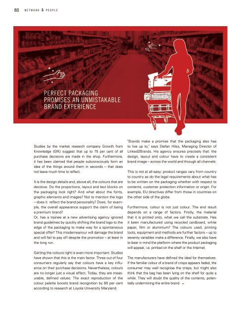
60 n e t w o r k & p e o p l e<br />
Perfect packaging<br />
promises an unmistakable<br />
brand experience<br />
Studies by the market research company Growth from<br />
Knowledge (GfK) suggest that up to 75 per cent of all<br />
purchase decisions are made in the shop. Furthermore,<br />
it has been claimed that people subconsciously form an<br />
idea of the things around them in seconds – that does<br />
not leave much time to reflect.<br />
It is the design details and, above all, the colours that are<br />
decisive. Do the proportions, layout and text blocks on<br />
the packaging look right? And what about the fonts,<br />
graphic elements and images? Not to mention the logo<br />
– does it reflect the brand personality? Does, for example,<br />
the overall appearance support the claim of being<br />
a premium brand?<br />
Or, has a trainee at a new advertising agency ignored<br />
brand guidelines by quickly shifting the brand logo to the<br />
edge of the packaging to make way for a spontaneous<br />
special offer? This misdemeanour will damage the brand<br />
and will fail to pay off despite the promotion – at least in<br />
the long run.<br />
Getting the colours right is even more important. Studies<br />
have shown that this is the main factor. Three out of four<br />
consumers regularly say that colours have a key influence<br />
on their purchase decisions. Nevertheless, colours<br />
are no longer just a visual effect. Today, they are measurable,<br />
defined values. The exact reproduction of the<br />
colour palette boosts brand recognition by 80 per cent<br />
according to research at Loyola University Maryland.<br />
"Brands make a promise that the packaging also has<br />
to live up to," says Stefan Hilss, Managing Director of<br />
<strong>Linked</strong>2Brands. His agency ensures precisely that: the<br />
design, layout and colour have to create a consistent<br />
brand image – across the world and through all channels.<br />
This is not at all easy: product ranges vary from country<br />
to country as do the legal requirements about what has<br />
to be written on the packaging whether with respect to<br />
contents, customer protection information or origin. For<br />
example, EU directives differ from those in countries on<br />
the other side of the globe.<br />
Furthermore, colour is not just colour. The end result<br />
depends on a range of factors. Firstly, the material<br />
that it is printed onto, what we call the substrate. Has<br />
it been manufactured using recycled cardboard, white<br />
paper, film or aluminium? The colours used, printing<br />
tools, equipment and methods are further factors – up to<br />
seventy variables make a difference. Finally, we also have<br />
to bear in mind the platform where the product packaging<br />
will appear, i.e. printed on the shelf or the Internet.<br />
The manufacturers have defined the ideal for themselves.<br />
If the familiar colour of a brand of crisps appears faded, the<br />
consumer may well recognise the crisps, but might also<br />
think that the bag has been lying on the shelf for quite a<br />
while. They will doubt the quality of the contents, potentially<br />
undermining the entire brand.