MontanaCans LOOKBOOK 2021
https://www.yumpu.com/en/document/view/65637371/montanacans-lookbook-2021
https://www.yumpu.com/en/document/view/65637371/montanacans-lookbook-2021

Create successful ePaper yourself
Turn your PDF publications into a flip-book with our unique Google optimized e-Paper software.
Born in 1978, NOMAD’s graffiti journey started<br />
in the city of Bremerhaven where experienced<br />
his formative years. Although starting<br />
his graffiti path in 1993, it wasn’t till 1998–<br />
1999 till he took ownership of the name NOMAD while<br />
living in Nürnberg.<br />
Without his awareness, these 5 letters became<br />
the key to his pursuit for continual progression in<br />
the graffiti discipline of letter styles. NOMAD’s path took<br />
him on a style map that not even Google would be able<br />
to plot. With the vigor of the Berlin style writing movement,<br />
NOMAD took his skills, not to the nation’s capital,<br />
but rather, the port city of Hamburg. Which incidentally<br />
due to its strong graffiti community, plays a key<br />
role in the history and future of not only German graffiti<br />
but also, Europe and all over the globe.<br />
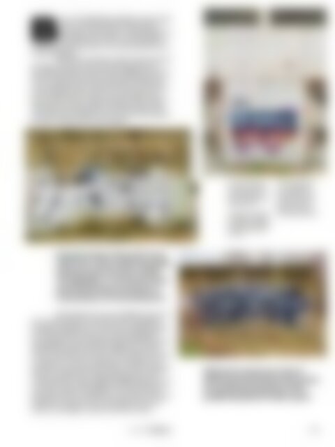
← A knowing nod to<br />
the history of graffiti,<br />
and a progressive<br />
need to keep pushing<br />
things forward.<br />
↓ Going from positive<br />
to negative, or negative<br />
to positive, NOMAD<br />
makes it look easy either<br />
way.<br />
↑ The hand and ductus<br />
of NOMAD are<br />
ever-present in his<br />
continually evolving<br />
practice. There is<br />
always a little more<br />
than mear perfection.<br />
Paying homage to those that came<br />
before him, many traditional graffiti<br />
elements such as arrows, clouds,<br />
3D, highlights, or horizontal (train<br />
panel) placement are present in<br />
many phases of his development.<br />
With rebellion at its core, NOMAD’s style is at<br />
times indescribable, and at other times the epidemy<br />
of graphic typography. An arena where graffiti abstraction<br />
meets head-on with some classic typographic<br />
heavyweights. Always heavily loaded with the key color<br />
ingredients of black and white, NOMAD can do with<br />
two cans which few can even conceive. What is for some<br />
a restriction, is to him a challenge. A challenge, that<br />
just like his style experiments, lead him down a road that<br />
can go in any direction. Paying homage to those that<br />
came before him, many traditional graffiti elements such<br />
as arrows, clouds, 3D, highlights, or horizontal (train<br />
panel) placement are present in many phases of his development.<br />
However even if you think you’ve seen it<br />
before, he manages to make it look like no other.<br />
Without his awareness, these 5<br />
letters became the key to his pursuit<br />
for continual progression in the<br />
graffiti discipline of letter styles.<br />
Interview Nomad<br />
105