Chapter 14 - Bootstrap Methods and Permutation Tests - WH Freeman
Chapter 14 - Bootstrap Methods and Permutation Tests - WH Freeman
Chapter 14 - Bootstrap Methods and Permutation Tests - WH Freeman

Create successful ePaper yourself
Turn your PDF publications into a flip-book with our unique Google optimized e-Paper software.
<strong>14</strong>-22 CHAPTER <strong>14</strong> <strong>Bootstrap</strong> <strong>Methods</strong> <strong>and</strong> <strong>Permutation</strong> <strong>Tests</strong><br />
800<br />
Smooth<br />
Regression line<br />
600<br />
Payoff<br />
400<br />
200<br />
0 200 400 600 800 1000<br />
Number<br />
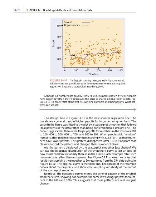
FIGURE <strong>14</strong>.10 The first 254 winning numbers in the New Jersey Pick-<br />
It Lottery <strong>and</strong> the payoffs for each. To see patterns we use least-squares<br />
regression (line) <strong>and</strong> a scatterplot smoother (curve).<br />
Although all numbers are equally likely to win, numbers chosen by fewer people<br />
have bigger payoffs if they win because the prize is shared among fewer tickets. Figure<br />
<strong>14</strong>.10 is a scatterplot of the first 254 winning numbers <strong>and</strong> their payoffs. What patterns<br />
can we see?<br />
The straight line in Figure <strong>14</strong>.10 is the least-squares regression line. The<br />
line shows a general trend of higher payoffs for larger winning numbers. The<br />
curve in the figure was fitted to the plot by a scatterplot smoother that follows<br />
local patterns in the data rather than being constrained to a straight line. The<br />
curve suggests that there were larger payoffs for numbers in the intervals 000<br />
to 100, 400 to 500, 600 to 700, <strong>and</strong> 800 to 999. When people pick “r<strong>and</strong>om”<br />
numbers, they tend to choose numbers starting with 2, 3, 5, or 7, so these numbers<br />
have lower payoffs. This pattern disappeared after 1976; it appears that<br />
players noticed the pattern <strong>and</strong> changed their number choices.<br />
Are the patterns displayed by the scatterplot smoother just chance? We<br />
can use the bootstrap distribution of the smoother’s curve to get an idea of<br />
how much r<strong>and</strong>om variability there is in the curve. Each resample “statistic”<br />
is now a curve rather than a single number. Figure <strong>14</strong>.11 shows the curves that<br />
result from applying the smoother to 20 resamples from the 254 data points in<br />
Figure <strong>14</strong>.10. The original curve is the thick line. The spread of the resample<br />
curves about the original curve shows the sampling variability of the output<br />
of the scatterplot smoother.<br />
Nearly all the bootstrap curves mimic the general pattern of the original<br />
smoother curve, showing, for example, the same low average payoffs for numbers<br />
in the 200s <strong>and</strong> 300s. This suggests that these patterns are real, not just<br />
chance.