Chapter 2: Graphs, Charts, and Tables--Describing Your Data
Chapter 2: Graphs, Charts, and Tables--Describing Your Data
Chapter 2: Graphs, Charts, and Tables--Describing Your Data

You also want an ePaper? Increase the reach of your titles
YUMPU automatically turns print PDFs into web optimized ePapers that Google loves.
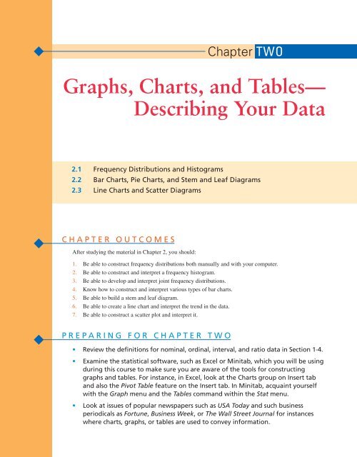
<strong>Chapter</strong> TWO<br />
<strong>Graphs</strong>, <strong>Charts</strong>, <strong>and</strong> <strong>Tables</strong>—<br />
<strong>Describing</strong> <strong>Your</strong> <strong>Data</strong><br />
2.1 Frequency Distributions <strong>and</strong> Histograms<br />
2.2 Bar <strong>Charts</strong>, Pie <strong>Charts</strong>, <strong>and</strong> Stem <strong>and</strong> Leaf Diagrams<br />
2.3 Line <strong>Charts</strong> <strong>and</strong> Scatter Diagrams<br />
CHAPTER OUTCOMES<br />
After studying the material in <strong>Chapter</strong> 2, you should:<br />
1. Be able to construct frequency distributions both manually <strong>and</strong> with your computer.<br />
2. Be able to construct <strong>and</strong> interpret a frequency histogram.<br />
3. Be able to develop <strong>and</strong> interpret joint frequency distributions.<br />
4. Know how to construct <strong>and</strong> interpret various types of bar charts.<br />
5. Be able to build a stem <strong>and</strong> leaf diagram.<br />
6. Be able to create a line chart <strong>and</strong> interpret the trend in the data.<br />
7. Be able to construct a scatter plot <strong>and</strong> interpret it.<br />
PREPARING FOR CHAPTER TWO<br />
• Review the definitions for nominal, ordinal, interval, <strong>and</strong> ratio data in Section 1-4.<br />
• Examine the statistical software, such as Excel or Minitab, which you will be using<br />
during this course to make sure you are aware of the tools for constructing<br />
graphs <strong>and</strong> tables. For instance, in Excel, look at the <strong>Charts</strong> group on Insert tab<br />
<strong>and</strong> also the Pivot Table feature on the Insert tab. In Minitab, acquaint yourself<br />
with the Graph menu <strong>and</strong> the <strong>Tables</strong> comm<strong>and</strong> within the Stat menu.<br />
• Look at issues of popular newspapers such as USA Today <strong>and</strong> such business<br />
periodicals as Fortune, Business Week, or The Wall Street Journal for instances<br />
where charts, graphs, or tables are used to convey information.
32 CHAPTER 2 • GRAPHS, CHARTS, AND TABLES—DESCRIBING YOUR DATA<br />
W HY Y OU N EED TO K NOW<br />
We live in an age where we are constantly bombarded with<br />
visual images <strong>and</strong> stimuli. Much of our time is spent watching<br />
television, playing video games, or working at a computer<br />
monitor. These technologies are advancing rapidly, making<br />
the images sharper <strong>and</strong> more attractive to our eyes. Flat-panel<br />
screens, high-resolution monitors, <strong>and</strong> high-definition televisions<br />
represent significant improvements over the original<br />
technologies that they replaced. However, this phenomenon<br />
is not limited to video technology, but has also become an<br />
important part of the way businesses communicate with customers,<br />
employees, suppliers, <strong>and</strong> other constituents.<br />
Presentations <strong>and</strong> reports are expected to include<br />
high-quality graphs <strong>and</strong> charts that effectively transform<br />
data into information. While the written word is still vital,<br />
words become even more powerful when coupled with an<br />
effective visual illustration of data. The adage that “a picture<br />
is worth a thous<strong>and</strong> words” is particularly relevant in<br />
business decision making.<br />
As a business major, upon graduation you will find<br />
yourself on both ends of the data analysis business. On the<br />
one h<strong>and</strong>, regardless of what you end up doing for a career,<br />
you will almost certainly be involved in preparing reports<br />
<strong>and</strong> making presentations requiring the use of the visual<br />
descriptive statistical tools presented in this chapter. You<br />
will be on the “do it” end of the data analysis process.<br />
Thus, you need to know how to use these statistical tools.<br />
On the other h<strong>and</strong>, you will also find yourself reading<br />
reports or listening to presentations that others have made.<br />
In many instances, you will be required to make important<br />
decisions, or reach conclusions, based on the information<br />
in those reports or presentations. Thus, you will be on the<br />
“use it” end of the data analysis process. You need to be<br />
knowledgeable about these tools in order to effectively<br />
screen <strong>and</strong> critique the work that others do for you.<br />
<strong>Charts</strong> <strong>and</strong> graphs are not just tools used internally by<br />
businesses. Business periodicals such as Fortune <strong>and</strong><br />
Business Week use graphs <strong>and</strong> charts extensively in articles<br />
to help readers better underst<strong>and</strong> key concepts. Many<br />
advertisements will even use graphs <strong>and</strong> charts effectively<br />
to convey their message. Virtually every issue of The Wall<br />
Street Journal contains different graphs, charts, or tables<br />
that display data in an informative way.<br />
Thus, you will find yourself as both a producer <strong>and</strong> a<br />
consumer of the descriptive statistical techniques known as<br />
graphs, charts, <strong>and</strong> tables. You will create a competitive<br />
advantage for yourself throughout your career if you<br />
obtain a solid underst<strong>and</strong>ing of the techniques introduced<br />
in <strong>Chapter</strong> 2.<br />
This chapter introduces some of the most frequently used tools <strong>and</strong> techniques for<br />
describing data with graphs, charts, <strong>and</strong> tables. Although this analysis can be done manually,<br />
we will provide output from Excel <strong>and</strong> Minitab showing that these software packages<br />
can be used as tools for doing the analysis easily, quickly, <strong>and</strong> with a finished quality that<br />
once required a graphic artist.<br />
CHAPTER OUTCOME #1<br />
Frequency Distribution<br />
A summary of a set of data that<br />
displays the number of<br />
observations in each of the<br />
distribution’s distinct categories<br />
or classes.<br />
Discrete <strong>Data</strong><br />
<strong>Data</strong> that can take on a countable<br />
number of possible values.<br />
2.1 Frequency Distributions <strong>and</strong> Histograms<br />
As we discussed in <strong>Chapter</strong> 1, in today’s business climate, companies collect massive<br />
amounts of data they hope will be useful for making decisions. Every time a customer<br />
makes a purchase at a store like Wal-Mart or Sears, data from that transaction is updated to<br />
the store’s database. For example, one item of data that is captured is the number of different<br />
product categories included in each “market basket” of items purchased. Table 2.1<br />
shows these data for all customer transactions for a single day at one store in Atlanta. A total<br />
of 450 customers made purchases on the day in question. The first value, 4, in Table 2.1<br />
indicates that the customer’s purchase included four different product categories (for example<br />
food, sporting goods, photography supplies, <strong>and</strong> dry goods).<br />
While the data in Table 2.1 are easy to capture with the technology of today’s cash<br />
registers, in this form the data provide little or no information that managers could use to<br />
determine the buying habits of their customers. However, these data can be converted into<br />
useful information through descriptive statistical analysis.<br />
Frequency Distribution<br />
One of the first steps would be to construct a frequency distribution.<br />
The product data in Table 2.1 take on only a few possible values (1, 2, 3, ..., 11). The<br />
minimum number of product categories is 1 <strong>and</strong> the maximum number of categories in<br />
these data is 11. These data are called discrete data.
CHAPTER 2 • GRAPHS, CHARTS, AND TABLES—DESCRIBING YOUR DATA 33<br />
TABLE 2.1 Product Categories Per Customer at the Atlanta Retail Store<br />
4 2 5 8 8 10 1 4 8 3 4 1 1 3 4<br />
1 4 4 5 4 4 4 9 5 4 4 10 7 11 4<br />
10 2 6 7 10 5 4 6 4 6 2 3 2 4 5<br />
5 4 11 1 4 1 9 2 4 6 6 7 6 2 3<br />
6 5 3 4 5 6 5 3 10 6 5 7 7 4 3<br />
8 2 2 6 5 11 9 9 5 5 6 5 3 1 7<br />
6 6 5 3 8 4 3 3 4 4 4 7 6 4 9<br />
1 6 5 5 4 4 7 5 6 6 9 5 6 10 4<br />
7 5 8 4 4 7 4 6 6 4 4 2 10 4 5<br />
4 11 8 7 9 5 6 4 2 8 4 2 6 6 6<br />
6 4 6 5 7 1 6 9 1 5 9 10 5 5 10<br />
5 4 7 5 7 6 9 5 3 2 1 5 5 5 5<br />
5 9 5 3 2 5 7 2 4 6 4 4 4 4 4<br />
6 5 8 5 5 5 5 5 2 5 5 6 4 6 5<br />
5 7 10 2 2 6 8 3 1 3 5 6 3 3 6<br />
5 4 5 3 3 7 9 4 4 5 10 6 10 5 9<br />
4 3 8 7 1 8 4 3 1 3 6 7 5 5 5<br />
4 7 4 11 6 6 3 7 9 4 4 2 9 7 5<br />
1 6 6 8 3 8 4 4 1 9 3 9 3 4 2<br />
9 5 5 7 10 5 3 4 7 7 6 2 2 4 4<br />
4 7 3 5 4 9 2 3 4 3 2 1 6 4 6<br />
1 8 1 4 3 5 5 10 4 4 4 6 9 2 7<br />
9 4 5 3 6 5 5 3 4 6 5 7 3 6 8<br />
3 6 1 5 7 7 5 4 6 6 6 3 6 9 5<br />
4 5 10 1 5 5 7 8 9 1 6 5 6 6 4<br />
10 6 5 5 5 1 6 5 6 4 7 9 10 2 6<br />
4 4 6 11 9 5 4 4 3 5 4 6 2 6 7<br />
3 5 6 7 4 5 4 6 9 4 3 3 6 9 4<br />
3 7 5 6 11 4 4 8 4 2 8 2 4 2 3<br />
6 5 1 10 5 9 5 4 5 1 4 9 5 4 4<br />
When you encounter discrete data, where the variable of interest can take on only a<br />
reasonably small number of possible values, a frequency distribution is constructed by<br />
counting the number of times each possible value occurs in the data set. We organize these<br />
counts into a frequency distribution table as shown in Table 2.2. Now, from this frequency<br />
distribution we are able to see how the data values are spread over the different number of<br />
possible product categories. For instance, you can see that the most frequently occurring<br />
number of product categories in a customer’s “market basket” is 4, which occurred 92<br />
times. You can also see that the three most common number of product categories are 4,<br />
5, <strong>and</strong> 6. Only a very few times do customers purchase 10 or 11 product categories in their<br />
shopping trip to the store.<br />
Consider another example in which a consulting firm surveyed r<strong>and</strong>om samples of<br />
residents in two cities, Dallas, Texas, <strong>and</strong> Knoxville, Tennessee. The firm is investigating<br />
the labor markets in these two communities for a client that is thinking of relocating its<br />
corporate offices to one of the two locations. Education level of the workforce in the two<br />
cities is a key factor in making the relocation decision. The consulting firm surveyed 160<br />
r<strong>and</strong>omly selected adults in Dallas <strong>and</strong> 330 adults in Knoxville <strong>and</strong> recorded the number
34 CHAPTER 2 • GRAPHS, CHARTS, AND TABLES—DESCRIBING YOUR DATA<br />
TABLE 2.2 Atlanta Store Product<br />
Categories Frequency<br />
Distribution<br />
Number of<br />
Product<br />
Catagories<br />
Frequency<br />
1 25<br />
2 29<br />
3 42<br />
4 92<br />
5 83<br />
6 71<br />
7 35<br />
8 19<br />
9 29<br />
10 18<br />
11 7<br />
Total 450<br />
TABLE 2.3 Frequency Distributions of Years of College Education<br />
Dallas<br />
Knoxville<br />
Years of College Frequency Years of College Frequency<br />
0 35 0 187<br />
1 21 1 62<br />
2 24 2 34<br />
3 22 3 19<br />
4 31 4 14<br />
5 13 5 7<br />
6 6 6 3<br />
7 5 7 4<br />
8 3 8 0<br />
Total 160 Total 330<br />
Relative Frequency<br />
The proportion of total<br />
observations that are in a given<br />
category. Relative frequency<br />
is computed by dividing the<br />
frequency in a category by the<br />
total number of observations.<br />
The relative frequencies can be<br />
converted to percentages by<br />
multiplying by 100.<br />
of years of college attended. The responses ranged from zero to eight years. Table 2.3<br />
shows the frequency distributions for each city.<br />
Suppose now we wished to compare the college years distribution for Dallas with<br />
that for Knoxville. How do the two cities’ distributions compare? Do you see any difficulties<br />
in making this comparison? Because the surveys contained different numbers of<br />
people, it is difficult to compare the frequency distributions directly. When the number of<br />
total observations differs, comparisons are aided if relative frequencies are computed.<br />
Equation 2-1 is used to compute the relative frequencies.
CHAPTER 2 • GRAPHS, CHARTS, AND TABLES—DESCRIBING YOUR DATA 35<br />
Relative Frequency<br />
Relative frequency f i<br />
n<br />
(2.1)<br />
where:<br />
f i<br />
Frequency of the ith value of the discreate variable<br />
n <br />
k<br />
∑<br />
i1<br />
f i<br />
k The number of different values for the discrete variable<br />
Table 2.4 shows the relative frequencies for each city’s distribution. This makes a<br />
comparison of the two much easier. We see that Knoxville has relatively more people without<br />
any college (56.7%) or one year of college (18.8%) than Dallas (21.9% <strong>and</strong> 13.1%).<br />
At all other levels of education, Dallas has relatively more people than Knoxville.<br />
The frequency distributions shown in Table 2.2 <strong>and</strong> Table 2.3 were developed from<br />
quantitative data. That is, the variable of interest was numerical (number of product categories<br />
or number of years of college). However, a frequency distribution can also be developed<br />
when the data are qualitative data or nonnumerical data. For instance, if a survey<br />
asked individuals for their marital status, the following possible responses could be listed:<br />
Single<br />
Married<br />
Divorced<br />
Other<br />
Table 2.5 shows the frequency distribution from a survey of 200 people.<br />
TABLE 2.4 Relative Frequency Distributions of Years of College<br />
Dallas<br />
Knoxville<br />
Years of Relative Relative<br />
College Frequency Frequency Frequency Frequency<br />
0 35 35/160 0.219 187 187/330 0.567<br />
1 21 21/160 0.131 62 62/330 0.188<br />
2 24 24/160 0.150 34 34/330 0.103<br />
3 22 22/160 0.138 19 19/330 0.058<br />
4 31 31/160 0.194 14 14/330 0.042<br />
5 13 13/160 0.081 7 7/330 0.021<br />
6 6 6/160 0.038 3 3/330 0.009<br />
7 5 5/160 0.031 4 4/330 0.012<br />
8 3 3/160 0.019 0 0/330 0.000<br />
Total 160 330<br />
TABLE 2.5 Marital Status Frequency<br />
Distribution<br />
Marital Status<br />
Frequency<br />
Single 80<br />
Married 90<br />
Divorced 20<br />
Other 10<br />
Total 200
36 CHAPTER 2 • GRAPHS, CHARTS, AND TABLES—DESCRIBING YOUR DATA<br />
SUMMARY Developing Frequency <strong>and</strong> Relative Frequency Distributions for Discrete <strong>Data</strong><br />
To develop a discrete data frequency distribution, perform<br />
the following steps:<br />
1. List all possible values of the variable. If the variable is<br />
ordinal level or higher, order the possible values from<br />
low to high.<br />
2. Count the number of occurrences at each value of<br />
the variable <strong>and</strong> place this value in a column labeled<br />
“frequency.”<br />
To develop a relative frequency distribution, do the<br />
following:<br />
3. Use Equation 2.1 <strong>and</strong> divide each frequency count by the<br />
total number of data values <strong>and</strong> place in a column headed<br />
“relative frequency.”<br />
EXAMPLE 2-1 Frequency <strong>and</strong> Relative Frequency Distributions<br />
TRY PROBLEM 2.3<br />
International Airline Travel Following the tragic events of September 11, 2001,<br />
there was a sharp reduction in international travel by U.S. citizens. A travel magazine<br />
recently surveyed 16 business executives to determine how many international trips they<br />
made in 2006. The following data were observed:<br />
3 0 0 1<br />
1 2 2 0<br />
0 2 1 0<br />
2 1 4 2<br />
The editors wish to construct a frequency distribution <strong>and</strong> a relative frequency distribution<br />
for the number of international trips taken by these executives.<br />
Step 1 List the possible values.<br />
The possible values listed in order for the discrete variable are 0, 1, 2, 3,<br />
4.<br />
Step 2 Count the number of occurrences at each value.<br />
The frequency distribution follows:<br />
International Trips Frequency Relative Frequency<br />
0 5 5/16 .3125<br />
1 4 4/16 .2500<br />
2 5 5/16 .3125<br />
3 1 1/16 .0625<br />
4 1 1/16 .0625<br />
Total 16 1.0000<br />
Step 3 Determine the relative frequencies.<br />
The relative frequencies are determined by dividing each frequency by<br />
16, as shown. Thus, just over 31% of those responding took no trips<br />
during 2006.
CHAPTER 2 • GRAPHS, CHARTS, AND TABLES—DESCRIBING YOUR DATA 37<br />
EXAMPLE 2-2 Frequency Distribution for Qualitative <strong>Data</strong><br />
Lawn Care Companies A subdivision in northern California has 20 homes.<br />
Recently a survey was conducted to determine which lawn service the homeowners used<br />
last summer. Fifteen homeowners responded to the survey with the following results:<br />
Emerald Green Thumb Green Thumb Self Self<br />
Master Care Emerald Self Master Care Green Thumb<br />
Emerald Self Master Care Emerald Self<br />
The frequency distribution for this qualitative variable is found as follows:<br />
Step 1 List the possible values.<br />
The possible values for the variable are Emerald, Green Thumb, Master<br />
Care, <strong>and</strong> Self.<br />
Step 2 Count the number of occurrences at each value.<br />
The frequency distribution is<br />
Lawn Company<br />
Frequency<br />
Emerald 4<br />
Green Thumb 3<br />
Master Care 3<br />
Self 5<br />
Total 15<br />
Business<br />
Application<br />
Excel <strong>and</strong> Minitab Tutorial<br />
ATHLETIC SHOE SURVEY In recent years, a status symbol for many students has been the<br />
br<strong>and</strong> <strong>and</strong> style of athletic shoes they wear. Companies such as Nike <strong>and</strong> Adidas compete<br />
for the top position in the sport shoe market. A survey was recently conducted in which<br />
100 college students at a southern state school were asked a number of questions, including<br />
how many pairs of Nike shoes they currently own. The data are in a file called<br />
SportsShoes on the CD-ROM that comes with this text.<br />
The variable Number of Nike is a discrete quantitative variable. Figures 2.1 <strong>and</strong> 2.2<br />
show frequency distributions (Excel <strong>and</strong> Minitab versions) for the number of Nike shoes<br />
owned by those surveyed. These frequency distributions show that, although a few<br />
people own more than six pairs of Nike shoes, the bulk of those surveyed own two or<br />
fewer pairs.<br />
CHAPTER OUTCOME #1<br />
Continuous <strong>Data</strong><br />
<strong>Data</strong> whose possible values are<br />
uncountable <strong>and</strong> which may<br />
assume any value in an interval.<br />
Grouped <strong>Data</strong> Frequency Distributions<br />
In the previous examples, the variable of interest was a discrete variable <strong>and</strong> the number<br />
of possible values for the variable was limited to only a few. However, there are many<br />
instances in which the variable of interest will be either continuous (weight, time, length)<br />
or discrete <strong>and</strong> have many possible outcomes (age, income, stock prices), yet we want to<br />
describe the variable using a frequency distribution.<br />
BLOCKBUSTER INC. Blockbuster is one of the largest video rental <strong>and</strong> sales companies in<br />
the United States. Its stores rent <strong>and</strong> sell both VHS tapes <strong>and</strong> DVD products. Recently, a<br />
district manager for Blockbuster in Arkansas conducted a survey of customers in her district.<br />
Among the questions asked on the written survey was, “How many DVD movies do
38 CHAPTER 2 • GRAPHS, CHARTS, AND TABLES—DESCRIBING YOUR DATA<br />
FIGURE 2.1<br />
Excel 2007 Output—<br />
Nike Shoes Frequency<br />
Distribution<br />
Excel 2007 Instructions:<br />
1. Open File: SportsShoes.xls.<br />
2. Enter the Possible Values<br />
for the Variable; i.e., 0, 1,<br />
2, 3, 4, etc.<br />
3. Select the cells to contain<br />
the Frequency values.<br />
4. Click on the fx button.<br />
5. Select the Statistics—<br />
FREQUENCY function.<br />
6. Enter the range of data<br />
<strong>and</strong> the bin range (the cells<br />
containing the possible<br />
number of shoes).<br />
7. Press ctrl-shift-enter to<br />
determine the frequency<br />
values.<br />
you own?” A total of 230 people completed the survey; Table 2.6 shows the responses to<br />
the DVD ownership question. These data are discrete, quantitative data. The values range<br />
from 0 to 30.<br />
The manager is interested in transforming these data into useful information by constructing<br />
a frequency distribution. Table 2.7 shows one approach where the possible values<br />
for the number of DVD movies owned is listed from 0 to 30. While this frequency distribution<br />
is a step forward in transforming the data into information, because of the large<br />
number of possible values for DVD movies owned, the 230 observations are spread over a<br />
large range, making analysis difficult. In this case, the manager might consider forming a<br />
grouped data frequency distribution by organizing the possible number of DVD movies<br />
owned into discrete categories or classes.<br />
The first step in constructing a grouped frequency distribution is to sort the quantitative<br />
data from low to high. The sorted data is called a data array. Next, define the classes<br />
FIGURE 2.2<br />
Minitab Output—Nike<br />
Shoes Frequency<br />
Distribution<br />
Minitab Instructions:<br />
1. Open file: SportsShoes.MTW.<br />
2. Choose Stat > <strong>Tables</strong> ><br />
Tally Individual Variables.<br />
3. In Variables, enter data<br />
column.<br />
4. Under Display, check<br />
Counts.<br />
5. Click OK.<br />
The number of<br />
pairs of Nike<br />
shoes owned.
CHAPTER 2 • GRAPHS, CHARTS, AND TABLES—DESCRIBING YOUR DATA 39<br />
TABLE 2.6 DVD Movies Owned: Blockbuster Survey<br />
9 4 13 10 5 10 13 14 10 19<br />
0 10 16 9 11 14 8 15 7 15<br />
10 11 9 7 6 12 12 14 15 16<br />
15 14 10 13 9 12 12 10 10 11<br />
15 14 9 19 3 9 16 19 15 9<br />
4 2 4 5 6 2 3 4 7 5<br />
6 2 2 0 0 8 3 4 3 2<br />
2 5 2 5 2 2 6 2 5 6<br />
5 2 7 3 5 1 6 4 3 6<br />
3 7 7 1 6 2 7 1 3 2<br />
4 0 2 2 4 6 2 5 3 7<br />
4 16 9 10 11 7 10 9 10 11<br />
11 12 9 8 9 7 9 17 8 13<br />
14 13 10 6 12 5 14 7 13 12<br />
9 6 10 15 7 7 9 9 13 10<br />
9 3 17 5 11 9 6 9 15 8<br />
11 13 4 16 13 9 11 5 12 13<br />
0 3 3 3 2 1 4 0 2 0<br />
3 7 1 5 2 2 3 2 1 3<br />
2 3 3 3 0 3 3 3 1 1<br />
13 24 24 17 17 15 25 20 15 20<br />
21 23 25 17 13 22 18 17 30 21<br />
18 21 17 16 25 14 15 24 21 15<br />
Mutually Exclusive Classes<br />
Classes that do not overlap so that<br />
a data value can be placed in only<br />
one class.<br />
All-Inclusive Classes<br />
A set of classes that contains all<br />
the possible data values.<br />
Equal-Width Classes<br />
The distance between the lowest<br />
possible value <strong>and</strong> the highest<br />
possible value in each class is equal<br />
for all classes.<br />
for the variable of interest. Care needs to be taken when constructing these classes to<br />
ensure each data point is put into one, <strong>and</strong> only one, possible class. Therefore, the classes<br />
should meet four criteria.<br />
First, they must be mutually exclusive.<br />
Second, they must be all-inclusive.<br />
Third, if at all possible, they should be of equal width.<br />
Equal-width classes make analyzing <strong>and</strong> interpreting the frequency distribution easier.<br />
However, there are some instances in which the presence of extreme high or low values<br />
makes it necessary to have an open-ended class. For example, annual family incomes<br />
in the United States are mostly between $15,000 <strong>and</strong> $200,000. However, there are some<br />
families with much higher family incomes. In order to best accommodate these high<br />
incomes, you might consider having the highest income class be “over $200,000” or<br />
“$200,000 <strong>and</strong> over” as a catchall for the high-income families.<br />
Fourth, avoid empty classes if possible.<br />
Empty classes are those for which there are no data values. If this occurs, it may be<br />
because you have set up classes that are too narrow.<br />
Steps for Grouping <strong>Data</strong> into Classes There are four steps for grouping data, such<br />
as that found in Table 2.6, into classes.<br />
Step 1 Determine the number of groups or classes to use. Although there is<br />
no absolute right or wrong number of classes, the rule of thumb is to have<br />
between 5 <strong>and</strong> 20 classes. Another guideline for helping you determine<br />
how many classes to use is the 2 k n rule, where k the number of<br />
classes <strong>and</strong> n the number of data values. For example, for n 230, the<br />
2 k n rule would suggest k 8 classes (2 8 256 230).
40 CHAPTER 2 • GRAPHS, CHARTS, AND TABLES—DESCRIBING YOUR DATA<br />
TABLE 2.7 Frequency Distribution of DVD Movies Owned<br />
DVD Movies Owned<br />
Frequency<br />
0 8<br />
1 8<br />
2 22<br />
3 22<br />
4 11<br />
5 13<br />
6 12<br />
7 14<br />
8 5<br />
9 19<br />
10 14<br />
11 9<br />
12 8<br />
13 12<br />
14 8<br />
15 12<br />
16 6<br />
17 7<br />
18 2<br />
19 3<br />
20 2<br />
21 4<br />
22 1<br />
23 1<br />
24 3<br />
25 3<br />
26 0<br />
27 0<br />
28 0<br />
29 0<br />
30 1<br />
Total 230<br />
Class Width<br />
The distance between the lowest<br />
possible value <strong>and</strong> the highest<br />
possible value for a frequency<br />
class.<br />
Remember, these are only guidelines for the number of classes. There<br />
is no specific right or wrong number. In general, use fewer classes for<br />
smaller data sets; more classes for larger data sets. However, using too few<br />
classes tends to condense data too much, <strong>and</strong> information is lost. Using too<br />
many classes spreads out the data so much that little advantage is gained<br />
over the original raw data.<br />
Step 2 Establish the class width.<br />
The minimum class width is determined by Equation 2.2<br />
Class Width<br />
Largest ValueSmallest Value<br />
W <br />
Number of Classes<br />
(2.2)
CHAPTER 2 • GRAPHS, CHARTS, AND TABLES—DESCRIBING YOUR DATA 41<br />
For the Blockbuster data using eight classes, we get:<br />
W<br />
<br />
Largest Smallest<br />
Classes<br />
<br />
30 0<br />
375 .<br />
8<br />
Class Boundaries<br />
The upper <strong>and</strong> lower values of<br />
each class.<br />
This means we could construct eight classes that are each 3.75 units wide<br />
to provide mutually exclusive <strong>and</strong> all-inclusive classes. However, because<br />
our purpose is to make the data more underst<strong>and</strong>able, we suggest that you<br />
round up to a more convenient class width, such as 4.0.<br />
Step 3 Determine the class boundaries for each class.<br />
The class boundaries determine the lowest possible value <strong>and</strong> the highest<br />
possible value for each class. In the Blockbuster example, if we start the<br />
first class at 0, we get the class boundaries shown in the first column of the<br />
table below. Notice the classes have been formed to be mutually exclusive<br />
<strong>and</strong> all-inclusive.<br />
DVD Movies Owned (Classes) Frequency<br />
0–3.99 60<br />
4–7.99 50<br />
8–11.99 47<br />
12–15.99 40<br />
16–19.99 18<br />
20–23.99 8<br />
24–27.99 6<br />
28–31.99 1<br />
Total 230<br />
Cumulative Frequency<br />
Distribution<br />
A summary of a set of data that<br />
displays the number of observations<br />
with values less than or equal to<br />
the upper limit of each of its<br />
classes.<br />
Cumulative Relative<br />
Frequency Distribution<br />
A summary of a set of data that<br />
displays the proportion of<br />
observations with values less<br />
than or equal to the upper limit of<br />
each of its classes.<br />
Cumulative<br />
Relative Cumulative Relative<br />
DVD Movies Frequency Frequency Frequency Frequency<br />
0–3.99 60 0.261 60 0.261<br />
4–7.99 50 0.217 110 0.478<br />
8–11.99 47 0.204 157 0.683<br />
12–15.99 40 0.174 197 0.857<br />
16–19.99 18 0.078 215 0.935<br />
20–23.99 8 0.035 223 0.970<br />
24–27.99 6 0.026 229 0.996<br />
28–31.99 1 0.004 230 1.000<br />
Total 230<br />
Another step we can take to help analyze the Blockbuster data is to construct a<br />
cumulative frequency distribution <strong>and</strong> a cumulative relative frequency distribution.<br />
The cumulative frequency distribution is shown in the Cumulative Frequency<br />
column. We can then form the cumulative relative frequency distribution as shown<br />
in the Cumulative Relative Frequency column. The cumulative relative frequency distribution<br />
indicates, as an example, that 85.7% of the sample own fewer than 16 DVD<br />
movies.
42 CHAPTER 2 • GRAPHS, CHARTS, AND TABLES—DESCRIBING YOUR DATA<br />
SUMMARY Developing Frequency Distributions for Continuous Variables<br />
To develop a continuous data frequency distribution, perform<br />
the following steps:<br />
1. Determine the desired number of classes or groups. The<br />
rule of thumb is to use 5 to 20 classes. The 2 k n rule<br />
can be used.<br />
2. Determine the minimum class width using:<br />
Largest Value Smallest Value<br />
W <br />
Number of Classes<br />
Round the class width up to a more convenient value.<br />
3. Define the class boundaries, making sure that the classes<br />
that are formed are mutually exclusive <strong>and</strong> all-inclusive.<br />
Ideally, the classes should have equal widths <strong>and</strong> should<br />
all contain at least one observation.<br />
4. Count the number of values in each class.<br />
EXAMPLE 2-3 Frequency Distribution for Continuous Variables<br />
TRY PROBLEM 2.9<br />
Airport Security Screening Example 2-1 referred to the international travel difficulties<br />
after the September 11, 2001, attack on the World Trade Center in New York<br />
City <strong>and</strong> the Pentagon in Washington D.C. As a result, airports throughout the world have<br />
stepped up their security, <strong>and</strong> passengers have had to spend more time waiting to pass<br />
through security screening. At the Miami, Florida, airport, officials each week select a<br />
r<strong>and</strong>om sample of passengers. For each person selected, the time spent in the security<br />
screening line is recorded. The waiting times (already sorted from high to low), in seconds,<br />
for one such sample of 72 passengers are as follows:<br />
35 339 650 864 1,025 1,261<br />
38 340 655 883 1,028 1,280<br />
48 395 669 883 1,036 1,290<br />
53 457 703 890 1,044 1,312<br />
70 478 730 934 1,087 1,341<br />
99 501 763 951 1,091 1,355<br />
138 521 788 969 1,126 1,357<br />
164 556 789 985 1,176 1,360<br />
220 583 789 993 1,199 1,414<br />
265 595 802 997 1,199 1,436<br />
272 596 822 999 1,237 1,479<br />
312 604 851 1,018 1,242 1,492<br />
The airport security manger wishes to construct a frequency distribution for the time passengers<br />
wait for security screening. The frequency distribution is determined as follows:<br />
Step 1 Group the data into classes.<br />
The number of classes is arbitrary but typically will be between 5 <strong>and</strong> 20,<br />
depending on the volume of data. In this example, we have n 72 data<br />
items. Using the 2 k n guideline we get k 7 classes (2 7 126 72).<br />
Step 2 Determine the class width.<br />
Largest Value Smallest Value<br />
W <br />
<br />
Number of Classes<br />
1,<br />
492 35 208.<br />
1429 225<br />
7<br />
Note, we have rounded the class width up from the minimum required<br />
value of 208.1429 to the more convenient value of 225.
CHAPTER 2 • GRAPHS, CHARTS, AND TABLES—DESCRIBING YOUR DATA 43<br />
Step 3 Define the class boundaries.<br />
0 <strong>and</strong> under 225<br />
225 <strong>and</strong> under 450<br />
450 <strong>and</strong> under 675<br />
675 <strong>and</strong> under 900<br />
900 <strong>and</strong> under 1,125<br />
1,125 <strong>and</strong> under 1,350<br />
1,350 <strong>and</strong> under 1,575<br />
These classes are mutually exclusive, all-inclusive, <strong>and</strong> have equal widths.<br />
Step 4 Count the number of values in each class.<br />
Waiting Time<br />
Frequency<br />
0 <strong>and</strong> under 225 9<br />
225 <strong>and</strong> under 450 6<br />
450 <strong>and</strong> under 675 12<br />
675 <strong>and</strong> under 900 13<br />
900 <strong>and</strong> under 1,125 14<br />
1,125 <strong>and</strong> under 1,350 11<br />
1,350 <strong>and</strong> under 1,575 7<br />
This frequency distribution shows that for this sample of passengers, most<br />
people wait between 450 <strong>and</strong> 1,350 seconds.<br />
Frequency Histogram<br />
A graph of a frequency distribution<br />
with the horizontal axis showing<br />
the classes, the vertical axis<br />
showing the frequency count, <strong>and</strong><br />
(for equal class widths) the<br />
rectangles having a height equal to<br />
the frequency in each class.<br />
CHAPTER OUTCOME #2<br />
Business<br />
Application<br />
Excel <strong>and</strong> Minitab Tutorial<br />
Histograms<br />
Although frequency distributions are useful for analyzing large sets of data, they are presented<br />
in table format <strong>and</strong> may not be as visually informative as a graph. If a frequency<br />
distribution has been developed from a quantitative variable, a frequency histogram can<br />
be constructed directly from the frequency distribution. In many cases, the histogram<br />
offers a superior format for transforming the data into useful information. (Note, histograms<br />
cannot be constructed from a frequency distribution where the variable of interest<br />
is qualitative. However, a similar graph, called a bar chart, is used when qualitative data<br />
are involved.)<br />
A histogram shows three general types of information:<br />
1. It provides a visual indication of where the approximate center of the data is. Look<br />
for the center point along the horizontal axes in the histograms in Figure 2.3. Even<br />
though the shapes of the histograms are the same, there is a clear difference in where<br />
the data are centered.<br />
2. We can gain an underst<strong>and</strong>ing of the degree of spread (or variation) in the data. The<br />
more the data cluster around the center, the smaller the variation in the data. If the<br />
data are spread out from the center, the data exhibit greater variation. The examples<br />
in Figure 2.4 all have the same center but are different in terms of spread.<br />
3. We can observe the shape of the distribution. Is it reasonably flat, is it weighted to<br />
one side or the other, is it balanced around the center, or is it bell-shaped?<br />
CAPITAL CREDIT UNION Even for applications with small amounts of data, such as the<br />
Blockbuster example, constructing grouped data frequency distributions <strong>and</strong> histograms is<br />
a time-consuming process. Decision makers may hesitate to try different numbers of<br />
classes <strong>and</strong> different class limits because of the effort involved <strong>and</strong> the “best” presentation<br />
of the data may be missed.
44 CHAPTER 2 • GRAPHS, CHARTS, AND TABLES—DESCRIBING YOUR DATA<br />
FIGURE 2.3<br />
Histograms Showing<br />
Different Centers<br />
(a)<br />
100<br />
200 300 400 500 600 700 800<br />
(b)<br />
100 200 300 400 500 600 700 800<br />
(c)<br />
100 200 300 400 500 600 700 800<br />
We showed earlier that Excel <strong>and</strong> Minitab both provide the capability of constructing<br />
frequency distributions. Both software packages are also quite capable of generating<br />
grouped data frequency distributions <strong>and</strong> histograms.<br />
Consider Capital Credit Union (CCU) in Mobile, Alabama, which recently began<br />
issuing a new credit card. Managers at CCU have been wondering how customers have<br />
been using the card, so a sample of 300 customers was selected. <strong>Data</strong> on the current credit<br />
card balance (rounded to the nearest dollar) <strong>and</strong> the genders of the cardholders appear in<br />
the file Capital, which is stored on your CD-ROM.<br />
As with the manual process, the first step in Excel or Minitab is to determine the number<br />
of classes. Recall that the rule of thumb is to use between 5 <strong>and</strong> 20 classes, depending<br />
on the amount of data. Suppose we decide to use 10 classes.<br />
FIGURE 2.4<br />
Histograms—Same<br />
Center, Different Spread<br />
(a)<br />
100<br />
200 300 400 500 600 700 800<br />
(b)<br />
100 200 300 400 500 600 700 800<br />
(c)<br />
100 200 300 400 500 600 700 800
CHAPTER 2 • GRAPHS, CHARTS, AND TABLES—DESCRIBING YOUR DATA 45<br />
Next, we determine the class width using Equation 2.2. The highest account balance<br />
in the sample is $1,493.00. The minimum is $99.00. Thus, the class width is<br />
1, 493. 00 99.<br />
00<br />
W <br />
10<br />
139.<br />
40<br />
which we round up to $150.00.<br />
Our classes will be<br />
$90–239.99<br />
$240–389.99<br />
$390–539.99<br />
etc.<br />
The resulting histogram in Figure 2.5 shows that the data are centered between<br />
$690 <strong>and</strong> $840. The customers vary considerably in their credit card balances, but the<br />
distribution is quite symmetrical <strong>and</strong> somewhat bell-shaped. Capital Credit Union managers<br />
must decide whether the usage rate for the credit card is sufficient to warrant the<br />
cost of maintaining the credit card accounts.<br />
FIGURE 2.5<br />
Excel 2007 Output of<br />
Credit Card Balance<br />
Histogram<br />
Excel 2007 Instructions:<br />
1. Open file: Capital.xls<br />
2. Set up an area on the worksheet for the<br />
bins defined as 239.99, 389.99, etc. up<br />
to 1589.99 Be sure to include a label<br />
such as “Bins.”<br />
3. On the <strong>Data</strong> tab, click <strong>Data</strong> Analysis.<br />
4. Select Histogram.<br />
5. Input Range specifies the actual data<br />
values as the Credit Card Account<br />
Balance column <strong>and</strong> the bin range as the<br />
area defined in Step 2.<br />
6. Put on a new worksheet <strong>and</strong> include<br />
the Chart Output.<br />
7. Right-mouse-click on the bars <strong>and</strong> use<br />
the Format <strong>Data</strong> Series Options to set<br />
gap width to zero <strong>and</strong> add lines to the<br />
bars.<br />
8. Convert the bins to actual class labels<br />
by typing labels in Column A. Note,<br />
the bin 239.99 is labeled 0-239.99.
46 CHAPTER 2 • GRAPHS, CHARTS, AND TABLES—DESCRIBING YOUR DATA<br />
FIGURE 2.6<br />
Minitab Output of<br />
Credit Card Balance<br />
Histogram<br />
Minitab Instructions:<br />
1. Open file: Capital.MTW.<br />
2. Choose Graph ><br />
Histogram.<br />
3. Click Simple.<br />
4. Click OK.<br />
5. In Graph variables,<br />
enter data column.<br />
6. Click OK.<br />
Issues with Excel If you use Excel to construct a histogram as indicated in the instructions<br />
in Figure 2.5, the initial graph will come up with gaps between the bars. Because histograms<br />
illustrate the distribution of data across the range of all possible values for the<br />
quantitative variable, histograms do not have gaps. Therefore, to get the proper histogram<br />
format, you need to close these gaps by setting the gap width to zero, as indicated in the<br />
Excel instructions shown in Figure 2.5. Minitab provides no gaps with its default output,<br />
as shown in Figure 2.6.<br />
SUMMARY Constructing Frequency Histograms<br />
To construct a frequency histogram, perform the following<br />
steps:<br />
1. Follow the steps for constructing a frequency distribution<br />
(see Examples 2-1 or 2-3).<br />
2. Use the horizontal axis to represent the variable of<br />
interest. Use the vertical axis to represent the frequency<br />
in each class.<br />
3. Draw vertical bars for each class or data value so that<br />
the heights of the bars correspond to the frequencies.<br />
Make sure there are no gaps between the bars. (Note, if<br />
the classes do not have equal widths, the bar height<br />
should be adjusted to make the area of the bar proportional<br />
to the frequency.)<br />
4. Label the histogram appropriately.<br />
EXAMPLE 2-4 Frequency Histograms<br />
TRY PROBLEM 2.10<br />
Emergency Response Times The director of emergency responses in Montreal,<br />
Canada, is interested in analyzing the time needed for response teams to reach their destinations<br />
in emergency situations after leaving their stations. She has acquired the response<br />
times for 1,220 calls last month. To develop the frequency histogram, perform the following<br />
steps:
CHAPTER 2 • GRAPHS, CHARTS, AND TABLES—DESCRIBING YOUR DATA 47<br />
Step 1 Construct a frequency distribution.<br />
Because response time is a continuous variable measured in seconds, the<br />
data should be broken down into classes <strong>and</strong> the steps given in Example 2-3<br />
should be used. The following frequency distribution with 10 classes was<br />
developed:<br />
Response Time Frequency Response Time Frequency<br />
0 <strong>and</strong> under 30 36 180 <strong>and</strong> under 210 145<br />
30 <strong>and</strong> under 60 68 210 <strong>and</strong> under 240 80<br />
60 <strong>and</strong> under 90 195 240 <strong>and</strong> under 270 43<br />
90 <strong>and</strong> under 120 180 270 <strong>and</strong> under 300 31<br />
120 <strong>and</strong> under 150 260 Total 1,220<br />
150 <strong>and</strong> under 180 182<br />
Step 2 Construct the axes for the histogram.<br />
The horizontal axis will be response time <strong>and</strong> the vertical axis will be<br />
frequency.<br />
Step 3 Construct bars with heights corresponding to the frequency of each<br />
class <strong>and</strong> label appropriately.<br />
This is shown as follows:<br />
300<br />
Emergency Response Time Distribution<br />
250<br />
200<br />
Frequency<br />
150<br />
100<br />
50<br />
0 0 30 60 90 120 150 180 210 240 270 300<br />
Emergency Response Times (Seconds)<br />
This histogram indicates that the response times vary considerably. The<br />
center is somewhere in the range of 120 to 180 seconds.<br />
Relative Frequency Histograms <strong>and</strong> Ogives<br />
Histograms can also be used to display relative frequency distributions <strong>and</strong> cumulative relative<br />
frequency distributions. A relative frequency histogram is formed in the same manner<br />
as a frequency histogram, but relative frequencies are used rather than frequencies. The<br />
cumulative relative frequency is presented using a graph called an ogive. Example 2-5<br />
illustrates each of these graphical tools.
48 CHAPTER 2 • GRAPHS, CHARTS, AND TABLES—DESCRIBING YOUR DATA<br />
EXAMPLE 2-5 Relative Frequency Histograms <strong>and</strong> Ogives<br />
TRY PROBLEM 2.16<br />
Emergency Response Times (continued) Example 2-4 introduced the situation<br />
facing the emergency response manager in Montreal. In that example, she formed a frequency<br />
distribution for a sample of 1,220 response times. She is now interested in graphing<br />
the relative frequencies <strong>and</strong> the cumulative relative frequencies. To do so, use the following<br />
steps:<br />
Step 1 Convert the frequency distribution into relative frequencies <strong>and</strong><br />
cumulative relative frequencies.<br />
Cumulative Relative<br />
Response Time Frequency Relative Frequency Frequency<br />
0 <strong>and</strong> under 30 36 36/1220 0.0295 0.0295<br />
30 <strong>and</strong> under 60 68 68/1220 0.0557 0.0852<br />
60 <strong>and</strong> under 90 195 195/1220 0.1598 0.2451<br />
90 <strong>and</strong> under 120 180 180/1220 0.1475 0.3926<br />
120 <strong>and</strong> under 150 260 260/1220 0.2131 0.6057<br />
150 <strong>and</strong> under 180 182 182/1220 0.1492 0.7549<br />
180 <strong>and</strong> under 210 145 145/1220 0.1189 0.8738<br />
210 <strong>and</strong> under 240 80 80/1220 0.0656 0.9393<br />
240 <strong>and</strong> under 270 43 43/1220 0.0352 0.9746<br />
270 <strong>and</strong> under 300 31 31/1220 0.0254 1.0000<br />
1,220 1.0000<br />
Step 2 Construct the relative frequency histogram.<br />
Place the quantitative variable on the horizontal axis <strong>and</strong> the relative<br />
frequencies on the vertical axis. The vertical bars are drawn to heights<br />
corresponding to the relative frequencies of the classes.<br />
.25000<br />
Emergency Response Time Relative Frequency Distribution<br />
.20000<br />
Relative Frequency<br />
.15000<br />
.10000<br />
.05000<br />
.00000 0 30 60 90 120 150 180 210 240 270 300<br />
Response Times (seconds)<br />
Note the relative frequency histogram has exactly the same shape as the frequency<br />
histogram. However, the vertical axis has a different scale.<br />
Step 3 Construct the ogive.<br />
Draw a line connecting the points plotted above the upper limit of each class<br />
at a height corresponding to the cumulative relative frequency.
CHAPTER 2 • GRAPHS, CHARTS, AND TABLES—DESCRIBING YOUR DATA 49<br />
Cumulative Relative Frequency<br />
1.00000<br />
.90000<br />
.80000<br />
.70000<br />
.60000<br />
.50000<br />
.40000<br />
.30000<br />
.20000<br />
.10000<br />
.00000<br />
Emergency Response Times<br />
Ogive<br />
0 30 60 90 120 150 180 210 240 270 300<br />
Response Times<br />
CHAPTER OUTCOME #3<br />
Joint Frequency Distributions<br />
Frequency distributions are effective tools for describing data. Thus far we have discussed<br />
how to develop grouped <strong>and</strong> ungrouped frequency distributions for one variable at a time.<br />
For instance, in the Capital Credit Union example, we were interested in customer credit<br />
card balances for all customers. We constructed a frequency distribution <strong>and</strong> histogram for<br />
that variable. However, often we need to examine the data more closely. This may involve<br />
constructing a joint frequency distribution for two variables. Joint frequency distributions<br />
can be constructed for qualitative or quantitative variables.<br />
SUMMARY Constructing Joint Frequency Distributions<br />
A joint frequency distribution is constructed using the following<br />
steps:<br />
1. Obtain a set of data consisting of paired responses for<br />
two variables. The responses can be qualitative or quantitative.<br />
If the responses are quantitative, they can be discrete<br />
or continuous.<br />
2. Construct a table with r rows <strong>and</strong> c columns, in which<br />
the number of rows represents the number of categories<br />
(or numeric classes) of one variable <strong>and</strong> the number of<br />
columns corresponds to the number of categories (or<br />
numeric classes) of the second variable.<br />
3. Count the number of joint occurrences at each row level<br />
<strong>and</strong> each column level for all combinations of row <strong>and</strong><br />
column values <strong>and</strong> place these frequencies in the appropriate<br />
cells.<br />
4. Compute the row <strong>and</strong> column totals, which are called the<br />
marginal frequencies.<br />
5. If a joint relative frequency distribution is desired,<br />
divide each cell frequency by the total number of paired<br />
observations.<br />
EXAMPLE 2-6 Joint Frequency Distribution<br />
Pizza Hut Pizza Hut is a national pizza chain that has franchises in every major city<br />
in the United States <strong>and</strong> many foreign countries. Recently, the manager at a Minnesota<br />
store collected data dealing with customer purchases. Among the data collected were
50 CHAPTER 2 • GRAPHS, CHARTS, AND TABLES—DESCRIBING YOUR DATA<br />
TRY PROBLEM 2.12<br />
two variables: payment method (cash or charge) <strong>and</strong> number of pizzas purchased. The<br />
manager wishes to develop a joint frequency distribution to better underst<strong>and</strong> the buying<br />
habits of his customers. To do this, he can use the following steps:<br />
Step 1 Obtain the data.<br />
The paired data for the two variables for a sample of 12 customers are<br />
obtained.<br />
Customer Payment Method Pizzas Purchased<br />
1 Charge 2<br />
2 Charge 1<br />
3 Cash 2<br />
4 Charge 2<br />
5 Charge 1<br />
6 Cash 1<br />
7 Cash 3<br />
8 Charge 1<br />
9 Charge 3<br />
10 Cash 2<br />
11 Cash 1<br />
12 Charge 1<br />
Step 2 Construct the rows <strong>and</strong> columns of the joint frequency table.<br />
The row variable will be the payment method, <strong>and</strong> two rows will be used,<br />
corresponding to the two payment methods. The column variable is pizzas<br />
purchased, <strong>and</strong> it will have three levels, because the data for this variable<br />
contain only the values 1, 2, <strong>and</strong> 3. (Note, if a variable is continuous,<br />
classes should be formed using the methods discussed in Example 2-3.)<br />
Pizzas Purchased<br />
1 2 3<br />
Payment<br />
Charge<br />
Cash<br />
Step 3 Count the number of joint occurrences at each row level <strong>and</strong> each<br />
column level for all combinations of row <strong>and</strong> column values <strong>and</strong> place<br />
these frequencies in the appropriate cells.<br />
Pizzas Purchased<br />
Payment<br />
1 2 3 Total<br />
Charge 4 2 1 7<br />
Cash 2 2 1 5<br />
Total 6 4 2 12<br />
Step 4 Calculate the row <strong>and</strong> column totals (see Step 3).<br />
The manager can now see that for this sample, most people charged their purchase<br />
(seven people) <strong>and</strong> most people purchased only one pizza (six people).<br />
Likewise, four people both purchased one pizza <strong>and</strong> charged their purchase.
CHAPTER 2 • GRAPHS, CHARTS, AND TABLES—DESCRIBING YOUR DATA 51<br />
Business<br />
Application<br />
Excel <strong>and</strong> Minitab Tutorial<br />
CAPITAL CREDIT UNION (CONTINUED) Recall that the Capital Credit Union discussed earlier<br />
was interested in evaluating the success of its new credit card. Figures 2.5 <strong>and</strong> 2.6 showed<br />
the frequency distribution <strong>and</strong> histogram for a sample of customer credit card balances.<br />
Although this information is useful, the managers would like to know more. Specifically, what<br />
does the credit card balance distribution look like for male versus female cardholders?<br />
One way to approach this is to sort the data by the gender variable <strong>and</strong> develop frequency<br />
distributions <strong>and</strong> histograms for males <strong>and</strong> females separately. You could then<br />
make a visual comparison of the two to determine what, if any, difference exists between<br />
males <strong>and</strong> females. However, an alternative approach is to jointly analyze the two variables:<br />
gender <strong>and</strong> credit card balance.<br />
Although the process is different for Excel <strong>and</strong> Minitab, both software packages provide<br />
methods for analyzing two variables jointly. In Figure 2.5, we constructed the frequency<br />
distribution for the 300 credit card balances using 10 classes. The class width was<br />
set at $150. Figure 2.7 shows a table that is called a joint frequency distribution. This type<br />
of table is also called a cross-tabulation table. 1<br />
The Capital Credit Union managers can use a joint frequency table to analyze the<br />
credit card balances for males versus females. For instance, for the 61 customers with<br />
balances of $540 to $689, Figure 2.7 shows that 45 were males <strong>and</strong> 16 were females.<br />
Previously, we discussed the concept of relative frequency (proportions, which Excel converts<br />
to percentages) as a useful tool for making comparisons between two data sets. In<br />
this example, comparisons between males <strong>and</strong> females would be easier if the frequencies<br />
were converted to proportions (or percentages). The result is the joint relative frequency<br />
table shown in Figure 2.8. Notice that the percentages in each cell are percentages of the<br />
FIGURE 2.7<br />
Excel 2007 Output of the Capital Credit Union Joint Frequency Distribution<br />
Excel 2007 Instructions.<br />
1. Open file: Captital.xls.<br />
2. Place cursor anywhere<br />
in the data.<br />
3. On the Insert tab, click on<br />
PivotTable <strong>and</strong> click OK.<br />
4. Drag Credit Card<br />
Account Balance to<br />
“Drop Row Field Here”<br />
area.<br />
5. Right-click in Credit<br />
Card Account Balance<br />
numbers <strong>and</strong> click Group.<br />
6. Change Start at to 90.<br />
Change End to 1589.<br />
Change By to 150.<br />
7. Drag Gender to “Drop<br />
Column Fields Here” area.<br />
8. Drag Credit Card<br />
Account Balance to<br />
“Drop <strong>Data</strong> Items Here”<br />
area.<br />
9. Click on “Drop Page<br />
Fields Here” area to<br />
close it.<br />
Minitab Instructions (for similar results):<br />
1. Open file: Capital.MTW.<br />
2. Click on <strong>Data</strong> > Code > Numeric to<br />
Text.<br />
3. Under Code data from columns,<br />
select data column.<br />
4. Under Into columns, specify<br />
destination column; Classes.<br />
5. In Original values, define each<br />
data class range.<br />
6. In New, specify code for each class.<br />
7. Click OK.<br />
8. Click on Stat > <strong>Tables</strong> > Cross<br />
Tabulation <strong>and</strong> Chi-Square.<br />
9. Under Categorical Variables For rows<br />
enter Classes column <strong>and</strong> For columns<br />
enter Gender column.<br />
10. Under Display check Column Frequency.<br />
11. Click OK.<br />
1 In Excel, the joint frequency distribution is developed using a tool called Pivot tables. In Minitab, the joint<br />
frequency distributions are constructed using the Cross Tabulation option.
52 CHAPTER 2 • GRAPHS, CHARTS, AND TABLES—DESCRIBING YOUR DATA<br />
FIGURE 2.8<br />
Excel 2007 Output of<br />
the Joint Relative<br />
Frequencies<br />
Excel 2007 Instructions:<br />
1. Place cursor in the Gender<br />
numbers of the PivotTable.<br />
2. Right-click <strong>and</strong> select<br />
Value Field Settings.<br />
3. On the Show values as<br />
tab, click on the down<br />
arrow <strong>and</strong> select % of<br />
total.<br />
4. Click OK. In Figure 2.8 we have used the<br />
<strong>Data</strong> Field Settings of the Excel<br />
PivotTable to represent the data as<br />
percentages.<br />
total 300 people in the survey. For example, the $540-to-$689 class had 20.33% (61) of the<br />
300 customers. The male customers with balances in the $540-to-$689 range constituted<br />
15% (45) of the 300 customers, whereas females with that balance level made up 5.33%<br />
(16) of all 300 customers. On the surface, this result seems to indicate a big difference<br />
between males <strong>and</strong> females at this credit balance level.<br />
Suppose we really wanted to focus on the male-versus-female issue <strong>and</strong> control for<br />
the fact that there are far more male customers than female. We could compute the percentages<br />
differently. Rather than using a base of 300 (the entire sample size), we might<br />
instead be interested in the percentages of the males who have balances at each level, <strong>and</strong><br />
the same measure for females. 2 Figure 2.9 shows the relative frequencies converted to<br />
FIGURE 2.9<br />
Minitab Relative<br />
Frequency<br />
Distribution—Males<br />
<strong>and</strong> Females<br />
Minitab Instructions:<br />
1. Open file: Capital.MTW.<br />
2. Steps 2–7 as in Figure 2.7.<br />
3. Click on Stat > <strong>Tables</strong> ><br />
Cross Tabulation <strong>and</strong><br />
Chi-square.<br />
4. Under Categorical<br />
variables For rows enter<br />
Classes column <strong>and</strong> For<br />
columns enter Gender<br />
column.<br />
5. Under Display, check<br />
Total Percents.<br />
6. Click OK.<br />
2 Such distributions are known as marginal distributions.
CHAPTER 2 • GRAPHS, CHARTS, AND TABLES—DESCRIBING YOUR DATA 53<br />
percentages of the column total. In general, there seems to be little difference in the male<br />
<strong>and</strong> female distributions with respect to credit card balances.<br />
There are many options for transferring data into useful information. Thus far, we<br />
have introduced frequency distributions, joint frequency tables, <strong>and</strong> histograms. In the next<br />
section, we discuss one of the most useful graphical tools: the bar chart.<br />
2-1: Exercises<br />
Skill Development<br />
2-1. Assuming you have data for a variable with<br />
2,000 values, using the 2 k n guideline, what<br />
is the least number of groups that should be<br />
used in developing a grouped data frequency<br />
distribution?<br />
2-2. A study is being conducted in which a variable of<br />
interest has 1,000 observations. The minimum<br />
value in the data set is 300 points <strong>and</strong> the maximum<br />
is 2,900 points.<br />
a. Use the 2 k n guideline to determine the minimum<br />
number of classes to use in developing a<br />
grouped data frequency distribution.<br />
b. Based on the answer to part a, determine the<br />
class width that should be used. (Round up to<br />
the nearest 100 points.)<br />
2-3. Given the following data, develop a frequency<br />
distribution:<br />
5 3 2 6 6<br />
7 3 3 6 7<br />
7 9 7 5 3<br />
12 6 10 7 2<br />
6 8 0 7 4<br />
2-4. You have the following data:<br />
a. Construct a frequency distribution for these<br />
data. Use the 2 k n guideline to determine the<br />
number of classes to use.<br />
b. Develop a relative frequency distribution using<br />
the classes you constructed in part a.<br />
c. Develop a cumulative frequency distribution<br />
<strong>and</strong> a cumulative relative frequency distribution<br />
using the classes you constructed in part a.<br />
d. Develop a histogram based on the frequency<br />
distribution you constructed in part a.<br />
2-5. Fill in the missing components of the following<br />
frequency distribution constructed for a sample<br />
size of 50:<br />
Cumulative<br />
Relative Relative<br />
Class Frequency Frequency Frequency<br />
7.85 – 0.12<br />
– 8.05 0.48<br />
8.05 – .24<br />
– 8.25 .10<br />
8.25 – <br />
2-6. Produce the relative frequency distribution from a<br />
sample of size 50 that gave rise to the following<br />
ogive:<br />
8 6 11 14 10<br />
11 9 7 2 8<br />
9 5 5 5 12<br />
7 8 4 17 8<br />
12 7 8 8 7<br />
10 8 6 9 9<br />
11 16 2 7 4<br />
8 4 4 5 5<br />
9 9 6 6 7<br />
7 9 5 4 5<br />
14 2 9 0 6<br />
1 1 12 11 4<br />
Cumulative Relative Frequency<br />
1.0<br />
0.8<br />
0.6<br />
0.4<br />
0.2<br />
0.0<br />
Ogive<br />
0 100 200 300<br />
Sales<br />
400 500 600
54 CHAPTER 2 • GRAPHS, CHARTS, AND TABLES—DESCRIBING YOUR DATA<br />
2-7. The following cumulative relative frequency distribution<br />
summarizes data obtained in a study of the<br />
ending overages (in dollars) for the cash register<br />
balance at a business:<br />
Cumulative<br />
Relative Relative<br />
Class Frequency Frequency Frequency<br />
−60.00 – −40.00 2 0.04 0.04<br />
−40.00 – −20.00 2 0.04 0.08<br />
−20.00 – 00.00 8 0.16 0.24<br />
00.00 – 20.00 16 0.32 0.56<br />
20.00 – 40.00 20 0.40 0.96<br />
40.00 – 60.00 2 0.04 1.00<br />
a. Determine the proportion of the days in which<br />
there were no shortages<br />
b. Determine the proportion of the days the cash<br />
register was less than $20 off.<br />
c. Determine the proportion of the days in which<br />
the cash register was less than $40 over or at<br />
most $20 short.<br />
2-8. You are given the following data:<br />
6 10 6 4 9 5<br />
5 5 5 7 6 2<br />
5 5 5 4 5 7<br />
6 7 8 6 8 4<br />
7 5 5 5 5 7<br />
8 7 6 7 5 4<br />
6 4 4 7 4 6<br />
6 7 8 6 7 6<br />
7 8 5 6 5 7<br />
3 6 4 7 4 4<br />
a. Construct a frequency distribution for these<br />
data.<br />
b. Based on the frequency distribution, develop a<br />
histogram.<br />
c. Construct a relative frequency distribution.<br />
d. Develop a relative frequency histogram.<br />
e. Compare the two histograms. Why do they look<br />
alike?<br />
2-9. Using the data from Problem 2-8,<br />
a. Construct a grouped data relative frequency<br />
distribution of the data. Use the 2 k n guideline<br />
to determine the number of classes.<br />
b. Construct a cumulative frequency distribution<br />
of the data.<br />
c. Construct a relative frequency histogram.<br />
d. Construct an ogive.<br />
Business Applications<br />
2-10. Wendy’s is one of the largest fast-food chains in<br />
the world. Recently, the district manager for<br />
Wendy’s in Las Vegas conducted a study in which<br />
she selected a r<strong>and</strong>om sample of sales receipts.<br />
She was interested in the number of line items on<br />
the receipts. For instance, if a customer ordered<br />
two 1 / 4 -pound hamburgers, one side of fries, <strong>and</strong><br />
two soft drinks, the number of line items would be<br />
five. The following data were observed:<br />
7 5 7 6 5 5 4 8 6 5<br />
8 7 6 5 6 2 9 4 4 5<br />
8 4 9 6 6 5 8 9 9 1<br />
6 5 10 6 7 6 5 5 5 6<br />
8 7 6 8 6 6 9 6 12 7<br />
5 6 7 11 4 4 3 4 1 4<br />
11 2 5 5 8 2 3 4 9 6<br />
6 5 8 6 3 6 4 5 8 10<br />
a. Develop a frequency distribution for these data.<br />
Discuss briefly what the frequency distribution<br />
tells you about these sample data.<br />
b. Based on the results in part a, construct a frequency<br />
histogram for these sample data.<br />
2-11. In a survey conducted by NFO Interactive,<br />
investors were asked to rate how knowledgeable<br />
they felt they were as investors. Both online <strong>and</strong><br />
traditional investors were included in the survey.<br />
The survey resulted in the following data:<br />
Of the online investors, 8%, 55%, <strong>and</strong> 37%<br />
responded they were “savvy,” “experienced,”<br />
<strong>and</strong> “novice,” respectively.<br />
Of the traditional investors, the percentages<br />
were 4, 29, <strong>and</strong> 67, respectively.<br />
Six hundred investors were surveyed, of which 200<br />
were traditional investors.<br />
a. Use the information to construct a joint frequency<br />
distribution.<br />
b. Use the information to construct a joint relative<br />
frequency distribution.<br />
c. Determine the proportion of investors who<br />
were both online investors <strong>and</strong> rated themselves<br />
experienced.<br />
d. Calculate the proportion of investors who were<br />
online investors.<br />
2-12. KXGH Television, Channel 7, is the NBC affiliate<br />
in a mid-size southeastern city. Recently, the station’s<br />
sales manager surveyed 20 advertisers <strong>and</strong><br />
asked each one to rate the service of the station on<br />
the following scale:<br />
VERY GOOD GOOD FAIR POOR VERY POOR<br />
1 2 3 4 5
CHAPTER 2 • GRAPHS, CHARTS, AND TABLES—DESCRIBING YOUR DATA 55<br />
He also tracked the general time slot when the<br />
advertiser’s commercials were shown on the station.<br />
The following codes were used:<br />
1 morning 2 afternoon<br />
3 evening 4 various times<br />
The following sample data were observed:<br />
Rating<br />
Time Slot<br />
2 1<br />
1 1<br />
3 3<br />
2 1<br />
1 1<br />
4 4<br />
2 2<br />
1 1<br />
2 1<br />
2 2<br />
Rating<br />
Time Slot<br />
4 3<br />
2 2<br />
3 3<br />
3 3<br />
2 1<br />
1 1<br />
1 1<br />
5 3<br />
2 4<br />
3 4<br />
a. Construct separate relative frequency distributions<br />
for each of the two variables.<br />
b. Construct a joint frequency distribution for<br />
these two variables.<br />
c. Construct a joint relative frequency distribution<br />
for these two variables. Write a short paragraph<br />
describing what the data imply.<br />
2-13. In a study to evaluate the time required to turn<br />
around its airplanes, an airline company has<br />
r<strong>and</strong>omly sampled 49 airplane records. The<br />
turnaround times, measured in minutes, for the<br />
sampled planes are as follows:<br />
89 83 97 101 86 89 86<br />
91 84 89 87 93 86 90<br />
86 92 92 88 88 92 86<br />
93 80 93 77 98 94 95<br />
94 88 95 87 99 98 90<br />
91 87 89 89 96 88 94<br />
95 79 94 86 92 94 85<br />
a. Create a data array of the turnaround times.<br />
b. Develop a frequency distribution using five<br />
classes having equal widths.<br />
c. Develop a histogram from the frequency distribution<br />
you created in part b.<br />
d. Develop a relative frequency <strong>and</strong> a cumulative<br />
relative frequency distribution for the turnaround<br />
times using the same five classes created<br />
in part b. What percent of the sampled planes<br />
have turnaround times greater than 96 minutes?<br />
2-14. Hurricane Katrina in 2005 caused massive<br />
damage to the states of Louisiana, Mississippi,<br />
<strong>and</strong> Alabama. In addition to the loss of life, a<br />
large amount of property was damaged by the<br />
wind <strong>and</strong> floods that resulted from the storm.<br />
Many of the properties were covered by insurance.<br />
One of the country’s largest insurance<br />
companies recently released data on a sample of<br />
100 residential properties showing the dollars in<br />
claims paid on each property. The sample data<br />
are as follows:<br />
$172,229 $211,021 $159,205 $247,697 $247,469<br />
$176,736 $240,815 $195,056 $315,097 $257,150<br />
$129,779 $207,451 $165,225 $178,970 $319,101<br />
$87,429 $219,808 $242,761 $277,389 $213,803<br />
$153,468 $205,696 $210,447 $179,029 $241,331<br />
$117,808 $188,909 $376,644 $185,523 $168,145<br />
$158,094 $135,461 $131,457 $263,232 $256,262<br />
$240,034 $289,973 $302,341 $178,684 $226,998<br />
$176,440 $268,106 $181,507 $118,752 $251,009<br />
$196,457 $195,249 $195,986 $201,680 $233,182<br />
$271,552 $123,262 $212,411 $246,462 $177,673<br />
$103,699 $252,375 $192,335 $265,992 $232,247<br />
$320,004 $213,020 $192,546 $295,660 $211,876<br />
$265,787 $207,443 $203,043 $133,014 $289,645<br />
$251,560 $302,054 $185,381 $284,345 $184,869<br />
$237,485 $282,506 $278,783 $335,920 $199,630<br />
$248,272 $232,234 $188,833 $168,905 $357,612<br />
$241,894 $186,956 $114,601 $301,728 $251,865<br />
$207,040 $221,614 $318,154 $156,611 $219,730<br />
$201,473 $174,840 $196,622 $263,686 $159,029<br />
a. Using the 2 k n guideline, what is the minimum<br />
number of classes that should be used to<br />
display these data in a grouped data frequency<br />
distribution?<br />
b. Referring to part a, what should the class width<br />
be, assuming you round the width up to nearest<br />
$1,000?<br />
c. Referring to parts a <strong>and</strong> b, develop a grouped<br />
data frequency distribution for these insurance<br />
data.<br />
d. Based on your answer to part c, construct <strong>and</strong><br />
interpret a frequency histogram for the insurance<br />
data.<br />
2-15. Wageweb exhibits salary data obtained from surveys.<br />
It provides compensation information on<br />
over 170 benchmark positions, including finance<br />
positions. It reported that salaries of Chief Finance<br />
Officers (CFOs) ranged from $127,735 to<br />
$209,981 (Wageweb.com, April 12, 2004) for data<br />
as of October 1, 2003. Suppose the following data<br />
represent a sample of the annual salaries for
56 CHAPTER 2 • GRAPHS, CHARTS, AND TABLES—DESCRIBING YOUR DATA<br />
25 CFOs. Assume that data are in thous<strong>and</strong>s of<br />
dollars.<br />
173.1 171.2 141.9 112.6 211.1 156.5 145.4 134.0<br />
192.0 185.8 168.3 131.0 214.4 155.2 164.9 123.9<br />
161.9 162.7 178.8 161.3 182.0 165.8 213.1 177.4<br />
159.3<br />
a. Using 11 classes, construct a cumulative frequency<br />
distribution.<br />
b. Determine the proportion of CFO salaries that<br />
are larger than $175,000.<br />
c. Determine the proportion of CFO salaries that<br />
are at most $205,000 <strong>and</strong> at least $135,000.<br />
2-16. The San Diego Union Tribune reported (“Mortgage<br />
Interest Rates Rise,” September 16, 2005) that the<br />
30-year fixed-rate mortgage rates had risen to an<br />
average of 5.74% in September 2005. A sample of<br />
mortgage rates in the San Diego area produced the<br />
following interest rates:<br />
5.84 5.73 5.58 5.69 5.84 5.68 5.73<br />
5.79 5.77 5.67 5.76 5.70 5.70 5.66<br />
5.71 5.80 5.81 5.75 5.81 5.78 5.79<br />
5.77 5.73 5.67 5.74 5.76 5.76 5.74<br />
5.73 5.71 5.71 5.72 5.80 5.69 5.88<br />
5.70 5.75 5.75 5.68 5.72 5.70 5.67<br />
5.83 5.76 5.80<br />
a. Construct a histogram with eight classes beginning<br />
at 5.58.<br />
b. Determine the proportion of mortgage rates that<br />
are at least 5.74%.<br />
c. Generate an ogive for this data.<br />
Computer <strong>Data</strong>base Exercises<br />
2-17. The Franklin Tire Company is interested in<br />
demonstrating the durability of its steel-belted<br />
radial tires. To do this, the managers have decided<br />
to put four tires on 100 different sport utility<br />
vehicles <strong>and</strong> drive them throughout Alaska.<br />
The data collected indicate the number of miles<br />
(rounded to the nearest 1,000 miles) that each<br />
of the SUVs traveled before one of the tires on<br />
the vehicle did not meet minimum federal<br />
st<strong>and</strong>ards for tread thickness. The data file is<br />
called Franklin.<br />
a. Construct a frequency distribution <strong>and</strong> histogram<br />
using 8 classes. Use 51 as the lower<br />
limit of the first class.<br />
b. The marketing department wishes to know<br />
the tread life of at least 50% of the tires, the<br />
10% that had the longest tread life, <strong>and</strong> the<br />
longest tread life of these tires. Provide this<br />
information to the marketing department.<br />
Also provide any other significant items that<br />
point out the desirability of this line of steelbelted<br />
tires.<br />
c. Construct a frequency distribution <strong>and</strong> histogram<br />
using 12 classes, using 51 as the lower<br />
limit of the first class. Compare your results<br />
with those in parts a <strong>and</strong> b. Which distribution<br />
gives the best information about the desirability<br />
of this line of steel-belted tires? Discuss.<br />
2-18. The United States Golf Association recently<br />
conducted a survey of its members. Among other<br />
questions, the members were asked to indicate the<br />
number of 18-hole rounds that they played last<br />
year. <strong>Data</strong> for a sample of 294 members is provided<br />
in the data file called golf survey.<br />
a. Using the 2 k n guideline, what is the minimum<br />
number of classes that should be used to<br />
display these data in a grouped data frequency<br />
distribution?<br />
b. Referring to part a, what should the class width<br />
be, assuming you round the width up to nearest<br />
integer?<br />
c. Referring to parts a <strong>and</strong> b, develop a grouped<br />
data frequency distribution for these golf<br />
data.<br />
d. Based on your answer to part c, construct<br />
<strong>and</strong> interpret a frequency histogram for<br />
the data.<br />
2-19. J.D. Power <strong>and</strong> Associates’ annual customersatisfaction<br />
survey, the Automotive Performance,<br />
Execution <strong>and</strong> Layout (APEAL) Study SM , in its<br />
10th year, was released on September 21, 2005.<br />
The study measures owners’ satisfaction with<br />
the design, content, layout, <strong>and</strong> performance of<br />
their new vehicles. A file entitled APEAL contains<br />
the satisfaction ratings for 2005 for each<br />
make of car.<br />
a. Construct a histogram for the APEAL<br />
ratings that starts at 825 <strong>and</strong> has class widths<br />
of 10.<br />
b. The past industry average APEAL rating was<br />
855. What does the 2005 data suggest in<br />
terms of the relative satisfaction with the 2005<br />
models?<br />
c. Determine if any class is vacant <strong>and</strong> indicate what<br />
that would signify with respect to these data.<br />
2-20. Ars Technia, LLD published a news release<br />
(Eric Bangeman, “Dell still king of market<br />
share,” January 18, 2005) that presented the<br />
results of a study concerning the world market<br />
share for the major manufacturers of personal<br />
computers. It indicated that Dell held 17.9% of<br />
this market. The file entitled PCMarket contains<br />
a sample of the market shares alluded to in the<br />
article.
CHAPTER 2 • GRAPHS, CHARTS, AND TABLES—DESCRIBING YOUR DATA 57<br />
a. Construct a histogram from this set of data <strong>and</strong><br />
identify the market shares for each of the listed<br />
manufacturers.<br />
b. Excluding the data referred to as “other,”<br />
determine the total market share of the manufacturers<br />
that have headquarters in the United<br />
States.<br />
2-21. Orl<strong>and</strong>o, Florida, is a vacation destination for<br />
travelers from across the United States <strong>and</strong> around<br />
the world. As a result, the Orl<strong>and</strong>o International<br />
Airport is very busy throughout the year. The<br />
Greater Orl<strong>and</strong>o Airport Authority (GOAA) maintains<br />
a variety of data pertaining to airport operations.<br />
For example, the GOAA tracks the number<br />
of people who get on <strong>and</strong> off airplanes by airline.<br />
For the year 2004, these data are in a file called<br />
Orl<strong>and</strong>o Airport 2004. These data can also<br />
be located on the airport’s Web site at sun6.dms.<br />
state.fl.us/goaa. Suppose the airport manager is<br />
interested in analyzing the passenger data. In<br />
particular, she wishes you to help her with the<br />
following. (Hint: Use the variable called Total.)<br />
a. Using the 2 k n guideline, what is the minimum<br />
number of classes that should be used to<br />
display these data in a grouped data frequency<br />
distribution?<br />
b. Referring to part a, what should the class width<br />
be, assuming you round the width up to nearest<br />
1,000 passengers?<br />
c. Referring to parts a <strong>and</strong> b, develop a grouped<br />
data frequency distribution for these airport<br />
data.<br />
d. Based on your answer to part c, construct<br />
<strong>and</strong> interpret a frequency histogram for<br />
the data.<br />
2-22. The manager of AJ’s Fitness center, a full-service<br />
heath <strong>and</strong> exercise club, recently conducted a<br />
survey of 1,214 members. The objective of the<br />
survey was to determine the satisfaction level of<br />
his club’s customers. In addition, the survey asked<br />
for several demographic factors such as age <strong>and</strong><br />
gender. The data from the survey are in a file<br />
called AJFITNESS.<br />
a. One of the key variables is “Overall Customer<br />
Satisfaction.” This variable is measured on an<br />
ordinal scale as follows:<br />
5 very satisfied 4 satisfied 3 neutral<br />
2 dissatisfied 1 very dissatisfied<br />
Develop a frequency distribution for this variable<br />
<strong>and</strong> discuss the results.<br />
b. Develop a joint relative frequency distribution<br />
for the variables “Overall Customer Satisfaction”<br />
<strong>and</strong> “Typical of Visits Per Week.” Discuss the<br />
results.<br />
2-23. The file German Coffee contains data on individual<br />
coffee consumption (in kg) for 144 r<strong>and</strong>omly<br />
selected German coffee drinkers.<br />
a. Construct a data array of the coffee consumption<br />
data.<br />
b. Construct a frequency distribution of the coffee<br />
consumption data. Within what class do more<br />
of the observations fall?<br />
c. Construct a histogram of the coffee consumption<br />
data. Briefly comment on what the histogram<br />
reveals concerning the data.<br />
d. Develop a relative frequency distribution <strong>and</strong><br />
a cumulative relative frequency distribution of<br />
the coffee data. What percentage of the coffee<br />
drinkers sampled consumes 8.3 kg or more<br />
annually?<br />
Bar Chart<br />
A graphical representation of a<br />
categorical data set in which a<br />
rectangle or bar is drawn over each<br />
category or class. The length or<br />
height of each bar represents the<br />
frequency or percentage of<br />
observations or some other measure<br />
associated with the category. The<br />
bars may be vertical or horizontal.<br />
The bars may all be the same color<br />
or they may be different colors<br />
depicting different categories.<br />
Additionally, multiple variables can<br />
be graphed on the same bar chart.<br />
Business<br />
Application<br />
2.2 Bar <strong>Charts</strong>, Pie <strong>Charts</strong>, <strong>and</strong> Stem<br />
<strong>and</strong> Leaf Diagrams<br />
Bar <strong>Charts</strong><br />
Section 2-1 introduced some of the basic tools for describing numerical variables, both discrete<br />
<strong>and</strong> continuous, when the data are in their raw form. However, in many instances,<br />
you will be working with categorical data or data that have already been summarized to<br />
some extent. In these cases, an effective presentation tool is often a bar chart.<br />
NEW CAR SALES The automobile industry is a significant part of the U.S., Japanese, <strong>and</strong><br />
German economies. When car sales are up, the economies of these countries are up, <strong>and</strong><br />
vice-versa. Table 2.8 displays data showing the total number of cars sold in March 2005,
58 CHAPTER 2 • GRAPHS, CHARTS, AND TABLES—DESCRIBING YOUR DATA<br />
TABLE 2.8 March 2005 New Car Sales for the<br />
Top Six Automobile Companies<br />
(United States)<br />
Car Company<br />
March 2005 Sales<br />
General Motors 426,114<br />
Ford 305,173<br />
DaimlerChrysler 243,165<br />
Toyota 203,443<br />
Honda 128,548<br />
Nissan 106,042<br />
Source: www.theautochannel.com/news/2005/04/<br />
22/046636.html<br />
CHAPTER OUTCOME #4<br />
by the six largest automobile companies in the world. Although the table format is informative,<br />
a graphical presentation is often desirable. Because the car sales data are summarized<br />
by car company, a bar chart would work well in this instance. The bars on a bar chart<br />
can be vertical (called a column bar chart) or horizontal (called a horizontal bar chart.)<br />
Figure 2.10 illustrates an example of a column bar chart. The height of the bars corresponds<br />
to the number of cars sold by each company. This gives you an idea of the sales<br />
advantage held by General Motors in March 2005.<br />
One strength of the bar chart is its capability of displaying multiple variables on the<br />
same chart. For instance, a bar chart can conveniently compare new car sales data for<br />
March 2005 <strong>and</strong> sales for the same month the previous year. Figure 2.11 is a horizontal bar<br />
chart that does just that. Notice that both GM <strong>and</strong> Ford had a decline in car sales in March<br />
between 2004 <strong>and</strong> 2005.<br />
People sometimes confuse histograms <strong>and</strong> bar charts. Although there are some similarities,<br />
they are two very different graphical tools. Histograms are used to represent a<br />
frequency distribution associated with a quantitative (ratio or interval-level) variable. Refer<br />
to the histogram illustrations in Section 2-1. In every case, the variable on the horizontal<br />
axis was numerical, with values moving from low to high. There are no gaps between the<br />
histogram bars. On the other h<strong>and</strong>, bar charts are used when the variable of interest is<br />
categorical, as in this case in which the category is car company.<br />
FIGURE 2.10<br />
Bar Chart Showing<br />
March 2005 New Car<br />
Sales<br />
450,000<br />
400,000<br />
350,000<br />
300,000<br />
Car Sales<br />
250,000<br />
200,000<br />
150,000<br />
100,000<br />
50,000<br />
0<br />
General<br />
Motors<br />
Ford<br />
Daimler<br />
Chrysler<br />
Toyota<br />
Honda<br />
Nissan<br />
Automobile Company
CHAPTER 2 • GRAPHS, CHARTS, AND TABLES—DESCRIBING YOUR DATA 59<br />
FIGURE 2.11<br />
Bar Chart Comparing<br />
March 2004 <strong>and</strong> March<br />
2005 Car Sales<br />
Nissan<br />
2005 Up 12.5%<br />
March Car Sales: 2004 <strong>and</strong> 2005<br />
Honda<br />
2005 Up 6.9%<br />
Automobile Company<br />
Toyota<br />
Daimler<br />
Chrysler<br />
2005 Up 12.2%<br />
2005 Up 2.7%<br />
Ford<br />
2005 Down 5.4%<br />
General<br />
Motors<br />
2005 Down 1.1%<br />
0<br />
50,000 100,000 150,000 200,000 250,000 300,000 350,000 400,000 450,000 500,000<br />
Cars Sold<br />
March 2005 Sales<br />
March 2004 Sales<br />
SUMMARY Constructing Bar <strong>Charts</strong><br />
A bar chart is constructed using the following steps:<br />
1. Define the categories for the variable of interest.<br />
2. For each category, determine the appropriate measure or<br />
value.<br />
3. For a column bar chart, locate the categories on the horizontal<br />
axis. The vertical axis is set to a scale<br />
corresponding to the values in the categories. For a horizontal<br />
bar chart, place the categories on the vertical axis<br />
<strong>and</strong> set the scale of the horizontal axis in accordance with<br />
the values in the categories. Then construct bars, either<br />
vertical or horizontal, for each category such that the<br />
length or height corresponds to the value for the category.<br />
EXAMPLE 2-7 Bar <strong>Charts</strong><br />
TRY PROBLEM 2.27<br />
Investment Recommendations In the July 11, 2005 issue of Fortune, David<br />
Stires authored “The Best Stocks to Buy Now.” The article identified 40 companies as<br />
good investment opportunities. These companies were divided into five categories:<br />
Growth <strong>and</strong> Income, Bargain Growth, Deep Value, Small Wonders, <strong>and</strong> Foreign Value.<br />
For each company, data for several key variables were reported, including the<br />
price/earnings ratio based on the previous 12-months’ reported earnings. We are interested<br />
in constructing a bar chart of the PE ratios for the eight companies classified as<br />
Growth <strong>and</strong> Income.
60 CHAPTER 2 • GRAPHS, CHARTS, AND TABLES—DESCRIBING YOUR DATA<br />
Step 1 Define the categories.<br />
<strong>Data</strong> are available for the June 24, 2005 stock price <strong>and</strong> price/earnings<br />
ratio for each of eight companies. These data are shown as follows:<br />
Company (ticker symbol) PE Ratio Stock Price<br />
Abbott Labs (ABT) 21 $49<br />
Altria Group (MO) 14 $65<br />
Coca-Cola (KO) 21 $42<br />
Colgate-Palmolive (CL) 20 $51<br />
General Mills (GIS) 17 $51<br />
Pfizer (PFE) 13 $29<br />
Proctor & Gamble (PG) 21 $53<br />
Wyeth (WYE) 15 $43<br />
The category to be displayed is the company.<br />
Step 2 Determine the appropriate measure to be displayed.<br />
The measure of interest is the price/earnings ratio.<br />
Step 3 Develop the bar chart.<br />
A column bar chart is developed by placing the eight companies on the<br />
horizontal axis <strong>and</strong> constructing bars whose heights correspond to the<br />
value of the company’s price/earnings ratio. Each company is assigned a<br />
different-colored bar. The resulting bar chart is<br />
25<br />
PE Ratio<br />
20<br />
21<br />
21<br />
20<br />
21<br />
17<br />
10<br />
PE Ratio15<br />
14<br />
13<br />
15<br />
5<br />
0<br />
Abbott<br />
Labs<br />
(ABT)<br />
Altria<br />
Group<br />
(MO)<br />
Coca-Cola<br />
(KO)<br />
Colgate-<br />
Palmolive<br />
(CL)<br />
General<br />
Mills<br />
(GIS)<br />
Pfizer<br />
(PFE)<br />
Proctor &<br />
Gamble<br />
(PG)<br />
Wyeth<br />
(WYE)<br />
Company<br />
Step 4 Interpret the results.<br />
The bar chart shows three companies with especially low PE ratios. These<br />
are Altria Group, Pfizer, <strong>and</strong> Wyeth. Thus, of the eight recommended companies<br />
in the Growth <strong>and</strong> Income group, these three have the lowest PE ratios.<br />
You might be interested in seeing how these eight companies have<br />
done since this article was published in July 2005. Go to one of the online<br />
services (for example, Yahoo Finance) to get the current stock prices <strong>and</strong><br />
PE ratios <strong>and</strong> compare those with the values listed above.
CHAPTER 2 • GRAPHS, CHARTS, AND TABLES—DESCRIBING YOUR DATA 61<br />
TABLE 2.9 Salary <strong>Data</strong> for Bach, Lombard, & Wilson<br />
Males: Average<br />
Females: Average<br />
Year Starting Salaries Starting Salaries<br />
2000 $44,456 $41,789<br />
2001 $47,286 $46,478<br />
2002 $56,234 $53,854<br />
2003 $57,890 $58,600<br />
2004 $63,467 $59,070<br />
2005 $61,090 $55,321<br />
2006 $67,543 $64,506<br />
Business<br />
Application<br />
Excel <strong>and</strong> Minitab Tutorial<br />
BACH, LOMBARD, & WILSON One of the most useful features of bar charts is that they<br />
can display multiple issues. Consider Bach, Lombard, & Wilson, the New Engl<strong>and</strong> law<br />
firm. Recently, the firm h<strong>and</strong>led a case in which a woman was suing her employer, a major<br />
electronics firm, claiming the company gave higher starting salaries to men than to women.<br />
Consequently, she stated, even though the company tended to give equal percentage raises<br />
to women <strong>and</strong> men, the gap between the two groups widened.<br />
Attorneys at Bach, Lombard, & Wilson had their staff assemble massive amounts of<br />
data. Table 2.9 provides an example of the type of data they collected. A bar chart is a more<br />
effective way to convey this information, as Figure 2.12 shows. From this graph we can<br />
quickly see that in all years except 2003 the starting salaries for males did exceed that of<br />
females. The bar chart also illustrates that the general trend in starting salaries for both<br />
groups has been increasing, though with a slight downturn in 2005. Do you think the information<br />
in Figure 2.12 alone is sufficient to rule in favor of the claimant in this lawsuit?<br />
FIGURE 2.12<br />
Bar Chart of Starting<br />
Salaries<br />
$80,000<br />
$70,000<br />
Male<br />
Males tend to have higher starting salaries.<br />
General upward trend in salaries.<br />
$60,000<br />
Female<br />
Average Starting Salaries<br />
$50,000<br />
$40,000<br />
$30,000<br />
$20,000<br />
$10,000<br />
0<br />
2000 2001 2002 2003 2004 2005 2006
62 CHAPTER 2 • GRAPHS, CHARTS, AND TABLES—DESCRIBING YOUR DATA<br />
TABLE 2.10 Salary <strong>Data</strong> for the Bach, Lombard, & Wilson Example<br />
Males:<br />
Females:<br />
Average Males: Average Females:<br />
Starting Percentage Starting Percentage<br />
Year Salaries with MBA Salaries with MBA<br />
2000 $44,456 35 $41,789 18<br />
2001 $47,286 39 $46,478 20<br />
2002 $56,234 49 $53,854 22<br />
2003 $57,890 40 $58,600 30<br />
2004 $63,467 46 $59,070 25<br />
2005 $61,090 32 $55,321 24<br />
2006 $67,543 48 $64,506 26<br />
Bar charts like the one in Figure 2.12 that display two or more variables are referred to as<br />
cluster bar charts.<br />
Suppose other data are available showing the percentage of new hires having MBA<br />
degrees by gender, as illustrated in Table 2.10. The cluster bar chart in Figure 2.13 presents<br />
FIGURE 2.13<br />
Excel 2007 Output—Bar<br />
Chart of MBA Hire <strong>Data</strong><br />
Excel 2007 Instructions:<br />
1. Open file: Bach.xls.<br />
2. Select data for chart.<br />
3. On Insert tab, click<br />
Bar Chart, <strong>and</strong> then click<br />
Clustered Bar option.<br />
4. Use the Layout tab of<br />
the Chart Tools to add<br />
titles <strong>and</strong> remove grid<br />
lines.<br />
5. Use the Design tab of the<br />
Chart Tools to move the<br />
chart to a new worksheet.<br />
Minitab Instructions for Similar Results:<br />
(Create stacked columns for Percent Hired,<br />
Years, <strong>and</strong> Gender, See Tutorial.)<br />
1. Open file: Bach.MTW.<br />
2. Click on Graph > Bar Chart.<br />
3. Under Bars represent, select<br />
Values from a table.<br />
4. Under One column of values, select<br />
Cluster, click OK.<br />
5. In Graph variables, enter Percent<br />
Hired column.<br />
6. In Categorical variables for<br />
grouping (1-4 outer-most first), enter<br />
Year <strong>and</strong> Gender columns.<br />
7. Click OK.
CHAPTER 2 • GRAPHS, CHARTS, AND TABLES—DESCRIBING YOUR DATA 63<br />
FIGURE 2.14<br />
Excel 2007 Output—Bar Chart of Average Starting Salaries by Degree Type<br />
Excel 2007 Instructions:<br />
1. Open file: Bach.xls.<br />
2. Select data for chart.<br />
3. On Insert tab, click<br />
Column Chart, <strong>and</strong> then<br />
click Clustered Column<br />
option.<br />
4. Use the Layout tab of<br />
the Chart Tools to add<br />
titles <strong>and</strong> remove grid<br />
lines.<br />
5. Use the Design tab of the<br />
Chart Tools to move the<br />
chart to a new worksheet.<br />
Females with MBA<br />
degrees have higher<br />
average starting<br />
salaries than males<br />
with MBAs.<br />
Pie Chart<br />
A graph in the shape of a circle.<br />
The circle is divided into “slices”<br />
corresponding to the categories or<br />
classes to be displayed. The size of<br />
each slice is proportional to the<br />
magnitude of the displayed<br />
variable associated with each<br />
category or class.<br />
these data clearly. The chart shows that every year the percentage of new hires with MBA<br />
degrees was substantially higher for male hires than for female hires. What might this<br />
imply about the reason for the difference in starting salaries?<br />
After viewing the bar chart in Figure 2.13, the lead attorney had her staff look at the<br />
average starting salary for MBA <strong>and</strong> non-MBA graduates for the combined seven-year<br />
period, broken down by male <strong>and</strong> female employees. Figure 2.14 shows the bar chart for<br />
those data.<br />
Figure 2.14 shows an interesting result. Over the seven-year period, females actually<br />
had higher starting salaries than males for those with <strong>and</strong> without MBA degrees.<br />
Then how can Figure 2.12 be correct, when it shows that in almost every year the male<br />
average starting salary exceeded the female average starting salary? The answer lies in<br />
Figure 2.13, which shows that far more of the newly hired males had MBAs. Because<br />
MBAs tend to get substantially higher starting salaries, the overall male average salary<br />
was higher. In this case, the initial data looked like the electronics firm had been discriminating<br />
against females by paying lower starting salaries. After digging deeper, we<br />
see that females actually get the higher starting average salaries with <strong>and</strong> without MBA<br />
degrees. However, does this prove that the company is not discriminating in its hiring<br />
practices? Perhaps it purposefully hires fewer female MBAs or fewer females in general.<br />
More research is needed.<br />
Pie <strong>Charts</strong><br />
Another graphical tool that can be used to transform data into information is the<br />
pie chart.
64 CHAPTER 2 • GRAPHS, CHARTS, AND TABLES—DESCRIBING YOUR DATA<br />
SUMMARY Constructing Pie <strong>Charts</strong><br />
A pie chart is constructed using the following steps:<br />
1. Define the categories for the variable of interest.<br />
2. For each category, determine the appropriate measure<br />
or value. The value assigned to each category is the<br />
proportion the category is to the total for all categories.<br />
3. Construct the pie chart by displaying one slice for each<br />
category that is proportional in size to the proportion the<br />
category value is to the total of all categories.<br />
EXAMPLE 2-8 Pie <strong>Charts</strong><br />
Gold Equipment A survey was recently conducted of 300 golfers that asked questions<br />
about the impact of new technology on the game. One question asked the golfers to<br />
indicate which area of golf equipment is most responsible for improving an amateur<br />
golfer’s game. The following data were obtained:<br />
TRY PROBLEM 2.28<br />
Equipment<br />
Frequency<br />
Golf Ball 81<br />
Club Head Material 66<br />
Shaft Material 63<br />
Club Head Size 63<br />
Shaft Length 3<br />
Don’t Know 24<br />
To display these data in pie chart form, use the following steps:<br />
Step 1 Define the categories.<br />
The categories are the six equipment-response categories.<br />
Step 2 Determine the appropriate measure.<br />
The appropriate measure is the proportion of the golfers surveyed. The<br />
proportion for each category is determined by dividing the number of<br />
Club Head Size<br />
21%<br />
Don’t Know<br />
8%<br />
Shaft Length<br />
1%<br />
Golf Equipment Impact<br />
Golf Ball<br />
27%<br />
Shaft Material<br />
21%<br />
Club Head Material<br />
22%
CHAPTER 2 • GRAPHS, CHARTS, AND TABLES—DESCRIBING YOUR DATA 65<br />
golfers in a category by the total sample size. For example, for the category<br />
golf ball, the percentage is 81/300 0.27 27%.<br />
Step 3 Construct the pie chart.<br />
The pie chart is constructed by dividing a circle into six slices (one for<br />
each category) such that each slice is proportional to the percentage of<br />
golfers in the category.<br />
Pie charts are sometimes mistakenly used when a bar chart would be more appropriate.<br />
For example, a few years ago the student leaders at Boise State University wanted to<br />
draw attention to the funding inequities among the four public universities in Idaho. To do<br />
so, they rented a large billboard adjacent to a major thoroughfare through downtown Boise.<br />
The billboard contained a large pie chart like the one shown in Figure 2.15, where each<br />
slice indicated the funding per student at a given university. However, for a pie chart to be<br />
appropriate, the slices of the pie should represent parts of a total. But in the case of the billboard,<br />
that was not the case. The amounts merely represented the dollars of state money<br />
spent per student at each university. The sum of the four dollar amounts on the pie chart<br />
was a meaningless number. In this case, a bar chart like that shown in Figure 2.16 would<br />
have been more appropriate.<br />
CHAPTER OUTCOME #5<br />
Stem <strong>and</strong> Leaf Diagrams<br />
Another graphical technique that is useful for doing a preliminary analysis of quantitative<br />
data is called the stem <strong>and</strong> leaf diagram. The stem <strong>and</strong> leaf diagram is similar to the histogram<br />
introduced in Section 2-1 in that it displays the distribution for the quantitative<br />
variable. However, unlike the histogram, in which the individual values of the data are lost<br />
if the variable of interest is broken into classes, the stem <strong>and</strong> leaf diagram shows the individual<br />
data values.<br />
Minitab has a procedure for constructing stem <strong>and</strong> leaf diagrams. Although Excel<br />
does not have a stem <strong>and</strong> leaf procedure, the PHStat add-ins to Excel that are included on<br />
the CD-ROM do have a stem <strong>and</strong> leaf procedure.<br />
FIGURE 2.15<br />
Pie Chart: Per Student<br />
Funding for Universities<br />
Lewis <strong>and</strong> Clark College,<br />
$5,410<br />
Boise State University,<br />
$5,900<br />
Idaho State University,<br />
$6,320<br />
University of Idaho,<br />
$7,143
FIGURE 2.16<br />
Bar Chart: Per Student<br />
Funding for Universities<br />
$8,000<br />
$7,000<br />
$6,000<br />
Boise State<br />
University,<br />
$5,900<br />
University of Idaho,<br />
$7,143<br />
Idaho State University,<br />
$6,320<br />
Lewis <strong>and</strong> Clark<br />
College, $5,410<br />
$5,000<br />
$4,000<br />
$3,000<br />
$2,000<br />
$1,000<br />
$0<br />
Boise State<br />
University<br />
University of<br />
Idaho<br />
Idaho State<br />
University<br />
Lewis <strong>and</strong><br />
Clark College<br />
SUMMARY Constructing Stem <strong>and</strong> Leaf Diagrams<br />
To construct the stem <strong>and</strong> leaf diagram for a quantitative<br />
variable, use the following steps:<br />
1. Sort the data from low to high.<br />
2. Analyze the data for the variable of interest to determine<br />
how you wish to split the values into a stem <strong>and</strong> a leaf.<br />
3. List all possible stems in a single column between the<br />
lowest <strong>and</strong> highest values in the data.<br />
4. For each stem, list all leaves associated with the stem.<br />
EXAMPLE 2-9<br />
Stem <strong>and</strong> Leaf Diagrams<br />
TRY PROBLEM 2.24<br />
Regis Auto Rental The operations manager for Regis Auto Rental is interested in<br />
performing an analysis of the miles driven for the cars the company rents on weekends.<br />
One method for analyzing the data for a sample of 200 rentals is the stem <strong>and</strong> leaf diagram.<br />
The following data represent the miles driven in the cars:<br />
113 112 63 127 110 129 142 115 192 94<br />
165 121 105 140 85 93 105 140 93 126<br />
183 118 67 104 162 110 76 109 91 132<br />
88 96 132 80 144 112 57 139 123 124<br />
172 149 198 114 88 111 133 117 138 134<br />
53 147 108 109 153 89 159 99 130 93<br />
161 118 115 117 128 98 125 184 134 132<br />
117 127 166 72 122 109 124 92 82 69<br />
110 128 151 67 142 177 135 121 143 89<br />
160 115 138 79 104 76 89 110 44 140<br />
117 103 59 109 145 117 162 108 141 139<br />
148 175 107 117 87 87 150 152 80 168<br />
88 127 131 85 143 101 137 111 128 147<br />
110 81 111 149 154 90 150 117 101 116<br />
153 176 112 147 87 177 190 66 62 154<br />
143 122 176 153 97 106 86 62 146 98<br />
134 135 127 118 109 143 146 152 140 95<br />
102 137 158 69 122 135 136 129 91 136<br />
135 86 131 154 132 59 136 85 142 137<br />
155 190 120 154 102 109 97 157 144 149
CHAPTER 2 • GRAPHS, CHARTS, AND TABLES—DESCRIBING YOUR DATA 67<br />
The stem <strong>and</strong> leaf diagram is constructed using the following steps:<br />
Step 1 Sort the data from low to high.<br />
The lowest value is 44 miles <strong>and</strong> the highest value is 198 miles.<br />
Step 2 Split the values into a stem <strong>and</strong> leaf.<br />
Stem tens place leaf units place<br />
For example, for the value 113, the stem is 11 <strong>and</strong> the leaf is 3. We are<br />
keeping one digit for the leaf.<br />
Step 3 List all possible stems from lowest to highest.<br />
Step 4 Itemize the leaves from lowest to highest <strong>and</strong> place next to the appropriate<br />
stems.<br />
4 4<br />
5 3 7 9 9<br />
6 2 2 3 6 7 7 9 9<br />
7 2 6 6 9<br />
8 0 0 1 2 5 5 5 6 6 7 7 7 8 8 8 9 9 9<br />
9 0 1 1 2 3 3 3 4 5 6 7 7 8 8 9<br />
10 1 1 2 2 3 4 4 5 5 6 7 8 8 9 9 9 9 9 9<br />
11 0 0 0 0 0 1 1 1 2 2 2 3 4 5 5 5 6 7 7 7 7 7 7 7 8 8 8<br />
12 0 1 1 2 2 2 3 4 4 5 6 7 7 7 7 8 8 8 9 9<br />
13 0 1 1 2 2 2 2 3 4 4 4 5 5 5 5 6 6 6 7 7 7 8 8 9 9<br />
14 0 0 0 0 1 2 2 2 3 3 3 3 4 4 5 6 6 7 7 7 8 9 9 9<br />
15 0 0 1 2 2 3 3 3 4 4 4 4 5 7 8 9<br />
16 0 1 2 2 5 6 8<br />
17 2 5 6 6 7 7<br />
18 3 4<br />
19 0 0 2 8<br />
The stem <strong>and</strong> leaf diagram shows that most people drive the rental car between<br />
80 <strong>and</strong> 160 miles, with the most frequent value in the 110- to 120-mile range.<br />
2-2: Exercises<br />
Skill Development<br />
2-24. Given the following data, construct a stem <strong>and</strong> leaf<br />
diagram:<br />
0.7 1.7<br />
0.8 1.8<br />
1.0 2.0<br />
1.1 2.1<br />
1.4 2.4<br />
2.0 3.0<br />
2.8 3.8<br />
3.3 4.3<br />
4.4 5.4<br />
5.3 6.3<br />
5.4 6.4<br />
2-25. A university has the following number of students<br />
at each grade level.<br />
Freshman 3,450<br />
Sophomore 3,190<br />
Junior 2,780<br />
Senior 1,980<br />
Graduate 750<br />
a. Construct a bar chart that effectively displays<br />
these data.<br />
b. Construct a pie chart to display these data.<br />
c. Referring to the graphs constructed in parts<br />
a <strong>and</strong> b, indicate which you would favor as the<br />
most effective way of presenting these data.<br />
Discuss.<br />
2-26. The following data reflect the percentages<br />
of employees with different levels of<br />
education:<br />
Education Level<br />
Percentage<br />
Less than HS Graduate 18<br />
HS Graduate 34<br />
Some College 14<br />
College Graduate 30<br />
Graduate Degree 4<br />
Total 100
68 CHAPTER 2 • GRAPHS, CHARTS, AND TABLES—DESCRIBING YOUR DATA<br />
a. Develop a pie chart to illustrate these<br />
data.<br />
b. Develop a horizontal bar chart to illustrate these<br />
data.<br />
2-27. Given the following sales data for product<br />
category <strong>and</strong> sales region, construct at least<br />
two different bar charts that display the data<br />
effectively:<br />
Region<br />
East West North South<br />
XJ-6 Model 200 300 50 170<br />
Product X-15-Y Model 100 200 20 100<br />
Type Craftsman 80 400 60 200<br />
Generic 100 150 40 50<br />
2-28. The 2004 Annual Report to shareholders<br />
of Murphy Oil Corporation contains the<br />
following information concerning the number<br />
of barrels of product sold per day by product<br />
category for North America <strong>and</strong> the United<br />
Kingdom.<br />
2-29. Boston Properties is a real estate investment trust<br />
(REIT) that owns first-class office properties in<br />
selected markets. According to its 2004 annual<br />
report, its income distribution by region (in percent)<br />
was as follows:<br />
2004 Income Distribution<br />
Region (in %)<br />
Boston 24<br />
San Francisco 14<br />
Washington, D.C. 21<br />
Princeton 5<br />
New York City 36<br />
a. Construct a pie chart to display the income<br />
distribution by region for 2004.<br />
b. Construct a bar chart to display the income<br />
distribution by region for 2004.<br />
c. Which chart do you think more effectively<br />
displays the information?<br />
2-30. A large technology corporation recently<br />
released the following data concerning its<br />
operating profits (in $billions) for the last<br />
five years:<br />
Product Sold—Barrels Per Day<br />
(Murphy Oil Corporation 2004 Annual Report<br />
To Shareholders)<br />
North America 2004<br />
Gasoline 207,786<br />
Kerosene 4,811<br />
Diesel & Home Heating Oils 66,648<br />
Residuals 13,699<br />
Asphalt, LPG, <strong>and</strong> Other 8,857<br />
United Kingdom 2004<br />
Gasoline 11,435<br />
Kerosene 2,756<br />
Diesel & Home Heating Oils 14,649<br />
Residuals 4,062<br />
Asphalt, LPG, <strong>and</strong> Other 4,205<br />
Year 2001 2002 2003 2004 2005<br />
Profit 0.5 0.1 0.7 0.5 0.2<br />
a. Construct a bar chart to graphically display<br />
these data.<br />
b. Construct a pie chart to graphically display<br />
these data.<br />
c. Select the display that most effectively<br />
displays the data <strong>and</strong> provide reasons for<br />
your choice.<br />
2-31. As reported in Business Week (“Dark Days for<br />
Daimler,” August 15, 2005), DaimlerChrysler<br />
stated its first-half revenues (in $billions) for 2005<br />
as follows:<br />
Commercial Financial<br />
Division Mercedes Chrysler Vehicles Services Total<br />
Revenues 27.7 30.5 23.2 8.9 90.3<br />
a. Construct a pie chart that displays North<br />
American sales.<br />
b. Construct a pie chart that displays United<br />
Kingdom sales.<br />
c. Develop a bar chart that effectively compares<br />
the daily product sales for North America <strong>and</strong><br />
the United Kingdom.<br />
a. Produce a bar chart for these data<br />
b. Determine the proportion of first-half revenues<br />
accounted for by its vehicle divisions.<br />
Business Applications<br />
2-32. In September 2005, an Associated Press article by<br />
David Caruso, titled “Million-Dollar Homes Are
CHAPTER 2 • GRAPHS, CHARTS, AND TABLES—DESCRIBING YOUR DATA 69<br />
Now A Dime A Dozen,” discussed the rapid<br />
growth of residential real estate prices in the<br />
United States. In the article he reports the U.S.<br />
Census data indicate that “. . . for first time, there<br />
are more than one million owner-occupied homes<br />
in the United States worth $1 million or more.”<br />
The following data reflect the number of $1 million<br />
homes in the United States in the five years prior<br />
to 2005:<br />
Year<br />
Number of $1 Million Homes<br />
2000 394,878<br />
2001 495,600<br />
2002 595,441<br />
2003 714,467<br />
2004 1,034,386<br />
Develop a horizontal bar chart to represent these<br />
data in graphical form.<br />
2-33. At the March meeting of the board of directors<br />
for the Graystone Services Company, one of the<br />
regional managers put the following data on<br />
the overhead projector to illustrate the ratio of the<br />
number of units manufactured divided by the<br />
number of employees at each of Graystone’s five<br />
manufacturing plants:<br />
Plant Location<br />
Units Manufactured/Employees<br />
Bismarck ND 14.5<br />
Boulder CO 9.8<br />
Omaha NE 13.0<br />
Harrisburg PA 17.6<br />
Portl<strong>and</strong> ME 5.9<br />
a. Discuss whether a pie chart or a bar chart<br />
would be most appropriate to present these data<br />
graphically.<br />
b. Based on your analysis in part a, construct the<br />
chart you have recommended.<br />
2-34. The pharmaceutical industry is a very fastgrowing<br />
segment of the U.S. <strong>and</strong> international<br />
economies. Recently, there has been controversy<br />
over how studies are done to show that drugs<br />
are both safe <strong>and</strong> effective. One drug product,<br />
Cymbalta, which is an antidepressant, was purported<br />
in a published abstract of an article in a<br />
medical journal to be superior to other competing<br />
products. Yet, the article itself stated that no<br />
studies had actually been done to show such<br />
comparisons between Cymbalta <strong>and</strong> other<br />
competing products. In an August 2005 report<br />
in The Wall Street Journal, an article titled<br />
“Reading Fine Print, Insurers Question Drug<br />
Studies,” the following data were presented<br />
showing the U.S. sales of antidepressant drugs<br />
by major br<strong>and</strong>. The sales data for the first half<br />
of 2005 are<br />
Antidepressant Drug<br />
Sales (First Half 2005<br />
in billions)<br />
Effexor XR $1.29<br />
Lexapro $1.03<br />
Zoloft $1.55<br />
Cymbalta $0.27<br />
Other $0.97<br />
Construct an appropriate graph to display these<br />
data.<br />
2-35. The number of br<strong>and</strong>ed retail outlets for Murphy<br />
Oil Corporation as of December 31 of each<br />
year from 2001 to 2004 is shown here (2004<br />
Annual Report to Shareholders Murphy Oil<br />
Corporation).<br />
Br<strong>and</strong>ed Retail Outlets 2001 2002 2003 2004<br />
North America 387 506 623 752<br />
Other 428 408 371 375<br />
Develop a chart that effectively compares the number<br />
of br<strong>and</strong>ed retail outlets over time between<br />
North America <strong>and</strong> Other.<br />
2-36. The 2005 Annual Report to Shareholders of the<br />
Procter & Gamble Company reports its geographic<br />
sales split, based on fiscal year 2005 net sales, as<br />
follows:<br />
Geographic Region<br />
Sales Split<br />
North America 48%<br />
Western Europe 24%<br />
Northeast Asia 5%<br />
Developing Geographies 23%<br />
a. Construct a bar chart that displays this<br />
information.<br />
b. Construct a pie chart that displays this<br />
information.<br />
2-37. A fast-food restaurant monitors its drive-thru service<br />
times electronically to ensure that its speed of<br />
service is meeting the company’s goals. A sample
70 CHAPTER 2 • GRAPHS, CHARTS, AND TABLES—DESCRIBING YOUR DATA<br />
of 28 drive-thru times was recently taken <strong>and</strong> is<br />
shown here.<br />
Speed of Service (time in seconds)<br />
83 138 145 147<br />
130 79 156 156<br />
90 85 68 93<br />
178 76 73 119<br />
92 146 88 103<br />
116 134 162 71<br />
181 110 105 74<br />
a. Construct a stem <strong>and</strong> leaf diagram of the speed<br />
of service times.<br />
b. What range of time might the restaurant say is<br />
the most frequent speed of service?<br />
2-38. A r<strong>and</strong>om sample of 30 customer records for a<br />
physician’s office showed the following time (in<br />
days) to collect insurance payments:<br />
Number of Days to Collect Payment<br />
34 55 36 39 36<br />
32 35 30 47 31<br />
60 66 48 43 33<br />
24 37 38 65 35<br />
22 45 33 29 41<br />
38 35 28 56 56<br />
a. Construct a stem <strong>and</strong> leaf diagram of these data.<br />
b. Within what range of days are most payments<br />
collected?<br />
2-39. USA Today presented data (Marilyn Adams <strong>and</strong><br />
Dan Reed, “Difficult times battered airlines,”<br />
September 16, 2005) to show that major airlines<br />
accounting for more than half of capacity were<br />
expected to be in bankruptcy court. The total<br />
seat capacity of major airlines was 858 billion<br />
at the time. For airlines expected to be in<br />
bankruptcy court, the following data were<br />
presented:<br />
2004 airline seat capacity (in billions)<br />
Airline United Delta Northwest U.S. Airways ATA<br />
Capacity 145 130 92 54 21<br />
a. Construct a bar graph representing the contribution<br />
to the total seat capacity of the major airlines<br />
for the five airlines indicated.<br />
b. Produce a pie chart exhibiting the percentage of<br />
the total seat capacity for the five major airlines<br />
expected to be in bankruptcy court <strong>and</strong> the combined<br />
capacity of all others.<br />
c. Calculate the percent of the capacity of the airlines<br />
expected to be in bankruptcy court. Was<br />
USA Today correct in the percentage stated?<br />
2-40. The NPD Group provides global sales <strong>and</strong> marketing<br />
information that helps clients make more<br />
informed, fact-based decisions in order to optimize<br />
their businesses. Many of the world’s most successful<br />
companies rely on them for insight on what<br />
is selling, where, <strong>and</strong> why so that they can underst<strong>and</strong><br />
<strong>and</strong> leverage the latest trends. They recently<br />
(July 2005) released the following results of a survey<br />
intended to determine the market share distribution<br />
for the major corporations that make digital<br />
music devices:<br />
Creative<br />
Corporation Apple SanDisk Technology iRiver Samsung<br />
Market Share 74% 6.4% 3.9% 3.6% 2.6%<br />
a. Generate a bar chart to display these data.<br />
b. Generate a pie chart to display these data.<br />
c. Which of the two displays most effectively presents<br />
the data? Explain your answer.<br />
Computer <strong>Data</strong>base Exercises<br />
2-41. The manager for Capital Educators Federal Credit<br />
Union has selected a r<strong>and</strong>om sample of 300 of the<br />
credit union’s credit card customers. The data are<br />
in a file called Capital. The manager is interested<br />
in graphically displaying the percentage of card<br />
holders of each gender.<br />
a. Determine the appropriate type of graph to use<br />
in this application.<br />
b. Construct the graph <strong>and</strong> interpret it.<br />
2-42. Amazon.com celebrated its 10th anniversary in<br />
July 2005. Its growth can seen by examining its<br />
increasing sales volume (in $billions) <strong>and</strong> the net<br />
income/loss during Amazon’s 10 years of existence<br />
as reported in USA Today (“Amazon CEO<br />
takes long view,” September 6, 2005). A file entitled<br />
AMAZON contains these data.<br />
a. Construct one bar graph illustrating the relationship<br />
between sales <strong>and</strong> income for each separate<br />
year of Amazon’s existence.<br />
b. Describe the type of relationship that exists<br />
between the years in business <strong>and</strong> Amazon’s<br />
sales volume.<br />
c. Amazon’s sales rose sharply. However, its net<br />
income yielded losses, which increased during<br />
the first few years. In which year did this situation<br />
reverse itself <strong>and</strong> show improvement in the<br />
net income balance sheet?<br />
2-43. The Honda Ridgeline was the highest-ranked compact<br />
pickup in J.D. Power <strong>and</strong> Associates annual<br />
customer-satisfaction survey released on
CHAPTER 2 • GRAPHS, CHARTS, AND TABLES—DESCRIBING YOUR DATA 71<br />
September 21, 2005. The study also found that<br />
models with high ratings have a tendency to stay<br />
on dealers’ lots a shorter period of time. As an<br />
example, the Honda Ridgeline had stayed on dealers’<br />
lots an average of 24 days. The file entitled<br />
Honda contains 50 lengths of stay on dealers’ lots<br />
for Ridgeline trucks.<br />
a. Construct a stem <strong>and</strong> leaf display for these<br />
data.<br />
b. Determine the average length of stay on dealers’<br />
lots by the Honda Ridgeline. Does this<br />
agree with the average obtained by J.D. Power<br />
<strong>and</strong> Associates? Explain the difference.<br />
2-44. In your capacity as assistant to the administrator at<br />
Freedom Hospital, you have been asked to develop<br />
a graphical presentation that focuses on the insurance<br />
carried by the geriatric patients at the hospital.<br />
The data file Patients contains data for a sample<br />
of geriatric patients. In developing your presentation,<br />
please do the following:<br />
a. Construct a pie chart that shows the percentage<br />
of patients with each health insurance<br />
payer.<br />
b. Develop a bar chart that shows total charges for<br />
patients by insurance payer.<br />
c. Develop a stem <strong>and</strong> leaf diagram for the lengthof-stay<br />
variable.<br />
d. Develop a bar chart that shows the number of<br />
males <strong>and</strong> females by insurance carrier.<br />
2-45. Recently, a study was conducted in which a r<strong>and</strong>om<br />
sample of hospitals was selected from each of<br />
four categories of hospitals: university related, religious<br />
related, community owned, <strong>and</strong> privately<br />
owned. At issue is the hospital charges associated<br />
with outpatient gall bladder surgery. The following<br />
data are in the file called Hospitals:<br />
University Religious Municipally Privately<br />
Related Affiliated Owned Held<br />
$6,120 $4,010 $4,320 $5,100<br />
$5,960 $3,770 $4,650 $4,920<br />
$6,300 $3,960 $4,575 $5,200<br />
$6,500 $3,620 $4,440 $5,345<br />
$6,250 $3,280 $4,900 $4,875<br />
$6,695 $3,680 $4,560 $5,330<br />
$6,475 $3,350 $4,610 $5,415<br />
$6,250 $3,250 $4,850 $5,150<br />
$6,880 $3,400 $5,380<br />
$6,550<br />
a. Compute the average charge for each hospital<br />
category.<br />
b. Construct a bar chart showing the averages by<br />
hospital category.<br />
c. Discuss why a pie chart would not in this case<br />
be an appropriate graphical tool.<br />
CHAPTER OUTCOME #6<br />
Line Chart<br />
A two-dimensional chart showing<br />
time on the horizontal axis <strong>and</strong><br />
the variable of interest on the<br />
vertical axis.<br />
Business<br />
Application<br />
Excel <strong>and</strong> Minitab Tutorial<br />
2.3 Line <strong>Charts</strong> <strong>and</strong> Scatter Diagrams<br />
Line <strong>Charts</strong><br />
Most of the examples that have been presented thus far have involved cross-sectional data,<br />
or data gathered from many observations, all taken at the same time. However, if you have<br />
time-series data that are measured over time (e.g., monthly, quarterly, or annually), an<br />
effective tool for presenting such data is a line chart.<br />
MCGREGOR VINEYARDS McGregor Vineyards owns <strong>and</strong> operates a winery in the<br />
Sonoma Valley in northern California. At a recent company meeting, the financial manager<br />
expressed concern about the company’s profit trend over the past 20 weeks. He presented<br />
weekly profit <strong>and</strong> sales data to McGregor management personnel. The data are on the<br />
CD-ROM that accompanies this text in the file McGregor.<br />
Initially, the financial manager developed two separate line charts for this data: one<br />
for sales, the other for profits. These are displayed in Figures 2.17a <strong>and</strong> 2.17b. These line<br />
charts provide an indication that, although sales have been increasing, the profit trend is<br />
downward. But to fit both Excel graphs on one page, he had to compress the size of the<br />
graphs. This “flattened” the lines somewhat, masking the magnitude of the problem.<br />
What the financial manager needed is one graph with both profits <strong>and</strong> sales. Figure 2.18<br />
shows his first attempt. This is better, but there still is a problem: The sales <strong>and</strong> profit variables<br />
are of different magnitudes. This results in the profit line being flattened out to almost<br />
a straight line. The profit trend is hidden.
72 CHAPTER 2 • GRAPHS, CHARTS, AND TABLES—DESCRIBING YOUR DATA<br />
FIGURE 2.17A<br />
Excel 2007 Output<br />
Showing McGregor<br />
Line <strong>Charts</strong><br />
To overcome this problem, the financial manager needed to construct his graph using<br />
two scales, one for each variable. Figure 2.19 shows the improved graph. We can now<br />
clearly see that although sales are moving steadily higher, profits are headed downhill. For<br />
some reason, costs are rising faster than revenues, <strong>and</strong> this graph should motivate<br />
McGregor Vineyards to look into the problem.<br />
Excel 2007 Instructions:<br />
1. Open file: McGregor.xls.<br />
2. Select the Sales (dollars)<br />
data to be graphed.<br />
3. On the Insert tab, click<br />
the Line chart.<br />
4. Click the Line with<br />
Markers option.<br />
5. Use the Layout tab in the<br />
Chart Tools to remove<br />
the Legend, change the<br />
Chart Title, add the Axis<br />
Titles, <strong>and</strong> remove the<br />
grid lines.<br />
6. Repeat Steps 2–5 for the<br />
Profit data.<br />
Sales Increasing<br />
but Profits<br />
Decreasing<br />
FIGURE 2.17B<br />
Minitab Output<br />
Showing McGregor<br />
Line <strong>Charts</strong><br />
Minitab Instructions:<br />
1. Open file: McGregor.MTW.<br />
2. Choose Graph > Times<br />
Series Plot.<br />
3. Select Simple.<br />
4. Click OK.<br />
5. In Series enter Sales <strong>and</strong> Profit columns.<br />
6. Select Multiple <strong>Graphs</strong>.<br />
7. Under Show Graph Variables, select In<br />
separate panels of the same graph.<br />
8. Click OK. OK.
CHAPTER 2 • GRAPHS, CHARTS, AND TABLES—DESCRIBING YOUR DATA 73<br />
FIGURE 2.18<br />
Excel 2007 Line <strong>Charts</strong><br />
of McGregor Profit <strong>and</strong><br />
Sales<br />
Excel 2007 Instructions:<br />
1. Open file: McGregor.xls.<br />
2. Select the two variables,<br />
Sales (dollars) <strong>and</strong><br />
Profit, to be graphed.<br />
3. On the Insert tab, click<br />
the Line chart.<br />
4. Click the Line with<br />
Markers option.<br />
5. Use the Layout tab in<br />
the Chart Tools to<br />
change the Chart Title,<br />
add the Axis Titles,<br />
remove the border, <strong>and</strong><br />
remove the grid lines.<br />
Minitab Instructions (for similar results):<br />
1. Open File: McGregor.MTW.<br />
2. Choose Graph > Times Series Plot.<br />
3. Select Multiple.<br />
4. Click OK.<br />
5. In Series enter Sales <strong>and</strong> Profit columns.<br />
6. Select Multiple <strong>Graphs</strong>.<br />
7. Under Show Graph Variables, select<br />
Overlaid on the same graph.<br />
8. Click OK. OK.<br />
FIGURE 2.19<br />
Excel 2007 Sales <strong>and</strong><br />
Profits Line Chart<br />
Profit <strong>and</strong> Sales going in<br />
opposite directions<br />
Excel 2007 Instructions:<br />
1. Select the two variables to<br />
be graphed.<br />
2. Go to the Chart Wizard.<br />
3. Click on the Custom<br />
Types Tab.<br />
4. Select Lines on 2 Axes.<br />
5. Finish Line Chart.<br />
Two Vertical Axes:<br />
Left = Sales<br />
Right = Profit<br />
Minitab Instructions (for similar results):<br />
1. Open File: McGregor.MTW.<br />
2. Choose Graph > Times Series Plot.<br />
3. Select Multiple.<br />
4. Click OK.<br />
5. In Series, enter Sales <strong>and</strong> Profit columns.<br />
6. Select Multiple <strong>Graphs</strong>.<br />
7. Click OK.
74 CHAPTER 2 • GRAPHS, CHARTS, AND TABLES—DESCRIBING YOUR DATA<br />
SUMMARY Constructing Line <strong>Charts</strong><br />
A line chart, also commonly called a trend chart, is developed<br />
using the following steps:<br />
1. Identify the time-series variable of interest <strong>and</strong> determine<br />
the maximum value <strong>and</strong> the range of time periods<br />
covered in the data.<br />
2. Construct the horizontal axis for the time periods using<br />
equal spacing between each time period. Construct the<br />
vertical axis with a scale appropriate for the range of values<br />
of the time-series variable.<br />
3. Plot the points on the graph <strong>and</strong> connect the points with<br />
straight lines.<br />
EXAMPLE 2-10 Line <strong>Charts</strong><br />
Grogan Builders Grogan Builders produces mobile homes in Alberta, Canada. The<br />
owners are planning to exp<strong>and</strong> the manufacturing facilities. To do so requires additional<br />
financing. In preparation for the meeting with the bankers, the owners have assembled<br />
data on total annual sales for the past 10 years. These data are shown as follows:<br />
1997 1998 1999 2000 2001 2002 2003 2004 2005 2006<br />
1,426 1,678 2,591 2,105 2,744 3,068 2,755 3,689 4,003 3,997<br />
TRY PROBLEM 2.46<br />
The owners wish to present these data in a line chart to effectively show the company’s<br />
sales growth over the 10-year period. To construct the line chart, the following steps are<br />
used:<br />
Step 1 Identify the time-series variable.<br />
The time-series variable is units sold measured over 10 years, with a maximum<br />
value of 4,003.<br />
Step 2 Construct the horizontal <strong>and</strong> vertical axes.<br />
The horizontal axis will have the 10 time periods equally spaced. The vertical<br />
axis will start at zero <strong>and</strong> go to a value exceeding 4,003. We will use<br />
4,500. The vertical axis will also be divided into 500-unit increments.<br />
Step 3 Plot the data values on the graph <strong>and</strong> connect the points with straight<br />
lines.<br />
Mobile Homes Sold<br />
4,500<br />
4,000<br />
3,500<br />
3,000<br />
2,500<br />
2,000<br />
1,500<br />
1,000<br />
500<br />
0<br />
Grogan Builders<br />
Annual Sales<br />
1997 1998 1999 2000 2001 2002 2003 2004 2005 2006<br />
Year
CHAPTER 2 • GRAPHS, CHARTS, AND TABLES—DESCRIBING YOUR DATA 75<br />
CHAPTER OUTCOME #7<br />
Scatter Diagram<br />
A two-dimensional graph of<br />
plotted points in which the vertical<br />
axis represents values of one<br />
quantitative variable <strong>and</strong> the<br />
horizontal axis represents values of<br />
the other quantitative variable.<br />
Each plotted point has coordinates<br />
whose values are obtained from<br />
the respective variables.<br />
Dependent Variable<br />
A variable whose values are<br />
thought to be a function of, or<br />
dependent on, the values of<br />
another variable called the<br />
independent variable. On a scatter<br />
plot, the dependent variable is<br />
placed on the y axis <strong>and</strong> is often<br />
called the response variable.<br />
Independent Variable<br />
A variable whose values are<br />
thought to impact the values of<br />
the dependent variable. The<br />
independent variable, or<br />
explanatory variable, is often<br />
within the direct control of the<br />
decision maker. On a scatter plot,<br />
the independent variable, or<br />
explanatory variable, is graphed on<br />
the x axis.<br />
Scatter Diagrams<br />
In Section 2.1 we introduced a set of statistical tools known as joint frequency distributions<br />
that allow the decision maker to examine two variables at the same time. Another tool used to<br />
study two quantitative variables simultaneously is the scatter diagram, or the scatter plot.<br />
There are many situations in which we are interested in underst<strong>and</strong>ing the bivariate relationship<br />
between two quantitative variables. For example, a company would like to know the<br />
relationship between sales <strong>and</strong> advertising. A bank might be interested in the relationship<br />
between savings account balances <strong>and</strong> credit card balances for its customers. A real estate<br />
agent might wish to know the relationship between the selling price of houses <strong>and</strong> the number<br />
of days that the houses have been on the market. The list of possibilities is almost limitless.<br />
Regardless of the variables involved, there are several key relationships we are looking<br />
for when we develop a scatter diagram. Figure 2.20 shows scatter diagrams representing<br />
some key bivariate relationships that might exist between two quantitative variables.<br />
<strong>Chapter</strong>s 14 <strong>and</strong> 15 make extensive use of scatter diagrams. They introduce a statistical<br />
tool called regression analysis that focuses on the relationship between two variables.<br />
These variables are known as dependent <strong>and</strong> independent variables.<br />
PERSONAL COMPUTERS Can you think of any product that has increased in quality <strong>and</strong><br />
capability as rapidly as personal computers? Not that long ago an 8-MB RAM system with<br />
a 486 processor <strong>and</strong> a 640-K hard drive sold in the mid-$2500 range. Now the same money<br />
would buy a 3.0 GHz or faster machine with a 100 GB hard drive <strong>and</strong> 512-MB RAM or<br />
more!<br />
In September 2005 we examined various Internet Web sites looking for the best prices<br />
on personal computers. The data file called Personal Computers contains data on several<br />
characteristics, including processor speed, hard drive capacity, RAM, whether a monitor is<br />
included, <strong>and</strong> the price for 13 personal computers. Of particular interest is the relationship<br />
between the computer price <strong>and</strong> processing speed. Our objective is to develop a scatter diagram<br />
to graphically depict what, if any, relationship exists between these two variables. The<br />
dependent variable is price <strong>and</strong> the independent variable is processor speed. Figure 2.21<br />
shows the Excel scatter diagram output. The relationship between processor speed <strong>and</strong> price<br />
is somewhat curvilinear <strong>and</strong> positive.<br />
FIGURE 2.20<br />
Scatter Diagrams<br />
Showing Relationships<br />
Between x <strong>and</strong> y<br />
y<br />
y<br />
y<br />
(a) Linear<br />
x<br />
(b) Linear<br />
x<br />
(c) Curvilinear<br />
x<br />
Excel <strong>and</strong> Minitab Tutorial<br />
y<br />
y<br />
y<br />
(d) Curvilinear<br />
x<br />
(e) No Relationship<br />
x<br />
(f) No Relationship<br />
x
76 CHAPTER 2 • GRAPHS, CHARTS, AND TABLES—DESCRIBING YOUR DATA<br />
7FIGURE 2.21<br />
Excel 2007 Output of<br />
Scatter Diagrams for<br />
Computers <strong>Data</strong><br />
Excel 2007 Instructions:<br />
1. Open file: Personal<br />
Computer.xls.<br />
2. Select data for chart<br />
(Processor GHz <strong>and</strong> Price).<br />
3. On Insert tab, click XY<br />
(Scatter), <strong>and</strong> then click<br />
Scatter with only<br />
Markers option.<br />
4. Use the Layout tab of the<br />
Chart Tools to add titles<br />
<strong>and</strong> remove grid lines.<br />
5. Use the Design tab of the<br />
Chart Tools to move the<br />
chart to a new worksheet.<br />
Minitab Instructions (for similar result):<br />
1. Open file: Personal Computers.MTW.<br />
2. Choose Graph > Scatterplot.<br />
3. Select Simple.<br />
4. Click OK.<br />
5. In Y, enter Price column. In X, enter<br />
Processor Speed column.<br />
6. Click OK.<br />
SUMMARY Constructing Scatter Diagrams<br />
A scatter diagram is a two-dimensional graph showing the<br />
joint values for two quantitative variables. It is constructed<br />
using the following steps:<br />
1. Identify the two quantitative variables <strong>and</strong> collect paired<br />
responses for the two variables.<br />
2. Determine which variable will be placed on the vertical<br />
axis <strong>and</strong> which variable will be placed on the horizontal<br />
axis. Often the vertical axis can be considered the<br />
dependent variable (y) <strong>and</strong> the horizontal axis can be<br />
considered the independent variable (x).<br />
3. Define the range of values for each variable <strong>and</strong> define the<br />
appropriate scale for the x <strong>and</strong> y axes.<br />
4. Plot the joint values for the two variables by placing a<br />
point in the x,y space. Do not connect the points.<br />
EXAMPLE 2-11 Scatter Diagrams<br />
TRY PROBLEM 2.47<br />
Fortune’s Best Eight Companies Each year, Fortune magazine surveys employees<br />
regarding job satisfaction to try to determine which companies are the “best” companies<br />
to work for in the United States. Fortune also collects a variety of data associated with<br />
these companies. For example, the table here shows data for the top eight companies on
CHAPTER 2 • GRAPHS, CHARTS, AND TABLES—DESCRIBING YOUR DATA 77<br />
three variables: number of U.S. employees; number of training hours per year per<br />
employee; <strong>and</strong> total revenue in millions of dollars.<br />
Company U.S. Employees Training Hr/Yr Revenues<br />
Southwest Airlines 24,757 15 $3,400<br />
Kingston Technology 552 100 $1,300<br />
SAS Institute 3,154 32 $653<br />
Fel-Pro 2,577 60 $450<br />
TD Industries 976 40 $127<br />
MBNA 18,050 48 $3,300<br />
W.L. Gore 4,118 27 $1,200<br />
Microsoft 14,936 8 $8,700<br />
To better underst<strong>and</strong> these companies, we might be interested in the relationship<br />
between number of U.S. employees <strong>and</strong> revenue <strong>and</strong> between training hours <strong>and</strong> U.S.<br />
employees. To construct these scatter diagrams, we can use the following steps:<br />
Step 1 Identify the two variables of interest.<br />
In the first case, one variable is U.S. employees <strong>and</strong> the second is revenue.<br />
In the second case, one variable is training hours <strong>and</strong> the other is<br />
U.S. employees.<br />
Step 2 Identify the dependent <strong>and</strong> independent variables.<br />
In each case, think of U.S. employees as the independent (x) variable. Thus,<br />
Case 1: y revenue (vertical axis)<br />
Case 2: y training hours<br />
(vertical axis)<br />
x U.S. employees<br />
(horizontal axis)<br />
x U.S. employees<br />
(horizontal axis)<br />
Step 3 Establish the scales for the vertical <strong>and</strong> horizontal axes.<br />
The maximum value for each variable is<br />
revenue $8,700 U.S. employees 24,757 training hours 100<br />
Step 4 Plot the joint values for the two variables by placing a point in the<br />
x, y space.<br />
$10,000<br />
$9,000<br />
Scatter Diagram<br />
Revenue (Millions)<br />
$8,000<br />
$7,000<br />
$6,000<br />
$5,000<br />
$4,000<br />
$3,000<br />
$2,000<br />
$1,000<br />
General Positive Relationship<br />
0<br />
0<br />
5,000<br />
10,000<br />
15,000<br />
U.S. Employees<br />
20,000<br />
25,000<br />
30,000
78 CHAPTER 2 • GRAPHS, CHARTS, AND TABLES—DESCRIBING YOUR DATA<br />
120<br />
Scatter Diagram<br />
100<br />
General Negative Relationship<br />
Training Hours<br />
80<br />
60<br />
40<br />
20<br />
0<br />
0<br />
5,000<br />
10,000<br />
15,000<br />
20,000<br />
25,000<br />
30,000<br />
(U.S. Employees)<br />
2-3: Exercises<br />
Skill Development<br />
2-46. You have the following sales data for the past<br />
12 months. Develop a line graph for these data.<br />
Month Jan Feb Mar Apr May Jun<br />
Sales 200 230 210 300 320 290<br />
Month Jul Aug Sep Oct Nov Dec<br />
Sales 300 360 400 410 390 450<br />
2-47. The following data have been selected on two variables,<br />
y <strong>and</strong> x. Construct a scatter plot for these<br />
two variables <strong>and</strong> indicate what type, if any, relationship<br />
appears to be present.<br />
y<br />
x<br />
100 23.5<br />
250 17.8<br />
70 28.6<br />
130 19.3<br />
190 15.9<br />
250 19.1<br />
40 35.3<br />
2-48. The following information shows the year-end dollar<br />
value (in millions) of deposits for Bank of the<br />
Ozarks, Inc. for the years 1997–2004. (Source:<br />
Bank of the Ozarks, Inc., 2004 Annual Report.)<br />
Year<br />
Deposits (in $millions)<br />
1997 296<br />
1998 529<br />
1999 596<br />
2000 678<br />
2001 678<br />
2002 790<br />
2003 1062<br />
2004 1380<br />
Prepare a line chart of the data <strong>and</strong> briefly describe<br />
what the chart shows.<br />
2-49. The following data represent 11 observations of<br />
two quantitative variables:<br />
x contact hours with client, y profit generated<br />
from client.<br />
x y x y x y x y<br />
45 2,345 54 3,811 34 −700 24 1,975<br />
56 4,200 24 2,406 45 3,457 32 206<br />
26 278 23 3,250 47 2,478<br />
a. Construct a scatter plot of the data. Indicate<br />
whether the plot suggests a linear or nonlinear<br />
relationship between the dependent <strong>and</strong> independent<br />
variables.<br />
b. Determine how much influence one data point<br />
will have upon your perception of the relationship
CHAPTER 2 • GRAPHS, CHARTS, AND TABLES—DESCRIBING YOUR DATA 79<br />
between the independent <strong>and</strong> dependent variables<br />
by deleting the data point with the smallest<br />
x-value. What appears to be the relationship<br />
between the dependent <strong>and</strong> independent variables?<br />
2-50. The district manager for a corporation has collected<br />
the following data on annual sales <strong>and</strong> the<br />
years of experience of members of his sales staff:<br />
Sales $K: 200 191 135 236 305 183 50 192 184 73<br />
Years: 10 4 5 9 12 6 2 7 6 2<br />
a. Construct a scatter plot representing these data.<br />
b. Determine the kind of relationship that exists<br />
(if any) between years of experience <strong>and</strong><br />
sales.<br />
c. Approximate the increase in sales that accrues<br />
with each additional year of experience for a<br />
member of the salesforce.<br />
Business Applications<br />
2-51. In July 2005, Greg S<strong>and</strong>oval of the Associated<br />
Press authored a study of the video game<br />
industry that focused on the efforts of the<br />
industry to interest women in the games.<br />
In that study, he cited another report by the<br />
Entertainments Software Association that<br />
indicated the percentage of women who play<br />
video games in 2004 was 43% while only<br />
12.5% of the software developers were female.<br />
S<strong>and</strong>oval also presented the following data<br />
showing the U.S. computer/video game<br />
sales:<br />
Year<br />
Sales (Billions)<br />
1996 $3.80<br />
1997 $4.30<br />
1998 $5.70<br />
1999 $6.10<br />
2000 $6.00<br />
2001 $6.30<br />
2002 $6.95<br />
2003 $7.00<br />
2004 $7.30<br />
Construct a line chart showing these<br />
computer/video game sales data. Write a short<br />
statement describing the graph.<br />
2-52. Recent changes in the U.S. federal tax code have<br />
increased the popularity of dividend-paying stocks<br />
for some investors. Shown here are the diluted net<br />
earnings per common share <strong>and</strong> the dividends per<br />
common share for the Procter & Gamble Company<br />
for the years 1996–2005. (Source: 2005 P&G<br />
Annual Report.)<br />
Diluted Net Earnings Dividends per<br />
Year per Common Share Common Share<br />
1996 $1.00 $0.40<br />
1997 $1.14 $0.45<br />
1998 $1.28 $0.51<br />
1999 $1.29 $0.57<br />
2000 $1.23 $0.64<br />
2001 $1.03 $0.70<br />
2002 $1.54 $0.76<br />
2003 $1.85 $0.82<br />
2004 $2.32 $0.93<br />
2005 $2.66 $1.03<br />
a. Construct a line chart of diluted net earnings<br />
per common share for the years 1996–2005.<br />
b. Construct a line chart of dividends per common<br />
share for the years 1996–2005.<br />
c. Construct a chart that can be used to determine<br />
whether there is a relationship between the two<br />
variables for the years 1996–2005. What relationship,<br />
if any, appears to exist between the<br />
two variables?<br />
2-53. Amazon.com celebrated its 10th anniversary in<br />
July 2005. Its growth can be seen by examining its<br />
increasing sales volume (in $billions) as reported<br />
by Hoovers Inc.<br />
Sales 0.0005 0.0157 0.1477 0.6098 1.6398<br />
Year 1995 1996 1997 1998 1999<br />
Sales 2.7619 3.1229 3.9329 5.2637 6.9211<br />
Year 2000 2001 2002 2003 2004<br />
a. Construct a line plot for Amazon’s sales.<br />
b. Describe the type of relationship that exists<br />
between the years in business <strong>and</strong> Amazon’s<br />
sales volume.<br />
c. In which year does it appear that Amazon had<br />
the sharpest increase in sales?<br />
2-54. Business Week (Reed, Stanley, et al., “Open Season on<br />
Big Oil,” September 26, 2005) reported on data provided<br />
by A. G. Edwards & Sons concerning the profits<br />
($billions) for 10 of the largest integrated oil <strong>and</strong><br />
gas companies over the period from 1999 to 2005.<br />
Year 1999 2000 2001 2002 2003 2004 2005<br />
Profit 33.3 62.5 58.3 41.7 66.7 91.7 118.0
80 CHAPTER 2 • GRAPHS, CHARTS, AND TABLES—DESCRIBING YOUR DATA<br />
a. Produce a line plot of the profit versus the year.<br />
b. Describe the types of relationship that exist<br />
between years <strong>and</strong> profits during the specified<br />
time period.<br />
c. Which of the relationships would you use to<br />
project the companies’ profits in the year 2006?<br />
Explain your answer.<br />
Computer <strong>Data</strong>base Exercises<br />
2-55. Major League Baseball is played in 30 North<br />
American cities, including Toronto, Canada.<br />
Having a team in a city is generally considered to<br />
provide an economic boost to the community.<br />
Although winning is the stated goal for all teams,<br />
the business side of baseball has to do with attendance.<br />
The data file MLB Attendance -2005 contains<br />
data for both home <strong>and</strong> road game attendance<br />
for all 30 MLB teams for 2005. Of interest is the<br />
relationship between average home attendance <strong>and</strong><br />
average road attendance. Using the 2005 attendance<br />
data, construct the appropriate graph to help<br />
determine the relationship between these two variables<br />
<strong>and</strong> discuss the implications of the graph.<br />
2-56. In the October 17, 2005 issue of Fortune, a special<br />
advertising section focused on private jets. Included in<br />
the section was an article about “fractional” jet ownership,<br />
where wealthy individuals <strong>and</strong> also companies<br />
share ownership in private jets. The idea is that the<br />
expensive airplanes can be better utilized if more than<br />
one individual or company has an ownership stake.<br />
Av<strong>Data</strong>, Inc. provided data showing the number of<br />
fractional ownerships since 1986. These data are in<br />
the file called JetOwnership. Using these data,<br />
develop a line chart that displays the trend in fractional<br />
ownership between 1986 <strong>and</strong> 2004. Discuss.<br />
2-57. In 2005, a chain of events, including the war in<br />
Iraq <strong>and</strong> hurricane Katrina, lead to a sharp increase<br />
in fuel costs. As a result, the U.S. airline industry<br />
has been hit hard financially. Some airlines are<br />
substituting smaller planes on certain routes in an<br />
attempt to reduce fuel costs. As an analyst for one<br />
of the major airlines, you have been asked to analyze<br />
the relationship between passenger capacity<br />
<strong>and</strong> fuel consumption per hour. <strong>Data</strong> for 19 commonly<br />
flown planes is presented in the file called<br />
Airplanes. Develop the appropriate graph to illustrate<br />
the relationship between fuel consumption per<br />
hour <strong>and</strong> passenger capacity. Discuss.<br />
2-58. Japolli Bakery tracks sales of its different bread<br />
products on a daily basis. The following data show<br />
sales for 22 consecutive days at one of its retail outlets<br />
in Nashville. Develop a line chart that displays<br />
these data. The data are also located in a data file<br />
called Japolli Bakery. Discuss what, if any, conclusions<br />
you might be able to reach from the line chart.<br />
Day of Week White Wheat Multigrain Black Cinnamon Raisin Sourdough French Light Oat<br />
Friday 436 456 417 311 95 96 224<br />
Saturday 653 571 557 416 129 140 224<br />
Sunday 496 490 403 351 114 108 228<br />
Monday 786 611 570 473 165 148 304<br />
Tuesday 547 474 424 365 144 104 256<br />
Wednesday 513 443 380 317 100 92 180<br />
Thursday 817 669 622 518 181 152 308<br />
Friday 375 390 299 256 124 88 172<br />
Saturday 700 678 564 463 173 136 248<br />
Sunday 597 502 457 383 140 144 312<br />
Monday 536 530 428 360 135 112 356<br />
Tuesday 875 703 605 549 201 188 356<br />
Wednesday 421 433 336 312 100 104 224<br />
Thursday 667 576 541 438 152 144 304<br />
Friday 506 461 406 342 135 116 264<br />
Saturday 470 352 377 266 84 92 172<br />
Sunday 748 643 599 425 153 148 316<br />
Monday 376 367 310 279 128 104 208<br />
Tuesday 704 646 586 426 174 160 264<br />
Wednesday 591 504 408 349 140 120 276<br />
Thursday 564 497 415 348 107 120 212<br />
Friday 817 673 644 492 200 180 348
CHAPTER 2 • GRAPHS, CHARTS, AND TABLES—DESCRIBING YOUR DATA 81<br />
2-59. Federal flood insurance underwritten by the federal<br />
government was initiated in 1968. This federal<br />
flood insurance coverage has, according to USA<br />
Today (“How you pay for people to build in flood<br />
zones,” September 21, 2005), more than tripled in<br />
the past 15 years. A file entitled Flood contains the<br />
amount of federal flood insurance coverage for<br />
each of the years from 1990 to 2004.<br />
a. Produce a line plot for these data.<br />
b. Describe the type of relationship between<br />
the year <strong>and</strong> the amount of federal flood<br />
insurance.<br />
c. Determine the average increase per year in<br />
federal flood insurance.<br />
2-60. The Office of Management <strong>and</strong> Budget keeps<br />
data on many facets of corporations. One item<br />
that has become a matter of concern in the<br />
number of applications for patents submitted<br />
compared to the backlog of applications that have<br />
not been processed by the end of the year. A file<br />
entitled Patent provides data extracted from a<br />
USA Today article (Kevin Maney, “Patent<br />
applications so abundant that examiners can’t<br />
catch up,” September 21, 2005) that addresses<br />
the problem.<br />
a. Construct the two line plots on the same<br />
axes.<br />
b. Determine the types of relationship that exist<br />
between the years <strong>and</strong> the two patent-related<br />
variables.<br />
c. During which year(s) did the backlog of applications<br />
at the end of year equal approximately<br />
the same number of patent applications?<br />
2-61. Energy prices have been a major source of economic<br />
<strong>and</strong> political debate in the United States<br />
<strong>and</strong> around the world. Consumers have seen<br />
gasoline prices at the pump rise <strong>and</strong> the impact<br />
of fuel prices has been blamed for economic<br />
problems in the United States at different points<br />
in time. The following data (also found in the<br />
file called Gasoline Prices) reflect the average<br />
price of regular unleaded gasoline in the state of<br />
California for the years between 1970 <strong>and</strong> 2005.<br />
The first price column is the actual average<br />
price of gasoline during each of those years.<br />
The second column is the average price adjusted<br />
for inflation, with 2005 being the base year.<br />
(Note, for each year prior to 2005, the average<br />
gasoline price is adjusted downward to reflect<br />
the inflation adjustment compared to the base<br />
year of 2005.)<br />
a. Construct an appropriate chart showing the<br />
actual average price of gasoline in California<br />
over the years between 1970 <strong>and</strong> 2005.<br />
b. Add to the graph developed in part a the data<br />
for the adjusted gasoline prices.<br />
c. Based on this graph from part b, what conclusions<br />
might be reached about the price of<br />
gasoline over the years between 1970 <strong>and</strong><br />
2005?<br />
Actual<br />
Inflation Adjusted<br />
Year Average Price Price (Base Year 2005)<br />
1970 $0.34 $1.36<br />
1971 $0.36 $1.36<br />
1972 $0.35 $1.27<br />
1973 $0.39 $1.38<br />
1974 $0.53 $1.67<br />
1975 $0.59 $1.69<br />
1976 $0.61 $1.67<br />
1977 $0.65 $1.66<br />
1978 $0.65 $1.57<br />
1979 $0.90 $1.98<br />
1980 $1.23 $2.49<br />
1981 $1.35 $2.50<br />
1982 $1.25 $2.18<br />
1983 $1.12 $1.88<br />
1984 $1.13 $1.83<br />
1985 $1.11 $1.75<br />
1986 $0.87 $1.35<br />
1987 $0.89 $1.33<br />
1988 $0.90 $1.31<br />
1989 $0.97 $1.36<br />
1990 $1.09 $1.47<br />
1991 $1.15 $1.50<br />
1992 $1.10 $1.40<br />
1993 $1.22 $1.52<br />
1994 $1.21 $1.47<br />
1995 $1.23 $1.47<br />
1996 $1.32 $1.54<br />
1997 $1.33 $1.53<br />
1998 $1.16 $1.32<br />
1999 $1.36 $1.53<br />
2000 $1.66 $1.82<br />
2001 $1.64 $1.75<br />
2002 $1.51 $1.60<br />
2003 $1.83 $1.90<br />
2004 $2.12 $2.15<br />
2005 $2.39 $2.39<br />
Source: The California Energy Commission, September 2005<br />
2-62. Existing-home sales rose in August of 2005 to the<br />
second-highest pace on record, with strong price<br />
gains in a market of tight supply, according to the<br />
National Association of Realtors ® (Walter Molony<br />
<strong>and</strong> Lucien Salvant, “Existing Home Sales Second<br />
Highest on Record,” September 26, 2005). A file<br />
entitled EHSales contains the number of existing<br />
homes sold (millions) from August of 2004 to<br />
August 2005.
82 CHAPTER 2 • GRAPHS, CHARTS, AND TABLES—DESCRIBING YOUR DATA<br />
a. Construct a line plot for these data.<br />
b. The data file also contains data concerning the<br />
median selling price ($thous<strong>and</strong>s). Construct a<br />
graph containing the line plot for both the number<br />
of sales (tens of thous<strong>and</strong>s) <strong>and</strong> the median<br />
($thous<strong>and</strong>s) price of these sales for the indicated<br />
time period.<br />
c. Describe the relationship between the two line<br />
plots constructed in part b.<br />
Summary <strong>and</strong> Conclusions<br />
This chapter has introduced some of the most commonly<br />
used statistical techniques for organizing data <strong>and</strong> presenting<br />
them in a meaningful way to aid in the decision-making<br />
process. Organizing raw data into a frequency distribution<br />
is a major step in transforming data into information. We<br />
have outlined the steps for developing frequency distributions<br />
<strong>and</strong> for producing histograms.<br />
The chapter also has introduced other graphical techniques<br />
for displaying data to make them more usable to a decision<br />
maker. The choices for effective graphical data displays are<br />
numerous. Histograms, bar charts, pie charts, stem <strong>and</strong> leaf<br />
diagrams, scatter diagrams, <strong>and</strong> line graphs are among the more<br />
commonly used techniques. Figure 2.22 summarizes the conditions<br />
under which each descriptive technique is appropriate.<br />
Software packages, such as Excel <strong>and</strong> Minitab, have<br />
made graphical representation of data much easier. You are<br />
now able to analyze large volumes of data quickly <strong>and</strong> easily.<br />
The output from these packages can be pasted directly<br />
into word-processing documents to create professionallooking<br />
business reports.<br />
Equations<br />
Relative Frequency<br />
Class Width<br />
Relative Frequency f i<br />
n<br />
(2.1)<br />
W <br />
Largest Value Smallest Value<br />
Number of Classes<br />
(2.2)<br />
FIGURE 2.22<br />
Summary: Descriptive<br />
Statistical Techniques<br />
Quantitative<br />
Discrete or<br />
Continuous<br />
Interval/Ratio<br />
Time<br />
<strong>Data</strong> Series<br />
Class<br />
<strong>Data</strong><br />
Type<br />
Qualitative<br />
Categorical<br />
Nominal/Ordinal<br />
Line Chart<br />
Frequency<br />
Distribution<br />
Bar Chart<br />
(Vertical or<br />
Horizontal)<br />
Cross-Sectional<br />
Bar Chart<br />
(Vertical)<br />
Relative<br />
Frequency<br />
Distribution<br />
Pie Chart<br />
Grouped<br />
or<br />
Ungrouped<br />
Frequency<br />
Distribution<br />
Relative<br />
Frequency<br />
Distribution<br />
Cumulative<br />
Relative<br />
Frequency<br />
Distribution<br />
Histogram<br />
Stem <strong>and</strong> Leaf<br />
Diagram<br />
Scatter<br />
Diagram<br />
Ogive<br />
Joint<br />
Frequency<br />
Distribution<br />
Joint<br />
Frequency<br />
Distribution
CHAPTER 2 • GRAPHS, CHARTS, AND TABLES—DESCRIBING YOUR DATA 83<br />
Key Terms<br />
All-inclusive classes 39<br />
Bar chart 57<br />
Class boundaries 41<br />
Class width 40<br />
Continuous data 37<br />
Cumulative frequency<br />
distribution 41<br />
Cumulative relative frequency<br />
distribution 41<br />
Dependent variable 75<br />
Discrete data 32<br />
Equal-width classes 39<br />
Frequency distribution 32<br />
Frequency histogram 43<br />
Independent variable 75<br />
Line chart 71<br />
Mutually exclusive classes 39<br />
Pie chart 63<br />
Relative frequency 34<br />
Scatter diagram 75<br />
<strong>Chapter</strong> Exercises<br />
Conceptual Questions<br />
2-63. Discuss the advantages of constructing a relative<br />
frequency distribution as opposed to a frequency<br />
distribution.<br />
2-64. What are the characteristics of a data set that<br />
would lead you to construct a bar chart?<br />
2-65. What are the characteristics of a data set that<br />
would lead you to construct a pie chart?<br />
2-66. Discuss the differences in data that would lead you<br />
to construct a line chart as opposed to a scatter plot.<br />
Business Applications<br />
2-67. In a USA Today article (Adrienne Lewis, “Tuition<br />
outstrips inflation,” January 5, 2004), it was disclosed<br />
that college tuition had risen at a faster pace<br />
than inflation for more than two decades. The article<br />
presented the average college tuition <strong>and</strong> fees for<br />
four-year institutions from 1984 to 2004. Those data<br />
for the selected years are<br />
Year 1984 1989 1994 1999 2004<br />
Private $9,202 $12,146 $13,844 $16,454 $19,710<br />
College<br />
Tuition<br />
Public $2,074 $2,395 $3,188 $3,632 $4,694<br />
College<br />
Tuition<br />
a. Construct one bar graph illustrating the relationship<br />
between private <strong>and</strong> public university<br />
tuition for the displayed years.<br />
b. Describe the tuition trend for both private <strong>and</strong><br />
public college tuition.<br />
2-68. USA Today (“Big (lack of) men on campus,”<br />
September 23, 2005) used the following data to<br />
illustrate the decline in the percentage of men who<br />
receive college <strong>and</strong> advanced degrees:<br />
Bachelor<br />
Doctorate<br />
1989 2003 2014* 1989 2003 2014*<br />
Men 47 43 40 64 57 49<br />
Women 53 57 60 36 43 51<br />
*Education Department projection<br />
a. Use one graph that contains two bar charts,<br />
each of which represents the kind of degree<br />
received, to display the relationship between the<br />
percentages of men <strong>and</strong> women receiving each<br />
type of degree.<br />
b. Describe any trends that might be evident.<br />
2-69. USA Today reported (Anthony Breznican <strong>and</strong><br />
Gary Strauss, “Where have all the moviegoers<br />
gone?” June 23, 2005) that in the summer of<br />
2005 ticket sales to movie theaters had fallen<br />
17 straight weeks, the industry’s longest losing<br />
streak since 1985. To determine the long-term<br />
trends in ticket sales, the following data representing<br />
the number of admissions (billions) were<br />
obtained from the National Association of<br />
Theatre Owners:<br />
Year 1987 1988 1989 1990 1991 1992 1993 1994 1995<br />
Admissions 1.09 1.08 1.26 1.19 1.14 1.17 1.24 1.28 1.26<br />
Year 1996 1997 1998 1999 2000 2001 2002 2003 2004<br />
Admissions 1.34 1.39 1.48 1.47 1.42 1.49 1.63 1.57 1.53
84 CHAPTER 2 • GRAPHS, CHARTS, AND TABLES—DESCRIBING YOUR DATA<br />
a. Produce a line plot of the data.<br />
b. Describe any trends that you detect.<br />
2-70. The Minnesota State Fishing Bureau has contracted<br />
with a university biologist to study the<br />
length of walleyes (fish) caught in Minnesota<br />
lakes. The biologist has collected data on a sample<br />
of 1,000 fish caught <strong>and</strong> developed the following<br />
relative frequency distribution:<br />
Class Length (inches)<br />
Relative Frequency f i<br />
8 to less than 10 .22<br />
10 to less than 12 .15<br />
12 to less than 14 .25<br />
14 to less than 16 .24<br />
16 to less than 18 .06<br />
18 to less than 20 .05<br />
20 to less than 22 .03<br />
a. Construct a frequency distribution from this relative<br />
frequency distribution <strong>and</strong> then produce a<br />
histogram based on the frequency distribution.<br />
b. Construct a pie chart from the relative frequency<br />
distribution. Discuss which of the two graphs,<br />
the pie chart or the histogram, you think is more<br />
effective in presenting the fish length data.<br />
2-71. The following data represent the commuting distances<br />
for employees of the Pay-<strong>and</strong>-Carry<br />
Department store.<br />
a. The personnel manager for Pay-<strong>and</strong>-Carry<br />
would like you to develop a frequency distribution<br />
<strong>and</strong> histogram for these data.<br />
b. Develop a stem <strong>and</strong> leaf diagram for these data.<br />
c. Break the data into three groups (under 3 miles,<br />
3 <strong>and</strong> under 6 miles, <strong>and</strong> 6 <strong>and</strong> over). Construct<br />
a pie chart to illustrate the proportion of<br />
employees in each category.<br />
Commuting Distance (miles)<br />
their call is answered by the central switchboard.<br />
The company would like to have at most 2% of<br />
the callers wait two minutes or more. The company’s<br />
calling service has provided the following data<br />
showing how long each of last month’s callers<br />
spent on hold:<br />
Class<br />
Number<br />
Less than 15 seconds 456<br />
15 to less than 30 seconds 718<br />
30 to less than 45 seconds 891<br />
45 to less than 60 seconds 823<br />
60 to less than 75 seconds 610<br />
75 to less than 90 seconds 449<br />
90 to less than 105 seconds 385<br />
105 to less than 120 seconds 221<br />
120 to less than 150 seconds 158<br />
150 to less than 180 seconds 124<br />
180 to less than 240 seconds 87<br />
More than 240 seconds 153<br />
a. Develop a relative frequency distribution <strong>and</strong><br />
ogive for these data.<br />
b. The company estimates it loses an average<br />
of $30 in business from callers who must<br />
wait two minutes or more before receiving<br />
assistance. The company thinks that last<br />
month’s distribution of waiting times is<br />
typical. Estimate how much money the<br />
company is losing in business per month<br />
because people have to wait too long before<br />
receiving assistance.<br />
2-73. The regional sales manager for American Toys, Inc.<br />
recently collected data on weekly sales (in dollars)<br />
for the 15 stores in his region. He also collected<br />
data on the number of salesclerk work hours during<br />
the week for each of the stores. The data are as<br />
follows:<br />
3.5 2.0 4.0 2.5 0.3 1.0 12.0 17.5<br />
3.0 3.5 6.5 9.0 3.0 4.0 9.0 16.0<br />
3.5 0.5 2.5 1.0 0.7 1.5 1.4 12.0<br />
9.2 8.3 1.0 3.0 7.5 3.2 2.0 1.0<br />
3.5 3.6 1.9 2.0 3.0 1.5 0.4 6.4<br />
11.0 2.5 2.4 2.7 4.0 2.0 2.0 3.0<br />
d. Referring to part c, construct a bar chart to depict<br />
the proportion of employees in each category.<br />
2-72. A computer software company has been looking<br />
at the amount of time customers spend on hold after<br />
Store Sales Hours Store Sales Hours<br />
1 23,300 120 9 27,886 140<br />
2 25,600 135 10 54,156 300<br />
3 19,200 96 11 34,080 254<br />
4 10,211 102 12 25,900 180<br />
5 19,330 240 13 36,400 270<br />
6 35,789 190 14 25,760 175<br />
7 12,540 108 15 31,500 256<br />
8 43,150 234
CHAPTER 2 • GRAPHS, CHARTS, AND TABLES—DESCRIBING YOUR DATA 85<br />
a. Develop a scatter plot of these data. Determine<br />
which variable should be the dependent variable<br />
<strong>and</strong> which should be the independent variable.<br />
b. Based on the scatter plot, what, if any, conclusions<br />
might the sales manager reach with<br />
respect to the relationship between sales <strong>and</strong><br />
number of clerk hours worked? Do any stores<br />
st<strong>and</strong> out as being different? Discuss.<br />
Computer <strong>Data</strong>base Exercises<br />
2-74. USA Today reported (Jefferson Graham, “Looks<br />
like the new iPod’s a hit,” September 19, 2005)<br />
that Apple had 74% of the digital music device<br />
market, according to researcher The NPD Group.<br />
The NPD Group provides global sales <strong>and</strong> marketing<br />
information that helps clients make more<br />
informed, fact-based decisions in order to optimize<br />
their businesses. The data in the file entitled<br />
Digital provide the br<strong>and</strong> of digital devices owned<br />
by a sample of consumers that would produce the<br />
market shares alluded to in the article. Produce a<br />
pie chart that represents the market shares obtained<br />
from the referenced sample. Indicate the market<br />
shares <strong>and</strong> the identity of those manufacturers in<br />
the pie chart.<br />
2-75. The file Home-Prices contains information about<br />
single-family housing prices in 100 metropolitan<br />
areas in the United States.<br />
a. Construct a frequency distribution <strong>and</strong> histogram<br />
of 1997 median single-family home<br />
prices. Use the 2 k n guideline to determine<br />
the appropriate number of classes.<br />
b. Construct a cumulative relative frequency distribution<br />
<strong>and</strong> ogive for 1997 median single-family<br />
home prices.<br />
c. Repeat parts a <strong>and</strong> b but this time use half again<br />
as many class intervals as recommended by the<br />
2 k n guideline. What was the impact of using<br />
more class intervals?<br />
2-76. Elliel’s Department Store tracks its inventory on a<br />
monthly basis. Monthly data for the years 1996–<br />
2000 are in the file called Elliels.<br />
a. Construct a line chart showing the monthly<br />
inventory over the five years. Discuss what this<br />
graph implies about inventory.<br />
b. Sum the monthly inventory figures for each<br />
year. Then present the sums in bar chart form.<br />
Discuss whether you think this is an appropriate<br />
graph to describe the inventory situation at<br />
Elliels.<br />
2-77. The Energy Information Administration (EIA) surveys<br />
the price of diesel fuel. The EIA-888 is a survey<br />
of diesel fuel outlet prices from truck stops <strong>and</strong><br />
service stations across the country. It produces estimates<br />
of national <strong>and</strong> regional prices. The diesel<br />
fuel prices that are released are used by the trucking<br />
industry to make rate adjustments in hauling contracts.<br />
The file entitled Diesel$ contains the average<br />
on-highway diesel prices for each of 53 weeks from<br />
September 27, 2004 to September 26, 2005.<br />
a. Construct a histogram with 11 classes beginning<br />
at $1.85.<br />
b. Are there any data points that are unusually<br />
larger than the rest of the data? In which classes<br />
do these points occur? What is the interpretation<br />
of this phenomenon?<br />
2-78. The Energy Information Administration published<br />
a press release on September 26, 2005 (Paula Weir<br />
<strong>and</strong> Pedro Saavedra, “Two Multi-Phase Surverys<br />
That Combine Overlapping Sample Cycles at<br />
Phase I”). The file entitled Diesel$ contains the<br />
average on-highway diesel prices for each of 53<br />
weeks from September 27, 2004 to September 26,<br />
2005. It also contains equivalent information for<br />
the state of California, recognized as having the<br />
highest national prices.<br />
a. Construct a chart containing line plots for both<br />
the national average <strong>and</strong> California’s diesel<br />
prices. Describe the relationship between the<br />
diesel prices in California versus the national<br />
average.<br />
b. In what week did the California average diesel<br />
price surpass $3.00 a gallon?<br />
c. Determine the smallest <strong>and</strong> largest price paid in<br />
California for a gallon of diesel. At what weeks<br />
did these occur? Use this information to project<br />
when California gas prices might exceed $4.00,<br />
assuming a linear trend between California<br />
diesel prices <strong>and</strong> the week in which they<br />
occurred.<br />
VIDEO CASE 3<br />
Drive-Thru Service Times @ McDonald’s<br />
When you’re on the go <strong>and</strong> looking for a quick meal, where do<br />
you go? If you’re like millions of people every day, you make a<br />
stop at McDonald’s. Known as “quick service restaurants” in the<br />
industry (not “fast food”), companies such as McDonald’s invest<br />
heavily to determine the most efficient <strong>and</strong> effective ways to<br />
provide fast, high quality service in all phases of their business.<br />
Drive-thru operations play a vital role. It’s not surprising<br />
that attention is focused on the drive-thru process. After all,
86 CHAPTER 2 • GRAPHS, CHARTS, AND TABLES—DESCRIBING YOUR DATA<br />
over 60% of individual restaurant revenues in the United States<br />
come from the drive-thru experience. Yet underst<strong>and</strong>ing the<br />
process is more complex than just counting cars. Marla King,<br />
professor at the company’s international training center,<br />
Hamburger University, got her start 25 years ago working at<br />
a McDonald’s drive-thru. She now coaches new restaurant<br />
owners <strong>and</strong> managers. “Our stated drive-thru service time is<br />
90 seconds or less. We train every manager <strong>and</strong> team member<br />
to underst<strong>and</strong> that a quality customer experience at the drivethru<br />
depends on them,” says Marla. Some of the factors that<br />
affect customers’ ability to complete their purchases within 90<br />
seconds include restaurant staffing, equipment layout in the<br />
restaurant, training, <strong>and</strong> efficiency of the grill team, <strong>and</strong> frequency<br />
of customer arrivals to name a few. Also, customer<br />
order patterns also play a role. Some customers will just order<br />
drinks, while others seem to need enough food to feed an<br />
entire soccer team. And then there are the special orders.<br />
Obviously, there is plenty of room for variability here.<br />
Yet that doesn’t stop the company from using statistical<br />
techniques to better underst<strong>and</strong> the drive-thru action. In particular,<br />
McDonald’s utilizes graphical techniques to display data<br />
<strong>and</strong> to help transform the data into useful information. In order<br />
for restaurant managers to achieve the goal in their own restaurants,<br />
they need training in proper restaurant <strong>and</strong> drive-thru<br />
operations. Hamburger University, McDonald’s training center<br />
located near Chicago, Illinois, satisfies that need. In the mockup<br />
restaurant service lab, managers go through a “before <strong>and</strong><br />
after” training scenario. In the “before scenario,” they run the<br />
restaurant for thirty minutes as if they were back in their home<br />
restaurants. Managers in the training class are assigned to be<br />
crew, customers, drive-thru cars, special needs guests (such<br />
as hearing impaired, indecisive, or clumsy), or observers.<br />
Statistical data about the operations, revenues, <strong>and</strong> service<br />
times are collected <strong>and</strong> analyzed. Without the right training,<br />
the restaurant’s operations usually start breaking down after<br />
10–15 minutes. After debriefing <strong>and</strong> analyzing the data collected,<br />
the managers make suggestions for adjustments <strong>and</strong><br />
head back to the service lab to try again. This time, the results<br />
usually come in well within st<strong>and</strong>ards. “When presented with<br />
the quantitative results, managers are pretty quick to make the<br />
connections between better operations, higher revenues, <strong>and</strong><br />
happier customers,” Marla states.<br />
When managers return to their respective restaurants, the<br />
training results <strong>and</strong> techniques are shared with staff who are<br />
charged with implementing the ideas locally. The results of the<br />
training eventually are measured when McDonald’s conducts a<br />
restaurant operations improvement process study, or ROIP.<br />
The goal is simple: improved operations. When the ROIP<br />
review is completed, statistical analyses are performed <strong>and</strong><br />
managers are given their results. Depending on the results,<br />
decisions might be made that require additional financial<br />
resources, building construction, staff training, or reconfiguring<br />
layouts. Yet one thing is clear: statistics drive the decisions<br />
behind McDonald’s drive-thru service operations.<br />
Discussion Questions:<br />
1. After returning from the training session at Hamburger<br />
University, a McDonald’s store owner selected a r<strong>and</strong>om<br />
sample of 362 drive-thru customers <strong>and</strong> carefully<br />
measured the time it took from when a customer entered<br />
the McDonald’s property until the customer had received<br />
the order at the drive-thru window. These data are in the<br />
file called McDonald’s Drive-Thru Waiting Times.<br />
Note, the owner selected some customers during the<br />
breakfast period, others during lunch <strong>and</strong> others during<br />
dinner. Construct any appropriate graphs <strong>and</strong> charts that<br />
will effectively display these drive-thru data. Prepare a<br />
short discussion indicating the conclusions that this store<br />
owner might reach after reviewing the graphs <strong>and</strong> charts<br />
you have prepared.<br />
2. Referring to question 1, suppose the manager comes<br />
away with the conclusion that his store is not meeting the<br />
90 second customer service goal. As a result he plans to<br />
dig deeper into the problem by collecting more data from<br />
the drive-thru process. Discuss what other measures you<br />
would suggest the manager collect. Discuss how these<br />
data could be of potential value in helping the store<br />
owner underst<strong>and</strong> his problem.<br />
3. Visit a local McDonald’s that has a drive-thru facility.<br />
R<strong>and</strong>omly sample 20 drive-thru customers <strong>and</strong> collect the<br />
following data:<br />
a. the total time from arrival on the property to departure<br />
from the drive-thru window.<br />
b. the time from when customers place the order until<br />
they receive their order <strong>and</strong> exit the drive-thru process<br />
c. the number of cars in the line when the sampled vehicle<br />
enters the drive-thru process.<br />
Using the data that you have collected, construct appropriate<br />
graphs <strong>and</strong> charts to describe these data. Write a short report<br />
discussing the data.<br />
CASE 2.1<br />
Server Downtime<br />
After getting outst<strong>and</strong>ing grades in high school <strong>and</strong> scoring<br />
very high on his ACT <strong>and</strong> SAT tests, Clayton Haney had his<br />
choice of colleges but wanted to follow his parents legacy<br />
<strong>and</strong> enrolled at Northwestern University. Clayton soon<br />
learned that there is a big difference between getting high<br />
grades in high school <strong>and</strong> being a good student. While he<br />
was recognized as being quite bright <strong>and</strong> very quick to pick<br />
up on things, he had never learned how to study. As a result,
CHAPTER 2 • GRAPHS, CHARTS, AND TABLES—DESCRIBING YOUR DATA 87<br />
after slightly more than two years at Northwestern, Clayton<br />
was asked to try his luck at another university. To the<br />
chagrin of his parents, Clayton decided that college was not<br />
for him.<br />
After short stints working for a computer manufacturer<br />
<strong>and</strong> as a manager for a Blockbuster video store, Clayton<br />
l<strong>and</strong>ed a job working for the EDS company. EDS contracts to<br />
support information technology implementation <strong>and</strong> application<br />
for companies in the United States <strong>and</strong> throughout the<br />
world. Clayton had to train himself in virtually all aspects of<br />
personal computers <strong>and</strong> local area networks <strong>and</strong> was assigned<br />
to work for a client in the Chicago area.<br />
Clayton’s first assignment was to research the downtime<br />
on one of the client’s primary network servers. He was asked<br />
to study the downtime data for the month of April <strong>and</strong> to make<br />
a short presentation to the company’s management. The downtime<br />
data are in a file called Server Downtime. These data are<br />
also shown in Table C-2.1-A. Although Clayton is very good<br />
at solving computer problems, he has had no training or experience<br />
in analyzing data, so he is going to need some help.<br />
Required Tasks:<br />
a. Construct a frequency distribution showing the number of<br />
times during the month that the server was down for each<br />
downtime cause category.<br />
b. Develop a bar chart that displays the data from the frequency<br />
distribution in part a.<br />
c. Develop a histogram that displays the downtime data.<br />
d. Develop a pie chart that breaks down the percentage<br />
of total downtime that is attributed to each downtime<br />
cause during the month.<br />
e. Prepare a short written report that discusses the downtime<br />
data. Make sure you merge the graphs <strong>and</strong> charts into the<br />
report.<br />
TABLE C-2.1-A<br />
Date<br />
Problem<br />
Experienced<br />
Downtime<br />
Minutes<br />
04/01/06 Lockups 25<br />
04/02/06 Lockups 35<br />
04/05/06 Memory Errors 10<br />
04/07/06 Lockups 40<br />
04/09/06 Weekly Virus Scan 60<br />
04/09/06 Lockups 30<br />
04/09/06 Memory Errors 35<br />
04/09/06 Memory Errors 20<br />
04/12/06 Slow Startup 45<br />
04/12/06 Weekly Virus Scan 60<br />
04/13/06 Memory Errors 30<br />
04/14/06 Memory Errors 10<br />
04/19/06 Manual Re-start 20<br />
04/20/06 Memory Errors 35<br />
04/20/06 Weekly Virus Scan 60<br />
04/20/06 Lockups 25<br />
04/21/06 Memory Errors 35<br />
04/22/06 Memory Errors 20<br />
04/27/06 Memory Errors 40<br />
04/28/06 Weekly Virus Scan 60<br />
04/28/06 Memory Errors 15<br />
04/28/06 Lockups 25<br />
CASE 2.2<br />
Yakima Apples, Inc.<br />
As a rule, Julie Fredrick preferred to work in the field rather<br />
than do “office” work in her capacity as a midlevel manager<br />
with Yakima Apples, Inc., a large grower <strong>and</strong> processor of<br />
apples in the state of Washington. However, after just leaving<br />
a staff meeting where she was asked to prepare a report of<br />
apple consumption in the United States, Julie was actually<br />
looking forward to spending some time at her computer<br />
“crunching some numbers.” Arden Golchein, senior marketing<br />
manager, indicated that he would e-mail her a data file that<br />
contained apple consumption data from 1970 through 2002<br />
<strong>and</strong> told her that he wanted a very nice report using graphs,<br />
charts, <strong>and</strong> tables to describe apple consumption.<br />
When she got to her desk, the e-mail was waiting <strong>and</strong><br />
she saved the file under the name Yakima Apples. These<br />
data are also shown in Table C-2.2-A. Julie had done quite a<br />
bit of descriptive analysis in her previous job with the<br />
Washington State Department of Agriculture, so she had<br />
several ideas for types of graphs <strong>and</strong> tables that she might<br />
construct. She began by creating a list of the tasks that she<br />
thought would be needed.<br />
Required Tasks:<br />
a. Construct a line chart showing the total annual consumption<br />
of apples.<br />
b. Construct one line chart that shows two things: the annual<br />
consumption of fresh apples <strong>and</strong> the annual consumption<br />
of processed apples.<br />
c. Construct a line chart that shows the annual consumption<br />
for each type of processed apples.<br />
d. Construct a histogram for the total annual consumption of<br />
apples.<br />
e. Write a short report that discusses the historical pattern of<br />
apple consumption. The report will include all pertinent<br />
charts <strong>and</strong> graphs.
88 CHAPTER 2 • GRAPHS, CHARTS, AND TABLES—DESCRIBING YOUR DATA<br />
TABLES C-2.2-A Apples: Per Capita Consumption in Pounds (fresh<br />
weight equivalent)<br />
Processed<br />
Year Total Fresh Total Canned Juice Frozen Dried Other<br />
1970 31.4 17.0 14.4 5.6 6.4 0.8 0.9 0.7<br />
1971 30.7 16.4 14.3 5.3 7.0 0.9 0.5 0.6<br />
1972 28.0 15.5 12.5 4.7 5.4 1.1 0.6 0.6<br />
1973 29.5 16.1 13.3 6.0 4.6 1.0 1.1 0.6<br />
1974 30.5 16.4 14.1 5.8 5.9 0.6 0.9 0.9<br />
1975 33.3 19.5 13.8 4.8 6.9 0.8 1.0 0.4<br />
1976 29.7 17.1 12.6 4.3 6.3 0.6 1.1 0.3<br />
1977 31.5 16.5 15.0 4.9 7.9 0.7 1.0 0.5<br />
1978 35.5 17.9 17.5 5.5 9.6 0.6 1.0 0.8<br />
1979 35.9 17.1 18.8 5.9 10.6 0.6 1.1 0.6<br />
1980 39.6 19.2 20.4 5.3 13.0 0.6 0.8 0.7<br />
1981 34.5 16.8 17.7 4.4 11.5 0.6 0.8 0.4<br />
1982 39.5 17.5 22.0 5.4 14.6 0.7 0.9 0.5<br />
1983 41.4 18.3 23.1 5.1 15.8 0.5 1.2 0.4<br />
1984 44.1 18.4 25.7 5.0 18.4 0.6 1.3 0.4<br />
1985 43.0 17.3 25.7 5.3 18.4 0.6 1.2 0.3<br />
1986 42.8 17.8 25.0 4.9 18.2 0.7 0.8 0.4<br />
1987 48.0 20.8 27.2 5.4 19.4 0.9 1.2 0.3<br />
1988 47.0 19.8 27.2 5.7 19.1 0.8 1.2 0.3<br />
1989 46.1 21.2 24.8 5.3 17.4 0.8 1.1 0.2<br />
1990 47.4 19.6 27.9 5.5 20.7 0.7 0.8 0.3<br />
1991 43.3 18.1 25.2 5.1 18.1 0.8 0.8 0.4<br />
1992 46.3 19.1 27.1 5.8 18.7 0.8 1.2 0.6<br />
1993 47.8 19.0 28.8 5.1 21.3 0.6 1.4 0.3<br />
1994 48.5 19.3 29.1 5.3 21.3 0.5 1.5 0.5<br />
1995 44.7 18.7 26.0 4.9 18.9 0.8 1.2 0.3<br />
1996 46.1 18.7 27.4 4.9 20.3 0.8 1.2 0.2<br />
1997 44.5 18.1 26.5 5.6 18.5 0.8 0.9 0.7<br />
1998 47.1 19.0 28.1 4.4 21.5 0.7 1.2 0.4<br />
1999 46.8 18.5 28.3 4.8 21.4 0.6 1.0 0.5<br />
2000 45.3 17.5 27.9 4.4 21.4 0.9 0.8 0.5<br />
2001 43.7 15.6 28.0 4.6 21.3 0.9 0.8 0.5<br />
2002 43.4 16.0 27.5 4.0 21.4 0.7 0.8 0.5<br />
Source: USDA/Economic Research Service<br />
CASE 2.3<br />
Welco Lumber Company—<br />
Part A<br />
Gene Denning wears several hats at the Welco Lumber<br />
Company, including process improvement team leader, shipping<br />
manager, <strong>and</strong> assistant human resources manager. Welco Lumber<br />
makes cedar fencing materials at its Naples, Idaho, facility<br />
employing about 160 people.<br />
Over 75% of the cost of the finished cedar fence boards is<br />
in the cedar logs that the company buys on the open market.<br />
Therefore, it is very important that the company get as much<br />
finished product as possible from each log. One of the most
CHAPTER 2 • GRAPHS, CHARTS, AND TABLES—DESCRIBING YOUR DATA 89<br />
FIGURE C-2.3-A<br />
Log Breakdown at the Head Rig<br />
Slabs<br />
Cant<br />
Slabs<br />
important steps in the manufacturing process is referred to as<br />
the head rig. The Head Rig is a large saw that breaks down the<br />
logs into slabs <strong>and</strong> cants. Figure C-2.3-A shows the concept.<br />
From small logs with diameters of 12 inches or less, one<br />
cant <strong>and</strong> four or fewer usable slabs are obtained. From larger<br />
logs, multiple cants as well as four slabs are obtained. Finished<br />
fence boards can be produced from both the slabs <strong>and</strong> the<br />
cants.<br />
At some companies, the head rig cutting operation is automated<br />
<strong>and</strong> the cuts are made based on a scanner system <strong>and</strong><br />
computer algorithms. However, at Welco Lumber, the head rig<br />
is operated manually by operators who must look at a log as it<br />
arrives <strong>and</strong> determine how best to break the log down to get the<br />
most finished product. In addition, the operators are responsible<br />
for making sure that the cants are “centered” so that maximum<br />
product can be gained from them.<br />
Recently, Gene Denning headed up a study in which he<br />
videotaped 365 logs being broken down by the head rig. All<br />
three operators, April, Sid <strong>and</strong> Jim, were involved. Each log<br />
was marked as to its true diameter. Then Gene observed the<br />
way the log was broken down <strong>and</strong> the degree to which the<br />
cants were properly centered. He then determined the projected<br />
value of the finished product from each log given the<br />
way it was actually cut. In addition, he also determined what<br />
the value would have been had the log been cut in the optimal<br />
way. <strong>Data</strong> for this study is in a file called Welco Lumber.<br />
A portion of the data is shown in Table C-2.3-A.<br />
You have been asked to assist Gene by analyzing these<br />
data using graphs, charts, <strong>and</strong> tables as appropriate. He wishes<br />
to focus on the lost profit to the company <strong>and</strong> whether there are<br />
differences among the operators. Also, do the operators tend to<br />
do a better job on small logs than on large logs? In general, he<br />
is hoping to learn as much as possible from this study <strong>and</strong><br />
needs your help with the analysis.<br />
TABLE C-2.3-A Head Rig <strong>Data</strong>—Welco Lumber Company<br />
5-Nov-06 Thru 21-Nov-06<br />
Head Rig Log Study<br />
Baseline<br />
Log Large/Small Correct Cut Actual Potential Potential<br />
Log # Operator Size Log (Yes or No) Error Category Value Value Gain<br />
1 Sid 15 Large No Excessive Log Breakdown $59.00 $65.97 $6.97<br />
2 Sid 17 Large No Excessive Log Breakdown $79.27 $85.33 $6.06<br />
3 Sid 11 Small Yes No Error $35.40 $35.40 $0.00<br />
4 Sid 11 Small No Off Center Cant $31.61 $35.40 $3.79<br />
5 Sid 14 Large No Reduced Value Cut $47.67 $58.86 $11.19<br />
6 Sid 17 Large Yes No Error $85.33 $85.33 $0.00<br />
7 Sid 8 Small Yes No Error $16.22 $16.22 $0.00<br />
8 Sid 11 Small Yes No Error $35.40 $35.40 $0.00<br />
9 Sid 9 Small Yes No Error $21.54 $21.54 $0.00<br />
10 Sid 9 Small No Off Center Cant $18.92 $21.54 $2.62<br />
11 Sid 10 Small Yes No Error $21.54 $21.54 $0.00<br />
12 Sid 8 Small Yes No Error $16.22 $16.22 $0.00<br />
13 Sid 10 Small No Off Center Cant $25.71 $28.97 $3.26<br />
14 Sid 12 Small Yes No Error $41.79 $41.79 $0.00<br />
15 Sid 11 Small Yes No Error $35.40 $35.40 $0.00
90 CHAPTER 2 • GRAPHS, CHARTS, AND TABLES—DESCRIBING YOUR DATA<br />
References<br />
Berenson, Mark L., <strong>and</strong> David M. Levine, Basic Business Statistics: Concepts <strong>and</strong> Applications,<br />
10th ed. (Upper Saddle River, NJ: Prentice Hall, 2006).<br />
Clevel<strong>and</strong>, William, S., “<strong>Graphs</strong> in Scientific Publications,” The American Statistician 38<br />
(November 1984), pp. 261–269.<br />
Clevel<strong>and</strong>, William S., <strong>and</strong> R. McGill, “Graphical Perception: Theory, Experimentation, <strong>and</strong><br />
Application to the Development of Graphical Methods,” Journal of the American Statistical<br />
Association 79 (September 1984), pp. 531–554.<br />
Cryer, Jonathan D., <strong>and</strong> Robert B. Miller, Statistics for Business: <strong>Data</strong> Analysis <strong>and</strong> Modeling,<br />
2nd ed. (Belmont, CA: Duxbury Press, 1994).<br />
Microsoft Excel 2007 (Redmond, WA: Microsoft Corp., 2007).<br />
Minitab for Windows Version 15 (State College, PA: Minitab, 2007).<br />
Siegel, Andrew F., Practical Business Statistics, 5th ed. (Burr Ridge, IL: Irwin, 2003).<br />
Tufte, Edward R., Envisioning Information (Cheshire, CT: Graphics Press, 1990).<br />
Tufte, Edward R., The Visual Display of Quantitative Information, 2nd ed. (Cheshire,<br />
CT: Graphics Press, 2001).<br />
Tukey, John W., Exploratory <strong>Data</strong> Analysis (Reading, MA: Addison-Wesley, 1977).