Chapter 2: Graphs, Charts, and Tables--Describing Your Data
Chapter 2: Graphs, Charts, and Tables--Describing Your Data
Chapter 2: Graphs, Charts, and Tables--Describing Your Data

You also want an ePaper? Increase the reach of your titles
YUMPU automatically turns print PDFs into web optimized ePapers that Google loves.
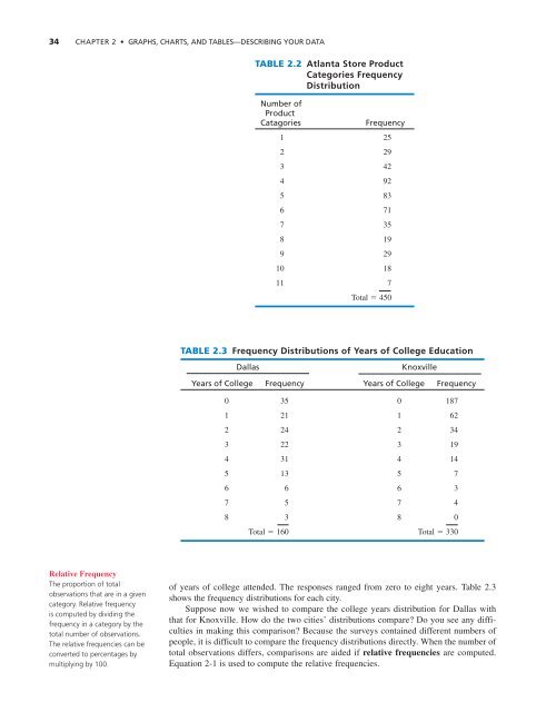
34 CHAPTER 2 • GRAPHS, CHARTS, AND TABLES—DESCRIBING YOUR DATA<br />
TABLE 2.2 Atlanta Store Product<br />
Categories Frequency<br />
Distribution<br />
Number of<br />
Product<br />
Catagories<br />
Frequency<br />
1 25<br />
2 29<br />
3 42<br />
4 92<br />
5 83<br />
6 71<br />
7 35<br />
8 19<br />
9 29<br />
10 18<br />
11 7<br />
Total 450<br />
TABLE 2.3 Frequency Distributions of Years of College Education<br />
Dallas<br />
Knoxville<br />
Years of College Frequency Years of College Frequency<br />
0 35 0 187<br />
1 21 1 62<br />
2 24 2 34<br />
3 22 3 19<br />
4 31 4 14<br />
5 13 5 7<br />
6 6 6 3<br />
7 5 7 4<br />
8 3 8 0<br />
Total 160 Total 330<br />
Relative Frequency<br />
The proportion of total<br />
observations that are in a given<br />
category. Relative frequency<br />
is computed by dividing the<br />
frequency in a category by the<br />
total number of observations.<br />
The relative frequencies can be<br />
converted to percentages by<br />
multiplying by 100.<br />
of years of college attended. The responses ranged from zero to eight years. Table 2.3<br />
shows the frequency distributions for each city.<br />
Suppose now we wished to compare the college years distribution for Dallas with<br />
that for Knoxville. How do the two cities’ distributions compare? Do you see any difficulties<br />
in making this comparison? Because the surveys contained different numbers of<br />
people, it is difficult to compare the frequency distributions directly. When the number of<br />
total observations differs, comparisons are aided if relative frequencies are computed.<br />
Equation 2-1 is used to compute the relative frequencies.