Chapter 2: Graphs, Charts, and Tables--Describing Your Data
Chapter 2: Graphs, Charts, and Tables--Describing Your Data
Chapter 2: Graphs, Charts, and Tables--Describing Your Data

Create successful ePaper yourself
Turn your PDF publications into a flip-book with our unique Google optimized e-Paper software.
48 CHAPTER 2 • GRAPHS, CHARTS, AND TABLES—DESCRIBING YOUR DATA<br />
EXAMPLE 2-5 Relative Frequency Histograms <strong>and</strong> Ogives<br />
TRY PROBLEM 2.16<br />
Emergency Response Times (continued) Example 2-4 introduced the situation<br />
facing the emergency response manager in Montreal. In that example, she formed a frequency<br />
distribution for a sample of 1,220 response times. She is now interested in graphing<br />
the relative frequencies <strong>and</strong> the cumulative relative frequencies. To do so, use the following<br />
steps:<br />
Step 1 Convert the frequency distribution into relative frequencies <strong>and</strong><br />
cumulative relative frequencies.<br />
Cumulative Relative<br />
Response Time Frequency Relative Frequency Frequency<br />
0 <strong>and</strong> under 30 36 36/1220 0.0295 0.0295<br />
30 <strong>and</strong> under 60 68 68/1220 0.0557 0.0852<br />
60 <strong>and</strong> under 90 195 195/1220 0.1598 0.2451<br />
90 <strong>and</strong> under 120 180 180/1220 0.1475 0.3926<br />
120 <strong>and</strong> under 150 260 260/1220 0.2131 0.6057<br />
150 <strong>and</strong> under 180 182 182/1220 0.1492 0.7549<br />
180 <strong>and</strong> under 210 145 145/1220 0.1189 0.8738<br />
210 <strong>and</strong> under 240 80 80/1220 0.0656 0.9393<br />
240 <strong>and</strong> under 270 43 43/1220 0.0352 0.9746<br />
270 <strong>and</strong> under 300 31 31/1220 0.0254 1.0000<br />
1,220 1.0000<br />
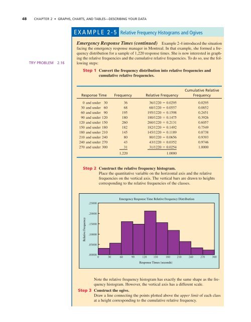
Step 2 Construct the relative frequency histogram.<br />
Place the quantitative variable on the horizontal axis <strong>and</strong> the relative<br />
frequencies on the vertical axis. The vertical bars are drawn to heights<br />
corresponding to the relative frequencies of the classes.<br />
.25000<br />
Emergency Response Time Relative Frequency Distribution<br />
.20000<br />
Relative Frequency<br />
.15000<br />
.10000<br />
.05000<br />
.00000 0 30 60 90 120 150 180 210 240 270 300<br />
Response Times (seconds)<br />
Note the relative frequency histogram has exactly the same shape as the frequency<br />
histogram. However, the vertical axis has a different scale.<br />
Step 3 Construct the ogive.<br />
Draw a line connecting the points plotted above the upper limit of each class<br />
at a height corresponding to the cumulative relative frequency.