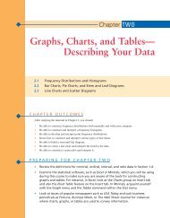
Chapter 2: Graphs, Charts, and Tables--Describing Your Data
Chapter 2: Graphs, Charts, and Tables--Describing Your Data
Chapter 2: Graphs, Charts, and Tables--Describing Your Data

You also want an ePaper? Increase the reach of your titles
YUMPU automatically turns print PDFs into web optimized ePapers that Google loves.
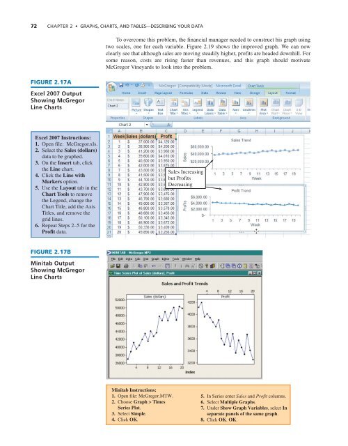
72 CHAPTER 2 • GRAPHS, CHARTS, AND TABLES—DESCRIBING YOUR DATA<br />
FIGURE 2.17A<br />
Excel 2007 Output<br />
Showing McGregor<br />
Line <strong>Charts</strong><br />
To overcome this problem, the financial manager needed to construct his graph using<br />
two scales, one for each variable. Figure 2.19 shows the improved graph. We can now<br />
clearly see that although sales are moving steadily higher, profits are headed downhill. For<br />
some reason, costs are rising faster than revenues, <strong>and</strong> this graph should motivate<br />
McGregor Vineyards to look into the problem.<br />
Excel 2007 Instructions:<br />
1. Open file: McGregor.xls.<br />
2. Select the Sales (dollars)<br />
data to be graphed.<br />
3. On the Insert tab, click<br />
the Line chart.<br />
4. Click the Line with<br />
Markers option.<br />
5. Use the Layout tab in the<br />
Chart Tools to remove<br />
the Legend, change the<br />
Chart Title, add the Axis<br />
Titles, <strong>and</strong> remove the<br />
grid lines.<br />
6. Repeat Steps 2–5 for the<br />
Profit data.<br />
Sales Increasing<br />
but Profits<br />
Decreasing<br />
FIGURE 2.17B<br />
Minitab Output<br />
Showing McGregor<br />
Line <strong>Charts</strong><br />
Minitab Instructions:<br />
1. Open file: McGregor.MTW.<br />
2. Choose Graph > Times<br />
Series Plot.<br />
3. Select Simple.<br />
4. Click OK.<br />
5. In Series enter Sales <strong>and</strong> Profit columns.<br />
6. Select Multiple <strong>Graphs</strong>.<br />
7. Under Show Graph Variables, select In<br />
separate panels of the same graph.<br />
8. Click OK. OK.