Chapter 2: Graphs, Charts, and Tables--Describing Your Data
Chapter 2: Graphs, Charts, and Tables--Describing Your Data
Chapter 2: Graphs, Charts, and Tables--Describing Your Data

Create successful ePaper yourself
Turn your PDF publications into a flip-book with our unique Google optimized e-Paper software.
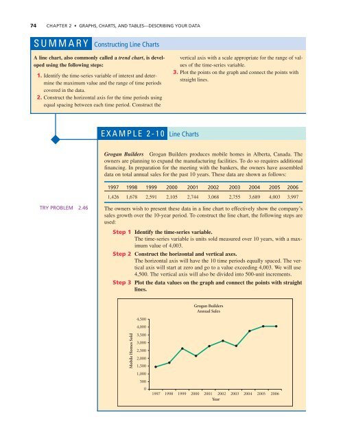
74 CHAPTER 2 • GRAPHS, CHARTS, AND TABLES—DESCRIBING YOUR DATA<br />
SUMMARY Constructing Line <strong>Charts</strong><br />
A line chart, also commonly called a trend chart, is developed<br />
using the following steps:<br />
1. Identify the time-series variable of interest <strong>and</strong> determine<br />
the maximum value <strong>and</strong> the range of time periods<br />
covered in the data.<br />
2. Construct the horizontal axis for the time periods using<br />
equal spacing between each time period. Construct the<br />
vertical axis with a scale appropriate for the range of values<br />
of the time-series variable.<br />
3. Plot the points on the graph <strong>and</strong> connect the points with<br />
straight lines.<br />
EXAMPLE 2-10 Line <strong>Charts</strong><br />
Grogan Builders Grogan Builders produces mobile homes in Alberta, Canada. The<br />
owners are planning to exp<strong>and</strong> the manufacturing facilities. To do so requires additional<br />
financing. In preparation for the meeting with the bankers, the owners have assembled<br />
data on total annual sales for the past 10 years. These data are shown as follows:<br />
1997 1998 1999 2000 2001 2002 2003 2004 2005 2006<br />
1,426 1,678 2,591 2,105 2,744 3,068 2,755 3,689 4,003 3,997<br />
TRY PROBLEM 2.46<br />
The owners wish to present these data in a line chart to effectively show the company’s<br />
sales growth over the 10-year period. To construct the line chart, the following steps are<br />
used:<br />
Step 1 Identify the time-series variable.<br />
The time-series variable is units sold measured over 10 years, with a maximum<br />
value of 4,003.<br />
Step 2 Construct the horizontal <strong>and</strong> vertical axes.<br />
The horizontal axis will have the 10 time periods equally spaced. The vertical<br />
axis will start at zero <strong>and</strong> go to a value exceeding 4,003. We will use<br />
4,500. The vertical axis will also be divided into 500-unit increments.<br />
Step 3 Plot the data values on the graph <strong>and</strong> connect the points with straight<br />
lines.<br />
Mobile Homes Sold<br />
4,500<br />
4,000<br />
3,500<br />
3,000<br />
2,500<br />
2,000<br />
1,500<br />
1,000<br />
500<br />
0<br />
Grogan Builders<br />
Annual Sales<br />
1997 1998 1999 2000 2001 2002 2003 2004 2005 2006<br />
Year