Chapter 2: Graphs, Charts, and Tables--Describing Your Data
Chapter 2: Graphs, Charts, and Tables--Describing Your Data
Chapter 2: Graphs, Charts, and Tables--Describing Your Data

Create successful ePaper yourself
Turn your PDF publications into a flip-book with our unique Google optimized e-Paper software.
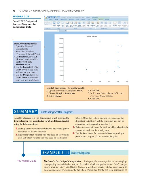
76 CHAPTER 2 • GRAPHS, CHARTS, AND TABLES—DESCRIBING YOUR DATA<br />
7FIGURE 2.21<br />
Excel 2007 Output of<br />
Scatter Diagrams for<br />
Computers <strong>Data</strong><br />
Excel 2007 Instructions:<br />
1. Open file: Personal<br />
Computer.xls.<br />
2. Select data for chart<br />
(Processor GHz <strong>and</strong> Price).<br />
3. On Insert tab, click XY<br />
(Scatter), <strong>and</strong> then click<br />
Scatter with only<br />
Markers option.<br />
4. Use the Layout tab of the<br />
Chart Tools to add titles<br />
<strong>and</strong> remove grid lines.<br />
5. Use the Design tab of the<br />
Chart Tools to move the<br />
chart to a new worksheet.<br />
Minitab Instructions (for similar result):<br />
1. Open file: Personal Computers.MTW.<br />
2. Choose Graph > Scatterplot.<br />
3. Select Simple.<br />
4. Click OK.<br />
5. In Y, enter Price column. In X, enter<br />
Processor Speed column.<br />
6. Click OK.<br />
SUMMARY Constructing Scatter Diagrams<br />
A scatter diagram is a two-dimensional graph showing the<br />
joint values for two quantitative variables. It is constructed<br />
using the following steps:<br />
1. Identify the two quantitative variables <strong>and</strong> collect paired<br />
responses for the two variables.<br />
2. Determine which variable will be placed on the vertical<br />
axis <strong>and</strong> which variable will be placed on the horizontal<br />
axis. Often the vertical axis can be considered the<br />
dependent variable (y) <strong>and</strong> the horizontal axis can be<br />
considered the independent variable (x).<br />
3. Define the range of values for each variable <strong>and</strong> define the<br />
appropriate scale for the x <strong>and</strong> y axes.<br />
4. Plot the joint values for the two variables by placing a<br />
point in the x,y space. Do not connect the points.<br />
EXAMPLE 2-11 Scatter Diagrams<br />
TRY PROBLEM 2.47<br />
Fortune’s Best Eight Companies Each year, Fortune magazine surveys employees<br />
regarding job satisfaction to try to determine which companies are the “best” companies<br />
to work for in the United States. Fortune also collects a variety of data associated with<br />
these companies. For example, the table here shows data for the top eight companies on