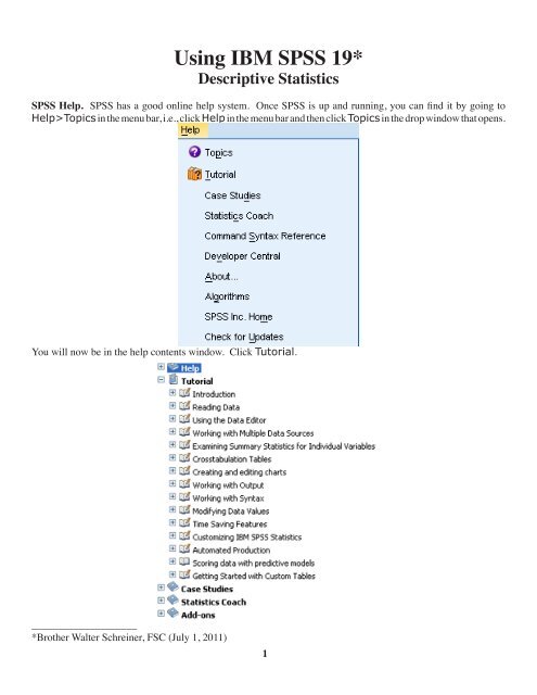
Using IBM SPSS 19 Descriptive Statistics - CBU
Using IBM SPSS 19 Descriptive Statistics - CBU
Using IBM SPSS 19 Descriptive Statistics - CBU

You also want an ePaper? Increase the reach of your titles
YUMPU automatically turns print PDFs into web optimized ePapers that Google loves.
<strong>Using</strong> <strong>IBM</strong> <strong>SPSS</strong> <strong>19</strong>*<br />
<strong>Descriptive</strong> <strong>Statistics</strong><br />
<strong>SPSS</strong> Help. <strong>SPSS</strong> has a good online help system. Once <strong>SPSS</strong> is up and running, you can find it by going to<br />
Help>Topics in the menu bar, i.e., click Help in the menu bar and then click Topics in the drop window that opens.<br />
You will now be in the help contents window. Click Tutorial.<br />
____________________<br />
*Brother Walter Schreiner, FSC (July 1, 2011)<br />
1
You can then open any of the books comprising the tutorial by clicking on the + to get to the various subtopics.<br />
Once in a subtopic is open, you can just keep clicking on the right and left arrows to move through it page<br />
by page. I suggest going through the entire Overview booklet. Once you are working with a data set, and have<br />
an idea of what you want to do with the data, you can also use the <strong>Statistics</strong> Coach under the Help menu to<br />
help get the information you wish. It will lead you through the <strong>SPSS</strong> process.<br />
<strong>Using</strong> the <strong>SPSS</strong> Data Editor. When you begin <strong>SPSS</strong>, you open up to the Data Editor. For our purposes right<br />
now, you can learn how to do this by going to Help>Tutorial><strong>Using</strong> the Data Editor, and then working<br />
your way through the subtopics. The data we will use is given in the table below, with the numbers indicating<br />
total protein (μg/ml).<br />
`<br />
76.33 77.63 149.49 54.38 55.47 51.70<br />
78.15 85.40 41.98 69.91 128.40 88.17<br />
58.50 84.70 44.40 57.73 88.78 86.24<br />
54.07 95.06 114.79 53.07 72.30 59.36<br />
76.33 77.63 149.49 54.38 55.47 51.70<br />
59.20 67.10 109.30 82.60 62.80 61.90<br />
74.78 77.40 57.90 91.47 71.50 61.70<br />
106.00 61.10 63.96 54.41 83.82 79.55<br />
153.56 70.17 55.05 100.36 51.16 72.10<br />
62.32 73.53 47.23 35.90 72.20 66.60<br />
59.76 95.33 73.50 62.20 67.20 44.73<br />
57.68<br />
For our data, double click on the var at the top of the first column or click on the Variable View tab at the bottom<br />
of the page, type in ``protein" in the Name column, and hit Enter. Under the assumption that you are going<br />
to enter numerical data, the rest of the row is filled in.<br />
Changes in the type and display of the variable can be made by clicking in the appropriate cells and using any<br />
buttons given. Then hit the Data View tab and type in the data values, following each by Enter.<br />
Save the file as usual where you wish under the name protein.sav. You just need type protein. The suffix is<br />
attached automatically.<br />
2
Sorting the Data. From the menu, choose Data>Sort Cases…, click the right arrow to move protein to<br />
the Sort by box, make sure Ascending is chosen, and click OK. Our data column is now in ascending order.<br />
However, the first thing that come up is an output page telling you what has happened. Click the table with the<br />
Star on it to get back to the Data Editor.<br />
Obtaining the <strong>Descriptive</strong> <strong>Statistics</strong>. Go to Analyze><strong>Descriptive</strong> <strong>Statistics</strong>>Explore...,<br />
select protein from the box on the left, and then click the arrow for Dependent List:. Make sure Both is<br />
checked under Display.<br />
3
Click the <strong>Statistics</strong>... button, then make sure <strong>Descriptive</strong>s and Percentiles are checked. We will use 95%<br />
for Confidence Interval for Mean. Click Continue.<br />
Then click Plots.... Under Boxplots, select Factor levels together, and under <strong>Descriptive</strong>, choose both<br />
Stem-and-leaf and Histogram. Then click Continue.<br />
4
Then click OK. This opens an output window with two frames. The frame on the left contains an outline of the<br />
data on the right.<br />
5
Clicking an item in either frame selects it, and allows you to copy it (and paste into a word processor), for instance.<br />
Double clicking an item in the left frame either shows or hides that item in the right frame. Clicking on<br />
<strong>Descriptive</strong>s in the left frame brings up the following:<br />
The Standard Error of the Mean is a measure of how much the value of the mean may vary from repeated<br />
samples of the same size taken from the same distribution. The 95% Confidence Interval for Mean are<br />
two numbers that we would expect 95% of the means from repeated samples of the same size to fall between. The<br />
5% Trimmed Mean is the mean after the highest and lowest 2.5% of the values have been removed. Skewness<br />
measures the degree and direction of asymmetry. A symmetric distribution such as a normal distribution<br />
has a skewness of 0, a distribution that is skewed to the left, when the mean is less than the median, has a negative<br />
skewness, and a distribution that is skewed to the right, when the mean is greater than the median, has a positive<br />
skewness. Kurtosis is a measure of the heaviness of the tails of a distribution. A normal distribution has kurtosis<br />
0. Extremely nonnormal distributions may have high positive or negative kurtosis values, while nearly normal<br />
distributions will have kurtosis values close to 0. Kurtosis is positive if the tails are “heavier” than for a normal<br />
distribution and negative if the tails are “lighter” than for a normal distribution.<br />
Double clicking an item in the right frame opens it's editor, if it has one. Double click on the histogram, shown on<br />
the next page, to open the Chart Editor. To learn about the Chart Editor, visit Building Charts and Editing<br />
Charts under Help>Core System. Once the chart editor opens, choose Edit>Properties from the<br />
Chart Editor Menus, click on a number on the vertical axis (which highlights all such numbers), and then click on<br />
Scale. From the left diagram at the bottom of the next page, we see a minimum and a maximum for the vertical<br />
axis and a major increment of 5. This corresponds to the tick marks and labels on the vertical axis. Now click on<br />
Labels & Ticks, check Display Ticks under Minor Ticks, and enter 5 for Number of minor ticks per<br />
major ticks:. The Properties window should now look like the rightmost diagram at the bottom of the next<br />
page. Click Apply to see the results of this change.<br />
6
Now click on a number on the horizontal axis and then click on Number Format. In the diagram to the left<br />
below, we see that we have 2 decimal places. The values in this window can be changed as desired. Next, click<br />
on one of the bars and then Binning in the Properties window. Suppose we want bars of width 20 beginning at<br />
30. Check Custom, Interval width:, and enter 20 in the value box. Check Custom value for anchor:,<br />
followed by 30 in the value box. Your window should look like the one on the right below.<br />
Finally, click Apply and close the Chart Editor to get the histogram below.<br />
8
Next choose Percentiles from either output frame. The following comes up.<br />
Obviously, there are two different methods at work here. The formulas are given in the <strong>SPSS</strong> Algorithms Manual.<br />
Typically, use the Weighed Average. Tukey’s Hinges was designed by Tukey for use with the boxplot.<br />
The box covers the Interquartile range (IQR) = Q 75<br />
- Q 25<br />
, with the line being Q 50<br />
, the median. In all three cases,<br />
the Tukey’s Hinges is used. The whiskers extend a maximum of 1.5 IQR from the box. Data points between<br />
1.5 and 3 IQR from the box are indicted by circles and are known as outliers, while those more than 3 IQR from<br />
the box are indicated by asterisks and are known as extremes. In this boxplot, the outliers are the 59th, 60th, and<br />
61st elements of the data list.<br />
Copying Output to Word (for instance). You can easily copy a selection of output or the entire output window<br />
to Word and other programs in the usual fashion. Just select what you wish to copy, choose Edit>Copy,<br />
switch to a Word or other document and choose Edit>Paste. After saving the output, you can also export<br />
it as a Word, Powerpoint, Excel, text, or PDF document from File>Export. For information on this, see<br />
Help>Tutorial>Working with Output or Help>Core System>Working with Output.<br />
Probability Distributions<br />
Binomial Distribution. We shall assume n=15 and p=.75. We will first find P(X ≤ x | 15, .75) for x = 0, ..., 15,<br />
i.e., the cumulative probabilities. First put the numbers 0 through 15 in a column of a worksheet. (Actually, you<br />
only need to enter the numbers whose cumulative probability you desire.) Then click Variable View, type in<br />
number (the name you choose is optional) under Name, and I suggest putting in 0 for Decimal. Still in Variable<br />
View, put the names cum_bin and bin_prob in new rows under Name, and set Width to 12, Decimal<br />
to 10, and Columns to 12 for each of these.<br />
9
Then click back to Data View. From the menu, choose Transform>Compute Variable.... When the<br />
Compute Variable window comes up, click Reset, and type cum_bin in the box labeled Target Variable.<br />
Scroll down the Function group: window to CDF & Noncentral CDF to select it, then scroll to and select<br />
Cdf.Binom in the Functions and Special Variables: window. Then press the up arrow. We need to fill in<br />
the three arguments indicated by question marks. The first is the x. This is given by the number column. At this<br />
point, the first question mark should be highlighted. Click on number in the box on the left to highlight it, then<br />
hit the right arrow to the right of that box. Now highlight the second question mark and type in 15 (our n), and<br />
then highlight the third question mark and type in .75 (our p). Hit OK. If you get a message about changing the<br />
existing variable, hit OK for that too.<br />
The cumulative binomial probabilities are now found in the column cum_bin. Now we want to put the individual<br />
binomial probabilities into the column bin_prob. Do basically the same as the above, except make the<br />
Target Variable “bin_prob,” and the Numeric Expression “CDF.BINOM(number,15,.75) - CDF.<br />
BINOM(number-1,15,.75).'' The Data View now looks like the table at the top of the next page, with<br />
the cumulative binomial probabilities in the second column and the individual binomial probabilities in the third<br />
coloumn.<br />
10
Poisson Distribution. Let us assume that l =.5. We will first find P(X ≤ x | .5)for x = 0, ..., 15, i.e., the cumulative<br />
probabilities. First put the numbers 0 through 15 in a column of a worksheet. (We have already done this<br />
above. Again, you only need to enter the numbers whose cumulative probability you desire.) Then click Variable<br />
View, type in number (we have done this above and the name you choose is optional) under Name, and<br />
I suggest putting in 0 for Decimal. Still in Variable View, put the names cum_pois and pois_pro in new<br />
rows under Name, and set Width to 12, Decimal to 10, and Columns to 12 for each of these.<br />
Then click back to Data View. From the menu, choose Transform>Compute Variable.... When the<br />
Compute Variable window comes up, click Reset, and type cum_pois in the box labeled Target Variable.<br />
Scroll down the Function group: window to CDF & Noncentral CDF to select it, then scroll to<br />
and select Cdf.Poisson in the Functions and Special Variables: window. Then press the up arrow. We<br />
need to fill in the two arguments indicated by question marks. The first is the x. That is given by the number<br />
column. At this point, the first question mark should be highlighted. Click on number in the box on the left to<br />
highlight it, then hit the right arrow to the right of that box. Now highlight the second question mark and type<br />
in .5 (our l). Then hit OK. If you get a message about changing the existing variable, hit OK for that too. The<br />
11
cumulative Poisson probabilities are now found in the column cum_pois.<br />
Now we want to put the individual Poisson probabilities into the column pois_pro. Do basically the<br />
same as above, except make the Target Variable “pois_pro,” and the Numeric Expression “CDF.<br />
POISSON(number,.5) - CDF.POISSON(number-1,.5).” The Data View now looks like the table<br />
below, with the cumulative Poisson probabilities in the fourth column and the individual Poisson probabilities in<br />
the fifth coloumn.<br />
Normal Distribution. Suppose we are using a normal distribution with mean 100 and standard deviation 20 and<br />
we wish to find P(X ≤ 135). Start a new Data Editor sheet, and just type 0 in the first row of the first column<br />
and then hit Enter. Then click Variable View, put the names cum_norm, int_norm, and inv_norm in new<br />
rows under Name, and set Decimal to 4 for each of these.<br />
Then click back to Data View. From the menu, choose Transform>Compute Variable.... When<br />
the Compute Variable window comes up, click Reset, and type cum_norm in the box labeled Target<br />
Variable. Scroll down the Function group: window to CDF & Noncentral CDF to select it, then scroll<br />
to and select Cdf.Normal in the Functions and Special Variables: window. We need to fill in the three<br />
arguments indicated by question marks to get CDF.NORMAL(135,100,20) under Numeric Expression: as<br />
in the diagram at the top of the next page.<br />
12
The probability is now found in the column cum_norm.<br />
Staying with the normal distribution with mean 100 and standard deviation 20, suppose we with to find P(90 ≤ X<br />
≤135). Do as above except make the Target Variable “int_norm,” and the Numeric Expression “CDF.<br />
NORMAL(135,100,20) - CDF.NORMAL(90,100,20).” The probability is now found in the column<br />
int_norm.<br />
Continuing to use a normal distribution with mean 100 and standard deviation 20, suppose we wish to find x such<br />
that P(X ≤ x) = .6523. Again, do as above except make the Target Variable “inv_norm,” and the Numeric<br />
Expression “IDF.NORMAL(.6523,100,20)” by choosing Inverse DF under Function Group: and<br />
Idf.Normal under Functions and Special Variables:. The x-value is now found in the column inv_<br />
norm. From the table below we see that for the normal distribution with mean 100 and standard deviation 20,<br />
P(X ≤ 135) = .9599 and P(90 ≤ X ≤ 135) = .6514$. Finally, if P(X ≤ x) = .6523, then x=107.8307.<br />
13
Confidence Intervals and Hypothesis Testing <strong>Using</strong> t<br />
A Single Population Mean. We found earlier that the sample mean of the data given on page 2, which you may<br />
have saved under the name protein.sav, is 73.3292 to four decimal places. We wish to test whether the mean<br />
of the population from which the sample came is 70 as opposed to a true mean greater than 70. We test<br />
H 0<br />
: m = 70<br />
H a<br />
: m > 70.<br />
From the menu, choose Analyze>Compare Means>One-Sample T Test. Select protein from the<br />
left-hand window and click the right arrow to move it to the Test Variable(s) window. Set the Test Value<br />
to 70.<br />
Click on Options. Set the Confidence Interval to 95% (or anyother value you desire).<br />
Then click Continue followed by OK. You get the following output.<br />
14
<strong>SPSS</strong> gives us the basic descriptives in the first table. In the second table, we are given that the t-value for our test<br />
is 1.110. The p-value (or Sig. (2-tailed)) is given as .272. Thus the p-value for our one-tailed test is onehalf<br />
of that or .136. Based on this test statistic, we would not reject the null hypothesis, for instance, for a value<br />
of a=.05. <strong>SPSS</strong> also gives us the 95% Confidence Interval of the Difference between our data scores<br />
and the hypothesized mean of 70, namely (-2.6714, 9.3298). Adding the hypothesized value of 70 to both<br />
numbers gives us a 95% confidence interval for the mean of (67.3286,79.3298). If you are only interested<br />
in the confidence interval from the beginning, you can just set the Test Value to 0 instead of 70.<br />
The Difference Between Two Population means. For a data set, we are going to look at a distribution of 32 cadmium<br />
level readings from the placenta tissue of mothers, 14 of whom were smokers. The scores are as follows:<br />
non-smokers<br />
10.0 8.4 12.8 25.0 11.8 9.8 12.5 15.4 23.5 9.4 25.1 <strong>19</strong>.5 25.5 9.8 7.5 11.8 12.2 15.0<br />
smokers<br />
30.0 30.1 15.0 24.1 30.5 17.8 16.8 14.8 13.4 28.5 17.5 14.4 12.5 20.4<br />
We enter this data in two columns of the Data Editor. The first column, which is labeled s_ns, contains a 1 for<br />
each non-smoking score and a 2 for each smoking score. The scores are contained in the second column, which is<br />
labeled cadmium. Clicking Variable View, we put s_ns for the name of the first column, change Decimals<br />
to 0, and type in Smoker for Label. Double-click on the three dots following None,<br />
and in the window that opens, type 1 for Value, Non-Smoker for Value Label, and then press Add. Then<br />
type 2 for Value, Smoker for Value Label,<br />
15
and again press Add. Then hit OK and complete the Variable View as follows.<br />
Returning to Data View gives a window whose beginning looks like that below.<br />
Now we wish to test the hypotheses<br />
H 0<br />
: m 1<br />
- m 2<br />
= 0<br />
H a<br />
: m 1<br />
- m 2<br />
≠ 0<br />
where m 1<br />
refers to the population mean for the non-smokers and m 2<br />
refers to the population mean for the smokers.<br />
From the menu, choose Analyze>Compare Means>Independent-Samples T Test, and in the window<br />
that comes up, move cadmium to the Test Variable(s) window, and s_ns into the Grouping Variable<br />
window.<br />
Notice the two questions marks that appear. Click on Define Groups..., put in 1 for Group 1 and 2 for<br />
Group 2.<br />
16
Then click Continue. As before, click Options..., enter 95 (or any other number) for Confidence Interval,<br />
and again click Continue followed by OK. The first table of output gives the descriptives.<br />
To get the second table as it appears here, I first double-clicked on the Independent Samples Test table,<br />
giving it a fuzzy border and bringing us into the table editor, and then chose Pivot>Transpose Rows and<br />
Columns from the menu.<br />
In interpreting the data, the first thing we need to determine is whether we are assuming equal variances. Levene's<br />
Test for Equality of Variances is an aid in this regard. Since the p-value of Levine's test is p=.502<br />
for a null hypothesis of all variances equal, in the absense of other information we have no strong evidence to<br />
17
discount this hypothesis, so we will take our results from the Equal Variances Assumed column. We see<br />
that, with 30 degrees of freedom, we have t=-2.468 and p=.020, so we reject the null hypothesis H 0<br />
: m 1<br />
- m 2<br />
= 0 at<br />
the a=.05 level of significance. That we would reject this null hypothesis can also be seen in that the 95% Confidence<br />
Interval of the Difference of (-10.4025, -.9816) does not contain 0. However, we would not reject<br />
the null hypothesis at the a=.01 level of significance and, correspondingly, the 99% Confidence Interval of<br />
the Difference, had we chosen that level, would contain 0.<br />
Paired Comparisons. We consider the weights (in kg) of 9 women before and after 12 weeks on a special diet,<br />
with the goal of determining whether the diet aids in weight reduction. The paired data is given below.<br />
Before 117.3 111.4 98.6 104.3 105.4 100.4 81.7 89.5 78.2<br />
After 83.3 85.9 75.8 82.9 82.3 77.7 62.7 69.0 63.9<br />
We place the Before data in the first column of our worksheet and the After data in the second column. We wish<br />
to test the hypotheses<br />
H 0<br />
: m B-A<br />
= 0<br />
H a<br />
: m B-A<br />
> 0<br />
with one-sided alternative. From the menu, choose Analyze>CompareMeans>Paire-Samples T Test.<br />
In the window that opens, first click Before followed by the right arrow to make it Variable 1 and then After<br />
followed by the right arrow to make it Variable 2.<br />
Next, click Options... to set Confidence Interval to 99%. Then click Continue to close the Options...<br />
window followed by OK to get the output.<br />
18
The first output table gives the descriptives and a second (not shown here) gives a correlation coefficient. From<br />
the third table, which has been pivoted to interchange rows and columns,<br />
we see that we have a t-score of 12.740. The fact that Sig.(2-tailed) is given as .000 really means that it is less<br />
than .001. Thus, for our one-sided test, we can conclude that p < .0005, so that in almost any situation we would<br />
reject the null hypothesis. We also see that the mean of the weight losses for the sample is 22.5889, with a 99%<br />
Confidence Interval of the Difference (the mean weight loss for the population from which the sample<br />
was drawn) being (16.6393, 28.5384).<br />
One-Way ANOVA<br />
For data, we will use percent predicted residual volume measurements as categorized by smoking history.<br />
Never 35, 120, 90, 109, 82, 40, 68, 84, 124, 77, 140, 127, 58, 110, 42, 57, 93<br />
Former 62, 73, 60, 77, 52, 115, 82, 52, 105, 143, 80, 78, 47, 85, 105, 46, 66, 95, 82, 141,<br />
64, 124, 65, 42, 53, 67, 95, 99, 69, 118, 131, 76, 69, 69<br />
Current 96, 107, 63, 134, 140, 103, 158<br />
We will place the volume measurements in the first column and the second column will be coded by 1 = “Never,”<br />
2 = “Former,” and 3 =”Current.” The Variable View looks as below.<br />
We test to see if there is a difference among the population means from which the samples have been drawn. We<br />
use the hypotheses<br />
<strong>19</strong>
H 0<br />
: m N<br />
= m F<br />
= m C<br />
H a<br />
: Not all of m N<br />
, m F<br />
, and mC are equal.<br />
From the menu we choose Analyze>Compare Means>One-Way ANOVA.... In the window that opens,<br />
place volume under Dependent List and Smoker[smoking] under Factor.<br />
Then click Post Hoc... For a post-hoc test, we will only choose Tukey (Tukey's HSD test) with Significance<br />
Level .05, and then click Continue.<br />
20
Then we click options and choose <strong>Descriptive</strong>, Homogeneity of variance test, and Means plot. The<br />
Homogeneity of variance test calculates the Levene statistic to test for the equality of group variances.<br />
This test is not dependent on the assumption of normality. The Brown-Forsythe and Welch statistics are better<br />
than the F statistic if the assumption of equal variable does not hold.<br />
Then we click Continue followed by OK to get our output.<br />
A first impression from the <strong>Descriptive</strong>s is that the mean of the Current smokers differs significantly from<br />
those who Never smoked and the Former smokers, the latter two means being pretty much the same.<br />
21
The results of the Test of Homogeneity of Variances is nonsignificant since we have a p value of .974,<br />
showing that there is no reason to believe that the variances of the three groups are different from one another.<br />
This is reassuring since both ANOVA and Tukey's HSD have equal variance assumptions. Without this reassurance,<br />
interpretation of the results would be difficult, and we would likely rern the data with the Brown-Forsythe<br />
and Welch statistics.<br />
Now we look at the results of the ANOVA itself. The Sum of Squares Between Groups is the SSA, the<br />
Sum of Squares Within Groups is the SSW, the Total Sum of Squares is the SST, the Mean Square<br />
Between Groups is the MSA, the Mean Square Within Groups is the MSW, and the F value of 3.409<br />
is the Variance Ratio. Since the p value is .039, we will reject the null hypothesis at the a = .05 level of significance,<br />
concluding that all three population means are not the same, but would not reject it at the a = .01 level.<br />
So now the question becomes which of the means significantly differ from the others. For this we look to posthoc<br />
tests. One option which was not chosen was LSD (least significant difference) since this simply does a t test<br />
on each pair. Here, with three groups we would test three pairs. But if you have 7 groups, for instance, that is 21<br />
separate t tests, and at an a = .05 level of significance, even if all the means are the same, you can expect on the<br />
average to get one Type I error where you reject a true null hypothesis for every 20 tests. In other words, while<br />
the t test is useful in testing whether two means are the same, it is not the test to use for checking multiple means.<br />
That is why we chose ANOVA in the first place. We have chosen Tukey's HSD because it offers adequate protection<br />
from Type I errors and is widely used.<br />
Looking at all of the p values (Sig.) in the Multiple Comparisons table, we see that Current differs significantly<br />
(a = .05) from Never and Former, with no significant difference detected between Never and Former.<br />
The second table for Tukey's HSD, seen below, divides the groups into homogeneous subsets and gives the mean<br />
for each group.<br />
22
Simple Linear Regression and Correlation<br />
We will use the following 109 x-y data pairs for simple linear regression and correlation.<br />
The x's are waist circumferences (cm) and the y's are measurements of deep abdominal adipose tissue gathered<br />
by CAT scans. Since CAT scans are expensive, the goal is to find a predictive equation. First we wish to take a<br />
look at the scatter plot of the data, so we choose Graphs>Legacy Dialogs>Scatter/Dot from the menu.<br />
In the window that opens, click on Simple Scatter, and then Define. In the Simple Scatterplot window<br />
that opens, drag x and y to the boxes shown.<br />
23
Then click OK to get the following scatter plot, which leads us to suspect that there is a significant linear relationship.<br />
Regression. To explore this relationship, choose Analyze>Regression>Linear... from the menu, select and<br />
move y under Dependent and x under Independent(s).<br />
24
Then click <strong>Statistics</strong>..., and in the window that opens with Estimates and Model fit already checked, also<br />
check Confidence intervals and <strong>Descriptive</strong>s.<br />
Then click Continue. Next click Plots.... In the window that opens, enter *ZRESID for Y and *ZPRED for<br />
X to get a graph of the standardized residuals as a function of the standardized predicted values. After clicking<br />
Continue, next click Save.... In the window that opens, check Mean and Individual under Prediction<br />
Intervals with 95% for Confidence Intervals. This will add four columns to our data window that give the<br />
95% confidence intervals for the mean values m y|x<br />
and individual values y I<br />
for each x in our set of data pairs.<br />
25
Then click Continue followed by OK to get the output.<br />
We first see the mean and the standard deviation for the two variables in the <strong>Descriptive</strong> <strong>Statistics</strong>.<br />
In the Model Summary, we see that the bivariate correlation coefficient r (R) is .8<strong>19</strong>, indicating a strong<br />
positive linear relationship between the two variables. The coefficient of determination r 2 (R Square) of .670<br />
indicates that, for the sample, 67% of the variation of y can be explained by the variation in x. But this may be an<br />
overestimate for the population from which the sample is drawn, so we use the Adjusted R Square as a better<br />
estimate for the population. Finally, the Standard Error of the Estimate is 33.0649.<br />
We use the sample regression (least squares) equation ŷ=a+bx to approximate the population regression equation<br />
m y|x<br />
=a+b x. From the Coefficients table, a is -215.981 and b is 3.459 from the first row of numbers (rows and<br />
columns transposed from the output), so the sample regression equation is ŷ=-215.981+3.459x. From the last<br />
two rows of numbers in the table, one gets that 95% confidence intervals for a and b are (-259.<strong>19</strong>0, -172.773)<br />
and (2.994, 3.924), respectively.<br />
The t test is used for testing the null hypothesis b=0, for if b=0, the sample regression equation will have little<br />
value for prediction and estimation. It can be used similarly to test the null hypothesis a=0, but this is of much<br />
less interest. In this case, we read from the above table that for H 0<br />
:b=0, H a<br />
:b≠0, we have t=14.740. Since the<br />
p-value (Sig. =.000) for that t test is less than .001 (the meaning of Sig. =.000), we can reject the null hypothesis<br />
of b=0.<br />
Although the ANOVA table is more properly used in multiple regression for testing the null hypothesis<br />
b 1<br />
=b 2<br />
=...=b n<br />
=0 with an alternative hypothesis of not all b_i=0, it can also be used to test b=0 in simple linear<br />
regression. In the table below, the Regression Sum of Squares (SSR) is the variation expained by regression,<br />
and the Residual Sum of Squares} (SSE) is the variation not explained by regression (the ``E'' stands<br />
for error). The Mean Square Regression and the Mean Square Residual are MSR and MSE respectively,<br />
with the F value of 217.279 being their quotient. Since the p-value (Sig. = .000) is less than .001, we can<br />
26
eject the null hypothesis of b=0.<br />
We now return to the scatter plot. Double click on the plot to bring up the Chart Editor and choose Options>Y<br />
Axis Reference Line from the menu. In the window that opens, select Refernce Line and, from the dropdown<br />
menue for Set to:, choose Mean and then click Apply.<br />
Next, from the Chart Editor menu, choose Elements>Fit Line at Total. In the window that opens, with Fit<br />
Line highlighted at the top, make sure Linear is chosen for Fit Method, and Mean with 95% for Confidence<br />
Intervals. Then click Apply. You get the first graph at the top of the next page. In this graph, the horizontal<br />
line shows the mean of the y-values, 101.894. We see that the scatter about the regression line is much less than<br />
the scatter about the mean line, which is as it should be when the null hypothesis b=0 has been rejected. The<br />
bands about the regression line give the 95% confidence interval for the mean values m y|x<br />
for each x, or from another<br />
point of view, the probability is .95 that the population regression line m y|x<br />
=a+bx lies within these bands.<br />
Finally, go back to the same menu and choose Individual instead of Mean, followed again by Apply. After<br />
some editting as discussed earlier in this manual, you get the second graph on the next page. Here, for each x-<br />
value, the outer bands give the 95% confidence interval for the individual y I<br />
for each value of x.<br />
The confidence bands in the scatter plots relate to the four new columns in our data window, a portion of which is<br />
shown at the bottom of the next page. We interpret the first row of data. For x=74.5, the 95% confidence interval<br />
27
for the mean value m y|74.5<br />
is ( 32.41572, 52.72078) , corresponding to the limits of the inner bands at x=74.5 in the<br />
scatter plot, and the 95% confidence interval for the individual value y I<br />
(74.5)is (-23.7607,108.8972), corresponding<br />
to the limits of the outer bands at x=74.5. The first pair of acronyms lmci and umci stand for “lower mean<br />
confidence interval” and “upper mean confidence interval,” respectively, with the i in the second pair standing for<br />
“individual.”<br />
Finally, consider the residual plot below. On the horizontal axis are the standardized y values from the data pairs,<br />
and on the vertical axis are the standardized residuals for each such y. If all the regression assumptions were met<br />
for our data set, we would expect to see random scattering about the horizontal line at level 0 with no noticable<br />
patterns. However, here we see more spread for the larger values of y, bringing into question whether the assumption<br />
regarding equal standard deviations for each y population is met.<br />
Correlation. Choose Analyze>Correlate>Bivariate... from the menu to study the correlation of the two<br />
variables x and y.<br />
In the window that opens, move both x and y to the Variables window and make sure Pearson is selected. The<br />
other two choices are for nonparametric correlations. We will choose Two-tailed here since we already have<br />
the results of the One-tailed option in the Correlation table in the regression output. In general, you choose<br />
One-tailed if you know the direction of correlation (positive or negative), and Two-tailed if you do not. Clicking<br />
OK gives the results.<br />
29
We see again that the Pearson Correlation r is .8<strong>19</strong>, and from the Sig. of .000, we know that the p-value is less<br />
than .001 and so we would reject a null hypothesis of r=0.<br />
Multiple Regression<br />
We will use the following data set for multiple linear regression. In this data set, required ram, amount of input,<br />
and amount of output, all in kilobytes, are used to predict minutes of processing time for a given task. From<br />
left to right, we will use the variables y, x 1<br />
, x 2<br />
, and x 3<br />
. Overall, the process used parallels that of simple linear<br />
regression.<br />
30
Choose Analyze>Regression>Linear... from the menu, select and move minutes under Dependent and<br />
ram, input, and output, in that order, under Independent(s). Then fill in the options for <strong>Statistics</strong>,<br />
Plots, and Save exactly as you did for simple linear regression.<br />
Finally, click OK to get the output.<br />
We first see the mean and the standard deviation for all of the variables in the <strong>Descriptive</strong> <strong>Statistics</strong>.<br />
In the Model Summary, we see that the coefficient of multiple correlation r (R) is .959, indicating a strong<br />
positive linear relationship between the predictors and the dependent variable. The coefficient of determination<br />
r 2<br />
(R Square) of .920 indicates that, for the sample, 92% of the variation of minutes can be explained by the<br />
variation in ram, input, and output. But this may be an overestimate for the population from which the sample<br />
is drawn, so we use the Adjusted R Square as a better estimate for the population. Finally, the Standard<br />
Error of the Estimate is 1.4773.<br />
Letting y=minutes, x 1<br />
=ram, x 2<br />
=input, and x 2<br />
=output, we use the sample regression (least squares) equation<br />
ŷ=a+b 1<br />
x 1<br />
+b 2<br />
x 2<br />
+b 3<br />
x 3<br />
to approximate the population regression equation m y|(x1,x2,x3)<br />
=a+b 1<br />
x 1<br />
+b 2<br />
x 2<br />
+b 3<br />
x 3<br />
. From the<br />
Coefficients table on the next page, a=.975, b 1<br />
=.09937, b 2<br />
=.243, and b 3<br />
=1.049 from the first row of numbers<br />
(rows and columns transposed from the output), so the sample regression equation is ŷ=.975+.09937x 1<br />
+.243x 2<br />
+<br />
31
1.049x 3<br />
. From the last two rows of numbers in the table, one gets that 95% confidence intervals are (-.694,2.645)<br />
for a, (.061,.138) for b 1<br />
, (.000,.487) for b 2<br />
, and (.692,1.407) for b 3<br />
.<br />
The t test is used for testing the various null hypotheses b i<br />
=0. It can be used similarly to test the null hypothesis<br />
a=0, but this is of much less interest. In this case, we read from the above table that, as an example, for H 0<br />
:b 1<br />
=0,<br />
H a<br />
:b 1<br />
≠0, we have t=5.469. Since the p-value (Sig. = .000) for that t test is less than .001, we can reject the null<br />
hypothesis of b 1<br />
=0. Notice that at the a=.05 level, we would accept the null hypothesis b 2<br />
=0 since p=.05. Also,<br />
notice that 0 is in the 95% confidence interval for b 2<br />
(barely). But if using these t tests, keep in mind the dangers<br />
of using multiple hypothesis tests and/or finding multiple confidence intervals on the same set of data.<br />
Preferably, we use the ANOVA table for testing the null hypothesis b 1<br />
=b 2<br />
=b 3<br />
=0 with an alternative hypothesis<br />
of not all b i<br />
=0. In the ANOVA table, the Regression Sum of Squares (SSR) is the variation expained<br />
by regression, and the Residual Sum of Squares (SSE) is the variation not explained by regression (the<br />
“E”stands for error). The Mean Square Regression and the Mean Square Residual are MSR and MSE<br />
respectively, with the F value of 60.965 being their quotient. Since the p-value (Sig. = .000) is less than .001, we<br />
can reject the null hypothesis of b 1<br />
=b 2<br />
=b 3<br />
=0, inferring indeed that there is a regression effect.<br />
The mean value m y|(x1,x2,x3)<br />
and individual y I<br />
confidence intervals for each data point relate to the four new columns<br />
in our data window, a portion of which is shown below. We interpret the first row of data. For the predictor triple<br />
(x 1<br />
,x 2<br />
,x 3<br />
)=(<strong>19</strong>,5,1), the 95% confidence interval for the mean value m y|(<strong>19</strong>,5,1)<br />
is (3.88934, 6.36905) and the 95%<br />
confidence interval for the individual value y I<br />
(<strong>19</strong>,5,1) is (1.76090,8.49749). The first pair of acronyms lmci and<br />
umci stand for”lower mean confidence interval” and “`upper mean confidence interval,” respectively, with the i<br />
in the second pair standing for “individual.”<br />
32
Finally, consider the residual plot below. On the horizontal axis are the standardized y values from the data points,<br />
and on the vertical axis are the standardized residuals for each such y. If all the regression assumptions were met<br />
for our data set, we would expect to see random scattering about the horizontal line at level 0 with no noticable<br />
patterns. In fact, that is exactly what we see here.<br />
Nonlinear Regression<br />
We will use the data set below for nonlinear regression. The fact that the data is nonlinear is made clear by the<br />
scatter plot, which was obtained by methods indicated in the section on Simple Linear Regression and<br />
Correlation.<br />
Transformation of Variables to Get a Linear Relationship. In this case we take the natural logarithm of the<br />
dependent variable y to see if x and ln y are linearly related. First return to Variable View in the Data Editor,<br />
and in the third row enter lny under Name and 4 for Decimals, as shown at the top of the next page.<br />
33
Then click back to Data View. From the menu, choose Transform>Compute Variable.... When the<br />
Compute Variable window comes up, click Reset, then type lny in the box labeled Target Variable.<br />
Then scroll down the Function Group window to Arithmetic and then down the Functions and Special<br />
Variables window to Ln to select it and press the up arrow.<br />
To fill in the argument indicated by question mark, click on y in the box on the left to highlight it, then hit the right<br />
arrow to the right of that box. Then hit OK. If you get a message about changing the existing variable, hit OK<br />
for that too. The natural logarithm for each y are now found in the column lny, as seen below.<br />
From the scatter plot that follows at the top of the next page, it seems clear that x and ln y are linearly related. Doing<br />
a linear regression with x as the independent variable and lny as the dependent variable as described in the section<br />
Simple Linear Regression and Correlation, we get the regression equation ln y=-.001371+2.303054 x<br />
with a Standard Error of the Estimate of .0159804. This is equivalent to the exponential regression equation<br />
ŷ=.99863(10.0047) x .<br />
34
Choosing a Model using Curve Estimation. To find an appropriate model for a given data set, such as the one<br />
in the previous section, choose Analyze>Regression>Curve Estimation.... In the Curve Estimation<br />
window that opens, enter y under Dependent(s), x under Independent with Variable selected, and make<br />
sure Include constant in equation, Plot models, and Display ANOVA table are all checked. Under<br />
Models, for this example check Quadratic, Cubic, and Compound.<br />
The following table from the help menu describes the various models.<br />
35
Finally, click OK. We show below the output for the Quadratic model. The regression equation is ŷ=336.790-<br />
693.691x+295.521x 2 . The other data, although arranged differently, is similar to that for linear and multiple<br />
regression. We do note that the Standard Error is 111.856.<br />
Although they are not shown here, the regression equation for the Cubic model is ŷ=-248.667+779.244x-<br />
680.240x 2 +185.859x 3 with a Standard Error of 35.776 and the regression equation for the Compound model<br />
is ŷ=.999(10.005) x with a Standard Error of .016. The results of the Compound equation are seen to be<br />
similar to those of the previous section, as expected. From a comparison of standard errors, it appears that Compound<br />
is the best model of the three examined. We are also given a plot with the observed points along with the<br />
graphs of the models selected. We again see that Compound provides the best model of the three considered.<br />
36
Chi-Square Test of Independence<br />
For data, we will use a survey of a sample of 300 adults in a certain metropolitan area where they indicated which<br />
of three policies they favored with respect to smoking in public places.<br />
We wish to test if there is a relationship between education level and attitude toward<br />
smoking in public places. We test the hypotheses<br />
H 0<br />
: Education level and policy favored are independent<br />
H a<br />
:The two variables are not independent<br />
Ignoring the Total row and column, we enter the data from the table into the first<br />
column of the Data View, reading across the rows from left to right. In the<br />
second column we list the row the data came from, and in the third column the<br />
column the data came from. This is seen to the right.<br />
In the Variable View below, across from “educ,” enter “Education” for “Label,”<br />
and for “Values” enter 1 = “College,” 2 = “High School,” and 3 = “Grade<br />
School.” Across from “policy,” enter Policy for “Label,” and for “Values”<br />
enter 1 = “No restrictions,” 2 = “Designated areas,” 3 = “No smoking,” and 4<br />
=”No opinion.''<br />
37
This is not very well documented, but the first thing we need to do for c 2 is to tell <strong>SPSS</strong> which column contains<br />
the frequency counts. Choose Data>Weight Cases... from the menu, and in the window that opens,<br />
choose Weight cases by and move the variable count under Frequency Variable. Then click OK. Now<br />
choose Analyze><strong>Descriptive</strong> <strong>Statistics</strong>>Crosstabs... from the menu.<br />
In the window that opens, move Education[educ] under Row(s) and Policy[policy] under Column(s).<br />
Next click <strong>Statistics</strong>..., and in the window that opens, check only Chi-square, and then click Continue.<br />
Next click Cells....<br />
38
Check Observed and Expected under Counts, followed by Continue and OK.<br />
The first table of output simply provides a table of the Counts and the Expected Counts if the variables are<br />
independent.<br />
From the second table, the Pearson Chi-Square statistic is 22.502 with a p-value ( Asymp. Sig. (2-sided))<br />
of .001. Thus, for instance, we would reject the null hypothesis at the a=.01 level of significance. Notice the<br />
note that 16.7% of the cells have expected counts less than 5 and the minimum expected count is 4.5. Typically,<br />
we need no more than 20% of the expected counts less than 5 with a minimum expected count of at least 1.<br />
Nonparametric Tests<br />
The Wilcoxon Matched-Pairs Signed-Rank Test. For data, we use cardiac output (liters/minute) of 15 postcardiac<br />
surgical patients. The data is as follows:<br />
We want to test the hypotheses<br />
4.91 4.10 6.74 7.27 7.42 7.50 6.56 4.64<br />
5.98 3.14 3.23 5.80 6.17 5.39 5.77<br />
H 0<br />
: m=5.05<br />
H a<br />
: m≠5.05<br />
We enter the data by putting the numbers above in the first column, labeled output. Because we are using a<br />
matched-pairs test, we create the matched pairs by entering the test value 5.05 fifteen times in the second column,<br />
labeled constant. The Data View looks as at the top of the next page.<br />
39
From the menu, choose Analyze>Nonparametric Tests>Legacy Dialogs>2 Related Samples....<br />
In the window that opens, first click output followed by the arrow to make it Variable 1 for Pair 1, then constant<br />
followed by the arrow to make it Variable 2. Make sure Wilcoxon is checked. If you want descriptive<br />
statistics and/or quartiles, you can choose those under Options.... Then click OK to get the output.<br />
The first table of output gives the number of the 15 comparisons that are Negative (rank of constantrank of output), and Ties (rank of constant=rank of output). We are<br />
also given the Mean Rank and Sum of Ranks for all of the Negative Ranks and the Positive Ranks.<br />
The test statistic is the smaller of the Sum of Ranks.<br />
40
The Z in the second table is the standardized normal approximation to the test statistic, and the Asymp. Sig<br />
(2-tailed) of .140, which we will use as our p-value, is estimated from the normal approximation. Because of<br />
the size of this p-value, we will not reject the null hypothesis at any of the usual levels of significance.<br />
The Mann-Whitney Rank-Sum Test. For data, we will look at hemoglobin determination (grams) for 25 laboratory<br />
animals, 15 of whom have been exposed to prolonged inhalation of cadmium oxide.<br />
Exposed 14.4, 14.2, 13.8, 16.5, 14.1, 16.6, 15.9, 15.6, 14.1, 15.2, 15.7,<br />
16.7, 13.7, 15.3, 14.0<br />
Unexposed 17.4, 16.2, 17.1, 17.5, 15.0, 16.0, 16.9, 15.0, 16.3, 16.8,<br />
We want to test the hypotheses<br />
H 0<br />
: m exposed<br />
=m unexposed<br />
H a<br />
: m exposed<br />
>m unexposed<br />
As for the t test earlier, we enter the 25 hemogolobin readings in column one of the Data View and label the<br />
column hemoglob. In the second column, labeled status, we use 1=“Exposed” and 2=“Unexposed”, which<br />
are also listed under Values for status in the Variable View.<br />
To do the test, choose Analyze>Nonparametric Tests>Legacy Dialogs>Two Independent Samples...<br />
from the menu.<br />
In the window that opens, first check Mann-Whitney U under Test Type, then move the variable hemoglob<br />
to the Test Variable List box and the variable status to the Grouping Variable box. Then click Define<br />
Groups....<br />
41
Put 1 in the box for Group 1 and 2 in the box for Group 2. Then click Continue. You may click Options...<br />
if you want the output to include descriptive statistics and/or quartiles. Finally, click OK to get the output.<br />
We see from the first table, after ranking the hemoglob values from least to greatest, the Mean Rank and<br />
Sum of Ranks for each status category.<br />
The Mann-Whitney U, calculated by counting the number of times a value from the smaller group (here<br />
Unexposed) is less than a value from the larger group (here Exposed), is 25.000. This is equivalent to the<br />
Wilcoxon W, which is the Sum of Ranks of the smaller group. The Z in the second table is again the standardized<br />
normal approximation to the test statistic, and the Asymp. Sig (2-tailed) of .006 is estimated from<br />
the normal approximation. Because we are using a 1-tailed test, we will take one-half of this number, .003 as our<br />
p-value, causing us to reject the null hypothesis at all of the usual levels of significance.<br />
Control Charts<br />
Control Charts for the Mean. To illustrate control charts for the mean, we use the following sample yield data<br />
in grams/liter which have been obtained for each of five successive days, with all samples of size 7. Let us also<br />
assume that the process has a specified mean m 0<br />
=50 and specified standard deviation s 0<br />
=1.<br />
Day 1: 49.5 49.9 50.5 50.2 50.5 49.8 51.1<br />
Day 2: 48.5 52.3 48.2 51.2 50.1 49.3 50.0<br />
Day 3: 50.5 51.7 49.5 51.2 48.3 50.2 50.4<br />
Day 4: 49.8 49.7 50.2 50.6 50.3 49.4 49.3<br />
Day 5: 50.5 50.9 49.5 50.2 49.8 49.8 50.3<br />
In entering the data in the Data Editor, put the 35 sample values in the first column, labeled g_per_l, with 1<br />
decimal place, and put the day number in the second column, labeled day, with no decimal places. A portion of<br />
this Data Editor window is shown at the top of the next page.<br />
42
To create the control chart(s), click Analyze>Quality Control>Control Charts... from the menu bar, and<br />
in the window that opens, select X-Bar, R, s under Variable Charts and make sure Cases are units is<br />
checked under Data Organization.<br />
Then click Define, and in the new window that opens, move g_per_l under Process Measurement and<br />
day under Subgroups Defined by. Under Charts, we will select X-Bar using standard deviation and<br />
check the box for Display s chart.<br />
43
Click Options, and enter 2 for Number of Sigmas. After clicking Continue, since we have specifications<br />
for the mean, we click <strong>Statistics</strong>..., and in the window that opens, based on our specified mean and standard<br />
deviation, enter 50.756 for Upper and 49.244, Lower for Specification Limits, and 50 for Target. Then<br />
select Estimate using S-Bar under Capability Sigma. Finally, click Continue followed by OK to get<br />
the control charts.<br />
The first control chart given as output is the chart for the mean. This chart, which is pretty much self-explanatory,<br />
clearly shows the daily means along with the unspecified (UCL and LCL) and specified (USpec and LSpec)<br />
control limits. It is clear that the process is always in control.<br />
The second control chart is for the standard deviation, and it is clear that, as far as standard deviation is concerned,<br />
the process is out of control on Day 2.<br />
In the event X-Bar using range had been chosen, the second chart would be a range chart.<br />
44
Control Charts for the Proportion. To illustrate control charts for the proportion, we use the number of defectives<br />
in samples of size 100 from a production process for twenty days in August.<br />
August: 6 7 8 9 10 11 12 13 14 15<br />
Defectives: 8 15 12 <strong>19</strong> 7 12 3 9 14 10<br />
August: 16 17 18 <strong>19</strong> 20 21 22 23 24 25<br />
Defectives: 22 13 10 15 18 11 7 15 24 2<br />
In entering the data in the Data Editor, put the 20 numbers of defectives (from each sample of size 100) in the<br />
first column, labeled r, and put the corresponding date in August in the second column, labeled August, both<br />
with no decimal places, as shown below.<br />
To create the control chart, click Analyze>Quality Control>Control Charts... from the menu bar, and<br />
in the window that opens, select p, np under Attribute Charts and make sure Cases are subgroups is<br />
checked under Data Organization.<br />
Then click Define, and in the new window that opens, move r under Number Nonconforming, move August<br />
under Subgroups Labeled by, select Constant for Sample Size, and enter 100 in the following<br />
box. Under Chart, we will select p (Proportion nonconforming).<br />
45
Now click Options, and enter 3 for Number of Sigmas. Then click Continue followed by OK to get the<br />
control chart, which is again pretty much self-explanatory. We see that the process is out of control on August 24<br />
and 25, although it is hard to call too few defectives out of control.<br />
46