- Page 4:
DesigningBrandIdentity
- Page 8:
Alina WheelerDesigningBrandIdentity
- Page 16:
Thank you to mycolleagues who share
- Page 20:
ProcessBest PracticesPart 2 present
- Page 24:
1 BasicsPart 1 illuminates the diff
- Page 28:
Brand touchpointsEach touchpoint is
- Page 32:
Brand identity implies an asset.Cor
- Page 36:
When to start the processNew compan
- Page 40:
Key stakeholdersAs the branding pro
- Page 44:
Reasons to invest in brand identity
- Page 48:
Who develops brand strategy?It is u
- Page 52:
Repositioning historySneakersIn the
- Page 56:
Less is moreAppleThink differentTar
- Page 60:
Moments of truthDonovan/Green ident
- Page 64:
Qualities of an effective nameThe r
- Page 68:
Types of brand architectureVarious
- Page 72:
Essential characteristicsA cross-se
- Page 76:
Fundamental principles of staying o
- Page 80:
Pay attentionNot every culture hasa
- Page 84:
Brand identity idealscoherencemeani
- Page 88:
Being a sustainable business isintr
- Page 92:
The logo is the gatewayto the brand
- Page 96:
Each day, 1.2 billion people around
- Page 100:
Courtesy of allmyfaves.com39
- Page 104:
Trademarks and their date of origin
- Page 108:
Vueling: Saffron Brand ConsultantsA
- Page 112:
Unilever leads its brands througha
- Page 116:
GE has a commitment toprotecting it
- Page 120:
Truvia natural sweetenerrepresents
- Page 124:
Topology of marksThere are no hard
- Page 128:
Name that brandArtist and cultural
- Page 132:
Late July:Louise Fili Ltd.Dell:Sieg
- Page 138:
Brand identity elementsPictorial ma
- Page 142:
Brand identity elementsAbstract mar
- Page 146:
Brand identity elementsEmblemsEmble
- Page 150:
Brand identity elementsCharactersIt
- Page 154:
Brand identity elementsLook and fee
- Page 158:
Brand forcesBrand dynamicsWhat’s
- Page 162:
Brand forcesSustainabilityMaking a
- Page 166:
Brand forcesSocial mediaThe consume
- Page 170:
Brand forcesBrand licensingLicensin
- Page 174:
Brand forcesPrivate labelingFor man
- Page 178:
Brand forcesCertificationAs the pro
- Page 182:
Brand forcesPersonal brandingWe use
- Page 186:
Before and afterAs organizations gr
- Page 190:
Before and afterThe logo is the gat
- Page 194:
Before and afterPackagingBeforeAfte
- Page 198:
Work with talented people to create
- Page 202:
ProcessA process for successThe bra
- Page 206:
ProcessManaging the processAstute p
- Page 210:
ProcessMeasuring successBrand ident
- Page 214:
ProcessCollaborationGreat outcomes
- Page 218:
ProcessDecision makingDecision maki
- Page 222:
ProcessInsightDesigning an identity
- Page 226:
Phase 11 : conducting researchCondu
- Page 230:
Phase 11 : conducting researchMarke
- Page 234:
Phase 11 : conducting researchUsabi
- Page 238:
Phase 11 : conducting researchMarke
- Page 242:
Phase 11 : conducting researchCompe
- Page 246:
Phase 11 : conducting researchLangu
- Page 250:
Phase 11 : conducting researchAudit
- Page 254:
Phase 22 : clarifying strategyClari
- Page 258:
Phase 22 : clarifying strategyNarro
- Page 262:
Phase 22 : clarifying strategyBrand
- Page 266:
Phase 22 : clarifying strategyNamin
- Page 270:
Phase 33 : designing identityDesign
- Page 274:
Phase 33 : designing identityLogoty
- Page 278:
Phase 33 : designing identityColorC
- Page 282:
Phase 33 : designing identityMore c
- Page 286:
Phase 33 : designing identityTypogr
- Page 290:
Phase 33 : designing identitySoundA
- Page 294:
Phase 33 : designing identityMotion
- Page 298:
Phase 33 : designing identityTrial
- Page 302:
Phase 33 : designing identityPresen
- Page 306:
Phase 44 : creating touchpointsCrea
- Page 310:
Phase 44 : creating touchpointsTrad
- Page 314:
Phase 44 : creating touchpointsLett
- Page 318:
Phase 44 : creating touchpointsBusi
- Page 322:
Phase 44 : creating touchpointsColl
- Page 326:
Phase 44 : creating touchpointsWebs
- Page 330:
Phase 44 : creating touchpointsFavi
- Page 334:
Phase 44 : creating touchpointsSign
- Page 338:
Phase 44 : creating touchpointsProd
- Page 342:
Phase 44 : creating touchpointsPack
- Page 346:
Phase 44 : creating touchpointsAdve
- Page 350:
Phase 44 : creating touchpointsEnvi
- Page 354:
Phase 44 : creating touchpointsVehi
- Page 358:
Phase 44 : creating touchpointsUnif
- Page 362:
Phase 44 : creating touchpointsEphe
- Page 366:
Phase 55 : managing assetsManaging
- Page 370:
Phase 55 : managing assetsChanging
- Page 374:
Phase 55 : managing assetsLaunching
- Page 378:
Phase 55 : managing assetsBuilding
- Page 382:
Phase 55 : managing assetsInternal
- Page 386:
Phase 55 : managing assetsBrand boo
- Page 390:
Phase 55 : managing assetsStandards
- Page 394:
Phase 55 : managing assetsStandards
- Page 398:
Phase 55 : managing assetsOnline br
- Page 402:
Phase 55 : managing assetsReproduct
- Page 406:
Phase 55 : managing assetsGlobal me
- Page 410:
Extraordinary work is done for extr
- Page 414:
ACLUThe American Civil Liberties Un
- Page 418:
Amazon.comAmazon.com seeks to be th
- Page 422:
ApotekApotek wants to be your local
- Page 426:
AssurantThe successful initial publ
- Page 430:
Aveda UrukuWe believe in beauty wit
- Page 434:
BeelineBeeline believes in life on
- Page 438:
BPBP has transformed from a local o
- Page 442:
California Academy of SciencesCalif
- Page 446:
CerealityWe created Cereality ® to
- Page 450:
Chambers GroupChambers Group’s co
- Page 454:
City Church EastsideCity Church Eas
- Page 458:
Coca-ColaCoke brings joy. It’s ha
- Page 462:
Eimer StahlEimer Stahl is a trim, a
- Page 466:
FedExFedEx embodies a twenty-first
- Page 470:
FengFeng is an homage to the sereni
- Page 474:
FORA.tvFORA.tv provides videos of t
- Page 478:
GEGE is imagination at work. GE peo
- Page 482: Good Housekeeping SealWhen the Good
- Page 486: Heavy BubbleHeavy Bubble is a servi
- Page 490: Herman MillerHerman Miller stands f
- Page 494: Hot WheelsHot Wheels encompasses sp
- Page 498: HPHP invents new technologies and s
- Page 502: IUNI EducacionalIUNI Educacional pr
- Page 506: Kort & GodtEverything begins with t
- Page 510: Laura ZindelMerging a passion for n
- Page 514: Library of CongressThe Library of C
- Page 518: MoMAThe Museum of Modern Art seeks
- Page 522: The New SchoolThe New School stands
- Page 526: NIZUCNIZUC reflects the ancient May
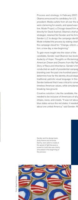
- Page 530: ObamaBarack Obama’s 2008 U.S. pre
- Page 536: Process and strategy: Olympic Games
- Page 540: Process and strategy: Charleston, S
- Page 544: Process and strategy: Eager to make
- Page 548: Process and strategy: The task forc
- Page 552: Process and strategy: Preferred Rea
- Page 556: Process and strategy: Harnessing th
- Page 560: Process and strategy: Saks approach
- Page 564: Process and strategy: The business
- Page 568: Process and strategy: The release o
- Page 572: Process and strategy: Tate retained
- Page 576: Process and strategy: Poplar Forest
- Page 580: Process and strategy: In 1997, Cron
- Page 584:
Process and strategy: While the con
- Page 588:
Process and strategy: Vanguard’s
- Page 592:
Process and strategy: Grapefruit, a
- Page 596:
Vueling was successfulfrom its star
- Page 600:
Process and strategy: Points NorthC
- Page 604:
This is the beginning of anew chapt
- Page 608:
Klein, Naomi. No Logo. New York: Pi
- Page 612:
Bayn, 62, 63Bayne, Katie, 219BBC, 2
- Page 616:
Indexbrand identity process. See as
- Page 620:
IndexDunn, Dennis, 105Dunn, Michael
- Page 624:
IndexA Hundred Monkeys, 20, 122Hurd
- Page 628:
IndexMobil, 41Mok, Clement, 59, 271
- Page 632:
IndexRalph Lauren, 21Ramírez, Juan
- Page 636:
Indextrade dress, value, 48-49trade
- Page 640:
DESIGN/BUSINESSPraise for previous