DynaPro NanoStar manual - Department of Physiology and Biophysics
DynaPro NanoStar manual - Department of Physiology and Biophysics
DynaPro NanoStar manual - Department of Physiology and Biophysics

Create successful ePaper yourself
Turn your PDF publications into a flip-book with our unique Google optimized e-Paper software.
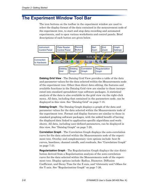
Chapter 2: Getting StartedThe Experiment Window Tool BarThe icon buttons on the toolbar in the experiment window are used toselect the display format <strong>of</strong> the data contained in the measurement node <strong>of</strong>the experiment tree, to start <strong>and</strong> stop data recording <strong>and</strong> automatedexperiments, <strong>and</strong> to open various worksheets <strong>and</strong> control panels. Briefdescriptions <strong>of</strong> each button are given below.InstrumentControl PanelPlate ReaderControl PanelRecordButtonStartZoomEndZoomGraphSettingsConnectionto HardwareDatalogGridDatalogGraphCorrelationGraphRegularizationGraphDatalog Grid View - The Datalog Grid View provides a table <strong>of</strong> the data<strong>and</strong> parameter values for the data selected within the Measurements node<strong>of</strong> the experiment tree. Other than direct data editing, the features <strong>and</strong>available functions in the Datalog Grid view are similar to those incorporatedinto st<strong>and</strong>ard spreadsheet type s<strong>of</strong>tware packages. A statisticalanalysis <strong>of</strong> the data is also available in the grid view via the right-clickmenu. All data, including that contained in the parameters node, can bedisplayed in this view. See “Datalog Grid” on page 7-15.Datalog Graph - The Datalog Graph displays a graph <strong>of</strong> the data <strong>and</strong>parameter values for the data selected within the Measurements node <strong>of</strong>the experiment tree. Format <strong>and</strong> display features are similar to those inst<strong>and</strong>ard graphing s<strong>of</strong>tware packages, with the added benefit <strong>of</strong> havingthe displayed data linked to application-specific algorithms <strong>and</strong> worksheets.All data, including user-defined parameters, can be displayed inthis view. See “Datalog Graph” on page 7-20.Correlation Graph - The Correlation Graph displays the auto-correlationcurve for the data selected within the Measurements node <strong>of</strong> the experimenttree. Overlay <strong>and</strong> complementary view options include: best fitcurves, baselines, channel cut<strong>of</strong>fs, <strong>and</strong> residuals. See “Correlation Graph”on page 7-21.Regularization Graph - The Regularization Graph displays the size distributionderived from a Regularization analysis <strong>of</strong> the auto-correlationcurve for the data selected within the Measurements node <strong>of</strong> the experimenttree. Display options include: Radius, Diameter, DiffusionCoefficient, <strong>and</strong> Decay Time for the X axis, <strong>and</strong> %Intensity <strong>and</strong> %Mass forthe Y axis. See “Regularization Graph” on page 7-26.2-8 DYNAMICS User’s Guide (M1400 Rev. K)