- Page 2:
Chapter 1: Overview and Descriptive
- Page 6:
Chapter 1: Overview and Descriptive
- Page 10:
Chapter 1: Overview and Descriptive
- Page 16:
Chapter 1: Overview and Descriptive
- Page 20:
Chapter 1: Overview and Descriptive
- Page 24:
Chapter 1: Overview and Descriptive
- Page 28: Chapter 1: Overview and Descriptive
- Page 32: Chapter 1: Overview and Descriptive
- Page 36: Chapter 1: Overview and Descriptive
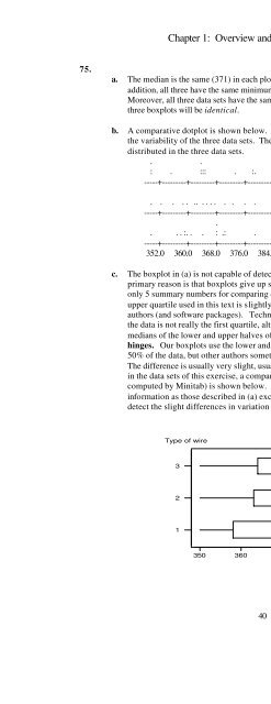
- Page 40: Chapter 1: Overview and Descriptive
- Page 44: Chapter 1: Overview and Descriptive
- Page 48: Chapter 1: Overview and Descriptive
- Page 52: Chapter 1: Overview and Descriptive
- Page 56: Chapter 1: Overview and Descriptive
- Page 62: Chapter 1: Overview and Descriptive
- Page 66: Chapter 1: Overview and Descriptive
- Page 70: Chapter 1: Overview and Descriptive
- Page 74: Chapter 1: Overview and Descriptive
- Page 78: Chapter 1: Overview and Descriptive
- Page 84: Chapter 1: Overview and Descriptive
- Page 88: Chapter 1: Overview and Descriptive
- Page 92: Chapter 1: Overview and Descriptive
- Page 96: Chapter 2: Probability3.a. Event A
- Page 100: Chapter 2: Probability6.a.OutcomeNu
- Page 104: Chapter 2: Probabilityd. (A 1 ∩ A
- Page 108: Chapter 2: ProbabilitySection 2.211
- Page 112: Chapter 2: Probability14.a. P(A ∪
- Page 116: Chapter 2: Probability21.a. P({M,H}
- Page 120: Chapter 2: Probability26.a. P(A 1
- Page 124: Chapter 2: Probability32.a. 5×4×3
- Page 128: Chapter 2: Probability⎛ ⎞35. Th
- Page 132:
Chapter 2: Probability40.a. If the
- Page 136:
Chapter 2: Probability⎛n⎞n!n!
- Page 140:
Chapter 2: Probability49. The first
- Page 144:
Chapter 2: Probability54. P(A 1 ) =
- Page 148:
Chapter 2: Probability59..14 × .3
- Page 152:
Chapter 2: Probabilityb. P(0 def in
- Page 156:
Chapter 2: Probability64.a. P(+) =
- Page 160:
Chapter 2: Probability67.a. P(U ∩
- Page 164:
Chapter 2: Probability74. P(no erro
- Page 168:
Chapter 2: Probability81. P(both de
- Page 172:
Chapter 2: Probability86.a. For rou
- Page 176:
Chapter 2: Probability91. P(A∪B)
- Page 180:
Chapter 2: Probability97.a. P(pass
- Page 184:
Chapter 2: Probability104..15a. P(G
- Page 188:
Chapter 2: Probability108.a. P(all
- Page 192:
Chapter 3: Discrete Random Variable
- Page 196:
Chapter 3: Discrete Random Variable
- Page 200:
Chapter 3: Discrete Random Variable
- Page 204:
Chapter 3: Discrete Random Variable
- Page 208:
Chapter 3: Discrete Random Variable
- Page 212:
Chapter 3: Discrete Random Variable
- Page 216:
Chapter 3: Discrete Random Variable
- Page 220:
Chapter 3: Discrete Random Variable
- Page 224:
Chapter 3: Discrete Random Variable
- Page 228:
Chapter 3: Discrete Random Variable
- Page 232:
Chapter 3: Discrete Random Variable
- Page 236:
Chapter 3: Discrete Random Variable
- Page 240:
Chapter 3: Discrete Random Variable
- Page 244:
Chapter 3: Discrete Random Variable
- Page 248:
Chapter 3: Discrete Random Variable
- Page 252:
Chapter 3: Discrete Random Variable
- Page 256:
Chapter 3: Discrete Random Variable
- Page 260:
Chapter 4: Continuous Random Variab
- Page 264:
Chapter 4: Continuous Random Variab
- Page 268:
Chapter 4: Continuous Random Variab
- Page 272:
Chapter 4: Continuous Random Variab
- Page 276:
Chapter 4: Continuous Random Variab
- Page 280:
Chapter 4: Continuous Random Variab
- Page 284:
Chapter 4: Continuous Random Variab
- Page 288:
Chapter 4: Continuous Random Variab
- Page 292:
Chapter 4: Continuous Random Variab
- Page 296:
Chapter 4: Continuous Random Variab
- Page 300:
Chapter 4: Continuous Random Variab
- Page 304:
Chapter 4: Continuous Random Variab
- Page 308:
Chapter 4: Continuous Random Variab
- Page 312:
Chapter 4: Continuous Random Variab
- Page 316:
Chapter 4: Continuous Random Variab
- Page 320:
Chapter 4: Continuous Random Variab
- Page 324:
Chapter 4: Continuous Random Variab
- Page 328:
Chapter 4: Continuous Random Variab
- Page 332:
Chapter 4: Continuous Random Variab
- Page 336:
Chapter 4: Continuous Random Variab
- Page 340:
Chapter 4: Continuous Random Variab
- Page 344:
Chapter 4: Continuous Random Variab
- Page 348:
Chapter 4: Continuous Random Variab
- Page 352:
Chapter 5: Joint Probability Distri
- Page 356:
Chapter 5: Joint Probability Distri
- Page 360:
Chapter 5: Joint Probability Distri
- Page 364:
Chapter 5: Joint Probability Distri
- Page 368:
Chapter 5: Joint Probability Distri
- Page 372:
Chapter 5: Joint Probability Distri
- Page 376:
Chapter 5: Joint Probability Distri
- Page 380:
Chapter 5: Joint Probability Distri
- Page 384:
Chapter 5: Joint Probability Distri
- Page 388:
Chapter 5: Joint Probability Distri
- Page 392:
Chapter 5: Joint Probability Distri
- Page 396:
Chapter 5: Joint Probability Distri
- Page 400:
Chapter 5: Joint Probability Distri
- Page 404:
Chapter 5: Joint Probability Distri
- Page 408:
Chapter 5: Joint Probability Distri
- Page 412:
Chapter 6: Point Estimation3.a. We
- Page 416:
Chapter 6: Point Estimation9.a. E(
- Page 420:
Chapter 6: Point Estimation16.a. E
- Page 424:
Chapter 6: Point Estimation21.⎛ 1
- Page 428:
Chapter 6: Point Estimation27.a. f
- Page 432:
Chapter 6: Point Estimation32. spa.
- Page 436:
Chapter 6: Point Estimation38.a. Th
- Page 440:
Chapter 7: Statistical Intervals Ba
- Page 444:
Chapter 7: Statistical Intervals Ba
- Page 448:
Chapter 7: Statistical Intervals Ba
- Page 452:
Chapter 7: Statistical Intervals Ba
- Page 456:
Chapter 7: Statistical Intervals Ba
- Page 460:
Chapter 7: Statistical Intervals Ba
- Page 464:
Chapter 7: Statistical Intervals Ba
- Page 468:
Chapter 7: Statistical Intervals Ba
- Page 472:
Chapter 7: Statistical Intervals Ba
- Page 476:
Chapter 8: Tests of Hypotheses Base
- Page 480:
Chapter 8: Tests of Hypotheses Base
- Page 484:
Chapter 8: Tests of Hypotheses Base
- Page 488:
Chapter 8: Tests of Hypotheses Base
- Page 492:
Chapter 8: Tests of Hypotheses Base
- Page 496:
Chapter 8: Tests of Hypotheses Base
- Page 500:
Chapter 8: Tests of Hypotheses Base
- Page 504:
Chapter 8: Tests of Hypotheses Base
- Page 508:
Chapter 8: Tests of Hypotheses Base
- Page 512:
Chapter 8: Tests of Hypotheses Base
- Page 516:
Chapter 8: Tests of Hypotheses Base
- Page 520:
Chapter 8: Tests of Hypotheses Base
- Page 524:
Chapter 9: Inferences Based on Two
- Page 528:
Chapter 9: Inferences Based on Two
- Page 532:
Chapter 9: Inferences Based on Two
- Page 536:
Chapter 9: Inferences Based on Two
- Page 540:
25. We calculate the degrees of fre
- Page 544:
Chapter 9: Inferences Based on Two
- Page 548:
Chapter 9: Inferences Based on Two
- Page 552:
Chapter 9: Inferences Based on Two
- Page 556:
Chapter 9: Inferences Based on Two
- Page 560:
Chapter 9: Inferences Based on Two
- Page 564:
Chapter 9: Inferences Based on Two
- Page 568:
Chapter 9: Inferences Based on Two
- Page 572:
Chapter 9: Inferences Based on Two
- Page 576:
Chapter 9: Inferences Based on Two
- Page 580:
Chapter 9: Inferences Based on Two
- Page 584:
Chapter 9: Inferences Based on Two
- Page 588:
Chapter 9: Inferences Based on Two
- Page 592:
Chapter 10: The Analysis of Varianc
- Page 596:
Chapter 10: The Analysis of Varianc
- Page 600:
Chapter 10: The Analysis of Varianc
- Page 604:
Chapter 10: The Analysis of Varianc
- Page 608:
Chapter 10: The Analysis of Varianc
- Page 612:
Chapter 10: The Analysis of Varianc
- Page 616:
Chapter 10: The Analysis of Varianc
- Page 620:
Chapter 10: The Analysis of Varianc
- Page 624:
Chapter 10: The Analysis of Varianc
- Page 628:
Chapter 11: Multifactor Analysis of
- Page 632:
Chapter 11: Multifactor Analysis of
- Page 636:
Chapter 11: Multifactor Analysis of
- Page 640:
Chapter 11: Multifactor Analysis of
- Page 644:
Chapter 11: Multifactor Analysis of
- Page 648:
Chapter 11: Multifactor Analysis of
- Page 652:
Chapter 11: Multifactor Analysis of
- Page 656:
Chapter 11: Multifactor Analysis of
- Page 660:
Chapter 11: Multifactor Analysis of
- Page 664:
Chapter 11: Multifactor Analysis of
- Page 668:
Chapter 11: Multifactor Analysis of
- Page 672:
Chapter 11: Multifactor Analysis of
- Page 676:
Chapter 11: Multifactor Analysis of
- Page 680:
Chapter 11: Multifactor Analysis of
- Page 684:
Chapter 11: Multifactor Analysis of
- Page 688:
Chapter 11: Multifactor Analysis of
- Page 692:
Chapter 11: Multifactor Analysis of
- Page 696:
Chapter 11: Multifactor Analysis of
- Page 700:
Chapter 11: Multifactor Analysis of
- Page 704:
Chapter 12: Simple Linear Regressio
- Page 708:
Chapter 12: Simple Linear Regressio
- Page 712:
Chapter 12: Simple Linear Regressio
- Page 716:
Chapter 12: Simple Linear Regressio
- Page 720:
Chapter 12: Simple Linear Regressio
- Page 724:
Chapter 12: Simple Linear Regressio
- Page 728:
Chapter 12: Simple Linear Regressio
- Page 732:
Chapter 12: Simple Linear Regressio
- Page 736:
Chapter 12: Simple Linear Regressio
- Page 740:
Chapter 12: Simple Linear Regressio
- Page 744:
Chapter 12: Simple Linear Regressio
- Page 748:
Chapter 12: Simple Linear Regressio
- Page 752:
Chapter 12: Simple Linear Regressio
- Page 756:
Chapter 12: Simple Linear Regressio
- Page 760:
Chapter 12: Simple Linear Regressio
- Page 764:
Chapter 12: Simple Linear Regressio
- Page 768:
Chapter 12: Simple Linear Regressio
- Page 772:
Chapter 12: Simple Linear Regressio
- Page 776:
Chapter 12: Simple Linear Regressio
- Page 780:
Chapter 12: Simple Linear Regressio
- Page 784:
Chapter 12: Simple Linear Regressio
- Page 788:
Chapter 13: Nonlinear and Multiple
- Page 792:
Chapter 13: Nonlinear and Multiple
- Page 796:
Chapter 13: Nonlinear and Multiple
- Page 800:
Chapter 13: Nonlinear and Multiple
- Page 804:
Chapter 13: Nonlinear and Multiple
- Page 808:
Chapter 13: Nonlinear and Multiple
- Page 812:
Chapter 13: Nonlinear and Multiple
- Page 816:
Chapter 13: Nonlinear and Multiple
- Page 820:
Chapter 13: Nonlinear and Multiple
- Page 824:
Chapter 13: Nonlinear and Multiple
- Page 828:
Chapter 13: Nonlinear and Multiple
- Page 832:
Chapter 13: Nonlinear and Multiple
- Page 836:
Chapter 13: Nonlinear and Multiple
- Page 840:
Chapter 13: Nonlinear and Multiple
- Page 844:
Chapter 13: Nonlinear and Multiple
- Page 848:
Chapter 13: Nonlinear and Multiple
- Page 852:
Chapter 13: Nonlinear and Multiple
- Page 856:
Chapter 13: Nonlinear and Multiple
- Page 860:
Chapter 13: Nonlinear and Multiple
- Page 864:
Chapter 13: Nonlinear and Multiple
- Page 868:
Chapter 13: Nonlinear and Multiple
- Page 872:
Chapter 13: Nonlinear and Multiple
- Page 876:
Chapter 13: Nonlinear and Multiple
- Page 880:
Chapter 14: The Analysis of Categor
- Page 884:
Chapter 14: The Analysis of Categor
- Page 888:
Chapter 14: The Analysis of Categor
- Page 892:
Chapter 14: The Analysis of Categor
- Page 896:
Chapter 14: The Analysis of Categor
- Page 900:
Chapter 14: The Analysis of Categor
- Page 904:
Chapter 14: The Analysis of Categor
- Page 908:
Chapter 14: The Analysis of Categor
- Page 912:
Chapter 14: The Analysis of Categor
- Page 916:
Chapter 15: Distribution-Free Proce
- Page 920:
Chapter 15: Distribution-Free Proce
- Page 924:
Chapter 15: Distribution-Free Proce
- Page 928:
Chapter 15: Distribution-Free Proce
- Page 932:
Chapter 15: Distribution-Free Proce
- Page 936:
Chapter 15: Distribution-Free Proce
- Page 940:
Chapter 16: Quality Control Methods
- Page 944:
Chapter 16: Quality Control Methods
- Page 948:
Chapter 16: Quality Control Methods
- Page 952:
Chapter 16: Quality Control Methods
- Page 956:
Chapter 16: Quality Control Methods
- Page 960:
Chapter 16: Quality Control Methods
- Page 964:
Chapter 16: Quality Control Methods