contact office magazine #29
Other countries, other customs. Not least, this can be seen in the way in which we design our office spaces. Owing to mentality, rental costs and individual space requirement, there aren’t just miles between Asia, Europe and America, but worlds.
Other countries, other customs. Not least, this can be seen in the way in which we
design our office spaces. Owing to mentality, rental costs and individual space requirement,
there aren’t just miles between Asia, Europe and America, but worlds.
- No tags were found...

Create successful ePaper yourself
Turn your PDF publications into a flip-book with our unique Google optimized e-Paper software.
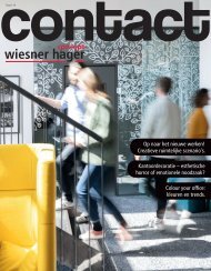
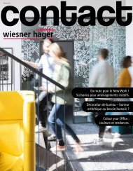
Interior architecture<br />
OFFICE GREY ZONE:<br />
How colour in the <strong>office</strong><br />
Warm or cold?<br />
What colour should you have for the <strong>office</strong>?<br />
increases our performance.<br />
The living room impresses with soft green tones which remind you of ripe olives. The kitchen has<br />
a lively feel thanks to red wooden chairs. And in the bathroom, dark blue bath towels and candles<br />
break up the white surroundings. Only the <strong>office</strong> seems sad – almost lifeless, thanks to the greybeige<br />
monotony.<br />
In living quarters, the targeted use of colour has always<br />
had a great significance, because colours stimulate<br />
our mood and influence the visual climate. We spend<br />
more time at our workspace than in our living room,<br />
which is why it is just as important to think about the<br />
use of colour here: who is motivated to work productively<br />
by a bleak, drab <strong>office</strong> appearance? If we look at<br />
it the other way round: who feels balanced and calm if<br />
an <strong>office</strong> immersed in neon colours reminds you more<br />
of a disco? “The main task of good <strong>office</strong> architecture<br />
is to bring people, function, space and furnishings into<br />
a common context. This is why good interior architecture<br />
strives for a gentle balance between a low level<br />
of stimulation and an overload of stimulation,” says<br />
Helga Eigner, interior architect at Office Consulter<br />
Roomware.<br />
Colour, light and space in sync.<br />
For the beneficial effect of colours to develop, the<br />
colours and areas must be brought into the right<br />
proportions. A large, drab area is just as stressful for<br />
our eyes as a brightly coloured area. In nature, there<br />
are no larger homogeneous areas. Even a meadow is a<br />
mixture of many different shades of green. So, if there<br />
is too little or too much stimulation for our eyes, this<br />
can lead to problems with concentration, headaches<br />
and even to visual impairment.<br />
A vigilance study at the University of Vienna determined<br />
during a check of the error rate during<br />
sustained attention that colourful stimuli significantly<br />
increases concentration levels. Rooms without colour<br />
or rooms which were too bright increased the error<br />
rate among the test subjects. According to the study,<br />
a colour balance which generates a balanced level of<br />
tension would be the best for the eyes and the head.<br />
Light plays just as important a role in the selection of<br />
colour as the function of the room itself. Helga Eigner<br />
explains: “Colour is perceived in different ways depending<br />
on the type of light source. Surfaces which have<br />
a pleasant colouring in daylight can look completely<br />
different in yellowish overhead light.” The use of the<br />
room should be decisive for the colour selection: the<br />
design of communication rooms may be more open<br />
for bolder colour concepts than working rooms which<br />
are permanently occupied. Here, colour should only<br />
be used as an accent.<br />
Tastes are known to be very different, yet the influence<br />
of colours on people is not a question of personal<br />
taste, rather an objective theory of the psychological<br />
effect of colour. This is why there are definite applications<br />
for certain colours which we utilise in an <strong>office</strong><br />
environment.<br />
Red isn’t used as a signal colour for nothing.<br />
It gets our attention in an instant. We associate<br />
it with danger, as well as with love and passion.<br />
In its pure form, red should only be used for<br />
accents, above all in rooms which should<br />
encourage communication.<br />
Blue is a cold colour and reminds us of the<br />
vastness of the sea or sky. It increases our ability<br />
to concentrate and has a calming effect. A blue<br />
pin-board, a blue picture or a blue desktop<br />
wallpaper are options for breathing new life into<br />
everyday <strong>office</strong> life.<br />
Yellow is the purest colour, apart from<br />
white. It radiates cheerfulness and liveliness.<br />
It is best suited to reception areas<br />
and working cafes, as well as for places<br />
where people want to relax.<br />
With its earthy effect, brown is primarily<br />
suited to flooring. Brown provides<br />
stability.<br />
Green is a mixed colour and can assume many<br />
shades and facets. It represents growth and<br />
reminds us of nature. Like yellow, it is used for a<br />
cosier atmosphere, but also in rooms which were<br />
designed for concentrated working. Nature and<br />
colour can be integrated into the room design<br />
using room plants.<br />
Orange is also a mixed colour and assumes the<br />
properties of red – signal colour – and yellow<br />
– cheerfulness. Used in communication and<br />
conference rooms, it combines the concentration<br />
and attention of the participant.<br />
White is a non-colour and is associated with purity,<br />
above all. It should be avoided as a homogeneous colour<br />
on larger surfaces. White or bright tables remind us of a<br />
blank sheet of paper and focus our concentration on the<br />
current activity. Here, you must ensure that the surface is<br />
matt and not reflective.<br />
18 <strong>contact</strong><br />
<strong>contact</strong> 19