Society's Brand Guidelines

You also want an ePaper? Increase the reach of your titles
YUMPU automatically turns print PDFs into web optimized ePapers that Google loves.
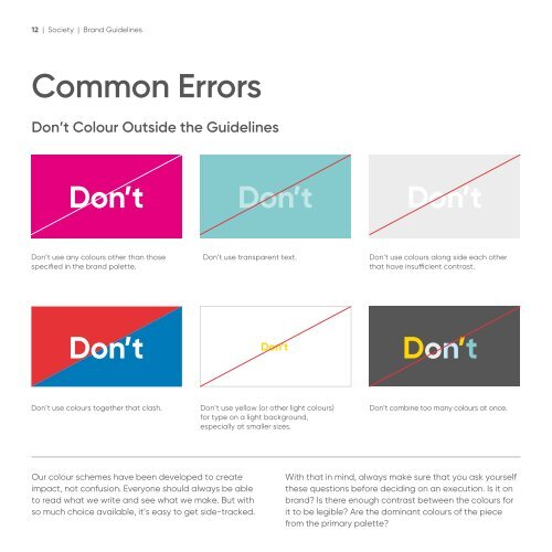
12 | Society | <strong>Brand</strong> <strong>Guidelines</strong><br />
Common Errors<br />
Don’t Colour Outside the <strong>Guidelines</strong><br />
Don’t<br />
Don’t<br />
Don’t<br />
Don’t use any colours other than those<br />
specified in the brand palette.<br />
Don’t use transparent text.<br />
Don’t use colours along side each other<br />
that have insufficient contrast.<br />
Don’t<br />
Don’t<br />
Don’t<br />
Don’t use colours together that clash.<br />
Don’t use yellow (or other light colours)<br />
for type on a light background,<br />
especially at smaller sizes.<br />
Don’t combine too many colours at once.<br />
Our colour schemes have been developed to create<br />
impact, not confusion. Everyone should always be able<br />
to read what we write and see what we make. But with<br />
so much choice available, it’s easy to get side-tracked.<br />
With that in mind, always make sure that you ask yourself<br />
these questions before deciding on an execution. Is it on<br />
brand? Is there enough contrast between the colours for<br />
it to be legible? Are the dominant colours of the piece<br />
from the primary palette?