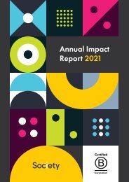
Society's Brand Guidelines

Create successful ePaper yourself
Turn your PDF publications into a flip-book with our unique Google optimized e-Paper software.
18 | Society | <strong>Brand</strong> <strong>Guidelines</strong><br />
Common Errors<br />
A Checklist for Type Perfection<br />
w r ong<br />
wrong<br />
Keep tracking, kerning, and leading<br />
reasonable and legible. Do not stray<br />
far from the examples in this guide.<br />
Try to avoid using centered or completely<br />
justified alignment for multi-line text.<br />
Do not use unauthorised fonts or<br />
typefaces. The only exception is stylised<br />
merchandise or illustrations on a case-bycase<br />
basis.<br />
wrong<br />
wrong<br />
wrong<br />
Do not use a stroke or outline on<br />
typography. Also avoid using a drop<br />
shadow on typography at all costs.<br />
Do not use typography on any angle<br />
other than 0° or 90°. Our typography<br />
should always read up if 90°.<br />
Do not stretch, squish, or otherwise<br />
mangle typography. Use the appropriate<br />
weight instead.