contact_magazine_#36_EN
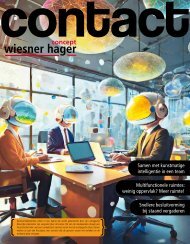
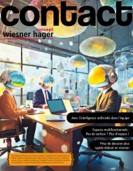
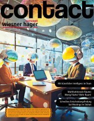
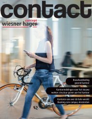
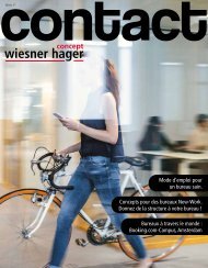
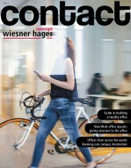
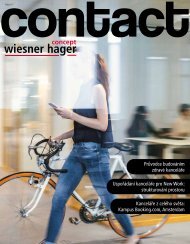
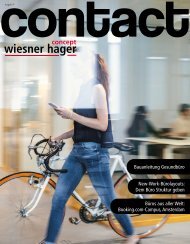
The way from the traditional office to the New Work office has turned out to be the hottest challenge of today. Traditional mindsets regarding organisation and leadership are a thing of the past. Joining forces with the architect Martin Thörnblom, an expert for innovative office concepts, we’ve booked a discovery trip to New Work and composed the title story based on the valuable experiences made on the journey.
The way from the traditional office to the New Work office has turned out to be the hottest challenge of today. Traditional mindsets regarding organisation and leadership are a thing of the past. Joining forces with the architect Martin Thörnblom, an expert for innovative office concepts, we’ve booked a discovery trip to New Work and composed the title story based on the valuable experiences made on the journey.
- No tags were found...

Create successful ePaper yourself
Turn your PDF publications into a flip-book with our unique Google optimized e-Paper software.
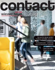
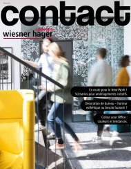
Interior design<br />
The Pantone Colour Institute has voted Viva Magenta as colour of the year 2023.<br />
The vivid red with a touch of magenta is particularly striking and brings up<br />
the question about integrating (trendy) colours into office design.<br />
Design: Schönstil © Lorin Canaj<br />
Design: Schönstil<br />
Colour your<br />
Office.<br />
© PhilippLipiarski<br />
Yvonne Meindl-Cavar is founder and CEO of<br />
Schönstil, consulting engineers for interior architecture<br />
and design, in Vienna. Among her activities,<br />
she designs worlds of work and has a predilection for<br />
integrating a variety of colours. She knows only too<br />
well: “Colours can generate worlds of atmosphere<br />
quite specifically, soothing or stimulating according<br />
to need. The prerequisite is that you study the effect<br />
of different colours.” Blue and green, for instance,<br />
have a relaxing and calming effect; black used in the<br />
correct amount can be elegant but if applied too<br />
extensively can appear heavy and negative. Yellow<br />
generates an optimistic and stimulating atmosphere,<br />
while extensive areas in red can evoke an aggressive<br />
mood. However, if used skilfully, a touch of red can<br />
boost activity. White is a non-colour that steers focus<br />
and concentration onto<br />
the actual task at hand,<br />
but shouldn’t be used too<br />
spaciously, because white<br />
can easily come across as<br />
sterile and cold.<br />
Transposed to office<br />
design, this means that<br />
not only the effect of the<br />
individual colours is a<br />
key factor but also their<br />
combination and dosage. For instance, if you work<br />
all day at the screen, the desktop colour should be<br />
light in hue so that the contrast to the screen isn’t<br />
too strenuous for the eyes. In the extended office setting<br />
the correct combination of colours is of primary<br />
importance. Best of all, you should restrict yourself<br />
to three or four tones that can be applied in different<br />
proportions. “I use colours to create demarcations<br />
– for instance between communication zones and<br />
task areas, and to cite the firm’s corporate identity in<br />
terms of a resonant and cohesive overall concept. In<br />
doing so, I rely mostly on muted colours, which you<br />
don’t get tired of so quickly,” says Meindl-Cavar.<br />
Colours can generate worlds of<br />
atmosphere quite specifically,<br />
soothing or stimulating according<br />
to need.<br />
Trendy! But sensible, too?<br />
So much for colour theory. But let’s get<br />
back to this year’s trend in colour – Viva<br />
Magenta. It brings us to the question of<br />
whether it’s sensible to tune office design<br />
in with (short-term) trends. How do<br />
you integrate trendy colours without having to keep<br />
adapting to the latest craze? “I feel that all colours<br />
are timeless that are reflected in muted form and in<br />
great abundance in the natural environment. For<br />
example, blue tones, green, beige and brown. These<br />
colours never go out of fashion, and you don’t get<br />
tired of them so quickly. This is why I wouldn’t advise<br />
applying trendy colours at random. Colours should<br />
always relate to the firm, or be deliberately applied<br />
to create a specific image for it. In principle, though,<br />
we should stop being<br />
afraid of colours. A wall<br />
can usually be repainted<br />
quickly and without<br />
too much trouble. This<br />
does not outweigh the<br />
enormous benefits to be<br />
gained by colour”, says the<br />
interior designer emphatically.<br />
Viva Magenta is outstandingly<br />
vivid and intensive. People are very shy<br />
about using striking colours – especially in the office<br />
environment. “Basically there isn’t any colour in<br />
existence that is too intense. It’s all a question of how<br />
it’s applied. Ultimately, the colour design ought to<br />
be perceived as pleasant by a great number of people.<br />
Only then will they feel “at home”, and this is what<br />
it’s all about. If a firm’s corporate design is underscored<br />
by a striking colour, you can inject this subtly<br />
into the design with accents of colour. If people<br />
want to paint a large number of walls, they should<br />
choose a more muted version of the colour so as not<br />
to be swamped by hyper-stimulation”, Meindl-Cavar<br />
describes the experiences gained in her daily work.<br />
© freepik<br />
16 <strong>contact</strong><br />
<strong>contact</strong> 17