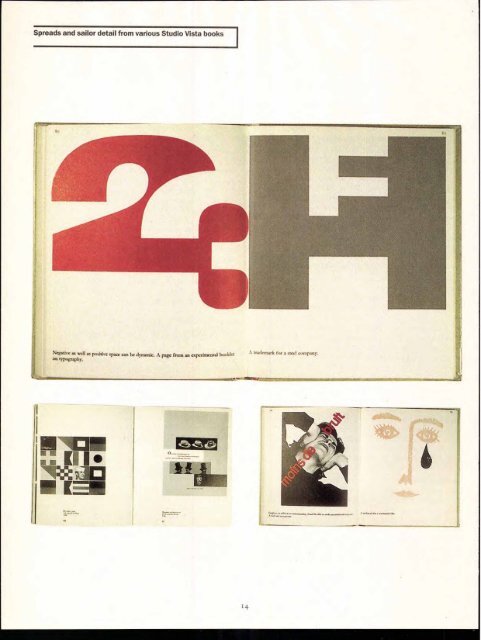
Spreads and sailor detail from various Studio Vista books Negative as Iva its positive space can be dynamic. A page from an experimental Inn Ain 41)%4211411. "Iv 48111Wirit 14 trademark for a steel cmpany. ...ansaroul
approach. "They talked about signage systems. They raised the intellectual stakes. And I wonder whether a lot of design publishing now even gets close." Conway Lloyd-Morgan worked as an editor at Studio Vista directly with both John Lewis and David Herbert. As a student at Oxford in the 1960s, Lloyd-Morgan had ambitions to be the art critic for Isis, the university magazine then edited by Anthony Holden. Having pitched for the job, he was awarded the task, with the proviso that he also design the publication. At Blackwell's bookshop he picked up several "quite different" publications from the Studio Paperbacks series for 12/6, and began his fledgling design career. Inspired by the books, he later interviewed Herbert about the imprint— only to find out some years later that Herbert considered the article one of the worst on publishing that he'd ever read. This didn't stop Lloyd-Morgan from eventually beginning a fruitful relationship with Vista. "Vista looked at subjects nobody else did. These weren't coffee-table books. They fitted swinging London, yet at the same time they were understated. They touched the zeitgeist like no one else did:' And the relationship with the young design community was exciting: "All the best names were in touch with us. They were interested in experimenting with lithography over letterpress, they needed the publicity, and they liked the fast turnaround on titles. I'm sure Vista bankrolled many a late-night Trattoria meal on Old Compton Street: The relationship between Herbert and Lewis was regarded by Morgan as pivotal to the imprint's success. "It was hard to define, but they complemented each other even when they disagreed:' And the pioneering spirit led to some entrepreneurial acts. In the late stages of Kitsch in 1969, a picture of a vulgar interpretation of Rodin's "Kiss" was required. The Italian publisher informed Vista that it would take weeks to supply an original, and so a member of the Vista staff and his wife were photographed later that night in the same position, and the image was published. Authors visiting the offices would see staff in mini-skirts and high heels, turtlenecks and drainpipe jeans — this was a young, vibrant team, and it was what people grew to expect. Sadly, it didn't last. By the mid-1970s, despite success — and being published to a growing American market by Reinhold in New York — Studio Vista was in a decline, attributed variously to the decline in the "art-mood: to new and emerging publishing markets in which it was difficult to compete, and to an alliance with a new London publisher who was less enthusi- astic about"avant-garde" works. Fundamentally, however, Studio Vista ran out of material. After 62 Picturebacks, 36 Studio Paperbacks, 30 Handbooks, and 48 Pocket Howto books, Vista ran out of subject matter. Some titles were re-published by the Herbert Press, and publishers such as Lund Humphries, Penguin, and Macmillan followed the spirit of the imprint in their own work. Conway Lloyd-Morgan published Twentieth Century Type Designers as an homage to the spirit of Studio Vista — even going so far as to create it in a square format. Studio Vista as an imprint, and Studio Paperbacks in particular, stand as influential points in design publishing. Now, they are sought after by ardent collectors, but poor construction means that they are rarely to be found in good condition. On reflection, the values of Studio Paperbacks were numerous. Apart from establishing new trends in design and instructional publishing, and by default capturing the birth of the British graphic-design industry, the books made the point that design was not just about looking good but about its effectiveness and accountability within a broader social context. These weren't heavily varnished beauty parades filled with flotsam and jetsam. They gave information, delivered by practitioners who discussed and explained the processes that they believed would lead to a better-designed and better-structured world. An aim not entirely without merit in these troubled times. Patrick Baglee is Design Editor at Real Time Studios and chair of the Typographic Circle in London. HEADLINE ITC KLEPTO TEXT: ITC FRANKLIN GOTHIC BOOK CAPTIONS: ITC FRANKLIN GOTHIC DEMI IMAGES REPRODUCED BY KIND PERMISSION OF CASSELL PLC 15 The emphasis of Visual Comparisons Studio Vista titles by Alan Fletcher, was squarely on Colin Forbes, and showing and telling. Bob Gill. Lower left: Top and lower right: spread from Paul spreads from Rand's Thoughts on Graphic Design: Design.
- Page 1 and 2: U sac UPPER AND LOWER CA : THE INT'
- Page 3 and 4: Fall 1998 Agfa Direct Fonts Royalty
- Page 5: Messagefrom ITC N OCTOBER, ITC WENT
- Page 8 and 9: CbmsOwe. nn., tn.* Po 1. no4ftes .
- Page 11 and 12: In the mid-1960s, the first in a mo
- Page 13: The Studio Paperbacks series came u
- Page 17 and 18: The Skeptical Typographer by Olav M
- Page 19 and 20: H&Js: Senora' Para ✓ ph Ch ter To
- Page 21 and 22: Ad 'di arri xt by John D. Berry 1.,
- Page 23 and 24: F., Street, LONDON. Pica 1Blacit, a
- Page 25 and 26: Cas Cas lo Caslon Caslon 25 CHOICE
- Page 27 and 28: 9T .)\ 0-(P QRsTuu--(A9-)6 6,xxte,y
- Page 29: acAe0MgV6JpCfra 047QA_S`CUV -W -XZ
- Page 32: MARK VAN BRONKHORST (MvB Design, Al
- Page 35 and 36: ITC American T ewriter® Ilia light
- Page 37 and 38: www.FontSmart.corn Tim Donaldson Ti
- Page 39 and 40: ITC ANCESTOR- v\:fo-v■- S itt g c
- Page 41 and 42: (ziv A: continued from page 9) "As