


You also want an ePaper? Increase the reach of your titles
YUMPU automatically turns print PDFs into web optimized ePapers that Google loves.
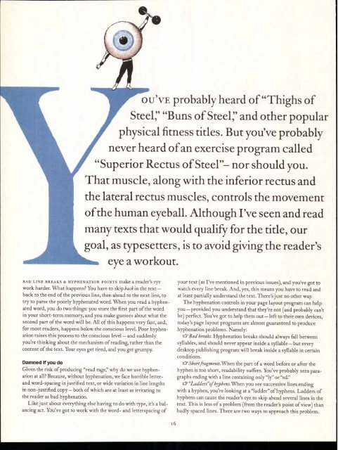
OU'VE probably heard of "Thighs of<br />
Steer "Buns of Steer and other popular<br />
physical fitness titles. But you've probably<br />
never heard of an exercise program called<br />
"Superior Rectus of Steel"— nor should you.<br />
That muscle, along with the inferior rectus and<br />
the lateral rectus muscles, controls the movement<br />
of the human eyeball. Although I've seen and read<br />
many texts that would qualify for the title, our<br />
goal, as typesetters, is to avoid giving the reader's<br />
eye a workout.<br />
BAD LINE BREAKS & HYPHENATION POINTS make a reader's eye<br />
work harder. What happens? You have to skip back in the text—<br />
back to the end of the previous line, then ahead to the next line, to<br />
try to parse the poorly hyphenated word. When you read a hyphenated<br />
word, you do two things: you store the first part of the word<br />
in your short-term memory, and you make guesses about what the<br />
second part of the word will be. All of this happens very fast, and,<br />
for most readers, happens below the conscious level. Poor hyphenation<br />
raises this process to the conscious level—and suddenly<br />
you're thinking about the mechanism of reading, rather than the<br />
content of the text. Your eyes get tired, and you get grumpy.<br />
Damned if you do<br />
Given the risk of producing "read rage," why do we use hyphenation<br />
at all? Because, without hyphenation, we face horrible letterand<br />
word-spacing in justified text, or wide variation in line lengths<br />
in non-justified copy— both of which are at least as irritating to<br />
the reader as bad hyphenation.<br />
Like just about everything else having to do with type, it's a balancing<br />
act. You've got to work with the word- and letterspacing of<br />
6<br />
your text (as I've mentioned in previous issues), and you've got to<br />
watch every line break. And, yes, this means you have to read and<br />
at least partially understand the text. There's just no other way.<br />
The hyphenation controls in your page layout program can help<br />
you—provided you understand that they're not (and probably can't<br />
be) perfect. You've got to help them out— left to their own devices,<br />
today's page layout programs are almost guaranteed to produce<br />
hyphenation problems. Namely:<br />
a Bad breaks. Hyphenation breaks should always fall between<br />
syllables, and should never appear inside a syllable—but every<br />
desktop publishing program will break inside a syllable in certain<br />
conditions.<br />
Short fi-agments.When the part of a word before or after the<br />
hyphen is too short, readability suffers. You've probably seen paragraphs<br />
ending with a line containing only "ly" or "ed."<br />
"Ladders"of byphens.When you see successive lines ending<br />
with a hyphen, you're looking at a"ladder"of hyphens. Ladders of<br />
hyphens can cause the reader's eye to skip ahead several lines in the<br />
text. This is less of a problem (from the reader's point of view) than<br />
badly spaced lines. There are two ways to approach this problem.


