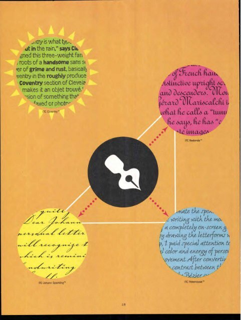
,Iitry is what typ, ut in the rain," says CIL fined this three-weight fan roots of a handsome sans s& Per of grime and rust, basically Iventry in the roughly produce Coventry section of Clevela makes it an objet trouve,' -sion of something tha' faxed or photr- ITC Coventry'" — _ oeutcrt, riaut up ,d, 6C, cutO Deiscat/D . but CYLVtioatedli 1,0 dug rte caCe6 a "tam Cte. oa, Lto "C ittitagzA ITC Redonda" ,mate th6 spoi,. izriting -y3itA. the mot. - a C6YKr)et6) 0A-J-C1/66)1A, 1 ,1) cira-yoing tiL6 16ttotfo -rykts-k p, I paid sp6cia1 att6Atiox tc f) co-iov and energy Of reirso `CrYYMeAt (41ter canwrtiy coAtrast h6tize6n ?LI ' ITC Freemouse"
acAe0MgV6JpCfra 047QA_S`CUV -W -XZ aBcaeffocuuttopit6tiwco,95 1234567'890 ITC Redonda'" ABCOMBfq--XajdtDRA eXPORS(621VWCp ITC Redonda" Fancy ‘6,ff 2x(ir? (42CD6.T(0.1-17,1.X.LNIN UT a, RS.7-1/CIA -P3XYZ -1234567890 496616fgkijkhtutorcirstx-z ITC Freemouse- ABCDEFGHIJKLMNOPQRSTUVWX YZ abcdefghijklmnopqrstuvwxyz 1234567890 ITC Coventry'" Heavy ABCDEFGHIJKLMNOPQRSTUVWX YZ abcdefghijklmnopqrstuvwxyz 1234567890 ITC Coventry'" Medium ABCDEFGHIJKLMNOPQRSTUVWX YZ abcdefghijklmnopqrstuvwxyz 1234567890 ITC Coventry'" Thin ITC Redonda ITC Redonda is based on a common style of French handwriting in the 19th century, a distinctive upright script with looping ascenders and descenders. Montreal-based designer Gerard Mariscalchi is himself French-born, with what he calls a "tumultuous life." In a long career, he says, he has "conceived and realized corporate images, packaging, posters, illustrations, a dozen typefaces, and even about thirty stamps for African and southern Pacific states." He fell in love with type in his twenties, "studying the works of masters like Excoffon, Usherwood, and Frutiger, as well as those from calligraphers and type designers like Plantin, Cochin, and Duren" According to Mariscalchi, the "calligraphic script" that inspired Redonda was in use in the French administration for more than a century (circa 1840-1960)." Redonda comes with two sets of caps, both highly flourished: those in regular Redonda are ornate, with loosely waving swashes, while the swashes in Redonda Fancy are more tightly curled. www.itcfonts.com/itc/fonts/fulVITC2573.html ITC Johann Sparkling The quill pen scratches across the page: "Dear Johann..." Anyone who has seen a personal letter from the 18th century will recognize the style of this typeface, which is reminiscent of the educated handwriting of that period. "ITC Johann Sparkling is intended to close the gap between highly formal copperplate scripts and the scribbled look of 'true' handwriting," says Vienna designer Viktor Solt. "I am not much interested in highly formal and perfect calligraphy but in quick, personal-looking scripts. Usually I start with some historic samples. I do not try to copy these sources but to incorporate them into my own handwriting. It takes up to two weeks and many sheets of paper until the respective script becomes my own. Of course this would not be an economic approach to individual lettering jobs, but I can conserve the custom script for future use by digitizing it" Johann Sparkling appears much smaller than its nominal point size, so it's best used fairly large. And of course these ornate swash caps are never meant to be used together, only in conjunction with the lowercase. www.itcfonts.com/itc/fonts/full/ITC2572.html ITC Freemouse Very different from his earlier ITC faces, ITC Coconino and ITC Beorama, Slobodan Miladinov's ITC Freemouse is still the result of the tension between the computer and the hand. "Freemouse was my first experiment in creating type using only the computer as a design tool," says Miladinov. "I wanted to sublimate the spontaneity and expressivity of calligraphic writing with the modern, slightly digital outlook of a completely on-screen generated typeface." He started by drawing the letterforms using only the mouse. "At that step, I paid special attention to preserving the emotional color and energy of personal calligraphic gesture/movement. After converting the lines to a path, I achieved the contrast between thin and thick strokes by manipulating the Bezier curves, partly following the logic and experience of italic lettering." Freemouse has the look of a chancery italic, but with a backward flip to some of the letters and a very lively contrast of stroke width and curve."That game of improvisation," continues Miladinov, "determined unexpected, random effects, especially in the details, that would be impossible to get and control in conventional pen-on-paper calligraphy." www.itcfonts.conVitc/fonts/fulVITC2578.html ITC Coventry "ITC Coventry is what type would look like if you left a gothic font out in the rain," says Cleveland designer Brian Sooy, who designed this three-weight family. if you look close, you'll see the roots of a handsome sans serif font buried under a layer of grime and rust, basically." Sooy found his inspiration for Coventry in the roughly produced student flyers that he saw in the Coventry section of Cleveland Heights, Ohio. "I suppose that makes it an objet trouve," he says. Coventry gives the impression of something that's been faxed or photocopied several times. "While it looks very irregular in text, it's very carefully spaced to give that effect. Too regular and it would look that way, too little and it would resemble a fifteen-dollar font from one of the many foundries that have sprung up across the net:' Sooy intends the face to work both in text and in headlines, even on billboards. "If it has any historical reference, it's a very short history. I wasn't attempting to mimic any grunge fonts, I was attempting to create a font that stylistically appeared distressed but remained highly legible." He adds: "Coventry is distressed so you don't have to be." ITC Coventry Thin: www.itcfonts.com/itc/fonts/full/ITC2575.html ITC Coventry Medium: www.itcfonts.com/itc/fonts/full/ITC2576.html ITC Coventry Thin: www.itcfonts.com/itc/fontsifulVITC2577.html FONTE K. All new itc fonts include the new ()Euro currency symbol. See more online at www.itcfonts.com 2 9
- Page 1 and 2: U sac UPPER AND LOWER CA : THE INT'
- Page 3 and 4: Fall 1998 Agfa Direct Fonts Royalty
- Page 5: Messagefrom ITC N OCTOBER, ITC WENT
- Page 8 and 9: CbmsOwe. nn., tn.* Po 1. no4ftes .
- Page 11 and 12: In the mid-1960s, the first in a mo
- Page 13 and 14: The Studio Paperbacks series came u
- Page 15 and 16: approach. "They talked about signag
- Page 17 and 18: The Skeptical Typographer by Olav M
- Page 19 and 20: H&Js: Senora' Para ✓ ph Ch ter To
- Page 21 and 22: Ad 'di arri xt by John D. Berry 1.,
- Page 23 and 24: F., Street, LONDON. Pica 1Blacit, a
- Page 25 and 26: Cas Cas lo Caslon Caslon 25 CHOICE
- Page 27: 9T .)\ 0-(P QRsTuu--(A9-)6 6,xxte,y
- Page 32: MARK VAN BRONKHORST (MvB Design, Al
- Page 35 and 36: ITC American T ewriter® Ilia light
- Page 37 and 38: www.FontSmart.corn Tim Donaldson Ti
- Page 39 and 40: ITC ANCESTOR- v\:fo-v■- S itt g c
- Page 41 and 42: (ziv A: continued from page 9) "As