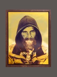
ST/A/R_3
Dritte Ausgabe der ST/A/R - Zeitung
Dritte Ausgabe der ST/A/R - Zeitung

Erfolgreiche ePaper selbst erstellen
Machen Sie aus Ihren PDF Publikationen ein blätterbares Flipbook mit unserer einzigartigen Google optimierten e-Paper Software.
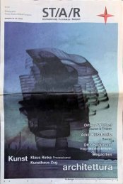
Städteplanung / Architektur / Religion<br />
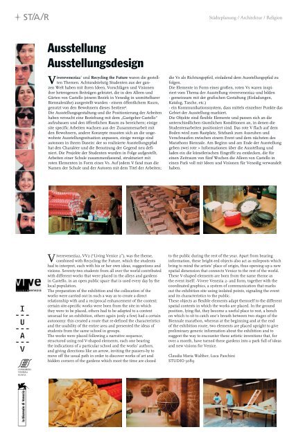
Ausstellung<br />
Ausstellungsdesign<br />
und Recycling the Future waren die gestellten<br />
Themen. Achtundsiebzig Studenten aus der gan-<br />
V iverevenezia21<br />
zen Welt haben mit ihren Ideen, Vorschlägen und Visionen<br />
ihre heterogenen Beiträgen geleistet, die in den Alleen und<br />
Gärten von Castello (einem Bezirk in Venedig in unmittelbarer<br />
Biennalenähe) ausgestellt wurden - einem öffentlichem Raum,<br />
genutzt von den Bewohnern dieses Sestiere².<br />
Die Ausstellungsgestaltung und die Positionierung der Arbeiten<br />
haben versucht eine Beziehung mit dem „Gastgeber Castello“<br />
aufzubauen und den öffentlichen Raum zu bereichern; einige<br />
site specific Arbeiten wachsen aus der Zusammenarbeit mit<br />
den Bewohnern, andere Konzepte mussten sich an die ungewohnte<br />
Ausstellungssituation anpassen, einige wenige sind<br />
autonom in ihrem Dasein: der so realisierte Ausstellungspfad<br />
hat den Charakter und die Benutzung der Gegend neu definiert.<br />
Die Projekte der Studenten wurden in Folge aufgestellt,<br />
Arbeiten einer Schule zusammenfassend, strukturiert mit<br />
roten Elementen in Form eines Vs. Auf jedem V fand man die<br />
Namen der Schule und der Autoren mit dem Titel der Arbeiten;<br />
die Vs als Richtungspfeil, einladend dem Ausstellungspfad zu<br />
folgen.<br />
Die Elemente in Form eines großen, roten Vs waren inspiriert<br />
vom Thema der Ausstellung viverevenezia2 und bilden<br />
- gemeinsam mit der grafischen Gestaltung (Einladungen,<br />
Katalog, Tasche, etc.)<br />
- ein Kommunikationssystem, dass mittels einzelner Punkte das<br />
Gebiet der Ausstellung markiert.<br />
Die Objekte sind flexible Elemente und passen sich an die<br />
unterschiedlichen räumlichen Konditionen an, in denen die<br />
Studentenarbeiten positioniert sind. Das rote V flach auf dem<br />
Boden wird zum Rastplatz, Sitzbank zum Ausruhen und<br />
Verschnaufen zwischen einem Event und dem nächsten des<br />
Marathons Biennale. Am Beginn und am Ende der Ausstellung<br />
geben zwei rote > Informationen über die Ausstellung und<br />
laden ein die künstlerischen Eingriffe zu entdecken, die für<br />
einen Zeitraum von fünf Wochen die Alleen von Castello in<br />
einen Park voll mit Ideen und Visionen für Venedig verwandelt<br />
haben.<br />
Viverevenezia2, VV2 (“Living Venice 2”), was the theme,<br />
combined with Recycling the Future, which the students<br />
had to interpret, each with his or her own ideas, suggestions and<br />
visions. Seventy-two students from all over the world contributed<br />
with different works that were placed in the alleys and gardens<br />
in Castello, in an open public space that is used every day by the<br />
local population.<br />
The preparation of the exhibition and the collocation of the<br />
works were carried out in such a way as to create a direct<br />
relationship with and a reciprocal enhancement of the context;<br />
certain site-specific works were born from the site in which<br />
they were to be placed, others had to be adapted to a context<br />
unusual for an exhibition, others again (only a few) had a certain<br />
autonomy: this created a route that re-defined the characteristics<br />
and the usability of the entire area and presented the ideas of<br />
students from the same school in groups.<br />
The works were placed following a narrative sequence,<br />
structured using red V-shaped elements, each one bearing<br />
the indications of a particular school and the works’ authors,<br />
and giving directions like an arrow, inviting the passers-by to<br />
move off the usual path in order to discover works of art and<br />
hidden corners of the gardens which most the time are closed<br />
to the public during the rest of the year. Apart from bearing<br />
information, these bright-red objects also act as mileposts which<br />
bring to mind the artists’ place of origin, thus opening up a new<br />
spatial dimension that connects Venice to the rest of the world.<br />
These V-shaped elements are born from the same theme as<br />
the event itself: -Vivere Venezia 2- and form, together with the<br />
coordinated graphics, a system of communication that marks<br />
out the exhibition site using isolated points, signaling the event<br />
and its characteristics to the public.<br />
These objects as flexible elements adapt themself to the different<br />
spatial contexts in which the works are placed. In the ground<br />
position, lying flat, they become a useful place to rest, a bench<br />
on which to sit to catch one’s breath between two stages of the<br />
Biennale marathon, whereas at the beginning and at the end<br />
of the exhibition route, two elements are placed upright to give<br />
preliminary generic information about the exhibition and to<br />
suggest the way to encounter these artistic inventions that, for<br />
over a month, have turned these gardens into a park full of ideas<br />
and new visions for Venice.<br />
Claudia Maria Walther, Luca Paschini<br />
<strong>ST</strong>UDIO 3089<br />
74